


|
doctor 7 posted:Continuing with trying to subtly make photos look a bit more flattering I took this snapshot while away with my folks for the weekend. The shot of the boat is great, and there's really nothing I'd change. MrBlandAverage posted:Here are some parking lots. These three are me trying to get back into large format, and portraits are not something I usually do. 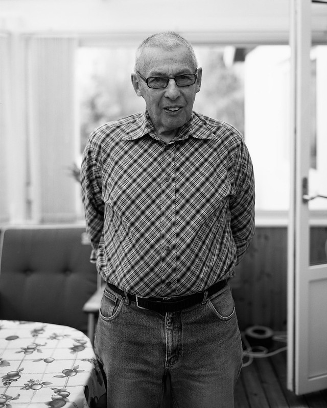 olle gustafsson 2 by like okay cool dude, on Flickr 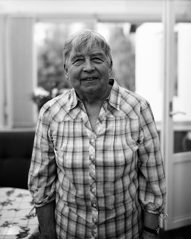 aina gustafsson by like okay cool dude, on Flickr 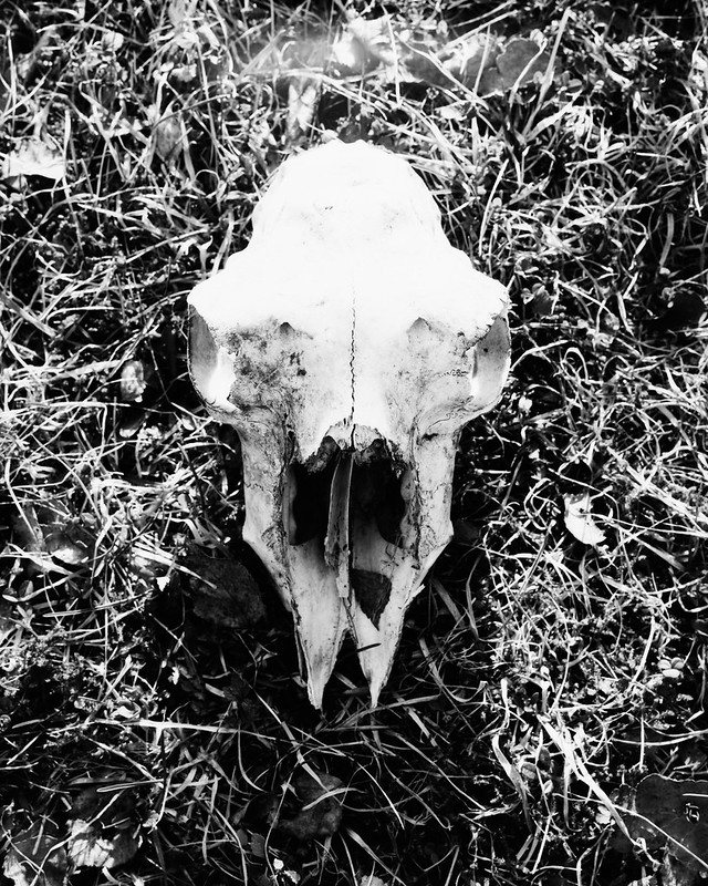 goat skull by like okay cool dude, on Flickr sensy v2.0 fucked around with this message at 15:52 on May 11, 2012 |
 #
?
May 11, 2012 15:40
#
?
May 11, 2012 15:40
|
|


|

|
| # ? May 21, 2024 19:26 |
|
|
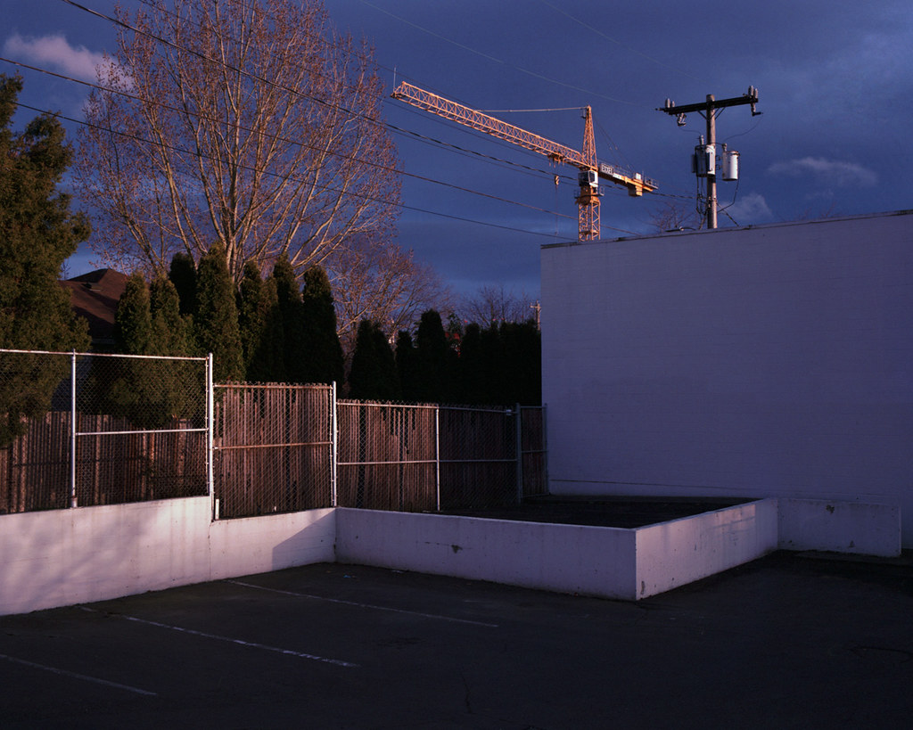
sensy v2.0 posted:Of the three, I think the first is the weakest. It doesn't interest me as much as the other ones for some reason, and I think the busy background with all the trees makes it feel out of place compared to the other two. I can see that one being out of place with the other two, certainly. What about in a series with more pictures of parking lots, where the lots themselves rather than the surroundings are more clearly the subject? What I like about that first one is the three different tones of asphalt... sensy v2.0 posted:These three are me trying to get back into large format, and portraits are not something I usually do. The first two are great as environmental portraits. I wish there were just a little less clutter on the seat behind your grandfather, and I wish your grandmother were standing a little further back, in the same place as your grandfather was, so her hands wouldn't be cut off. The pictures work better individually than together because of this, I think. Watch your highlights. The skull looks pretty blown out. Bad scan, or is the negative blocked up in the highlights? 8th-samurai posted:Here is another one from my city in color series: Normally I hate this kind of color cast, but here it just makes me think of golden hour on a day where there's a cloud cover that happens to be open where the sun is setting, so you get a certain kind of light bouncing off the bottom of the clouds in addition to the normal golden hour light. I really dig how the crane is lined up with the power lines - it's hard to find ways to manage the presence of power lines in urban landscapes and you did it here. HookShot posted:
If only the benches were straight in that last one  The one of the museum guard is about perfect. This reminds me of JaundiceDave's series about people interacting with art, except because he's there all the time, to this guard the art is so mundane. The only thing I'd change would be to crop top and left so the painting runs all the way into the corner. ---------------- I've been shooting some color negs too. I haven't forgotten about you my sweet Portra... 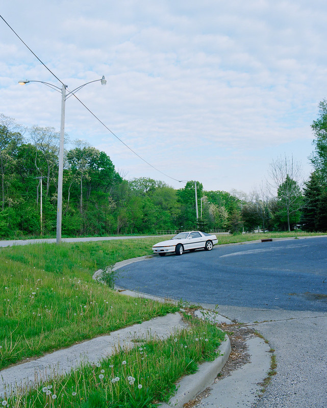 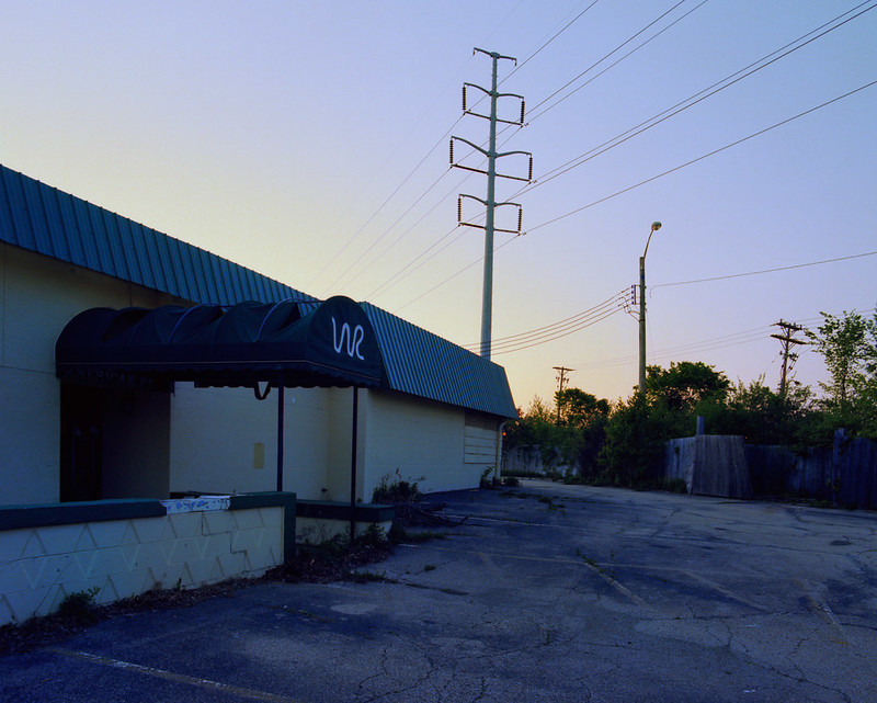 I had trouble with this last one - I wanted to show the emptiness of this subdivision without including too much sky, but now I feel it's a little too wide. Thoughts? 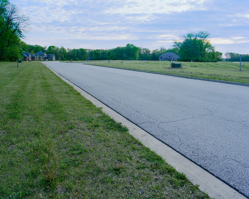
MrBlandAverage fucked around with this message at 17:22 on May 11, 2012 |
|
#
?
May 11, 2012 16:36
|
|


|
In that first one, the pole with two different light fixtures really makes it. It's like one of those "find the thing that does not belong" puzzles, but it's right there clear as day.
|
|
#
?
May 11, 2012 16:45
|
|

|
HookShot posted:
HookShot posted:
HookShot posted:
|
|
#
?
May 11, 2012 17:44
|
|


|
MrBlandAverage posted:MrBlandAverage posted:Compostionally this is nice. The light really lets the scene down though. The cold cast doesn't really add to the mood in a positive way. I think it would look great maybe with sunrise on the side of the building. Maybe straighten out that leaning power pole too. MrBlandAverage posted:I had trouble with this last one - I wanted to show the emptiness of this subdivision without including too much sky, but now I feel it's a little too wide. Thoughts?
|
|
#
?
May 11, 2012 17:45
|
|


|
8th-samurai posted:I think you are right, too wide. The looming foreground just doesn't work here. I think the most natural way to show emptiness is in a straight on manner. Using wide angle tricks always makes it look exaggerated and that doesn't always work. A more matter-of-fact shot closer to the the houses might give you what you are looking for. 100% agree. There's far too much empty space in the frame and it makes the image more about the pavement than anything else.
|
|
#
?
May 11, 2012 17:53
|
|

|
Okay here's a bunch of my shots. I'm still learning the compositional ropes and especially so for 6x6, so I'd like to hear a lot of that. Comments on my processing are also appreciated. All images can be clicked for hugeness. (2k x 2k) I was actually trying to get some flare from the setting sun - didnt't work. Still like it, although I noticed that the wheel is cropped. Dang. Like the mood of the light.  Took this on my way home from another shoot, which didn't turn out. Also have a version without car, but I like this one better. I enjoy the railing and the segmentation between light/dark.  No people photos from me this time. Took this on the fire escape of a tall building when I was shooting a cityscape which didn't come out. (Notice a pattern?) Like the color and the simple geometry in this one. 
|
|
#
?
May 11, 2012 18:00
|
|
|
MrBlandAverage posted:I can see that one being out of place with the other two, certainly. What about in a series with more pictures of parking lots, where the lots themselves rather than the surroundings are more clearly the subject? What I like about that first one is the three different tones of asphalt... MrBlandAverage posted:The first two are great as environmental portraits. I wish there were just a little less clutter on the seat behind your grandfather, and I wish your grandmother were standing a little further back, in the same place as your grandfather was, so her hands wouldn't be cut off. The pictures work better individually than together because of this, I think. MrBlandAverage posted:Watch your highlights. The skull looks pretty blown out. Bad scan, or is the negative blocked up in the highlights?
|
|
#
?
May 11, 2012 18:15
|
|
|
VomitOnLino posted:
I like this one. Abstraction is easy to do but hard to do well. This really takes some fairly mundane aspects of a modern building and elevates them to something more. VomitOnLino posted:Took this on my way home from another shoot, which didn't turn out. Also have a version without car, but I like this one better. I enjoy the railing and the segmentation between light/dark. This one has potential but looks a bit sloppy to me. The guard rail down the center leads your eye straight through the photo which just doesn't work for me with all the eye catching lights elsewhere. My gaze just pinballs around the photo. I think a few steps to the right would have worked better giving the interesting parts more harmony.
|
|
#
?
May 11, 2012 18:16
|
|
|
MrBlandAverage posted:I had trouble with this last one - I wanted to show the emptiness of this subdivision without including too much sky, but now I feel it's a little too wide. Thoughts? Maybe get closer to the houses and put them in the foreground and use the wideness of the lens to show the emptiness around it? VomitOnLino posted:Took this on my way home from another shoot, which didn't turn out. Also have a version without car, but I like this one better. I enjoy the railing and the segmentation between light/dark. I agree with 8th-Samurai about the guard rail down the middle. Moving to the right and having the road/guard rail move more across the frame rather than straight to the middle might be nice?
|
|
#
?
May 11, 2012 18:31
|
|

|
Thanks MrBlandAverage and VomitOnLino for the crits. You're both SO RIGHT about the uneven benches. I had about a 5 second window of that room being completely empty except for the guard, and I really wished I'd had the time to straighten them. I'll play with the cropping for 1 and 2 as well for sure. I think you're right about the angle of the dude, I just really wanted to get the fact that he was playing with his phone in the shot, and from the front his knee was blocking it, but in retrospect I probably should have gone front-on anyways.
|
|
#
?
May 11, 2012 18:42
|
|
|
VomitOnLino posted:No people photos from me this time. Took this on the fire escape of a tall building when I was shooting a cityscape which didn't come out. (Notice a pattern?) Like the color and the simple geometry in this one. I want to like this more, but one of the bars on the ladder cage almost perfectly lines up with the edge of the building and compresses things a bit too much for my taste. Did you take any pictures of the same subject, maybe sitting more towards the right? I'd also like to see the verticals a little straighter for a subject like this.
|
|
#
?
May 11, 2012 19:00
|
|
|
Here's a few I took on a trip to Switzerland and exclusively used an X100: Artistically Placed Tree by Cacator, on Flickr Clock Tower Graffiti by Cacator, on Flickr  Stechelberg by Cacator, on Flickr  Alps by Cacator, on Flickr Clouds over Luzern by Cacator, on Flickr The last one I'm having trouble with, don't know if it is exposed too little or if I should convert it to black and white or if something less blue would work better. HookShot posted:
I usually like taking shots like this at art museums and did at the Kunsthaus in Zurich, but I can't really explain why, if it's just the aesthetics or the way space is used in a museum or what. Not really a critique, but how would you describe it? Cacator fucked around with this message at 21:42 on May 12, 2012 |
|
#
?
May 11, 2012 20:03
|
|


|
Cacator posted:
quote:
 131/366 - Sunset on the beach by fuglsnef, on Flickr
|
|
#
?
May 11, 2012 23:31
|
|


|
Trying out slides at night, metering is a little tricker than with print film.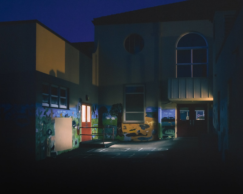 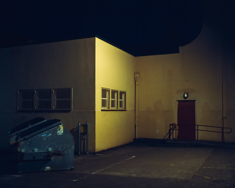
bellows lugosi fucked around with this message at 01:33 on May 12, 2012 |
|
#
?
May 12, 2012 01:28
|
|
|
dukeku posted:dukeku posted: 
|
|
#
?
May 12, 2012 03:52
|
|

|
David Pratt posted:This is pretty boring. Central composition, and it's just a picture of someone else's art. Fair enough if you're documenting street art, but as a photo it doesn't stand on its own. Understandable, I guess I can crop closer to push it to the left.  Clock Tower Graffiti by Cacator, on Flickr quote:This seems underexposed to me. I understand you had to to get the god ray in as much detail as you did, but I'd be tempted to draw an exposure gradient across the bottom left of the picture to lighten it up. Either that or darken it completely so it's just a silhouette against the sky. Went with the former and added the gradient. Thanks for the input.  Clouds over Luzern by Cacator, on Flickr Cacator fucked around with this message at 05:07 on May 12, 2012 |
|
#
?
May 12, 2012 05:05
|
|
|
Reichstag posted:I'm a sucker for power lines, and I like this, but the composition makes me think that maybe it wasn't supposed to be the focus of the shot? dukeku posted:Trying out slides at night, metering is a little tricker than with print film. I love both of these. The top one has like a menacing evil playground feel. The bottom one just has amazing color and I love the exposure. Is the sky clipped to black in the bottom image, or is that a really dark blue? Side note: I figured out all my color issues and can now actually post something that looks like it did in Lightroom.  20120425-482.jpg by tijag, on Flickr
|
|
#
?
May 12, 2012 07:04
|
|

|
dukeku posted:Trying out slides at night, metering is a little tricker than with print film. Cacator posted:Here's a few I took on a trip to Switzerland and exclusively used an X100: tijag posted:I figured out all my color issues and can now actually post something that looks like it did in Lightroom. Hotwax Residue fucked around with this message at 07:11 on May 12, 2012 |
|
#
?
May 12, 2012 07:05
|
|

|
Hotwax Residue posted:I think the the horizon should be lower in the frame. And maybe you could have got down closer to the flowers, that would make the tree appear larger.  Artistically Placed Tree by Cacator, on Flickr Would a center crop work as well?
|
|
#
?
May 12, 2012 12:09
|
|
|
Reichstag posted:The first one is technically sound, and almost works, but I'm struggling to connect to the guy. I ask myself 'what's he thinking?' and all I get in return is 'man, motorbike'. It might also have helped to bring in the motorbike itself a little more as well, although having it implied isn't exactly a disaster. The second, for me, doesn't really work because of the bottom third of the photo. I like the crazy overhead lines, but the bottom third is like 'so what?'. These photos I took a couple of weeks ago, but I've been super busy and posting them slipped my mind:  DSC02058.jpg by chidona, on Flickr  DSC02017.jpg by chidona, on Flickr And this is an attempt at abstraction:  DSC02152.jpg by chidona, on Flickr
|
|
#
?
May 12, 2012 12:49
|
|

|
Cacator posted:Would a center crop work as well?
|
|
#
?
May 12, 2012 16:39
|
|

|
Chidona posted:
Chidona posted:
Chidona posted:
Cacator posted:
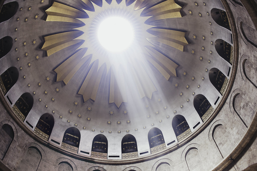
dukeku posted:dukeku posted:VomitOnLino posted:Visited the Church of the Holy Sepulchre in Jersualem (supposedly where Jesus was crucified and was resurrected). 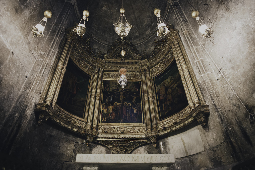 _MG_2202-150 by spf3million, on Flickr What's left of the J-man's tomb. 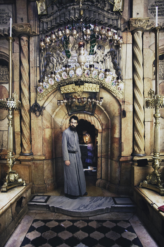 _MG_2215-153 by spf3million, on Flickr
|
|
#
?
May 12, 2012 17:45
|
|

|
Saint Fu posted:
This is awesome- the processing works really well with the subject. I like how are no obvious pieces of modern technology in the frame; it looks like it could easily have been taken forty years ago. For some reason the hat on the right side kind of perfects it for me. I spent the day shooting ships at the port...not sure if I'm happy with any of the results though.  
Bouillon Rube fucked around with this message at 03:17 on May 13, 2012 |
|
#
?
May 13, 2012 03:12
|
|


|
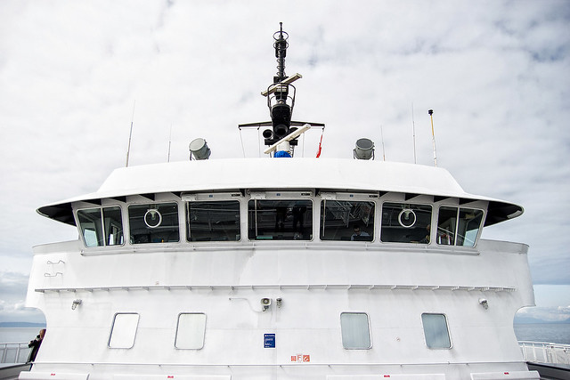
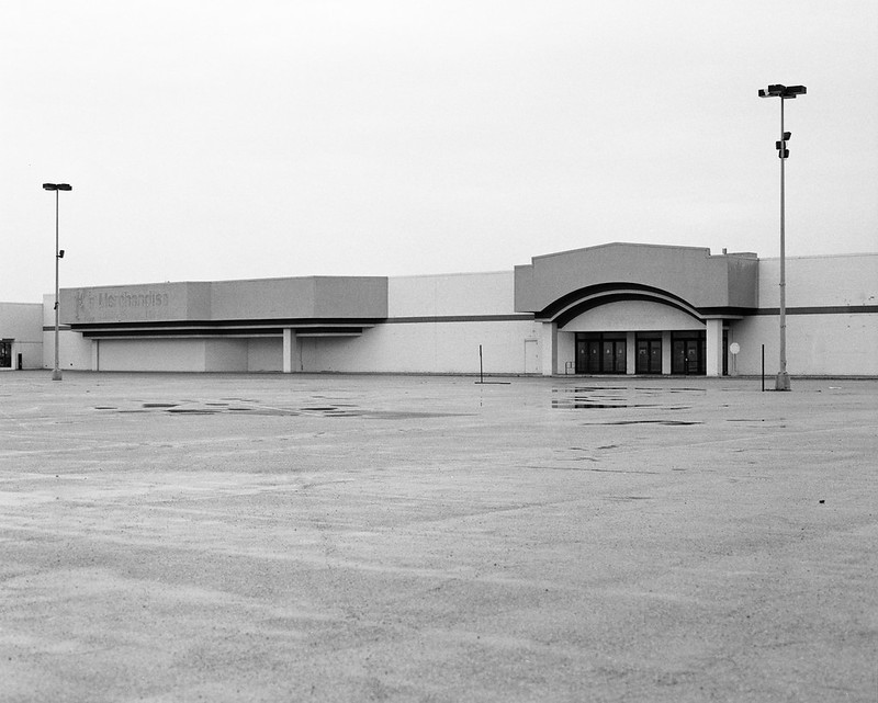
Augmented Dickey posted:I spent the day shooting ships at the port...not sure if I'm happy with any of the results though. The first one seems flat and, well, it's a big boat. Maybe a longer shot of the aftercastle (I think that's what the structure on the stern is called)? I get the feeling that there's a lot of detail in there that I'd like to see, like a miniature city. I like the second shot quite a bit. I might be the minority but I think the amount of sky is a touch overpowering. The cloud detail is great but I get lost in it and dismiss the tug and that very nice water texture. -- I need to get out of the drat suburbs. I feel like I've hit a creativity black hole.  I don't think I know how to shoot architecture and I'm pretty sure I took the second one just to take something. I don't think I know how to shoot architecture and I'm pretty sure I took the second one just to take something. untitled by jankyangles, on Flickr  untitled by jankyangles, on Flickr
|
|
#
?
May 13, 2012 03:54
|
|
|
sensy v2.0 posted:You've successfully made your mom look great, but if you wanted it to be flattering for your dad you caught him at the worst possible time. Chin down and looking really disinterested. Saint Fu posted:Visited the Church of the Holy Sepulchre in Jersualem (supposedly where Jesus was crucified and was resurrected). Maker Of Shoes posted:
I'm trying to expand from shooting people and whatnot so I went on a bit of a hike today and took a few photos. This is the only one I like. I've never tried taking pictures of poo poo I see in the woods, or processing greenery before, so any tips would be appreciated no matter how basic. 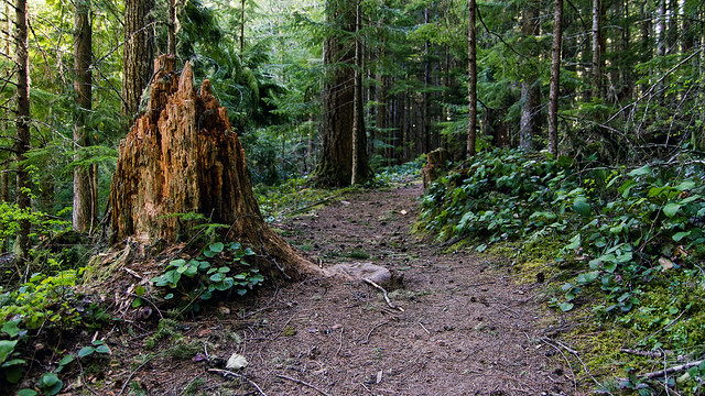 IMG_4906 by Aidan R, on Flickr doctor 7 fucked around with this message at 04:42 on May 13, 2012 |
|
#
?
May 13, 2012 04:04
|
|


|
Maker Of Shoes posted:I like the second shot quite a bit. I might be the minority but I think the amount of sky is a touch overpowering. The cloud detail is great but I get lost in it and dismiss the tug and that very nice water texture Thanks for the input! Here's another shot along those lines but with more of an emphasis on the water detail. Not sure if I went too far in the other direction this time around. [img]http://farm8.staticflickr.com/7215/7185789684_ae36fb80a1_c_d.jpg][/img] Bouillon Rube fucked around with this message at 04:33 on May 13, 2012 |
|
#
?
May 13, 2012 04:26
|
|
|
doctor 7 posted:I'm trying to expand from shooting people and whatnot so I went on a bit of a hike today and took a few photos. This is the only one I like. I've never tried taking pictures of poo poo I see in the woods, or processing greenery before, so any tips would be appreciated no matter how basic. It's a nice shot with good composition, colors, and processing but kinda boring. No fault of your own but most shots in the woods will be. When I started posting in CC/dorkroom in 08 Confused Us had a good quote with any shot with 2/3rds of it green (in a forest) will probably be a bad idea. It's certainly not always right but I've followed it as a rule of thumb where I could. MrBlandAverage posted:cyan/red balance might need a lil adjusting - at least on firefox for my monitor.    My desktop for editing is dead so these are straight jpegs from my camera. I'll get around to editing them when I get my motherboard back from ASUS. 
|
|
#
?
May 13, 2012 06:08
|
|

|
David Pratt posted:
I really like this shot. It's quite nice, I just wish it was a little bit lighter. Do you have a tripod? If you'd done a long exposure to smooth out the water I think it would have been fantastic. But basically, the lack of detail in the rocks and sand detracts from the picture. You could always bracket exposures if you were worried about too much light from the sunset. That said, I really like the composition of it, looks fantastic!  Sant'Ignazius by hookshot88, on Flickr 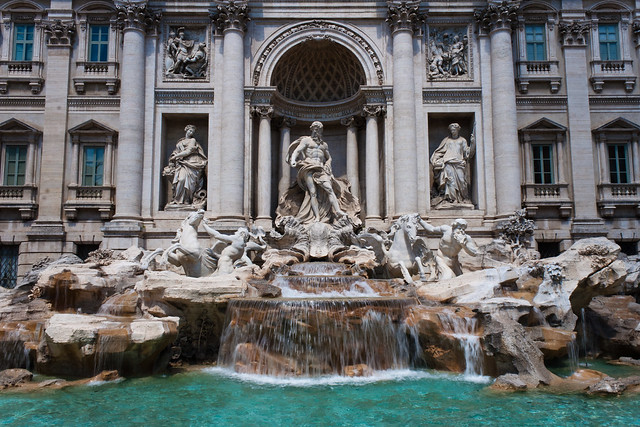 Fontana di Trevi by hookshot88, on Flickr 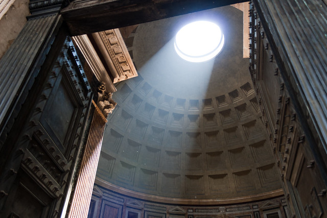 Pantheon by hookshot88, on Flickr
|
|
#
?
May 13, 2012 07:38
|
|
|
Saint Fu posted:
Absolutely fantastic! The second one is really really good. Something I noticed about the first one: The little hanging lamps seem to be a bit overexposed - especially the top right and top left ones (but mostly the top right one). I wouldn't say that detracts from the awesomeness of it, though ")
|
|
#
?
May 13, 2012 14:57
|
|
|
guidoanselmi posted:The reflection in her left eye (photo right) looks extremely odd. Makes her look like that eye is looking in the wrong direction. chidona posted:These photos I took a couple of weeks ago, but I've been super busy and posting them slipped my mind: Not sure the pure black at the bottom is a net positive. I like the 4x6 crop factor, but it's dragging my eye to the bottom of the shot. quote:
I see why you liked it (see my running shot below). It has great, strong colors, but... I think you may overestimate your emotional attachment to it, because it's just a center composed shot of some kid's back. Neither action nor interest. quote:And this is an attempt at abstraction: I like it, and as an abstract is just that, have nothing further to say. Three from me: 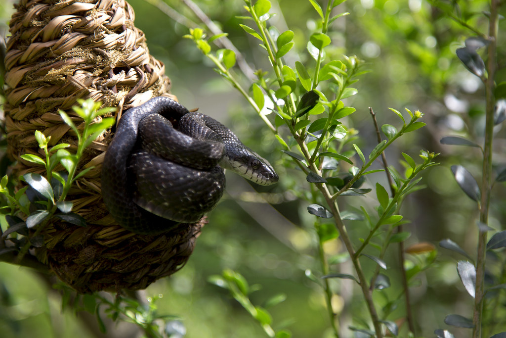 Rat Snake3 by torgeaux, on Flickr The Boy's First Race:  Not Even Touching the Ground by torgeaux, on Flickr 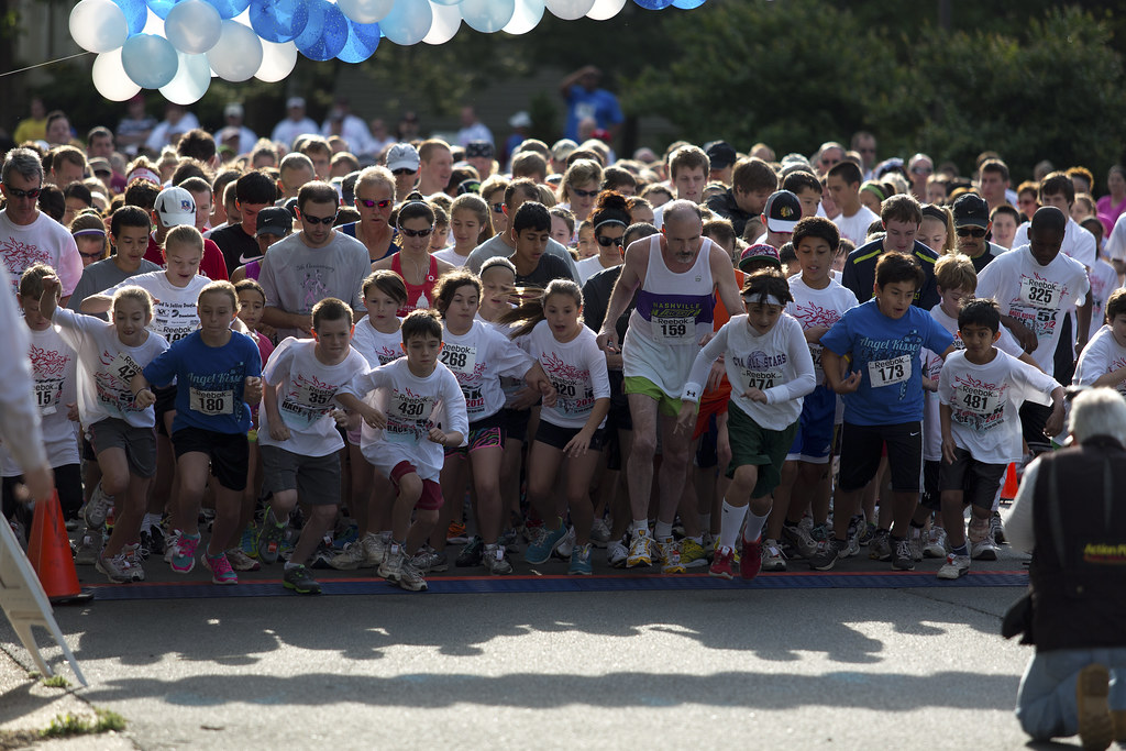 Start of the Race2 by torgeaux, on Flickr Edit: As suggested. 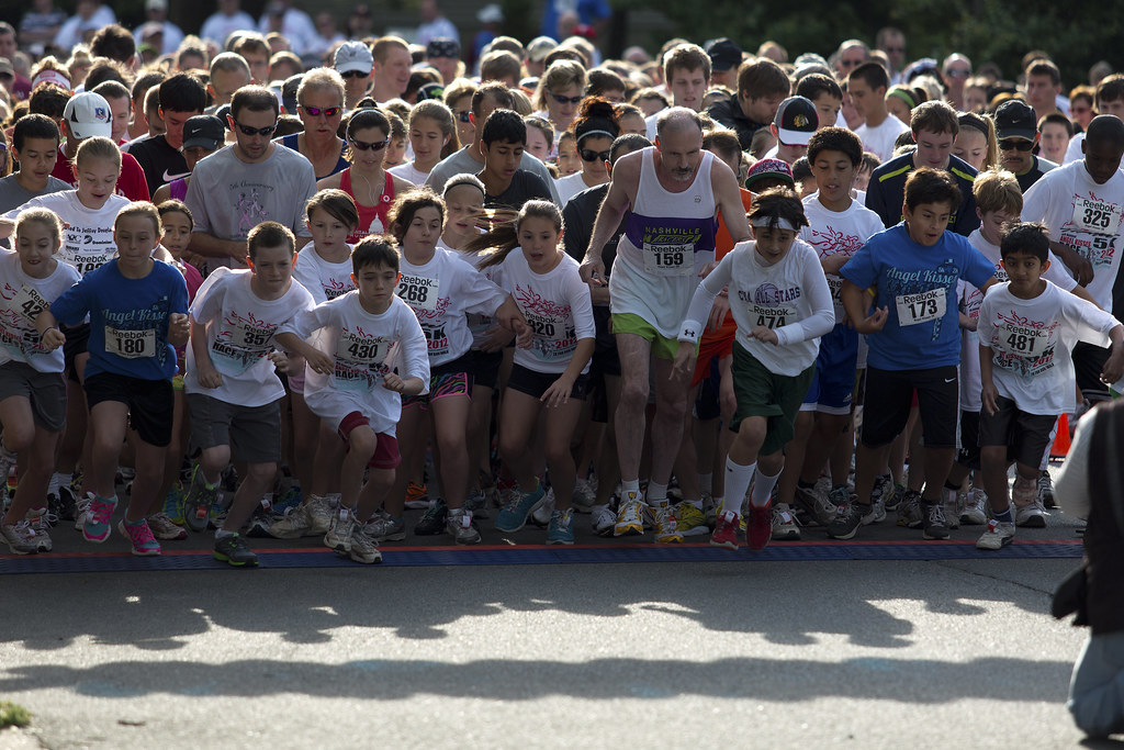 Start of the Race3 by torgeaux, on Flickr torgeaux fucked around with this message at 20:21 on May 13, 2012 |
|
#
?
May 13, 2012 15:10
|
|
|
torgeaux posted:
guidoanselmi posted: doctor 7 posted:These are both loving stellar. I honestly don't know what to say other than drat fine work. Composition works, exposure is spot on, colour looks a bit dulled (I don't know if you did anything in regards to it) but it looks just right for the photos. Really well done. HookShot posted:
 _MG_2229-151 by spf3million, on Flickr I spent a ton of time editing out a thing in the middle of the room. Could you tell if I hadn't said anything?  _MG_2229 by spf3million, on Flickr
|
|
#
?
May 13, 2012 17:45
|
|
|
guidoanselmi posted:It's a nice shot with good composition, colors, and processing but kinda boring. No fault of your own but most shots in the woods will be. When I started posting in CC/dorkroom in 08 Confused Us had a good quote with any shot with 2/3rds of it green (in a forest) will probably be a bad idea. It's certainly not always right but I've followed it as a rule of thumb where I could. torgeaux posted:
That's your kid right? He's cute but I don't have much to add because it's probably more of a personal shot than a serious photo. That said it's snapped at a good moment in time but I'm wondering if a different angle might help a tad. Maybe closer to the ground or even more of a profile shot, the fact he's mid-air doesn't really pop out at you. For the final one I'd say you should either crop it in more to lose the photographer on the right and the stray arm on the left or, if you did crop it, uncrop it a bit so you can see the full camera man. It's a good photo and I wouldn't be surprised if you sent it to a local paper they'd print it on their front page. Tried something new, again, with longer night time exposures which I haven't tried until last night. I took another and though I liked the processing I couldn't get it to look remotely even due to the angle at which I shot it. So these are two that I liked.  IMG_4927 by Aidan R, on Flickr 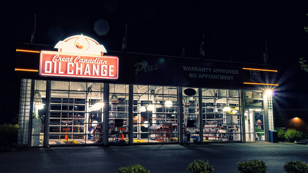 IMG_4932 by Aidan R, on Flickr doctor 7 fucked around with this message at 20:15 on May 13, 2012 |
|
#
?
May 13, 2012 20:12
|
|
|
doctor 7 posted:You know that's a great rule of thumb. Thanks for the tip. Glad the post work seemed to work out OK. Snake was shot at f/4, widest I could get, because of the shading. I was just a few inches out, leaning in, so lots of camera shake. The head is pretty focused, but my smaller apertures were just blurry. Yeah, the boy is a shot I like, but like my criticism of Chidona, it's tough to separate how much you like the photo because of how you feel for the subject. Changed the race shot. On yours: The first one the angle is great, and it's a shot I can really like. The second one, I want to like more, because the shop has a great feel. I think the not quite straight on, not quite angled shot hurts it.
|
|
#
?
May 13, 2012 20:25
|
|
|
torgeaux posted:Snake was shot at f/4, widest I could get, because of the shading. I was just a few inches out, leaning in, so lots of camera shake. The head is pretty focused, but my smaller apertures were just blurry. I'm not quite happy with the angle either, I would've preferred to be further back by there were trees in the way on both sides of the building in the plaza. My thought was to get in closer to avoid the trees and foliage in the shot, for the most part, but I guess it didn't work as I would've liked. It was basically setup like this: pre: -----------
| |
| |
-----------
* *
x
|
|
#
?
May 13, 2012 20:51
|
|
|
doctor 7 posted:You know that's a great rule of thumb. Thanks for the tip. Glad the post work seemed to work out OK. Yeah, playing with the magenta sliders in raw is a fun way to go for editing some forest stuff if you didn't do that directly. i like the look of your post work
|
|
#
?
May 14, 2012 00:24
|
|
|
Saint Fu posted:
Looks great. The bit of masonry beneath the arched window has a bit of a rough transition that might benefit from some burning, but had I not known I would have assumed it was patina. Saint Fu posted:Visited the Church of the Holy Sepulchre in Jersualem (supposedly where Jesus was crucified and was resurrected). These are also impeccable. The lamps look great as-is, I don't find I'm missing any detail and the feel is much nicer because of it. They match the light thrown to the sides of the triptych. The muted shadows and overall tone on each looks very accurate; there's just enough of your own character in them to really draw a closer viewing. At first I wanted to suggest straightening the second's horizontals, but after thinking about it I'm not so sure. His posture seems to fit it, seems somehow stranger (and more compelling) as a result. HookShot posted:
In the first, I wish you had more room at the bottom, as straightening those verticals would really improve it. I like the figure in the aisle, positioned nicely. Great composition on the second. If you had clipped the very upper corner of the door frame it wouldn't be nearly as strong. I might clean up some of those illuminated specs, but otherwise wouldn't change much. You should both check out this series by Eduard Widmer.  DSC_5922.jpg by scottch, on Flickr  DSC_5889.jpg by scottch, on Flickr  DSC_5305-Edit.jpg by scottch, on Flickr
|
|
#
?
May 14, 2012 04:11
|
|
|
scottch posted:
I really like this one, but I think it the sky could be cropped down even more. It'd be three rectangles, one sand, one ocean, and one sky.  Tank by DAMNNIGERIAN, on Flickr This isn't the best picture I've taken, but something about the diagnol line of the mountain makes it appealing to me.
|
|
#
?
May 14, 2012 04:25
|
|
|
scottch posted:
drat NIGGA posted:I really like this one, but I think it the sky could be cropped down even more. It'd be three rectangles, one sand, one ocean, and one sky. Did some more night time photos and I swear after uploading the Flickr the colours are a touch off for some reason. Also the lens flare from the powerful lights is starting to get to me. Is there something I can do about that or is it just  ? ?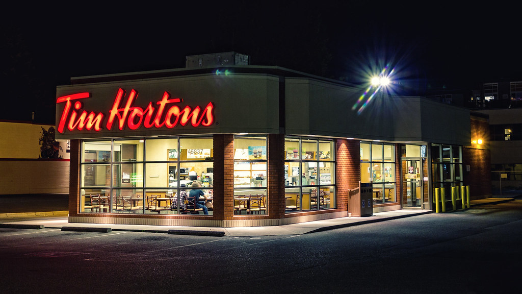 Nighthorts by Aidan R, on Flickr 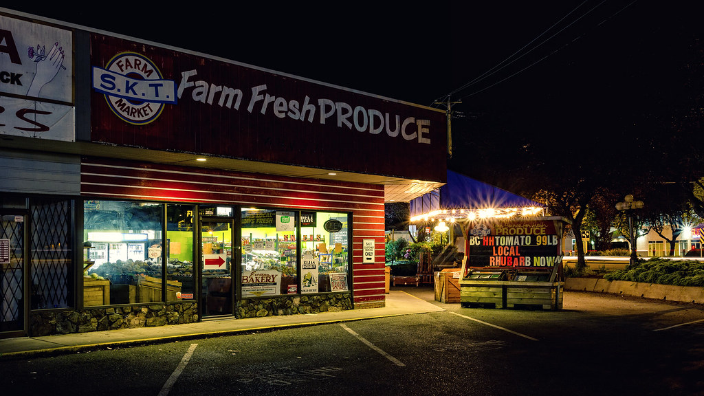 IMG_4966 by Aidan R, on Flickr 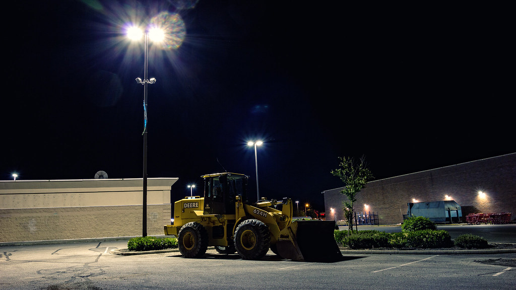 IMG_4943 by Aidan R, on Flickr doctor 7 fucked around with this message at 10:10 on May 14, 2012 |
|
#
?
May 14, 2012 09:47
|
|
|

|
| # ? May 21, 2024 19:26 |
|
|
drat NIGGA posted:I really like this one, but I think it the sky could be cropped down even more. It'd be three rectangles, one sand, one ocean, and one sky. Thanks for the feedback, I'll try that crop out. And that's pack ice, not sand. And those are houses in the second, but I feared I might have been too far away to convey any sense of domesticity. Thanks. I see what you were going for with the diagonal, but it's too noisy. It reads as "hey some brush" and not a strong line like a more barren bit of landscape might convey. The crop also confuses the subject. Is it the tank or the brush?
|
|
#
?
May 14, 2012 13:01
|
|