


|
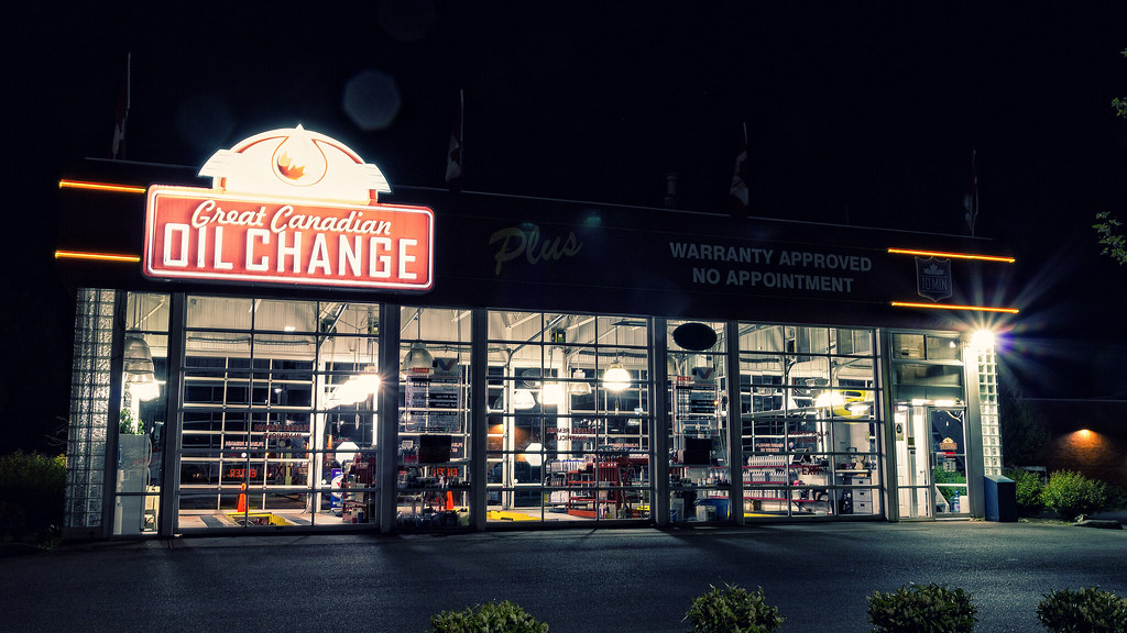
guidoanselmi posted:cyan/red balance might need a lil adjusting - at least on firefox for my monitor. The first one looks like you have a reflection of a reflector in her eye? It makes her look a little  , like the other people said. I like the second one best even though the posing of the hands seems a little forced or something. The third one has a weird shadow where your lights didn't catch her right eyesocket and I'm distracted by that one out of focus flower. , like the other people said. I like the second one best even though the posing of the hands seems a little forced or something. The third one has a weird shadow where your lights didn't catch her right eyesocket and I'm distracted by that one out of focus flower.drat NIGGA posted:I really like this one, but I think it the sky could be cropped down even more. It'd be three rectangles, one sand, one ocean, and one sky. What's the subject here? What are you showing us? Please think about how people who are not you are going to interpret a scene visually with the context removed. Also, I don't see a mountain... None of the straight lines in these seem to be vertical or horizontal and it bugs me. doctor 7 posted:Did some more night time photos and I swear after uploading the Flickr the colours are a touch off for some reason. Also the lens flare from the powerful lights is starting to get to me. Is there something I can do about that or is it just Flare is something you pretty much have to  when using a kit zoom. Most good primes will handle it better, though with that kind of scene it's nearly impossible to avoid. when using a kit zoom. Most good primes will handle it better, though with that kind of scene it's nearly impossible to avoid.My favorite of these is IMG_4966 because of some of the little details and the way you lined up everything here. For example, utility poles are a pain in the rear end to deal with compositionally, but the way it's lined up with the front of the building is great. I also like Nighthorts because you captured the building without any cars or other distracting compositional elements around it, so it's a clean look the others don't have. ---------------------- Two random things. 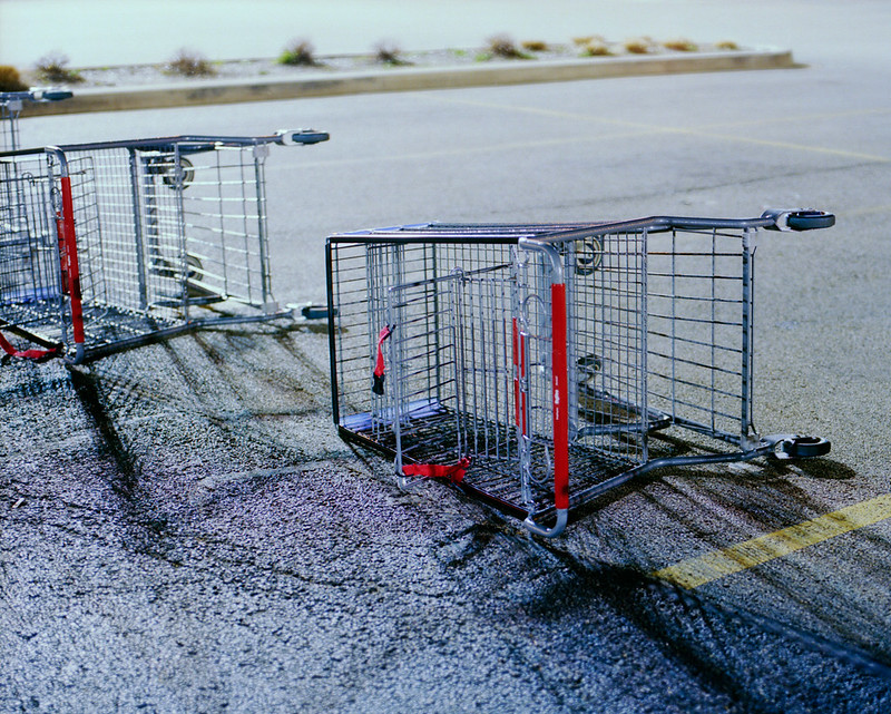 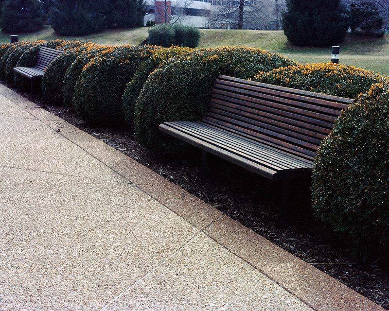
|
 #
?
May 14, 2012 14:26
#
?
May 14, 2012 14:26
|
|


|

|
| # ? May 9, 2024 22:55 |
|
|
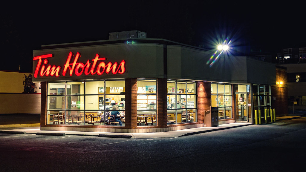
MrBlandAverage posted:None of the straight lines in these seem to be vertical or horizontal and it bugs me. I drove past the Tim Hortons about an hour earlier when I was out taking other shots. It was pretty busy with some cars parked outside so I skipped it. Driving past it when I was coming back home I noticed all the cars were gone, save one, and the people inside were perfectly positioned. I feel super lucky I got the shot.
|
|
#
?
May 14, 2012 19:42
|
|


|
MrBlandAverage posted:Two random things. These are kinda doing my head in. They are very very pretty. The colours are lovely. The DOF is ideal. The framing is excellent. But I just don't find anything very compelling about them. So I guess I like them as an aesthetic thing, just not seeing any story or anything like that. But that was probably what you were going for so this is a really silly critique? They also suffer from the exact same problems I am running into lately.  Night Market by AshBurrows, on Flickr I think the frame and colours etc are kinda nice but it's just pointless. I can't seem to convey anything lately other than "oh it was night time and I thought it would look nice or something?" I am having some sort of existential photography crisis.
|
|
#
?
May 14, 2012 21:06
|
|


|
MrBlandAverage posted:Shopping carts aren't intrinsically the most interesting things to look at, but I love the all the detail in the shadows. There are a lot of nice parallel and perpendicular lines in the shot, which really makes it work for me regardless of the subject matter. MrBlandAverage posted:I think this would work better with a larger aperture- as is, the exposure and tones are very nice but I find myself distracted by all the detail in the top fifth of the frame. I took these yesterday while walking around my parents' neighborhood. I'm happy with the tones but something about the composition seems a bit contrived to me with both of them. Anyone like to offer some tips for shooting cars? 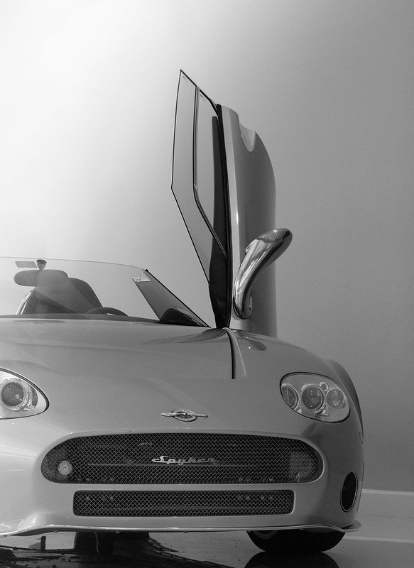 
Bouillon Rube fucked around with this message at 02:30 on May 15, 2012 |
|
#
?
May 15, 2012 02:05
|
|


|
I'm not a huge fan of cropping off the car in weird places. I can kind of see what you're going for with the top one and it almost works, but I think it'd be better if you'd gone full on abstract with it. The Porsche is lit well, it's not a typical car shot but I keep wanting to look at it so you did something right. Cutting the car off at the hood ornament hurts it though.. I keep wanting to see the whole thing.
|
|
#
?
May 15, 2012 02:48
|
|

|
MrBlandAverage posted:I think this one works the best due to the lack of diagonals. There is less movement forcing you to focus on the emptiness and shapes. I think these types of shots work best when they are simple. The other two have too much going on. Bread Zeppelin fucked around with this message at 01:08 on May 19, 2012 |
|
#
?
May 15, 2012 05:31
|
|
|
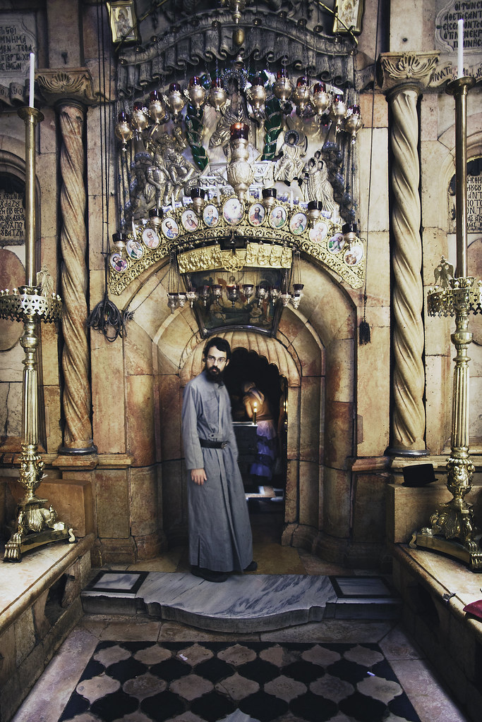
guidoanselmi posted:Your flash needs to be softened or something, it's way too harsh (especially in the first photo). I think a little more fill would help balance out the ratios as well. Saint Fu posted:What's left of the J-man's tomb. Yeah this is really good. David Pratt posted:
This is a bit too dark - all I see is a sunset and dark blobs pretty much. Maybe add an exposure mask? MrBlandAverage posted:This is a bit too busy/muddled together IMO. Maybe reprocessing it would help. Few show shots   
|
|
#
?
May 15, 2012 06:03
|
|

|
Oprah Haza posted:This is great, I love how the light is positioned. I know it's impossible but I wish the microphone wasn't blocking our view of the dude. The colours are amazing, and the diagonal lines make the composition more energetic. Oprah Haza posted:This one is nice, and technically well done, but it's not as compelling as the others. It doesn't have the colours that the first one has or the energy that the second does. It just isn't a very interesting shot. Oprah Haza posted:This one is great, it has some depth to it, emotion, energy and gives more of an overview of the band.  I'm pretty proud of this one because this was the setup I had to use: 
|
|
#
?
May 16, 2012 15:22
|
|

|
KongGeorgeVII posted:This is great, I love how the light is positioned. I know it's impossible but I wish the microphone wasn't blocking our view of the dude. The colours are amazing, and the diagonal lines make the composition more energetic. I don't know what you were going for with this. It looks like you had a bunch of stuff lying on your desk and you were too lazy to go outside, or you wanted to show off your iPhone, iPad and Macbook. I'm not trying to insult you, I've fallen prey to just taking pictures of poo poo on my desk all the time. I just feel like this is a lazy picture. *edit* I also think that, while the lighting is decent, it looks a little underexposed. I went to the Portland Japanese Gardens today. Here are the two best pictures of the day for me. Let it rip! By the way, the colors look best in firefox. Chrome makes it look really lovely.  Japanese Garden by Jenseales, on Flickr 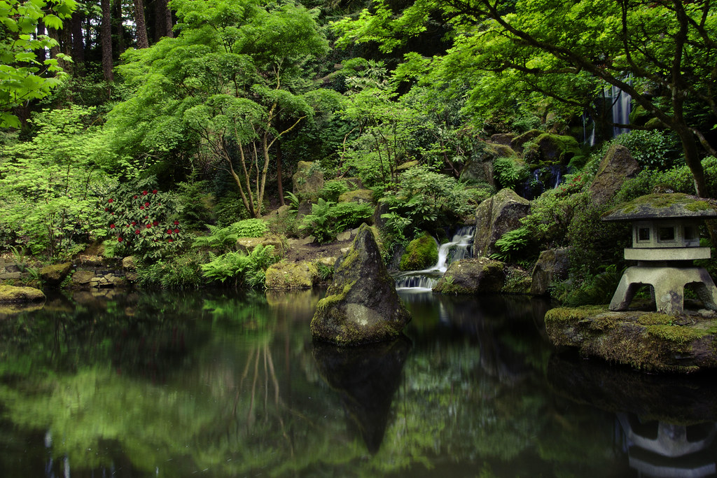 Reflection by Jenseales, on Flickr Turd Nelson fucked around with this message at 03:56 on May 18, 2012 |
|
#
?
May 18, 2012 03:53
|
|
|
Turd Nelson posted:
The second one is technically fine and aesthetically pleasing, but I feel like I've seen this shot in every book about a Japanese garden ever published. Not your fault, it is what it is. The red flowers are almost unreal looking, the way they pop in the background, I find my eyes drawn to them almost instantly, and yet they're not the focal point of the image. went for a walk at lunch today, trying to shoot my way out of a slump - still pretty deep into one...keep shooting...  DSC00034.jpg by Trip Sixes, on Flickr 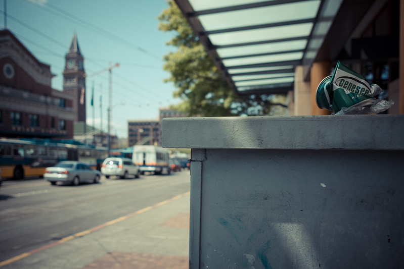 Genesee by Trip Sixes, on Flickr krackmonkey fucked around with this message at 07:23 on May 18, 2012 |
|
#
?
May 18, 2012 06:44
|
|
|
Turd Nelson posted:I don't know what you were going for with this. It looks like you had a bunch of stuff lying on your desk and you were too lazy to go outside, or you wanted to show off your iPhone, iPad and Macbook. I'm not trying to insult you, I've fallen prey to just taking pictures of poo poo on my desk all the time. I just feel like this is a lazy picture. Yeah, that's a fair call. It's a shot for a studio photography class I'm doing at uni, and we had to take a photo of a collection of objects with some kind of loose connection. I'm a doing a design course so it's jokingly entitled "the tools of the trade". The reason I chose those objects is because they can be a bit difficult to photograph, lots of reflective surfaces to control and black can make it hard to show how the object looks in 3D. I had to use previous bits of my work (like that big poster in the setup shot) in order to create the highlight across the ipad and to bounce some light into the bottom of the headphones to give it some more form. It might be a bit underexposed but our lecturer mentioned that he likes it when objects that are meant o be black are actually black. I tried to strike a balance between keeping a little bit of detail and depicting the objects real colours. Thanks for the crit, I love that tree shot by the way.
|
|
#
?
May 18, 2012 14:22
|
|
|
Turd Nelson posted:
Really digging this. It looks like veins spreading through some type of tissue, like a leaf under a microscope. I almost wish the bench wasn't visible through the foliage at the bottom to complete the illusion.
|
|
#
?
May 18, 2012 15:51
|
|
|
Turd Nelson posted:
I love the first one--the framing, colors, and exposure are spot on. Great shot. For me, the second one doesn't feel like a Japanese garden at all. Your composition is nice and suggests serenity, but the colors don't have that feel to them--they're too vivid and lively for me. Here's picture I found on my memory card: 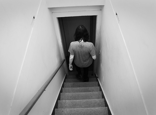 Stairs by renburress, on Flickr I didn't think anything of it because it seemed crooked and boring, but I realized that my friend's shoulders are parallel with the frame and the diagonal lines on her sides were symmetrical.
|
|
#
?
May 18, 2012 18:43
|
|
|
the nicker posted:Really digging this. It looks like veins spreading through some type of tissue, like a leaf under a microscope. I almost wish the bench wasn't visible through the foliage at the bottom to complete the illusion. It looks like the close-up of a cornea to me, actually (do not do a google image search for cornea). Here's a few more from my trip to Switzerland:  Kunsthaus Zurich by Cacator, on Flickr  Rolex Learning Center by Cacator, on Flickr  On the Waterfront by Cacator, on Flickr
|
|
#
?
May 19, 2012 00:49
|
|


|
That guy's actually doing a kickflip, isn't he? (on cobblestone too, making him a legitimate badass) And you cloned out the skateboard. 
|
|
#
?
May 19, 2012 04:50
|
|
|
xzzy posted:That guy's actually doing a kickflip, isn't he? (on cobblestone too, making him a legitimate badass) Nope, he's doing a legitimate leg-powered human jump. And I have no skill with image manipulation. It was a difficult shot to get since the X100 is most definitely not meant for action.
|
|
#
?
May 19, 2012 06:18
|
|
|
krackmonkey posted:went for a walk at lunch today, trying to shoot my way out of a slump - still pretty deep into one...keep shooting... I really like the tone and color of these. That yellow hydrant really pops! Did you do split toning on these? I like split toning. You've done a fine job at making the subject stand out without removing it too far from its environment. I think the shortcoming lies in the subject - firehydrants aren't terribly interesting to most people and unless it's shown in an irregular context or it's doing something (like spewing water!) Thanks for the feedback everyone! I went ahead and removed the bench at the bottom (which I hadn't noticed until it was mentioned). 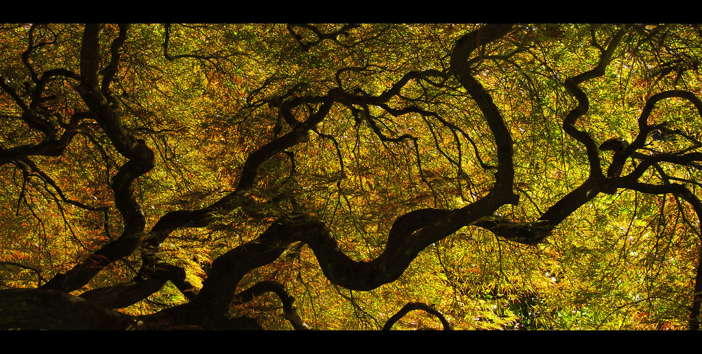 Japanese Garden by Jenseales, on Flickr Here's another shot from the Japanese gardens. I was trying to emulate the look of Alien Cowboy's stuff. How do the colors come off? Too green? 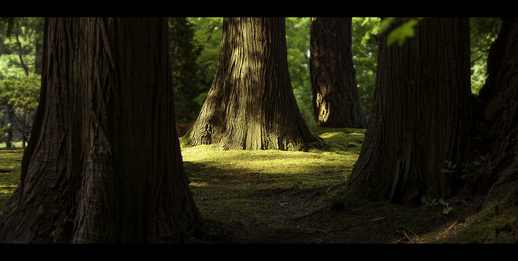 Untitled by Jenseales, on Flickr
|
|
#
?
May 19, 2012 07:09
|
|
|
Turd Nelson posted:Thanks for the feedback everyone! I went ahead and removed the bench at the bottom (which I hadn't noticed until it was mentioned). Something I'm working on for the photo contest.  _MG_2363-161-162 by spf3million, on Flickr
|
|
#
?
May 19, 2012 07:16
|
|

|
That feels off-balance. The cloud is almost totally featureless and that column on the left is dragging the whole image towards it. Maybe try a different crop, something more vertical.guidoanselmi posted:
I really love these two and I hope the editing is minimal because these two look pretty great raw (the first moreso than the second). They remind me of the music video for Deftones' Sextape, which utilized no color correction at all. It's a very distinctive look.
|
|
#
?
May 19, 2012 09:46
|
|

|
Turd Nelson posted:
Okay both of these are fantastic, and I love the cropping with the movie theater style widescreen bars. You did a really good job on mimicking Alien Cowboys shots, since I had to look at the screen name to see that it wasn't his photo. The colors in both are so vivid and crisp.
|
|
#
?
May 19, 2012 15:44
|
|

|
Turd Nelson posted:Here's another shot from the Japanese gardens. I was trying to emulate the look of Alien Cowboy's stuff. How do the colors come off? Too green? I like how the size of the trees isn't immediately obvious. They could either be really big or your camera could be close to the ground. The blurry leaf in the foreground is kinda just there, but I really like the colors and light. This is from a burlesque shoot at a local camera club. We had strobes, but for whatever reason my shots were not coming out well at all. I tried some natural light and did a little better. I'm paranoid I'm not exposing properly though.  Vyolet Gazing Skyward by BJ.Austin, on Flickr Krispy Wafer fucked around with this message at 03:28 on May 20, 2012 |
|
#
?
May 20, 2012 03:26
|
|


|
Krispy Kareem posted:
The one thing that always caught me out with strobes was trying to shoot at my max HSS shutter speed and getting poo poo results. So yeah: You need to even out the light that's falling on her face and her body. There's also an annoying indentation on her belly area which could be removed with a little skin softening or cloning (it looks like she was wearing something high waisted and elastic and it has left an imprint). I took some photos of other people's work this weekend just because:  JCP201200505-8114 by The Real Cosh, on Flickr  JCP201200505-8130 by The Real Cosh, on Flickr 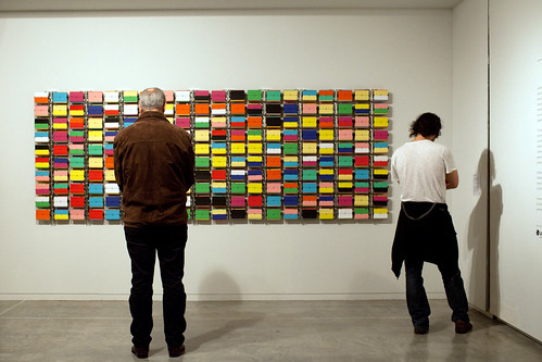 JCP201200505-8125 by The Real Cosh, on Flickr
|
|
#
?
May 20, 2012 09:06
|
|

|
MrBlandAverage posted:Two random things. Explain to me why you ruined what might have been my favorite photograph (at least this week). Seriously though, I love everything about this photo except the left upper edge. This would have owned so hard if that third cart wasn't there and the second cart was entirely in frame. Having them all bunched up together just ruins the balance for me. I really don't care for the letterbox crop. It just makes things look cheap to me. The light in both of these is good but the color cast and saturation is a bit much for my taste, it's teetering on the edge of **GrEaT SHoTZ** flickr award worthy. Composition wise I think the top photo would work much better as a vertical, or at least with the bottom 5th of the image cropped out. Those larger branches are awkward looking and detract from the flowing lines of the smaller ones, as do the multiple ones leading your eye out the bottom of the frame. The second one has a few issues as well. Those OOF leaves hanging down need to go they are distracting. That gap between tree on the left and the edge of the frame doesn't do much for me. It just unbalances the image leading my eye to an open area just out side the frame. The whole rest of the image is drawing attention to the limited space between the trees, which is a great idea by the way explore that poo poo.
|
|
#
?
May 20, 2012 10:42
|
|


|
Dr. Cool posted:Here's picture I found on my memory card: I'd try and straighten it up a bit. It looks really off when it's crooked like that, and it's not strong enough a crook for it to look like you intended to do it that way. I'd also play with the B&W conversion to try and make it more interesting. There isn't really too much else I can add. If it were me I probably would have just dumped it, but if you play with it some more I can see how it might have a bit of potential. 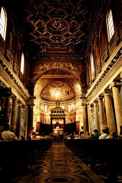 Santa Maria in Trastevere by hookshot88, on Flickr  Rome by hookshot88, on Flickr 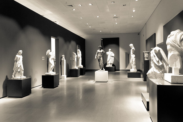 National Museum Rome by hookshot88, on Flickr
|
|
#
?
May 20, 2012 20:41
|
|
|
HookShot posted:
This is so close to centered and symmetrical that the fact that it isn't REALLY stands out. I generally like the post on it but the blacks are a little overboard in the ceilings and pews. I think you could get a little more detail in them while still retaining that dramatic feeling.
|
|
#
?
May 21, 2012 08:57
|
|
|
Schofferhofer posted:
I really like the voyeuristic feel of this one. I feel like I'm watching something I'm not supposed to, as both of the people in this picture are deep in contemplation of the art on display, which to me is a really personal, vulnerable thing. It feels impish. If there's one thing I would suggest improving, it'd be to watch the verticals/horizontals. It may be lens distortion or camera position, but the line running along the top of the photo really invites comparison to the frame line, and since it's not straight, it stands out. The same is true of the right side of the picture, but it's not as strong.  Bubble by TheJeffers, on Flickr
|
|
#
?
May 21, 2012 15:38
|
|

|
TheJeffers posted:
I like this. It's shot in a kind of simple matter-of-fact manner. I would like to see more space in front of the sphere and a bit less contrast though. It's a bit tight which takes away from the feeling that this is a magazine ad for mad science.
|
|
#
?
May 21, 2012 16:10
|
|
|
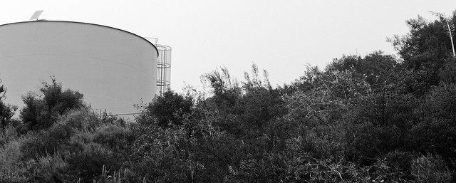
Someone's been visiting Fermilab!  Good job shooting that thing, I've tried to get a decent shot of it for years and I just never could get "the one" because the surrounding scenery is so uninspiring. I've wanted to try and get it with some storm clouds in the background, but I've yet to have my camera on hand when one blew through. Someday I'll learn to just lug my camera wherever I got, but 
|
|
#
?
May 21, 2012 20:06
|
|
|
TheJeffers posted:
I agree with what the others said. A farther away shot would have looked better. Give it more space. Having it sit in the middle of a landscape with nothing but a field around it would add to the strangeness of a giant metallic object being in a field, which is what I assume you were going for. Here are some assorted shots: A drunken disabled man attempts to breakdance in a nightclub, much to the amusement of onlookers  A man plays "When Saints Go Marching In" for tips on a DC corner while a tourist seems lost 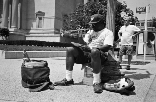 A man protests alone against the government outside his "bunker." 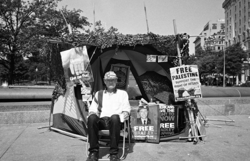
|
|
#
?
May 21, 2012 22:15
|
|

|
the posted:I agree with what the others said. A farther away shot would have looked better. Give it more space. Having it sit in the middle of a landscape with nothing but a field around it would add to the strangeness of a giant metallic object being in a field, which is what I assume you were going for. Unfortunately that's literally not possible for that spot. He really did do the best job possible. This is where it lives: http://g.co/maps/jcqnh Immediately on the left is a parking lot.
|
|
#
?
May 21, 2012 22:22
|
|
|
the posted:A drunken disabled man attempts to breakdance in a nightclub, much to the amusement of onlookers the posted:A man plays "When Saints Go Marching In" for tips on a DC corner while a tourist seems lost I also think a slightly higher angle would have worked better, and maybe more from the side to avoid the bus stop and poster stand in the background. If you didn't, try observing the scene for a little while, see if there are some patterns in the musician's movements, and try to catch him in a good pose. the posted:A man protests alone against the government outside his "bunker." Kinda suffering from the "hands not doing anything" problem. Sure, he's sitting there, supposed to be protesting, and obviously aware of the camera, but he doesn't come across as really caring that much about his cases. - - - Spring finally arrived proper.  Should I perhaps have removed some of the grass on the branch before taking this?  I think I took this just the wrong moment, or should have stuck around for a few seconds more. The man turned to look at the
|
|
#
?
May 21, 2012 22:34
|
|


|
nielsm posted:
The grass is not the problem, the whole thing is out of focus. I may have framed the twig a bit higher as well, as it is it's a little bottom heavy. nielsm posted:
I like this one, but I can't help feeling it's underexposed. I'd wait for a second opinion on that, though.
|
|
#
?
May 21, 2012 22:53
|
|

|
Augmented Dickey posted:I think this would work better with a larger aperture- as is, the exposure and tones are very nice but I find myself distracted by all the detail in the top fifth of the frame.  8th-samurai posted:Explain to me why you ruined what might have been my favorite photograph (at least this week). HookShot posted:
nielsm posted:
------------------ Took a drive up a rural state highway on a foggy morning. Skies not very interesting, but I like the fog in the first one. 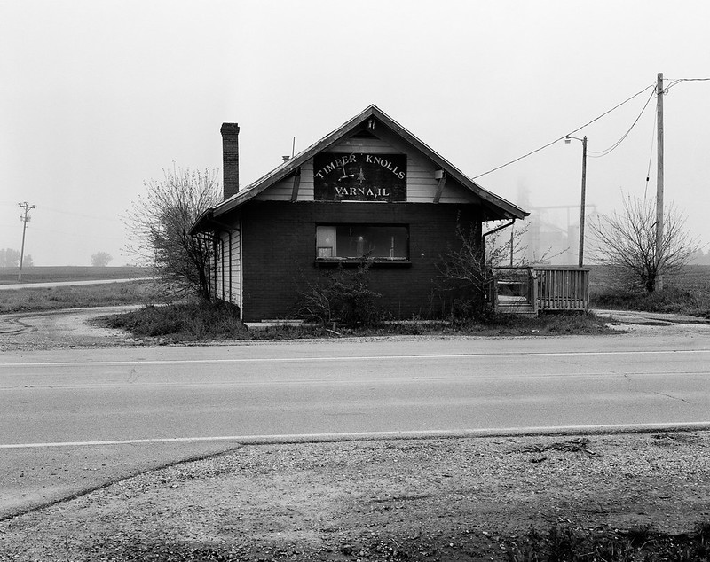 
|
|
#
?
May 22, 2012 01:47
|
|
|
That shot of the abandoned house is fantastic. I'd probably shave off some of the ground at the bottom though.. it seems to distract from the subject because there's so much of it.
|
|
#
?
May 22, 2012 01:51
|
|
|
xzzy posted:That shot of the abandoned house is fantastic. I'd probably shave off some of the ground at the bottom though.. it seems to distract from the subject because there's so much of it. I'm gonna say I like the current framing. Without so much ground I think it would give the house a really bad case of the "thing on a mountain top" look with such an empty sky. Love the shot. edit: 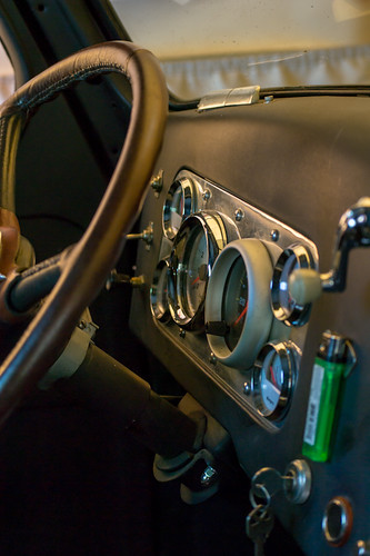 international 1 by jankyangles, on Flickr I'm going out on a limb here and saying I actually like something I took overall. My biggest problem with it that kinda ruins it though is the non matching speedometer bezel. 
Maker Of Shoes fucked around with this message at 05:00 on May 22, 2012 |
|
#
?
May 22, 2012 04:35
|
|

|
Maker Of Shoes posted:
I don't think that angle does much justice to what looks like a pretty interesting old car panel. Everything feels a bit cramped and chopped off at its limbs, with half a steering wheel, half a key, and that out of focus crank obscuring one of the dials, which themselves are all smooshed together in such a way that while we can tell what they are, we can't really see the more interesting part of them (their faces). The gross green plastic lighter also snaps me pretty quickly away from the "classic car" mood that the rest of the subject creates. I would like to see a closer (and a little more front on) detail shot of that panel of dials. If you wanted to get creative with a strobe or something you could try and throw a shadow of the steering wheel or the key or that crank or whatever over the panel to add some dimension to a more front on shot. Just spit-balling, as right now to me it's a random collection of details without any real detail to them, if that makes sense.  Naoshima by Lon Lon Rabbit, on Flickr
|
|
#
?
May 22, 2012 14:38
|
|
|
Lon Lon Rabbit posted:
The lighting in this is intense. How did you get this shot? I can't imagine a pumpkin like this just being left alone by itself.
|
|
#
?
May 22, 2012 15:46
|
|
|
Lon Lon Rabbit posted:Just spit-balling, as right now to me it's a random collection of details without any real detail to them, if that makes sense. Absolutely. Thanks! ")
|
|
#
?
May 22, 2012 16:33
|
|
|
Edmond Dantes posted:I like this one, but I can't help feeling it's underexposed. I'd wait for a second opinion on that, though. You're right, I could have pushed it another � stop up and should have. MrBlandAverage posted:This would just be an interesting photo if not for the presence of the man, who's a dark, unsettling figure in an otherwise generic landscape. Now I'm wondering what the building is and why a large part of it has no windows... vaguely sinister. This is making me worry, it's pretty much the complete opposite of my intentions. Also, the buildings belong to a university, and I assume the windowless area houses a lecture hall. I think I know what to do... shoot from the other end of the field, near the buildings (It'll surely just turn out as a rather boring, generic landscape photo then.)
|
|
#
?
May 22, 2012 16:48
|
|
|

|
| # ? May 9, 2024 22:55 |
|
|
MrBlandAverage posted:Took a drive up a rural state highway on a foggy morning. Skies not very interesting, but I like the fog in the first one. Unusually, I like the central composition of these, they remind me of a kid's drawing of a house. And not in a bad way - little kids are loving masters of composition. I'd have considered taking the first one at a different angle - a bit round to the right to get the road horizontal. I'd also have cropped out the dark bit in the bottom right. I don't think the boring sky is a detriment to the second photo, as it does a really good job of framing the house and gives it a really nice sharp outline. quote:
Like MBA said, the exposure on this is fantastic - did you do much post? More from my 366: 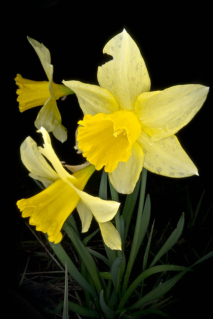 133/366 - Daffodils by fuglsnef, on Flickr  137/366 - Camera by fuglsnef, on Flickr Not totally happy with the exposure on this but I'm not sure what else I can do:  143/366 - Glass by fuglsnef, on Flickr
|
|
#
?
May 22, 2012 21:09
|
|