|
Honestly, I think it's just an issue of perspective. To me it looks like the engines are at like a 30 degree angle, and the hull is side on. And definitely ditch the rudders. Do contrails in the game instead. 
|
 #
?
May 15, 2012 04:28
#
?
May 15, 2012 04:28
|
|


|

|
| # ? May 13, 2024 08:35 |
|
|
Scut posted:Let's get some pixels rolling up in this thread! This reminds me of ship designs by Scott Robertson from a sketching video, however you want to take that. ")
|
|
#
?
May 18, 2012 02:34
|
|
|
Oh man, you know what I realize would be really good? A pixel art program where you can overlay or underlay an image with full resolution. By which I mean, instead of looking like this (sketch pulled from a random GIS search for "sketch", and pixels drawn hastily): It would look like this:  A man can dream 
|
|
#
?
May 18, 2012 04:24
|
|

|
I don't know too much about this just yet, but couldn't you just draw on a separate layer over your full resolution image, then remove the bottom layer? You might have to use larger pixels at first and then scale it down, but it sounds like it wouldn't be too hard to set up. You could do this in most any program that supports multiple layers. Then again, I'm just learning how to do these things so I could be completely wrong...
|
|
#
?
May 18, 2012 04:31
|
|
|
Nah, you can only ever work in the same resolution as the underlay; he wants separate resolutions each layer (I personally don't think it's that useful unless your resizing is removing really thin lines that you want to be able to see?)
|
|
#
?
May 18, 2012 04:43
|
|
|
Count Uvula posted:Nah, you can only ever work in the same resolution as the underlay; he wants separate resolutions each layer (I personally don't think it's that useful unless your resizing is removing really thin lines that you want to be able to see?) Well if you look in that picture I posted, it's much clearer to see what you're pixelling on the bottom one compared to the top one. Gives you more of a sense of shape really.
|
|
#
?
May 18, 2012 05:19
|
|
|
Perhaps by using a large grid and drawing in blocks as big as each grid square (preferably in something that also has Snap To Grid), you could scale the finished image down so that each grid square becomes a single pixel?
|
|
#
?
May 19, 2012 21:46
|
|
|
Internet Exploder posted:Perhaps by using a large grid and drawing in blocks as big as each grid square (preferably in something that also has Snap To Grid), you could scale the finished image down so that each grid square becomes a single pixel? this is what they do in icon design -- Apple design guides recommends making an icon at 1024px, then scaling downwards as you need it. I can't remember the names but there are a few programs that help with that.
|
|
#
?
May 20, 2012 05:31
|
|

|
I've been trying to make some "low tech" looking spaceship sprites. This is the first one I finished that I like the look of, but I'm not really sure about the turrets. Also trying to think of ways to make objects that are composed almost entirely of cylinders look detailed is hard.
|
|
#
?
May 20, 2012 17:52
|
|
|
Mimsy: I like the overall design. If you're looking for some greeble ideas, consider the engineering concerns that make the International Space Station look like it does. Cylinders are prevalent because the structure has to be assembled from pieces that fit in a space shuttle bay or a rocket. Everything that doesn't need to be pressurized is strapped to the outside of the habitation areas to maximize usable space. You can also add external scaffolding, an easy way to add rigidity to structures without much mass. In general I think designs that are asymmetrical will look "lower tech".
|
|
#
?
May 20, 2012 18:18
|
|

|
Internet Janitor posted:Mimsy: I like the overall design. If you're looking for some greeble ideas, consider the engineering concerns that make the International Space Station look like it does. Cylinders are prevalent because the structure has to be assembled from pieces that fit in a space shuttle bay or a rocket. Everything that doesn't need to be pressurized is strapped to the outside of the habitation areas to maximize usable space. You can also add external scaffolding, an easy way to add rigidity to structures without much mass. In general I think designs that are asymmetrical will look "lower tech". That'll all depend on the purpose of the ship, won't it? If they're going for more of a "combat space ship" then stuff will have to be hidden away and protected, whereas a civilian/exploratory ship can go with external equipment.
|
|
#
?
May 20, 2012 18:33
|
|

|
I've added some random lumps and panel lines and added an asymmetrical gun turret thinger where there was previously just an additional set of antennas, also shortened the radiators a little, did that help? I'm probably going to make a set of these and I'll make sure to incorporate external scaffolding on the ones that aren't meant to be armored. Mimsy fucked around with this message at 20:50 on May 20, 2012 |
|
#
?
May 20, 2012 20:37
|
|
|
Aww crap I accidentally quoted myself
|
|
#
?
May 20, 2012 20:49
|
|
|
Adding some asymmetry and variations in panel lines would help a lot, but I've noticed that your main light source seems to be coming from the viewer's POV. If the light was coming from a more dramatic angle (above or below, etc) you could convey a lot more of the form and it would look less static.
|
|
#
?
May 23, 2012 16:54
|
|

|
 Got that ship completed. Mostly a pile of massaging the lighting and hacking away bits that didn't work visually. Anyone in the thread going to be in on the SA Gamedev Challenge this year?
|
|
#
?
May 28, 2012 22:58
|
|
|
Scut posted:
I'm thinking of entering, but I don't know any artists; was thinking of seeing if any pixel artist folks wanted to join forces with a technician/designer team (we did Caves of Qud, no art involved ") ) )You guys rock, wish I could do pixel art. 
|
|
#
?
May 29, 2012 02:08
|
|

|
Unormal posted:I'm thinking of entering, but I don't know any artists; was thinking of seeing if any pixel artist folks wanted to join forces with a technician/designer team (we did Caves of Qud, no art involved I'd like to do art again this year, but I probably won't be able to devote as much time to it as I had in the past couple years. I wouldn't mind making some sprites\loading screens depending on what you're game idea is.
|
|
#
?
May 29, 2012 02:17
|
|

|
The aforementioned SA GameDev VII game dev challenge has officially begun. It's generally been a pretty fun thing, and there are prizes, and so on. It might also be the only excuse you'll ever get to draw pixel balls.
|
|
#
?
Jun 1, 2012 21:18
|
|
|

|
|
#
?
Jun 8, 2012 08:04
|
|

|
Looks avatar worthy. Zoom it in 2x!
|
|
#
?
Jun 8, 2012 15:57
|
|
|
Here's a first try after reading some of the tutorials in the first post. I can't really draw anything other than basic geometric shapes, but it will be fun to play around more. -= study of orb =- WorldIndustries fucked around with this message at 08:54 on Jun 13, 2012 |
|
#
?
Jun 13, 2012 08:42
|
|
|
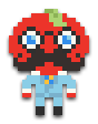
I'm relatively new to Pixel-art, and art in general, but here's a few examples of my attempts of art: A sprite of a friends character. I wasn't sure how to create a good human-base, hopefully as I improve I can create my own, so i used Ash Crimson's sprite as a base, got his outline and then proceeded to change it..  A bigger, more detailed sprite of the above character  My attempt at spriting a shuckle, based upon an official picture of it.  Well uh, a room. Ash Crimson fucked around with this message at 22:53 on Jun 13, 2012 |
|
#
?
Jun 13, 2012 18:39
|
|

|
punchdaily posted:I am finally, after almost two decades of trying, getting a somewhat firm hold on pixel graphics. but I made some GameBoy RPG mock-ups a month or so ago as a lark. I like working within the Gameboy palate because it stops me from going apeshit on the sprites. I was inspired by the sprites of the Japanese version of Ghostbusters 2 for the NES, which has some super-adorable sprite work, and is made by the team that made Kirby's Adventure! It's really worth a try if you can get a hold of it. Warning: For some reason Winston is blue. These are absolutely wonderful. I'd love to see the Ghostbusters 2 sprites you used as inspiration, is there any good site for viewing these as opposed to just trying to glean from screenshots? http://spriters-resource.com doesn't seem to have anything and that's the only big site I know for resources like that.
|
|
#
?
Jun 13, 2012 23:43
|
|


|
http://www.spriters-resource.com/nes/newghostbusters2/sheet/27451 You mean this one? I am pretty sure he means this game. But yeah it's a good inspiration because the small touches on the sprites shape gives it character and they are simple good designs.
|
|
#
?
Jun 14, 2012 00:34
|
|

|
Chipp Zanuff posted:I'm relatively new to Pixel-art, and art in general, but here's a few examples of my attempts of art: Be wary of pillow shading! It looks like you put down your darkest shadow color first and then pillow shaded from there. You should define your light source first and then shade accordingly.  (I also don't know how to render out folds in pants, so maybe this won't be the best example) Be mindful about your anatomy too, because anatomical errors will be more obvious on larger, detailed sprites. You gave him two right hands, for starters.
|
|
#
?
Jun 15, 2012 04:06
|
|

|
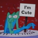
Scut posted:Looks avatar worthy. Zoom it in 2x! fine  Chipp Zanuff posted:snip In addition to Rapt0rCharles's post, be mindful of the saturation in your colours. The blue carpet especially is eye-burning. In the sprite you're using a heap of colours, and "straight" colour ramps (i.e. shifting in value rather than saturation and hue). Read this for a better description (hue shifting at the bottom). Some mostly-mirrored portraits using Dawnbringer's 16 colour palette: 
|
|
#
?
Jun 16, 2012 09:22
|
|
|
Whooops, forgot about this thread, let me go back...SSH IT ZOMBIE posted:How did you do the leaves, anyway? There's so many, was there any copy\paste work, or all pushing pixel by pixel? a boxing teahorse posted:Again, though, messing around with subtle hue-shifting on the darkest and lightest bits of the leaves is a really neat way to show that they're catching sunlight and to show depth/create contrast. That only goes so far, though, since it's a very stylized tree where the leaves register as more of a single, shaped mass than thousands of individuals. SSH IT ZOMBIE posted:I'll try to fix it, good catch. Should I change the body's color at all? Since everything is a shade of purple it looks kind of odd. Here's what I've been working on lately:   I think it's done, but I'd like to get some feedback before dropping it. Keep in mind that it will hold on certain frames in game for ascending and descending.
|
|
#
?
Jun 16, 2012 10:14
|
|

 Here's a GIF of my take at some minor changes. Up to you to decide whether it fits the style/looks better or not.
|
.TakaM posted:
Thats looking pretty nice. The main thing I see with it is the back, tail and the back legs on the landing, they seem to be a bit ridgid, maybe bring the back legs towards the head with a slightly curved back a for the land?
|
|
#
?
Jun 16, 2012 12:15
|
|


|
Rapt0rCharles9231 posted:Advice Exclamation Marx posted:Advice Thanks for the advice guys! I've decided to go back to doing small-scale stuff before I embark on bigger, ambitious sprites. As such, here's an attempt I made at some random dude:  I'm not happy about the darker skin colours, they look too similar, but I couldn't seem to find a decent balance between the two. Ash Crimson fucked around with this message at 13:16 on Jun 16, 2012 |
|
#
?
Jun 16, 2012 13:13
|
|
|
Exclamation Marx posted:Some mostly-mirrored portraits using Dawnbringer's 16 colour palette: Dawnbringer's palette is great, as are those portraits. I'm currently using the same palette in this piece (WIP): 
|
|
#
?
Jun 16, 2012 14:38
|
|
|
Finally got around to trying out the new, actively maintained version of Pixen. Holy poo poo, I can resize the canvas without crashing and I can merge layers without desaturating my colors!
|
|
#
?
Jun 16, 2012 19:23
|
|
|
There's some really great stuff in here! Here's just a couple of my own things. This first one is from a platform game that I started and never finished, something I am guilty of doing way too often.  And this second one is from a dungeon crawl game I am working on right now that is almost finished, I'll be posting the game on here when it's done. It's 3D but the enemies are 2D sprites and the 3D textures are all low res pixel art style. 
MWMetric fucked around with this message at 04:28 on Jun 17, 2012 |
|
#
?
Jun 17, 2012 04:24
|
|
|
A LOVELY LAD posted:Thats looking pretty nice. The main thing I see with it is the back, tail and the back legs on the landing, they seem to be a bit ridgid, maybe bring the back legs towards the head with a slightly curved back a for the land?   I moved the hind legs and arched the back a little, maybe not enough?
|
|
#
?
Jun 17, 2012 05:03
|
|
|
Lain posted:And this second one is from a dungeon crawl game I am working on right now that is almost finished, I'll be posting the game on here when it's done. It's 3D but the enemies are 2D sprites and the 3D textures are all low res pixel art style.
|
|
#
?
Jun 17, 2012 07:38
|
|
|
Lain posted:And this second one is from a dungeon crawl game I am working on right now that is almost finished, I'll be posting the game on here when it's done. It's 3D but the enemies are 2D sprites and the 3D textures are all low res pixel art style. This looks really good, I like the environment a lot. My only critique is that the contrast in style between the environment and character is kind of jarring. There's a lot of color variance in the walls and floors, but the character is pure solid colors with no shading. Both look fine on their own, but it looks a bit strange when they're combined.
|
|
#
?
Jun 17, 2012 07:57
|
|
|
Gordon Cole posted:This looks really good, I like the environment a lot. My only critique is that the contrast in style between the environment and character is kind of jarring. There's a lot of color variance in the walls and floors, but the character is pure solid colors with no shading. Both look fine on their own, but it looks a bit strange when they're combined. Yeah I know what you mean, that's actually because I started this game as a 48 hour challenge to myself to get a game done, and everything was stylized like the character there and the walls and everything were just flat and the same style. I decided I would turn it into a full game and I kept the original enemies and character sprites because I really liked how they turned out, so there is a bit of a disconnect. Everything is already taking me way longer than I planned to so I can't really justify updating all the original sprites, there are a lot of them!
|
|
#
?
Jun 17, 2012 08:16
|
|
|
Exclamation Marx posted:fine Oh you're Pixeller Jeremy!
|
|
#
?
Jun 17, 2012 18:26
|
|

|
I love pixel art. Pretty out of practice at the moment This is my work area--I copy paste in case I screw up something or don't like how it's turning out. It's also fun to see how I progress and all the little tweaks I make, like deciding I needed a better palette than the one provided by Paint. And because I'm a good girl, here's a closeup.  Any tips on how to shade the shirt? I'm totally stuck and it just doesn't look right.
|
|
#
?
Jun 18, 2012 18:01
|
|
|
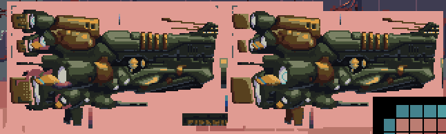
CantDecideOnAName posted:
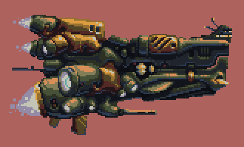
The bright blue of the shirt is a higher value than the brightest parts of the jacket, I would bring it down so that it doesn't feel like it's jutting out so much. To contribute, some enemy ships for that shmup I'm working on: 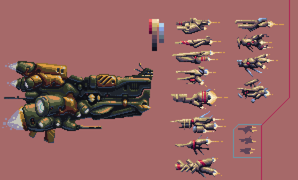
|
|
#
?
Jun 19, 2012 04:14
|
|
|

|
| # ? May 13, 2024 08:35 |
|
|
Lovely work in the thread. Sort of inspires me to do some pixel stuff too. 
|
|
#
?
Jun 19, 2012 20:38
|
|