


|
xenilk posted:
here's a cross-post from the SAD dump, I was tired and not certain how confident I was about it when I posted it last night, but rest and fresh eyes make me see it in a new light. 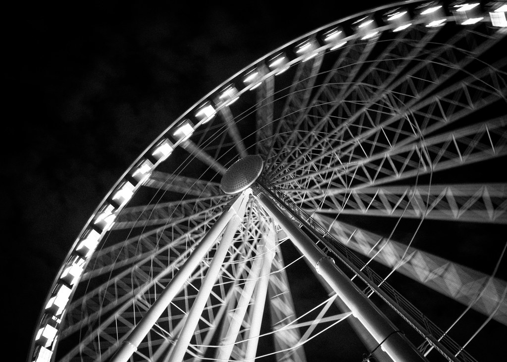 wheel1 by Trip Sixes, on Flickr
|
 #
?
Jul 22, 2012 17:08
#
?
Jul 22, 2012 17:08
|
|

|

|
| # ? May 12, 2024 04:00 |
|
|
KingColliwog posted:
I really like the middle shot. The person being in the shot really gives us a sense of scale and adds a bit of drama. I like the post-processing on the last two. The color palette gives it a very tranquil feel. I don't think the shot with the person needs to be pulled back all that much farther but the last one could use some more space to add drama. Otherwise there is not a lot going on. Overall I really like the second shot while the first and third are fairly typical hiking shots. They are not bad or anything just a little dull. They could use a little something extra to give them some drama. -- I seem to say this every few months but I am trying to really get back into photography. I've been busy as hell shooting things for work but nothing really for myself. That changed last week. I took an ungodly amount of photographs on my sail boat trip to the Bahamas. Here are a few I liked quite a bit: 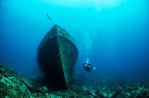 Wreck of the Austin Smith by christopherpaulscott, on Flickr 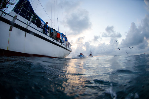 Giant Stride at twilight by christopherpaulscott, on Flickr  "Look what I found" by christopherpaulscott, on Flickr
|
|
#
?
Jul 23, 2012 05:58
|
|


|
I'm not super comfortable critting others yet, so I'm going to post a photo that I'm not satisfied with and crit that: This started out as a panorama along the river, but I ended up feeling like the pano was showing too much, so I just picked this photo out of the set and worked on it. I took this photo of a hydroelectric dam early in the morning, and I'm really satisfied with how the colours turned out, but the composition... I dunno. It seems to be missing an important element, it doesn't really draw me into the photo. The problem is, I don't know how it could have been improved. I'm also worried that I went a little overboard with the Clarity slider in Lightroom.
|
|
#
?
Jul 23, 2012 16:10
|
|
|
I think the problem with it is there's not a clear central focus. The dam is obviously the subject of the photo.. but it's not being presented in any interesting way. It's just some lines that converge towards a vanishing point on the right. As a documentary photo I think it's pretty good. It shows the architecture well and those types of photos certainly have reason to be made. As a creative photo, like you say, it's missing something. Try to imagine shooting the same spot with a different angle or items in the scene that would made it interesting. Like if there was someone in a kayak in the water. Or you got super close to one of the arches and made an abstract. Or there were storm clouds in the sky. Not that any of these things would be possible at the time you were shooting, but that's what I try to think of when deciding whether to shoot a landscape.. most scenes can produce an interesting photo, you just have to be there at the right time and maybe that particular morning wasn't it. The processing looks fine to me.. the dam seems a little too orange but that's mostly an issue of personal preferences.
|
|
#
?
Jul 23, 2012 16:25
|
|

|
ZoCrowes posted:
That first one is perfect. Iconic, mysterious, everything I love about underwater photos. I feel like the second one succumbs to distracting distortion along the left edge. I totally see the elements you were going for (the birds, the timing, the clouds), but it just doesn't come together for me. Making the clouds/diver pop a little and de-emphasizing the boat might help. Basically the same thing xzzy said. Technically there isn't anything wrong with it, the subject just isn't strong enough to stand on its own. You could try darkening the clouds a little, to add some drama, or even shift the color slightly to contrast the dam more. 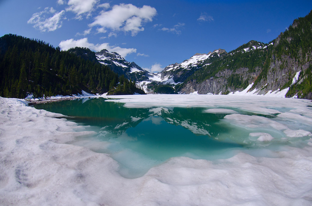
|
|
#
?
Jul 23, 2012 16:39
|
|

|
Z posted:That first one is perfect. Iconic, mysterious, everything I love about underwater photos. Godamn that is a stunning picture. I think I would ask what your intent is tho. If you want to focus on that beautiful reflection, I think the photo needs a tighter crop. I think I'm also bothered that the snow in the foreground is pretty gross compared to the pristine nature in the background.
|
|
#
?
Jul 23, 2012 16:54
|
|
|
xzzy posted:I think the problem with it is there's not a clear central focus. The dam is obviously the subject of the photo.. but it's not being presented in any interesting way. It's just some lines that converge towards a vanishing point on the right. Thanks, your critique really helped me to figure out what was wrong with it! I think I'm going to go back there a couple more times and see if I can make a more interesting photo. Maybe at sunset. There are a lot of expensive houses just a few hundred metres downriver, and many of them have docks and speedboats - I might be able to catch one on a warm evening, when the water level is higher.
|
|
#
?
Jul 23, 2012 17:28
|
|
|
If you want to push the architectural angle, shooting the brick building from the other side of the river might work too. Assuming you have access to that area, anyway.
|
|
#
?
Jul 23, 2012 17:38
|
|
|
Awkward Davies posted:Godamn that is a stunning picture. I think I would ask what your intent is tho. If you want to focus on that beautiful reflection, I think the photo needs a tighter crop. I think I'm also bothered that the snow in the foreground is pretty gross compared to the pristine nature in the background. Thanks! My focus was both the reflection and the color of the lake, which is why I left some room on the bottom. Tough choice, because I wanted the shoreline to frame the picture, but that resulted in a larger chunk of snow in the bottom left than I would have liked. I agree about quality of the snow though. I cleaned up some debris in it, but I'm thinking I might need to desaturate it as well. The problem I kept running into was how to make snow whiter without losing all sense of texture and contrast.
|
|
#
?
Jul 23, 2012 17:44
|
|
|
Unfortunately spring snow always looks lovely. It's just the nature of the beast.
|
|
#
?
Jul 23, 2012 18:04
|
|
|
krackmonkey posted:I like the concept behind this a lot, cooler still that you were able to find a place and all the necessary ingredients to execute it. That being said, as others have mentioned the framing is very claustrophobic and adds to the "unreal-ness" of the image. I also think the sky is a little pink-ish, possibly as a result of your semi-vintage processing. Thanks for the comments everyone, I hear you guys about the claustrophobic feeling and agree with it. I've been struggling with that lately, I need to step out a little bit when taking shots, it's a bad habit I have :/
|
|
#
?
Jul 23, 2012 18:26
|
|

|
In case anyone didn't visit the last page, just a quick reminder that critique is mandatory when posting images (see the OP for exact details) ")
|
|
#
?
Jul 23, 2012 18:29
|
|


|
Curious, is this the full image you captured or have you cropped ina bit? It's absolutely beautiful, though I agree with the chap above about there being a little to much foreground, I feel it lacks a little in the sky department for such a wide shot. If you have one that's got a little more in it you could totally get away with a square crop here, and that would nip the sides where the distortion is becoming really apparent. As is it feels a little like it's forcing my head down and(to me at least)oddly claustrophobic. These 2 are from my recent snake shoot, I think I like these 2 a little better. There's about 30 that would have been drat perfect if the slippery wee bugger hadn't dropped his head at just the wrong second or moved in a way that reduced the poor girl to fits of giggles, but what's a boy to do? I'm still stabbing myself over how indistinct his head is in the first on here but it's the one the client liked best. 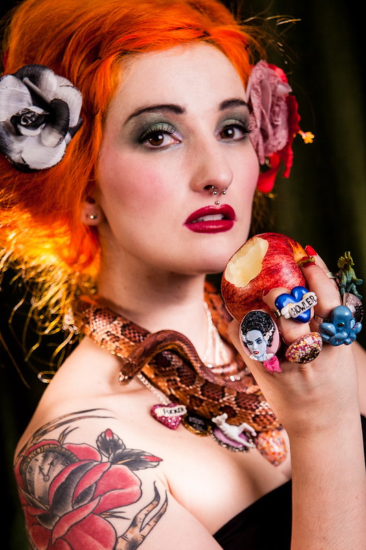 Kirsten & Jake 3 by Shannow, on Flickr  Kirsten & Jake 4 by Shannow, on Flickr
|
|
#
?
Jul 24, 2012 02:52
|
|
|
scotty posted:
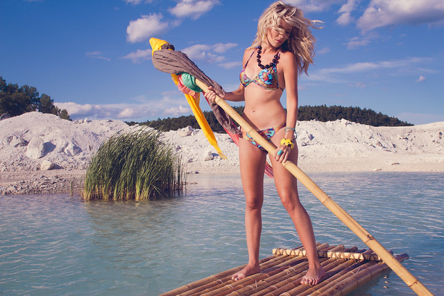
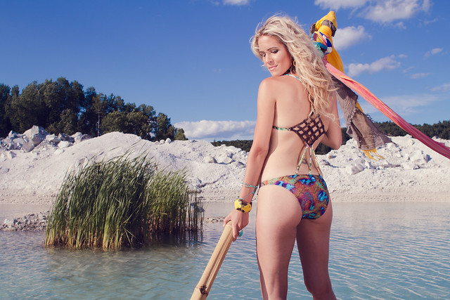
The style - split toned, low contrast shots of pretty girls in various degrees of undress - reminds me a lot of shots I'd see in Vice magazine, or other similar hipster-ish mags I see lying around trendy cafes. In particular, I really like the first shot. The window light is flattering and the the blown out window doesn't at all detract from it. The background is just the right amount of messy and compliments the model's sexy-yet-casually-sloppy appearance (I have no problem believing that's her apartment. I like the last picture the least. I can't quite put my finger on it - I think it has something to do with the background competing for attention. All the sloping lines make me a little uneasy. Maybe if your camera was at 90� to the wall, I'd feel better about it, though if the framing was too perfect it might detract from the 'casual snapshot' vibe you have going on (which I like). I also wish I could see some more detail in her top; I don't like how it's not true black, and at the same time has almost no detail either. Great job, overall though. 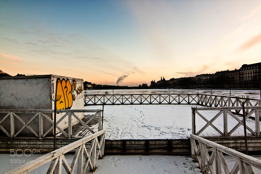 Snow by Victor's adorable world of pixels  Transcriptomics by Victor's adorable world of pixels  Like a hawk by Victor's adorable world of pixels
|
|
#
?
Jul 24, 2012 13:15
|
|


|
Cockwhore posted:The style - split toned, low contrast shots of pretty girls in various degrees of undress - reminds me a lot of shots I'd see in Vice magazine, or other similar hipster-ish mags I see lying around trendy cafes. I disagree. I think the 3rd is the strongest. To me, it is the most authentic moment. The first two feel more obviously posed/cliched, whereas the third feels like a real moment. She's looking directly at the camera, and there's something about her expression that really grabs me. I do think you could attempt a tighter crop to get rid of that smidgen of distracting building on the left tho.
|
|
#
?
Jul 24, 2012 16:48
|
|
|
Shannow posted:Curious, is this the full image you captured or have you cropped ina bit? It's absolutely beautiful, though I agree with the chap above about there being a little to much foreground, I feel it lacks a little in the sky department for such a wide shot. If you have one that's got a little more in it you could totally get away with a square crop here, and that would nip the sides where the distortion is becoming really apparent. As is it feels a little like it's forcing my head down and(to me at least)oddly claustrophobic. My contribution - a commercial art project: 
|
|
#
?
Jul 25, 2012 21:22
|
|
|
sw1gger posted:My contribution - a commercial art project: First of all a technical nitpick, there's some weird white spots all over your image. I assume that this was shot on film. I would spot those out, these spots add nothing and are distracting. Then I gotta disclaim that I'm not a model/studio photographer so please take that into consideration with my critique, okay here goes: I like the overall mood of the shot, it has a mystery-theme going on, which is interesting. I would have maybe tried to put an additional light the models eyes or general face region, which isn't green. Then the mountain dew bottle seems to be a bit blown out with some details already washing out. I'm ambiguous about the weird circular blur, it helps to channel my attention but it also seems to be weirdly distracting and clashing with the feel of the rest of the photograph. Then, the green lighting on the girls arms gives her an unhealthy skin-cast. It's kind of of-putting. I understand going with green and I like the general idea the shot is trying to portray. Maybe change it in post? I don't know why it seems worse on the arms than the face but for me it is. Last but not least, consider playing with the composition a bit so that everything is not smack-dab in the center. If you find something to lead the viewer into the image, you might even be able to do away with that radial blur thingy.
|
|
#
?
Jul 26, 2012 04:54
|
|


|
Disclaimer: I'm not happy with these & feeling kind of "blah" about them. I can't explicitly figure out what's wrong with them besides "boring subject matter", which is, as an explanation - kind of lacking. Posted in order of preference, from "best" to worst.   
|
|
#
?
Jul 26, 2012 05:01
|
|
|
Shannow posted:Curious, is this the full image you captured or have you cropped ina bit? It's absolutely beautiful, though I agree with the chap above about there being a little to much foreground, I feel it lacks a little in the sky department for such a wide shot. If you have one that's got a little more in it you could totally get away with a square crop here, and that would nip the sides where the distortion is becoming really apparent. As is it feels a little like it's forcing my head down and(to me at least)oddly claustrophobic. Uncropped 10mm fisheye. On account of the lens, I had the keep the horizon above the midline or it would be distorted, and I feel like putting excessive sky in a landscape photo is sort of cliche. I suppose my goal was to show the foreground kind of spreading out towards the camera, with the mountains and sky just there to frame the lake. But eh, if it didn't work it didn't work. I took quite a few -- I may go back and look for one with better proportions.
|
|
#
?
Jul 26, 2012 05:30
|
|
|
VomitOnLino posted:Disclaimer: I'm not happy with these & feeling kind of "blah" about them. I can't explicitly figure out what's wrong with them besides "boring subject matter", which is, as an explanation - kind of lacking. You are right, they do contain a boring subject. What drew you to take the photos of these objects in the first place? Reflecting on what specifically interested you about the object could maybe help you to realize what you need to focus on when shooting challenging subjects- make the viewer see what you see. Also, when you are shooting boring things head on, they will always look less lovely if you remove lens distortion. It's the most noticeable in your second shot. sw1gger posted:My contribution - a commercial art project: I saw this in the portraits thread and it really caught my eye. Like the other person who critiqued it, I don't really like what you did with the blur. I say blur all of the ivy or none of it. Also- I agree that the composition could use a bit of work. I think it's fine that she is in the center, but I think it'd be much more striking if you kept the square crop but zoomed it out a bit so I could see more of her legs. I think all of the green lighting is well done and I wouldn't recommend changing any of it. Also keep the floating dust, if that's what it is... I think it adds to the overall "mystery" of the picture. Shannow posted:
My two main grievances with this photo are the focus and the art direction. I'm not sure why you shot F5, as if you had stopped down a bit you probably could have had both the apple and her face in focus. Another option in the future is to step back a little and crop it afterwards. Anyway, I think if you could only choose one thing to focus on here, it should have been her face, and not the apple. Which of the two do you think people want to be able to see better? Regarding art direction, I think it's pretty bad / juvenile. It's as if you thought "hey this girl has really bright hair and a tattoo, let's see how much poo poo we can cram into this photo!" The rings? Lose them. Flowers in the hair? Lose them. Necklace? Lose it. Why do you need both a snake AND a silly looking necklace? But really the rings are the worst. They really take away from the fact that there is even a hand there. Awkward Davies posted:
Really brief critique here, but avoid shots of musicians eating the mic. I think this shot has way more potential if you don't include all the junk in the foreground. Maybe that was your intention, I don't know, but it looks like you have a perfectly fine frozen lake thing lined with buildings just past it, as well as a pretty sky. That sounds like a decent start for a photo. *************** Here are three shots up for portfolio consideration:  Camping at Worthington by Myotomy, on Flickr  The Long Stare by Myotomy, on Flickr  Snow Dog by Myotomy, on Flickr
|
|
#
?
Jul 26, 2012 22:02
|
|


|
ohrwurm posted:
This photo evokes feelings of calm, quiet, and solitude in me. My eye is drawn through the scene by the planter edging, stopping at the round form of the trash can, which in turn brings me up the trunk of the tree behind it. I find the transition between light/dark/light on the wall to be pleasant and it contributes strongly to the mood of the scene. The bright part of the path echoes the bright part of the wall and leads my eye there next. In turn, the two benches versus the one bench and the distance between them creates a subtle tension between the near and distant parts of the scene that keeps me in the picture. Crosspost from the Photo Contest thread:  TheJeffers fucked around with this message at 03:57 on Jul 27, 2012 |
|
#
?
Jul 27, 2012 03:53
|
|


|
VomitOnLino posted:Disclaimer: I'm not happy with these & feeling kind of "blah" about them. I can't explicitly figure out what's wrong with them besides "boring subject matter", which is, as an explanation - kind of lacking. I like the middle one by far the best, I find the top one kind of boring, and something is off on the composition of the last one - it feels like that black roof thing is in the wrong place of the photo. Now, some crossposts from the macro thread  Fly head by alctel, on Flickr I'm interested in any comments on stuff I could have done in post better here  ladybug by alctel, on Flickr And for this one, composition - in addition, are the highlights distracting?  Cricket by alctel, on Flickr Not much to say about this one
|
|
#
?
Jul 27, 2012 16:58
|
|

|
Not really qualified to say much about macro shots, but that ladybug (or ladybug lookalike, I'm not good at spotting the impostors) is loving badass. Only thing I'd like to see different is the large specular highlight.. it'd be nice if it wasn't completely blown out.
|
|
#
?
Jul 27, 2012 17:05
|
|
|
Augmented Dickey posted:more pedantic urban wonderings From the Low-effort thread. I think the first one is the strongest here. The contrast between the orange and the rest of the image is great, and I like the overall color tone and processing. It's an intriguing scene, and I like the balance in the composition (two brick walls, two trees, a fence connecting them). I really like it. The second two are less interesting. The picture of the books feels cliched, the horizon seems off, and I'm not really sure why I'm looking at a picture of these books, and why I should care. The green of the grass is nice, and the light is nice, but that's about it. Third one is a picture of a house. That's about all I get from it.
|
|
#
?
Jul 27, 2012 19:09
|
|


|
Awkward Davies posted:From the Low-effort thread. Thanks for the input- after looking at these again I mostly agree with you. The first one is definitely my favorite; I feel like the books could have worked but as you mentioned the shot has some serious composition issues that really prevent the viewer from engaging with the subject. In the third shot I guess I was trying to emphasize the path leading to the porch but I just couldn't quite make it work. Again, thank you for taking the time to critique my shots!
|
|
#
?
Jul 28, 2012 02:57
|
|


|
VomitOnLino posted:Disclaimer: I'm not happy with these & feeling kind of "blah" about them. I can't explicitly figure out what's wrong with them besides "boring subject matter", which is, as an explanation - kind of lacking. I actually quite like these. I think what they show is that you're paying attention to details that a lot of people miss. They're interesting, but I agree they could be more interesting. I think you should continue to look out for things that catch your eye and don't necessarily look conventional. And I think the more you do that the more you'll improve. Good job! ... Here's some new B&W work:   
|
|
#
?
Jul 28, 2012 22:59
|
|
|
RangerScum posted:Here are three shots up for portfolio consideration: Wow, Wow, and Wow. I can't conceivably critique these, so my criticism is that they make me realise how far I am away from taking photos like that. :P Although I would prefer The Long Stare in a wider aspect ratio. --- This is a photo of a silk loom in Vietnam. Seeing the actual process of silk making was amazing. The machines use the equivalent of punch cards to control the patterns on the finished product. Extremely cool. 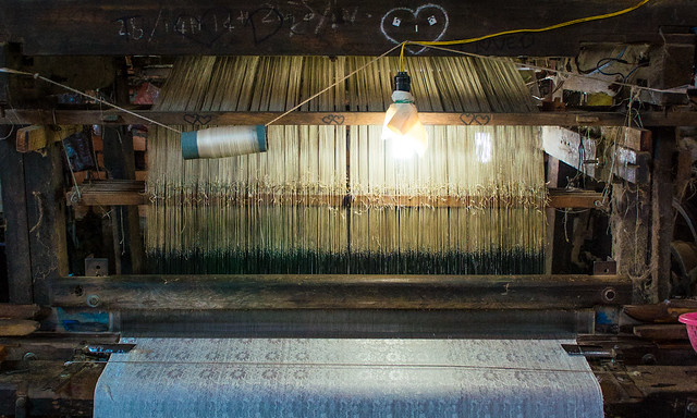 Silk loom. Da Lat, Vietnam by alangrainger, on Flickr Metalslug fucked around with this message at 08:03 on Jul 29, 2012 |
|
#
?
Jul 29, 2012 07:48
|
|

|
TheJeffers posted:Crosspost from the Photo Contest thread: I spent a chunk of my afternoon in a hothouse, enthralled by the fragility and texture. 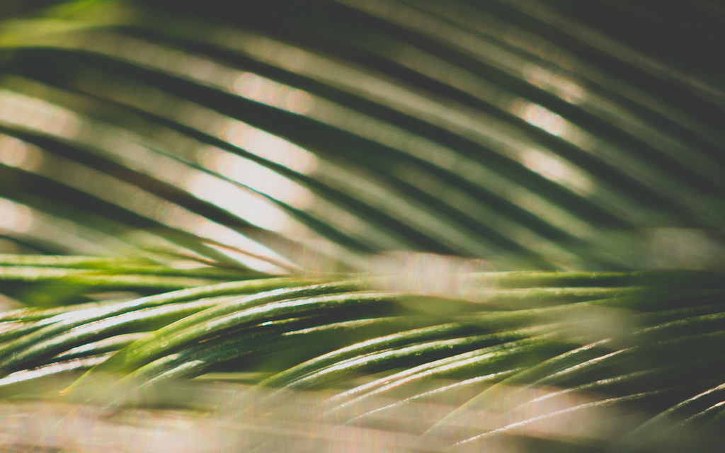 P7280057.jpg by Trip Sixes, on Flickr 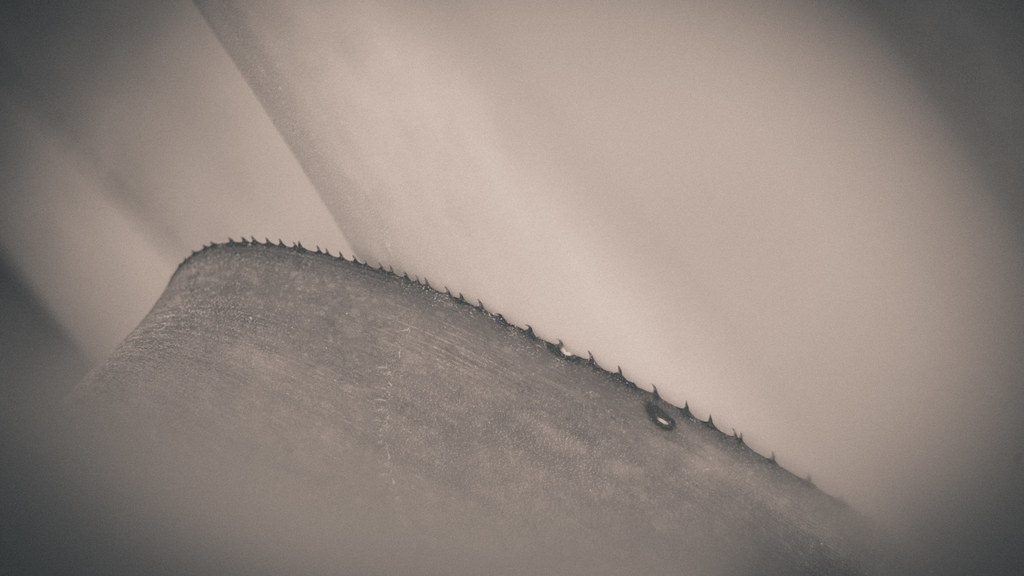 P7280051.jpg by Trip Sixes, on Flickr and a cross-post from the low effort thread:  P7280050.jpg by Trip Sixes, on Flickr (mad props to Alkanphel for the inspiration)
|
|
#
?
Jul 29, 2012 08:03
|
|
|
krackmonkey posted:I spent a chunk of my afternoon in a hothouse, enthralled by the fragility and texture. You're welcome! Glad to hear I helped to inspire some of your shots  I really like the soft gentle feel to the tones and textures of both your shots as well, especially the 2nd one with that arc of thorns acting as a focal point. I really like the soft gentle feel to the tones and textures of both your shots as well, especially the 2nd one with that arc of thorns acting as a focal point.
|
|
#
?
Jul 29, 2012 09:37
|
|

|
RangerScum posted:You are right, they do contain a boring subject. What drew you to take the photos of these objects in the first place? Reflecting on what specifically interested you about the object could maybe help you to realize what you need to focus on when shooting challenging subjects- make the viewer see what you see. Also, when you are shooting boring things head on, they will always look less lovely if you remove lens distortion. It's the most noticeable in your second shot. These are all good pictures, just thought I'd point out that they're all composed almost exactly the same: human/s on the right/bottom right and nature on the left.
|
|
#
?
Jul 29, 2012 15:45
|
|
|
Awkward Davies posted:These are all good pictures, just thought I'd point out that they're all composed almost exactly the same: human/s on the right/bottom right and nature on the left. Thanks for this. I am pretty clearly getting too comfortable with that composition, and like it as I may, I need to make sure not to make it something I always fall back on. Much appreciated!
|
|
#
?
Jul 29, 2012 18:55
|
|
|
torgeaux posted:Sir: When you call these "low effort" we goons are concerned you're off your meds. Jesus, man. You're attention to detail is phenomenal. Thanks for posting again. I got really confused when I saw traffic from this thread instead of the one I posted in. I usually don't have much to say / can't write a sentence without over-thinking it and revising twenty times. So I post there since SAP is no longer available. Laser Cow posted:Is that a Pro-ject Debut III turntable? Your shot is a hell of a lot better than those on their website. loving nice, I love a good product shot. Yeah. I just had a German magazine buy rights to use that shot instead of theirs.
|
|
#
?
Jul 29, 2012 20:55
|
|

|
I guess you were intentionally going for that much shadow on the face, but it makes it quite hard to really take in the emotion there, since you have to look hard to work it out. Also they seem more gray & white, not black & white, but that could be my netbook. ---- This one is called The Last Supper. Composition aside, what could I do to make this photo great? It was a completely candid shot and I love everything that's happening in the scene. There's even Jesus passing Judas the "wine glass". How can I make this photo great?  The Last Supper by alangrainger, on Flickr
|
|
#
?
Jul 30, 2012 09:17
|
|
|
Tone down the contrast/saturation a little, get rid of the vignette.
|
|
#
?
Jul 30, 2012 11:59
|
|
|
Metalslug posted:I guess you were intentionally going for that much shadow on the face, but it makes it quite hard to really take in the emotion there, since you have to look hard to work it out. Change the crop, sacrifice some of the action on the sides to get a closer view of whats happening with the middle.
|
|
#
?
Jul 30, 2012 15:05
|
|
|
I tried the crop, but then that focuses the action on the woman with the fan. Also then I don't have 12 disciples plus Jesus. How's the colours/saturation now?  The Last Supper by alangrainger, on Flickr Metalslug fucked around with this message at 07:18 on Aug 11, 2012 |
|
#
?
Jul 30, 2012 17:21
|
|
|
Metalslug posted:I tried the crop, but then that focuses the action on the woman with the fan. Also then I don't have 12 disciples plus Jesus. I think you could add a little more saturation to the greens just to pop it a little, but otherwise it's solid. Part of me wants to crop the left edge closer but then you lose that really interesting structure. Christopher Irvine posted:You know I tried rotating them by a few degrees and everything else just looked off. I also am unsure about having the third one in B&W because there were some neat rust stains but it was in a shadow and I wanted it to feel more stark. I'll give it another go in GIMP and post it when done. Finally got around to doing this.  Several Options (Color) by lexingtondisoro, on Photobucket And a few more because why not  Suspend the Subscription Already by lexingtondisoro, on Photobucket  Untitled 7/28/2012 by lexingtondisoro, on Photobucket v The fourth photo was another poster's and the links aren't broken for me  (USER WAS PUT ON PROBATION FOR THIS POST) SHVPS4DETH fucked around with this message at 20:40 on Aug 1, 2012 |
|
#
?
Jul 31, 2012 00:14
|
|


|
 Mt. Rainier (USER WAS PUT ON PROBATION FOR THIS POST)
|
|
#
?
Jul 31, 2012 09:16
|
|

|
TheAngryDrunk posted:
Not sure how much you can actually do with the source photo, but some increase in clarity would be nice. If possible, you could increase the red so as to make the stars and stripes on the wingtip pop out a bit more. ---- How is the composition of this photo?  State Highway None by alangrainger, on Flickr
|
|
#
?
Aug 1, 2012 11:29
|
|
|

|
| # ? May 12, 2024 04:00 |
|
|
Metalslug posted:
That is a great photo, I love the colors and the general feel of it. From a composition stand point, I can't help but feel the right side should be cropped closer to the road. I feel like the formation that the road leads to should get a little more attention than the grass in the foreground. ------ This is one of my first attempts in experimenting with photography (first full manual camera). My primary concern was picking up the texture of the rock.  Hawaii by kamakaze9, on Flickr This photo is more recent and after I decided to pick up the hobby. It's more about me trying to incorporate a lot of the things I have read. Any advice on either is appreciated.  California Winery by kamakaze9, on Flickr Also, out of curiosity, are most people posting images pre or post processing? Both of mine are post.
|
|
#
?
Aug 1, 2012 15:47
|
|