


|
Augmented Dickey posted:
Your first picture has nice composition, but I think it could definitely use more light on the shoes. Fill light in post-processing or using a fill flash could help you solve it. I really enjoy your second shot; the tones are add a really pleasant ambiance. I wish the highlights weren't blown, but otherwise I think your exposure/composition are spot on. Haven't shot medium format in a while:  ellie by renburress, on Flickr  Untitled by renburress, on Flickr and a 35mm shot:  Untitled by renburress, on Flickr
|
 #
?
Sep 19, 2012 02:04
#
?
Sep 19, 2012 02:04
|
|


|

|
| # ? May 21, 2024 18:21 |
|
|
Dr. Cool posted:Haven't shot medium format in a while: This is probably my favorite. If that guard rail wasn't there this would be an even more amazing shot. It's got that "the last thing you see" attitude. 2 of mine from a recent trip, then from one not so recent but revisited in Photoshop  Quaint Cambodian by Ebola Cereal, on Flickr  Absurdly High by Ebola Cereal, on Flickr  Chicago Streets by Ebola Cereal, on Flickr
|
|
#
?
Sep 19, 2012 03:53
|
|

|
I took a picture. Tell me how bad it is. (p.s. I know about the huge black spot in the top left, but I want to keep this as a normal 4x6 crop since it's going to get printed). Pergolla 1 by king colliwog, on Flickr I decided to play with it and do some low contrast B&W 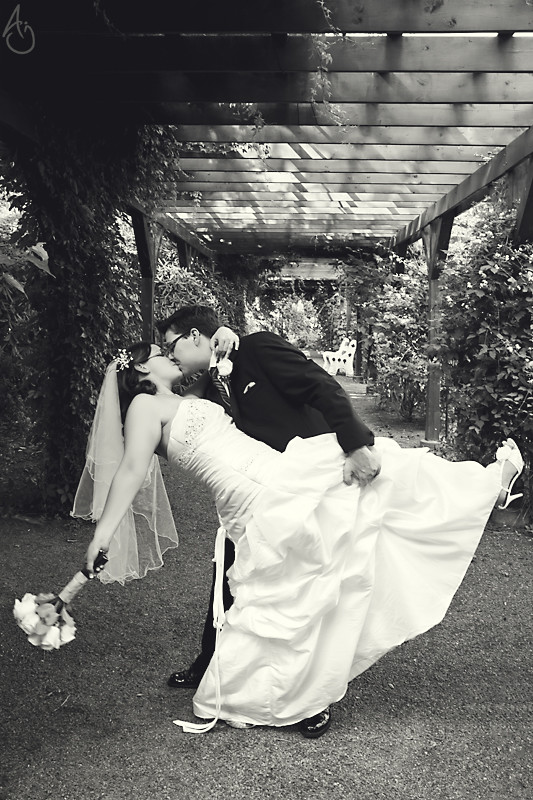 Pergolla 1 effet 1 by king colliwog, on Flickr Tyorik posted:
The first one is nice, I like the composition even if the guy on the buy is "going out of the frame". Some people think this is bad but honestly I very rarely care. I'd remove the shadow on the right and on the bottom that are bothering me. A little more light in the guys face would be good, but he was wearing a hat so unless you had a flash you couldn't do much about this. What sort of lens did you use for the other 2? Did you stich many photographs together? I really like how they convey the hugeness of those construction and how you managed to avoid distortion. I really enjoy looking at your 3rd picture It doesn't really have something that grabs my attention in particular, but the whole thing is interesting to me.
|
|
#
?
Sep 19, 2012 20:46
|
|

|
I think your white balance is off.. everything feels blue.
|
|
#
?
Sep 19, 2012 21:00
|
|

|
xzzy posted:I think your white balance is off.. everything feels blue. Hummmmm, might be right I'll try to fix it. I think it's mostly because of the ground that was bluish. There you go. Better? 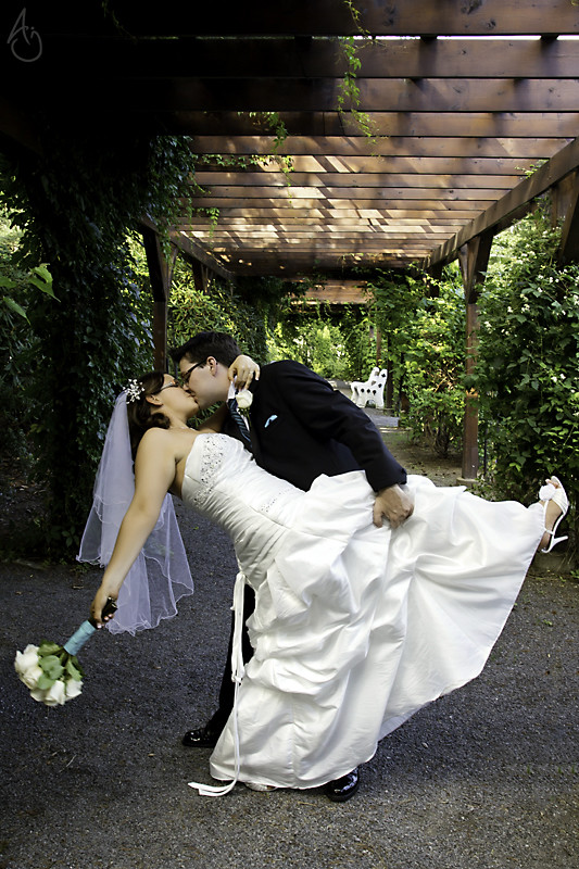 Pergolla 1 moins de bleu by king colliwog, on Flickr (do I need to post another critique?) KingColliwog fucked around with this message at 21:31 on Sep 19, 2012 |
|
#
?
Sep 19, 2012 21:07
|
|
|
Shampoo posted:
This has a very aged feel to it. It reminds me of a postcard you might get from a transatlantic ocean liner in the '50s or '60s. My attention is most immediately taken by the gold statue atop the harbor marker (lighthouse?) since it so strongly contrasts against the blue sky. The strong vertical of the marker leads my eye into the semicircular pedestal and then around the road/path that runs around its base. The road then leads my eye into the mass of ships at anchor, where there's a chaotic arrangement of masts, funnels, and antennae that still work together since they create a bunch of overlapping parallel lines. There's also a great deal of pleasing tension in the anchor lines extending into the harbor, since they lead you out into the water and then back to the shore since they're somewhat triangular in their arrangement. The hills in the background sort of echo the contours of the harbor buildings in the foreground, which is pleasant. The relation of the light to the scene is well-considered and helps contribute to the aged feel of the picture. Overall, there's a lot that rewards looking at this at a larger size and plenty to keep the eye busy and exploring. More car stuff:  Untitled by TheJeffers, on Flickr
|
|
#
?
Sep 19, 2012 21:11
|
|


|
KingColliwog posted:Hummmmm, might be right I'll try to fix it. I think it's mostly because of the ground that was bluish. The blue-ish tint (especially on the veil) is better, but it looks to me like her extended arm is a bit... green? The skin tomes seem a little odd. Might just be a product of the amount of greenery reflecting light in the vicinity, but it seemed a bit off to me, but that very easily could just be me/my monitor being odd. TheJeffers posted:
I really like this. The texture around the emblem looks sharp, and the framing so that all of the most interesting parts are reflective/illuminated makes for a really powerful effect. I've been trying my hand at landscapes while hiking over the last year, and I guess I've lurked around enough to finally get some feedback to help me continue to suck less. I'm a real sucker for huge landscapes, but it's been hard framing them well enough to really convey that "BIG" feeling without just buying a super-wide lens.  
|
|
#
?
Sep 19, 2012 22:20
|
|
|
[quote="atomicthumbs" post="407650225"]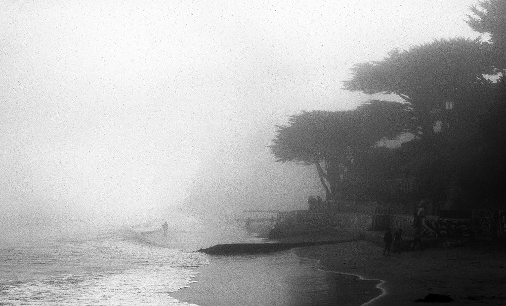 Untitled by atomicthumbs, on Flickr 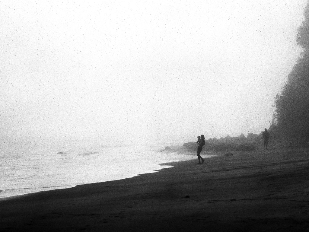 Lady with Dog by atomicthumbs, on Flickr I'm really digging these two. The grain may be a bit overdone for some, but I think it lends well to the whole misty atmosphere. Very well done. I did some Photoshopping to my car pic. Tried to bring down the bouncy houses and cropped it tighter. 
|
|
#
?
Sep 20, 2012 13:24
|
|
|
KingColliwog posted:I took a picture. Tell me how bad it is. (p.s. I know about the huge black spot in the top left, but I want to keep this as a normal 4x6 crop since it's going to get printed). Those chairs in the background 
|
|
#
?
Sep 20, 2012 15:54
|
|

|
xenilk posted:Those chairs in the background There were so many of them, and ugly trashbins too. Only could mask a certain amount. And I'm not sure I have to skills to clone that one out unfortunately.
|
|
#
?
Sep 20, 2012 16:38
|
|
|
dowdy_pants posted:I did some Photoshopping to my car pic. Tried to bring down the bouncy houses and cropped it tighter. The car really stands out in the picture and that's also what I like about it, it seems that the horizon is a little bit of but that might just be me, also the bouncy houses in the background are still a little bit too much. Maybe you could even try to go completely wild and try a sin-city effect on the car? Took these pics in New York last month 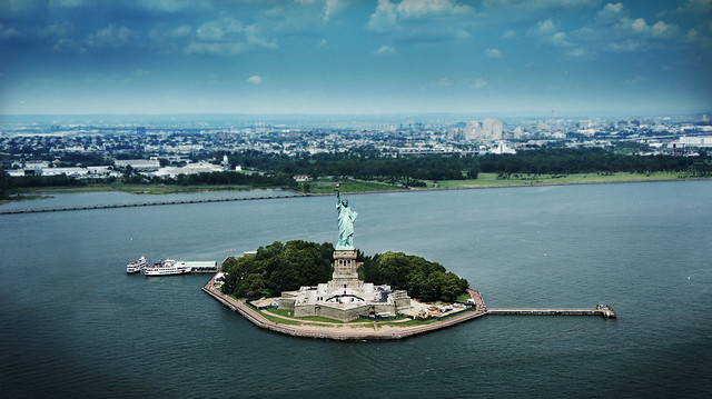 Lady Liberty by Christiaan Compaan, on Flickr  Manhattan From above by Christiaan Compaan, on Flickr 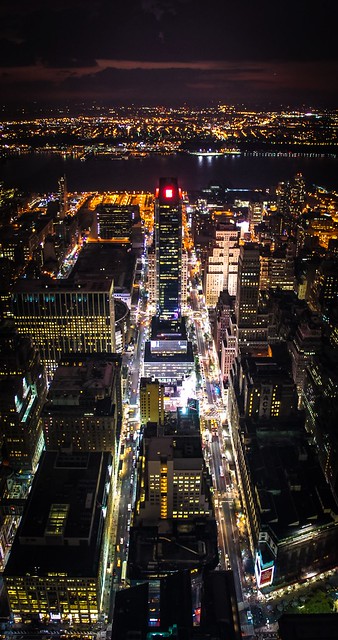 Manhattan at Night by Christiaan Compaan, on Flickr BreakingDolphins fucked around with this message at 17:33 on Sep 20, 2012 |
|
#
?
Sep 20, 2012 17:29
|
|

|
Tyorik posted:
Wonder what this would look like in B&W... bet it would kick it up a notch. Speaking of... here's a snapshot of a random hot chick at a festival. 
|
|
#
?
Sep 20, 2012 18:05
|
|
|
BreakingDolphins posted:
I feel like the framing on this one is either too low or too high, depending on how you wanted to present the image. If you were to crop it low, so that almost none of the ski was visible, it might lend a more urban feel to the image (and help with the contrast), but if you were to crop it high and get more sky in the image, it would also completely change the tone to something a little more broad and "vista"ish. From a purely technical point of view, I feel like it should be rotated a few degrees clockwise, but that might just be my eye.  DSC_0347 by jpitha, on Flickr This feels like every single "postcard of Greece you bought in the airport" but I'll admit, that's kind of what I was going for.
|
|
#
?
Sep 20, 2012 18:36
|
|


|
BreakingDolphins posted:The car really stands out in the picture and that's also what I like about it, it seems that the horizon is a little bit of but that might just be me, also the bouncy houses in the background are still a little bit too much. Maybe you could even try to go completely wild and try a sin-city effect on the car? I think this is a bad idea.
|
|
#
?
Sep 21, 2012 04:25
|
|


|
BreakingDolphins posted:The car really stands out in the picture and that's also what I like about it, it seems that the horizon is a little bit of but that might just be me, also the bouncy houses in the background are still a little bit too much. Maybe you could even try to go completely wild and try a sin-city effect on the car? Why such a heavy handed vignette on the first one? The focus and composition is nice though, but I think those two things is enough to draw attention to the statue. As for the others, was the idea just to take a "nice" picture of the city from above? It feels like not a lot of thought was put into it (For example, the second has just a smidgen of an outcropping there in the left lower corner, that could easily be cropped out) I took the time to view it full screen, but I still felt it just looked kind of generic in a bad way. You clearly have a good eye for composition (esp the first two) so maybe just think a little harder about either making it more clearly about just aesthetics, or whether you're trying to convey something more.
|
|
#
?
Sep 21, 2012 16:29
|
|


|
Went to a few places around Edinburgh today (it was a Doors Open Day where you get to visit places that don't usually allow the public in). Piano at a musical instrument museum  A different piano from a different angle  The ceiling of a records library type place. There's something about the almost a-symmetry in the last shot that I like although I don't know how to explain why.
|
|
#
?
Sep 22, 2012 22:22
|
|

|
Shampoo posted:
Overall I really like this photo, but when I really look at it, I feel like the sky and water are too similar. My eye keeps being drawn back to the ridiculously white city, instead of taking in the rest of the scene. Kin posted:
I really like this, but I wish you would have stopped down a bit more to get both the white and black keys in that section completely in focus. 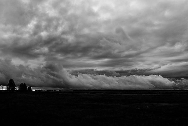 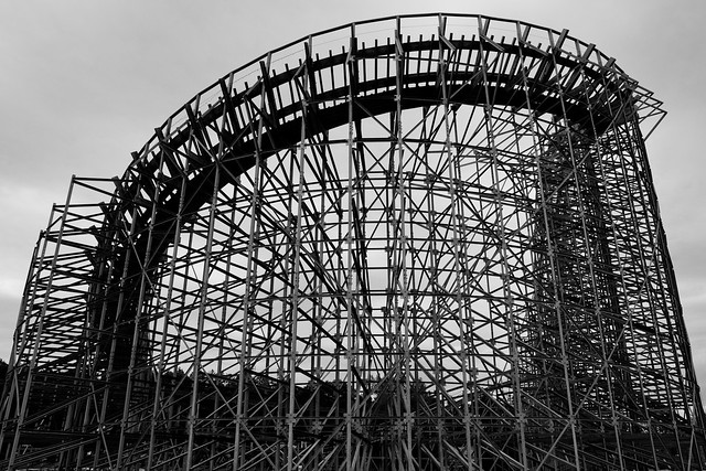  Really trying to shoot things that aren't low effort food or snapshots. Been trying to do a photo walk or drive every weekend if possible. Last weekend was a bit of a dreary, overcast weekend here, so my mood and processing were kind of the same. Hopefully I didn't go too overboard with the first or third.
|
|
#
?
Sep 23, 2012 06:29
|
|

|
nonanone posted:Why such a heavy handed vignette on the first one? The focus and composition is nice though, but I think those two things is enough to draw attention to the statue. Hey thanks for the feedback, someone else also mentioned the vignette on the first one. I took the first two picture in a rush; we where flying from Newark to our hotel in time square with a helicopter and I happen to have my camera with me the pilot was nice enough to take a detour to show us lady liberty. But ill keep your tips in mind for next time
|
|
#
?
Sep 23, 2012 12:10
|
|
|
I like the aggressive processing on this: I get easily bored by landscape photos, even the very pretty ones, because I've seen so many of those classic landscape shots (foreground interest, slow shutter speed to make the water misty, sunsetty sky) that they're just completely dull to me. This feels a bit different and the blackened ground has a nice moody feel to it. I like the processing in this, but I feel like it fills too much of the frame somehow - I'd rather see a bit more negative space and have it work with the structure. Moving back a few metres (providing there wasn't anything distracting either side of it) would have made it more interesting to me. But that might just be personal taste. It feels a bit oppressive and like I can't focus on one bit at once. Went to a Lucha wrestling show for a laugh and took a few shots. Fun night but I broke my 50 when I got too close to the action and it cracked on the floor (well, the casing did). Rickety loving thing. 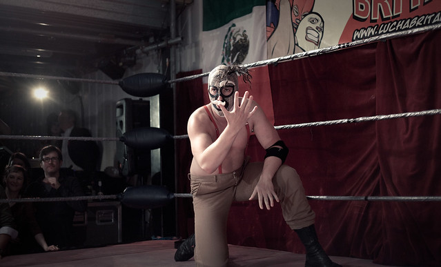 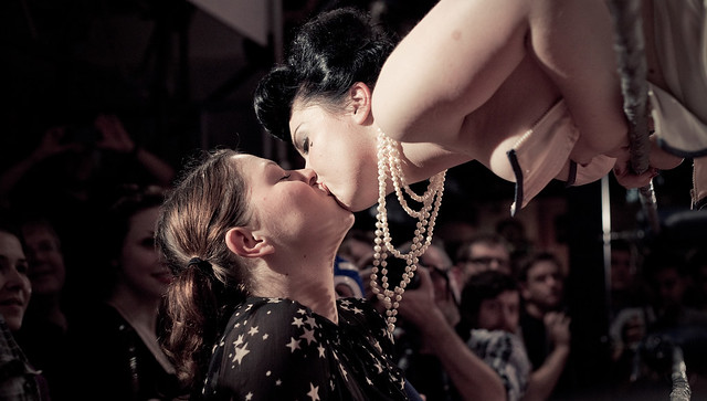
|
|
#
?
Sep 23, 2012 20:38
|
|

|
KingColliwog posted:
As someone who works at a wedding chapel in Vegas and sees at least a dozen dip shots a day, the pose itself just looks really awkward. I mean there's no "standard" way to do a dip, but it should at least look fluid and elegant in the photo (which will never be the reality unless you're working with trained dancers or something). -If she bent her leg at the knee instead of trying to hold it out straight like that she would probably look more relaxed. -The way her hand is just splayed out across his neck looks weird, and it would be better placed more on the back of his neck or further onto his shoulder if she needs to wrap her arm around his neck for support. -It looks like they're leaning their upper bodies slightly away from the camera which would press her upper arm against her body even more than just standing straight and makes it look unflattering (you should probably liquify it a bit in the photo you got anyway). She also looks like she's making an effort to hold her arm out when she should just be letting it hang loose. -Her flowers being so blurry is distracting and it looks like some sort of motion blur more than being out of the field of focus. -The framing is really claustrophobic. Dip shots create some really driving lines in a photo and when you just cut them off immediately with the edge of the photo, it makes it feel really cramped. You should probably photoshop the chairs out, also. And don't take any of this too personally. Dip shots are a lot harder to set up than they look, and a lot of couples just aren't even physically capable of doing it correctly. Just some stuff to be aware of in the future. I really like the color and lighting on this. Makes it feel very old-timey.
|
|
#
?
Sep 23, 2012 21:38
|
|


|
So, I got my very first DSLR on Friday and I have two shots I kinda like. Somebody tell me how awful I am and how I should never go outside with a camera, ever. 1)  Untitled by austinwalden, on Flickr I think I got the focus wrong here. I'm not quite 100% sure what I could do differently yet. I like the aperture setting and and blurred background, but my dog's face is so dark I'm not really sure I ever see his eyes anyway 2) 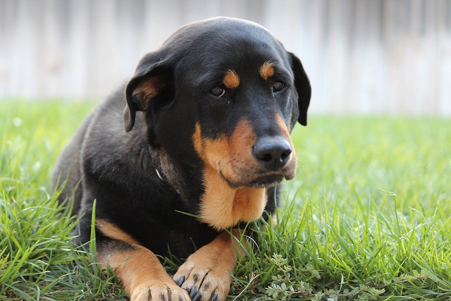 Untitled by austinwalden, on Flickr I think I did well on this one? The only thing that sucks is that I cut some of her paw off. For a first PAD post, how did I do?
|
|
#
?
Sep 24, 2012 03:45
|
|
|
I'd straighten the horizons on both of them. And then I'd give that 2nd dog a treat and a pat on the head and tell him that he's a good dogge that doesn't need to look so sad. e. also you should never go outside with a camera again, I guess. 
|
|
#
?
Sep 24, 2012 07:38
|
|
|
Mr. Despair posted:I'd straighten the horizons on both of them. First one is fine either way. Yeah on the second. And they're competent enough as far as dogs sitting in grass doing nothing photos go. It doesn't look like you missed focus or anything on either of them and the color and exposure is solid. Just keep shooting.
|
|
#
?
Sep 24, 2012 08:29
|
|
|
Thanks for the more in-depth critique! It was my first time doing something remotely like this so there's a lot to learn obviously. I also hadn't prepared for a dip shot (it was their idea at the time) so I had no idea how to pose it. I'll see what I can do for the arm/chair in the background. This is actually cropped (to help remove other benches/trashbins) so I'll try to give the framing more breathing room. Yeah the flower is just motion blur, the rest of the image is sharp. Thanks once again ") Loving this. What sort of processing did you do? Not sure about the framing on the first one with the cutted foot/leg but it's minor and bound to happen sometimes during live events like this. I love that we can see the light that is shining on him in the background. It's very interesting to me, especially since it's a very hard light. Gives him some sort of comic-super hero vibe that goes really well with his character. I like the second one, but I'd crop it on the left after the first spectator. So we see the first girl but not the two other ones. Main problem I have with the photo is that I don't understand what's going on at all. Who is this girl, is she kissing a spectator? Was she top less a couple of seconds before that and if so why? I like that it makes me wonder and think, but an additional shot or two that would give me some more context would be appreciated. KingColliwog fucked around with this message at 16:18 on Sep 24, 2012 |
|
#
?
Sep 24, 2012 16:11
|
|

|
Captain Apollo posted:So, I got my very first DSLR on Friday and I have two shots I kinda like. Somebody tell me how awful I am and how I should never go outside with a camera, ever. While self-critique DOES count, try to do a little more of it if that's the route you're going to take. (What I mean is that this was borderline-probateable but at least you put in some effort)
|
|
#
?
Sep 24, 2012 18:36
|
|


|
Kin posted:Went to a few places around Edinburgh today (it was a Doors Open Day where you get to visit places that don't usually allow the public in). Quoting myself because I forgot the mandatory self critique, sorry. First image: I lucked out with this really. It was a busy room and I didn't have time to line up shot properly, but I love the way that I managed to get the stark contrast with the depth of field. While Casu Marzu would prefer both black and white keys in shot I think otherwise (explained below). I used to play the piano as a kid and to me this seems like a visual representation of how I'd play, where in my head I'd focus and think about the particular keys of a particular part of the piano that i was going to play next. When I look at this photo I think, "I'm playing those next", if that makes sense. I went with a rich(?) brown temperature because that's also how I feel when I think of pianos. Old, wooden and in musty warm rooms. Second Image: I like the architecture of the piano and like how my image shows off the complexity of a device that produces such simple tones. I'm not so sure about how the image blurs towards the top and think that maybe the shot would be better if it was all in focus. Third image: The ceiling is symmetrical but my shot isn't and like I said in the original post, I don't know how to explain why I like it (i think it's something to do with how all the circles in the image look relative to eachother). I bumped up the contrast a lot to bring out the "orange/yellow"/blue between the sky and the ceiling to make things pop a bit more, but I might not have it quite right. Kin fucked around with this message at 20:30 on Sep 24, 2012 |
|
#
?
Sep 24, 2012 20:19
|
|
|
aliencowboy posted:synthesizer - kodak portra 160 This works brilliantly for me because of the use of color and careful composition. The synth player's face pops right off the background. The highlight on his glasses plus the highlight/blurred display on the screen thingy creates an implied diagonal line that leads right into the opposing diagonal of the console on the synthesizer. The player's hands, also being highlighted in red, are just as contrasty as the guy's face with regard to the background and it's really powerful. I get a feeling of intense focus and dynamism from this picture, and it stands well on its own rather than being just another concert/band shot.  Untitled by TheJeffers, on Flickr
|
|
#
?
Sep 24, 2012 21:40
|
|

|
I love how it feels that it's going to burst open, even though it's a skeletal structure. It's almost like's it's breathing. It just would have been good (as someone else said) to have allowed it a bit more room to do so. This is my first proper foray into the Dorkroom after lurking for a long while. Hopefully it's ok to get some advice on processing. 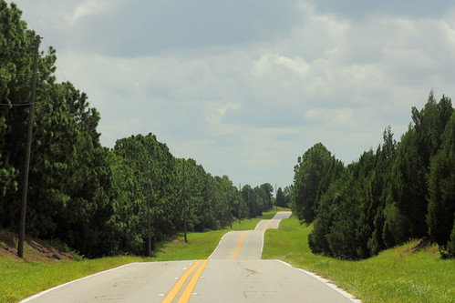 Ribbon Road by M Walts, on Flickr I saw this view on the way to a national park. On the way back, when I got a chance to shoot it, the clouds had come over more which was a bit annoying. At the time, the road really seemed to pop but it doesn't feel like I've quite got it here. I was hoping to show how the road looks like it was dropped over the landscape like thin pasta.  RocketFlag by M Walts, on Flickr This was at the Kennedy Space Center. There was purple underlighting which just ruined the pure white of the Saturn 5. I just liked the way the Stars and Stripes look they are swooping into the shot. To 'win' the space race. 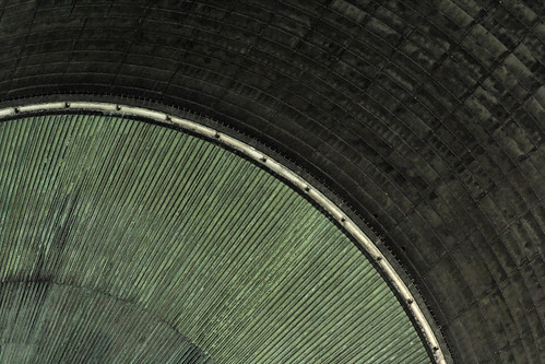 F1 by M Walts, on Flickr I think this is my favourite shot from the trip there. It's a zoom of the Exhaust port of the F1 rocket engine Had to lighten it up quite a lot in post to bring the detail of the tiling.
|
|
#
?
Sep 25, 2012 00:02
|
|
|
TheJeffers posted:
This photo does not really do much for me. There's a lack of contrast and tension. The lack of saturation and sepia-ization doesn't help, either. The subject isn't particularly interesting and the image is ultimately flat. If it was a gothic-style chimney, then perhaps you'd have something. The only thing of note, is that the chimney pipes look like misplaced water pipes. Where the saturation fails also is in what would / could be the contrast between the chimney and the tree above it and ultimately the sky. If these colors were bold and strong and offered aforementioned contrast perhaps I would feel differently about it. I do like some of your other photos on your flickr page, particularly the engine block (at least I think it is an engine block) and some of your portraits are good as well. ---- I live next to two awesome cemeteries that have some awesome sculptures guarding the dead. 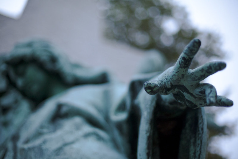 Angel in the Cemetery by geeves, on Flickr 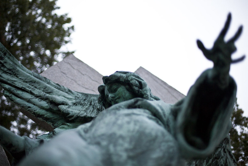 Angel in Allegheny Cemetery by geeves, on Flickr
|
|
#
?
Sep 25, 2012 00:12
|
|
|
Dalax posted:
|
|
#
?
Sep 25, 2012 01:21
|
|

|
Shampoo posted:I feel like the framing on this one is either too low or too high, depending on how you wanted to present the image. If you were to crop it low, so that almost none of the ski was visible, it might lend a more urban feel to the image (and help with the contrast), but if you were to crop it high and get more sky in the image, it would also completely change the tone to something a little more broad and "vista"ish. From a purely technical point of view, I feel like it should be rotated a few degrees clockwise, but that might just be my eye. Too much blank space in the sky I think. There's just too much blue and the white town is too far out of frame. Also, clean your sensor!
|
|
#
?
Sep 25, 2012 01:40
|
|

|
Dalax posted:I love how it feels that it's going to burst open, even though it's a skeletal structure. It's almost like's it's breathing. It just would have been good (as someone else said) to have allowed it a bit more room to do so. Yeah, I'm down that way a lot, so I'm definitely going to reshoot this when I get a chance. I was just in a hurry because the sky was about to open up and start pouring at any moment.
|
|
#
?
Sep 25, 2012 08:08
|
|
|
Dalax posted:
1) I like it, and I like where you were trying to go with it compositionally and conceptually. I think you are right about the sky not being great, though - if you could have caught a nice blue sky with hanging puffy clouds it would have helped add an almost surrealistic quality in both color and contrast and I think could have really elevated the picture. Are you close enough that you could head back on a day that has a better sky? Could it also perhaps stand to be bumped up in exposure? Maybe it is just the exposure of the sky not matching the rest of the photo. Might also want to shift towards magenta a tad. 2) Not my thing, not doing much for me. 3) I also like this one but that darker area just does not seem to be doing much. If there were some more subtle contrast in that area, or maybe even across the photo, it might pop more. Then again maybe you don't want that, but I think that drawing attention to the industrial lines that are throughout the picture could help it. It is a cool idea and not something I would have recognized to be an engine, which I like. Kin posted:
A few comments from a musician on #1 and #2 - 1 is very stereotypical. I don't mean to bust your balls but so many pianists I know have some picture of a keyboard with the shallow dof like this on their webpage or whatever - are you trying to draw attention to the white key that is in focus? I want to see more of it; this is clearly not a normal piano and looks like some kind of period instrument (is it a clavicord or something?)...I want to look at it, not the massive amount of blur going on. The second one is better, but again that blur seems to not really function well. You have these cool lines from the strings on the left and they lead into blur, the lines underneath from the hammers or whatever, the lines from the keys...it just seems like it would be cool to exploit these lines in an interesting way somehow. I guess the angle you are going for is "old things" and the processing and shooting style is trying to reflect that? I might just be tired and tweaked from no sleep due to my darling baby, and the fact that I am a musician, but I just want to see the instrument and not so much blur and ambiguity. Also, in the second shot it would be nice if you could minimize the glare off the keys. Take that all for what it's worth - you clearly had your reasons for shooting how you did, just wanted to offer another opinion to think about geeves posted:
I like #2 more, because you can still get a sense of the hand shape while out of focus, and that + the face seems more interesting than the reverse in shot 1. While generally not into blown out skies, I also like the contrast a lot more in #2, and am digging the composition as well. ----------------  Sophie by sunset by Paul Hofreiter, on Flickr My daughter is adorable and I was very happy to get this. From a photographer's viewpoint, though, I can't help notice that I didn't get the horizon right (or it might be the curvature of the lake shore) and I was left with the decision of leaving it as-is or trying to straighten it and lose a bit off the top of the photo, which I feel might alter the ratios in the background too much? I went through nearly an entire roll of film that evening trying different shots, and I find that weighing the beauty of the subject vs. a pretty background was difficult for me.  next stop, autumn by Paul Hofreiter, on Flickr Sat on this one for a couple of weeks, just wasn't sure if I was into it. Came back to it tonight and started to feel it after reverting it and starting over. It was a slow shutter speed...could have been sharper. Not sure if it is too steroetypical either, I was driving and coming to an overpass near my house and the sunset was beautiful so I decided to try to get something.  crossing by Paul Hofreiter, on Flickr Quick and dirty shot through the windshield (and quick and dirty edit as well). Just trying to put some feelers out as to if it is interesting at all.
|
|
#
?
Sep 25, 2012 08:15
|
|

|
geeves posted:
I'll have to go against rio's opinion on that one. I enjoy the first one very much. I think the composition could be slightly better (maybe the angle the picture was taken feels a bit off and you could have done it so the statue filled more of the frame). I like the vibe and beautiful DOF. The second doesn't work for me mostly because the hand looks like it's missing a finger which makes it look weird/amputated.
|
|
#
?
Sep 25, 2012 14:49
|
|
|
I'm not liking the huge out of focus blob at the bottom of the picture, either. It completely dominates the image.
|
|
#
?
Sep 25, 2012 14:51
|
|
|
rio posted:
Do YOU think it's interesting? The composition is fine, but in my opinion the photo just isn't interesting at all. There are lots of lines, then there is a lovely minivan in the middle of it.  Photo I took a while ago, but went back and reprocessed it. Photo I took a while ago, but went back and reprocessed it.
|
|
#
?
Sep 26, 2012 15:21
|
|

|
Pukestain Pal posted:Do YOU think it's interesting? The composition is fine, but in my opinion the photo just isn't interesting at all. There are lots of lines, then there is a lovely minivan in the middle of it.
|
|
#
?
Sep 26, 2012 17:26
|
|
|
rio posted:
It's nice, the light is great, but something feels a little off. Almost as if the background is in some sort of "uncanny valley" of sharpness. Or maybe the water is too distracting. Overall it just feels a bit too contrasty. rio posted:
I wish the "shadow line" was closer, because the large area of shaded green foliage is much less interesting than the colored sun-lit trees near the vanishing point. I like the train, especially the colors. It looks like a traffic cone when viewed in thumbnail size. rio posted:
I love windshield shots. They're difficult because you are so limited in perspective, framing, and time. Your composition is ok, but the minivan is killing your picture. It's a major element of the photo yet adds nothing. It also blocks my view of all the interesting lines behind it. The most interesting part is how the light hits the bridge. The green light is a nice touch, but still, the overall message is weak. I am curious what your other shot looks like, but it's unfortunate that the light changed. Both your second and third pictures have something really interesting near the vanishing point (the play of light/shadow). Is that what intrigues you in these photos? If so, get closer! Either physically or focally. ---  20120920-IMG_1444.jpg by SacktapDeluxe, on Flickr Crosspost from "Show Yourself". Still on the fence about this one.  20120921-IMG_8981.jpg by SacktapDeluxe, on Flickr
|
|
#
?
Sep 26, 2012 20:49
|
|
|
Why isn't this a square crop? If you want to maintain the 3:2 then you should probably back off on the crop until it's split in thirds. As it is it feels off. You could also play with the contrast a bit since it's a little flat.
|
|
#
?
Sep 27, 2012 01:39
|
|
|

|
| # ? May 21, 2024 18:21 |
|
|
Sovi3t posted:
The fact that you're posting the first one up for criticism makes me wonder what the hell you are doing. It's a snapshot. A silly photo for fun or for yourself and has no meaning. Am I supposed to critique your composition here? Or would you prefer I say your white balance could be adjusted or something? It's a stupid photo. Keep your stupid photos to yourself. The second one is a much better attempt! This is the kind of photo I am always happy to see here. It looks like you put some thought and effort into this, which I appreciate. Unfortunately, I don't think it's interesting enough. Sure -- you have linear lines and reflections and everything, but how interesting is it really? To me, not very interesting. But this isn't a bad start... I would keep looking for things like this. I think it shows effort and skill and artistic vision. And if you push these boundaries you will get better results. (USER WAS PUT ON PROBATION FOR THIS POST)
|
|
#
?
Sep 27, 2012 02:48
|
|