

|
Loaf32 posted:That will work with any complementary color pair. If you check out a color wheel Or use this http://colorschemedesigner.com/
|
 #
?
Oct 19, 2012 16:55
#
?
Oct 19, 2012 16:55
|
|


|

|
| # ? Jun 7, 2024 23:37 |
|
|
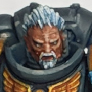
Finally got a new charger for my Camera, so no more heavily photoshopped cam phone pics. Here's some picture spam with proper photo's of some of my stuff from the last fortnight. Chaplain  Half of the Tactical Squad  Close up of Sergeant (camera really shows the sloppy paint on the robes)  Helbrute
|
|
#
?
Oct 19, 2012 17:18
|
|
|
VoodooXT posted:It's not listed on their website anymore. Call them. They have them, they were in the store last time I was there.
|
|
#
?
Oct 19, 2012 18:56
|
|

|
richyp posted:Finally got a new charger for my Camera, so no more heavily photoshopped cam phone pics. Here's some picture spam with proper photo's of some of my stuff from the last fortnight. This is a good post. Requesting more posts like this from you lot. I'd contribute, but I'm still in the early stages of learning to paint. richyp, you mentioned that you should have primed the chaplain black when you posted the first pic. I have two questions: how did you actually paint the chaplain's armor (your light primer, wash, highlight technique?), and how would you do black power armor working from a black basecoat? I'm painting up the DV dark angels as Consecrators, so black power armor is the order of the day!
|
|
#
?
Oct 19, 2012 19:10
|
|

|
Legendary Ptarmigan posted:richyp, you mentioned that you should have primed the chaplain black when you posted the first pic. I have two questions: how did you actually paint the chaplain's armor (your light primer, wash, highlight technique?), and how would you do black power armor working from a black basecoat? Yeah I used my signature prime white, wash and block paint in the gaps approach, mainly because the wash makes it pretty easy to see the different details when painting under a daylight lamp. The problem I had with the chaplains black armour was two things really. 1) Painting black over white can be as painful as painting white over black, i.e. you need to do it thin but you end up with lots of brush strokes and therefore it requires lots of layers. It's the reason that most of my DA (except the characters) are primed black, but the majority of the chaplain is actually bone coloured (the robes) so I figured it'd save me time to prime white. It's also why the robes are much smoother than on the Sergeant model who was primed black, working down from white was easier than working up to white. 2) The only black I have is a VMC one, and for some reason it's really glossy. I had to mix some matt varnish into the black because it permanently looked wet even whenit had dried. To answer your question about painting black armour on black primer, it's pretty straightforward as you can all but skip the longest part of painting which is the black base coat. What I'd do is one of the following: 1) Paint all the none black details first 2) Touch up the black primer with a thin layer of black where there maybe some gaps/slip ups from the non-black paint 3) Edge Highlight sparingly with various greys something like this: dddllwlldd, where d = dark grey, l = light grey, and w = white. i.e. you want a line of dark grey, followed by a slightly shorter light grey line inside it, followed by a tiny dot of white or really light grey in the centre. The other option is to paint everything in a REALLY dark grey, and hit the model with a few successive black washes. This will give you a greyer looking model but will avoid the pure Tron effect. Of course a combo of the two would work too, but either approach using dark grey as a base will result in non-black model. EDIT: Picture = 1000 words etc.. (it's great having a working camera again) Here's a shot of one of the Ravenwing bikers I've yet to paint, but made a start on the black areas.  You can see here what I was trying to describe with the 3 grey's. From a distance it looks pretty smooth, and with the close up you can see what I meant about being selective with the variations. richyp fucked around with this message at 21:16 on Oct 19, 2012 |
|
#
?
Oct 19, 2012 21:01
|
|
|
I e-mailed Brookhurst about why the Coat d'arms paints aren't on their website anymore. Their response: "Whoops, our bad." EDIT: They're back up. Oh my god... they're so... inexpensive. 
|
|
#
?
Oct 19, 2012 21:54
|
|
|
rear end Crackers! posted:Ah, thanks for this! I've been wondering what I can use to add depth without resorting to a black/brown wash. Loaf32 posted:That will work with any complementary color pair. If you check out a color wheel http://www.google.com/imgres?hl=en&...29,r:0,s:0,i:74 http://hyperphysics.phy-astr.gsu.edu/hbase/vision/rodcone.html#c3 Hey, hi. Something to consider when it comes to picking randomly from the complimentary color wheel is that some of those combinations just aren't as interesting as others for various reasons. If you look at the spectrum of light and then the way the cones in our eyes are arranged, we have the blue cones (which are a small population compared to our red and green cones) kind of covering 1/3rd of the visible spectrum all by themselves, while Red and Green (the predominant populations of cones) cover the lower frequency light. Practically speaking, we know that the sun, being yellow, is in the middle of our green and red detectors, we have a kind of bifocal vision system around determining color with respect to yellow. Then, we have this ultraviolet sensitivity that seems to be given disproportionate weight in our brain. We are literally incapable of 'seeing' as much blue as we are red and green, by population of cones in our eye. Yet our brain manages to determine the existence of this kind of light. Also, there are more red-green colorblind people than red-blue. And those redgreen colorblind aren't actually incapable of seeing red and green, they're just incapable of differentiating between them. In essence they see 'sunlight' or 'sky'. as the way the world of color works (only because those happen to be the way the world is outside of modern dyes and lamps). So red and green compliments tends to work well because they are responded to by different sets of cones--and those cones are bracketing yellow in terms of their responsiveness to the visible spectrum. However, red cones outnumber green cones, so a green wash of a red, while reasonably effective, will often not retain as much color as you might otherwise want. It's more like, you can achieve a darker shadow than you'd think, considering what you start with, but it's still not going to really work with the eye. Meanwhile if you pick a blue, our perception of blue terminates at the high frequency end of the visual spectrum in a purplish perception. So, apparently, our brain seems to think nearly ultraviolet and nearly infrared light kind of 'go together' in some sense--we distinguish less between the extreme edges of our visible perception. Furthermore, there are rods: http://hyperphysics.phy-astr.gsu.edu/hbase/vision/rodcone.html#c4 Rods are dark/light detectors, and don't distinguish color, but are far far far more sensitive. When they adapt to the full bright environment of daylight (or a harshly lit game store), they don't influence our perception of color as much. But when adapted to the dark (for instance when you have an inadequately lit painting area), they tend to reinforce green and blue perception. So the other thing is, deep purples that are bouncing high frequency light are often not what you get from a purple. Often you get a mixture of low frequency red mixed with high frequency blue. The result muddies perception somewhat. So when you see the ideal purple vs yellow--that's the ideal of a high frequency purple that your blue cones perceive against the red/green perception of yellow. In essence, the effective contrast comes from the fact that different sets of nerves are being stimulated by the colors which are otherwise close to each other. So I guess what I'm saying is, the complimentary color wheel is cool--it kind of shows you how your different nerves can react well to contrast by separating their responses. But we're still very light-dark sensitive, so, regardless, a low saturation (black/white/gray) shading technique next to a high saturation color will generally work well. After all, we're sensitive enough between red and green that the difference between orange and red and yellow tend to produce very pleasing results (possibly even to the color blind? I'm not sure how perception of orange-yellow-red works for them). Blue and yellow, blue and green, or blue and red seem to work pretty well too, in terms of being pleasant combinations. I've seen a number of great mini painters who shade blue with red, for example. There's also the classical technique of using red, orange, white and black to get all other colors. Because, to our perception, a gray next to red and orange looks blue. It's possible red-green colorblindness is reasonably common (for instance, all dogs are green colorblind, apparently) just because the majority of sensation with respect to vision has to do with the difference between the day and the night, and sensitivity to precise differences in the lower frequency of light aren't particularly advantageous. In any case, this is something also to consider when it comes to painting for an audience. Presumably, while most people aren't outright colorblind, you can count on variations of sensitivity to different colors between people as well as well as within a single person having been subjected to different lighting environments. For instance, say someone is coming in out of the early darkness of the winter to their bright gamestore and you want your minis to look great in the case. Is the answer to have subtlety of red and green or orange shades? Possibly their eyes, adapted to the lower light environment will appreciate more blue. This is all wildly speculative, but it's a little intriguing to think, for instance, that there will be some set number of people who look at your awesome Von Carstein or whatever with red robes and a green belt, and see only a monochromatic figure, or at the very least, not the grabbing contrast you anticipated. Even the background of the photographic treatment will affect how people perceive the colors of the mini. So the wheel is cool, but it doesn't necessarily render universal permission to combine colors. And there are specific combinations that recur throughout art and society which are not on the wheel--red white and blue, red yellow and green, blue and orange, green and orange, gray and red are some examples. 
|
|
#
?
Oct 19, 2012 21:58
|
|
|
VoodooXT posted:Oh my god... they're so... inexpensive. And they're really nice paints. And they don't come in stupid dropper bottles. And it's about time I ordered some more too.
|
|
#
?
Oct 19, 2012 23:28
|
|

|
TheCosmicMuffet posted:Hey, hi. Something to consider Amazing science painting talk itt. R.S. Gumby posted:And they don't come in stupid dropper bottles. Little league painting talk. dishwasherlove fucked around with this message at 23:52 on Oct 19, 2012 |
|
#
?
Oct 19, 2012 23:38
|
|


|
R.S. Gumby posted:And they're really nice paints. The only negative I can say about Brookhurst is that they don't appear to carry the entire line of Coat d'arms.
|
|
#
?
Oct 20, 2012 02:03
|
|
|
VoodooXT posted:The only negative I can say about Brookhurst is that they don't appear to carry the entire line of Coat d'arms. I'm going tomorrow morning. Woooo!
|
|
#
?
Oct 20, 2012 02:38
|
|

|
Manifest posted:I'm going tomorrow morning. Are you in Orange County?
|
|
#
?
Oct 20, 2012 03:42
|
|

|
Manifest posted:I'm going tomorrow morning. Let us know if they're holding out on us online buyers.
|
|
#
?
Oct 20, 2012 04:14
|
|
|
Liquitex Professional Spray Paint trip report: I base coated a Valkyrie with Cadmium Yellow Deep Hue 1 and this is how it turned out. Sorry for my terrible phone picture but that's about the best I can do. (Also the paint is still very wet so that's why it's glossy.)  It's very low odor so that's nice, you can barely smell it at all even after bringing it indoors. You can tell it's water based because it's started to run in the areas where I put too much on, although it's kind of making a naturally weathered look on its own since I primed grey so I think I'm ok with that. I'll definitely try to do much lighter coats over a long period of time to prevent pooling in the future. They've got a whole bunch of really nice, vibrant colors and it took me like three minutes to spray the whole Valkyrie so I'd definitely recommend these for basecoating!
|
|
#
?
Oct 20, 2012 05:16
|
|


|
I hadn't ever thought of using dots of white on grey lines for highlighting black, but that looks really good and I think I'll give it a try when I get to my Ravenwing. Separate question for this thread, how low a temperature can you safely spray can stuff at without it getting futzed up, in folks' experience? Like, the Dullcote can recommends "room temperature (70 F)" or something like that, but how low can it get before you risk ruining something? Same with primer--I guess it probably varies a little by brand, but so far I usually use Rustoleum primer, if that means anything to anyone. We're getting into the cold times here in Kansas City and I don't have a great way to spray indoors so this is becoming relevant 
|
|
#
?
Oct 20, 2012 05:33
|
|


|
magnetbox posted:Are you in Orange County? Los Angeles, I drive down every so often to get model air paint and tamiya stuff. Also they do a pretty steep discount on warmachine/warhammer.
|
|
#
?
Oct 20, 2012 05:39
|
|
|
I present: We can't stop here. This is Grot country.          While the grots are busy squabbling a third grot steals the teeth of the ork head.  
|
|
#
?
Oct 20, 2012 15:10
|
|

|
VoodooXT posted:The only negative I can say about Brookhurst is that they don't appear to carry the entire line of Coat d'arms. I was just there. They're missing more than a few paints.
|
|
#
?
Oct 20, 2012 19:58
|
|
|
Flying Guillotine posted:I was just there. They're missing more than a few paints. Yeah, on their website it says they only have a handful of paints and not even the basic colors like white and black.
|
|
#
?
Oct 20, 2012 20:03
|
|
|
Does anybody know where to get 2.5" / 60mm washers? I love using 1" fender washers as bases since they give plastic models some additional heft and I use sheet magnets to store / transport. I found one place online but it seems like something I should be able to find local, right? So far no luck.
|
|
#
?
Oct 20, 2012 20:31
|
|

|
Flying Guillotine posted:I actually don't like the dropper bottles. If you only need a tiny smidge of paint, you can't "drop" it any smaller than a BB or so. It also makes it hard to pour once the bottle falls to half full or so. If you get the paint up to the top of the bottle, you can bubble it up a little bit out of the bottle and dip your brush in it.
|
|
#
?
Oct 20, 2012 20:38
|
|

|
Buffalo squeeze posted:I present: We can't stop here. This is Grot country. Wow, this is a really excellent diorama. The ruined rhino is painted better than most stuff I've seen for display. I really like your stuff.
|
|
#
?
Oct 20, 2012 22:44
|
|
|
Just got an e-mail back from Brookhurst and it looks like they've stopped importing Coat d'arms.
|
|
#
?
Oct 21, 2012 00:07
|
|
|
Hi dudes, I'm back from my slump. Pretty awesome stuff you guys have been up to in the meantime. ") New project : 1:72/20mm Bundeswehr modern Afghanistan infantry. I'm making these as a sort of pilot commission for working with a young German company. The first batch is 5 figures, shooting small arms. Here's where I got so far with the first one. I'll update when I've made some more significant progress. If you want more regular updates just check out my [url="ludumartifex.blogspot.com"]blog./url]     
|
|
#
?
Oct 21, 2012 01:12
|
|

|
So say I wanted to try out this Series 7 thing, mostly to see if it helps me suck less at details, which model(s) exactly should I get at first? Just googling for "Winsor & Newton Series 7" brings up a still-bewildering array of sizes and other options, apparently. Please explain as though you were talking to a moderately complete idiot.
|
|
#
?
Oct 21, 2012 07:01
|
|
|
You want a Winsor & Newton series 7 size 0, 1, and maybe 2 if you like big brushes and cannot lie. Miniature vs. standard is bristle length, and a purely personal choice. They sell smaller ones, but I don't really use them. The great thing about S7s is that they have and hold a great point, which is why they're great for details. The smallest I'd ever consider getting is a 3/0, which is pretty much only a brush for painting eyeballs or the threads in tapestries.
|
|
#
?
Oct 21, 2012 07:18
|
|

|
I'd like to throw a recomendation up for Vallejo's Model AIR line of paints. I've only had the copper, aluminum, and scarlet red from this line, but they are smooth, thin, and cover beautifully. See the WIP shot below. Also, VGC Dead Flesh is somehow the perfect color or a Fokker E.III Eindecker.
|
|
#
?
Oct 21, 2012 07:22
|
|


|
I've got a bunch of the model air line, they're boss.
|
|
#
?
Oct 21, 2012 08:00
|
|
|
I've still got a bit of work to do on the base but here's the first model I've painted in 6 months.
|
|
#
?
Oct 21, 2012 15:12
|
|

|
That model and all the skin tones are amazing. I'm loving that grot terrain piece, too! Here's a bunch of my old models, dating back to the early 90's I guess. When I got into 40K I finally got a proper case (KR Multicases rock) so I 'rediscovered' some of my models I've had for ages. I primered over a bunch of my earliest models, intending to paint them, so sadly I don't have any pictures of them that are worthwhile. Some sort of berzerker and a gnoll, I think - these are minis that were given to me, I'm pretty sure they're from the late 70's or early 80's, I painted them in the late 80's or early 90's  The lighting isn't good, but I have a few WHFB models that I picked up just to use as bad guys in D&D games (a unit of Skaven and a unit of Black Orks). This horned dude is one of my favorite models, even if he's not painted very well. I also have a model of the same figure mounted on a horse, which is covered in primer.  I lucked out finding some Aliens models, so I have a couple of Alien soldier figures that are painted (badly) in dark green with almost no highlighting, so they're on the list to repaint. This guy in the middle is one of my favorite finished models, and the guy on the left, although not a spectacular model, is one of a series of adventuring figure models that I enjoyed doing. These were done in the late 90's or early 2000's  This is probably my favorite model I've painted. At the time I again picked it because it just looked cool and matched a D&D character I had at the time. I'm pretty sure a WHFB High Elf Prince. This was done in the circo 2002-4 
|
|
#
?
Oct 21, 2012 15:33
|
|

|
krushgroove posted:I lucked out finding some Aliens models, so I have a couple of Alien soldier figures that are painted (badly) in dark green with almost no highlighting, so they're on the list to repaint. These are worth crazy money on ebay.
|
|
#
?
Oct 21, 2012 17:54
|
|
|
VoodooXT posted:Yeah, on their website it says they only have a handful of paints and not even the basic colors like white and black. Do you really need Cote d'Arms to get white and black? They're available in any range.
|
|
#
?
Oct 21, 2012 18:05
|
|
|
VoodooXT posted:Just got an e-mail back from Brookhurst and it looks like they've stopped importing Coat d'arms. Nooooo! http://www.youtube.com/watch?v=a1Y73sPHKxw
|
|
#
?
Oct 21, 2012 18:09
|
|
|
Flying Guillotine posted:These are worth crazy money on ebay. Hmmm... Might be worth checking the selling prices then. I did get them about the time I was buying tons of stuff just because it was cool.
|
|
#
?
Oct 21, 2012 18:29
|
|
|
Flying Guillotine posted:Do you really need Cote d'Arms to get white and black? They're available in any range. It'd be nice to get 18mL of white or black for $1.50 each. VoodooXT fucked around with this message at 19:05 on Oct 21, 2012 |
|
#
?
Oct 21, 2012 19:01
|
|
|
Who are you and what have you done with my dinner?
|
|
#
?
Oct 21, 2012 19:16
|
|
|
See, now why do I never think of looking for stuff like this when I'm coming up with colour concepts. I'm the worst art student ever. 
|
|
#
?
Oct 21, 2012 19:28
|
|


|
Does anyone have any good example of battle damage done on coloured basecoats? I'm trying to paint the damage on some blue and some red things but can't workout what to do with the internal bit of the chips. Painting it with metallics clashes horribly with the rest of the model.
|
|
#
?
Oct 21, 2012 20:48
|
|

|
Lethemonster posted:Does anyone have any good example of battle damage done on coloured basecoats? I'm trying to paint the damage on some blue and some red things but can't workout what to do with the internal bit of the chips. Painting it with metallics clashes horribly with the rest of the model. I'd probably try adding scorch marks and stuff to transition between the bare metal and clean areas, otherwise it's going to end up looking like they got in a fender bender on the parade ground. I'd also add either mud splatter or weathering depending on if you want them to look well maintained or not, battle is inherently dirty and if you have damage on an otherwise immaculate tank it's going to look a little strange. This is all speculative since I don't know what your paint jobs look like!
|
|
#
?
Oct 21, 2012 21:02
|
|
|

|
| # ? Jun 7, 2024 23:37 |
|
|
Lethemonster posted:Does anyone have any good example of battle damage done on coloured basecoats? I'm trying to paint the damage on some blue and some red things but can't workout what to do with the internal bit of the chips. Painting it with metallics clashes horribly with the rest of the model. Use a darker variant of the base colour or grey and then highlight the lower edges with a lighter version of the base, opposites sides to an edge highlight. e.g. emboss the damage.
|
|
#
?
Oct 21, 2012 21:12
|
|