


|
David Pratt posted:
I have no idea what I'm looking at, but I kind of like it. I looked at your earlier tests in your flickr and while it's much more obvious how the effect was achieved they still make for a really cool experiment. I had actually been planning to do a similar thing, except with the camera moving perpendicular to the direction it's facing so that a somewhat normal photo would be achieved, but from an impossible perspective. Unfortunately my computer is way to old to be processing videos so I've been putting it off forever. ---------------------------- I kind of lost touch with digital and ended up shooting just film for probably 6 months or so. A week ago I started up again. It's nice to be back, but my ancient computer is reminding me why I left  . .Probably final version.  Alternate version Giant animated version Abstract version. 
|
 #
?
Oct 24, 2012 07:34
#
?
Oct 24, 2012 07:34
|
|

|

|
| # ? May 21, 2024 18:21 |
|
|
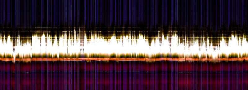
rio posted:These all are great. What is going on with the second picture out of curiosity? It's a candle flickering. You take a single column from each frame of the video and stack them left to right, so as you look across the frame you're looking across time instead of space.
|
|
#
?
Oct 24, 2012 15:32
|
|
|
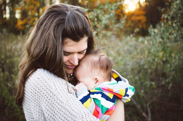
rio posted:I did a practice shoot with some friends of my wife and their new baby a couple days ago. I posted them all in the portrait thread with some questions and specifics but I wanted to post my 3 favorites here for any feedback you all might have judging them both as individual photos and if you were to view them as a product intended for a family who had hired a family photographer. Very cute! I think this one stands out way more than the two others but I'm pretty sure that the family will like all the pictures. Family pictures are such easy sell it's awesome.
|
|
#
?
Oct 24, 2012 16:30
|
|

|
rio posted:
Let me say first that in my age range, everybody is having kids, so I get subjected to a crapload of family pics on Facebook. These three pics blow them all out of the park. Most pics I see are lazily posed in front of a lovely background or are inside their uninteresting house - and I don't expect every photog to be at your level - but it's so nice to see someone who can bring out the warmth and love in a family versus just plopping them down on a couch or a bale of hay with no forethought. There's a big difference between a picture that says "here's the kid we made" and one that says "this is our family." Seriously great pictures.
|
|
#
?
Oct 24, 2012 17:30
|
|


|
This is gorgeous. I prefer this version to your alternate. It's too bad you can't get that warm yellow glow in the bottom left as well as that part of the image is so dark my eye heads right there when I look.rio posted:
My suggestion would be to find a way to tone down the sunlight glow at the top of the first one as it is quite distracting from the shot and my eye seems to go there first, and I'm not a fan of the third as the background is completely dominating. The second is my favourite as you have captured some great emotion, but again the blown sky in the background takes away from the shot. Keep in mind I probably don't know what I'm talking about. --------- I get pretty lost sometimes doing B&W conversions so I'm curious how well you all think this one came out. 
|
|
#
?
Oct 24, 2012 23:02
|
|

|
InternetJunky posted:I get pretty lost sometimes doing B&W conversions so I'm curious how well you all think this one came out. I really like this photo, it is really beautiful. The composition is great and the subject works really well in black and white. I think the dark parts at the bottom could use a little bit of lightening to bring out the details. The same can be said about some of the shadows in the trees on the left side; I want to see some more detail in the shadows. ----------------------- I planned on taking pictures of the Statue of Liberty and the NYC skyline at dawn but it was super foggy all morning. Here are some photos I got that day: I accidentally shot this one as a jpg and it came out with pretty bad white balance issues. Hopefully this came out okay but I'm unsure of the composition.  These two are the New Jersey September 11th Memorial  
FACKER fucked around with this message at 01:36 on Oct 25, 2012 |
|
#
?
Oct 24, 2012 23:35
|
|

|
InternetJunky posted:This is gorgeous. I prefer this version to your alternate. It's too bad you can't get that warm yellow glow in the bottom left as well as that part of the image is so dark my eye heads right there when I look. 
|
|
#
?
Oct 25, 2012 00:13
|
|
|
FACKER posted:I planned on taking pictures of the Statue of Liberty and the NYC skyline at dawn but it was super foggy all morning. Here are some photos I got that day: -The first photo is great. Nice gradient and a good use of negative space. The light on the top of the ship bugs me though, mostly because it is color in an otherwise naturally gray picture. I'm not sure if you want to clone it out (since you would also have to get rid of the reflection), but it should at least be desaturated. You should also clone out those spots floating on the water at the very bottom. -Second photo, really cool side lighting. It could use some perspective correction to straighten the verticals though. -The third is the best; the gold and gray melting into the fog is amazing. Again, though, my only complaint is that the spherical distortion of the lens is very apparent and it could use a tiny touch of vertical straightening. Luckily both of those are easy to do in LR/PS.
|
|
#
?
Oct 25, 2012 00:22
|
|
|
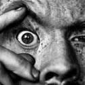
TheLastManStanding posted:I have no idea what I'm looking at, but I kind of like it. I looked at your earlier tests in your flickr and while it's much more obvious how the effect was achieved they still make for a really cool experiment. I had actually been planning to do a similar thing, except with the camera moving perpendicular to the direction it's facing so that a somewhat normal photo would be achieved, but from an impossible perspective. Unfortunately my computer is way to old to be processing videos so I've been putting it off forever. I like these, the thing that does bother me a bit is on the first one I wish the silhouette of the trees was more pronounced, that or the trees where lit up. Right now I feel like it blends in a little too much and just seems like an empty black space. ------  
|
|
#
?
Oct 25, 2012 06:54
|
|

|
rio posted:I did a practice shoot with some friends of my wife and their new baby a couple days ago. I posted them all in the portrait thread with some questions and specifics but I wanted to post my 3 favorites here for any feedback you all might have judging them both as individual photos and if you were to view them as a product intended for a family who had hired a family photographer. You need more eyes. In every one of those photos, you can't see the white of anyone's eyes (except a bit of the baby in the last one). Eyes show real emotion, you want to see them. Photo I took in Maine this summer that I'm pretty proud of. It was taken during the blue hour just after sunset.  Maine Is Beautiful by Paul Frederiksen, on Flickr
|
|
#
?
Oct 25, 2012 15:55
|
|

|
My cat is clearly annoyed with me. I'm trying to get better at taking pictures in general, starting small with my d40x and the cheap 35mm 1.8.  DSC_7187 by Mike Heath - Somacore, on Flickr (USER WAS PUT ON PROBATION FOR THIS POST)
|
|
#
?
Oct 25, 2012 20:02
|
|
|
Both are pretty nice, technically well done, but also the kind of landscape shots you've seen a million times before. On the first one, are you using a grad filter? It looks like it's cutting into the cliff on the left making it look unnaturally dark. The second could do with more foreground interest. Or less foreground and more sea - in a similar ratio to the first one. Also, there isn't much contrast in the middle, the rocks just smear into a white blob. The little rock pool on the right looks interesting, I'd have gone for that as a larger foreground element. Pukestain Pal posted:
") Love the symmetry on this one. There's something about the not-quite-half-and-half composition that's bugging me though. Perhaps having the trees fill 2/3rds of the frame might be better (you can always crop). Love the symmetry on this one. There's something about the not-quite-half-and-half composition that's bugging me though. Perhaps having the trees fill 2/3rds of the frame might be better (you can always crop).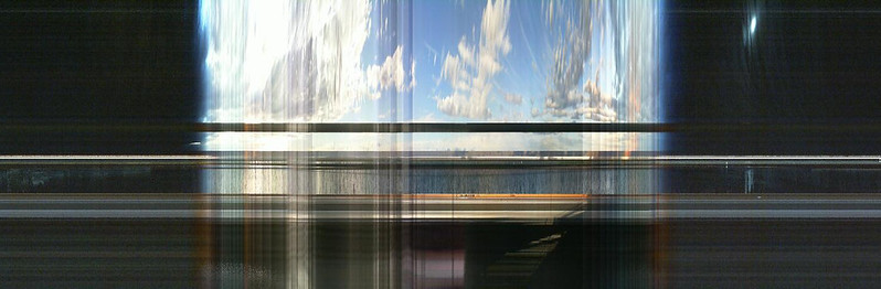 297/366 - Office Timelapse Slitscan by fuglsnef, on Flickr Tried icing sugar this time, but it still looks like snow. Going to use straight-up cigarette smoke next time, kicking myself for not thinking of that when I had it all still set up. 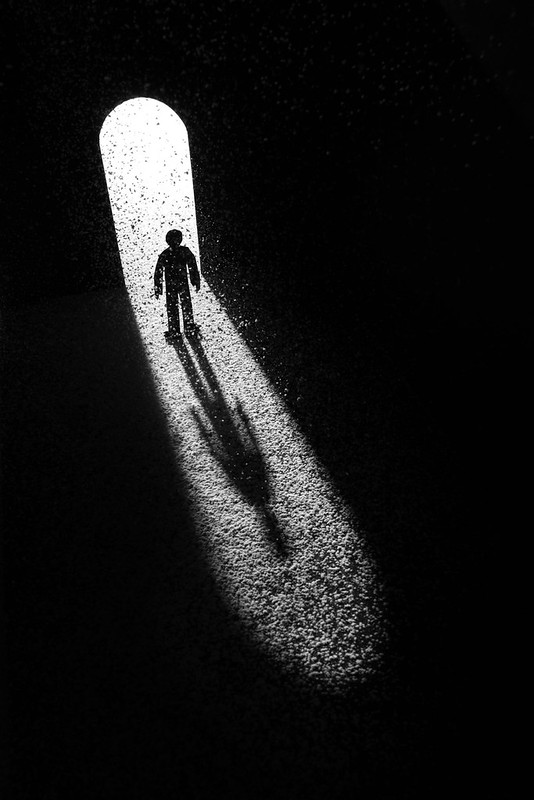 298/366 - The Doorway by fuglsnef, on Flickr
|
|
#
?
Oct 25, 2012 22:56
|
|
|
David Pratt posted:
This owns hard. If I did anything different it'd be to edit out the black area so it's completely black (specially in that top third).
|
|
#
?
Oct 26, 2012 04:20
|
|


|
David Pratt posted:Tried icing sugar this time, but it still looks like snow. Going to use straight-up cigarette smoke next time, kicking myself for not thinking of that when I had it all still set up.
|
|
#
?
Oct 26, 2012 05:37
|
|
|
Neither, trying to make it look like dust catching in sunlight. But now I know how to make snow ")
|
|
#
?
Oct 26, 2012 09:59
|
|
|
David Pratt posted:Neither, trying to make it look like dust catching in sunlight. But now I know how to make snow Incence burner, confined space and a small fan to diffuse the smoke so it can't form wisps.
|
|
#
?
Oct 26, 2012 20:02
|
|
|
Shannow posted:Incence burner, confined space and a small fan to diffuse the smoke so it can't form wisps. Genius, good excuse to get some incense too
|
|
#
?
Oct 26, 2012 22:19
|
|
|
David Pratt posted:
The top one is fantastic - the colors really blend well together. While it does get darker in the upper left corner, I feel it makes the cliff appear more sinister With the second one, I'm not really sure what I should be looking. Considering where my eyes lead (the middle-left area of the frame), I honestly don't feel it's interesting enough. Here's a recent piece for my "The Ghosts Outside 4B" series: 
|
|
#
?
Oct 27, 2012 00:47
|
|
|
David Pratt posted:Tried icing sugar this time, but it still looks like snow. Going to use straight-up cigarette smoke next time, kicking myself for not thinking of that when I had it all still set up. This is just great. I would agree, though, proper smoke in this could have been amazing. I'd also like to see one without any effects. Either way, I love the power in its simplicity: that is to say its clarity, not that it was simple or easy to produce. So a game called Hotline: Miami came out recently. I made some images for the hell of it. For context, it's basically Drive meets American Psycho (the book): The Game (sort of), where a man received coded messages on his answerphone tape to go and kill some mafia types. He can't remember why he's doing it and he's not in the best of health, mentally speaking. He dons a rubber animal mask and goes on a rampage. 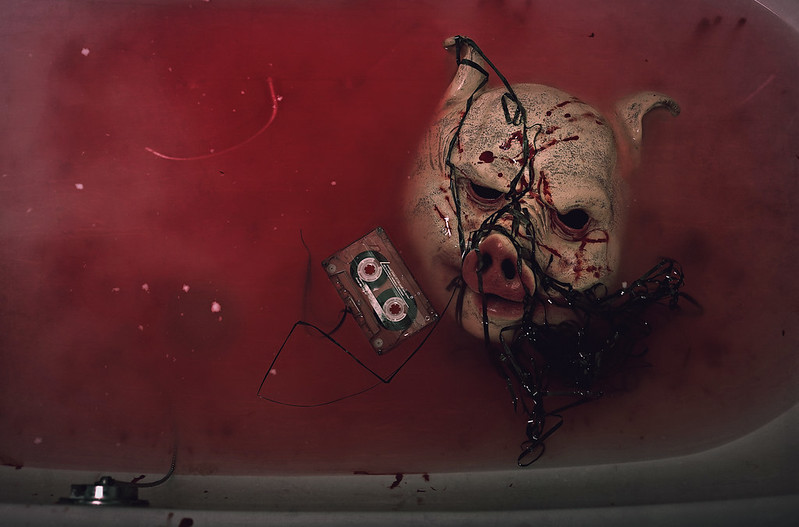  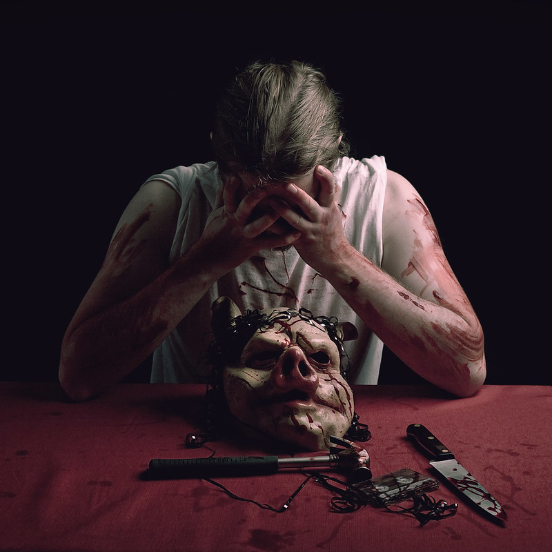
|
|
#
?
Oct 27, 2012 10:05
|
|

|
These are great. I love the lighting and I especially love the pig mask. The only thing that bothers me is the knife, how the blood is sort of spilled onto it in a neat pattern versus the messy, smeared blood on everything else. Great concept though and awesome series. --- My wife has a food, mainly dessert blog that I sometimes take pictures for. Most of the pictures are "in process" shots that end up looking like this one. I'm having trouble figuring out how to make them more "interesting" in general. I think this is a cool shot but I'm trying to make it look more professional I think. One of the main issues is with the white balance - all my shots in the kitchen end up looking very yellow and I'm having a hard time figuring out how to correct. The lights up top are fluorescent, but no matter my wb settings it seems I get yellow or really yellow tint. Nikon d40x and 18-55 kit for this one. 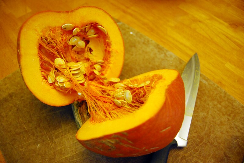 DSC_7205 by Mike Heath - Somacore, on Flickr Ninja Woodchuck fucked around with this message at 16:38 on Oct 27, 2012 |
|
#
?
Oct 27, 2012 16:27
|
|
|
Ninja Woodchuck posted:These are great. I love the lighting and I especially love the pig mask. The only thing that bothers me is the knife, how the blood is sort of spilled onto it in a neat pattern versus the messy, smeared blood on everything else. Great concept though and awesome series. Totally agree about the knife. It pretty much spoils it for me and is the one thing that I hate about the shot. I didn't do the "I like this, I hate this" thing on purpose to see if it was obvious. And it is. It's too neat, and it should really be red all over the tip to represent a stab. Ah well. As for yourself - what wb setting did you use? You probably want something like tungsten. Do you have lightroom and / or photoshop? Are you shooting in RAW? Your best bet is to shoot in RAW, then use a RAW processing program to alter the WB to exactly what you want. To take it further, you could use a selection tool to isolate the pumpkin in something like this and allow it to retain its warmth whilst cooling the rest of the image. Not too much, though, or it'll look too false. As for making it interesting, you need to think about arrangement of the objects in the scene. I'm not actually that happy with my placement of the objects in mine, as they look a little too deliberate, but I think some more careful placement in yours could make them more interesting. For example, the knife is sort of tucked under the pumpkin and doesn't look that exciting. I would pull back a bit, perhaps even stand on a chair (please be careful!) and do a top down shot, then arrange the items pleasingly, making it look clean and neat yet stylish. Think about lines through the images. You could do something like scatter a few of the pumpkin seeds to make a nice line through the less busy areas of the shot, something like that. Also I think you want it to look as bright and as clean as possible. You may need the help of an additional light. Is there any window light nearby?
|
|
#
?
Oct 27, 2012 18:53
|
|
|
Ninja Woodchuck posted:One of the main issues is with the white balance - all my shots in the kitchen end up looking very yellow and I'm having a hard time figuring out how to correct. The lights up top are fluorescent, but no matter my wb settings it seems I get yellow or really yellow tint. Nikon d40x and 18-55 kit for this one. Before you start preparing the food, find a sheet of blank, white paper and place it on the kitchen table. On the camera, push the Menu button and go to the Shooting menu, choose White Balance and select the last option, PRE. Then choose to Measure, and take a photo of the paper, filling the entire frame. Now every following picture you take should have correct white balance.
|
|
#
?
Oct 27, 2012 19:15
|
|


|
My house also does the "super yellow" thing for some reason (probably a combo of yellow lights + a light peach coloured wall), and I actually have better luck changing the primary green hue in LR under camera calibration in develop settings as opposed to the white balance.
|
|
#
?
Oct 27, 2012 21:45
|
|
|
I added some blue (complementary color of yellow), and the knife is now closer to neutral grey. The shadows turned blue, but that can be easily fixed (I just didn't bother) You didn't state if you shoot in RAW but if not - that's the first, essential, and THE most essential step in producing OK colors. Anything else you do is a waste of time if you don't shoot RAW.  It's a pretty gross picture though, that pumpkin doesn't make me want to eat it. I'm not sure how you can make this more interesting, and the only thing that came to mind was working deliberately with symmetry in this specific picture. You have two identical pieces, see if you can make something of that. Plus remove the knife if you're not going to include all of it in the picture. Also, I haven't done food photography at all, but I think that this kind of stuff works best with less shadow than you've got here - lighten it up a bit from that angle, but don't remove ALL shadow. Mathturbator fucked around with this message at 15:37 on Oct 28, 2012 |
|
#
?
Oct 28, 2012 15:33
|
|
|
Wow everyone, thanks for all the feedback on the pumpkin! 1. This one was not RAW. I don't have lightroom, only Photoshop CS5 but I can still import my RAW pics into PS just fine and I'll do that in the future. 2. All the comments about the WB stuff were really helpful. I didn't even know about the PRE setting in the camera, so I'm glad to be learning this stuff. 3. There are two giant windows beside the table where this is happening, so next time I'll try to turn off the overhead and see what I can do with natural light. I just got a 35 1.8 so I should be able to do more indoors with natural light. 4. I agree about the setup. I'll be putting a lot more thought about the lines, what goes into the frame, and how to get the effects I want. Thanks, again, a ton for all the info! EDIT: I've installed the 30 day trial of Lightroom 4. It's not nearly as expensive as I was thinking it would be, so might as well give it a shot. Ninja Woodchuck fucked around with this message at 22:14 on Oct 28, 2012 |
|
#
?
Oct 28, 2012 21:14
|
|
|
I have no idea why I love this picture so much... But I do!
|
|
#
?
Oct 28, 2012 23:44
|
|
|
The above post is legit and doesn't break any rules because of previous critique the same day, but just as a general note to people, the no-crit probation's getting kicked up to 3 days unless there's some really good excuse. I don't mean to be a dick but it's a really simple rule and giving/getting critique is really the point of this thread.
|
|
#
?
Oct 29, 2012 20:32
|
|


|
quote:
Here are some from yesterday's bike ride:  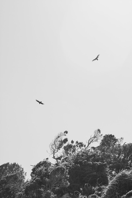 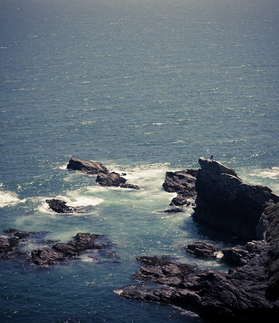
|
|
#
?
Oct 29, 2012 21:32
|
|


|
El Laucha posted:Here are some from yesterday's bike ride: I love the desaturated look in the first picture - it gives the feeling of bleakness and struggle, especially since he's not riding but lugging the bike up the hill. Your rocks may not look as smooth, but the sense of scale in the last picture is just staggering because of the tiny person there. It seems dangerous because of the person's wide stance and how everything is so sharp and big. This one is a little too blue tinted for me though.
|
|
#
?
Oct 29, 2012 21:48
|
|
|
El Laucha posted:Here are some from yesterday's bike ride: Fantastic. This reminds me of The Master. Beautiful tone and composition. Was this a friend of yours/a staged shot? The pose looks pretty intense for being out on that jetty-ish type thing. ---  Clock Tower. by Scott LaChapelle, on Flickr  The Bay. by Scott LaChapelle, on Flickr  Reflect, Reflect. by Scott LaChapelle, on Flickr
|
|
#
?
Oct 30, 2012 04:06
|
|

|
Nice use of empty space in both. In the former, the emptiness of the sky as opposed to the (quite) dense outcrop of canopy below emphasises the freedom of the birds in the air. I think the black/white process works more in favour than the colour (solo bird) picture beforehand in your photostream, which would have suited a tighter crop to the (leafless) tree, but you can't direct nature. I might have been tempted to clone in some extremely light cloud coverage at the top right of the picture myself, but I'm glad you left the sky empty. Nice tones. The second picture I feel like focus was missed slightly, it looks okay at small sized, but viewed large isn't quite right. However, I'll critique the composition mainly since I really like the feeling of "standing on the edge of the world" I get from this, which would be good on its own, but the figure on the rocky ledge just elevates the idea to great. The sunlight playing off the waves is really nice too, and the tones and processing are favourable. It has a real, hazy cinematic feel, like you're just waiting for the end credits to roll and Chi Mai to start playing.
|
|
#
?
Oct 30, 2012 12:35
|
|

|
scotty posted:Fantastic. This reminds me of The Master. Beautiful tone and composition. Was this a friend of yours/a staged shot? The pose looks pretty intense for being out on that jetty-ish type thing. It was just lucky timing. We were riding back with a small group of friends after a big ride out to the beach, and we took a small trail and when we stopped to rest I decided to take some photos of those rocks and noticed there was a dude standing there. Its not as sharp as I'd like it to have been but I was very far away and the lens I had mounted was a 50mm prime (the other one I had with me was a 10-22...).
|
|
#
?
Oct 30, 2012 13:25
|
|
|
scotty posted:
scotty posted:
scotty posted:
--- Used real smoke this time instead of flour/icing sugar. Incense didn't really work, so resorted to cigarette smoke  If you want to try this out I'd recommend a smoke machine. If you want to try this out I'd recommend a smoke machine.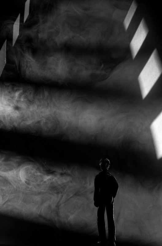 303/366 - Tower of Smoke by fuglsnef, on Flickr
|
|
#
?
Oct 30, 2012 19:40
|
|
|
David Pratt posted:--- This is awesome. I like it better than your first go around, and not just because of the smoke instead of icing sugar (I'd actually like to see it with icing sugar). I find the tower composition a lot more foreboding, and it draws me in a lot more. Though it could just be that the other one is almost identical to a picture that TomR took a while ago and I like that it's a slightly different take on the same idea, rather than it being almost exactly the same.
|
|
#
?
Oct 31, 2012 04:49
|
|

|
Do you mean the one with the little figure in the crack in the doorway? That was amazing. It won one of the monthly competitions didn't it?
|
|
#
?
Oct 31, 2012 10:35
|
|
|
David Pratt posted:This is great, I love geometric/silhouettey stuff. The beam across the top is bugging me though - is it supposed to be horizontal? It's making it feel like the whole thing's listing to the left or on a slope. This is my favourite because it's really tricky to work out the perspective, and I don't want to know, either. Really magical looking. Hard to critique, really, and I would be doing it for the sake of it. Nice image.
|
|
#
?
Oct 31, 2012 12:06
|
|
|
David Pratt posted:
The plastic-y highlights on the dude in this one bother me but otherwise this is perfect, and you have an awesome eye for perspective and lighting effects. I wish I could offer more but this is just a great image. InternetJunky posted:I get pretty lost sometimes doing B&W conversions so I'm curious how well you all think this one came out. I wanted to chime in on this one and say I love it. The whites really pop, the sky is nice and even, the path is nicely defined - nothing gets lost in the black and white conversion (to my eye). I've been working with b&w for a bit - it's definitely harder than it looks! Great job. ---- Speaking of b&w - here's a couple shots I did yesterday for a client of mine. Most of the shots aren't supposed to be "artsy" but the client loved these two anyway and I wanted to get your opinions.  pullup2 by Mike Heath - Somacore, on Flickr  DSC_7280 by Mike Heath - Somacore, on Flickr PS. Using the PRE WB setting on my Nikon has really helped my kitchen photo shoots! All the whites are white again - thanks a ton for all your suggestions and input. Also now shooting RAW.
|
|
#
?
Oct 31, 2012 16:06
|
|
|
scotty posted:
What I like about it is the water - it's very smooth yet it's got detail, and by that I mean it is smooth but not in that 10-stop ND filter way. The color of the water, the smoothness and the leaves combine to make a very nice mood, which I like. The rest of the picture gives balance, but is bland and boring. The blown out highlights don't annoy me as much as it should, probably because it would feel unnatural and HDR-like if they weren't blown out. Good work.
|
|
#
?
Nov 1, 2012 21:27
|
|
|
David Pratt posted:
This owns. It it an action figure? scotty posted:Fantastic. This reminds me of The Master. Beautiful tone and composition. Was this a friend of yours/a staged shot? The pose looks pretty intense for being out on that jetty-ish type thing. These have been commented on but they have promise so I wanted to add something and also ask if you are using film software like the VSCO film sets? The tones are nice but I am just getting that film emulation vibe. I love the look the look of film, try to get that look from digital and shoot film since I suck/digital is really hard to get looking like proper film so this is something I generally look for. Straighten #1 and #3. #3 is weaker because you are forcing the symmetry (even after straightening it would look like that) and the dynamic range is working against you. #1 is a nice shot and just straighten it for success. #2 I really want to like this. I can't decide whether I am looking between the poles at the building in the landscape or at the poles. I think that the vignetting (which looks to be done in post but again I could stand to be corrected) draws my eyes to the building, so if you are intending to have the viewer look more at the poles then lose it. I think moving a bit more to the right might have paid off in terms of the perspective/composition, but it is still a nice shot to look at. Did you crop it?
|
|
#
?
Nov 2, 2012 07:29
|
|

|

|
| # ? May 21, 2024 18:21 |
|
|
Ninja Woodchuck posted:The plastic-y highlights on the dude in this one bother me ... rio posted:This owns. It it an action figure? Yeah, it's a little white plastic dude painted black with a CD marker. Need to figure out a way to make him more matte, as the highlights are really giving away the scale and I wanted it to be as ambiguous as possible.
|
|
#
?
Nov 2, 2012 12:13
|
|