


|
No way I really appreciate it! Pixels were always one of those things that I desperately wanted to try but felt like it would be too much to learn, so every bit of critique helps. I re ally like the high contrast correction you did, I knew something was off but I couldn't put my finger on it. Thanks!
|
 #
?
Nov 28, 2012 16:42
#
?
Nov 28, 2012 16:42
|
|

|

|
| # ? May 11, 2024 11:07 |
|
|
poemdexter posted:Hey TemporalParadox, I totally stole your assets for my hobby prototype since they were so pretty. If you're interested in working on something is a purely hobby way meaning do whatever work whenever with 0 commitment, please let me know. Oryx tileset only goes so far. Oh, I never noticed this but how flattering. I've been pretty busy, but if there's still something in particular you need send me a PM and who knows, I might be free and bored some evening. No promises though.
|
|
#
?
Nov 29, 2012 02:33
|
|
|
stegoceras posted:I literally just started making pixel art, trying to find a good program on the mac for animating. I've got aseprite but I'm having a lot of trouble figuring it out because I'm computer illiterate. these are cute! Happy sun Jewel convinced me to stick with pixel art for a game I'm working on! So hello pixel thread Currently its 320x240 and 4 colors in an effort to keep artistic demands to a minimum & focus on the programming/writing as much as possible. Here are some portraits:  as they go right >>>> they get more recent, and the bottom is an example of my progression. Its really proving difficult to make them more serious (the games tone is quite somber) while trying to keep the charm wip background:  AND PUT IT ALL TOGETHER (carefully cropped in front of code so you know its some serious poo poo): . 
|
|
#
?
Nov 29, 2012 05:16
|
|


|
_jink posted:Happy sun Jewel convinced me to stick with pixel art for a game I'm working on! So hello pixel thread Hi!! Happy sun is best sun. Ghosts: 10 So are you gonna try 'n stick with 4 colors through the entire game? Seems like a good idea. Also, have you tried shifting the colors in the forest? Could look neat with it fading into darkness at the back. Also re:Portraits, the first three on the top can't help but remind me of Skullgirls' artstyle somehow, even though it's not really similar to any of the characters? Skullgirls is one of my favorite games visually so that's a good sign though!
|
|
#
?
Nov 29, 2012 06:08
|
|

|
Jewel posted:Ghosts: 10 Ya, sticking to 4 colors in the increasingly nebulous belief that fewer colors means less work. Like this?  Had to dither since the trees in silhouette looked lighter next to all that black. ~tbh~ it looks like a night shot of the same picture to me & not clearly superior. And I'm hesitant to start getting too much into dithering as that path leads to some very
|
|
#
?
Nov 29, 2012 09:30
|
|
|
_jink posted:Ya, sticking to 4 colors in the increasingly nebulous belief that fewer colors means less work. Mmh. Tough decision yeah, I mostly wanted to see which looked better, but you're right, they're about equal. Go with whatever's easier really 
|
|
#
?
Nov 29, 2012 13:53
|
|
|
I know it was ages ago but i hope you ended up going with the lighter one it looks a whole lot better! I started doing some stuff for a friends game and decided to give pixel art a try and it is a lot of fun so far. I've always struggled with colors and I think having to select them beforehand and worry about how they'll interact with each other has actually made me a lot better. here area couple of the character portraits from it and one of the area select pictures (none of them are actually finished yet though):  
|
|
#
?
Dec 20, 2012 04:01
|
|
|
I just did a 125 image series of abstract pixel art, and was wondering if posting a few here (or the whole thing) would be kosher. For a touch of content, the first and last images of the series.  
AfroSpatula fucked around with this message at 07:18 on Dec 21, 2012 |
|
#
?
Dec 21, 2012 07:14
|
|
|
AfroSpatula posted:I just did a 125 image series of abstract pixel art, and was wondering if posting a few here (or the whole thing) would be kosher. I know it's not meant for this, but since it's made for SA it could be allowed? How about trying to upload it to the LP Test Poster at http://lpix.org/sslptest/ That's usually used in the sandcastle thread to link a lot of images and text at once without cluttering up a thread. In theory if you host them all via imgur it shouldn't use any bandwidth at all.
|
|
#
?
Dec 21, 2012 07:19
|
|
|
These are excellent and I'd love to see a finished game with its art assets made by you.
|
|
#
?
Dec 21, 2012 15:19
|
|

|
This is giving me a King of Dragon Pass vibe. Great work!
|
|
#
?
Dec 21, 2012 15:34
|
|

|
I know it's not digital but I think the effort of cutting each pixel out by hand makes up for it.
|
|
#
?
Dec 22, 2012 02:52
|
|

|
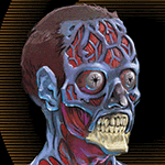
Here's some sort of horrible clown abomination I made 
|
|
#
?
Dec 22, 2012 07:31
|
|

|
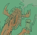
Pixelation secret santa gift
|
|
#
?
Dec 24, 2012 07:12
|
|

|
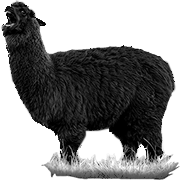
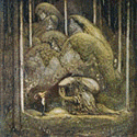
Excellent! The antler texture is great.
|
|
#
?
Dec 25, 2012 16:43
|
|
|
Ah thanks guys. That looks really cool exclamation marx, I love your palette it works amazingly well with those textures
|
|
#
?
Dec 28, 2012 00:24
|
|
|
Thanks! I was a bit worried about the palette because I had to work from a laptop, wasn't sure how accurate the colours would be. Here are all the gifts, some great work in there this is what I was working on before the moose lady, but I thought the composition was lacking. Also I can't draw robots. 
|
|
#
?
Dec 30, 2012 14:09
|
|
|
I'm working on a little pet project with my fiance and started on our protagonist tonight. I used to do pixel art all the time when I was younger but it was limited to making new pokemon trainer sprites (from scratch at least!) so I'm a newbie. Can I get some critique? 
|
|
#
?
Dec 31, 2012 08:28
|
|
|
Amaya posted:I'm working on a little pet project with my fiance and started on our protagonist tonight. I used to do pixel art all the time when I was younger but it was limited to making new pokemon trainer sprites (from scratch at least!) so I'm a newbie. Can I get some critique? For improving your walk cycle have the body bob up and down being lowest when the feet are stretched out(extreme position) and highest when they pass across each other(passing position).
|
|
#
?
Dec 31, 2012 10:03
|
|
|
Like this? Here's another also: 
|
|
#
?
Dec 31, 2012 12:23
|
|
|
Seeing as I was a bit bored today, decided to have some fun. This was a rough work in progress, I wanted to get the flat colors done.  Almost done. This is Bad Box Art Megaman which was in Street Fighter x Tekken.
|
|
#
?
Jan 1, 2013 02:27
|
|

|
Amaya posted:Like this? More. Have the entire body move up and down.
|
|
#
?
Jan 1, 2013 07:31
|
|
|
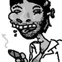
I am doing an absolutely terrible job with this hair.
|
|
#
?
Jan 3, 2013 19:26
|
|

|
Teim posted:I am doing an absolutely terrible job with this hair. I think you'll be helped a lot by determining where the light is coming from. Right now it looks like it's coming from dead ahead, which is only useful if the viewer is a headlight. ")
|
|
#
?
Jan 3, 2013 22:05
|
|

|
Teim posted:I am doing an absolutely terrible job with this hair. http://www.proko.com/how-to-draw-hair/
|
|
#
?
Jan 3, 2013 23:33
|
|
|
Octorok posted:Not necessarily pixel art, but this should help you determine how you want to differentiate your values and create hair textures. Thanks for that, I always feel like hair is were I'm weakest... well that and shading, so when I combine the two my brain melts. In the meantime I cleaned up a lot of my lines and curves and now he looks rounder. I might redo the top of his hair too.. 
|
|
#
?
Jan 4, 2013 15:11
|
|
|
8 colors + mandatory bobbing 
|
|
#
?
Jan 5, 2013 15:20
|
|

|
Triangle posted:8 colors + mandatory bobbing Can you please tell me more about this because it looks dope.
|
|
#
?
Jan 6, 2013 06:51
|
|
|
Triangle posted:8 colors + mandatory bobbing that handhair is cool as gently caress, but it would be better off without the zero-effort idle animation bob.
|
|
#
?
Jan 6, 2013 08:25
|
|
|
Scut posted:Can you please tell me more about this because it looks dope. It is Midna from The Legend of Zelda: Twilight Princess. Looks very dope, but I agree the idle needs some work.
|
|
#
?
Jan 6, 2013 11:54
|
|

|
So I'm starting a new game and I decided to sprite the main character. This is the first black outlined sprite I've done (I prefer using coloured). I really like the shape of my sprite but I'm not sure on the shading. What does anyone think of it?
|
|
#
?
Jan 7, 2013 22:07
|
|
|
Hello! Figured I'd try spriting a character of mine. I was never good at this but here we go. Also I don't have a clue on how to animate >_>    Here's a sketch of him/her if anyone's interested.  edit. Jumping and stuff! It's starting to look ok :O Imaginary Friend fucked around with this message at 15:55 on Jan 9, 2013 |
|
#
?
Jan 8, 2013 04:15
|
|
|
Oh man that's hella cute! In the animation department: you can improve your walks and runs dramatically if you have more of a "down" position. When walking or running, the foot hits the ground and then the knee bends as the weight transfers. You've got the "up" position in there in the run cycle (and a tiny one in the walk), where the foot pushes up and off, but if you balance it out with a down position, it'll have more suggestion of weight and springiness. In the book The Animator's Survival Kit, it shows how the head of someone walking/running makes kind of a sine wave, so it passes first below, then above the starting position with each stride.
|
|
#
?
Jan 9, 2013 17:32
|
|

|
I had to look at this every day in college. 
|
|
#
?
Jan 9, 2013 17:40
|
|
|
neonnoodle posted:Oh man that's hella cute! In the animation department: you can improve your walks and runs dramatically if you have more of a "down" position. When walking or running, the foot hits the ground and then the knee bends as the weight transfers. You've got the "up" position in there in the run cycle (and a tiny one in the walk), where the foot pushes up and off, but if you balance it out with a down position, it'll have more suggestion of weight and springiness. In the book The Animator's Survival Kit, it shows how the head of someone walking/running makes kind of a sine wave, so it passes first below, then above the starting position with each stride. old > new > I tried adding another frame but that screwed up the entire thing and lowering the down position even more made the whole thing look jagged. drat them pesky pixels and everyone one of them having to make such a difference  Oh, did a quick-climb thingie as well! 
Imaginary Friend fucked around with this message at 21:46 on Jan 9, 2013 |
|
#
?
Jan 9, 2013 21:42
|
|
|
Imaginary Friend posted:new > Woah this is soooooo nice! Have you got a blog for this stuff?
|
|
#
?
Jan 10, 2013 01:19
|
|
|
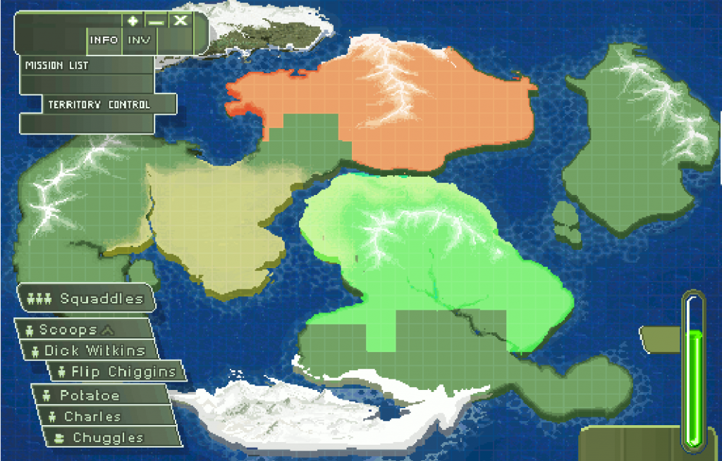 It's ain't particularly artsy, but I've been going for a retro-game mission map kind of feel here, and I'm finally almost happy with the result. Most of the menu stuff is placeholder, just wanted to see how it would look with some kind of HUD overlay.
|
|
#
?
Jan 11, 2013 16:30
|
|

|
Doesn't have to be artsy. I really like the layout design. Nothing too distracting, pleasant on the eyes. You'd be surprised most games have pretty poo poo UI menus.
|
|
#
?
Jan 11, 2013 21:18
|
|
|
Scut posted:Woah this is soooooo nice! Have you got a blog for this stuff? If anyone knows any good bear anatomy sites/books/whatever, please tell. My bear looks like a fricking warthog :/ 
|
|
#
?
Jan 14, 2013 20:32
|
|
|

|
| # ? May 11, 2024 11:07 |
|
|
Hahahah that's a really great bear!
|
|
#
?
Jan 14, 2013 22:07
|
|