


|
McMadCow posted:I think this model was the last shoot I'm going to do in this particular project. I have one more scene in the works, but that's going to be a much more elaborate staging. I like what I got out of it but I think I want to figure out something different now. I have to agree with everyone about these. This is my favorite model so far and I love the color shot.
|
 #
?
Jan 30, 2013 20:00
#
?
Jan 30, 2013 20:00
|
|


|

|
| # ? May 22, 2024 08:15 |
|
|
Thanks everyone for your input on these. That guy was a really awesome model, and I'm happy with how they turned out, but like I said I pretty much explored this part of the project as much as I'm interested. These are the last two cuts from the guy. Next time I post a portrait it will likely be something different. Michal by McMadCow, on Flickr  Michal in Surbiton by McMadCow, on Flickr
|
|
#
?
Feb 1, 2013 02:36
|
|

|
I think you should stick with it a bit, personally. You have the germ of a brilliant idea here. The first one with the hands creeping in from behind is excellent. That and the first B&W one on the previous page with the same model. These are the ones that "work" for me. I like the ones with the hands just coming in from the side, but abstracting things a touch further by adding a spot of mystery or emotion (like the hand oppressively clasped over the face of the female model and the hands out of nowhere element here) adds that extra piece and completes the puzzle. I think you should keep on with this, because it's a pretty cool series that you can create a fairly topical subtext to run alongside it, something about fashion and posing and the perfection and inherent lies in a photograph. Just my two cents, but I wouldn't throw this project away too readily.
|
|
#
?
Feb 1, 2013 09:44
|
|

|
I'm a big fan of that series, especially that last model, but I'm also excited for what you've got coming next, McMadCow. It's always very inspiring and makes me want to push myself out of my commercial box. Which hasn't really happened yet... Speaking of which, I pulled out this old photo and practiced my editing skills. I wanted to keep everything really natural looking and I've been relying on actions lately so I wanted to start from scratch. I got a little sloppy on her left shoulder, but I'm sick and  Thoughts?  b_a_april2012 by Breanne Unger, on Flickr
|
|
#
?
Feb 3, 2013 04:43
|
|

|
CarrotFlowers posted:I'm a big fan of that series, especially that last model, but I'm also excited for what you've got coming next, McMadCow. It's always very inspiring and makes me want to push myself out of my commercial box. Which hasn't really happened yet...
|
|
#
?
Feb 3, 2013 05:11
|
|
|
Dominoes posted:I like the one on the left; the right one looks too shopped. What about it makes it look too photoshopped? The left one is straight out of camera.
|
|
#
?
Feb 3, 2013 05:54
|
|
|
CarrotFlowers posted:What about it makes it look too photoshopped? The left one is straight out of camera.
|
|
#
?
Feb 3, 2013 16:17
|
|
|
CarrotFlowers posted:I'm a big fan of that series, especially that last model, but I'm also excited for what you've got coming next, McMadCow. It's always very inspiring and makes me want to push myself out of my commercial box. Which hasn't really happened yet... I like the edit. The eyes are brighter, skin is smoother, hair is better too. I didn't see a difference in the lips - you can edit them a bit (or not, I've seen lots of fashion retouchers edit the lips all the time). The only thing I noticed is that her face now glows brighter than her chest area, which is not too big a deal. That is easily fixable with lighting though. Good job. bobmarleysghost fucked around with this message at 16:41 on Feb 3, 2013 |
|
#
?
Feb 3, 2013 16:39
|
|


|
CarrotFlowers posted:What about it makes it look too photoshopped? The left one is straight out of camera. What makes it look photoshopped is that it's next to the unedited version. That's always the tricky thing about showing before/afters is that photoshop has a negative connotation to most people and mentioning it can bias people against an image. I remember a pro retoucher posted in a thread a while back and got run off because the forum consensus at the time was way waste more than 5 minutes editing skin on an image. I think it's a super good edit.
|
|
#
?
Feb 3, 2013 16:58
|
|

|
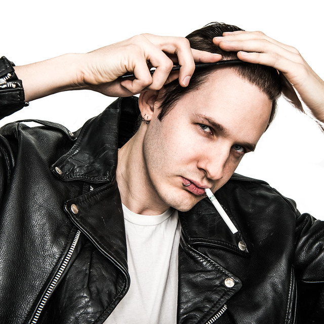
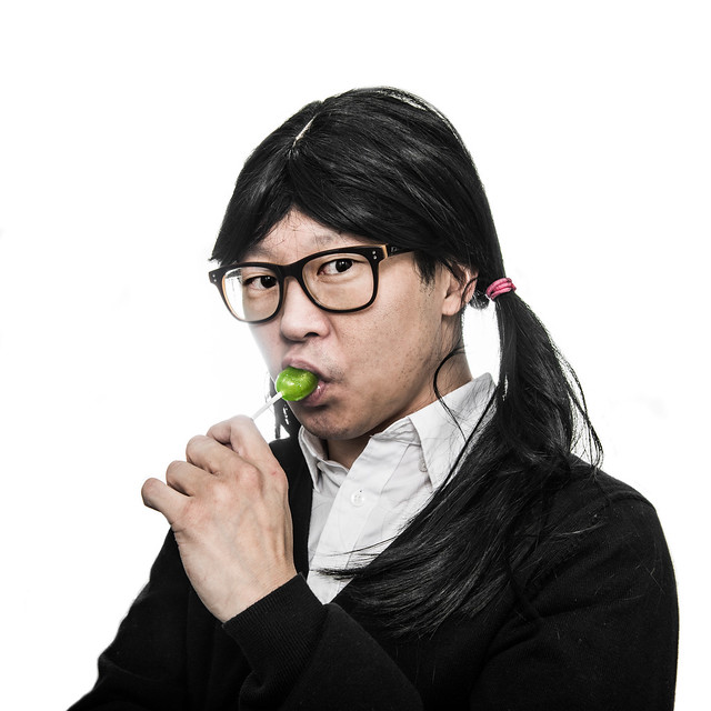
RangerScum posted:Shot some promo photos over the weekend. It was a fun style to work in, though the space that I had to shoot them in was loving terrible. Background needs a bit more work for one spot on one of the photos at least, but I'm sure there are other areas that I haven't noticed yet. The first one here looks the best overall IMO. The edges of her arms look weird in the second one, maybe you brushed over them while touching up the background? The third is kinda ruined for me by the unlit cigarette. I feel like with this kind of look you're skirting the edge of campy parody at the best of times, and something obvious like that completely breaks the suspension of disbelief for me. The fourth is hilarious and his expression is perfect, great job. Final slight nitpick; in the second and fourth pictures their left cheeks both have a slight glow where I guess the backdrop was a bit brightly lit.
|
|
#
?
Feb 3, 2013 18:40
|
|

|
Dominoes posted:The uniformity of the subject's skin and lips, and brightness of her iris. I did brighten her eyes a bit, but clearing up the blemishes (what little there are, she has great skin) and evening out her skin tone was part of the editing I was working on. I wanted it to be in a typical beauty shot style, which I understand not everyone agrees with, but it was good practice. Santa is strapped posted:I like the edit. The eyes are brighter, skin is smoother, hair is better too. I didn't see a difference in the lips - you can edit them a bit (or not, I've seen lots of fashion retouchers edit the lips all the time). The only thing I noticed is that her face now glows brighter than her chest area, which is not too big a deal. That is easily fixable with lighting though. Good job. Thanks! I did touch up her lips a tad, just smoothed the colour out a bit. I didn't notice her face being brighter than her chest, though I do now. I'll watch out for it in the future. Paragon8 posted:What makes it look photoshopped is that it's next to the unedited version. That's always the tricky thing about showing before/afters is that photoshop has a negative connotation to most people and mentioning it can bias people against an image. I remember a pro retoucher posted in a thread a while back and got run off because the forum consensus at the time was way waste more than 5 minutes editing skin on an image. Thanks, man. I was wondering if the unedited version beside it might have an impact on how much work was put into it, but I wanted to show it for comparison to see if I was on the right track. I posted the edited version on facebook and it's one of my most popular shots. I think the photo itself is kinda meh, but it was a good one for practicing on.
|
|
#
?
Feb 3, 2013 23:09
|
|
|
big scary monsters posted:The first one here looks the best overall IMO. The edges of her arms look weird in the second one, maybe you brushed over them while touching up the background? The third is kinda ruined for me by the unlit cigarette. I feel like with this kind of look you're skirting the edge of campy parody at the best of times, and something obvious like that completely breaks the suspension of disbelief for me. The fourth is hilarious and his expression is perfect, great job. Final slight nitpick; in the second and fourth pictures their left cheeks both have a slight glow where I guess the backdrop was a bit brightly lit. They were promo photos for a themed cover band, so campy parody was the actual goal... glad to hear it comes off that way. ")
|
|
#
?
Feb 3, 2013 23:50
|
|

|
In that case, nicely done!
|
|
#
?
Feb 4, 2013 03:03
|
|
|
McMadCow posted:Thanks everyone for your input on these. That guy was a really awesome model, and I'm happy with how they turned out, but like I said I pretty much explored this part of the project as much as I'm interested. These are the last two cuts from the guy. Next time I post a portrait it will likely be something different. This model is fantastic. All your shots of him remind me of this.
|
|
#
?
Feb 4, 2013 10:16
|
|

|
aliencowboy posted:This model is fantastic. All your shots of him remind me of this. It's funny you should mention that. I didn't mention Kraftwerk, but when I was talking to him about wardrobe, I sent him a bunch of pictures of Gary Numan from his Tubeway Army days. Same sort of scene, so that was very intentional. That guy was an awesome model and I'm already planning on getting him back for my next project. EDIT: https://www.youtube.com/watch?v=Uu6MDdxBork McMadCow fucked around with this message at 02:46 on Feb 5, 2013 |
|
#
?
Feb 5, 2013 02:36
|
|
|
 Untitled by xxyzx road, on Flickr
|
|
#
?
Feb 5, 2013 22:55
|
|

|
have you tried testing agency models yet?
|
|
#
?
Feb 5, 2013 23:30
|
|
|
Paragon8 posted:have you tried testing agency models yet? I've shot some agency models from minor agencies. I'm working on getting my book together to test with some of the bigger agencies.
|
|
#
?
Feb 5, 2013 23:43
|
|
|
TheAngryDrunk posted:I've shot some agency models from minor agencies. I'm working on getting my book together to test with some of the bigger agencies. just email 'em. I'm sure wilhemina would love your stuff. I'd just maybe pull down the processing a bit so they know they're getting some standardy shots.
|
|
#
?
Feb 5, 2013 23:44
|
|
|
Paragon8 posted:just email 'em. I'm sure wilhemina would love your stuff. I'd just maybe pull down the processing a bit so they know they're getting some standardy shots. Yeah, most of the stuff I post in here is for artistic purposes. I do regular commercial shots, too. I'm shooting a former Ford model this saturday. She's freelance now. I live in LA, so I have pretty good luck on Model Mayhem. But yeah, agency models are definitely a higher caliber.
|
|
#
?
Feb 5, 2013 23:47
|
|
|
TheAngryDrunk posted:Yeah, most of the stuff I post in here is for artistic purposes. I do regular commercial shots, too. I'm shooting a former Ford model this saturday. She's freelance now. I live in LA, so I have pretty good luck on Model Mayhem. But yeah, agency models are definitely a higher caliber. Interesting, MM is terrible in London because there are so many agencies here that anyone worthwhile basically already has representation. haha.
|
|
#
?
Feb 5, 2013 23:52
|
|
|
TheAngryDrunk posted:
I think this shot is great. The expression and hair are fantastic. But if you're trying to be flattering (which you very well may not be, in which case ignore me), you might want to know that my first thought was "really hairy arms."
|
|
#
?
Feb 6, 2013 18:19
|
|

|
Simple black and white Brittnee Hollenbach by tetradtx, on Flickr
|
|
#
?
Feb 8, 2013 04:04
|
|

|
Here's a photo of my son Milo from back in September. Straight out of camera.. I can't decide if I want to do anything else to it. Maybe a bit too much negative space on the left. IMG_4562 by bighoits, on Flickr
|
|
#
?
Feb 8, 2013 16:00
|
|
|
wanghammer posted:Here's a photo of my son Milo from back in September. Straight out of camera.. I can't decide if I want to do anything else to it. Maybe a bit too much negative space on the left. I think it's good the way it is. Good contrasting colors and shallow depth draw your eyes right to him.
|
|
#
?
Feb 8, 2013 16:14
|
|
|
A friend of mine went and spend months and months traveling around the far east. On his return, I decided to take a couple of shots playing with the idea of dragging him back home. we lost this guy for a little while... by thetzar, on Flickr  ...but we got him back by thetzar, on Flickr
|
|
#
?
Feb 10, 2013 21:00
|
|
|
Really cool! ^ Love the second one. Amanda at Linda Vista Hospital by xxyzx road, on Flickr
|
|
#
?
Feb 11, 2013 02:11
|
|
|
This question is to anyone who does a lot of indoor studio work. Chromakey backgrounds. Are they useful? The place I work for doesn't have them but I always get clients who tell me how cool they are and how convenient it is to take a favorite photo, then pick a favorite background without having to compromise. Along those lines. How easy is it to make virtual backgrounds for them? I'm guessing you just take a picture of a background (brickwall, wallpaper, a defined wallspace) with the same light and camera setup? Edit: I also don't say this enough but the work I see in this thread is regularly better than mine. Great stuff. Very inspiring. rcman50166 fucked around with this message at 02:33 on Feb 11, 2013 |
|
#
?
Feb 11, 2013 02:30
|
|

|
 Amanda on the roof by xxyzx road, on Flickr
|
|
#
?
Feb 11, 2013 05:29
|
|
|
thetzar posted:A friend of mine went and spend months and months traveling around the far east. On his return, I decided to take a couple of shots playing with the idea of dragging him back home. I like these two together. Reminds me of what I did last week. This is my friend who started his own DIY bio lab, where he shares a space with others who experiment in biology as a hobby separate from their day jobs. I did some PR shots for him but also did some more moody shots.  Jameson by AIIAZNSK8ER, on Flickr  Jameson by AIIAZNSK8ER, on Flickr  Jameson by AIIAZNSK8ER, on Flickr edit: That last one looks much darker on this monitor than when I edited it. AIIAZNSK8ER fucked around with this message at 02:45 on Feb 18, 2013 |
|
#
?
Feb 18, 2013 02:02
|
|

|
AIIAZNSK8ER posted:
Would recommend shopping out the wall corner off his head in the first photo and the vignette in the second. I'm not quite sure how I feel about the third but on first glance it looks cool. thetzar posted:
Very fun second photo, would recommend having him take off glasses or pop the glasses out the frame to avoid the break in his face.   
|
|
#
?
Feb 18, 2013 03:03
|
|
|
  
|
|
#
?
Feb 18, 2013 03:44
|
|
|
A friend of mine and I just rented a studio space. It's an old abandoned warehouse that's been divied up. I'm the only photographer there, the rest are painters, sculpters, welders etc. Our space is 3mx6m. There is no ceiling over our "cubicle" which means the light from the skylights gets in and changes with the movement of the sun. We're going to board it up so we can make it (almost) lightproof. Anyway...  That's one many test shots I fired after first getting my lighting equipment. I had a 580exII in a softbox to the right of subject, about 1 foot away, and a 430exII in a reflective/dual use umbrella to the left to light up the background. I'm really new to portraiture and have no real solid experience in it. When we can make this studio lightproof we also have the (dis?)advantage of a flourescent light tube directly above roughly where my friend is sitting. I know I need something to light up his hair. The only problem I'm running into at the moment is; operating at smaller apertures means the backdrop is going to show its creases. I tried bringing him further away from the background but our space is pretty small so it's not like I can go waaaaay back or anything. I'm guessing photoshop is the only way I can really blend out those lines from the background (or take an iron and iron the drat thing?)? ALso I'm thinking of getting some kind of reflector to bounce some light back up onto his face. This was our first day out there so go easy on me, and I have no experience in shooting portraiture setting whatsoever... any pointers would be greatly appreciated. I was playing through all my aperture settings and the biggest stinker was the background. This pic was 50mm f/9.0 1/200 ISO 50 I have: 5D mkII 85mm 1.2 LII USM 50mm 1.2 L USM 24mm 1.4 LII USM - This I was really hoping I could use but the space is really small. Any tips or help you could give me would be greatly appreciated! (dont mind the sheen, it is loving hot here in melbourne and we were sweating like pigs) e: also, I have a black backdrop as well, but didn't want to use it until we could lightprroof the space Sludge Tank fucked around with this message at 04:16 on Feb 18, 2013 |
|
#
?
Feb 18, 2013 04:10
|
|

|
Are you sure you're not overpowering the skylight already? F/9 ISO 50 and 1/200 seems pretty dark for indoors. I would think that kills the skylight, but maybe not. You should have no problems overpowering the fluorescent lights, so I wouldn't worry about that. As for backdrops, get some paper or one of those backdrops that fold up like a reflector.
|
|
#
?
Feb 18, 2013 04:45
|
|
|
TheAngryDrunk posted:Are you sure you're not overpowering the skylight already? F/9 ISO 50 and 1/200 seems pretty dark for indoors. I would think that kills the skylight, but maybe not. You can gel your lights to match the fluorescent, it fucks a little bit with colour temp. I would also recommend getting paper instead, cloth is a bitch. You should steam it if possible until then or just blast it with light to overexpose it.
|
|
#
?
Feb 18, 2013 05:37
|
|
|
Oprah Haza posted:You can gel your lights to match the fluorescent, it fucks a little bit with colour temp. I would also recommend getting paper instead, cloth is a bitch. You should steam it if possible until then or just blast it with light to overexpose it. You CAN get your lights to match the fluorescent (look at Rosco's Plusgreen gels), but honestly it's a pain in the rear end and not worth it, you're better off just overpowering the ambient with flash.
|
|
#
?
Feb 18, 2013 05:51
|
|


|
Sludge Tank posted:There is no ceiling over our "cubicle" which means the light from the skylights gets in and changes with the movement of the sun. Why? If you have a natural skylight, I would work it to death using reflectors. It looks great and isn't a pain in the rear end.
|
|
#
?
Feb 18, 2013 06:02
|
|
|
AIIAZNSK8ER posted:Why? If you have a natural skylight, I would work it to death using reflectors. It looks great and isn't a pain in the rear end. Listen to this man. Skylight with no reflectors.  Tamron 17-50 2.8 first shot by natebol, on Flickr
|
|
#
?
Feb 18, 2013 06:17
|
|
|
Thanks. Thing is, I also want to play around a lot with a black backdrop and have 'darker' settings, so being able to completely block out & control the light would be great. The photo I posted was actually taken around 8pm after the sun had gone down and most of the ambient light was gone. drat I wish I'd gone for paper backing, my mate actuallly suggested it to me as well. he said his sister has some and it works well. Oh well live & learn. I thought about blasting it with light as suggested but will this have a negative impact on the subject like adding nasty halos or anything? thanks again for tips so far. e: any post-prod tips you could offer would be appreciated. The above pic has more or less nothing done to it except I changed the colour temp in RAW. Sludge Tank fucked around with this message at 15:36 on Feb 18, 2013 |
|
#
?
Feb 18, 2013 15:01
|
|
|

|
| # ? May 22, 2024 08:15 |
|
|
Sludge Tank posted:Thanks. Thing is, I also want to play around a lot with a black backdrop and have 'darker' settings, so being able to completely block out & control the light would be great. The photo I posted was actually taken around 8pm after the sun had gone down and most of the ambient light was gone. If you blast that background with light from behind it will be fine (no halos). You could do a curves or exposure mask of the background and whiten it then do less touchup of creases if they are still there. Here is a SUPER QUICK very rough example. I did a curves layer on the bg, duplicated it then fiddled with opacity, then went ahead and curved the model as well. Took like 2 minutes including uploading. I'm sure you could do better if you took your time.  Anyway, the point is to shoot on paper. Edit: I couldn't resist. 
Oprah Haza fucked around with this message at 16:59 on Feb 18, 2013 |
|
#
?
Feb 18, 2013 16:30
|
|