


|
Dude, Zvezda, I've been doing pixel art for like maybe a year now and I'm not as good as those sprites. Definitely pursue that poo poo.
|
 #
?
Mar 16, 2013 20:38
#
?
Mar 16, 2013 20:38
|
|


|

|
| # ? May 13, 2024 11:43 |
|
|
Arg, thanks guys!Internet Janitor posted:Zvezda: Really nice stuff! you should try putting together a point-and-click adventure or something. If I was going to criticize anything it would be that using a large number of subtly different colors makes things look a little muddy- those characters probably wouldn't stand out well against a similarly detailed background. Try restricting your pallette a bit or using contrasting colors to provide a sharper silhouette. I'd LOVE to do a point and click adventure game sometime. It's the programming side of things that really intimidates me - I'd need a partner in crime! Thanks for the critique, I will keep the palette in mind ")
|
|
#
?
Mar 16, 2013 21:09
|
|

|
Zvezda posted:I'd LOVE to do a point and click adventure game sometime. It's the programming side of things that really intimidates me - I'd need a partner in crime! Thanks for the critique, I will keep the palette in mind For simple point-and-click games, you could try just messing around in Adventure Game Studio without needing to program.
|
|
#
?
Mar 17, 2013 04:22
|
|


|
Zvezda posted:Arg, thanks guys! I really liked your sprites. They're awesome. Do some more like that.
|
|
#
?
Mar 17, 2013 16:48
|
|
|
Zvezda posted:Oh man some lovely lovely things in this thread. Something you might want to keep in mind when doing pixel stuff is to avoid using anti-aliased brushes. They introduce tons of unnecessary colors and destroy edges. Something else you might want to do is to clean up your edges. Also, look into limited palettes. here is a little something to try and illustrate what I'm talking about.  6 colors + alpha
|
|
#
?
Mar 17, 2013 21:01
|
|


|
Thing is though, Triangle, yours looks like a (good!) sprite from an old video game; rules are in place and things are done accordingly. Which is cool if that's what you're going for. But the original looks like A Dude That Done Been Through some poo poo, even if some of the edges aren't perfect and the colors look muddy. Somehow I find that way more exciting than using a limited palette or properly following NES restrictions or avoiding banding or whatever. That's not to poo poo on your edit though, which is really good. I don't mean to sound like i'm some kind of expert who gets to decide who can break the rules or not, tbh I just recently started putting effort into learning about stuff like banding and anti-aliasing and limited palettes and poo poo. And now I done said a whole bunch of words so here's a thing I did today:  I think it's 12 colors total. I've been trying my hand at making my own 8 color palette, plus 4 more made up of the Game Boy greens.
|
|
#
?
Mar 17, 2013 22:44
|
|
|
Triangle posted:Something you might want to keep in mind when doing pixel stuff is to avoid using anti-aliased brushes. They introduce tons of unnecessary colors and destroy edges. Something else you might want to do is to clean up your edges. Also, look into limited palettes. Thanks for the feedback and I love your version! I'm pretty used to painting character concepts so, while I used the 1 pixel pencil brush in photoshop, I did use 50% or whatever opacity and the same kind of technique and didn't pay any mind to limiting my palette. If I did make a game - and I do plan on looking at AGS and seeing if I can get a level or scenario working - I'd definitely look into this kind of thing. the chaos engine: adorable, and such nice colours 
|
|
#
?
Mar 17, 2013 23:18
|
|
|
Yeah, I quite like the muddier version, too. It has more personality. I'd say a compromise is in order; definitely have your edges at 100% opacity, and maybe experiment with a limited palette, but don't take color limitation that far if you don't have to.
|
|
#
?
Mar 18, 2013 03:46
|
|

|
I should be asleep right now, but I ran across a tutorial on limited palette backgrounds and was dying to try it out.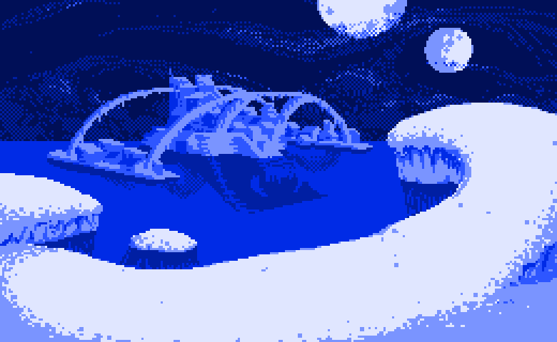 process gif:  I've never really done much with pixel backgrounds. Right direction yes/no?
|
|
#
?
Mar 18, 2013 13:14
|
|
|
^^^ looks like it's headed in the right direction! I'm settling on my color palette. So one of the things about this game is that for every boss, there have to be 10 variants. I plan on doing that through using different color schemes and decals. Here's the level 1 boss:  without decals. I'm just trying to figure out what the best color schemes would be. Disregard the limbs for the most part, I'm trying to get the base for the schemes right. Are there any possibilities I'm missing here?
|
|
#
?
Mar 18, 2013 23:11
|
|
|
Kazerad posted:I should be asleep right now, but I ran across a tutorial on limited palette backgrounds and was dying to try it out. Got a link to that tutorial? In fact, any links to other tutorials would be nice as well.
|
|
#
?
Mar 18, 2013 23:55
|
|

|
the chaos engine posted:^^^ looks like it's headed in the right direction! Thanks! Looking at it today, I'm pretty surprised how well it turned out. Not sure how I feel about those dithered clouds, though. They feel a little rough, though the version without them looks too plain to me. Chipp Zanuff posted:Got a link to that tutorial? http://www.wildbunny.co.uk/blog/2012/03/01/designing-a-retro-pixel-art-tile-set/ it's geared toward tileset making so I can't say I was actually following it that much; it was more like "Oh, hey, dithering. That's a thing, I want to try it". I also had just looked at http://purloux.com/artwork/tutorials/rundown/ and was somewhat inspired by the line "Dithering adds texture. It's unavoidable".
|
|
#
?
Mar 19, 2013 02:29
|
|
|
the chaos engine posted:I'm settling on my color palette. So one of the things about this game is that for every boss, there have to be 10 variants. I plan on doing that through using different color schemes and decals. Here's the level 1 boss: Well you've got twelve colors and ten robots so unless you want a white or black bot I'd say you've got your bases covered. They looks pretty nice though.
|
|
#
?
Mar 19, 2013 14:30
|
|

|
 New WIP. Does the desert camo come through properly? I've been staring at this for long enough that I think it's good, but another pair of eyes would help a lot. I'll be redoing the silly purple rifle once I settle on a real design to follow.
|
|
#
?
Mar 20, 2013 13:52
|
|
|
I have to say, Zvezda, I kinda prefer the original look too; it lends an impression of hidden/obscured detail in a way that's quite successful. Keep us up to date on further stuff!
|
|
#
?
Mar 20, 2013 13:59
|
|
|
Another guy! Real guns! New Camo! edit: and a test firing animation done with the old sniper sprite:  edit: replaced sniper's dumbass shemagh (god those things are hard with such low resolution) with a reverse baseball cap. 
jizzy sillage fucked around with this message at 15:23 on Mar 21, 2013 |
|
#
?
Mar 21, 2013 14:03
|
|
|
v1.  v2.  I'm really happy with this. Having a killer time, pickles are fun! jizzy sillage fucked around with this message at 16:42 on Mar 22, 2013 |
|
#
?
Mar 22, 2013 08:41
|
|
|
Hey Plank, scale up your images once or twice for posting. It really helps show off pixel art in the best light but also helps us critique your work. Those firing animations look fun, you could probably squeeze some more life out from adjusting the time of each frame a little more. Here's the latest piece I did. It's for my brother who does computer repair. 
|
|
#
?
Mar 22, 2013 19:11
|
|

|
I really like your piece, Scut! There seems to be a pixel missing from the lower left side of the computer on the vertical part of the base, but other than that I can't see any problems I would have posted zoomed gifs but I can't seem to find an option in GraphicsGale to scale them up at all? And animating in Photoshop is such a pain in the balls. Here's a couple stills, firing and not:   It's still a little stilted and motionless for me, I wanted to move the legs to a new position for firing when he shrugs his shoulders but I haven't managed to get a pose that I like the look of with that. If I put him in a proper firing stance, his feet should be parallel and his whole body facing the target, but that ends up looking odd in a standalone animation like this. This seems to be the closest I can get. edit: new wip: 
jizzy sillage fucked around with this message at 05:47 on Mar 23, 2013 |
|
#
?
Mar 23, 2013 01:58
|
|
|
Scut posted:Hey Plank, scale up your images once or twice for posting. It really helps show off pixel art in the best light but also helps us critique your work. Those firing animations look fun, you could probably squeeze some more life out from adjusting the time of each frame a little more. Cool as hell. The color palette gives me a strong mid 90's vibe.
|
|
#
?
Mar 23, 2013 08:33
|
|
|
The palette I used is a slight variant of Dawnbringer's 16 colour palette. It's really good and has become my default choice because it's /just/ tricky enough to force you to pay attention to colour temperature but small enough to not feel overwhelming. http://www.pixeljoint.com/forum/forum_posts.asp?TID=12795
|
|
#
?
Mar 23, 2013 20:10
|
|
|
So i'm a programmer making my own 2d homebrew game + engine(engine mostly done). My pixel art is in true classic lovely "programmer art" style but i'm happy to trudge along pixel pushing things in Aseprite and Paint.NET to add tiles to my game levels and static objects and stuff. But i'm getting really stuck at the animation bit. I hope this is not see as lame or anything to you proper artists but is there like... a free stick figure/outline template or something for basic animations like mainly walking cycle but also basic jumping/shooting/dieing/idle animations would be nice. So i could put it in a background layer and draw my own stuff over it but at least know that it looks fluid in motion and my anatomy is not too far off. Some stuff does pop up in google images but mostly it's either dead links or RPG Maker stuff that is tiny and i don't even know if i'm even legally allowed to use in my own game.
|
|
#
?
Mar 24, 2013 08:58
|
|

|
What kind of scale are you talking about here?
|
|
#
?
Mar 24, 2013 09:10
|
|
|
The character sprite is 64x64 (although the idle stance is more like 64x32), the part of the game with human characters is a side-scroller. I'm looking for a template with relatively normal proportions, not the giant heads i saw for RPG maker. This is an example of an idle frame i managed to make although it's by no means final, just something to stick inside the game to replace my previous red rectangle of a main character.  If the templates are another resolution but have good animation frames i don't mind resizing them since i'm most interested in where limbs go, how long they are, etc.. Dauq fucked around with this message at 15:38 on Mar 25, 2013 |
|
#
?
Mar 24, 2013 10:30
|
|
xposting from the making games megathreadquote:
Hoping to get more into the art critiquing side over here, though. The walk cycles are really, really crude and basic, but I feel like they're good enough. The big heads and bright colors are really what I need for the actual game.
|
|
|
#
?
Mar 25, 2013 17:27
|
|

|
Plank posted:v1. Have you tried playing with moving the legs a bit? Like if you slid the shin/foot forward a pixel while he assumes his firing stance it'd give the whole body a feeling of unity and oneness. The lighting is great but the bottom half doesn't move at all and a tiny little bit of movement could really tie the whole thing together.
|
|
#
?
Mar 26, 2013 23:32
|
|


|
Yeah Reiley, I was just away for a few days in paradise. I've tried a few options before for the legs, and they all sucked, but now that I'm back maybe I'll have some fresh ideas and perspective on the issue. He's still incomplete to me too, so don't worry
|
|
#
?
Mar 27, 2013 13:08
|
|
|
 Inspired by this thread I downloaded Pixen and created... this. I definitely don't at all have a feel for making these things yet but it's fun trying.
|
|
#
?
Mar 28, 2013 11:30
|
|
 RIP ZEEZ
|
My wife is making these to represent myself and my nerdy friends, each with its own nerdy aspect. She was hand drawing them, but saw my (sad) attempts at pixel art and tried it for herself. Didn't come out half bad I say     For comparison, this is my best effort so far 
|
|
#
?
Mar 30, 2013 00:09
|
|
|
Dude don't save pixel art as jpegs. 
|
|
#
?
Mar 30, 2013 00:24
|
|

|
Yeah don't do that. A bit of artifact is happening on your really kick rear end pics. Save them as PNGs!
|
|
#
?
Mar 30, 2013 04:40
|
|

|
Increase the contrast of the two colors she is using to make them pop a lot more. The designs are really nice and have a lot of personality, but using less similar colors will make them look way stronger.
|
|
#
?
Mar 30, 2013 06:04
|
|

|
I'll pass it along (especially the jpeg thing, since that's so easy). Thanks!
|
|
#
?
Mar 30, 2013 11:16
|
|
|
Fun drawings! I would also recommend changing the black outline to a very dark shade of the colour it is next to, or at least make it a very dark grey. Pure black is a bit jarring.
|
|
#
?
Mar 31, 2013 01:32
|
|
|
*clomp clomp*
|
|
#
?
Apr 1, 2013 04:44
|
|
|
 warning: anime rear end anime warning: anime rear end anime 6 frames and way too many colors
|
|
#
?
Apr 2, 2013 00:59
|
|
|
Feels like it's still a pretty small palette! Care to share it? Nice work.
|
|
#
?
Apr 2, 2013 04:11
|
|
|
Thank you! I didn't really use a predefined pallette, made it up as I went along. It has 4 base colors and each has a shadow, light, transition and reflection color + some others. I could've reduced the number of colors by combining, but I was way too tired.
|
|
#
?
Apr 2, 2013 11:41
|
|
|
Made this for a goon's avatar but he didn't want it (I'm making him a different one now).
|
|
#
?
Apr 2, 2013 12:15
|
|
|

|
| # ? May 13, 2024 11:43 |
|
|
Scut posted:*clomp clomp* I really love how this is animated. How did you manage to make it so smooth in such a limited space?
|
|
#
?
Apr 2, 2013 15:31
|
|
