


Gaspy Conana posted:I posted this in the DIY forum, but this may be more appropriate: You could... call Office Depot. With a telephone. Also, rasterbating is totally natural. It only gets weird when you get caught.
|
|
 #
?
Apr 24, 2013 02:30
#
?
Apr 24, 2013 02:30
|
|

|

|
| # ? May 10, 2024 00:52 |
|
|
blowingupcasinos posted:You could... call Office Depot. With a telephone. I went into my local one and they didn't seem to be able to adequately answer my question. I suppose I could call around tomorrow. And yeah, I've rasterbated a few times here and there after seeing my friends do it.
|
|
#
?
Apr 24, 2013 02:42
|
|

|
You might get better advice in the design thread, but here's what I'd do: I'd take the work I have now, go into Photoshop, and increase its size to the desired print size, then save that for print at Office Depot.
|
|
#
?
Apr 24, 2013 02:58
|
|

|
Convert to CMYK (probably going to lose some colour vibrancy), resize using nearest neighbour scaling, place on an A1 (or equivalent) size blank page, and take that file to a print shop and watch your hugeass pixels enter the real world.
|
|
#
?
Apr 24, 2013 07:52
|
|

|
blowingupcasinos posted:It's hard to read the back boot. Do you think you could darken it like you did the pants? Or are the pants dark because of a shadow from the tail? I'm happy to eschew realistic shadowing in favor of readability. How's this compare? 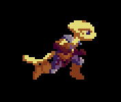 I took the highlights off her far boot entirely. If it's more readable this way I might try a middleground where the boot has shading when it's in front, but not in back. If it's not, I might try some darker shading outlining the boots in the places they touch, like in: 
|
|
#
?
Apr 24, 2013 10:36
|
|
|
Kazerad posted:I'm happy to eschew realistic shadowing in favor of readability. How's this compare? Overall I think the back boot should be a tiny bit darker (maybe the glove darkness?? But yeah some highlights when it's in front would be good. I absolutely love these animations though, you're great at it.
|
|
#
?
Apr 24, 2013 10:49
|
|

|
Thank you! My concern about dropping the far boot to a darker brown is that I use that shade for different material types throughout the rest of the design, so if I used it for shading it'd probably just come across as mismatched boots. I did try using the next step of brown down as an outline when they overlap, though, and I kind of like how that turned out.  Gaspy Conana posted:I have some pixel art that I want to print and attach to a 20x30 inch posterboard. The piece is 120 by 80 pixels, so it's perfectly proportional to the size of the board. I need to do this by friday, so I'm a bit limited on time. Could I get a print this size at an Office Depot or staples or something? What do I need to do to ensure that it's printed at exactly 20 by 30 inches? I was thinking of rasterbating it as a last resort, but I figure it would be a good idea to ask experts.  Ew ew ew ew. 20x30" is one of Office Depot's posterboard sizes, so you don't actually have to do any math to make sure it turns out the right size. All you have to do is scale the pixel art up to something heinously big (in a way that keeps the pixels looking square) and give them the file. They'll scale it back down so it fits the paper.
|
|
#
?
Apr 24, 2013 12:45
|
|
|
That kinda crap makes me wonder what sort of twisted individual enjoys playing HD remakes and emulated games with a filter or smoothing enabled. It always, always, always looks like junk.
|
|
#
?
Apr 24, 2013 13:02
|
|

|
Gaspy Conana posted:I posted this in the DIY forum, but this may be more appropriate: The good thing about pixel art is that you can scale it up to any size without a loss of quality in Photoshop, provided you use the right settings. Go to Image > Image Size, then make sure both Constrain Proportions and Resample Image are checked. For Resample Image, make sure that Nearest Neighbor (preserve hard edges) is selected, then adjust the height or width values as desired. For printing, make sure you use a 300 DPI resolution to ensure crisp edges. Staples or Kinkos or whatever should have oversized full color printing available, and the turnaround time should be about a day, location depending. When you talk to the guy behind the counter, be sure to stress that the 20x30 size is the most important part, since a lot of desk jockeys will just print blindly and the higher resolution can sometimes translate to a gigantic, smeary image printed at 72 DPI. Actually, if quality is a concern, research to see if there's a local print shop in the area. It might be pricier, but they'll be more technically skilled and the color/quality will probably be a lot better. Places like Kinkos and Staples usually get you washed out colors and lots of roller marks, in my experience. e: Wow, beaten.
|
|
#
?
Apr 24, 2013 14:33
|
|

|
Upscale with nearest neighbor. 300ppi. Export as a PDF. I'd suggest you DON'T convert to CMYK, as this is for actual press runs and it could mess up your colors otherwise. In most cases you'll want to make your PDF in RGB and allow the printing device to do the conversion for you, as they all interpret color differently. If you've ever gone to print something and your blacks came out a dark brown instead of black, this is what happened. If you haven't used the printer before and you want to test it out I'd suggest making 2 8.5x11 PDFs with your image shrunk to fit on there, one page in RGB and the other in CMYK. Letter-sized color prints are cheap and you'll get a preview for a few bucks before you have a giant one printed.
|
|
#
?
Apr 24, 2013 15:17
|
|

|
Yodzilla posted:That kinda crap makes me wonder what sort of twisted individual enjoys playing HD remakes and emulated games with a filter or smoothing enabled. It always, always, always looks like junk. It depends on the game and the filter. Advanced filters that perform some level of image analysis combined with cell shaded art can look quite good on an HD screen. Yoshi's Island can look fantastic.  The 'Ours' filter is amazing. Here's a video of Mario World in that filter. MikeJF fucked around with this message at 16:57 on Apr 24, 2013 |
|
#
?
Apr 24, 2013 16:47
|
|


|
What games have used that? Genuinely curious.
|
|
#
?
Apr 24, 2013 16:51
|
|
|
Unfortunately, the really good filters tend to be more common in emulators than HD remakes. I think some have use HQ4X-style ones but I don't remember any official remakes using filters as good as the one I linked above (which is significantly better than HQ4X). That said, the one I linked above is literally a Microsoft research paper, so... And yeah, it's all dependent on the game style which filter is best. That one works best with smooth, rounded and cell-shaded artwork. Results may vary otherwise. MikeJF fucked around with this message at 17:01 on Apr 24, 2013 |
|
#
?
Apr 24, 2013 16:55
|
|
|
Personally, I'd much rather have pixels. It's also worth noting that Mario World uses a very cartoony style with flat colors and rounded shapes which probably lends itself better to this sort of postprocessing than other styles. Running a Metal Slug game though an upscaling filter would be a travesty. edit: beaten.
|
|
#
?
Apr 24, 2013 17:02
|
|

|
Respect the pixel artist's craft and don't use filters. They're just always� tacky.
|
|
#
?
Apr 24, 2013 18:34
|
|
|
Oh I don't say use filters on pixel artists who did it deliberately in an era unrestricted by resolution. That's just wrong. You're mutilating their work. But Yoshi's Island with a really good filter like above on an HD TV looks lovely.
|
|
#
?
Apr 24, 2013 18:39
|
|
|
The link eludes me right now, but a while back I read a rather interesting article that basically said a lot of older games were designed with the actual intent of their graphics being blurry - since most TVs at the time would do that regardless. As an example I remember it used some castle tiles that, when blurred by a television from around when the game was released, took on an almost painterly quality. Back then, pixel art was often a technological limitation artists tried to subtly surpass rather than a style they celebrated (pretty much the same route that low poly 3d has taken). Depending on the game, a filter can be kind of neat and isn't always even undermining the artist's original intentions. Personally I think it would be rather fun to design art for a game with the intention of it being scaled up through a particular algorithm - some of the vector based methods on that page linked up above are actually pretty drat stylish. Kazerad fucked around with this message at 21:31 on Apr 24, 2013 |
|
#
?
Apr 24, 2013 21:27
|
|
|
Batman for the NES is my favourite example of this. Compare this:   They were really good at using different patterns to create textures when the analog signal blurs neighboring pixels together. You want a NTSC filter for this though. As for the "vectorizer" kind, there are a lot of these types of shaders available for emulators (actually running in realtime unlike that Microsoft research paper). Best one in my opinion is SABR. Mother 3 looks pretty good for example (I wouldn't want to play through it that way but it's neat to try). 
|
|
#
?
Apr 24, 2013 23:57
|
|

|
I tried doing some cleaner sprite stuff recently. This is probably the best outcome. Is there a place that has all the standard restrictions (resolutions, colour restrictions, sprite size restrictions, etc) for NES, Gameboy, SNES, and GBA screens? The wiki pages are a bit confusing.
|
|
#
?
Apr 27, 2013 13:35
|
|

|
Wikipedia's pretty straightforward about most of them. Usually somewhere like Technical specifications > Video. Can't always find sprite size limitations on those pages, though. There's also List of video game console palettes. Game Boy: 160 x 144 (10:9). For handheld systems that supply their own screen like this, you can also figure out pixel density if you want, but, yeah, let's just say it's not "retina display". Sprites 8x8 or 8x16. GBA: 240 x 160 (3:2). Sprites up to 64 x 64. NES: 256 x 240 (16:15) but often only using 256 x 224 (16:14) because of TV limitations. Sprites 8x8 or 8x16. SNES: Usually 256 x 224 (16:14). Wikipedia mentions a bit of a range, so you can go game-by-game with Google; for example, GIS "breath of fire 2 snes screenshot png" and you'll see mostly 256 x 224 images. You can also open sprite sheets up in your sprite-art program to figure out what usually-preset 16-color palette they're using. Sprites up to 64 x 64. I've pulled a lot of this information before, since I think it pays to know this stuff. It's not enough info to actually develop for a GBA or anything, but if you want to mimic the surface-limitations of the system, it's probably good enough. I like to work in similar sizes but modern aspect ratios, like 384 x 216 (16:9 x 24), which is almost as tall as the SNES resolution, or 320 x 180 (16:9 x 20), slightly taller than a GBA (but considerably wider).
|
|
#
?
Apr 27, 2013 14:31
|
|

|
This is an often overlooked aspect of pixel art and I think a source of some nostalgia older gamers like myself (31. I think that counts as old?) The displays that we remember some of our favourite pixel art from are now obsolete, and when one tries to look at a much-loved piece on a modern display it often comes as a bit of a shock. I've not encountered raster-type filters that didn't feel awkward or look distracting, but I'm wondering if a good filter exists. Perhaps a filter or post-process that doesn't blur the pixels like an old CRT, but applies some manner of colour blending to get a similar effect without coming across like a lovely blur filter? Scut fucked around with this message at 14:59 on Apr 27, 2013 |
|
#
?
Apr 27, 2013 14:34
|
|

|
Zackarotto posted:Wikipedia's pretty straightforward about most of them. Usually somewhere like Technical specifications > Video. Can't always find sprite size limitations on those pages, though. There's also List of video game console palettes. I suppose the limitations that are mostly because of RAM and stuff aren't that important but it's still kind of fun to know exactly what people dealt with back then. Anyway last night after I asked the question I decided to try a demake screen mockup of Binding of Isaac. It was a fun experiment.  Most of the things on the floor (that presumably would be moving) are 16x16. The pages all list the sprite limitation as 8x16 but I noticed in games like Link's Awakening most enemies and objects are 16x16 so I guess they just treat them as two sprites? Anyway it was pretty fun.
|
|
#
?
Apr 28, 2013 07:04
|
|
|
Couple of Pixelation links relating to current chat Thread including some how-tos for scanlines Restrictions Guide
|
|
#
?
Apr 28, 2013 08:35
|
|
|
Nice. According to that restrictions guide, all NES sprites are actually made up of 8x8 tiles, and when you have it on 8x16 mode, it's actually just wasting the tile next to it for any sprites that are actually 8x8 or smaller. So, yeah, developing for the NES sounds like a lot of fun. It also means that as a purely visual limitation, sprite size restrictions are effectively meaningless, as people were sticking these tiles together to make larger sprites from Day One.
|
|
#
?
Apr 28, 2013 12:38
|
|
|
I haven't done any pixel art before, nor have I had much exposure to it before this, but after reading through this thread and being very impressed with everybody's work, I wanted to try my limited artistic chops at pixel art: 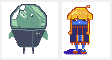 Since I wasn't too confident, I wanted to start with something really small. The colour difference between my monitor and my Cintiq kinda bit me in the leg here, especially on the blue/orange one. These were done on a 64x64 canvas, with GraphicsGale, but I also tried a 128x128 one, with some dithering tentatively thrown in: 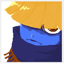 After this brief experience, I must admit, I had a lot of fun doing these. Particularly fun were the limitations, which provided a nice challenge, and just how different it is from painting. The careful crafting and tweaking of a small picture, and the thought you sometimes had to put in just to find a right place for a single pixel was a refreshing change from the broad sweeps and fast strokes of painting. So thanks thread, for exposing me to something new and fun.
|
|
#
?
May 1, 2013 10:09
|
|

|
Make more portraits like this! Fresh.
|
|
#
?
May 3, 2013 03:49
|
|
|
I'm doing a pixel art project for college and I'd really appreciate it if I could get any feedback. It's the first time I've ever done it so its a bit basic, I'd be really grateful for any suggestions at all or any mistakes I've made. For the project I've designed a company and logo and stuff, and have to design 3 posters (Nike, Mcdonalds and Dr Pepper), this is the Nike one so far minus the logo and tagline: http://25.media.tumblr.com/c785bc79bd8b09397e62f46f194938ec/tumblr_mm6a7qoSgM1soqj89o1_1280.png
|
|
#
?
May 3, 2013 14:41
|
|
|
Scut posted:Make more portraits like this! Fresh. Thanks man, I'll see if I can whip something up. I'll definitely be doing more of pixel art, this stuff is pretty fun. Doakes posted:I'm doing a pixel art project for college and I'd really appreciate it if I could get any feedback. It's the first time I've ever done it so its a bit basic, I'd be really grateful for any suggestions at all or any mistakes I've made. Looks pretty nice, one thing that kinda irks my eye is that the character is drawn as if viewed directly from the side, but the world is isometric, they have two different perspectives, so to speak. Sorry if that made no sense. Also this is a purely a matter of personal taste, but have you tried coloured outlines? Like the outlines of the building could be a darker shade of their main colour. I think it might look a tad better, you seem to have done this with the water tanks on the rooftops, and I think it works. Good luck with the project regardless.
|
|
#
?
May 3, 2013 17:25
|
|
|
Doakes posted:I'm doing a pixel art project for college and I'd really appreciate it if I could get any feedback. It's the first time I've ever done it so its a bit basic, I'd be really grateful for any suggestions at all or any mistakes I've made. In addition to what Robobohobobahfiwgql said, a couple things stood out to me:  The orange shades used on the inside parts of this window are a little too subtle for my tastes. Compared to the yellow decor and the black outline they are almost invisible, at a glance making it look like the the outline just overshoots the window a bit. 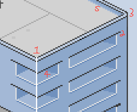 Couple things here, numbered for ease: 1.) Why does that white line continue up onto the edge of the wall? Over by 3, the top of the wall is a smooth surface. 2.) What's going on with the top edge of these windows/vents/whatever? It reaches over a little as though there's an overhang, but there's nothing else to imply that. 3.) This corner (as well as its brother on the other side) is very rounded compared to the other buildings. I think there's some tutorials out there on how to handle the corners in isometric tilesets if you need them, but in your case it will probably come down to moving a chunk of the building by 1px at most. 4.) What's happening with the inside of these holes? On the left side of the building it's a 90 degree turn inward, but on the right sides it's more of an 80 degree bend inward. 5.) Why the row of antialiasing here? To me, it makes the corner seem less sharp and almost rounded, which is strange given that none of the others are like that. 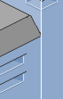 You probably don't want this white line. The two buildings are touching as if part of one structure, and that would be more clear if you just had that face of them merge into a single surface. If it's simply a seam between them, you probably don't want to use white pixels for it, since those have thus far been reserved for the lighting on corners. And you definitely don't want it to run over the corner of the roof like that if it's the building behind that roof! 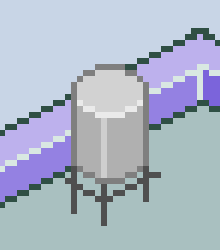 Lastly, this little thing kind of bothers me. It creates a sort of tangent where (at a glance) it can almost look like the horizontal bars on the base go under the wall, since they end at the same place. Its far right corner is also very pointy. Hope that helps some!
|
|
#
?
May 3, 2013 19:08
|
|
|
Kazerad posted:In addition to what Robobohobobahfiwgql said, a couple things stood out to me:  Thanks a lot for the the tips, its helped a lot, I've fixed the mistakes and changed the outline colors, and i'll probably move the little water tower thing over next. I'm not really sure why the overhang things look like they do to be honest, I based them on the windows on the middle building in this that have the same thing going on: 
|
|
#
?
May 6, 2013 10:17
|
|
|
Doakes posted:Thanks a lot for the the tips, its helped a lot, I've fixed the mistakes and changed the outline colors, and i'll probably move the little water tower thing over next. I'm not really sure why the overhang things look like they do to be honest, I based them on the windows on the middle building in this that have the same thing going on: You're welcome! Glad I could help. As for the overhang, if you look closely at the building in the second image, the windows there are actually inset a bit. The vertical interior of the space uses the same color as the face, but they do have a ledge underneath as well. 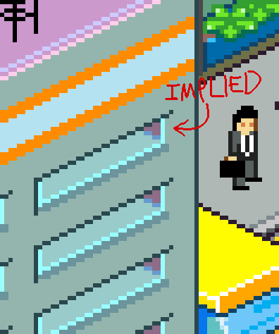
|
|
#
?
May 6, 2013 20:26
|
|
|
Edit: Nevermind. Found what I was looking for under a big panel.
DicktheCat fucked around with this message at 01:16 on May 7, 2013 |
|
#
?
May 6, 2013 21:46
|
|

|
Was fooling around with a few ideas and whipped this up tonight - Pretty well pleased with the results - I've got a decent system in place to quickly whip up basic environments and such. We'll see if I can turn this into something more interesting later. 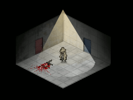 Scut posted:Looks interesting. Do you draw the room within that isometric perspective or is it a 3d model? Kinda hard to tell at such small scale. Actually it's faux-3D, I have a pixel wireframe box setup that I can create the basic shapes of the environment with, then I can stretch and distort existing textures straight down behind them to give them a 3D appearance. It's a quick way to make a pretty convincing 3D environment. McKilligan fucked around with this message at 04:54 on May 21, 2013 |
|
#
?
May 20, 2013 14:12
|
|

|
Looks interesting. Do you draw the room within that isometric perspective or is it a 3d model? Kinda hard to tell at such small scale.
|
|
#
?
May 20, 2013 15:54
|
|
|
Here's a little compilation of a bunch of assets i'm creating for the Space Station 13 remake. I know it's not traditional pixel art, but would appreciate any crits. I've been trying hard to keep the 'perspective' consistent and think overall I'm doing okay (although the airlock might need tweaking).
|
|
#
?
May 21, 2013 17:18
|
|
|
McKilligan posted:Was fooling around with a few ideas and whipped this up tonight - Pretty well pleased with the results - I've got a decent system in place to quickly whip up basic environments and such. We'll see if I can turn this into something more interesting later. Starring at it I think I can see what you mean, is there a good tutorial for isomorphicism like that or would it be possible for you to give an overview on how you did it step by step /w which programs? 
|
|
#
?
May 21, 2013 17:31
|
|

|
Supernorn posted:Here's a little compilation of a bunch of assets i'm creating for the Space Station 13 remake. I know it's not traditional pixel art, but would appreciate any crits. I've been trying hard to keep the 'perspective' consistent and think overall I'm doing okay (although the airlock might need tweaking). Yeah, the top of the door looks like it comes to the mid-depth of the walls, but the bottom of the door looks like it starts closer to the front of the walls, if I'm reading it right, because it's horizontally level with them. It's all very beautiful and detailed, though. I hope the character won't prove too difficult to animate. edit: The door could simply be taller than the walls, but with that oblique projection, there's no real way of telling. Maybe with a shadow or something, but I don't know, I'm bad at shadows. edit 2: Also, if the walls didn't touch the ceiling, there wouldn't be much point in an airlock, now, would there? So, scratch that idea. Zackarotto fucked around with this message at 19:30 on May 21, 2013 |
|
#
?
May 21, 2013 19:26
|
|
|
Supernorn posted:Here's a little compilation of a bunch of assets i'm creating for the Space Station 13 remake. I know it's not traditional pixel art, but would appreciate any crits. I've been trying hard to keep the 'perspective' consistent and think overall I'm doing okay (although the airlock might need tweaking). I feel like your player sprite needs a bit of an outline. Everything else has one, more or less, and he's kinda slipping into the background without one. Other than that, maybe a bit of gloss on the blood in the IV drip? And something feels off about the contrast in the sink but other than that this looks great. Please come back when you get to adding the butts and clown suits 
|
|
#
?
May 21, 2013 19:49
|
|

|
Raenir Salazar posted:Starring at it I think I can see what you mean, is there a good tutorial for isomorphicism like that or would it be possible for you to give an overview on how you did it step by step /w which programs?  By simple cutting and pasting these basic bits, I can create the framework for an environment, like so: I also lowered the opacity on the tiles so they didn't look so harsh.  Next, I just did a GIS for a cement texture - I'm pretty sure that this is the one I used - I don't have step by step pictures here, but it's very easy to do - All you do is scale the texture down to roughly the size you need on a new layer beneath your grid, then use the SHEAR tool to angle it along the surface of your plane. All of the textures, the walls and floor, are from the same texture, I simply adjust the brightness and contrast of each to make them distinct - making one wall darker, another lighter, etc. I also switched to a black background, just because. You can pretty much get any texture to fit your frame almost exactly just alternating between the SCALE and SHEAR tools, or simply cropping anything that goes over the edges when necessary.  From there, I did the exact same thing to get some doors - just GIS for door, scale it down, and shear it to fit the perspective. If you want one of the opposite wall, just copy and flip it horizontally, maybe change the hue, one red, one blue. I also added in the characters on a new layer.  Finally, on a final layer, I just use some gradients to add some shadow around the edges, and a yellow gradient in a cone shape to illuminate the room. Honestly the yellow lighting is kinda lovely, and if you were concerned with realism it could be done alot better, but it gets the point across.  You could do this with pretty much any kind of room, provided you can find appropriate textures. Of course, if you wanted to you could just whip them all up from scratch, but that's alot more time intensive. McKilligan fucked around with this message at 16:03 on May 22, 2013 |
|
#
?
May 22, 2013 15:59
|
|
|

|
| # ? May 10, 2024 00:52 |
|
|
Possibly interesting for pixel enthusiasts: I tried my hand at making something that kept to NES limitations for a jam over at Gamejolt. In all honesty I'm not 100% sure I managed to follow the restrictions because it's just a lot to keep track of (only so many sprites per scanline etc), but I tried! Game's here: Steel Novella 2083  There's honestly not much to the actual gameplay as it's extremely short and not challenging at all, but I'm pretty pleased with how it came out anyway. It also gained a ton of traction for some reason, I've seen it mentioned on indiegames.com, IndieStatik, and Newgrounds featured it like a second after I uploaded it. It's still under judgment and I think most of the comments are going to be "why the hell is this a featured game". I have no idea what they were thinking. I will say this though: It was a ton of fun keeping to NES restrictions and I feel like I learned from the experience, so I can definitely recommend people to give it a try!
|
|
#
?
May 22, 2013 16:13
|
|
