|
Last one for a bit I promise: Was out making night landscapes at 2:30am on cinco de mayo and one of these guys asked me for a photo, so I had them jump in a garden behind some floodlights and did a 4s exposure.
|
 #
?
May 8, 2013 07:24
#
?
May 8, 2013 07:24
|
|


|

|
| # ? May 29, 2024 12:57 |
|
|
Tested Sue Bryce's vflat/natural light approach... pretty neat ") 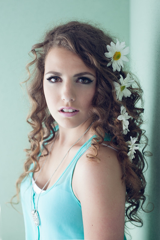 IMG_2352 by avoyer, on Flickr 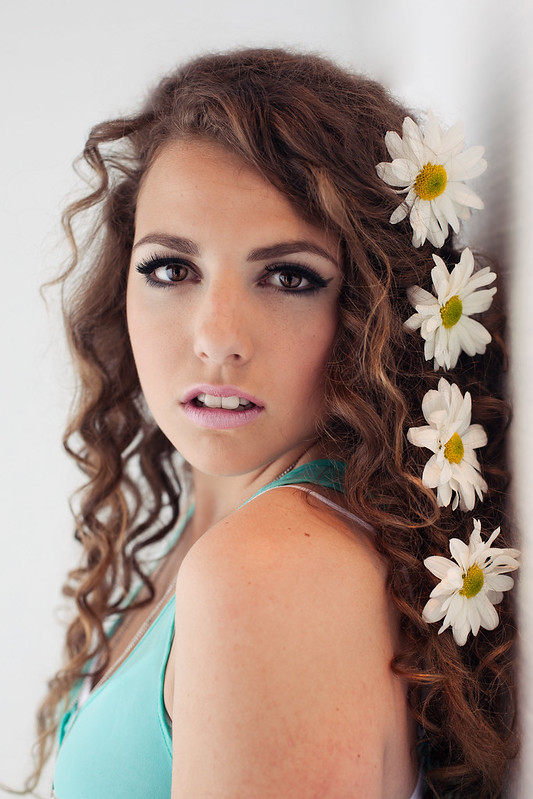 IMG_2306 by avoyer, on Flickr
|
|
#
?
May 13, 2013 04:14
|
|

|
If by nice you mean sickly, yes.
|
|
#
?
May 13, 2013 04:15
|
|
|
Reichstag posted:If by nice you mean sickly, yes. Sorry if I'm not edgy as you are. Seems we both enjoy doing what we do so that's all I care about
|
|
#
?
May 13, 2013 04:48
|
|
|
xenilk posted:Tested Sue Bryce's vflat/natural light approach... pretty neat I like the first one a lot more. I like how her body is open toward the camera. The white balance seems quite a bit different between the two pics, too.
|
|
#
?
May 13, 2013 05:36
|
|

|
 Untitled by Isaac Sachs, on Flickr xenilk posted:Tested Sue Bryce's vflat/natural light approach... pretty neat The first one would be a lot better if it were warmer. The second one unflatteringly emphasizes her arm and two front teeth. (Please also get your model to make a different facial expression - give her some direction other than "stare at the camera blankly.")
|
|
#
?
May 13, 2013 06:56
|
|

|
I don't know where it started or how it's become so widespread but I've never asked someone to model who hadn't seriously modeled before where they defaulted to anything but slack-jawed blank doe-eyed stare. That isn't attractive on anyone.
|
|
#
?
May 13, 2013 07:01
|
|


|
mr. mephistopheles posted:I don't know where it started or how it's become so widespread but I've never asked someone to model who hadn't seriously modeled before where they defaulted to anything but slack-jawed blank doe-eyed stare. That isn't attractive on anyone. Male gaze informs aesthetic, men desire compliant/submissive women etc etc etc I graduated from university and I can still barely pay rent.
|
|
#
?
May 13, 2013 13:26
|
|
|
Interesting discussion going on. On a personal perspective I always reset the smile at first (relaxed jaw) and work from there to get the person more comfortable and get to guide them to start using expressions after a bit. Those two pictures aren't representative of the whole shoot and she's by no mean a model, just a client who wanted a shoot. There are plenty of other pictures of her smiling/giving a bit of a smirk. I will try to shuffle my selection more when I post it here in the future.
|
|
#
?
May 13, 2013 14:34
|
|
|
MrBlandAverage posted:The second one unflatteringly emphasizes her arm and two front teeth. I wanted to shoot a lady who complained that her nose was too big and that was the entire reason I wanted to shoot her. In a world of average noses and normal teeth, I like what's different.
|
|
#
?
May 13, 2013 15:05
|
|
|
mouth slightly open is a great direction to give because it is an easy way to stop a model from having a tight jaw and lips.
|
|
#
?
May 13, 2013 16:36
|
|

|
Retail photography ain't that bad  . I dare you to try to get that many people/kids all looking at the camera without blinking and for the most part, all smiling (Toddlers hate photos). . I dare you to try to get that many people/kids all looking at the camera without blinking and for the most part, all smiling (Toddlers hate photos).
|
|
#
?
May 13, 2013 19:37
|
|
|
rcman50166 posted:Retail photography ain't that bad It looks like you need to add some fill light coming from camera left.
|
|
#
?
May 13, 2013 21:36
|
|

|
RangerScum posted:It looks like you need to add some fill light coming from camera left. It does need it. There actually isn't even a light there. I'm not sure who designed the studio but camera left has always been a little dark.
|
|
#
?
May 13, 2013 22:20
|
|
|
 DSCF2010.jpg by fuglsnef, on Flickr 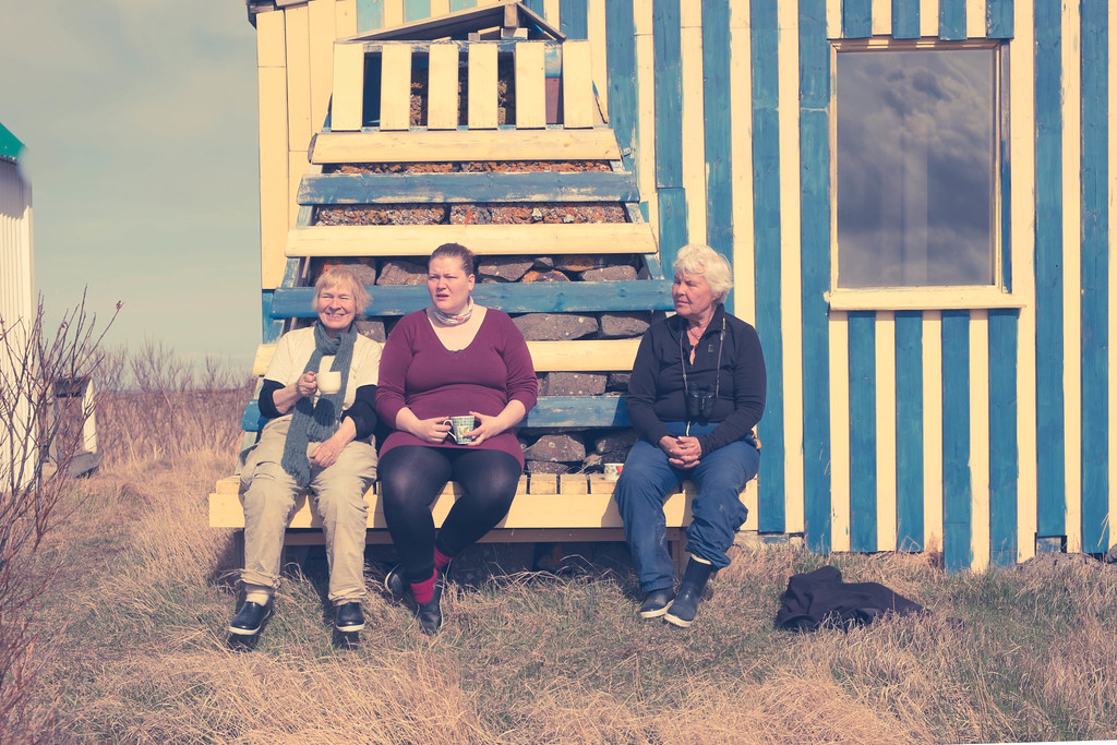 DSCF2033.jpg by fuglsnef, on Flickr
|
|
#
?
May 13, 2013 23:24
|
|
|
David Pratt posted:
You might want to check your monitor because it looks like I'm seeing this image through a clear pane of urine.
|
|
#
?
May 13, 2013 23:47
|
|

|
dukeku posted:You might want to check your monitor because it looks like I'm seeing this image through a clear pane of urine. The new Serrano.A filter from Lee isn't for everyone.
|
|
#
?
May 14, 2013 10:19
|
|


|
Man, posing is such a pain in the rear end. This is my first attempt at a senior portrait:     Stole the idea for the last one from the photo stitching posts. Don't kill me. Ugh the quality is a bit low, I think it got upscaled, stupid Facebook. Also, morning summer sun is kind of a bitch to deal with especially in the grass.
|
|
#
?
May 14, 2013 19:13
|
|

 Have you seen my apex seals? I seem to have lost them.

|
xenilk posted:Interesting discussion going on. On a personal perspective I always reset the smile at first (relaxed jaw) and work from there to get the person more comfortable and get to guide them to start using expressions after a bit. Those two pictures aren't representative of the whole shoot and she's by no mean a model, just a client who wanted a shoot. Why did you post less good shots from the set? I'm not a fan of the "she's not a model so she looks bad" line - I photograph a lot of people who aren't models and I (admittedly, certainly not always) get a natural expression out of them. That is part of portraiture. You can't just expect to shoot people who always know what to do in front of camera. You are good and you have exhibited good work here on several occasions before. This is nowhere near your best. Don't get lazy and don't throw up weak excuses. Put the effort in. Maybe I'm being too strong and you were putting this up purely for a lighting effect example, although I'm not sure what's distinctive about the lighting approach, either. rcman50166 posted:It does need it. There actually isn't even a light there. I'm not sure who designed the studio but camera left has always been a little dark. Are you saying you're not allowed to add fill? Good job on the eyes being open, though. I bloody HATE group shots. I should put myself on the block if I'm going to come posting with my grump on. Here are a couple of shots from a recent session.  
|
|
#
?
May 14, 2013 19:26
|
|

|
Gazmachine posted:Are you saying you're not allowed to add fill? Good job on the eyes being open, though. I bloody HATE group shots. Allowed implies there's something�anything�to put there for fill in the first place. Chain retail studios in the US are not what most photographers would call well-equipped. Or equipped, for that matter.
|
|
#
?
May 15, 2013 07:02
|
|

|
Gazmachine posted:I should put myself on the block if I'm going to come posting with my grump on. Here are a couple of shots from a recent session. First, I will say I can only speculate on what you were going for so I could be totally misreading these. These look really, really flat and washed out, which seems intentional but I can't figure out why. It kinda suits the first one because it's a really soft, demure pose, but the direct center composition of the second and her eyes being wide open staring at the viewer feels like the photo should have an intensity to it and the processing seems to be working in direct opposition to what the photo is conveying. The dead-on look with her hair covering one side of her face also makes her jaw look really blocky and asymmetrical compared to the nice curve it has in the first. Super nitpicky but you did a good job of softening her skin except for a small patch of make-up in the left corner of her mouth which could probably stand to be cleaned up to fit the overall photo better. I do like them generally, though, and the lighting is awesome. And I don't mean to offend your artistic sensibilities and I apologize if this is overstepping, but I did a quick photoshop to show you what I was trying to say so you can more easily determine for yourself if you think it would be an improvement or not. All I did was adjust curves and do a little dodging/burning and sharpening of the eyes. Her skin needs more cleaning up now, but I think it overall suits the "feel" of the photo more. It could just be we have different personal tastes and you hate my suggestion, though. 
|
|
#
?
May 15, 2013 08:22
|
|
|
While I do personally prefer the post-work in the second one am I crazy or does it make her jaw look larger on the right side to anyone but me? Is it alright for me to drop this here as a cross-post from photodump? The more I look at it the more I like it and want some feedback on it. I did some blemish touch-ups in Lightroom, along with bumping up the exposure and boosting the mid-tones which brought out the face. I upped the contrast a bit to make up for the enhanced exposure/mid-tones. I used the iris-enhancer and teethwhitener but tuned both those down to about 1/2 of what they are normally. I brought it into Photoshop and then ran it through Color Efex pro doing a touch of Procontrast and a Dynamic Skin Softener (enough to make the skin look better without taking away anything from major lines in the face because that just looks really odd/airbrushed to me).  IMG_6782 by Aidan R, on Flickr doctor 7 fucked around with this message at 17:49 on May 15, 2013 |
|
#
?
May 15, 2013 09:36
|
|


|
mr. mephistopheles posted:First, I will say I can only speculate on what you were going for so I could be totally misreading these. You're dead right on the jaw thing. It is mad uneven-looking. I was more uncertain of the second one and whether it was quite right: I did that thing where I convinced myself that the issues "weren't that bad" because I liked her expression so much. I feel like her eye looks kinda woozy, too. Processing-wise, I'm just doing this low contrast, washed out thing at the moment, just because I like it. Don't worry, I'm not so precious as to be offended by you having a go at re-processing my work. I would say, though, that (again I guess this is personal preference kicking in) I'm not keen on the alternate version. It looks way too harsh to my eyes. That's almost certainly because I'm more about the light touch and this whole "flat" aesthetic at the moment. I like the muted feel it gives. I'm trying to make it feel a bit ethereal and understated. I have no idea if I'm getting anywhere near that feel with these, but I don't want a "vibrant" look as such. I also should have masked out her skin to make the pores less visible, to be honest.
|
|
#
?
May 15, 2013 13:38
|
|
|
I prefer the low contrast version myself as well.
|
|
#
?
May 15, 2013 13:47
|
|
|
Fake Ken Rockwell posted:I prefer the low contrast version myself as well. Agreed - and my personal style is the super high-contrast thing. The original seems more... inviting. While the high-contrast version has more "impact" I can't say I enjoy looking at it more.
|
|
#
?
May 15, 2013 15:16
|
|

|
I think the low contrast version would be more interesting if the white background was white. When I see low contrast stuff where all the whites are a grey, it makes me assume that people just adjusted sliders without consideration for the whole image. Not saying that's what you did here.
|
|
#
?
May 15, 2013 16:15
|
|
|
Gazmachine posted:You're dead right on the jaw thing. It is mad uneven-looking. I was more uncertain of the second one and whether it was quite right: I did that thing where I convinced myself that the issues "weren't that bad" because I liked her expression so much. I feel like her eye looks kinda woozy, too. All good. Like I said, I assumed it was intentional, and I do agree it fits the first photo perfectly.
|
|
#
?
May 15, 2013 16:57
|
|
|
Gazmachine posted:Why did you post less good shots from the set? I'm not a fan of the "she's not a model so she looks bad" line - I photograph a lot of people who aren't models and I (admittedly, certainly not always) get a natural expression out of them. That is part of portraiture. You can't just expect to shoot people who always know what to do in front of camera. Out of curiosity did you try liquify to make her jaw less uneven? Personnaly I think it looks kind of cool but I'm guessing she might not buy/like the image if it's not fixed?
|
|
#
?
May 15, 2013 18:48
|
|
|
Nah. I don't like using liquify or anything like that. If it's not right, I just throw it out. This was reference stuff for some hair and make up students, but I love this model so I spent some time just trying other stuff out that wasn't just "turn this way, turn that way". The more I look at her jaw the more it looks like she's been hit with a really heavy left hook. there's stuff I like about it but I think I'm going to swap it out of my folio for something else. Can't unsee destroyed jaw. casa de mi padre posted:I think the low contrast version would be more interesting if the white background was white. When I see low contrast stuff where all the whites are a grey, it makes me assume that people just adjusted sliders without consideration for the whole image. Not saying that's what you did here. Heh, I actually altered the background to make it less white - I wanted a sort of overall tone and the background didn't please me when it was too white. I also loathe pure white and prefer "fashion grey", for want of a less insidious term. Gazmachine fucked around with this message at 21:54 on May 15, 2013 |
|
#
?
May 15, 2013 21:51
|
|
|
So last night there was this 'meet and greet' of local photographers. Really awesome concept. They hired a model and let like 20 of us take her picture all at the same time. I am BRAND new to photography, especially when it comes to models. I didn't pose her at all, some other people did and I just took shots where everybody else was taking shots. I'm going to post a few of what I took. Can anybody tell me what I'm 'looking for' in terms of composition as well as how I should be 'making these look great' color wise in Lightroom? God I need a photography lightroom tutorial or something for people. Everybody kept going on and on about color, but I have a feeling they were also going to mess with things after the fact. People kept making reference to the 'catch 10' or something like that. Referring to shadows going across her face. No idea FYI I know she isn't looking at me or modeling for me, there were 20 of us, so I just captured whatever I could.  IMG_6623.jpg by Shockwave, on Flickr  IMG_6659.jpg by Shockwave, on Flickr  IMG_6627.jpg by Shockwave, on Flickr Dr. Shockwave fucked around with this message at 04:13 on May 16, 2013 |
|
#
?
May 16, 2013 03:53
|
|

|
I think meet and greet can be fun at first to learn photography but you'll realize it's way easier to learn when you have a model all for yourself. That way you can learn from your mistake (and not someone else's) and not just try to snap a shot while everyone is going at it with this one girl. Also, that way you're sure to make the shot the way you'd originally wanted to. Oh and hopefully your meet and greets aren't like the ones here where it's just a bunch of old dudes snapping shots at young girls (that poo poo creep me out). As for a critique on your shots I'll go with the usual watch your horizon line (crooked horizon never really works well with a picture since that's not how you're used to see the horizon). Critique-wise here it is: - All three pictures: always try to have straight horizons - First picture: I think that's your strongest one, I might have went closer since there's a lot of space over her and it's not filled with anything. - Second picture: I like it technically but it would have been a much much stronger picture if it was taken from the front (but I understand there were probably tons of people right in front of her) - Third picture: looks about the same time of people who go to the meets and greet here! ha ha. Edit: Here are a few of mine I recently retouched.  IMG_2450 by avoyer, on Flickr  IMG_2425 by avoyer, on Flickr  IMG_2399 by avoyer, on Flickr xenilk fucked around with this message at 05:00 on May 16, 2013 |
|
#
?
May 16, 2013 04:55
|
|
|
xenilk posted:Oh and hopefully your meet and greets aren't like the ones here where it's just a bunch of old dudes snapping shots at young girls (that poo poo creep me out). A "meet and greet" is much more useful if it's actually a group class where everyone gets feedback and is given their own time to get good shots. 10 guys huddled around a frail-looking young woman makes me feel like I'm in a strip club. xenilk posted:
|
|
#
?
May 16, 2013 05:23
|
|
|
I've decided to start cold requesting portraits from people on the street. This is WAY out of my comfort zone, but hopefully I'll end up with something cool. IMG_5723 by philip painter, on Flickr  IMG_5724 by philip painter, on Flickr And one of my youngest son.  IMG_5730 by philip painter, on Flickr
|
|
#
?
May 17, 2013 00:30
|
|

|
 DSC03447 by LargeHadron, on Flickr  DSC03476 by LargeHadron, on Flickr  DSC03461 by LargeHadron, on Flickr  DSC03486 by LargeHadron, on Flickr Same poo poo different day. But I did try to be more colorful this time.
|
|
#
?
May 18, 2013 06:47
|
|

|
LargeHadron posted:
She has a prominent forehead, so shots from above are a bad idea. Also, I think she'd benefit from tilting her head a bit.
|
|
#
?
May 18, 2013 10:13
|
|

|
LargeHadron posted:
These are solid, in addition to the above post, she needs her face framed by her hair, she doesn't have the jawline for hair totally over one shoulder. (or a darker background, but I like your background) These are not my best work but I'm trying to teach myself to use direct and mottled light more. It involves alot of post work and isn't as flattering as an overcast day or diffused sun/strobes but I like it.  Today I had a pick-up day on a little student docu-drama I�d been helping out on about renaissance/medieval fairs. Since it was only three hours shooting I had a little time to go explore; This is the blacksmith, a man about six foot tall of moderate but muscular build. The light outside his little hut was lovely and mottled so I asked for his photo, despite bending white hot metal like it was nothing he was not particularly comfortable in front of the camera, and I regret not getting a better shot of his eyes nor his burnt and calloused hands. I should have got him to look up to really bring out the eyes. The necklace he wears is twisted from two pieces of iron, a skill that his apprentices used for fashioning love hearts to give to the girls in the crowd.  And a quick test with a friend at a local park, not 100% on her posing, already noted that her right eye should be framed by the face to not appear googl-y. Bit of a shame, she's an ex-model and therefore quite easy to work with. XTimmy fucked around with this message at 10:52 on May 18, 2013 |
|
#
?
May 18, 2013 10:46
|
|
|
Missed focus, but she's a spaz. IMG_5757 by philip painter, on Flickr
|
|
#
?
May 19, 2013 01:25
|
|
|

|
|
#
?
May 19, 2013 15:53
|
|

|
I like.  
365 Nog Hogger fucked around with this message at 02:16 on May 20, 2013 |
|
#
?
May 20, 2013 02:13
|
|
|

|
| # ? May 29, 2024 12:57 |
|
|
I really like the texture of these. It has a slightly late-sixties thing going on, to my mind. Content: This guy plays in the local Powerchair Football League. He's a top bloke, loves his football. He normally hates having his photo taken as he's not always in full control of his muscles and thus can have some awkward facial expressions. I took a different approach, sitting and joking with him for a while and, when he looked away for a second, hit the button.  20130518-IMG_5865 by efcso1, on Flickr efcso fucked around with this message at 02:56 on May 20, 2013 |
|
#
?
May 20, 2013 02:37
|
|