


|
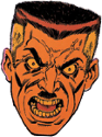
Alhazred posted:Yeah: Look at this wide range of variance! Remember, conventionally attractive is the only attractive acceptable in these funnybooks. Learn anything else and you might as well not wank at all to what you draw.
|
 #
?
Jun 2, 2013 12:52
#
?
Jun 2, 2013 12:52
|
|


|

|
| # ? May 12, 2024 20:41 |
|
|
Baron Bifford posted:This dude's art is terrible. The faces are obviously J. Scott Campbell-inspired. I've always had a soft spot for Campbell's art, despite all his obvious flaws, but this guy... not so much.
|
|
#
?
Jun 2, 2013 15:29
|
|
|
Isn't "Christopher Hart" one of those house names? The art in those drat things never looks the same between books.
|
|
#
?
Jun 2, 2013 18:44
|
|

|
I honestly don't think that art is that bad. A bit generic, but really, it's still better than some of the junk that gets printed.
|
|
#
?
Jun 2, 2013 19:49
|
|
|
Heresiarch posted:Isn't "Christopher Hart" one of those house names? The art in those drat things never looks the same between books. As far as I can tell, the only art he's ever published has been in his own how-to books. I dunno what motivates people to buy them really.
|
|
#
?
Jun 2, 2013 21:56
|
|

|
Christopher heart is only scratching the surface of children's drawing book hackery.
|
|
#
?
Jun 3, 2013 05:04
|
|

|
Oh my god there is actually a "Draw Furries" book. 
|
|
#
?
Jun 3, 2013 05:37
|
|

|
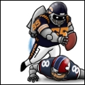
^Yeah, that looks about identical to the book section of my local Michael's. Speaking of Chris Hart, can you spot what's wrong in these pictures?   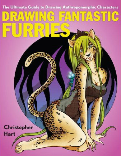 I personally think "hack" is a polite understatement.
|
|
#
?
Jun 3, 2013 05:50
|
|
|
I feel so unclean.
|
|
#
?
Jun 3, 2013 05:58
|
|


|
EgoEgress posted:^Yeah, that looks about identical to the book section of my local Michael's. Ah yes, the Pectoralis Boobis muscle group.
|
|
#
?
Jun 3, 2013 06:06
|
|


|
Draw Shojo Girls? Draw Girl Girls? That doesn't seem all that helpful.
|
|
#
?
Jun 3, 2013 06:13
|
|

|
EgoEgress posted:^Yeah, that looks about identical to the book section of my local Michael's. 1 - yes the boob is probably not normally made of solid bands of muscle although to be honest I have never cut one open to check. 2 - Mommy why is the wolf's foot on backwards? That looks so obviously lovely I dunno what would prompt him to draw that so wrong TWICE, intentionally. The rest of it, whatever style I dunno but what the gently caress is with the backwards foot? 3 - Apparently she is like a hyena furry because her back legs are about a foot and a half too short (even accounting for perspective they look way too short). Since she's got her arms going straight down, evidently her knees are directly under them, so umm  e: Really even his manga drawings are pretty terrible and lowest-common-denominator but I guess he knows who is buying his books. Flesh Forge fucked around with this message at 06:55 on Jun 3, 2013 |
|
#
?
Jun 3, 2013 06:52
|
|
|
Flesh Forge posted:1 - yes the boob is probably not normally made of solid bands of muscle although to be honest I have never cut one open to check.
|
|
#
?
Jun 3, 2013 12:05
|
|


|
I don't know if is Bane or the perspective what's hosed up  Shame, I like Guillem March's work
|
|
#
?
Jun 3, 2013 17:12
|
|

|
Flesh Forge posted:1 - yes the boob is probably not normally made of solid bands of muscle although to be honest I have never cut one open to check.
|
|
#
?
Jun 3, 2013 18:05
|
|

|
Dark_Tzitzimine posted:I don't know if is Bane or the perspective what's hosed up Both probably-it looks like he's controlling those wires ala Doctor Octopus.
|
|
#
?
Jun 3, 2013 18:35
|
|
|
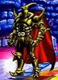
That Bane is pretty sweet and stylish. This thread gets weirdly nitpicky sometimes.
|
|
#
?
Jun 3, 2013 19:14
|
|

|
I think you can make an exception for overly muscular 90's-like imagery when it comes to Bane because he's supposed to look ridiculous, right?
|
|
#
?
Jun 3, 2013 19:50
|
|


|
It's also supposed to be one of those 3D covers from Villains Month which is why the perspective looks off.
|
|
#
?
Jun 3, 2013 20:47
|
|
|
Humboldt squid posted:Christopher heart is only scratching the surface of children's drawing book hackery. All of the anime ones are terrible, but the one in the upper right is hilariously bad.
|
|
#
?
Jun 3, 2013 22:56
|
|

|
EgoEgress posted:^Yeah, that looks about identical to the book section of my local Michael's. Cool Christopher Hart fact: "Hart has had the top selling art book in the United States for over a year, continuously ("Manga Mania," published by Random House. In addition, he has had the top 1, 2 and 3 art books in the country, simultaneously (Manga Mania, Anime Mania, and Drawing Cutting Edge Comics, published by Random House). His most recent series on drawing manga, "Manga for the Beginner," appeared on Bookscan's Top 50 list in the Art Category for two straight years; in addition, every title in the 4-book series has appeared on Bookscan's top 50 list, with three of them having appeared simultaneously."
|
|
#
?
Jun 4, 2013 00:52
|
|

|
GorfZaplen posted:All of the anime ones are terrible, but the one in the upper right is hilariously bad.
|
|
#
?
Jun 4, 2013 02:47
|
|

|
7744 posted:It's also supposed to be one of those 3D covers from Villains Month which is why the perspective looks off. Does that explain the computer-generated blur on the cables? Because that looks awful and hurts my eyes.
|
|
#
?
Jun 4, 2013 03:19
|
|
Baron Bifford posted:Since no woman can jiggle her boobs without moving the rest of her body, I'd say you're correct. That's not strictly true it just requires really strong pecs.
|
|
|
#
?
Jun 4, 2013 09:24
|
|

|
EvilMuppet posted:That's not strictly true it just requires really strong pecs. 
|
|
#
?
Jun 4, 2013 14:09
|
|
|
I can decide if I like or dislike the cover for the next issue of The Walking Dead: On the one hand, Neegan's face seems a little off from how he's usually drawn, but on the other hand, it goes give off a nice sense of the menace and  "What has he done?!" that defines the character. "What has he done?!" that defines the character.I'm on the fence about this one.
|
|
#
?
Jun 5, 2013 01:45
|
|
|
Mister Roboto posted:I honestly don't think that art is that bad. A bit generic, but really, it's still better than some of the junk that gets printed. Right but it's the "all women have to be hot and thin" dictum that people were objecting to. OldMemes posted:
The pencils and inks are killer, that spooky leer alone is doing as much for it as the blood and the knife. There's a really prominent coloring fuckup on the nose though  and the blood looks flat and computery in general. Probably cause it just slightly shifts value with the face and jacket? If it were bolder it would read as graphic but with the photoshoppy transparency & gradient effects it just reads as failed realism to me. and the blood looks flat and computery in general. Probably cause it just slightly shifts value with the face and jacket? If it were bolder it would read as graphic but with the photoshoppy transparency & gradient effects it just reads as failed realism to me.
|
|
#
?
Jun 5, 2013 04:01
|
|
|
Have I mentioned how much I love Francisco Francavilla? (click to fullsize)
|
|
#
?
Jun 5, 2013 07:56
|
|


|
I absolutely love Francavilla's art, but sometimes I wish someone would explain the full breadth of the color wheel to him.
|
|
#
?
Jun 5, 2013 15:01
|
|

|
  Ramon Villalobos I like to imagine Thor's bro-ness is what made Loki hate him.
|
|
#
?
Jun 6, 2013 03:56
|
|
|
I thought Thor had stuffed his head down his socks at first. VVV Loki's head is laying across Thor's upper leg, his horns must be angled pretty flat to end up pointing where they are. It really does look like he's got Thor's leg for a head though. Bubble-T fucked around with this message at 05:14 on Jun 6, 2013 |
|
#
?
Jun 6, 2013 04:03
|
|
|
Those are really stylish and stuff but I cannot parse what is going on with Loki's head. I can see the horns, yeah, but Thor's manly, meaty thigh is where Loki's head is. Like, in the same place. Help.
|
|
#
?
Jun 6, 2013 04:41
|
|
|
leg bones posted:
His batman reminds me a lot of Rafael Grampa's. 
|
|
#
?
Jun 6, 2013 05:10
|
|


|
Flesh Forge posted:Those are really stylish and stuff but I cannot parse what is going on with Loki's head. I can see the horns, yeah, but Thor's manly, meaty thigh is where Loki's head is. Like, in the same place. Help. I'm thinking he's using his thigh to push Loki's head forward.
|
|
#
?
Jun 6, 2013 05:27
|
|


|
whoa, rafael grampa is pretty awesome.   bonus batman: year 100 by paul pope 
|
|
#
?
Jun 6, 2013 06:33
|
|
|
leg bones posted:whoa, rafael grampa is pretty awesome. If you've never checked it out, he did a short Wolverine story in Strange Tales 2 for Marvel.
|
|
#
?
Jun 6, 2013 14:46
|
|
|
More importantly, his book Mesmo Delivery is one of the most beautifully violent comics of recent memory.
|
|
#
?
Jun 6, 2013 16:05
|
|
|
I love how he draws costumes. Instead of custom-tailored skin-tight spandex, his heroes wear stuff that, you know, someone would wear. Especially that Daredevil one with the sweats and the training gloves.
|
|
#
?
Jun 7, 2013 08:33
|
|
|
Choco1980 posted:I love how he draws costumes. Instead of custom-tailored skin-tight spandex, his heroes wear stuff that, you know, someone would wear. Especially that Daredevil one with the sweats and the training gloves. The Wolverine costume in that sketch is far and away the best version I've seen. Dig that bare-knuckle Canadian luchador take. The cowboy boots with the raised heel are a nice nod to the character too.
|
|
#
?
Jun 7, 2013 14:38
|
|
|

|
| # ? May 12, 2024 20:41 |
|
|
Choco1980 posted:I love how he draws costumes. Instead of custom-tailored skin-tight spandex, his heroes wear stuff that, you know, someone would wear. Especially that Daredevil one with the sweats and the training gloves. The problem with that Daredevil is he looks like a tracing of an underwear model. Also Grampa wants to be Frank Quitely, which is not always a good thing.
|
|
#
?
Jun 7, 2013 17:59
|
|

