


|
HolySwissCheese posted:I'm still pretty new to photography, but one thing I am finding is I like overexposing the backgrounds on portraits. I think it makes it kind of dreamlike, and it emphasizes the subject. Here's an example. I know focus isn't perfect, but any other critiques?
|
 #
?
Jun 9, 2013 03:55
#
?
Jun 9, 2013 03:55
|
|


|

|
| # ? May 22, 2024 14:33 |
|
|
HolySwissCheese posted:I'm still pretty new to photography, but one thing I am finding is I like overexposing the backgrounds on portraits. I think it makes it kind of dreamlike, and it emphasizes the subject. Here's an example. I know focus isn't perfect, but any other critiques? When the photograph is that overexposed you are just losing detail in the white. It's honestly distracting more than anything and its straining to look at. I don't know what gear you are using but it looks like you had it set to a wider aperture, you should try metering your camera to a correct exposure. The bokeh in the background should create enough of a difference between the background and the subject without having the need to blow everything out completely white.  untitled (18_.jpg by Jake, on Flickr
|
|
#
?
Jun 9, 2013 08:43
|
|
|
HolySwissCheese posted:I'm still pretty new to photography, but one thing I am finding is I like overexposing the backgrounds on portraits. I think it makes it kind of dreamlike, and it emphasizes the subject. Here's an example. I know focus isn't perfect, but any other critiques? I think it looks like someone who over exposed the background because they didn't know how to use a camera. I am not saying you don't know how to use the camera, I am just saying this is what it reminds me of. I would suggest finding other ways to emphasize the subject, because overall this is pretty boring. Edit : Man you guys beat me to it in record speed ..
|
|
#
?
Jun 9, 2013 16:35
|
|
|
Huxley posted:That Metal Dude posted:
On to my stuff... I just got baby's first DSLR last week and have been playing with it quite a bit. I've been interested in photography for a while, but I'm still not entirely sure what makes a 'good' photograph. I've been reading up on it and I hope that helps me improve, but I also think some direct criticism will help a lot in giving me specific things to look for. I'm trying to pick my best stuff, but if they're just eye-burningly bad then feel free to ask me not to post anymore until I get better. 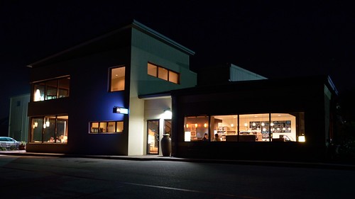 DSC_0057_01 by Samolety, on Flickr A local coffee shop that I frequent. I was trying to emphasize the contrast in the darkness/cold light outside and the bright, warm light inside. I think it turned out alright, but it really seems like it could have been better. I'm just not sure how.  _DSC0078 by Samolety, on Flickr The barista at the same coffee shop. Besides the disembodied hand from the guy across the counter, I really liked how this one turned out. I wish I had shot a little lower, but otherwise I kinda like it. Is there anything else I should have done differently? 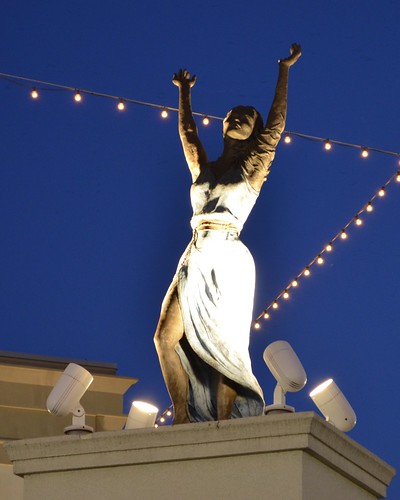 _DSC0217 by Samolety, on Flickr This one is a bit of a failure. It came out kinda blurry and it just didn't convey the feeling I got from the statue very well at all. I still posted it because I did really like the statue and I really wanted to get a good photo of it. I think the statue's pose combined well with the lighting to highlight a sort of "freedom" vibe. Besides holding the camera more still, is there something I could have done to help this one?
|
|
#
?
Jun 9, 2013 19:27
|
|


|
Samolety posted:
Consider that if you had held the camera lower, the heads of those dispensers in the foreground would have covered the barista's arm, and the machine on the left probably also some of his pouring-action. You'd have to be very careful to not obstruct the picture further, and while doing that you might have missed the shot. Taking all that into account, it's a pretty good shot. What might have been more interesting was if the customer (who I presume is the owner of the disembodied hand) was actually in the frame, but I still like the photo as it is.
|
|
#
?
Jun 9, 2013 19:39
|
|


|
The usual "I'm a newbie, so take that with a grain of salt" disclaimer.The Sheriff Jake posted:
Clich�, but nicely executed. I'd personally try to get less negative space on the right, but that's more of a personal preference. Samolety posted:
This is a solid shot. The car under the lights on the left is a little bit distracting. It's also crooked (look at the corner near the blue light, it's tilting to the right). If you're not completely happy with it, try shooting again messing with your angle... I think that going higher or lower could add to the image. Samolety posted:
I would probably shoot (or crop) a little bit closer so you don't have the corners of the building just by the border of the pic. Cloning out the light strings might do good also, in portraiture you don't want lines crossing the head of your subject (I know it's a statue, still think it should apply). Honestly I'd probably get closer and maybe lower and just try to get everything but the statue outside the picture, those lamps aren't exactly interesting either. I went on a two day hike on some train tracks... Tons of tunnels and the world's second highest train bridge on two beautiful days.  Sunset por primoitcho, no Flickr Cropped from 2:3, the lower part was just black nothing. Clich� but I like it.  V13 por primoitcho, no Flickr This thing is almost 150 meters high. I like how the colours turned out but i'm not exactly sure it works since the angle is a bit wonky.  Little Bridge por primoitcho, no Flickr Tried to go for a dark x light thing here, but i'm not sure it works. Maybe it needs more detail on the dark rock? I've already dodged it a bit (and burned the light rock, the contrast was too much). Primo Itch fucked around with this message at 21:44 on Jun 9, 2013 |
|
#
?
Jun 9, 2013 21:40
|
|
|
Samolety posted:
It looks like you've totally smashed the highlights in this one. Check your histogram, there will probably be a big spike on the right hand side. In digital photography it's wise to "expose to the left" - go for the brightest exposure you can without clipping your highlights. It's relatively easy (in RAW) to recover shadow details, but if your pixels are so bright they're > 1.0, there's no information left to recover.
|
|
#
?
Jun 10, 2013 16:07
|
|
|
Dren posted:I like this one the best of the photos you posted. It's well exposed, well lit, and you captured a nice smile. It's funny that the wide angle distortion makes the baby's hand look enormous. If that wasn't intentional, watch out for it. How did you do this? It looks cool and I'll like to try something like this too!
|
|
#
?
Jun 10, 2013 16:12
|
|


|
FistLips posted:How did you do this? It looks cool and I'll like to try something like this too! The short answer is to shoot a 360 panorama and stitch it as a stereographic projection, pitched 90 degrees. I used a panoramic tripod head but people say you can get it to work without one. There are tutorials available on the web: https://www.google.com/search?q=hugin+planet+tutorial&oq=hugin+planet and here are a smattering of other photos created using this technique: http://www.flickr.com/search/groups/?w=1007018%40N22&m=pool&q=planet
|
|
#
?
Jun 10, 2013 17:07
|
|

|
I've fallen in love and her name is Canon 70-200 f/4. Loved the colors in the sky and the lead in of the power lines. This lens just has a wonderful ability to compress .. finding many uses for it.  IMG_1095.jpg by jarredsutherland, on Flickr (USER WAS PUT ON PROBATION FOR THIS POST)
|
|
#
?
Jun 11, 2013 04:32
|
|
|
mAlfunkti0n posted:
I'm liking the colours a fair bit but they seem maybe a touch flat over all. Samolety posted:
Samolety posted:
These are just a couple playing with lighting at night  IMG_0695.jpg by drgarbanzo, on Flickr I like how this one turned out but I feel it may have been slightly over exposed perhaps.  IMG_0718.jpg by drgarbanzo, on Flickr I don't know if I entirely like this one as it seems to be missing something and I'm not sure what it is exactly.
|
|
#
?
Jun 11, 2013 06:49
|
|
|
Primo Itch posted:
I think the angle works. Between the silhouette and the storm clouds, there's already a forboding aspect going on, and the slightly off-axis angle works for that. It's not emphasizing the "massive 150 architectural achievement" aspect, but it works. Dr. Garbanzo posted:
The effect of the blinds on the light illuminating the tree is cool, but there's not much interaction between the two, or anything happening in the tree that needs illumination. If something was looking in, or there was something interesting on the right, it'd be a much more engaging image. Circumstance doesn't really lend itself to that, but them's the breaks. Let's non-standard crops and off-kilter angles! And then one more standard, but with awesome mutton chops.  IMG_8005 by fivre, on Flickr  IMG_7953 by fivre, on Flickr  IMG_7572 by fivre, on Flickr Edit: between new flickr, lightroom breaking, and drugs I may have not uploaded everything right. Forgive me. Qtotonibudinibudet fucked around with this message at 07:54 on Jun 11, 2013 |
|
#
?
Jun 11, 2013 07:47
|
|


|
Samolety posted:People talked about the babies a lot, but I really like the dog. Specifically, I think the perspective is working really well in this one. Being down there with the dog really seems to show "relaxed" and "lounging" better than other angles may have. Gonna critique this post because you have a big range of content and success in the execution in just three photos. The first is great. Lots of mood and very sharp with great tones. It looks like a great spot to hang. You could probably try boosting the shadows a bit to improve it, it's a little on the dark side. The second is just really flat in both composition and lighting. If you're going to do an environmental portrait, you need to show more. I think it would work a lot better with a wider angle. The lighting is also dull and the scene needs more contrast. The third is the worst, as the bottom of the statue is completely blown out, and the angle isn't showing it in an interesting way at all. Again, I think wider would have helped this shot, just to give it some context. These are the first two portraits from a new series I'm working on, a feature of local faces and micro interviews with them about who they are. I can't decide if I want to keep the composition really similar throughout (planning 100+ of these) or not. I like it but I would also like to branch out and add environmental portraits depending on the subject. I could post the stories with them, but I wanted feedback on the photos mostly.  Fraser by David Childers Photography, on Flickr  Madison by David Childers Photography, on Flickr
|
|
#
?
Jun 12, 2013 04:25
|
|

|
Primo Itch posted:
I personally would have moved a bit over to the left, cut the fourth pillar out and centered on the group of three. I posted these in the landscape thread, but I'll post them here too. 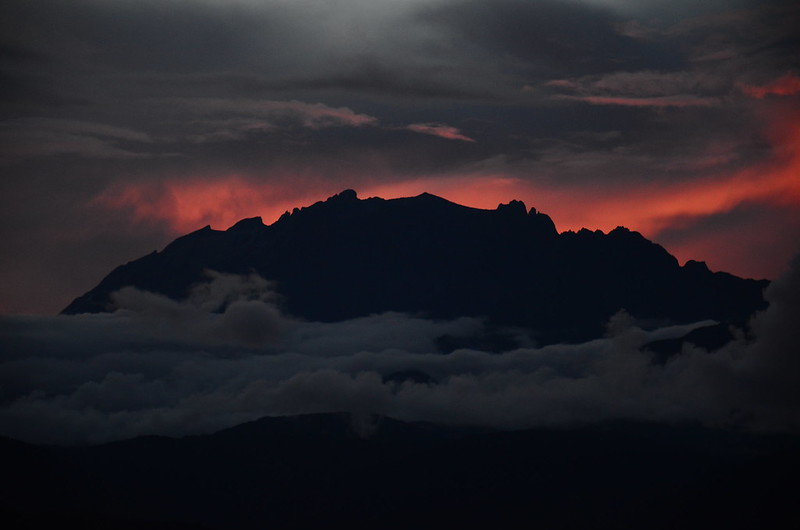 Mt. Kinabalu by Trips in the Rockies, on Flickr This was from a recent visit to the Malaysian Borneo highlands. Right off the camera, no post-processing. I really like how it turned out, but I have Mother Nature to thank for that. I don't think I want to change anything.  Sabah Sunset by Trips in the Rockies, on Flickr Same night, same location, same story. I'd like to bring out the oranges more, but not the blues. They're strong enough I think.
|
|
#
?
Jun 12, 2013 11:31
|
|


|
Samolety posted:
I'm really digging this one. For some reason it makes me think of the nighthawk painting. The colors and the mood is really great. You worked the extremely contrasted lighting well. It's really easy to mess up a shot like that. Great composition too, overall a shot I really enjoy looking at. fivre posted:
I think the angle works really well for a concert, it adds a lot of energy to the shots. The processing is nice and "rough" which once again works for the type of concert this seems to be. It's too bad that we don't see his face at all though, but it's not a huge problem either. Concert shooting is always really fun and challenging, I think you did well in those 3 shots. -- First time shooting a newborn, I don't think those are super popular here but whatever. It didn't want to sleep and liked to cry but I had fun anyway! Wouldn't want to do this every week though, it seems like it's really hard to be original with those.  IMG_2917 by king colliwog, on Flickr  IMG_2914 by king colliwog, on Flickr  IMG_2905 by king colliwog, on Flickr
|
|
#
?
Jun 13, 2013 00:38
|
|

|
Picnic Princess posted:I personally would have moved a bit over to the left, cut the fourth pillar out and centered on the group of three. I really enjoy the first one. Reminds me of Lord of the Rings. I agree: change nothing. The second I like as well, but part of me thinks the top could be cropped some more, but the dark hills and trees at the bottom provide a good sense of scale and distance to the landscape with the higher clouds. I, too, would like to see more orange hues. How would you bring out the orange some more without underexposing the lighter blues?  Alley To Liberty (Color). by ryantss, on Flickr I shot this in black and white and I like that too (also up on my Flickr), but I like this color shot more because it brings more life to an otherwise quiet alley. I spend a lot of time after work walking around my neighborhood district. Plenty of alleys with interesting sights and empty streets. It's odd living in a major metro area that doesn't seem to have the life it once did back in the heyday of mobsters and jazz music (Kansas City, for the curious).  222. by ryantss, on Flickr The city is trying to breathe life back into itself, especially with the addition of the Kaufmann Center for Performing Arts where the garage scene was shot, though there's a bit more of a ways to go as you can tell by the emptiness. Edit: I hope you all don't mind, but I forgot to post this one (ruined by the bird, if you can spot it.)  WA. by ryantss, on Flickr tau fucked around with this message at 00:52 on Jun 13, 2013 |
|
#
?
Jun 13, 2013 00:43
|
|

|
tau posted:
I really Like the parallel lines in this one.. Almost everything is so square\rectangular.. it also reminds me of a Tony Hawk game for some reason. I managed to snap this while my wife and son were playing with a tent caterpillar.  IMG_8127 by bighoits, on Flickr
|
|
#
?
Jun 13, 2013 16:22
|
|
|
tau posted:
It might just be me, but I can't help but feel that both of these would benefit from a tiny bit more space on the top?  AJK_1508-Edit-2.jpg by SAFistLips, on Flickr I'm kinda happy with this one, but I'm not sure I've gone too far with the post-processing? Edit: rotated it a bit. I think it looks better. FistLips fucked around with this message at 20:04 on Jun 14, 2013 |
|
#
?
Jun 13, 2013 19:07
|
|
|
KingColliwog posted:First time shooting a newborn, I don't think those are super popular here but whatever. It didn't want to sleep and liked to cry but I had fun anyway! Wouldn't want to do this every week though, it seems like it's really hard to be original with those. I like the first two. The first is a little strange, not not bad. The second just shows off the kid well, I think. Maybe try rotating it to portrait orientation, if I was handed a print of it I think that's how I'd view it. The third, however, is not good. While I wouldn't call it "dead baby syndrome", it does seem to have some level of "suffering baby syndrome". The kid's face is rather twisted, and combining that with what could look like a rash on the chest, I don't think it's flattering.
|
|
#
?
Jun 13, 2013 19:51
|
|
|
Beaver Fever posted:I took several shots of this dog on the porch, this one I ended up liking the best. I'd like to see more of the surround around the dog and also the top of the door just so it composes nicely and is naturally framed by the scene - It looks a bit cropped at present but I like everything else, moody colour, lighting is right and the dog looks cosy ") Here's some Urbex. 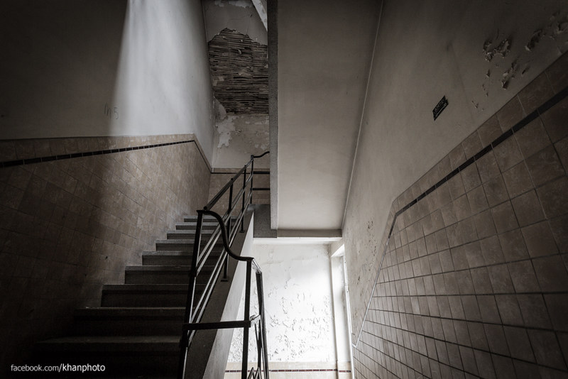 Un-Symmetry by Robbie Khan, on Flickr 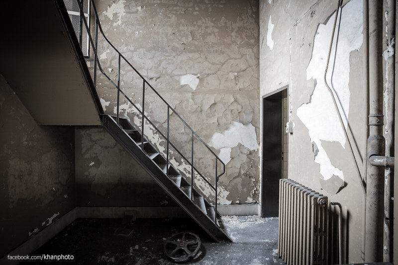 Theatre Staircase by Robbie Khan, on Flickr 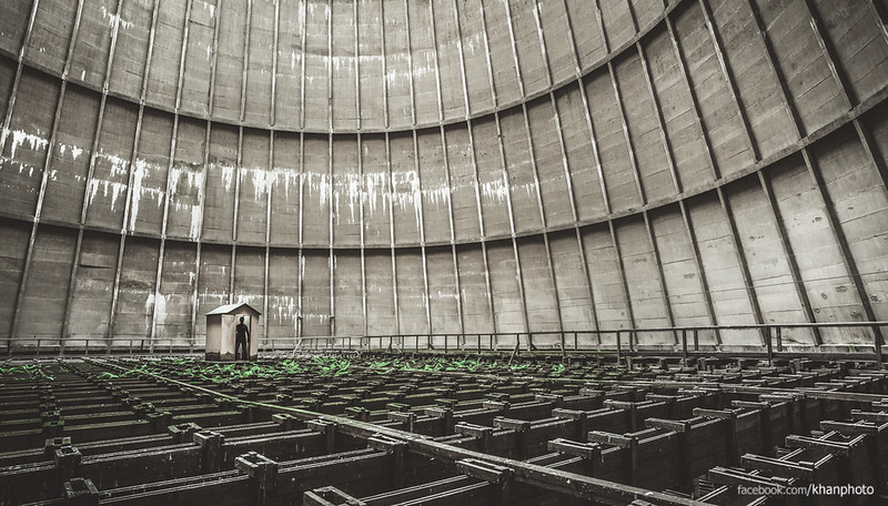 Shed of the week - Cooling Tower by Robbie Khan, on Flickr -
|
|
#
?
Jun 13, 2013 21:39
|
|


|
mrk posted:Here's some Urbex. All three of these are great. How are you doing your white balance, it's so clean and perfect. The first and third are better, the second is just a little too straight on. Actually, I think the second would be a lot better with a wider angle to accent the angles and lines. Two more portraits today, not crazy about the light in the first but it was the best available in his shop.  Patrick by David Childers Photography, on Flickr  August by David Childers Photography, on Flickr
|
|
#
?
Jun 14, 2013 02:04
|
|
|
Bottom Liner posted:All three of these are great. How are you doing your white balance, it's so clean and perfect. The first and third are better, the second is just a little too straight on. Actually, I think the second would be a lot better with a wider angle to accent the angles and lines. Bottom Liner posted:

|
|
#
?
Jun 14, 2013 02:37
|
|


|
It's a Will Ferrell cutout with a mustache taped to him  Thanks for the idea of vertical cropping, I'll give it a try.
|
|
#
?
Jun 14, 2013 02:56
|
|
|
FistLips posted:
It looks a bit skewed to me as well for some reason. Try adjusting it back a bit so your eye thinks it's fine and see how they compare? Content: A Butterfly I spotted whilst out taking photos of rocks... 
|
|
#
?
Jun 14, 2013 06:16
|
|

|
Bottom Liner posted:All three of these are great. How are you doing your white balance, it's so clean and perfect. The first and third are better, the second is just a little too straight on. Actually, I think the second would be a lot better with a wider angle to accent the angles and lines. White balance I leave to the camera (5D Mark 3) as I don't really have any problems with it on my lenses. If I do change it I change it in Lightroom later as I only shoot raw Unfortunately I could not get any wider as my widest lens is the 17-40L and that was at 17mm with perspective correction applied to fix the vertical distortion effect you get from ultra wide angle on full frame. Where the pipe meets the edge of the frame on the right is where that section of the frame ends so even if I have a wider lens you'd still only see as much as you do there. I'll keep hunting for similar stairways that are deeper though!
|
|
#
?
Jun 14, 2013 09:29
|
|
|
Picnic Princess posted:
I really like both of these. Echoing tau's sentiment of Lord of the Rings, the first thing I thought of when I saw the first one was Mordor. I then took the photo into PS and saw what it looked like with a 16:9 crop, and I liked it. I proceeded to do the same with the second. The first has some really strong emotive tones, and its palate makes it easy to enjoy. The second is uplifting in a sublime way: the foreground clouds raising up and heading right is really charming. tau posted:
The geometry in 222 is really pleasing. Great leading lines and light. The bottom left's darkness lends a lot of heft to that part of the image, and it's probably the most obvious part to change, should you choose to entertain the idea of opening up those shadows. I keep trying to get into the dark Western Auto photo but can't. I'm not sure what you're trying to do with the underexposure, and that's disconcerting. (Content aware fill should handle that bird no problem.) mrk posted:
All three are really thoughtfully composed shots, but I had to pick out the third because it really stands out. It's very industrial and full of leading lines. It's surreal and feels like a screencap from a game. Great positioning on the shed. This would make an awesome background. 
|
|
#
?
Jun 16, 2013 01:58
|
|
|
wanghammer posted:
I would have panned this over to the right, so the butterfly is in the left of the frame. The light's pretty harsh, for close up bug photos it's sometimes good to use a flash to get more even light. If you're going for a purely documentary style, showing the event as it happened, then I guess you've nailed it I see you shot it around sunset, seems like a good idea since it's given you nice diffuse light. Can't really find anything to complain about on this one, sorry! DSCF2184.jpg by fuglsnef, on Flickr  DSCF2186.jpg by fuglsnef, on Flickr  DSCF2187.jpg by fuglsnef, on Flickr
|
|
#
?
Jun 16, 2013 03:11
|
|
|
I feel like aligning the top building's horizontal 'stripes' to the overall frame (in post with skew for example) would bring some squareness to it (like your first one there). Got to take the new camera out camping this weekend. Green:  Found some berries but they weren't ripe yet  
VelociBacon fucked around with this message at 06:40 on Jun 16, 2013 |
|
#
?
Jun 16, 2013 06:35
|
|

|
 Indefinite Detainees by torgeaux, on Flickr  The Guards Loom Ominous by torgeaux, on Flickr Defraction? At f/32? Nah. And, through an 8 stop ND filter.  Fastest Formation Run by torgeaux, on Flickr bonus whimsy:  Skullboy Pancake with Space Shuttle by torgeaux, on Flickr (USER WAS PUT ON PROBATION FOR THIS POST)
|
|
#
?
Jun 17, 2013 01:48
|
|

|
David Pratt posted:This is lovely, it tells a story about taking care of things, both insect and human :3 I love how the softness of the hands is contrasted with the sharp details of the bug. The central composition is okay, but have you tried a square crop on the left hand side? Thanks.. I only had a few seconds to get the impromptu shot but it worked out fairly well. I'm embarrassed to say that my 19 month old son accidentally squished the poor caterpillar a few moments after that. I took a look at a square crop and I feel like it removes a bit too much from the shot.. an 8x11 crop seems to remove a bit of the empty space on the right and makes the photo a bit more pleasing to the eye.  8x11 by bighoits, on Flickr
|
|
#
?
Jun 17, 2013 15:55
|
|
|
[quote="torgeaux" post="416564239"] Indefinite Detainees by torgeaux, on Flickr The Guards Loom Ominous by torgeaux, on Flickr [\quote] Of these two, I like the second one more. Getting closer really lends itself to a slightly ominous feeling (like the title says) you can almost hear them humming. The EXIF data shows you were shooting really wide, and it shows in the distortion. I'm not sure if it's a stylistic choice or not, but I think some correction would really help this photo. I also think it's too blue, but that also might be style. Overall though, I like it. It's got feeling and it's interesting to look at.  Farm by jpitha, on Flickr This is an old one I took to re-processing right from RAW to see if I could capture the scene better. I think it's better than it was and not too "Set sliders to ART"  Towards the Parliament Building by jpitha, on Flickr Distortion here, but I opted to leave it to try and make the buildings loom a little. I worry though that the fact that I should have taken like two steps to the left before I snapped the drat photo is overshadowing that.
|
|
#
?
Jun 17, 2013 18:35
|
|


|
I really like this one, I feel like they're ganging up on me. I know the other photo is closer so it feels more looming but I like the branch there, too, because makes them feel abandoned. All it needs is some empty beer cans. Had some time to kill earlier today, went to the park.  IMG_1579 by Middleshoes, on Flickr Toyed around in Lightroom which I'm still learning. I wanted to really bring out the rust and grime, the caboose has been there in the weather for ages. Took it in broad daylight which washed things out more, but I like shooting in RAW much more than Large. What do you guys think? What could/should I had done differently?
|
|
#
?
Jun 18, 2013 04:35
|
|
|
torgeaux posted:
drat, posted in wrong thread. Apologies. Appreciate the critique.
|
|
#
?
Jun 19, 2013 11:30
|
|
|
Just got back into photography after a four/five year hiatus. Street has always been my favorite. First shots in a long time yesterday -- here's one: Consumer by crashcart, on Flickr e: I think the subject was good, but it just feels like something is missing or just off contrast-wise, especially with where the woman is. I don't think it's bad, but there's something that just feels a bit off, and I don't know if there's something I should be doing post-processing in order to improve it. Count Freebasie fucked around with this message at 18:05 on Jun 19, 2013 |
|
#
?
Jun 19, 2013 14:28
|
|


|
Count Freebasie posted:Just got back into photography after a four/five year hiatus. Street has always been my favorite. First shots in a long time yesterday -- here's one: It's pretty hilarious seeing someone apologize for breaking a rule only to have the very next poster break the same rule.
|
|
#
?
Jun 19, 2013 14:49
|
|


|
Mr. Despair posted:It's pretty hilarious seeing someone apologize for breaking a rule only to have the very next poster break the same rule. Ah, Christ...I apologize. Let me edit my last post.
|
|
#
?
Jun 19, 2013 18:01
|
|
|
It's not required, but it's better if you critique someone else's work. No one is going to give you a hard time because you're inexperienced, we're all here to learn from each other.
|
|
#
?
Jun 19, 2013 21:47
|
|
|
Shampoo posted:
I don't have much to say about your first one, maybe there's a bit too much featureless sky. It feels like the focus should be on the farm houses in the centre, but right now they're almost drowning the the foreground field. The second feels way too green. Check your colour balance, it feels bad to me. If there had been some mist, the greenness might have given a sense of unhealthyness/smog, if that's what you were going for, but if not you should probably change that. I'm also not sure about the amount of sky you have included, the view very clearly is tilted upwards in what also seems a somewhat unnatural way. Lastly, watch your foreground objects. The traffic light and cars in the foreground don't particularly add to the scene. I'd like a bit of crit on my entry to this month's contest. One thing I've done here, which I usually don't (because I'm lazy) is manually burn in some areas. I also had a layer of dodging, but accidentally didn't include it in the exported output, only noticed a while afterwards, and frankly it might only have made it worse if I had included it. Anyway: First serious attempt at digital burn.  Rocky by jiifurusu, on Flickr
|
|
#
?
Jun 19, 2013 22:26
|
|
|
nielsm posted:I'd like a bit of crit on my entry to this month's contest. I'm pretty new to this, so if you want me to gently caress off with my criticism, feel free to let me know. The sky seems to be a little flat to me, especially since the colors of the trees and the water are so deep and rich. Not sure how you would (or if you would) want to address that (maybe a little more contrast with the clouds?), but it's just my $.02
|
|
#
?
Jun 20, 2013 00:55
|
|
|

|
| # ? May 22, 2024 14:33 |
|
|
Count Freebasie posted:I'm pretty new to this, so if you want me to gently caress off with my criticism, feel free to let me know. Telling someone to gently caress off because of criticism is a probatable offense, so critique all you want. It's a good way to improve!
|
|
#
?
Jun 20, 2013 01:46
|
|