


|
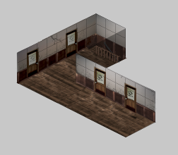
Not much of an update but here's some things i've done since then: Some attempts at bottles/potions and other stuff:  Another attempt at re-doing a previous picture i made:  An attempt at some strategy map thingy:  And finally some isometric buildings/flats:  I don't feel like i'm progressing much sadly.
|
 #
?
Jun 3, 2013 12:15
#
?
Jun 3, 2013 12:15
|
|


|

|
| # ? May 10, 2024 04:40 |
|
|
Chipp Zanuff posted:And finally some isometric buildings/flats: If they're lit from the left as their roofs suggest then the one on the right should look the same as the left one but with a shadow on the inner wall where the light is being blocked by the left building. That's also a thing to keep in mind with the bedroom picture - I'd think it would be lit from the one visible window, but the walls have the same amount of light on them and the furniture seem to be lit from the opposite wall, while the bed is probably lit from the lower left. The strategy map's a bit more abstract but most of the features are lit from the left, while their tiles don't have any corresponding shadows, except for the trees which are shadowed as if they were lit from above.
|
|
#
?
Jun 5, 2013 08:00
|
|

|
It's important to remember that isometric doesn't need to be all straight edges.
|
|
#
?
Jun 5, 2013 10:55
|
|

|
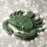
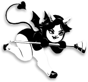
RedRupee posted:I did my first paid project ever and it was pretty fun. This is more or less the final result. I want to pet them.
|
|
#
?
Jun 7, 2013 04:31
|
|

|
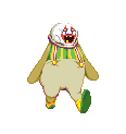
 Don't do that, they'll self destruct! Don't do that, they'll self destruct!Seriously though, those are adorable and I want one.
|
|
#
?
Jun 7, 2013 17:34
|
|

|
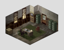  Another one similar to the last room I made - this time making a detective's office. I still need to add some more flavor stuff, but I'm really happy with the way this is turning out. Though, truthfully, would you call this pixel art or just really low-res art? I'm just nabbing most of the textures from elsewhere, then scaling/warping/recoloring them as needed rather than making everything from the ground up, but it's a huge timesaver. I add most of the little details in post as well, such as the cracks in the wall, the busted blinds, stuff like that. Making environments like this is alot of fun, I'm gonna keep at it. Edit - Now with Hallway! McKilligan fucked around with this message at 11:04 on Jun 8, 2013 |
|
#
?
Jun 8, 2013 08:04
|
|

|
McKilligan posted:
|
|
#
?
Jun 8, 2013 12:36
|
|
|
McKilligan posted:Though, truthfully, would you call this pixel art or just really low-res art? I believe it's been said in this thread that if the process is concerned with individual pixels, it's pixel art, whether those pixels are placed one-by-one like little Minecraft blocks, or placed rapidly, with tablet strokes. (edit: the OP says something sort of similar.) Your textures are not pixel art, but your added details would qualify. I'd call what you're doing "mixed media." But this is a discussion best left for the pedants who play your games. You just need to worry about whether it looks good, and it does.
|
|
#
?
Jun 8, 2013 12:44
|
|

|
MikeJF posted:It depends on the game and the filter. Advanced filters that perform some level of image analysis combined with cell shaded art can look quite good on an HD screen. Yoshi's Island can look fantastic. I think I actually prefer hq4x for character sprites out of those. Ours is good but it seems to mess up any kind of facial expression when the sprites are scaled up.
|
|
#
?
Jun 8, 2013 19:17
|
|

|
A little something I came up with and made in a couple minutes. I might do more with that sprite, it looks nice.
|
|
#
?
Jun 9, 2013 00:05
|
|

|
Looking for some feedback and tips. I'm building some simple enemies to test on Interstellaria this week, and I'm making an effort to try and make art that I'll actually use in the game later on. The setting is a outpost where the tenants are missing, the dogs have gone mad, and the robots are on red alert mode and attack everything rabid dog  spikey bot  Simple walker bot  simple shooter bot  **edit Sadly the smoke and effects are WHITE and don't show up well on the forums background...
|
|
#
?
Jun 10, 2013 08:37
|
|


|
Coldrice posted:Looking for some feedback and tips. I'm building some simple enemies to test on Interstellaria this week, and I'm making an effort to try and make art that I'll actually use in the game later on. The setting is a outpost where the tenants are missing, the dogs have gone mad, and the robots are on red alert mode and attack everything The dog is kinda looking stiff � it's mostly the ridgid torso. If you'd shift the back part a pixel or two at the right places, it'd create a much more fluid sense of motion. Here's a pretty decent video that shows the movement of a running dog. As for the walker robot, the legs are probably too smooth. The hard angles and solid shapes on the top half make the robot look ridgid, which is fine, but the legs are way too fluid. Also, the thigh should get shorter as he lifts his leg, because right now it looks like a) his leg is growing and b) he seems to be dragging his leg across the floor.
|
|
#
?
Jun 10, 2013 16:24
|
|
|
Coldrice posted:rabid dog Are they going to be scaled up? if so you could try something like using single pixels to make the fur on the dog's back stand up when it's idle. It looks too friendly when it's not frothing. I'm reinterpreting pokeymen from the... interesting... green sprites. Trying to keep similar to a similar pose, size etc.  
|
|
#
?
Jun 12, 2013 02:42
|
|
|
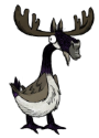
For a frog-bear with a flower on he back you've certainly made it more menacing.
|
|
#
?
Jun 12, 2013 14:36
|
|

|
Coldrice, I adore the stretched-out look of your robots! It makes me think of Swords and Sorcery! You've done a very good job getting across a lot of little details with minimalistic spritework. I would echo that the dog is a little stiff, and needs some squash 'n' stretch. It looks a little like you were too worried about staying on-model than the actual movement of his body. I know this is spritework, and not traditional animation, but I'd watch some videos of a dog in motion, and the difference between the walk and run cycle. If you can, find one you can download and look at in Quicktime, so you can go back and forth between frames, so you can see how the animal scrunches up its body. On the shooty-bot, his gun doesn't move with his body like his arm does. I don't know if this is on purpose (you know, because he'd be targeting things, and thus would have a system in place to keep his gun arm stable) or if you forgot. I really dig how their arms bounce, but stay stiff. Exclamation Marx- Your pokemon scare me. I like it. The bulbasaur makes me think of an old-style alien in the face. And here's my little run-cycle, finished:  Credit goes to Dewclaw for doing all the subtle shading and such. I'm just an animator. I'll have his shoot stuff and such in here later.
|
|
#
?
Jun 12, 2013 21:23
|
|
|
I love the rabid dog. It makes me laugh. It reminds me of skifree somehow.
|
|
#
?
Jun 12, 2013 21:59
|
|

|
DicktheCat posted:Coldrice, I adore the stretched-out look of your robots! It makes me think of Swords and Sorcery! You've done a very good job getting across a lot of little details with minimalistic spritework. Are you looking for work? I'm looking to hire a few fine men to animate some pre-existing sprites. They are somewhat complex. ") I'd have messaged you, but you don't have PM. :'( I'd have messaged you, but you don't have PM. :'(
Gaspy Conana fucked around with this message at 22:17 on Jun 12, 2013 |
|
#
?
Jun 12, 2013 22:14
|
|
|
DicktheCat posted:I want to pet them. Aw thanks guy. I've been doing sprites for some of the newer pokemon.   
|
|
#
?
Jun 12, 2013 22:44
|
|

|
Gaspy Conana posted:Are you looking for work? I'm looking to hire a few fine men to animate some pre-existing sprites. They are somewhat complex. If you're serious, the email I use for things on here (not the one I signed up with) is [email was here] I'm always lookin' for work! e: deleting email. DicktheCat fucked around with this message at 20:46 on Jun 13, 2013 |
|
#
?
Jun 12, 2013 23:14
|
|
|
What programs do people use for animation? I tried a few of the ones in the OP and they really blew! I've been using paint.net for pixel stuff and I really like it but it it pretty lousy at making animated gifs.
|
|
#
?
Jun 14, 2013 07:10
|
|
|
barge posted:What programs do people use for animation? I tried a few of the ones in the OP and they really blew! I've been using paint.net for pixel stuff and I really like it but it it pretty lousy at making animated gifs. GraphigsGale is good for animation, but it's like one of two features that's limited in the trial version.
|
|
#
?
Jun 14, 2013 08:37
|
|
|
Count Uvula posted:GraphigsGale is good for animation, but it's like one of two features that's limited in the trial version. As far as I know, the only animation limitation (or perhaps limitation at all) the free version has is that it can't save as Gif. If you want to save 20 dollars (or whatever 2000 yen is today) that badly, you can just export as an AVI and convert, or paste the frames into another program. I did that for more than a year before eventually realizing how exceedingly far I was going to save 20 dollars.
|
|
#
?
Jun 14, 2013 13:53
|
|
|
 I made a quick little tileset sorta thing for the hell of it today. It's my first foray into limited palette, which I have really enjoyed- I like the consistent look it gives. I still feel kinda iffy on some little things, like the column's shading, but whatever.
|
|
#
?
Jun 14, 2013 17:09
|
|
|
barge posted:What programs do people use for animation? I tried a few of the ones in the OP and they really blew! I've been using paint.net for pixel stuff and I really like it but it it pretty lousy at making animated gifs. Did you try Aseprite? It's in the OP, so you might have already, but once you actually learn it, and its shortcuts, it's actually quite good. I use it, and I've really enjoyed it, just as an animator. There are a few snags- like I don't quite like how you have to tab out to do much with its layers- but other wise, it's a very solid little program. It doesn't like tablets that much, but neither does GraphigsGale. I really, really like the program. It does everything I want, and for free. One of the best things I've found is that many of its shortcuts are analogous to Adobe products' shortcuts. It is also a very light program- it'll even run on my BF's dumb laptop!
|
|
#
?
Jun 14, 2013 17:26
|
|
|
DicktheCat posted:Did you try Aseprite? It's in the OP, so you might have already, but once you actually learn it, and its shortcuts, it's actually quite good. I use it, and I've really enjoyed it, just as an animator. There are a few snags- like I don't quite like how you have to tab out to do much with its layers- but other wise, it's a very solid little program. It doesn't like tablets that much, but neither does GraphigsGale. Seconding this! I almost typed the exact same post because I'm in love with the program. The upcoming updates are going to make it even better for animators.
|
|
#
?
Jun 14, 2013 17:43
|
|
|
 do it I am a bad animator but other than Aseprite, Grafx2 (free) and Graphics Gale (free trial, small cost) are supposedly good.
|
|
#
?
Jun 15, 2013 16:48
|
|
|
I've recently been trying to teach myself to do some simple pixel art and animations for my first attempt at making a game. The game part I'm comfortable with and that's all on track, but I have close to zero drawing experience. I am actually very pleased with the stuff I've produced so far as placeholder/prototype artwork for the game, but I'm also sure it is very bad in a broader context. Would it be bad form to post my crude beginner sprites and ask for feedback?
|
|
#
?
Jun 15, 2013 19:50
|
|
|
Seashell Salesman posted:I've recently been trying to teach myself to do some simple pixel art and animations for my first attempt at making a game. The game part I'm comfortable with and that's all on track, but I have close to zero drawing experience. I am actually very pleased with the stuff I've produced so far as placeholder/prototype artwork for the game, but I'm also sure it is very bad in a broader context. Would it be bad form to post my crude beginner sprites and ask for feedback? Heck no. Post dat ish.
|
|
#
?
Jun 15, 2013 20:23
|
|
|
Thanks for the go-ahead, then. I really think I need some feedback on how to improve since I'm not very tuned into art theory or workflows and I don't know anyone IRL to give guidance. These are all going to appear really tiny because the top-down game grid's cells are 24x24 (but when drawn are scaled up to 72x72). I wish I could figure out how to resize in BBCode but the examples I found online don't seem to work on SA.     Static placeholder graphic (using for anything that doesn't have a graphic):  Parry animation:  Swing animation:  Thrust animation:  I made all of them in GraphicsGale at 24x24 or 36x48 in 8-bit, with the default palette you get when you create a new image because I don't feel equipped to start planning the palette for the game and I wouldn't want to commit yet anyway. e: static sample of what scale things should look 
Seashell Salesman fucked around with this message at 21:25 on Jun 15, 2013 |
|
#
?
Jun 15, 2013 21:18
|
|
|
I love you, Seashell. I was having an argument with another person on SA about asking for critiques just a moment ago, and seeing you trying to get better at what you do makes me feel super better! I'd like to ask: what kind of animations style are you looking for? Like really old-school? You're doing the palette limitations, so are you following that style of animation?
|
|
#
?
Jun 16, 2013 01:43
|
|
|
DicktheCat posted:I love you, Seashell. I was having an argument with another person on SA about asking for critiques just a moment ago, and seeing you trying to get better at what you do makes me feel super better! Thanks. I hadn't given any thought to the style of animation at all yet. I have only really read about general western (American?) animation concepts so far and the stuff I consciously looked at for reference was Dennis Wedin's animations for Jacket in Hotline Miami, and the fighting game Darkstalkers. I'm not completely sure what it means for animations to authentically be old-school, do you have specific examples in mind?
|
|
#
?
Jun 16, 2013 02:30
|
|
|
Ah I gave aseprite another try and it actually seems pretty good, thanks! Seashell those look pretty good but an easy change would be to turn down the volume on that floor (maybe the contrast, saturation or tone could be tweaked) to make it not stand out so much. also exclamation marx that rules!!
|
|
#
?
Jun 16, 2013 03:29
|
|
|
soapydishwater posted:
For whatever reason I'm getting a serious Prince of Persia vibe off of this. I like it!
|
|
#
?
Jun 16, 2013 18:50
|
|


|
Seashell Salesman posted:Thanks. I hadn't given any thought to the style of animation at all yet. I have only really read about general western (American?) animation concepts so far and the stuff I consciously looked at for reference was Dennis Wedin's animations for Jacket in Hotline Miami, and the fighting game Darkstalkers. I'm not completely sure what it means for animations to authentically be old-school, do you have specific examples in mind? Ah, for old-school, I'm thinking old things like Legend of Zelda and DragonQuest, ect. But those have very simple "animations" I think DragonQuest's walk animation is like, what, two frames? Maybe three? Basically, I'm asking if you have a frame-limit in mind, and how close you are going to stick to the NES's limitations. Fighting games have really fluid, almost traditional-style animations, so it's a really different approach than a top-down style game. I think you'll be better served to continue to look at other top-down or even isometric style games for reference, if that's what you're going for. (Darkstalkers has some seriously good animation, though. If you just need ref for good stuff, that's certainly something to look at!) Sorry if that's a little obtuse or anything-I hope it helps. barge posted:Ah I gave aseprite another try and it actually seems pretty good, thanks! I'm so glad! It's such a good program. If you use adobe products, many of the shortcuts are the same, like "b" for brush and "g" for fill-in. One neat trick that doesn't seem obvious is using the + and - keys on your number pad to change the size of the tool you're using without opening the tools panel. I found that one out by accident!
|
|
#
?
Jun 16, 2013 22:43
|
|
|
DicktheCat posted:Ah, for old-school, I'm thinking old things like Legend of Zelda and DragonQuest, ect. But those have very simple "animations" I think DragonQuest's walk animation is like, what, two frames? Maybe three? That makes sense. In that case--- yes I do like the idea of limiting myself in the number of frames. Like with the palette and resolution I feel like it's safer to start with less and wait to ramp up the complexity. The ones I posted have 2 (parry, thrust) or 3 (swing) frames each, aside from a frame which is from the (currently static) idle sprite. The extra frame is just in there so that I could see how the animations flow in/out of the idle sprite. I remember the 2D Zelda games having super choppy animations, which maybe is sparser than I'd like but it's not a huge deal for me. I will have to go and look for top down games for NES or Mastersystem. A cursory search of some sprite rip sites didn't show many (there are a bunch of down-angled-but-not-isometric ones). If I am trying to maintain that more limited aesthetic do you have any advice on how I can improve them? e: the Link's Awakening sword swing animation is 3 frames, so I think I'm in the ballpark at least. Seashell Salesman fucked around with this message at 18:22 on Jun 18, 2013 |
|
#
?
Jun 16, 2013 23:33
|
|
|
Sure! An interesting way to make an animation look more interesting when you have limited frames is smearing. It is exactly what it sounds like, "smearing" the object to leave a motion trail, making it look like it has more motion than is really there. The Mega Man Zero series actually has really good examples of that, with Zero's sword, but I'm not sure about posting that here, as it's a side-scroller, and not what you're looking for. Oracle of Ages/Seasons has a decent example as well, and is probably more what you're looking for, being a top-down sort of game.  The little lines on his sword in places are examples of smearing. You'll have to play around with it to get the timing right, though. I do have to say that, if someone here who is more experienced with sprites says differently than I do, you'd probably be better served to listen to them. I'm a traditional animator, and messing with sprites is something I JUST got into recently. Though, I think knowing traditional animation things has made spriting much easier for me, so maybe that's something you'll want to look into as well.
|
|
#
?
Jun 18, 2013 22:44
|
|
|
The ones on that spritesheet are almost identical (or maybe are identical) to the ones in Link's Awakening. They definitely are similar to what I'm trying to do, and I've had a crack at replicating the smearing effect they used on the swing animation I posted before. I don't think I really like any of my attempts so far:    The main differences are obviously the shape and length of the arc.
|
|
#
?
Jun 19, 2013 04:12
|
|
|
Maybe something like this? I followed the full arc of the swing and tapered it a bit.
|
|
#
?
Jun 19, 2013 05:15
|
|

|
Clockwork Cupcake posted:Maybe something like this? I followed the full arc of the swing and tapered it a bit. I like this one much better than mine. Is it rude to ask if I can steal it?
|
|
#
?
Jun 19, 2013 06:45
|
|
|

|
| # ? May 10, 2024 04:40 |
|
|
Feel free!
|
|
#
?
Jun 19, 2013 08:55
|
|