

|
I think it looks good. I think the background is OOF enough that the creases aren't a big distraction too. 
|
 #
?
Jun 10, 2013 18:06
#
?
Jun 10, 2013 18:06
|
|


|

|
| # ? Jun 6, 2024 03:48 |
|
|
KingColliwog posted:I have a batch of photos that are technically similar (same lighting, same baby, same basket and blankets) to this (800x600 directly from RAW) : I don't know how accurate my phone screen is for colors, but it kind of looks like you changed him from baby pink to nauseous green.
|
|
#
?
Jun 10, 2013 18:32
|
|


|
voodoorootbeer posted:I don't know how accurate my phone screen is for colors, but it kind of looks like you changed him from baby pink to nauseous green. Looks pink on my laptop still.
|
|
#
?
Jun 10, 2013 19:27
|
|
|
voodoorootbeer posted:I don't know how accurate my phone screen is for colors, but it kind of looks like you changed him from baby pink to nauseous green. That's so weird, it does the same on my phone. It goes from nice and pink in the RAW file to very sickly green in the edited file. On my desktop computer it goes from gray-ish pink to warm-pink None of my screens are calibrated so how is it really? KingColliwog fucked around with this message at 19:54 on Jun 10, 2013 |
|
#
?
Jun 10, 2013 19:51
|
|

|
KingColliwog posted:That's so weird, it does the same on my phone. It goes from nice and pink to very sickly green. I'm just on my phone as well, I'll take a look on my desktop tonight, but definitely has the sickly green look to me right now.
|
|
#
?
Jun 10, 2013 19:53
|
|

|
Calibrated my monitor yesterday and neither looks green to me. That said I still like the cooler tone of the original over the edit.
|
|
#
?
Jun 10, 2013 19:57
|
|


|
CarrotFlowers posted:I'm just on my phone as well, I'll take a look on my desktop tonight, but definitely has the sickly green look to me right now. It would be great of you to do so. I just noticed that it also turns sickly-green in the thumbnails of a forum I go to (it'll make a small thumbnail of your picture to show next to the thread) but is the right color in the forum after. It's not the first time I notice this in those thumbnail either so I'd be happy to know it if my colors are hosed up on other's people computer. I guess I should calibrate my monitors  mr. mephistopheles posted:Calibrated my monitor yesterday and neither looks green to me. That said I still like the cooler tone of the original over the edit. Thanks for the opinion, I'll try a cooler version. I'm just used to warming up portraits but it might not be the best idea for newborns. \/\/ thanks, that's the kind of feedback I'm looking for. I never did babies before and I looked at the image too much and I don't know if things look off or not \/\/ KingColliwog fucked around with this message at 19:59 on Jun 10, 2013 |
|
#
?
Jun 10, 2013 19:57
|
|
|
KingColliwog posted:I have a batch of photos that are technically similar (same lighting, same baby, same basket and blankets) to this (800x600 directly from RAW) : Less skin smoothing. WAY less skin smoothing. Babies are meant to be a bit wrinkly, that's getting uncanny valley. EDIT: Others noticed the green tint. For what it's worth I'm on a calibrated monitor.
|
|
#
?
Jun 10, 2013 19:57
|
|

|
I see no green tint on my laptop, which I think has pretty good color. I've noticed stuff getting funky and green on my one monitor, I think it's just a hosed up monitor. Does anyone have info on what how to do monitor calibration correctly? I've tried downloading custom color profiles and dicking with settings on one of mine but all it does is gently caress the picture up worse. I did some reading on monitor calibration and it seems like the only way to really calibrate a monitor is to have a special monitor that does calibration.
|
|
#
?
Jun 10, 2013 20:21
|
|

|
Dren posted:I see no green tint on my laptop, which I think has pretty good color. I've noticed stuff getting funky and green on my one monitor, I think it's just a hosed up monitor. From what I've read, you really need to buy a calibrator to do any sort of real calibration. Stuff you'll find online will only help correct the big gently caress-ups, but if you really want to have accurate colors you need some piece of hardware that will physically read the colors your screen is putting out. -- Quick change on the picture, how does this compare?  etienne correction 1 by king colliwog, on Flickr I did a little bit of smoothing, played a little bit with the contrast and warmed the image slightly. So, aside from correction on the basket splinters and the lint on the babies hand, would this benefit from something? Does it look over processed? KingColliwog fucked around with this message at 20:27 on Jun 10, 2013 |
|
#
?
Jun 10, 2013 20:25
|
|
|
You have to have a calibration tool, like a Spyder. They're around a hundred bucks for the one-monitor edition.
|
|
#
?
Jun 10, 2013 20:25
|
|
|
KingColliwog posted:From what I've read, you really need to buy a calibrator to do any sort of real calibration. Stuff you'll find online will only help correct the big gently caress-ups, but if you really want to have accurate colors you need some piece of hardware that will physically read the colors your screen is putting out. No green tint anymore. Not sure what the difference is. Color spaces confuse me. To clarify, the first edit still looks green but the new one doesn't.
|
|
#
?
Jun 10, 2013 22:46
|
|
|
I just graduated, so I want to take this summer to figure this photography stuff out. I'm finally taking the plunge and posting here - do your worst, Dorkroom! For this shot, should I try and clone out the shadow on the sign, or is there any way I can "fill" it in with yellow, since it's mostly a uniform color?  Then there's this photo. I do wish all the stuff in the lower left wasn't there, I haven't played around with cloning it out yet, but I like the processing overall:  But I welcome any and all criticism, critique, and suggestions. I'm definitely still learning! Another question, though maybe this belongs in the portrait thread - what do you do about bloodshot eyes? I'm trying to improve through self-portraits but I have pretty dry eyes which means they're always slightly bloodshot and not bright white.
|
|
#
?
Jun 22, 2013 04:15
|
|

|
No, don't clone/fill. There's enough shadow around it that it would look really, really dumb. Beyond that, it's probably harder than you think since flat yellow will just look unnatural. It would be far easier to go back on another sunny day at a different time when there's no shadow.
|
|
#
?
Jun 22, 2013 04:24
|
|

|
Pianist On Strike posted:I just graduated, so I want to take this summer to figure this photography stuff out. I'm finally taking the plunge and posting here - do your worst, Dorkroom! 1. read understanding exposure if you haven't already 2. wait for the right light to take a picture if it's a scene you really care about, it'll do way more than anything you can do to "fix" it in post 3. take a poo poo load of pictures all the time so you can start to figure out when the light is "right" for what you want to do 4. buy an me super
|
|
#
?
Jun 22, 2013 04:48
|
|
|
Yep I'm reading Understanding Exposure currently. Right now, if there's something specific that I want to shoot I'll definitely plan it ahead of time, but I'm still doing a lot of "take camera everywhere, take pictures of all the cool things." I dunno, there isn't really a "newbie photography" thread other than the "my first DSLR" one, and that seems to be more asking what to buy, so I wasn't sure where to post this.
|
|
#
?
Jun 22, 2013 06:07
|
|
|
Post in Photo a Day. Carrying a camera everywhere is good but do consider that many times a shot is not the Ultimate Shot of Shots and that you can use a shot that is not perfect as a proof and go back to get it right another time.
|
|
#
?
Jun 22, 2013 07:22
|
|

|
Pianist On Strike posted:I just graduated, so I want to take this summer to figure this photography stuff out. I'm finally taking the plunge and posting here - do your worst, Dorkroom! It's okay to have shadows and peoples in your photographs. It makes them more interesting.
|
|
#
?
Jun 22, 2013 11:38
|
|

|
That restaurant picture is actually really cool. I guess the composition isn't totally orthodox, you might want to step backwards or zoom out a little bit, but the lighting is quite nice and you got a good moment with that woman walking by. It feels like your verticals aren't straight though, or maybe it's some lens distortion.
|
|
#
?
Jun 22, 2013 16:13
|
|

|
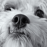
Those of you with the full Nik suite: I've been experimenting the last few weeks with using Silver Efex for color (after Viveza and sometimes even Color Efex Pro, and I've been pretty happy with the results. It's great for the sort of desaturated, high-texture look I generally like when I'm shooting dogs. Basically cover the full photo with control points and raise Selective Color up to maybe 40-60% or so. I love Silver's way of bringing out texture/detail, the color filter does great things with photos with well-defined foreground/backgrounds (like dogs on grass), and the finishing touches (cyanotype, coffee etc) can do some cool stuff with the highlights, kindof like setting a very slight Color Monochrome in Aperture. I suppose it can be kindof done in Color Efex using Bleach and Detail Extractor to an extent, but it just seems more fun to play around with this way.       (To be honest I wish I'd have brought out the brown in the last dogs' eyes a bit more. Sigh, destructive editing.) Anyway, posting mostly as an idea for folks, but I wouldn't mind some commentary and further ideas as to where to go with this.
|
|
#
?
Jun 23, 2013 21:11
|
|
|
 Just got the Lightroom trial today. Anything I hosed up at? Raw: 
|
|
#
?
Jun 24, 2013 05:23
|
|

|
Yeah, better beer -- Shock Top is pretty scrub tier. Pay no attention to the six-pack currently in my fridge
|
|
#
?
Jun 24, 2013 05:28
|
|
|
Hanging up the ol' camera. Fun while it lasted I guess.
|
|
#
?
Jun 24, 2013 05:36
|
|
|
More seriously though, that sky is like, really loving bright and just distracts from the subject in my opinion. Would a polarizer have been of any benefit, or moving the camera and using a reflector if you have one? There's a part of me that wants to convert it to black & white as I find white skies work better there but that may not be what you want. The odd vignetting in the upper right is off-putting as well.
|
|
#
?
Jun 24, 2013 05:50
|
|
|
Eegah posted:More seriously though, that sky is like, really loving bright and just distracts from the subject in my opinion. Would a polarizer have been of any benefit, or moving the camera and using a reflector if you have one? There's a part of me that wants to convert it to black & white as I find white skies work better there but that may not be what you want. Yeah I just noticed that upper right corner too. No reflector, but I am planning on getting one soon. I actually did just do this in black and white at first, but decided I might as well try to do it in color to see what I could come up with. EDIT: Just as a quick note, this wasn't a photo session... Just a quick candid shot. iSheep fucked around with this message at 06:07 on Jun 24, 2013 |
|
#
?
Jun 24, 2013 05:59
|
|
|
So, being the family member with the expensive looking camera, my younger sister asked if I would take her senior pictures. I think I actually got some nice shots, but there's one in particular that could do with some post. Hard to get an infocus shot of a person during a longer exposure, but I think it turned out well. But it seems like it could use a little pop. I did a B/W conversion and I think it looks nice, but I was wondering what sort of recommendations you guys would make. One thing that I'm considering is trying to get some color back into the blown out sky. Tools I have at my disposal, any thoughts on direction: Gimp, Photoshop CS2 Lightroom 4 Nik collection  
|
|
#
?
Jun 24, 2013 21:51
|
|

|
I think it's way too busy. The grass is contrasty and detailed all at the same time and it's just... really busy and distracting. The sky is blown. The waterfall is in a pretty prominent place, too (and not vertical) -- but you don't want to showcase a waterfall or nature, you want to showcase your sister, right? Does your sister have feet? Take a look at senior pictures online and try some more conventional shots, maybe, so you can get a feel for what you're working from in that particular format.
|
|
#
?
Jun 24, 2013 22:16
|
|
|
Recovering that sky is sadly not going to happen, short of compositing in a sky from a different image. I also have mixed feelings on the composition, my eye is drawn mostly to the waterfall and foliage rather than the girl, who feels just kind of 'there,' and takes up a relatively small space in the photo for a senior portrait. Is this for the school yearbook? If so, she should be filling more of the frame, as she'll likely be sharing a page with a handful of other students. The smile looks good but the clasped fingers give a sense of anxiousness.
|
|
#
?
Jun 24, 2013 22:32
|
|

|
Cru Jones posted:So, being the family member with the expensive looking camera, my younger sister asked if I would take her senior pictures. I think I actually got some nice shots, but there's one in particular that could do with some post. Your sister is ruining a perfectly good shot of that waterfall. Shoot for your subject. The long exposure makes the waterfall look cool but it does no favors for your sister. Are you doing a portrait or a waterfall picture? Also look at her arms and then look at her face. They are the same size. Do you know any woman that wants arms as big as her face? What is she doing with her hands? The entire pose is awkward and you can tell she feels awkward. That photo isn't salvageable.
|
|
#
?
Jun 24, 2013 22:34
|
|
|
tarepanda posted:
Thanks for bringing up her snow blower accident. Some good feedback, thanks all, points taken. We already have a bunch of 3/4s and headshots that turned out pretty well. She wanted something with the waterfall since it was in the same park we were shooting in and I wanted to make it happen if I could. mr. mephistopheles posted:The entire pose is awkward and you can tell she feels awkward. Could that be the pile of (edit: hopefully) dog poo poo on the rocks right below her? Photography is hard...
|
|
#
?
Jun 24, 2013 22:57
|
|
|
I think the biggest problem I have with that photo is that the waterfall by itself would be an amazing shot. Get her somewhere else, separate her from the background or foreground, make her pop and stand out in the photo.
|
|
#
?
Jun 24, 2013 23:21
|
|

|
Cru Jones posted:Could that be the pile of (edit: hopefully) dog poo poo on the rocks right below her? Photography is hard... That seems probable. And it's all good. Just learn from your mistakes and try not to make them next time. I have thousands of terrible images for every good photo I've taken. E: And since you asked for advice on how to make the photo pop, this is probably how I would edit it if I personally took the shot and absolutely had to try to save it for whatever reason (like my sister really liked it). Everything I did here could be done in CS4. This is just how I personally like to edit and you may hate it, but it's a potential suggestion. I muted the colors to try to make it look less busy and did a lot of dodging on her and burning on the background to try to make your eye drawn to her. The waterfall looks kinda lovely if you look directly at it but I think it looks fine if you're focusing on her. I tried making it brighter but it just kept pulling my eye away from her. I did some curves and color balance tweaking and used liquify to make her arms just a little smaller (which could have been accomplished with better posing, I'm usually opposed to changing someone's body shape or facial structure unless it's just a matter of unfortunate posing or lens distortion, which happens to me all the time). Whether you like this or not, I definitely think it's worth keeping in color. There are too many shapes going on and not enough focused bright area for black and white. In my opinion, anyway. 
mr. mephistopheles fucked around with this message at 23:46 on Jun 24, 2013 |
|
#
?
Jun 24, 2013 23:29
|
|
|
Cru Jones posted:She wanted something with the waterfall since it was in the same park we were shooting in and I wanted to make it happen if I could. You should have had her stand in the waterfall.
|
|
#
?
Jun 25, 2013 19:23
|
|

|
If anyone fancies trialling Phase One's 'Capture One Express 6' raw editing software, it's currently free (rather than $99) if you use the code DCM2013 at the checkout. http://www.phaseone.com/dcm I'll most likely try this and go back to Lightroom, but for any photo nubs with little spare cash, this might be a good first step past in-camera Jpegs ")
NoneMoreNegative fucked around with this message at 13:20 on Jun 28, 2013 |
|
#
?
Jun 28, 2013 13:18
|
|


|
NoneMoreNegative posted:If anyone fancies trialling Phase One's 'Capture One Express 6' raw editing software, it's currently free (rather than $99) if you use the code DCM2013 at the checkout. snagged, thanks Love free poo poo
|
|
#
?
Jun 28, 2013 13:41
|
|

|
NoneMoreNegative posted:Not sure which thread this would be best in code: SAVE80 Url: http://www.yfcanvas.com/promo.aspx Not affiliated at all, but happy with the canvas boxes I've bought for myself and for my folks.
|
|
#
?
Jun 28, 2013 15:50
|
|

|
I was wondering if I could have some opinions on the post processing that went into this editorial, specifically the colours. http://www.fashiongonerogue.com/lily-donaldson-pale-beauty-numero-134-ben-hassett/ I realize a lot of the look is achieved with makeup and styling, and this is being complimented by the post work but I'd like to try and understand what more went into it, if you think much did. I'm thinking some de-saturation and lightening in appropriate areas but I don't know if that's an oversimplification.
|
|
#
?
Jun 29, 2013 12:57
|
|
|
there's a million ways to do anything with post. Masking sections, playing with opacity etc. Sometimes it might be as simple as just masking a section of skin, including a bw layer and then adjusting the opacity for the desired lightness while in concert use a curves layer to manipulate contrast. it's sort of the thing you figure out yourself in photoshop. I have certain ways of doing things that have evolved from mistakes or experimentation into my regular workflow.
|
|
#
?
Jun 29, 2013 14:41
|
|
|
Paragon8 posted:there's a million ways to do anything with post. Masking sections, playing with opacity etc. Aye, I've been having a bit of a play around with various adjustments, masks and blending modes. Trying to increase my creative PS skills as it's something I've never been particularly top at but I'm using it for less creative stuff a lot at work now. So I figured starting to try and replicate looks would be a good place to start.
|
|
#
?
Jun 29, 2013 14:57
|
|
|

|
| # ? Jun 6, 2024 03:48 |
|
|
If you are trying to duplicate the skin (though it is most likely a make-up effect), you can try stacking a selective color layer and and tug and pull the red and yellows. Stack an additional selective color layer and do the same but set this one to a luminosity blend.
|
|
#
?
Jun 29, 2013 17:11
|
|
