


|
Waterhaul posted:
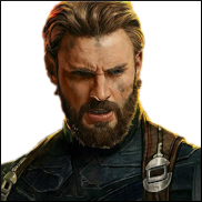
She looks like Samantha Carter. I think this is a good thing.
|
 #
?
Jul 4, 2013 03:08
#
?
Jul 4, 2013 03:08
|
|


|

|
| # ? Jun 13, 2024 04:39 |
|
|
Carol's suit is a thing of beauty. Pretty much the best redesign I've ever seen.
|
|
#
?
Jul 4, 2013 04:32
|
|

|
Captain Capacitor posted:She looks like Samantha Carter. I think this is a good thing. Could Captain Marvel blow up a sun?
|
|
#
?
Jul 4, 2013 04:56
|
|


socalled posted:You better. They cancelled Sif, they cancelled Red She-Hulk, and I'd be damned if I see them cancel Captain Marvel based on low sales. Everyone must buy Captain Marvel. I was dead certain it was already canned.
|
|
|
#
?
Jul 4, 2013 05:55
|
|


|
Rhyno posted:Carol's suit is a thing of beauty. Pretty much the best redesign I've ever seen. She looks like Marvelman/Miracleman 
|
|
#
?
Jul 4, 2013 06:58
|
|

|
Rhyno posted:Carol's suit is a thing of beauty. Pretty much the best redesign I've ever seen. My favorite part of the redesign isn't necessarily that they got rid of that silly black sheet she wrapped around her body. But that they toned down the ridiculous over-exaggerated playboy model physique she had going. She now just looks like an attractive and fit woman with almost semi normal proportions. My favorite example, which I don't have scans of, was from Avengers Assembled. She's sitting around talking to Cap, and she just looks like a normal woman that is a super hero, not some super model with superpowers. Unfortunately this changes from artist to artist. Edit: AH ha!  Best I could come up with on image search. But seriously, that is a huge step up. Leper Residue fucked around with this message at 07:24 on Jul 4, 2013 |
|
#
?
Jul 4, 2013 07:15
|
|

|
Phy posted:Could Captain Marvel blow up a sun? With her Binary powers, yes. Without, possibly, but it might kill her.
|
|
#
?
Jul 4, 2013 11:18
|
|


|
Trast posted:Wow, that looks awesome. I might have to scrap up some cash and start reading that series. Do it. It's gloriously enjoyable. The intro arc was a misstep, but everything since then has been gold, IMHO.
|
|
#
?
Jul 4, 2013 11:25
|
|

|
Flesh Forge posted:I guess he saw a certain famous masterpiece by Greg Land and thought this would be a good homage: That's actually a Greg Horn awful image he's referencing. 
|
|
#
?
Jul 4, 2013 21:29
|
|


|
Oops, you're totally right and I am dumb, I even made fun of Greg Horn earlier at length myself. To make up for this lovely thing I did, here are good things by Terry Moore, starting with a nice Ms. Marvel segue':  
|
|
#
?
Jul 5, 2013 18:59
|
|

I'm not saying Dave Marquez, artist of Ultimate Comics Spider-man, is a bad artist. But what the gently caress is going on with this hand? UCSM 25
|
|
|
#
?
Jul 18, 2013 21:10
|
|
|
Lurdiak posted:I'm not saying Dave Marquez, artist of Ultimate Comics Spider-man, is a bad artist. But what the gently caress is going on with this hand? It looks like who ever colored it tried to switch the thumb and the pointing finger.
|
|
#
?
Jul 18, 2013 21:23
|
|
|
Lurdiak posted:I'm not saying Dave Marquez, artist of Ultimate Comics Spider-man, is a bad artist. But what the gently caress is going on with this hand? Makes sense to me. Thumb back there, pointing finger there, rest of it is an enclosed hand. I liked the art quite a bit.
|
|
#
?
Jul 18, 2013 23:47
|
|


|
Senor Candle posted:It looks like who ever colored it tried to switch the thumb and the pointing finger. Once you pointed that out the hand sort of clicked together for me and made sense. That's probably what it is.
|
|
#
?
Jul 18, 2013 23:48
|
|

|
Gatts posted:Makes sense to me. Thumb back there, pointing finger there, rest of it is an enclosed hand. I liked the art quite a bit. Ohh, you're saying the pointing finger is below the thumb, pointing out of the page. That's a funny looking thumb then but it makes sense.
|
|
#
?
Jul 18, 2013 23:57
|
|
Senor Candle posted:It looks like who ever colored it tried to switch the thumb and the pointing finger. Yeah, that looks about right, but it broke my brain when I first saw it.
|
|
|
#
?
Jul 19, 2013 00:05
|
|
|
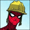
Lurdiak posted:That's because the helmet looks awful. gently caress you the full costume with helmet is the best  Avengers #8
|
|
#
?
Jul 19, 2013 01:51
|
|


|
 Upcoming issue of Green Arrow.
|
|
#
?
Jul 19, 2013 03:10
|
|
|
Whoa. Should I be picking up Green Arrow again?
|
|
#
?
Jul 20, 2013 13:32
|
|

|
ShortStack posted:Whoa. Should I be picking up Green Arrow again? Yup. Jeff Lemire and Andrea Sorrentino do good comics. They took over at #17.
|
|
#
?
Jul 20, 2013 16:34
|
|

|
Lurdiak posted:I'm not saying Dave Marquez, artist of Ultimate Comics Spider-man, is a bad artist. But what the gently caress is going on with this hand?
|
|
#
?
Jul 20, 2013 18:08
|
|
|
Right in the middle of the MAX run of Punisher Howard Chaykin did the art for one issue out of the entire run. His style clashed with the entirety of the rest of the series and the art really stood out. Most of the issue wasn't terrible, but two panels are particularly hideous. Punisher with a tiny, stunted mutant arm..  ..and giant, swollen, meatheaded Punisher  I can't help but laugh every time I look at this one. The expression on his pumpkin head is hilarious to me. The worst part is on the very next page he goes back to looking normal.
|
|
#
?
Aug 2, 2013 05:06
|
|

|
It's like his head is so fat, he can barely open his eyes. Also he looks about 70 years old.
|
|
#
?
Aug 2, 2013 05:19
|
|
|
The thing that really frustrates me with Howard Chaykin is how it still feels like the comic industry really wants us to get excited that he's drawing something. I was -3 when American Flagg came out and everything I've seen of his basically since then has been just total garbage. He's actually bad enough that I'll avoid books just to not have to look at his freaky lovely art. Hang it up, old man. I don't know who told you it was ok to ink with a sharpie but you need to get out of the game. Maybe write some new American Flagg for someone else to draw and dump it on IDW.
|
|
#
?
Aug 2, 2013 11:58
|
|

Mr Wind Up Bird posted:The thing that really frustrates me with Howard Chaykin is how it still feels like the comic industry really wants us to get excited that he's drawing something. I feel this way about a lot of people that the big two inexplicably consider draws. Like, it's not 1988 or even 1995 anymore, why are you acting like Rob Liefeld, Jeph Loeb, Joe Mad, Howard Chaykin, or even Jim Lee are something people are gonna get excited over? Yes, they were once either critically or commercially successful, but that was literally a lifetime ago for a lot of your audience, and they've proven time and again that they've got nothing to offer anymore. Sure, their stuff tends to sell decently, but not enough to justify all the hype and preferential treatment they get simply due to being Known Names, and definitely not enough that you can say it'd still sell without the marketing pushes they always get.
|
|
|
#
?
Aug 2, 2013 12:09
|
|
|
Mr Wind Up Bird posted:The thing that really frustrates me with Howard Chaykin is how it still feels like the comic industry really wants us to get excited that he's drawing something. I was -3 when American Flagg came out and everything I've seen of his basically since then has been just total garbage. He's actually bad enough that I'll avoid books just to not have to look at his freaky lovely art. Satellite Sam is good though and nothing like his Marvel work.
|
|
#
?
Aug 2, 2013 12:24
|
|

|
I think Satellite Sam and Black Kiss look great. The common thing may be that they're uncolored and are projects he probably gives a poo poo about. From Black Kiss 2 #2  
Teenage Fansub fucked around with this message at 12:43 on Aug 2, 2013 |
|
#
?
Aug 2, 2013 12:40
|
|
|
Waterhaul posted:Satellite Sam is good though and nothing like his Marvel work. If you don't want to get called a lovely artist, don't fill your portfolio overwhelmingly with poo poo, I guess.
|
|
#
?
Aug 2, 2013 12:54
|
|
|
Dan Didio posted:If you don't want to get called a lovely artist, don't fill your portfolio overwhelmingly with poo poo, I guess. I dunno. I wouldn't say Chaykin's portfolio has a majority of bad art. I think peoples opinions of him are coloured by the fact that a lot of Marvel guys like Bendis and Fraction got him working on current Marvel projects where the guys style just doesn't fit.
|
|
#
?
Aug 2, 2013 13:14
|
|
|
Chaykin really only does well when he's doing 50's/60's Americana. Everything else is so far out of his style that it looks bad and he should feel bad for doing it. But like Waterhaul said, you have people who love his Americana style and for some reason believe that transfers well to the major project they're currently doing. Instead of looking good, it looks bad and really throws off the flow of otherwise good books.
|
|
#
?
Aug 2, 2013 13:55
|
|


|
RevKrule posted:Chaykin really only does well when he's doing 50's/60's Americana. Everything else is so far out of his style that it looks bad and he should feel bad for doing it. But like Waterhaul said, you have people who love his Americana style and for some reason believe that transfers well to the major project they're currently doing. Instead of looking good, it looks bad and really throws off the flow of otherwise good books. I really like Chaykin's style for whatever reason. I enjoyed his Dominic Fortune series that was set in the 1930s -- the old-timey, square-jawed thing worked really well there. I'll admit that it's different from the style of most modern comic art, but so is Mike Allred's stuff. There's a mental adjustment you have to make, but I think it's worth it. It reminds me a little (not as strongly, of course) of my first real exposure to Steve Ditko -- his art felt uncomfortable to me for a long time.
|
|
#
?
Aug 2, 2013 14:10
|
|

|
Waterhaul posted:I dunno. I think you'd have to be really ignorant of the majority of his work at Marvel to say that it's a style that doesn't fit. It's noticeably amateurish, rushed work being pumped out by someone clearly capable of better. For whatever reason, granted, and I won't pretend to know, but it's hardly unfair to call the guy out on his most high profile work being bad, given the obvious dip in quality. It's Chaykin's prerogative, and it's disappointing more than anything, but it's pretty bizzare to defend it in those terms. He just put out some bad work. Saying 'the majority of his portfolio' was unfair of me, I admit, but I think the underlying point's sound.
|
|
#
?
Aug 2, 2013 14:28
|
|
|
Chaykin's art need a good colourist that understands what the hell they're doing. The horrible panels above are standard gradient colouring. Bad enough on its own, horrible here.
|
|
#
?
Aug 2, 2013 14:28
|
|


Isn't Chaykin also responsible for this beauty: Or does another 'artist' have stubby-arm-syndrome? But yeah, Chaykin is a no-buy for me, and I've never really seen any work of his that justifies people making excuses for how atrocious his Marvel work is. I remember people posted some... I wanna say Spirit? Or some other Golden Age hero? comic pages he drew, and it was the same garbage that made me drop Fraction's Punisher run that I'd been loving until then.
|
|
|
#
?
Aug 2, 2013 15:02
|
|
|
Lurdiak posted:I remember people posted some... I wanna say Spirit? Or some other Golden Age hero? You mean The Shadow? Yeah this is completely comparable to that Wolverine. 
|
|
#
?
Aug 2, 2013 15:16
|
|
|
Fish Of Doom posted:It's like his head is so fat, he can barely open his eyes. Also he looks about 70 years old. Which makes Chaykin the only person to draw Frank Castle looking anywhere close to his real age. He was meant to be 60 at the time, but everyone drew him looking 40.
|
|
#
?
Aug 2, 2013 17:53
|
|

|
Teenage Fansub posted:You mean The Shadow? Speaking as an artist and not someone familiar with his work outside of this thread: he has problems with arms bent in perspective (the angles in the sailor's arm in the foreground look off and not scaled right). Admittedly, it is really frickin' hard to do, which is a shame since his anatomy proportions look okay in standard perspective. The Punisher and Wolverine posted above look like the artist was just guessing on where the arms are going though.
|
|
#
?
Aug 2, 2013 18:52
|
|

|
Teenage Fansub posted:You mean The Shadow? He's exactly like Kyle Baker. When he doesn't give a poo poo, he REALLY doesn't give a poo poo.
|
|
#
?
Aug 2, 2013 20:30
|
|

|
A few of my favorites. Will Eisner is one of the most expressive artists when it comes to human emotions.   Finnish comic artist Petri Hiltunen has pleasing art. He does black & white, which suits his style very well.   Joakim Pirinen does the best psychedelic scenes (sorry about the terrible image, dividing Stockholm into three parts would really deserve more space!)  And finally the Grand Old Man of Finnish comics, Tarmo Koivisto. Famous for his "M�mmil�" series depicting life in an imaginary small town somewhere in Finland, he has also done other comics. I love his expressive and economic line.  
|
|
#
?
Aug 2, 2013 22:09
|
|

|

|
| # ? Jun 13, 2024 04:39 |
|
|
This is something that you don't really see too much any more, hand-lettering that has a context other than an innovative way to draw "BANG" - look at the question marks, how they resemble Hebrew.
|
|
#
?
Aug 2, 2013 22:15
|
|