|
Your boner is showing.
|
|
|
|

|
| # ? May 17, 2024 14:08 |
|
Evilkiksass posted:Well if it is a MUSIC event ... I get what you're saying, and agree. Only part I would like to point out (well technically two things) is that she's definitively not a professional model and I wanted the "not impressed" look on her but I imagine I can see how she looks "bored" instead of unimpressed which can go along the same lines. And it's bar events that make it look like it's a big frat party (fraternities are illegal here in Canada as far as I know). As I said earlier, I appreciate the critique.
|
|
|
|
xenilk posted:And it's bar events that make it look like it's a big frat party (fraternities are illegal here in Canada as far as I know). http://en.wikipedia.org/wiki/Fraternities_and_sororities_in_Canada ??
|
|
|
|
Well in the province of Quebec (I travel often to Ottawa and Montreal), where I am from, I haven't seen any. I always thought it was illegal to be quite honest. Edit: http://queensjournal.ca/story/2012-10-23/features/ams-revisits-fraternity-ban/ seems to talk about a fraternity ban... The policy stipulates that �no member of the Society shall be an active member of any fraternity or sorority, that is, any organization composed of students and former students which has a secret oath, constitution or pledge or which has a sign of identification such as a pin or Greek letters, or which is affiliated with any organization outside of the University.� xenilk fucked around with this message at 19:41 on Oct 2, 2013 |
|
|
|
loving lol.
|
|
|
|
Oh hi PYF Canadian Fraternity Facts thread!
|
|
|
|
xenilk posted:Well in the province of Quebec (I travel often to Ottawa and Montreal), where I am from, I haven't seen any. I always thought it was illegal to be quite honest. Ah, yes, the Alma Mater Society of Queen's University makes Canada's laws. That explains so much. Or maybe it's just that you can't read and always need to defend yourself and have the last word on critique?? (USER WAS PUT ON PROBATION FOR THIS POST)
|
|
|
|
Your boner is showing.
|
|
|
|
Dear thread shut up about frats.
|
|
|
|
This thread is greek to me
|
|
|
|
dukeku posted:Your boner is showing. How to shoot people and get a boner: The Portrait Photography Thread!
|
|
|
|
Well to change the vibe, I'm fairly confident those pictures won't create a whole new debate but you never know! From a previous session with the same girl who you guys went all nuts about the origami cranes, practicing off flash  IMG_3145 by avoyer, on Flickr And from a maternity shoot  IMG_6100 by avoyer, on Flickr  IMG_6092 by avoyer, on Flickr
|
|
|
|
I would be more selective with your sharpening. The bokeh in #1 seems to be sharpened and is distracting - it is easy to mask out your sharpening.
|
|
|
|
rio posted:I would be more selective with your sharpening. The bokeh in #1 seems to be sharpened and is distracting - it is easy to mask out your sharpening. Ah yeah, I tend to sharpen my B/W a bit more than the usual colored picture (which is close to no added sharpening), good call!
|
|
|
|
Boner: Deployed.
|
|
|
|
Deployability of boner: High.
|
|
|
|
What great contributions to the thread, if this were a thread about boners and getting probated.
|
|
|
|
While doing research for a short film, we took some character shots. In my opinion the best one I did.
|
|
|
|
Went on a walk with friends, ended up taking some nonsense shots of them.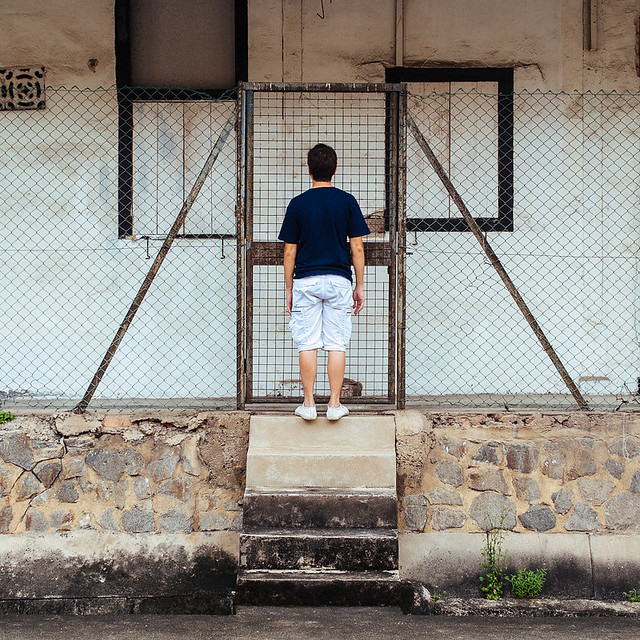 Scumback by alkanphel, on Flickr 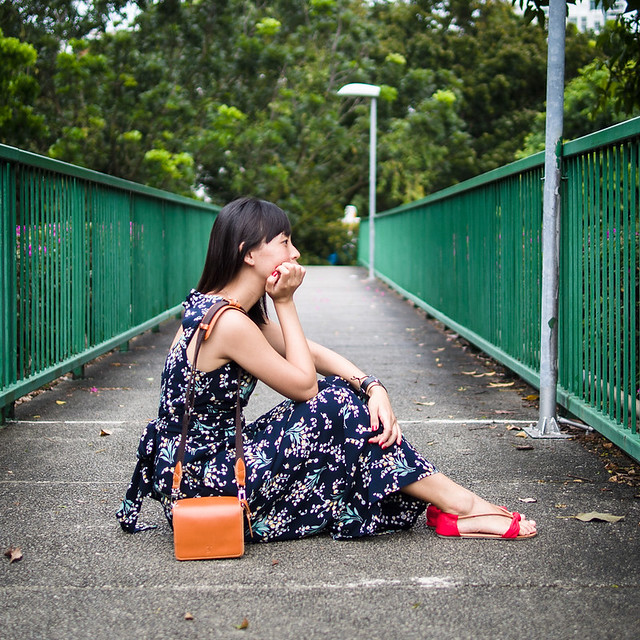 Stonefish by alkanphel, on Flickr  Running Scum by alkanphel, on Flickr
|
|
|
|
First attempt at a proper headshot on my new camera and lens. Kim 1 by mattphilpott, on Flickr  Kim 2 by mattphilpott, on Flickr  Kim 3 by mattphilpott, on Flickr I was shooting wide open and I'm learning there's never really any reason to do that. It just leaves too much out without really adding anything. I'm also not sure on the pose. It seem pretty standard, but I'm trying to be careful. I'm afraid it can be really easy to let a person's most prominent facial feature dominate a picture in a way you don't intend, and I'm trying to avoid that. Huxley fucked around with this message at 17:20 on Oct 14, 2013 |
|
|
|
Those pictures make me feel enormously tall. Try to shoot on a level (not from too far below, I don't want to see up her nose!) as you've squashed her neck to nothing. Jiblet fucked around with this message at 18:35 on Oct 14, 2013 |
|
|
|
Crossposting from PAD: So I've just been experimenting for the last few months and I decided to try out baby's first lighting setup. One cheap light shoot-through umbrella, one reflector, and a few friends that were willing to humor me. I enjoy playing around with gender expression and this ideally is going to be part of series of photos where I have women (and possibly men) doing things that violate gender norms. Please rip them apart so I know what to do better next time!  IMG_2314 by step_aside, on Flickr I think I should have cooled down the colors a good amount, but I didn't want to lose the vibrancy of her hair, and I felt that keeping that while toning down the rest would have looked unnatural. That belt should be white, for reference.  IMG_2163 by step_aside, on Flickr Probably should have moved the reflector both up and closer to catch more of her face and the inside of her jacket so it's less of a dark mass.  IMG_2188 by step_aside, on Flickr Mimicking the Jay Z portrait on the cover of this month's issue of Vanity Fair. Wooden beam in the background is casting an awkward shadow behind her head.
|
|
|
|
|
Huxley posted:First attempt at a proper headshot on my new camera and lens. step aside posted:Crossposting from PAD: e: Also in the first one it would have been better not to cut off the lower hand. big scary monsters fucked around with this message at 19:52 on Oct 14, 2013 |
|
|
|
For the angle, I was trying to find something that didn't make her nose look like it took up half her face. I see her neck disappear now, though. Hmm. Suggestions on angles/poses, or is it best just to own such a prominent feature (without like, shooting a fisheye directly at her)?
|
|
|
|
step aside posted:Crossposting from PAD: Do you plan to retouch her skin at all? Looks a bit rough to me..
|
|
|
|
big scary monsters posted:The hand positioning in the last picture seems somewhat awkward to me, but I'm bad at posing people. I think the intent is to pose a female in poses used by males. That actually is a neat idea. The first photo would be the most interesting I think. Maybe reshoot with the corrections others have said (background, brighter). I think it is worth reshooting, the subject seems to be cooperating well with what I think your intent is, and it seems like a fun project.
|
|
|
|
50 headshots in a day. The small IT business I work for desperately needed headshots for their intranet. I figured I needed some for my portfolio, so I agreed to do a headshot session with the staff at no cost. (Under my mantra of "full price or free, never cheap") I knew it'd help me gain some much needed interpersonal skills for dealing with future photography clients that aren't so comfortable in front of the camera, plus it'd help me gain some rapport with my day-job colleagues. Gear I ended up using:
I allowed 15 minutes per 3 people (More or less 4 hours to get through 50 people at that rate), but there were those that got a nice shot in the first few frames, and some that needed 30+ shots to get anything bearable. I'm a huge fan of Peter Hurley, so this Google+ Keynote titled "The Art of the Headshot" was my required watching in the evening before the day. https://www.youtube.com/watch?v=j-NKdOMtldM Peter Hurley influences aside, I went for landscape orientation because I felt like it lends itself to pleasant looking headshots. Very little torso was required, and shooting in portrait felt far too much like a mug shot. Come time to shoot, some people really surprised me - in one direction or another. Some of the dorkiest techs got great shots in the first few frames, and some people I thought were going to be comfortable in front of a camera completely froze up or gave resistance to direction. In order to get a successful shot, I had to employ a range of tricks. Sometimes a little direction, or a distracting comment from the receptionist who doubled as my assistant when trying to herd people from around the office.. sometimes a joke. Occasionally I had to pull a slightly insulting joke. I felt like I was sweating bullets when telling a senior manager "This time, don't look so constipated". The slightly shocked laugh followed by a natural smile got the exact shot I was after. One of the managers were due to leave in a weeks time, so I came up with the idea of getting everyone to pull a silly face, so I could collage them all and throw the end product onto a canvas, making a great leaving present. This ended up being a great icebreaker. I explained the leaving present, got them to pull a face, then the natural smiles that followed were spot on. I'm far from a successful headshot photography, but if anyone has any questions, I'm happy to answer them. On with the pics: Set up. (I would have used two umbrellas, but foolishly only took one umbrella adapter):  End results:          Silly faces collage: 
|
|
|
|
That collage is going to be a great gift.
|
|
|
|
Cyberbob posted:Headshots Power your fill way the gently caress down, or trek it around till it's almost a backlight. The totally deadpan lighting does very few people any favors. Post wise the skintones look quite desaturated and I think I'm seeing some ambient light casting onto the darker girls hair. Switch anything that isn't your lights off when shooting. You've done a good job of getting natural looking poses out of most of them.
|
|
|
Thanks everybody.big scary monsters posted:All look pretty underexposed, and the lighting on the left and right sides is uneven - I don't think that's intentional? I'd have taken down the distracting dart board in the first photo, and tried to get more separation from the background in the last one. The hand positioning in the last picture seems somewhat awkward to me, but I'm bad at posing people. I think with better lighting the second one could be good. Thanks. Yeah, I probably should have elevated the reflector on the right side of the photos. Good points regarding background and framing. xenilk posted:Do you plan to retouch her skin at all? Looks a bit rough to me.. Wasn't planning on it. A lot of portraits of men leave in imperfections, blemishes, etc. Redleg posted:I think the intent is to pose a female in poses used by males. I'm glad you like the idea! Unfortunately she's moving out of town in a week so that probably won't happen, but I'll keep the advice in mind for future shoots.
|
|
|
|
|
XTimmy posted:Power your fill way the gently caress down, or trek it around till it's almost a backlight. The totally deadpan lighting does very few people any favors. Post wise the skintones look quite desaturated and I think I'm seeing some ambient light casting onto the darker girls hair. Switch anything that isn't your lights off when shooting. You've done a good job of getting natural looking poses out of most of them. Thanks for that, and yea you're right actually, I hadn't noticed the ambient on the dark hair until now. With regards to the fill, that was a tricky one - not everyone's left side is their "best" side, so I got people to flip around to try and get the better side, flipping the picture in post to make them all match. Suddenly key becomes fill & vice versa, so to have a drastic power difference would be too much drat hassle to up/down the power every time I got them to flip sides. Essentially I was after a "one size fits all" lighting method, which is pretty critical for such a conveyor belt approach to the subjects.
|
|
|
|
I think you did great given your circumstances. Take XTimmy's comments as learning suggestions for your next shoot.
|
|
|
|
Is there any reason to stuff them all in the right side of the frame?
|
|
|
|
dukeku posted:Is there any reason to stuff them all in the right side of the frame? Because that's where the chair was in relation to the tripod. Do you even photo bro?
|
|
|
|
dukeku posted:Is there any reason to stuff them all in the right side of the frame?
|
|
|
|
Now I really want to turn one of those photos into an Enzyte ad but my stupid conscience.
|
|
|
|
Wario In Real Life posted:Presumably so text can be added as necessary to the left side. The reasonable assumption isn't always the right one.
|
|
|
|
mr. mephistopheles posted:Now I really want to turn one of those photos into an Enzyte ad but Fixed.
|
|
|
|
Cyberbob posted:
I had not considered this and it's a very good point.
|
|
|
|
|
| # ? May 17, 2024 14:08 |
|
Cyberbob posted:Thanks for that, and yea you're right actually, I hadn't noticed the ambient on the dark hair until now. I suppose next time you could save a "left" and "right" side preset of settings in your camera's C1/C2/C3 settings. 
|
|
|


