


|
McMadCow posted:These are generally nice, but you sure do like to have your model looking in camera out of the extreme corner of her eye. It's really awkward. A good guideline to use is that you should be able to see whites of the eyes on either side of the iris. Of course rules are made to be broken, but it's not working here- especially the last two. Good point, thanks. Any advice on how to avoid it? Is it bad camera positioning relative to where she is or should I be directing her to look somewhere other than directly down the lens? I really enjoy your work BTW, post more photos.
|
 #
?
Nov 25, 2013 00:31
#
?
Nov 25, 2013 00:31
|
|


|

|
| # ? May 17, 2024 17:02 |
|
|
I like to tell my clients to point the nose at the light and look at the camera from that angle, provided the light is nearby me.
|
|
#
?
Nov 25, 2013 04:50
|
|
|
deaders posted:Good point, thanks. Any advice on how to avoid it? Is it bad camera positioning relative to where she is or should I be directing her to look somewhere other than directly down the lens? I don't really know what to say to avoid it- I don't usually have my models look directly in-camera, but that's just me. I keep it in mind when I do, though. If you're making your model do something that feels awkward to them, there's a good chance it's going to look awkward to the viewer. Unless you're shooting high fashion, in which case get crazy. deaders posted:I really enjoy your work BTW, post more photos. Thanks! Unfortunately I'm not shooting much at the moment. Not with film, at least. I just finished my masters program and I don't have access to the school's darkroom anymore. Plus I have a truckload of debt and no job and I'm living overseas and and and... basically I can't afford to print my work at the moment, and I won't be able to until I have income. 
|
|
#
?
Nov 25, 2013 14:05
|
|

|
You'll jump back in the saddle eventually. Regroup, recover and then report back! I had to take a break myself due to job issues: it sucks.
|
|
#
?
Nov 26, 2013 00:33
|
|
|
nevermind
DAMN NIGGA fucked around with this message at 14:42 on Nov 27, 2013 |
|
#
?
Nov 27, 2013 14:12
|
|

|
I made photographs of a person this weekend, . by 8th-samurai, on Flickr 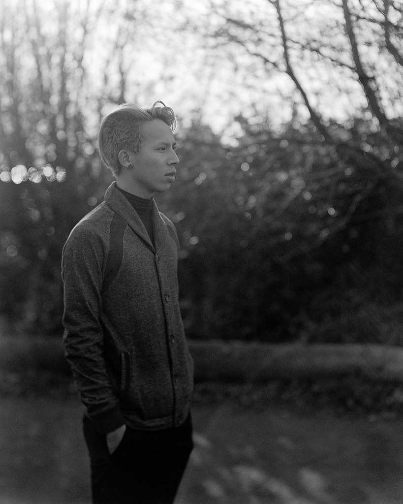 . by 8th-samurai, on Flickr
|
|
#
?
Nov 27, 2013 20:14
|
|


|
8th-snype posted:I made photographs of a person this weekend, The second one is really nice, with nice lighting. It's slightly flat in its tones though, and could possibly benefit from a burn from the bottom up in order to bring the focus back to your subject's face. I have a fetish for crazy burns though, so take it as a completely personal suggesting. It's still a nicely executed shot.
|
|
#
?
Nov 27, 2013 20:27
|
|
|
McMadCow posted:The second one is really nice, with nice lighting. It's slightly flat in its tones though, and could possibly benefit from a burn from the bottom up in order to bring the focus back to your subject's face. I have a fetish for crazy burns though, so take it as a completely personal suggesting. It's still a nicely executed shot. I really dig the way the 180mm Xenar draws people at wider apertures. I like my B&W a little flatter than most people so I didn't really mess with the contrast at all, there is probably a little flare in there from shooting into the light with a 40 year old lens at f/5.6.
|
|
#
?
Nov 27, 2013 20:34
|
|
|
Recently finished processing a shoot from a month or so ago: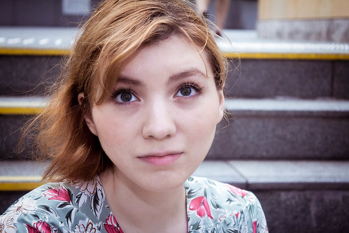 IMG_2805-Edit.jpg by ArtisticPretensions, on Flickr  IMG_2804-Edit.jpg by ArtisticPretensions, on Flickr  IMG_2881-Edit.jpg by ArtisticPretensions, on Flickr  IMG_2961-Edit.jpg by ArtisticPretensions, on Flickr  IMG_2970.jpg by ArtisticPretensions, on Flickr And one just for fun  IMG_2975.jpg by ArtisticPretensions, on Flickr Fire away, I would really appreciate any critique/ego deflation
|
|
#
?
Dec 3, 2013 12:28
|
|

|
Drop Database, in 2805 and 2804 where you did an outdoor tight crop headshot there's not enough separation between the foreground and background in your shots so the backgrounds end up being really distracting. It's like oh, there's some girl and... stairs? Having a smaller DoF or a light on the model would have helped. Also, I'm not really digging the posing. What is she looking at in 2805? 2881 is the best shot but the light is sort of... flat. And it's sort of awkward that she's in the center of a square crop with that pose she has. The pose suggests placing her toward the left and the bottom of the frame. Besides that square crops are sort of awkward for portraiture because people's proportions are more 3:2 than 1:1. I feel like you should photoshop her out of 2881 and put her in the bottom left of a 3:2 photo with a huge negative space (big blue sky or something) filling the middle/top/right. 2804 has a similar issue with placement. The way she's posed she'd be more at home toward the top right so that she'd be looking at negative space in the bottom left. But then again what the hell do I know.
|
|
#
?
Dec 3, 2013 16:48
|
|

|
Drop Database posted:
You're way too close to her on these. Unless you're doing it for effect, the perspective compression you get from being further away usually gives a more satisfying result. http://stepheneastwood.com/tutorials/lensdistortion/strippage.htm
|
|
#
?
Dec 3, 2013 19:11
|
|
|
Dren posted:It's like oh, there's some girl and... stairs?  I didn't think this through enough, but you're right of course. The stairs made sense to me because I had processed a few photos (full-body ones) in a row with them, but I can see how it's confusing when you're only looking at one photo.. I didn't think this through enough, but you're right of course. The stairs made sense to me because I had processed a few photos (full-body ones) in a row with them, but I can see how it's confusing when you're only looking at one photo..For completeness: 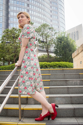 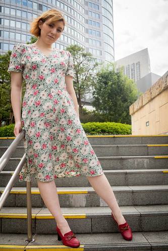 Dren posted:... What is she looking at in 2805? ") Dren posted:2881 is the best shot but the light is sort of... flat. And it's sort of awkward that she's in the center of a square crop with that pose she has. The pose suggests placing her toward the left and the bottom of the frame. Besides that square crops are sort of awkward for portraiture because people's proportions are more 3:2 than 1:1. I feel like you should photoshop her out of 2881 and put her in the bottom left of a 3:2 photo with a huge negative space (big blue sky or something) filling the middle/top/right. I.. I don't know why I didn't see that until you pointed it out. It seems so obvious in retrospect... I've re-cropped the photo. Better?  IMG_2881-Edit.jpg by ArtisticPretensions, on Flickr Dren posted:2804 has a similar issue with placement. The way she's posed she'd be more at home toward the top right so that she'd be looking at negative space in the bottom left. But then again what the hell do I know David Pratt posted:You're way too close to her on these. Unless you're doing it for effect, the perspective compression you get from being further away usually gives a more satisfying result. I did it for effect in one of them - 2961! I even cropped slightly closer to her face to get a bit more creepiness factor. But not in the other one.. Both shots were taken at 50/55mm (crop sensor). What would be a better or more flattering length/distance for a shot like that, in your opinion? Thanks for the quick and helpful feedback, I really appreciate it!
|
|
#
?
Dec 4, 2013 02:51
|
|
|
Randoms from a promo session: Real T@lk by TomOlson, on Flickr  Real T@lk by TomOlson, on Flickr  Real T@lk by TomOlson, on Flickr
|
|
#
?
Dec 4, 2013 04:09
|
|

|
RangerScum posted:Randoms from a promo session: I like the lighting but feel it would be stronger if you had a bit more light on his left (camera right) eye. And if you are going for the super crisp, clean look you could clone out some of the bits of fluff on his jacket. Cool shots though, what was your setup? I see the key light camera left and a hair light over his left shoulder?
|
|
#
?
Dec 4, 2013 05:10
|
|
|
deaders posted:I like the lighting but feel it would be stronger if you had a bit more light on his left (camera right) eye. And if you are going for the super crisp, clean look you could clone out some of the bits of fluff on his jacket. Thanks and good points. I will see about evening up the lighting on the face later. I had 3 B800s, two were behind the model lighting the backdrop and I had one out front in a softbox. I wish I had something to isolate the back lights to the background only but with my budget and time constraints that wasn't really something I could do- the studio didn't have anything on hand for that.
|
|
#
?
Dec 4, 2013 05:22
|
|
|
Drop Database posted:
I like those first two stairs pictures probably the best out of anything you posted. Face is a little dark in the one where she's looking down, maybe you could dodge it a bit. The crop of 2881 works better for me. And on negative space, it's a personal decision what to do with negative space and there are no right or wrong answers but it's not working for me in 2804. I think it's something about the setting and the dress... there's nothing discordant about a floral print dress in the middle of the day. I guess what I'm saying is that the setting, the dress, and even her smile don't really work with the ideas of awkwardness and uncomfortableness that off camera looks and unbalanced negative space create. It ends up looking like an outtake or something, as if you grabbed a test frame while the model's attention was diverted. So to me it looks more like a mistake but such is the danger of breaking the "rules". RangerScum posted:Thanks and good points. I will see about evening up the lighting on the face later. I think you could've gone with on-axis lighting for your key rather than camera left. Or, if you weren't committed to using two lights on the backdrop, you could've tried to light the backdrop on-axis and freed up a second light for fill. Above the backdrop and pointed straight down could have worked. You could also have tried to put the backdrop light on the floor behind him since the shots you showed were all upper body.
|
|
#
?
Dec 4, 2013 14:52
|
|
|
Drop Database posted:Both shots were taken at 50/55mm (crop sensor). What would be a better or more flattering length/distance for a shot like that, in your opinion? It's not really about focal length, it's about being far enough away so that there isn't any distortion of features. A longer focal length will help you do that while keeping the subject the same size.
|
|
#
?
Dec 4, 2013 14:55
|
|
|
Dren posted:I like those first two stairs pictures probably the best out of anything you posted. Dren posted:And on negative space, it's a personal decision what to do with negative space and there are no right or wrong answers but it's not working for me in 2804. I think it's something about the setting and the dress... there's nothing discordant about a floral print dress in the middle of the day. I guess what I'm saying is that the setting, the dress, and even her smile don't really work with the ideas of awkwardness and uncomfortableness that off camera looks and unbalanced negative space create. It ends up looking like an outtake or something, as if you grabbed a test frame while the model's attention was diverted. So to me it looks more like a mistake but such is the danger of breaking the "rules". I hear you. I need to make sure that the elements of the photo converge more obviously on the "story" I'm trying to tell with the photo in order to communicate it better when it's something that isn't intuitive. I've got another shoot coming up soon; hopefully I come up with a photo or two which comes together better...
|
|
#
?
Dec 4, 2013 15:07
|
|
|
Dren posted:I think you could've gone with on-axis lighting for your key rather than camera left. Or, if you weren't committed to using two lights on the backdrop, you could've tried to light the backdrop on-axis and freed up a second light for fill. Above the backdrop and pointed straight down could have worked. You could also have tried to put the backdrop light on the floor behind him since the shots you showed were all upper body. I did shoot with the main fill dead-on for most of the shoot, I just moved it around from time to time depending on how he was standing. As for the back lights, most of the shots were actually full-body so I had to keep them off to the side out of frame. Those are good things to keep in mind though, next time I will put in a little more effort and rearrange things if I'm getting in close to the subject. Oh and one other note, the subject was tall as gently caress and lighting him on access without getting major reflections was a major PITA. 
|
|
#
?
Dec 4, 2013 15:39
|
|
|
Hello is anyone feeling this? (please click through and full screen it) Untitled by Gareth Dutton Photography, on Flickr
|
|
#
?
Dec 5, 2013 00:00
|
|

|
Gazmachine posted:Hello is anyone feeling this? (please click through and full screen it) She looks like she's being forced to marry the evil prince at the start of the final act. Overall mood: resigned to her fate.
|
|
#
?
Dec 5, 2013 03:23
|
|


|
Excellent, I was hoping that came across. It's a shot from a usual bread and butter session that I wanted to turn more into a portrait or something vaguely interesting. I've tried to mute the tones to fit it. I didn't pick it for the client's selection but I liked it for other, non profitable reasons.
|
|
#
?
Dec 5, 2013 12:34
|
|
|
Gazmachine posted:Hello is anyone feeling this? (please click through and full screen it) I like it, I'm pretty sure she won't print it (if it was taken for her wedding) but I like the vibe, she seems vulnerable (hope that's what you were going for!)
|
|
#
?
Dec 5, 2013 17:05
|
|

|
Yep, yep, indeed it was. It wasn't a wedding, it was a hair and makeup course and this was the bridal look
|
|
#
?
Dec 5, 2013 20:11
|
|
|
Quick question: I'm planning for a session in a month or so where the subjects wish to obscure their faces. I'd really rather avoid robes and hoods since it's generally an aesthetic I find cliched within the sphere of both the subject's art, and the atmosphere the shoot will employ. To that end, does anyone have any experience with using flour/baby talc/powdered pigment in portraits, and will a handful or so of the above, thrown into the air, be enough to obscure a face if between the subject and the lens?
|
|
#
?
Dec 6, 2013 09:02
|
|

|
Not really... the powder either clumps, doesn't separate and eventually hits the ground in a wad and/or the powder does separate but the cloud is too diffuse to block all the light.
|
|
#
?
Dec 6, 2013 09:38
|
|

|
Try some starch. It tends to hang in the air a bit and if you light it from behind the backscatter will obscure stuff a bit. Try both a pressurized can of spray starch and a non-pressurized one, I'm not sure which works better.
|
|
#
?
Dec 6, 2013 20:40
|
|
|
I took some pictures of a co-worker and a few of them I really ended up liking. AJK_3333 by SAFistLips, on Flickr  AJK_3329 by SAFistLips, on Flickr Yes, she has hetereochromia or what it's called, and yes, I have some where she is smiling. Edit: I just played with some sharpening from a tutorial I found on youtube and replaced the previous versions. Hope I didn't mess things up! FistLips fucked around with this message at 15:56 on Dec 7, 2013 |
|
#
?
Dec 6, 2013 22:01
|
|

|
FistLips posted:I took some pictures of a co-worker and a few of them I really ended up liking. I get why, especially if these are pictures for her rather than pictures of her, you wouldn't want to slam people in the face with her eyes. I'm sure it's something she's sick of talking about, even if she's not self-conscious about it. She's cute and it's neat, so I can't imagine, but you never know. But just as an observer I kind of do want to be slammed with it. I somehow didn't even notice her eyes until you pointed it out. I feel like the the bottom pic could use more sharpness and maybe tighten in a bit. At least If I was trying to play it up. But it's also a pretty cool scarf, so they're both nice shots. It's just not every day you get such an interesting subject. Though, I guess you work with her, so you probably could shoot her every day. Or if she's sensitive about it, I wouldn't make a big deal out of it even for myself.
|
|
#
?
Dec 6, 2013 23:02
|
|


|
I definitely noticed the difference in eye colour immediately. Top one is nice. I like the clean colours and crisp, wintry feel. I would have preferred her in the centre. Rule of thirds can be important and powerful but make sure you're not just doing it for the sake of it. If she were looking into the empty space then the decision to have her to one side maybe would have felt more cohesive to the pose. Again, rules can be broken and it's not WRONG, but I personally feel it would have been more direct and would hold my attention better. With the bottom one, it's not that it needs more sharpness, it's that the focus is on the eyelashes and nose and has just missed the eyes unfortunately, which could be seen as a problem when the subject's eyes are even more of an important element in the frame than usual. It doesn't particularly bother me but I presume you haven't done it on purpose.
|
|
#
?
Dec 7, 2013 11:41
|
|
|
Totally agree that that photo would be way stronger with her dead center, as is it's a bit awkward.
|
|
#
?
Dec 7, 2013 13:31
|
|
|
deaders posted:Totally agree that that photo would be way stronger with her dead center, as is it's a bit awkward. The motion of the hood is moving camera right. Photo would be more balanced with her placed further camera left.
|
|
#
?
Dec 7, 2013 15:40
|
|
|
Thanks for your feedback, everyone - I agree with the centering, and just did that - better?
|
|
#
?
Dec 7, 2013 15:56
|
|
|
Yep, I think so.
|
|
#
?
Dec 7, 2013 20:42
|
|
|
I actually liked it way better the other way, but I probably don't know what I'm talking about. With her in the middle, you get less of a sense of where she is and the environment is made less important. I suppose that's probably the objective of portrait photography, but still; I think given the location, and the clothing, it's important.
|
|
#
?
Dec 7, 2013 22:31
|
|

|
vote_no posted:I actually liked it way better the other way, but I probably don't know what I'm talking about. With her in the middle, you get less of a sense of where she is and the environment is made less important. I suppose that's probably the objective of portrait photography, but still; I think given the location, and the clothing, it's important. I half agree and half disagree. As was pointed out, the crop partially took away from what the spectator is interested in - her different looking eyes. Having read the feedback I got, I get what the others mean. It would maybe be like taking a picture of someone with crazy red hair and then having them in front of say, a huge waterfall, taking the attention away from the hair. Not a perfect analogy, but I hope it works Now, I will probably take more pictures of her as we had fun, and maybe then I'll do something a bit different with regards to both posing and composition.
|
|
#
?
Dec 7, 2013 22:51
|
|
|
FistLips posted:I half agree and half disagree. As was pointed out, the crop partially took away from what the spectator is interested in - her different looking eyes. Having read the feedback I got, I get what the others mean. It would maybe be like taking a picture of someone with crazy red hair and then having them in front of say, a huge waterfall, taking the attention away from the hair. Not a perfect analogy, but I hope it works Related to that, I guess I also like the idea of having her eyes be something you only notice on second glance.
|
|
#
?
Dec 7, 2013 23:32
|
|
|
I did a Christmas photo shoot for a young family. Window light to the right  DSCF2855.jpg by fuglsnef, on Flickr Umbrella top right, bare strobe behind them pointed at the wall, window light left  DSCF2907.jpg by fuglsnef, on Flickr Bonus terrifying giant old man  DSCF2976.jpg by fuglsnef, on Flickr
|
|
#
?
Dec 8, 2013 20:40
|
|
|
David Pratt posted:I did a Christmas photo shoot for a young family. Have you tried a square-ish crop getting the socked foot out of the shot on the bottom right?
|
|
#
?
Dec 9, 2013 01:25
|
|
|

|
| # ? May 17, 2024 17:02 |
|
|
Spedman posted:Have you tried a square-ish crop getting the socked foot out of the shot on the bottom right? I did with some of the pictures from that setting (4:5), but I tried it with and without and preferred it in this one.
|
|
#
?
Dec 9, 2013 11:09
|
|