|
The Mash posted:I ask you, TYK, has there ever been a shirt that was made better by the sponsor? Reasons may include humour and/or aesthetics That Getafe Burger King one?
|
 #
?
Dec 19, 2013 02:29
#
?
Dec 19, 2013 02:29
|
|

|

|
| # ? Jun 5, 2024 11:44 |
|
|
Ours because the Chang elephants are boss
|
|
#
?
Dec 19, 2013 02:32
|
|

|
oldman posted:That Getafe Burger King one? That was a good one. Also, the Milan Pooh Jeans because funny sponsors are always great.
|
|
#
?
Dec 19, 2013 02:33
|
|


|
I love a Bimbo kit
|
|
#
?
Dec 19, 2013 02:34
|
|
|
I think a good sponsor can make a bland kit less so. You can't just have a blank spot in the center of the shirt, it looks too empty. Which is probably why I don't like national kits that don't have a sash, or stripes, or some other feature on the chest.
|
|
#
?
Dec 19, 2013 02:41
|
|
|
http://www.whoateallthepies.tv/lists/5408/top_10_funny_sh.html
|
|
#
?
Dec 19, 2013 02:42
|
|
|
Captain Trips posted:I think a good sponsor can make a bland kit less so. You can't just have a blank spot in the center of the shirt, it looks too empty. All national kits have a number on the front, it's a FIFA regulation.
|
|
#
?
Dec 19, 2013 02:43
|
|
|
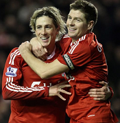
The Mash posted:I ask you, TYK, has there ever been a shirt that was made better by the sponsor? Reasons may include humour and/or aesthetics I just can't picture an Inter shirt without "PIRELLI" on the front, so there's that.
|
|
#
?
Dec 19, 2013 02:54
|
|


|
Paddyb posted:I love a Bimbo kit 
|
|
#
?
Dec 19, 2013 03:06
|
|
|
Love me some Bimbo
|
|
#
?
Dec 19, 2013 04:23
|
|
|
You guys are all wrong, Bimbo only sponsor horrible scum clubs
|
|
#
?
Dec 19, 2013 04:46
|
|


|
The Mash posted:I ask you, TYK, has there ever been a shirt that was made better by the sponsor? Reasons may include humour and/or aesthetics Any Roma Assitalia shirt
|
|
#
?
Dec 19, 2013 04:50
|
|

|
Drogadon posted:You guys are all wrong, Bimbo only sponsor horrible scum clubs See the post above yours for more evidence of this fact.
|
|
#
?
Dec 19, 2013 04:57
|
|
|
Lamont Cranston posted:Love me some Bimbo Why would you spend so much time "designing" a jersey based on something worn 100 years ago and then have a big sponsor and maker's mark??
|
|
#
?
Dec 19, 2013 05:01
|
|

|
Peanut President posted:Why would you spend so much time "designing" a jersey based on something worn 100 years ago and then have a big sponsor and maker's mark?? Because the sponsor pays millions of dollars a year to be on the front of their shirts? Not really sure what you're driving at here I mean did you not see this one from one page ago?
|
|
#
?
Dec 19, 2013 05:17
|
|

|
It's just something that irks me. They wouldn't have worn sponsors back in 1915 so can't they just for one match drop it? edit: I know it's all a business and poo poo but jesus it's kind of ridiculous.
|
|
#
?
Dec 19, 2013 06:24
|
|
|
I see the Mister Lady shop every time I go to Nuremburg. I had no idea the company sponsored 1FCN. That's great.
|
|
#
?
Dec 19, 2013 10:17
|
|

|
Ok, so we've firmly established that some sponsors do make certain shirts better on account of humour, but what about aesthetics then? Has any shirt ever been made prettier by having a sponsor?
|
|
#
?
Dec 19, 2013 13:44
|
|


|
The Newcastle brown ale sponsor always looked pretty good
|
|
#
?
Dec 19, 2013 13:46
|
|

|
I'm admittedly biased but I thought Carlsberg always looked great on the Liverpool kits, especially in the latter years - never intrusive, always complimented the kits'/club's colours well, etc: ('Nando in his prime  ) ) Same applies to Crown Paints. Dunno why but IMO the Emirates logo generally looks classy on most jerseys - Milan, Arsenal, PSG, Madrid, etc. (comedy option: Qatar Foundation on "Mes que un club" Barcelona, because you can't make a gradient look worse can you?) 
|
|
#
?
Dec 19, 2013 15:18
|
|
|
I've always thought the Chang logo looked really nice on the Everton shirt. I also have no idea what Chang is. edit: the 02 on the old Arsenal shirts always looked cool, too. double edit: Hmm I did a GIS for the O2 shirts,and I remember them better.  Didn't they have one with a bigger, less blocky O towards the end of that contract? blue footed boobie fucked around with this message at 15:46 on Dec 19, 2013 |
|
#
?
Dec 19, 2013 15:36
|
|

|
Nintendo Fiorentina is the obvious answer The one with gold in it wasn't as cool but this one is perfect
|
|
#
?
Dec 19, 2013 15:40
|
|
|
blue footed boobie posted:I've always thought the Chang logo looked really nice on the Everton shirt. I also have no idea what Chang is. 'Chang' is elephant in the Thai language, and the company makes beer.
|
|
#
?
Dec 19, 2013 23:30
|
|
|
The Jeep logo on Juventus jerseys look good imo. But they're super basic and would fit on any kit, really
|
|
#
?
Dec 20, 2013 00:31
|
|

|
oldman posted:'Chang' is elephant in the Thai language, and the company makes beer. It's a bit poo poo. The beer, not the sponsor logo, that's ace.
|
|
#
?
Dec 20, 2013 00:33
|
|
|
sticksy posted:I'm admittedly biased but I thought Carlsberg always looked great on the Liverpool kits, especially in the latter years - never intrusive, always complimented the kits'/club's colours well, etc:  I do miss the Carlsberg a lot I do miss the Carlsberg a lot 
|
|
#
?
Dec 20, 2013 02:34
|
|
|
Shrapnac posted:It's a bit poo poo. The beer, not the sponsor logo, that's ace. It is, but it was cold (and was served with ice?!) and made some way to getting my drunk.
|
|
#
?
Dec 20, 2013 03:43
|
|
|
Drogadon posted:Nintendo Fiorentina is the obvious answer I don't think it's possible to do any better than this
|
|
#
?
Dec 20, 2013 05:34
|
|


gucci void main posted:I don't think it's possible to do any better than this SEGA was a pretty sweet sponsor imo.
|
|
|
#
?
Dec 20, 2013 05:48
|
|

|
oh em gee bee ess posted:SEGA was a pretty sweet sponsor imo. Blue SEGA on the gold 01-02 away shirt. The Best Also Chang is alright for Asian macrobrew, whenever I find it in Japan it's at least a nice change from local brews.
|
|
#
?
Dec 20, 2013 08:11
|
|

|
Homura posted:
Me too, but Standard Chartered haven't been too bad. Kept their logo nice and simple and white, same as Carlsberg's.
|
|
#
?
Dec 20, 2013 08:24
|
|

|
The Mash posted:I ask you, TYK, has there ever been a shirt that was made better by the sponsor? Reasons may include humour and/or aesthetics I always liked Gemeentekrediet's logo on the Club kits: 
|
|
#
?
Dec 20, 2013 10:27
|
|

|
 Perfect to wear if you are in fact a TOP MAN and want everyone to know it
|
|
#
?
Dec 20, 2013 10:47
|
|
|
The Mash posted:Ok, so we've firmly established that some sponsors do make certain shirts better on account of humour, but what about aesthetics then? Has any shirt ever been made prettier by having a sponsor? 
|
|
#
?
Dec 20, 2013 11:48
|
|

|
I think our kits this year are actually better with the sponsor as well. Especially the away.
|
|
#
?
Dec 20, 2013 12:05
|
|

|
There is no Inter shirt without Pirelli!!!
|
|
#
?
Dec 20, 2013 13:05
|
|
|
Heh look at you scrub plastics. Here's the best kit sponsors: 
|
|
#
?
Dec 20, 2013 15:44
|
|
|
harperdc posted:Blue SEGA on the gold 01-02 away shirt. The Best 
|
|
#
?
Dec 20, 2013 21:26
|
|
|
I really liked when Gr�mio was sponsored by Coca-Cola.  Back in the olden days, sponsors wouldn't tack rival team colors in your team's shirt, even giant companies such as Coca-Cola, which shares its color with Gr�mio's rivals, Internacional. On the other side of the cola wars, Pepsi used to sponsor Corinthians, and they had to resort to using the international logo for Pepsi Twist in the club's shirt, as the fruit we call lemon in Brazil is actually the lime, which is green, Palmeiras' institutional colors. That was really tactful.   A couple of years ago, it seemed that every club in Brazil had the same regrettable BMG sponsor, a loan shark bank in orange which made every shirt look horrible:  Fortunately, they seem to be gone by now, except for clubs in Minas Gerais where the "bank" is based.
|
|
#
?
Dec 20, 2013 23:42
|
|

|

|
| # ? Jun 5, 2024 11:44 |
|
|
God I love reading & talking about football kits 
|
|
#
?
Dec 21, 2013 01:14
|
|