


|
grack posted:
Use lightroom. 
|
 #
?
Apr 21, 2014 08:07
#
?
Apr 21, 2014 08:07
|
|


|

|
| # ? Jun 10, 2024 11:21 |
|
|
Hi! There was a lunar eclipse last week and I borrowed my dad's Nikon D200 to try to take pictures of it. Unfortunately it was completely cloudy the whole night, so I didn't get anything. But I've been taking the camera out almost every day and taking pictures of everything. It's so much fun! I'm really enjoying the peace and quiet, and looking at things in a different way. I find I'm appreciating my environment and surroundings a lot more now. I'm a complete noob to photography, and the technical aspects of it kinda fly over my head for now. I've been trying to focus on composition and stuff to limit the amount of shots I take and to make the ones I do take more aesthetically pleasing. I don't feel comfortable yet critiquing other people's pictures, so I'll just focus on mine. Rip me apart please! I'd like to get better. Went out to a nearby park on Saturday, it was raining a little bit and there was almost no one around (nice!):  Learning 3 by badmountain, on Flickr Learning 3 by badmountain, on FlickrI thought this was pretty cool when I first took it, but I've been looking at other pictures of waterfalls and now I'm just kinda ashamed of it. I think if I took a step or two into the right, into the pool of water, I would've had a nicer shot (maybe?). I need to buy some flood pants. I wanted more focus on the waterfall itself, and I feel like the foliage in the upper right quadrant detracts from it.  Learning 2 by badmountain, on Flickr Learning 2 by badmountain, on FlickrI watched a video on leading lines before heading out, so I specifically tried to find something to try that out on. I saw this plant (dead fern I guess) and shot it pretty much top down. I like it, but I wish there was something for my eye to focus on at the bottom, to where it's pointing to. There was a clover-like plant at the bottom which isn't in focus - as it is my eye is drawn along the fern but then is sort of frustrated when there's nothing to look at besides the fern. Does that make sense?  Learning 1 by badmountain, on Flickr Learning 1 by badmountain, on FlickrThis one is probably my favourite out of the whole day. I'm not sure why exactly. Maybe it's the texture of the moss-covered rocks, or the little cave in the tree trunk behind them. I just really like looking at this one. I probably spent around 4 hours in the park alone, getting soaked, and it's been the highlight of my weekend so far.
|
|
#
?
Apr 21, 2014 20:59
|
|

|
Skizzzer posted:Hi! There was a lunar eclipse last week and I borrowed my dad's Nikon D200 to try to take pictures of it. Unfortunately it was completely cloudy the whole night, so I didn't get anything. But I've been taking the camera out almost every day and taking pictures of everything. It's so much fun! I'm really enjoying the peace and quiet, and looking at things in a different way. I find I'm appreciating my environment and surroundings a lot more now. 1:The waterfall looks great, but I think I would have wanted more of the water at the bottom. 2:The point of focus doesn't really work for me, hard to identify the subject here. 3:I think a smaller aperture would have worked better here. It kind of bothers me that the moss in the foreground is out of focus.  DSC_8139 by Dingus Falcon, on Flickr  DSC_8144 by Dingus Falcon, on Flickr I meant for these to be dark. murp fucked around with this message at 15:48 on Apr 22, 2014 |
|
#
?
Apr 22, 2014 04:23
|
|
|
murp posted:
The first one works because you have a very clearly defined subject ie the log bridge is much darker than the surroundings and so it stands out. The second one not so much. I'm trying to figure out what the focus of the picture is meant to be.  On the Couch X by jkostashuk1, on Flickr On the Couch X by jkostashuk1, on Flickr
|
|
#
?
Apr 22, 2014 04:40
|
|


|
grack posted:
I suppose it's just really something that is caught between two better angle but is only ok. I know it's a casual that you probably couldn't have really set up that much better so, it's just what might have been. It would have been a little more interesting if we could have caught the moment where a (the?) girl is coming in or out of the shop to add to the story. I don't know that I like the B&W treatment. I am familiar with the plant so I can identify it but the darkness kind of kills it.
|
|
#
?
Apr 22, 2014 18:09
|
|

|
Thanks for the feedback. I know the composition isn't perfect, you were right in that I didn't get a chance to re-shoot. I did like the expression enough that I decided to post it anyways. As for the plant, I burned it out to (hopefully) put a little more emphasis on the guy. Skizzzer posted:
I quite like the waterfall picture. Perhaps a touch more of the water and less of the surroundings would be good, but it's well-composed and shot regardless. The second two pictures really suffer from the same issue - you have large, eye-drawing features that are out of focus. For both, either a smaller aperture or a step back and to the left would have made them stronger.  Classy X by jkostashuk1, on Flickr Classy X by jkostashuk1, on Flickr
|
|
#
?
Apr 22, 2014 21:06
|
|

|
grack posted:
Wow, I loving love this; the stone cold glare with his middle finger up, then the faint face on the right peering at you, drat. Here's a couple.  Luftballons by ProWessler, on Flickr Not usually a fan of bird pictures but I do like how this one came out.  Untitled by ProWessler, on Flickr
|
|
#
?
Apr 22, 2014 21:29
|
|

|
murp posted:1:The waterfall looks great, but I think I would have wanted more of the water at the bottom. grack posted:
Thanks guys! Just to be clear, you both mean I should've shot at a higher f-stop right? Murk, your second picture looks really busy to me, and I feel that it detracts from your subject. It's a cool log, but I keep looking at the branches and twigs to the right of it, and the stuff in the foreground doesn't do much for me. I'm also not sure about the B&W - maybe if it was darker like you meant it to be it would be better. Ark posted:
Sweet. The bird picture is great, I love the symmetry of his feathers and the starkness of his body against the sky. The kid is a great pic too, though I wish he and his balloon filled the frame a bit more. The building and lamp not being vertical does bug me a little bit too. I picked up Lightroom and followed a tutorial on youtube for this one, and it feels way over-processed:  Learning Lightroom and Composition (2 of 5) by badmountain, on Flickr Learning Lightroom and Composition (2 of 5) by badmountain, on FlickrThis one's from today. How do you get rid of the lens flare? Or should I just not shoot into the sun?  Learning landscape (1 of 1) by badmountain, on Flickr Learning landscape (1 of 1) by badmountain, on FlickrI feel uncomfortable walking around people with my camera, I don't know how you guys just take pictures of angry old men and kids and stuff:  Learning 4 by badmountain, on Flickr Learning 4 by badmountain, on Flickr
Skizzzer fucked around with this message at 06:26 on Apr 23, 2014 |
|
#
?
Apr 23, 2014 06:23
|
|
|
Skizzzer posted:I feel uncomfortable walking around people with my camera, I don't know how you guys just take pictures of angry old men and kids and stuff: Hint: it is not a coincidence that the old man was angry
|
|
#
?
Apr 23, 2014 15:07
|
|

|
grack posted:Thanks for the feedback. I know the composition isn't perfect, you were right in that I didn't get a chance to re-shoot. I did like the expression enough that I decided to post it anyways. Used to eat lunch at this place most days when I was in high school.
|
|
#
?
Apr 23, 2014 15:28
|
|
|
I like it- I don't think it looks overprocessed at all. In fact, it has quite a natural look to me, but I didn't see the original. Are the sunbeams real? Skizzzer posted:
A lens hood helps if you're not using one already, though in this case I find the clouds somehow to be more distracting than the flare- they look almost too intense. Skizzzer posted:
I think this photo is the weakest of the three. The angle at which you've shot the scene needs a wider crop I think, so that the church window is less close to the edge of the frame. Are you trying to direct the viewer to the spire? I think it also needs a little more space above it, so that the spire is more central to the image, but this isn't really a style that I 'get', so I might be missing something. And for some of my own, I'm trying a bit of split toning, based on some discussion in the post-processing thread about this picture: Thoogsby posted:Hi Dudes/Dudettes. I'm infatuated with the tone of this photo. Any tips on replicating it? What do people think of my attempts below? Too instagrammy?  img_0056 by barfish, on Flickr img_0056 by barfish, on FlickrFor this one, I'm annoyed by the light source below the bride's arm, but I'm not sure how I could kill it:  img_0002 by barfish, on Flickr img_0002 by barfish, on Flickr
|
|
#
?
Apr 23, 2014 17:44
|
|


|
StarkingBarfish posted:And for some of my own, I'm trying a bit of split toning, based on some discussion in the post-processing thread about this picture: The split toning in the first one seems very subtle. The second one is less subtle but it's nowhere near over the top. Did you go with yellow highlight/purple shadows for your split toning in both? I think you'd need to go more of a yellow/blue to get tones more like the one in the photo where you are infatuated with the tones. Maybe play with the hue and stuff too. You want the image to end up feeling a little bit washed out so maybe cut the contrast/clarity too. A split tone I kind of like in shots in midday sun is blueish highlights/reddish shadows. Kind of counters the harshness of midday. You could try that on img_0056. The composition of img_0056 puts the girl a bit too far to the left for me. The composition of img_0002 is too tight for me. There is too much neg space between the couple and they are too close too the edges... it takes a second to see that it's a shot of a couple looking at each other across the crowd and that would be remedied by being zoomed out a tad.
|
|
#
?
Apr 23, 2014 18:38
|
|
|
Ark posted:Here's a couple. For the first one, I like the overall composition but I am wondering about the focus. Based on your EXIF, you shot wide open but focused on the balloon instead of the child's face. Was this intentional? It seems counter-intuitive. The second one... eh, sorry, isn't working for me. It looks nice but shows signs of overprocessing with the main culprit being the very noticeable halo around the eagle's body. Secondly, there really shouldn't be detail in the darker portions of the body from below. Skizzzer posted:Thanks guys! Just to be clear, you both mean I should've shot at a higher f-stop right? Yes, but you pushed it a little too far in your second picture and you're getting diffraction issues. Try to keep your f-stop at max f/16. Skizzzer posted:I feel uncomfortable walking around people with my camera, I don't know how you guys just take pictures of angry old men and kids and stuff: The honest truth is that most people (I'd say 90%+) don't care that much. The rest seem to be evenly split between "You're taking my picture? gently caress you!" and "You're taking my picture? Cool!" Case in point:  She's Got the Look X by jkostashuk1, on Flickr She's Got the Look X by jkostashuk1, on FlickrThis woman didn't really have the smirk going until I pointed my camera at her.
|
|
#
?
Apr 23, 2014 18:40
|
|
|
grack posted:
Beautiful. Going into my lookbook for sure
|
|
#
?
Apr 23, 2014 19:05
|
|

|
Dren posted:The split toning in the first one seems very subtle. The second one is less subtle but it's nowhere near over the top. Did you go with yellow highlight/purple shadows for your split toning in both? I think you'd need to go more of a yellow/blue to get tones more like the one in the photo where you are infatuated with the tones. Maybe play with the hue and stuff too. You want the image to end up feeling a little bit washed out so maybe cut the contrast/clarity too. A split tone I kind of like in shots in midday sun is blueish highlights/reddish shadows. Kind of counters the harshness of midday. You could try that on img_0056. Yeah, in both I went rose-yellow highlights and blue-purple shadows. I tried more yellow/blue to begin with, but I found it a little too extreme for my tastes. I'm surprised you find it subtle in the first photo- the original shot was very vibrant, and I found the toning procedure washed it out a lot. Maybe it's the monitor I'm working on. I like the idea of blue/red. I'll give that a go, thanks! Dren posted:The composition of img_0056 puts the girl a bit too far to the left for me. The composition of img_0002 is too tight for me. There is too much neg space between the couple and they are too close too the edges... it takes a second to see that it's a shot of a couple looking at each other across the crowd and that would be remedied by being zoomed out a tad. Thanks- I see what you mean. I think in img_0002 the crowd spoke more to me than the bride and groom. When I was cropping I was trying to avoid partial faces/limbs in the scene, but still keep the expressions on the people at the edges prominent. I'll see if I can pull off a wider crop on it, and add more space to the left of the girl.
|
|
#
?
Apr 23, 2014 19:13
|
|
|
StarkingBarfish posted:I'm surprised you find it subtle in the first photo- the original shot was very vibrant, and I found the toning procedure washed it out a lot. I don't have the original to compare to. What I mean is that it's not hit-you-in-the-face instagram obvious that you split toned it.
|
|
#
?
Apr 23, 2014 21:27
|
|
|
Ark posted:Here's a couple. This Rules grack posted:
I like this, I would try and crop out the sign on the far right though.  DSC_8263 by Dingus Falcon, on Flickr  DSC_8266 by Dingus Falcon, on Flickr  DSC_8247 by Dingus Falcon, on Flickr DSC_8247 by Dingus Falcon, on Flickr
|
|
#
?
Apr 24, 2014 01:27
|
|
|
StarkingBarfish posted:I like it- I don't think it looks overprocessed at all. In fact, it has quite a natural look to me, but I didn't see the original. Are the sunbeams real? Yup! Here's the original:  windsurfer (1 of 1) by badmountain, on Flickr windsurfer (1 of 1) by badmountain, on FlickrStarkingBarfish posted:
I like it, but I think her face is too far to the left and I wish the vertical pole in the middle wasn't there. When I first glance at it it almost looks like 2 different pictures spliced together. Maybe if you took a step to the left and had more of your friend/SO/sister not so close to the frame. StarkingBarfish posted:
I love this picture. Too bad about the light source, but I love how all the guys are looking at something else going on (I wonder what they're looking at?), while the groom and bride only have eyes for each other. Great story, and I like the composition. grack posted:
Duly noted. That smirk makes her seem so confident. I'm gonna have to give this a shot sometime!
|
|
#
?
Apr 24, 2014 06:35
|
|
|
Skizzzer posted:Yup! Here's the original: It's a good photo to begin with, but what you've done in post really tops it off. I like it a lot. Out of interest, can you point me to the tutorial you used?
|
|
#
?
Apr 24, 2014 07:36
|
|
|
this guy: https://www.youtube.com/watch?v=Vi1-8qYHWaQ&list=PLllFqBuTM0WI0fC_PujkGoLMyXWXd3yF7
|
|
#
?
Apr 24, 2014 19:44
|
|
|
murp posted:
1. Love the trumpet player. Great personality, great framing. Maybe just a touch brighter though? 2. Good idea but I think there's too much foreground that's OOF to make this really work. A couple feet closer and a bit to the left I think would be better 3. This is awesome. Love the negative space in the centre and the balance between the people in the bottom corner and the staircase in the top left.  Bus Stop X by jkostashuk1, on Flickr Bus Stop X by jkostashuk1, on Flickr
|
|
#
?
Apr 24, 2014 19:48
|
|
|
murp posted:
The first and the third I like quite a lot particularly the sideways glance from the trumpet player. The third one I like the way the shot was farmed putting the figures in the bottom corner helps give an overall feel that they are headed somewhere and there's important business to be discussed. I went for another trip out to Cockatoo Island which sits in the middle of Sydney Harbour. There's quite a lot to look at but these are three of my favourites:  IMG_1440.jpg by drgarbanzo, on Flickr IMG_1440.jpg by drgarbanzo, on Flickr IMG_1487.jpg by drgarbanzo, on Flickr IMG_1487.jpg by drgarbanzo, on Flickr IMG_1517.jpg by drgarbanzo, on Flickr IMG_1517.jpg by drgarbanzo, on Flickr
|
|
#
?
Apr 25, 2014 03:47
|
|
|
Dr. Garbanzo posted:
 Objectively, the vertical line that predominantly sits in the middle of the frame is not straight up and down. Subjectively, I find the featureless right side of the photo to be a little much and I think that reframing it so that it's comprising more like 1/4 of the frame would make for a stronger shot.
|
|
#
?
Apr 25, 2014 04:34
|
|
|
Dr. Garbanzo posted:
I really like this. The bottom part of your first pic looks too underexposed to me - is the guy your subject? It looks like he's taking a picture or a video, and he might have a funny hat on, but it's too hard to tell for me. Seconding that the vertical wall is not vertical and also that it's taking up too much of the picture. There's nothing interesting on that half right now. The clouds were gorgeous today but i missed it by a couple of minutes:  sunset (1 of 1) by badmountain, on Flickr sunset (1 of 1) by badmountain, on FlickrI love the light and water but i wish i had more time to find a better spot to take this shot. I want to take better landscape shots - any suggestions?
|
|
#
?
Apr 25, 2014 05:35
|
|
|
murp posted:
I think that the foliage at the top is unnecessary, and it would be a stronger image if you cropped the top 1/4 of the image out. That way you would have the negative space leading towards the people walking.  DSC_4500 by Stingray of Doom, on Flickr DSC_4500 by Stingray of Doom, on Flickr
|
|
#
?
Apr 25, 2014 09:16
|
|
|
 This is a series of shots which I've merged together. It was taken on an island south of Iceland during Easter when it was extremely windy. Here are a few things I dislike about this shot: Parts came out too smudgy/blurry. The lens was slowly being coated with seawater which may have had its say. The islands in the back are too blue. I think it looks decent overall, but it just feels wrong. Also, the left part of that huge cliff looks like an elephant, which is an added bonus if you ask me.
|
|
#
?
Apr 25, 2014 10:19
|
|
|
SteiniDJ posted:This is a series of shots which I've merged together. It was taken on an island south of Iceland during Easter when it was extremely windy. It is always windy in Iceland.  Apart from this morning. This morning was fine.
|
|
#
?
Apr 25, 2014 10:42
|
|
|
Dr. Garbanzo posted:
First one I quite like, as you've shot it in such a way to reinforce the idea that the building, not the people in it, is the subject. I think it works well, especially with the silhouettes. The second you needed to keep wider to make sure the entire shadow was kept in frame. The third there's too much blank frame on the right and the people really should be in focus. It's not the wall/partition that's interesting - it's the people and what they're doing. For the first and third you really need to straighten your photos as well. For me, I've been doing a lot of street shooting lately, here's a pair of contrasting pics.  Rack 'em Up X by jkostashuk1, on Flickr Rack 'em Up X by jkostashuk1, on Flickr The Argument X by jkostashuk1, on Flickr The Argument X by jkostashuk1, on Flickr
|
|
#
?
Apr 25, 2014 20:12
|
|
|
grack posted:First one I quite like, as you've shot it in such a way to reinforce the idea that the building, not the people in it, is the subject. I think it works well, especially with the silhouettes. Love the first shot! Tons of character in your subject. I would try a portrait crop on the second one. Just isolate the two guys talking in the center. A friend lent me this 60mm 2.8G this morning, so naturally I have been taking these tiny little tiny photos all day.  DSC_8295 by Dingus Falcon, on Flickr  DSC_8323 by Dingus Falcon, on Flickr  DSC_8342 by Dingus Falcon, on Flickr
|
|
#
?
Apr 26, 2014 19:37
|
|
|
SteiniDJ posted:
Did you use a tripod for the panning shots? If the software you're using has limits on its ability to micro-align the pictures that can lead to blurry sections in your photo. As for the islands in the back being too blue, eh. They're not bad. If they're bothering you you can trying using a dodge tool to lighten them a little. Break from Street photos today:  Farms X by jkostashuk1, on Flickr Farms X by jkostashuk1, on Flickr
|
|
#
?
Apr 26, 2014 20:41
|
|
|
StarkingBarfish posted:
The split-toning is reasonable for both pictures, certainly not overdone. For the first, you really, really needed to keep the woman's face in focus. Yes, the balloon is more the subject but a face is too strong of an element to be ignored, especially when it's so close to the front of the picture. The second... well, the placement of that light sucks but there's not a ton you can do about it. I would've liked a step back and a longer lens length to minimize the space between the bride and groom.  Laughing X by jkostashuk1, on Flickr Laughing X by jkostashuk1, on FlickrWish I was a step to the right, but I didn't have a chance to re-compose this. Still turned out pretty good, I think.
|
|
#
?
Apr 27, 2014 19:51
|
|
|
Skizzzer posted:I really like this. Invest in heavy ND, 6-10 stop range, learn long exposures, perhaps get a wide angle though I'd say that's not 100% necessary, positioning the camera a lower and perpendicular to the ground can lend a better sense of vastness. You've got a good colour palette going on there though the blues/blue-magenta are perhaps a little over the top. ~ Three from a more unconventional headshot shoot I did yesterday. Guy is selling himself as an actor for aggressive characters, and wanted something to fit that.  RossieFull-8171 by TimFPictures, on Flickr RossieFull-8171 by TimFPictures, on Flickr RossieFull-8137 by TimFPictures, on Flickr RossieFull-8137 by TimFPictures, on FlickrBit annoyed at the background in that. May rework it.  RossieFull-8197 by TimFPictures, on Flickr RossieFull-8197 by TimFPictures, on Flickrhttp://whenileftmybed.tumblr.com/post/84104098907/talent-ross-bussie-ross-met-me-at-a-party-where I'd appreciate an rear end tearing since I haven't done this in a while.
|
|
#
?
Apr 28, 2014 07:20
|
|
|
XTimmy posted:Three from a more unconventional headshot shoot I did yesterday. Guy is selling himself as an actor for aggressive characters, and wanted something to fit that. From a purely technical perspective, there's really only a handful of minor issues. The first is the background in the second picture (which you've already mentioned you were unhappy with), the second is the very small bright sections at the top of the second and third photos. Otherwise they're well lit and well composed. I especially like the low-angle you used on the first picture to accentuate the physical size of your model. The biggest issue as that your model/actor is totally dead weight in terms of body language and expression. He's not really coming across as aggressive. For example - in the second picture, palms up and wrists showing is an ingrained submissive posture, not aggressive. The aggressive posture would actually be hands down, showing the knuckles. Similarly, in the third picture refusing to make eye contact is a submissive posture, along with keeping the mouth closed. Aggressive would be making direct eye contact (challenge) and showing a little bit of teeth in a sneer (attack). For a little more background, you can try getting a hold of any of the body language books written by Barbara and Allan Pease. 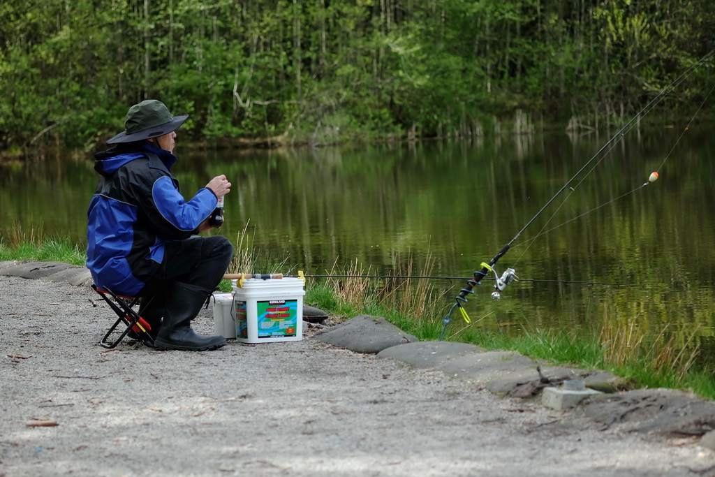 Gone Fishin' X by jkostashuk1, on Flickr Gone Fishin' X by jkostashuk1, on Flickr
|
|
#
?
Apr 28, 2014 17:27
|
|
|
grack posted:The biggest issue as that your model/actor is totally dead weight in terms of body language and expression. He's not really coming across as aggressive. Seconding this. XTimmy, you said the guy is trying to sell himself as aggressive, and the lighting/setting were great for aggressive, but when I looked at the guy all I thought was "puppy". grack posted:
Not sure what the subject is here. There's a lot of negative space in the foreground which makes me think maybe you're showing the lack of a second fisherman along with the unattended pole. But the unattended pole is cut off along the right edge of the shot so that's probably not it. I dunno it's sort of jumbled. It'd be an ok shot of just the fisherman if not for the unattended pole.
|
|
#
?
Apr 28, 2014 18:11
|
|
|
grack posted:
Beautiful shot. Looks like a Diet Coke ad.
|
|
#
?
Apr 28, 2014 18:24
|
|
|
grack posted:
I just want to say that I admire your use of the rule of thirds here- really stunning shot.
|
|
#
?
Apr 28, 2014 18:30
|
|

|
XTimmy posted:http://whenileftmybed.tumblr.com/post/84104098907/talent-ross-bussie-ross-met-me-at-a-party-where I totally didn't notice your link the first time around. Could you re-post the fourth picture with a tighter crop on the model? It's tough to tell with the downsized pictures but it does look like the best of the bunch.
|
|
#
?
Apr 28, 2014 22:51
|
|
|
Putrid Grin posted:
While no-one else has commented on this, I quite like this image. You can still tell that they're flowers, but the lighting is such that it starts to look like a random pattern. Almost like a de-constructed subject.  Really in to God X by jkostashuk1, on Flickr Really in to God X by jkostashuk1, on FlickrI don't know if there's much artistic merit here but I thought it was too absurd to pass up the photo. grack fucked around with this message at 22:53 on Apr 29, 2014 |
|
#
?
Apr 29, 2014 22:49
|
|
|
 the master by difficult listening on flickr  the light by difficult listening on flickr  the visitors by difficult listening on flickr Putrid Grin posted:
I really, really dig this. It almost abstracts the subject, so you have to stop and look at the contours and the shape of the shadows and re-examine it. The tone is really lovely too, the low greys, the light coming through the flesh of the flower, it's sort of ghostly.
|
|
#
?
Apr 30, 2014 00:28
|
|

|

|
| # ? Jun 10, 2024 11:21 |
|
|
grack posted:
Convert it to black and white, instant art.
|
|
#
?
Apr 30, 2014 00:31
|
|
