


|
Hydrocodone posted:I took these a while ago for my friends, who are the band pictured. They're nice snapshots of your friends, but they're kind of generic and boring for anyone who doesn't know them. There's only so much you can do when a concert venue has crappy lighting - could you have used a strobe? The background paintings are the best option for a background, I think the tight crop on the first photo is the most successful. Do you have any lenses that are faster than f/4?  Liberty by Jason the Hutt, on Flickr Liberty by Jason the Hutt, on Flickr
|
 #
?
Jun 16, 2014 15:43
#
?
Jun 16, 2014 15:43
|
|


|

|
| # ? May 26, 2024 02:39 |
|
|
Thanks for your feedback everyone!Hydrocodone posted:
For pretty much any live music photography you're going to need either a flash or a fast prime, preferably both. I think you were pretty much screwed in this situation. Ark posted:
This photo is exposed well for black and white, but there's so much going on that my eye never really finds a subject. murp posted:
Well done! The shadows are perfect and the composition is right on. Blue and orange always look great together. There are good lines through out and the fence really balances everything. Bubbacub posted:
I like the color in this, but the framing is too tight and I really want to see the rest of at least one guy's face. Next time try standing in front of the tank I guess?  ------  Odiorne Point by cclunie, on Flickr Odiorne Point by cclunie, on Flickr Dover Crossing by cclunie, on Flickr Dover Crossing by cclunie, on Flickr
|
|
#
?
Jun 16, 2014 16:19
|
|


|
Hydrocodone posted:Leaving the color discussion aside just a moment, I think these shots have a lot of potential but I want a wider angle on both of them. The first feels like it needs a little breathing room above and on the right side. The second I want there to be more space all around, the gate's close to fitting in and so I want it to fit entirely in and I think it would serve the photo well. u mean something like this? https://www.flickr.com/photos/damonabnormal/3185438616 or this? https://www.flickr.com/photos/sthomasphotos/2761798491 It is kinda tough to take a pic of *just* the arch and get the whole arch but leave space bc the thing is tightly hemmed in by buildings.
|
|
#
?
Jun 16, 2014 17:03
|
|

|
Dren posted:u mean something like this? https://www.flickr.com/photos/damonabnormal/3185438616 I like both those framing options more, yeah. But I see what you mean. That ATT store's facade is pretty flamboyant and can be distracting. Thanks for the feedback on my photos. I'm not unaware they might come across as "pics of my friends," but I tried to choose three I thought were interesting moments to anyone, action shots and stuff. As for lens speed, I have an f/2.8 lens I took some pictures with but I found I couldn't get to where I needed to stand to use that one. Lighting research time for me. Hydrocodone fucked around with this message at 17:53 on Jun 16, 2014 |
|
#
?
Jun 16, 2014 17:51
|
|

|
Bubbacub posted:They're nice snapshots of your friends, but they're kind of generic and boring for anyone who doesn't know them. There's only so much you can do when a concert venue has crappy lighting - could you have used a strobe? The background paintings are the best option for a background, I think the tight crop on the first photo is the most successful. Do you have any lenses that are faster than f/4? I REALLY like the composition of this one, the peeking men & small liberty on the side overshadowed by the huge, ominous hunk of metal that is a projection of power emphasized by the crop.
|
|
#
?
Jun 16, 2014 18:54
|
|

|
murp posted:
This is dope man, loving the colours and composition. Wooten posted:
I think I'm kinda biased because I'm around beaches all the time, but your first pic is just 'meh' for me. I think your subject is the log in the foreground but it's not that interesting to me. The shoreline extends to the sailboats which interest me more, but they're too distant to focus on. I like your second a lot more. I like the angle you took and the subject. It's too bad that power line is there. Was that train moving when you took the shot? My family went to Chinatown for dim sum on Father's Day:  Chinatown 1 by badmountain, on Flickr Chinatown 1 by badmountain, on Flickr Chinatown 2 by badmountain, on Flickr Chinatown 2 by badmountain, on Flickr Chinatown 3 by badmountain, on Flickr Chinatown 3 by badmountain, on Flickr
|
|
#
?
Jun 16, 2014 20:10
|
|
|
Medieval Medic posted:I REALLY like the composition of this one, the peeking men & small liberty on the side overshadowed by the huge, ominous hunk of metal that is a projection of power emphasized by the crop. Thanks! The heavy-handed metaphor is exactly what I was going for, and I had to play with the crop for a while to get it to work. The original picture is much wider, and the two heads peeking out get lost if the treads and the turret machine gun are in view.
|
|
#
?
Jun 16, 2014 20:29
|
|
|
quote:
I really like the mood in the second and third pictures. For some reason the blue lighting makes it feel like the locations should be bustling with activity, but there aren't any people visible. The first one is nice, but it feels less interesting in comparison. Bubbacub fucked around with this message at 20:37 on Jun 16, 2014 |
|
#
?
Jun 16, 2014 20:29
|
|
|
It was quite a busy shop, but I am still uncomfortable about taking shots of strangers. The shopowner waved me in when he saw me peeking my head in with my camera so I thought about taking a shot or two of him, but I wussed out :S. edit: it might sound like i'm arguing about your critique, but I'm not! Thanks for the advice man. Skizzzer fucked around with this message at 21:24 on Jun 16, 2014 |
|
#
?
Jun 16, 2014 21:15
|
|
|
Bubbacub posted:They're nice snapshots of your friends, but they're kind of generic and boring for anyone who doesn't know them. There's only so much you can do when a concert venue has crappy lighting - could you have used a strobe? The background paintings are the best option for a background, I think the tight crop on the first photo is the most successful. Do you have any lenses that are faster than f/4? I really like this pic except with that crop and the tank drivers riding with their heads out it bothers me I can't see their faces. I know there isn't anything you could have done about it (I am sure the tank was designed to make their heads as hard to see as possible), but my eyes keep wanting to move the their faces and there is that brace for the main gun obscuring them. Otherwise though I really like the focus on the front structures like the main gun and machine gun. I appreciate all the feedback on the Chinatown Gate. I got into the Photoshop Elements "enhance" menu and found the auto correct features to remove the cast while still getting the exaggerated colors I was going for. At some point I will need to sit down and learn how to fine tune it better manually. As for the framing, as Dren pointed out the gate is surrounded pretty tightly with buildings. Also it is a pretty well traveled street in DC so the vantage points are pretty much on the sidewalk if you need to take your time, which I did since I was using a camera with a waist finder and no in camera metering. If you have an autofocus camera you can use the crosswalk on G street but you have to hurry or you'll end up being a hood ornament on a metrobus, but I think that is the best vantage point to catch the least cluttered full shot of the gate. I still cut off one edge of the arch on this shot, but I had I stopped one or two step shorter I would have caught it. If I have time before I transfer out of DC I will have to go out and re-shoot this one, since I will know to have my focal length pre-set to 35mm next time.  China Town DC Digital by noonebutme2010, on Flickr China Town DC Digital by noonebutme2010, on FlickrAs for non Chinatown related pictures. Crowd shot of the last Keystone protest.  KeyStone1 by noonebutme2010, on Flickr KeyStone1 by noonebutme2010, on FlickrThis one has Daryl Hannah in it.  KeyStone7 by noonebutme2010, on Flickr KeyStone7 by noonebutme2010, on Flickr
|
|
#
?
Jun 16, 2014 23:08
|
|
|
iammeandsoareyou posted:
I quite like this shot from the standpoint of composition as the people in this situation are of more interest than the flags. However, the front row of faces are all out of focus (and a touch underexposed).  Lurch by jkostashuk1, on Flickr Lurch by jkostashuk1, on Flickr
|
|
#
?
Jun 17, 2014 00:10
|
|

|
Bubbacub posted:Yeah, I'd go with your instinct to crop it even tighter. The shadowy foreground feels very flat - it looks like an awesome landscape, but the light isn't being very flattering there. It really is an awesome place, but since the animals I'm looking for are sun loving I generally only make the 2.5 hour trip on sunny days. I didn't take any shots of the salt itself, but that's a good idea and I will probably do it next time I'm out there. The insects will soon show up in the macro thread  murp posted:I like the composition, but with no light in the foreground there isn't a whole lot to look at. I would revisit this at a different time if possible. Yeah you guys are right about the cropping. I think I'll take it up to at least the first "layer" of the bushes. Wooten posted:
I really like this one, the colors and darkness are very relaxing, but would be better without the ships in the background. The softness and muted sky put across what it's like to be in places like that in the morning or evening. Not that you're doing this here, but I've always disliked majestic, amazing landscapes that have a person in them for "scale". It always looks like a cat turd on a bedspread as far as I'm concerned, landscapes don't need scaling references unless there's something particularly unusual about them that would distort someone's perception of size. Human-habitated areas though, sure.
|
|
#
?
Jun 17, 2014 18:38
|
|


|
A little critique for others:Wooten posted:
grack posted:
Now, some of mine. Be forewarned that they're from my trip to London last month and therefore might have been done a million times (I honestly don't know).  Half Nelson by maritimexpat, on Flickr  The Edge by maritimexpat, on Flickr  Windsor Chalk by maritimexpat, on Flickr
|
|
#
?
Jun 18, 2014 15:17
|
|

|
Kenny Logins posted:A little critique for others: I didn't mind the somewhat shallow DOF at first, but now that you mention it, I think it would be really cool to take a photo here with a tilt-shift lens so the ground texture was all in focus but the background was washed out. Changing the height is good advice. I tend to prefer landscape photos that weren't obviously taken at the standing height of a human. I dunno, it just makes me feel like I'm also standing there with a camera. It's too real, man. quote:Now, some of mine. Be forewarned that they're from my trip to London last month and therefore might have been done a million times (I honestly don't know). Yes, done a million times, but nice nonetheless. You got some great clouds in the first one, and the lighting is also good in the second one. quote:
I like this. Old-looking uniform, old-looking castle, modern-looking battle rifle. Have you tried playing around with the processing in this one? Might be kind of hokey, but it might look cool if you desaturated the color a bit, so there was a hint of old-timey photography in it as well.
|
|
#
?
Jun 19, 2014 17:15
|
|
|
Kenny Logins posted:
Thanks for the feedback. I didn't, unfortunately, have a lot of time or space to set up a better picture but I liked the pairing of the two figures anyways. Kenny Logins posted:Now, some of mine. Be forewarned that they're from my trip to London last month and therefore might have been done a million times (I honestly don't know). Don't worry so much about pictures being done before, everything's been done to death in photography. If you do it well (and those first two pictures are well done) then it's worthwhile. The third one I like, I would've maybe cut just a bit of the tower on top because I don't think it's strictly necessary for the photo. Still works well as is.  What did you make by jkostashuk1, on Flickr What did you make by jkostashuk1, on FlickrTaken with an old Konica Hexanon 50mm F1.7.
|
|
#
?
Jun 20, 2014 02:23
|
|
|
grack posted:The third one I like, I would've maybe cut just a bit of the tower on top because I don't think it's strictly necessary for the photo. Still works well as is. Personally, I disagree about cropping out the tower. The relative amounts of lit and shadowy areas in the photo are nicely balanced. Cropping out part of the tower also puts more emphasis on the guard, and I don't think the image is about just the guard, it's more about his position in the environment.
|
|
#
?
Jun 20, 2014 17:14
|
|
|
 poppet likes fried meat by Jason the Hutt, on Flickr poppet likes fried meat by Jason the Hutt, on Flickr
|
|
#
?
Jun 20, 2014 17:19
|
|
|
Bubbacub posted:
I like this! The lighting and mood feel really nice, welcoming and fun. However, the can in the foreground keeps pulling my eyes toward it so I feel it's slightly distracting. I've never given my photos to the internet for critic before, so have at it.  The Ritch by Trifling Catalyst, on Flickr The Ritch by Trifling Catalyst, on FlickrI was going for a vibe inspired by the movie Drive in this one.
|
|
#
?
Jun 21, 2014 01:11
|
|
|
grack posted:Don't worry so much about pictures being done before, everything's been done to death in photography. If you do it well (and those first two pictures are well done) then it's worthwhile. Bubbacub posted:Personally, I disagree about cropping out the tower. The relative amounts of lit and shadowy areas in the photo are nicely balanced. Cropping out part of the tower also puts more emphasis on the guard, and I don't think the image is about just the guard, it's more about his position in the environment. As a real-time follow-up, here is the original (uncropped) as well as another, tighter shot taken about a second or two later.   I was pretty stoked when I realized I got basically exact same pose twice. While I see your point, grack, as between the two originally I liked having a little more vertical context. As Bubbacub said I wanted to take the shot because it seemed to me to be a little more rare to find a royal guard a) on his own, b) in motion and c) somewhere other than Buckingham. Windsor is more "castle-y" and I liked the juxtaposition. That being said, the tighter shot is one I've kept privately also, but I think the wider shot is a bit stronger.
|
|
#
?
Jun 21, 2014 12:13
|
|
|
There is no immediate focus to this photo - the intersecting lines on the right vs the harsh shadow vs the guard. The image also needs to be horizontally leveled. Bubbacub posted:
This image very badly needs color correction but is otherwise ok.  This was taken in the delivery room about an hour after birth.  Shoot for a costume designer who made this from scratch.  Same designer in her Black Canary cosplay outfit.
|
|
#
?
Jun 21, 2014 16:42
|
|
|
Skizzzer posted:
I love the colours in all three of these; the blue light in the second and third shots creates a very compelling mood. The third one is a bit busy, but I think it conveys how hectic these shops can be. I'm just getting started with digital photography and my friend was kind enough to let me take some pictures. I'd love to get feedback on these.  SMA_6805 par sandozbupropion, sur Flickr  SMA_6690 par sandozbupropion, sur Flickr I like the composition in the first shot, although I wish the background were less busy. I think both photos could be sharper, but overall I'm happy with how they turned out.
|
|
#
?
Jun 21, 2014 16:56
|
|
|
BlackWidowCult posted:
There are times when a centered composition works, and I don't think this is quite it. The second one is good, but not super interesting. Looking at your flickr page, I think you have some much stronger shots of her. I love the two that are through the fence, and the one with the bag on her head! She has amazing eyes, I like the close crop ones that emphasize that. Looks like she was an awesome model and you guys had fun, you should feel good about what you've gotten.  Shaw memorial by Jason the Hutt, on Flickr Shaw memorial by Jason the Hutt, on FlickrBubbacub fucked around with this message at 01:32 on Jun 22, 2014 |
|
#
?
Jun 22, 2014 01:29
|
|
|
Bubbacub posted:
The subject is interesting but the lighting looks totally unnatural and it's kind of jarring. 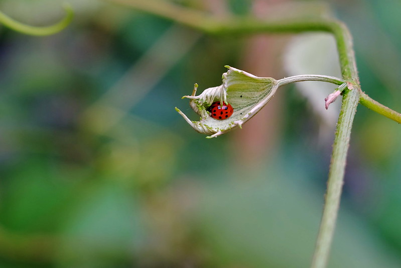 Ladybug by jkostashuk1, on Flickr Ladybug by jkostashuk1, on Flickr
|
|
#
?
Jun 22, 2014 03:13
|
|
|
grack posted:The subject is interesting but the lighting looks totally unnatural and it's kind of jarring. Unnatural how, did I pull the sky too dark? I was using a circular polarizer. quote:
Maybe a bit too much empty space, but cute!
|
|
#
?
Jun 22, 2014 03:56
|
|
|
Bubbacub posted:Unnatural how, did I pull the sky too dark? I was using a circular polarizer. Yeah. The sun is seemingly in the right of the frame behind the pillar (and the shadows on the foliage seem to confirm that), but if that's the case the pillar is too bright in comparison. It almost looks like an HDR that was pushed just a bit too far.
|
|
#
?
Jun 22, 2014 04:59
|
|
|
 tomorrowland by difficult listening on flickr  the fishes by difficult listening on flickr  the bus by difficult listening on flickr Oprah Haza posted:
I really really really super dig this. It was probably unintentional but I love that there's the pink blouse on the right side, and the blue jeans in the background on the left, and then the baby's swaddled in white with pink and blue. It's just neat, it fits really well. Also, these tones are gorgeous. Very soft.
|
|
#
?
Jun 22, 2014 05:13
|
|

|
grack posted:Yeah. The sun is seemingly in the right of the frame behind the pillar (and the shadows on the foliage seem to confirm that), but if that's the case the pillar is too bright in comparison. It almost looks like an HDR that was pushed just a bit too far. Ah, yeah, I see that. It's at the corner of a park, and there are tall buildings to the right and directly behind, so there's effectively a giant corner reflector behind me. It's just a trippy location for light.
|
|
#
?
Jun 22, 2014 14:09
|
|
|
Bubbacub posted:They're nice snapshots of your friends, but they're kind of generic and boring for anyone who doesn't know them. There's only so much you can do when a concert venue has crappy lighting - could you have used a strobe? The background paintings are the best option for a background, I think the tight crop on the first photo is the most successful. Do you have any lenses that are faster than f/4? I am not feeling the coloring here. I like the composition, as it is very dominating and fits the subject well, but the "look" of the image comes off kind of incomplete - like you were going for an older look but didn't quite nail it. Magic Hate Ball posted:
I like your cloud shot. The texture of the clouds and the line formed between the sky and the clouds are interesting to look at. Bubbacub posted:There are times when a centered composition works, and I don't think this is quite it. The second one is good, but not super interesting. Looking at your flickr page, I think you have some much stronger shots of her. I love the two that are through the fence, and the one with the bag on her head! She has amazing eyes, I like the close crop ones that emphasize that. Looks like she was an awesome model and you guys had fun, you should feel good about what you've gotten. The light is definitely weird here. Cool in a way, but mostly just disorienting. Almost like when there is a vignette added in post that adds shadows in places they don't belong in too jarring of a way. Maybe dodging the right side of the statue a bit could help; it is not a lost cause and ipf you do like the shot then you can do some post work to fix the weirdness.  IMG_7996 by -Paul Hofreiter- IMG_7996 by -Paul Hofreiter- DSCF9855 by -Paul Hofreiter- DSCF9855 by -Paul Hofreiter- DSC05785 by -Paul Hofreiter- DSC05785 by -Paul Hofreiter-
|
|
#
?
Jun 23, 2014 04:46
|
|

|
Thanks for your feedback everyone. The train in my second photo was moving, but fairly slow.Magic Hate Ball posted:
I like how fluffy the clouds look in your photo, sometimes it's hard to get that kind of definition in clouds. That said, you need to clean your sensor, in the mean time don't be afraid of your healing brush/clone stamp. I love the color in the second photo and the way you filled the frame with your subject. My only complaint is I feel like there is some detail missing in the shadows, especially in their eyes. Your first photo has great exposure and you framed the subject in an interesting way. I wish the transmission tower didn't intersect the trucks, but I see what you were doing getting all the trucks lined up. The background of your third photo is really busy, but I like how you got really low and got your subject from and interesting angle. ----  28 Pierce Street by cclunie, on Flickr 28 Pierce Street by cclunie, on Flickr Dover Police by cclunie, on Flickr Dover Police by cclunie, on Flickr
|
|
#
?
Jun 26, 2014 03:30
|
|
|
Wooten posted:
I like this shot. The dramatic angle, lovely looking place, police tape, and lack of post-shot perspective fix or shifted lens make it look like a cover from a goosebumps book from the 90s.  BWCOLOR by TCZPhotography, on Flickr BWCOLOR by TCZPhotography, on Flickr
|
|
#
?
Jun 26, 2014 15:25
|
|

|
Oprah Haza posted:
I really like how the pattern on the stockings matches the pattern on the fan she's sitting on. The color contrast between her outfit and the pipes is nice too. I think framing her in the center really works well here. Here are some photos from a trip I took to Philadelphia with my brother. This one was taken on the top of the Art Museum steps. It was about midnight and 10 or so guys showed up on bikes all kitted up with lights. There weren't any white lights on it, but the shutter was open so long that the lights cycled through all their colors and left me with this titanium glow look.  Lightup Bike by jmorris4371, on Flickr Taken from the deck of the Moshulu  Skyline by jmorris4371, on Flickr  Lantern by jmorris4371, on Flickr Phummus fucked around with this message at 14:41 on Jun 30, 2014 |
|
#
?
Jun 30, 2014 14:29
|
|

|
Boring. Boring. Also has dreadful HDR-haloing around the trees. Awesome. More of the third, less of the first two. If you must watermark make it subtle like the third, not obnoxious like the second.
|
|
#
?
Jun 30, 2014 17:27
|
|
|
Phummus posted:Here are some photos from a trip I took to Philadelphia with my brother. This is a bike on a show, the owner thinks that they are pretty nice, the bikes look well managed by their owners and the owners show them for other to appreciate. You captured one of them and showing that it is not only one, this and the lighting on them is pretty well and I kind of like this picture. Phummus posted:Taken from the deck of the Moshulu Phummus posted:
It is a funny small door and anyone walking through that door must walk sideways and the drain pipe looks like a bit funny but the lantern is the last thing that I noticed on that picture. ------ Bottarve, old farmstead on Gotland.  Gotland by dabrovnijk, on Flickr  Bottarve by dabrovnijk, on Flickr  Gotland by dabrovnijk, on Flickr erephus fucked around with this message at 22:08 on Jun 30, 2014 |
|
#
?
Jun 30, 2014 21:57
|
|
|
erephus posted:Bottarve, old farmstead on Gotland. The first picture, I'd like to see some more contrast even if it means losing some of the blue in the sky. It's very flat. The second I'm not sure if I like. I kind of get what you were trying to do with the lineup of tools but I think having the hammer handle OOF isn't the best choice because it's a very strong draw for the eye. The third needed some fill flash.  Gilmore by jkostashuk1, on Flickr Gilmore by jkostashuk1, on Flickr Overhead by jkostashuk1, on Flickr Overhead by jkostashuk1, on Flickr
|
|
#
?
Jul 7, 2014 01:52
|
|
|
grack posted:The first picture, I'd like to see some more contrast even if it means losing some of the blue in the sky. It's very flat. I think your second picture needs to be straightened.
|
|
#
?
Jul 7, 2014 16:35
|
|
|
grack posted:
First one is too tight, You cut off the bottom of the window frame and it just feels meh to me. Color is ok. Would have been far better, deadpan. Second one is pure poo poo. Learn to get the perspective right, when you are there. You are off by just enough that its loving with eyes. 8/10 for style, -10,000 for execution. Get a PC lens if you want to do something like this, in a serious manner. 35mm Nikkor AIS PC lens should be your next purchase.
|
|
#
?
Jul 7, 2014 16:42
|
|
|
Musket posted:Second one is pure poo poo. Learn to get the perspective right, when you are there. You are off by just enough that its loving with eyes. 8/10 for style, -10,000 for execution. Get a PC lens if you want to do something like this, in a serious manner. 35mm Nikkor AIS PC lens should be your next purchase. Eh. I was trying to use the building to accentuate the weird angle of the glass walls because they do lean inwards that dramatically. If you hate it, well, fair enough. A PC lens will likely be a purchase at some point this summer, though.
|
|
#
?
Jul 7, 2014 17:33
|
|
|
grack posted:Eh. I was trying to use the building to accentuate the weird angle of the glass walls because they do lean inwards that dramatically. If you hate it, well, fair enough. Blue line is straight down the middle of the image. Yellow lines are the perspective you took.  Slightly off never works, for symmetric structures make it perfect, or make it sufficiently off that it's obviously deliberate. If you wanted to accentuate the fact that the glass walls are leaning slightly inwards, a much lower perspective might have worked, camera all the way down to the floor.
|
|
#
?
Jul 7, 2014 17:57
|
|


|
grack posted:A PC lens will likely be a purchase at some point this summer, though. Haha okay
|
|
#
?
Jul 7, 2014 17:59
|
|

|

|
| # ? May 26, 2024 02:39 |
|
|
ansel autisms posted:Haha okay I was asking about getting one in the Mirrorless thread a few weeks ago but whatever. grack fucked around with this message at 18:28 on Jul 7, 2014 |
|
#
?
Jul 7, 2014 18:22
|
|