


|
Wooten posted:Kilimanjaro rises like Olympus above the Serengeti I agree in Toto.
|
 #
?
Sep 29, 2014 19:06
#
?
Sep 29, 2014 19:06
|
|


|

|
| # ? May 27, 2024 17:51 |
|
|
Wooten posted:I went to a local fair with my daughter. I really like the sense of motion in the first photo. In my opinion, the blur and colours combine to make it even more bright and cheerful - which is great for the subject! I do wish the grey stripe on the lower left of the image wasn't there; I think it grounds the image unnecessarily. For the second photo, I'd have cropped out the side of the basket on the lower left. There's an obvious carnivalesque theme between these photos, but I don't feel it as much in this second photo. The third photo is interesting, and again very cheerful (outside of the ride). It probably was out of your control but I'd have preferred everything inside of the ride to be crisp and unblurred. It's a cool concept though; I dig it.  Gotta Run by straygiraffe, on Flickr  Sheepscape by straygiraffe, on Flickr Fraction fucked around with this message at 22:29 on Sep 30, 2014 |
|
#
?
Sep 30, 2014 22:25
|
|


|
Fraction posted:
I think both of these are just too wide. The photo of the dog running at you is, well, a photo of a dog running at you. If it had been very tight on the dog, it could have been an interesting study, but I'm not really getting where you're going with it as is. Some very strange distortion around the edges, btw. The lighting on the sheepscape is much more interesting, but again we're very wide. That center sheep is interesting, but the oddles of sky isn't really. I got up very early and took this picture:  early riser by thetzar, on Flickr These were also pretty recent:  Untitled by thetzar, on Flickr  Untitled by thetzar, on Flickr
|
|
#
?
Oct 2, 2014 18:55
|
|

|
Shiruan posted:Gazelle in front of Kilimanjaro. This I'm looking to print large on canvas for a friend, hence the possible excessive silver toning. Really like this one, large print would be sick. I think it has good progression of size/scale from the gazelle all the way to the empty part of the sky.  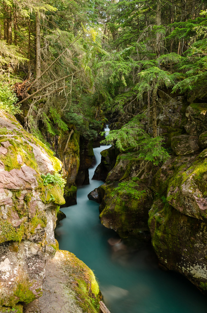 I feel like these are two of the better pictures I've taken (even though the composition is almost as trite as the Moulton Barn), considering them as print candidates, probably just for my apartment or something. Is there anything you guys would do different in post-processing to improve the images?
|
|
#
?
Oct 3, 2014 01:00
|
|

|
 a pond in montana by difficult listening on flickr  excellent birds by difficult listening on flickr  all or nothing by difficult listening on flickr thetzar posted:
I wish this guy had a different head. The body position is kinda fun and I dig fabric caught in mid-swing but his face is an expressionless void and it totally sucks the life out of the picture. The other is a little better if just by virtue of being more visually interesting, though if I had to pick a favorite from that series of photos it'd be this one.
|
|
#
?
Oct 3, 2014 01:09
|
|

|
I really like this picture. I would sit there and hang out awhile if I encountered this spot. the rocks and moss are really interesting to me and I like the water slow exposed like that. I don't like the second one as much.
|
|
#
?
Oct 3, 2014 13:22
|
|

|
single-mode fiber posted:
In this one I would lower your highlights and desat the yellows, and maybe the greens too, just a bit.
|
|
#
?
Oct 3, 2014 13:50
|
|

|
thetzar posted:
Try to avoid cropping out fingertips like that, it was the first thing that popped out at me when I saw the shot. Edit: Here's a shot I did recently for a singer/songwriter. I keep going back and forth on whether or not I like it. 
triplexpac fucked around with this message at 16:49 on Oct 3, 2014 |
|
#
?
Oct 3, 2014 16:43
|
|

|
I like the composition, but I really with I could see more of the left her face, especially if this is a promotional shot. This isn't to say that I don't like the dramatic lighting, but question its application/extremity for the purpose of this photo.  shisha by dshenphotos, on Flickr Shot this on my friend's camera and he was kind enough to send me the file. Rooftop party in low light, since I was using his fancy Sony a7 I got to play with the high ISO, which was great because I wanted the fast shutter speed to catch details in the smoke. I'm not crazy about the big dark empty space to the right of his head though.
|
|
#
?
Oct 3, 2014 20:28
|
|

|
I can only see that cloud as a giant santa claus style beard.
|
|
#
?
Oct 3, 2014 20:34
|
|

|
xzzy posted:I can only see that cloud as a giant santa claus style beard. All I can see: 
|
|
#
?
Oct 3, 2014 22:10
|
|

|
triplexpac posted:Try to avoid cropping out fingertips like that, it was the first thing that popped out at me when I saw the shot. I like the composition and idea, but that's super grainy and half her face is lost in the shadow.
|
|
#
?
Oct 3, 2014 22:21
|
|

|
triplexpac posted:Try to avoid cropping out fingertips like that, it was the first thing that popped out at me when I saw the shot. Either go full dark on the left side or dont.
|
|
#
?
Oct 3, 2014 22:32
|
|
|
hi liter posted:Shot this on my friend's camera and he was kind enough to send me the file. Rooftop party in low light, since I was using his fancy Sony a7 I got to play with the high ISO, which was great because I wanted the fast shutter speed to catch details in the smoke. I'm not crazy about the big dark empty space to the right of his head though. Magic Hate Ball posted:
As for me, I've finally started toying around in Lightroom. Not much but these were the first two pictures I finished and I think they took some OK shots and made them a bit better. I'm not sure how I feel about the focus, depth of field, or color on this one. The depth of field would have looked better if it were wider. The color is not very strong.  Panama 079 by esa_foto, on Flickr Panama 079 by esa_foto, on FlickrThose lights to the middle right are a bit distracting, however, there is another community there so, let it be?  Panama 078 by esa_foto, on Flickr Panama 078 by esa_foto, on Flickr
|
|
#
?
Oct 4, 2014 03:08
|
|

|
huhu posted:I think both of these would benefit from something that sticks out from the background. They're both pleasing backgrounds but nothing is really going on in the foreground. The downside of taking photos from a train is that you're basically taking nothing but nice background shots.
|
|
#
?
Oct 5, 2014 00:00
|
|
|
If you're not leaping out of the train you're not committed enough to your art imo
|
|
#
?
Oct 5, 2014 00:07
|
|

|
I recently got a DSLR and started shooting again after only using a 35mm SLR when I was a kid and a smartphone/point-and-shoot for years. I've been trying to shoot more nature and landscape stuff as I never really did it, and feel that most of mine come out kind of lovely. A friend and I walked through a park on Friday, and I got a couple that might be worth looking at. I wasn't aiming for anything specific on these, other than good composition.  Just a goose by notactuallyawookie, on Flickr Just a goose by notactuallyawookie, on FlickrI like the way the muddy water of the creek looks almost golden in the sunlight. I'm contemplating cropping it a bit more on the right side, but I haven't made up my mind. Birds are assholes and like to move around a lot.  A doe, a deer, a female deer by notactuallyawookie, on Flickr A doe, a deer, a female deer by notactuallyawookie, on FlickrI had a lot of trouble with focus on this, as I was shooting between some gaps in the trees and brush. I couldn't move much for fear of spooking her. I though the light came out nicely even if the focus is a bit off. Citizen Z fucked around with this message at 17:13 on Oct 5, 2014 |
|
#
?
Oct 5, 2014 16:51
|
|


|
Citizen Z posted:
Citizen Z posted:
I don't like the blown highlights on her fur, it's plain too bright. You should probably also crop the picture to make your subject more clear, but apart from that you seem to have caught the right moment.  I was lucky having the camera up right when a flock of pigeons took flight all around, but making them stand out at all in the busy scene took some really unconventional processing, strongly lowering contrast. Does this actually work, or is it just awkward?  Is this interesting at all?  Really strong contrast in this scene, not sure if it's good to have the land, sky and surfer this dark. (Shot with pol filter.)
|
|
#
?
Oct 5, 2014 22:43
|
|


|
Citizen Z posted:
I also like this one quite a bit. Really nice colors and just a nice picture all around. nielsm posted:
I don't think this one works that well. There are pigeons, yes, but not enough of them to make the shot. Two from me: My father and brother eating cake:  DSCF4603-Edit-Edit by SAFistLips, on Flickr DSCF4603-Edit-Edit by SAFistLips, on FlickrA friend:  DSCF4860-Edit by SAFistLips, on Flickr DSCF4860-Edit by SAFistLips, on Flickr
|
|
#
?
Oct 9, 2014 06:57
|
|

|
I love this; especially the tone. I want her face to be sharper though, the haze on the photo is great but I feel like it would pop more if you did a slight highpass on her face and especially the eyes. Also some more highlights in her hair might be nice. --- Re-processing some shots from a trip to Italy.  montorio III by bgibb187, on Flickr montorio III by bgibb187, on Flickr
Thoogsby fucked around with this message at 18:58 on Oct 10, 2014 |
|
#
?
Oct 10, 2014 18:55
|
|

|
Thoogsby posted:I love this; especially the tone. I want her face to be sharper though, the haze on the photo is great but I feel like it would pop more if you did a slight highpass on her face and especially the eyes. Also some more highlights in her hair might be nice. I really like this, did you do some dodging on the castle?
|
|
#
?
Oct 10, 2014 19:22
|
|
|
Geektox posted:I really like this, did you do some dodging on the castle? Just bumped the exposure on the cathedral and the smaller stone houses on the right.
|
|
#
?
Oct 10, 2014 19:30
|
|
|
Thoogsby posted:Just bumped the exposure on the cathedral and the smaller stone houses on the right. They do look a little bit... glowy.
|
|
#
?
Oct 12, 2014 03:17
|
|
|
huhu posted:As for me, I've finally started toying around in Lightroom. Not much but these were the first two pictures I finished and I think they took some OK shots and made them a bit better. This looks like it could be a really nice spot but it's really underexposed, that's why there's not much color or anything too interesting going on. If you try to save it in Lightroom you're probably just going to get a bunch of grain and distortion. I'd try going back earlier or on a clearer night where you'll have more light and can either take a longer exposure or have some sun to work with. --- street shot from a trip to rome:  green doors by bgibb187, on Flickr green doors by bgibb187, on Flickr
|
|
#
?
Oct 14, 2014 04:41
|
|
|
nielsm posted:
The low contrast looks terrible. I dunno if the shot is interesting enough to keep anyway, but if you do I'd turn the contrast back up. nielsm posted:
I like the different colours and scenes reflected in each window but they don't really stand out very well. Try boosting the exposure and saturation a little (don't overdo it) and see if that helps. Also it needs straightening. Wafflecopper fucked around with this message at 09:11 on Oct 14, 2014 |
|
#
?
Oct 14, 2014 05:55
|
|


|
Thoogsby posted:street shot from a trip to rome: Digging this, but it looks like a prime candidate for a square crop. I'd ditch the door on the right, which I don't think adds a huge amount to the composition, to end up with what looks like a pretty sweet mix of cool pipes, greenery, nasty tags, a weirdly shaped window and some great cobblestones. Lots of interesting features adding to the juxtaposition in the shot... But that door on the right isn't one of them.
|
|
#
?
Oct 14, 2014 07:43
|
|
|
nielsm posted:
First one feels like too tight of a crop. I feel like you're trying to emphasize the lion head as well as the bars, but without a little breathing room it feels a little awkward. The hard line of the light stone at the bottom is very jarring too - could you try a square crop set further back to help frame the entire scene more? The second one is just really dark and muted right now. I think also the parking lot and light poles in the background take away from what the focus should be? Here's a couple I took out on the Sonoma County coast a little bit ago - not sure how I feel about the processing on them.  IMG_0042.jpg by wildfoxmedia, on Flickr IMG_0042.jpg by wildfoxmedia, on Flickr IMG_9628.jpg by wildfoxmedia, on Flickr IMG_9628.jpg by wildfoxmedia, on Flickr
|
|
#
?
Oct 14, 2014 09:17
|
|
|
The first one is nice. Looks like a still from The Vanishing of Ethan Carter. The flare and dust is a little off-putting though. The composition in the second one isn't working. Most of the frame is out of focus, and the subject isn't prominent enough to balance that. Also: people in this thread stop posting tiny drat thumbnails, here is what you do: 
|
|
#
?
Oct 14, 2014 17:50
|
|
|
David Pratt posted:
I thought 800 wide was the max we're supposed to post here.
|
|
#
?
Oct 14, 2014 18:17
|
|
|
nullfox posted:
Totally in contrast to the other poster - I absolutely love this. I think the composition and light works beautifully. I'd genuinely have a print of this on my wall.
|
|
#
?
Oct 14, 2014 18:35
|
|
|
Fraction posted:Totally in contrast to the other poster - I absolutely love this. I think the composition and light works beautifully. I'd genuinely have a print of this on my wall. I agree that it is great. A brilliant use of three alternating layers: the bright subject, dark earth and then the bright sea.
|
|
#
?
Oct 14, 2014 20:00
|
|
|
Fart Amplifier posted:I thought 800 wide was the max we're supposed to post here. Rules thread: * Maximum width or height of any image should not exceed 1024 pixels. They updated it a little while back.
|
|
#
?
Oct 14, 2014 20:36
|
|
|
If I were doing post here I'd be tempted to tone down the brightness of the rocks in the lower right. I understand they light's authentic because they're out of the shade the rest of the photo is in, but that doesn't read that way for me in the frame and the difference in light levels draws my eye away from the water where it should be.  20140906-P9060335 by Setzu, on Flickr 20140906-P9060335 by Setzu, on Flickr 20140906-P9060513 by Setzu, on Flickr 20140906-P9060513 by Setzu, on FlickrI was 'commissioned' to take some frame-worthy shots of these little darlings before they got too old and ugly. This is my first crack at any kind of pre-planned outdoor shoot where I was able to choose the time and place, so I'm interested in feedback.
|
|
#
?
Oct 15, 2014 20:41
|
|


|
FistLips posted:
The composition is well done and gives a good sense of context but your brother looks like an amputee and I can't unsee it.
|
|
#
?
Oct 16, 2014 02:24
|
|

|
These feel very cluttered to me, especially near the top where the pictures get very busy with branches. If it were me I'd get a lot closer to the water and fill the entire frame with it, and not even bother with the trees. So anyways, I moved to Japan. When I'm not working I've been trying to get out and shoot some photos.   
|
|
#
?
Oct 19, 2014 15:20
|
|
|
Obama 2012 posted:
Great colors! Is that actual sunlight, or flash?
|
|
#
?
Oct 21, 2014 18:58
|
|
|
thetzar posted:Great colors! Is that actual sunlight, or flash? That's all natural light. I have a flash, but I haven't figured out how to use it yet.
|
|
#
?
Oct 21, 2014 19:02
|
|
|
I agree with the colors, but it looks a little dark to me, especially the first one. Plus, that blade of grass to the left is distracting, but I wonder if moving it out of the way would make that flower distracting, removing which would make the picture too boring? The second one is much more interesting, I think, because it gives some context to the subject.
|
|
#
?
Oct 21, 2014 22:06
|
|
|
The car is ugly as poo poo but I really like the tunnel as a frame. And the contrast of high-tech building materials and the weeds is great. Here are some of my recent shots:  bounce sw by arnesander, on Flickr  makro-3 by arnesander, on Flickr  wald im wald by arnesander, on Flickr I'm really not sure about the framing in this one. I love to see the little trees grow inside of the old, dead tree stump but I'm not sure if this is really the best angle. Any suggestions?
|
|
#
?
Oct 26, 2014 02:21
|
|

|

|
| # ? May 27, 2024 17:51 |
|
|
I'd like a bit more space around the last one, particularly at the top and bottom. You shouldn't be cutting off part of the subject of the photo like that. I'm not sure about the tree in the background either, as it has a greenish hue and the leaves are a bit lost against it. The colours are lovely aside from that. Also, post higher res god drat. Wafflecopper fucked around with this message at 06:11 on Oct 26, 2014 |
|
#
?
Oct 26, 2014 06:08
|
|