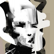
Scut posted:Did you draw these manually or is this like a unicode thing? I love it! I wish something like this was a standard in apps like pyxel edit. Manually. It was half anti-aliasing exploration and half arty disintegration of type. I cheated a whole bunch by flipping tiles too Xibanya posted:Holy crap that looks AMAZING! What you did really made the sprite pop, I will definitely try to apply what you've said going forward. Ooo now looking up tutorials on color ramps. I'm so glad you were able to put into words why the sprites just seemed kinda blah. I will now go and un-blah them! As I said, it's all stuff that literally everybody does when starting out. Check out these links if you haven't already (second one's more theory-based), pay special attention to anything that mentions "clusters", which are imo the most important things in creating solid pixel art.
|
|
|
|
|

|
| # ? May 27, 2024 04:58 |
|
Exclamation Marx posted:fun with dither patterns That is a big improvement, but you lost some of the brightness of the skirt. I thought the bright yellow really popped in a good way. I think it should be possible to have this cake and eat it too. e: phone posting, so my s3 display may be munging the colors, too. dobbymoodge fucked around with this message at 20:42 on Jul 10, 2015 |
|
|
|
  Getting back into gear again. need to push things further. get more better-er.
|
|
|
|
I applied what was said about colors to this character select portrait of one of the other characters: I know Exclamation Marx said no dithering but this image won't ever be animated and I wanted to make his beard more...beardy?
|
|
|
|
Xibanya posted:I applied what was said about colors to this character select portrait of one of the other characters: I'm gonna get poo poo for this, but: this reminds me a little too much of one of Scud's palettes, and not in a good way; you've got BROWN and BLUE and not a whole lot else. Unless this character is a zombie, I really recommend you at least reconsider the base skin color.
|
|
|
|
Besesoth posted:I'm gonna get poo poo for this, but: this reminds me a little too much of one of Scud's palettes, and not in a good way; you've got BROWN and BLUE and not a whole lot else. Unless this character is a zombie, I really recommend you at least reconsider the base skin color. part of it is that his outfit (on the in-match sprite, which shows the full body) has red stuff but that doesn't show up in the character portrait, so when I was trying to constrain the color palette the red ramps led to the skin color you see here. Should I use a different scheme for the character select portrait?
|
|
|
|
Perhaps a red background?
|
|
|
Xibanya posted:I applied what was said about colors to this character select portrait of one of the other characters: The dither on his beard is a little *too* noisy. Maybe try a more ordered dither with lines that follow the direction of hair growth.
|
|
|
|
|
Might be just me but I feel like dithering is going to always feel noisy if it's only applied to one element of an image while the rest is shaded w another method.
|
|
|
|
 Improvement?
|
|
|
the chaos engine posted:Might be just me but I feel like dithering is going to always feel noisy if it's only applied to one element of an image while the rest is shaded w another method. that too, yeah. Xibanya posted:
Much better!
|
|
|
|
|
Might as well post this bad boy. It's a simple pixel piece of Satoru Iwata, meant to resemble more traditional mediums. 
|
|
|
|
I asked a client what kind of AOE spells they would like and they said to do what I felt like so
|
|
|
|
Goddamn shoe you're getting really good at this
|
|
|
|
Shoehead posted:I asked a client what kind of AOE spells they would like and they said to do what I felt like so I'm terrible at pixel art and getting worse everyday but I think it would be funny if a second smaller stone statue fell on the first and that is why it cracks and falls apart.
|
|
|
|
Or a little hammer than then spins away
|
|
|
|
More things!
|
|
|
|
Shoehead posted:More things!  That's really good though.
|
|
|
|
I can hear the appropriate sound effect in my head when I see it. That's a kind of effect where I wouldn't be surprised to see a bunch of palette-shifted variants for different buffs in the game. MikeJF fucked around with this message at 02:10 on Jul 20, 2015 |
|
|
|
 More spiraling spells, this one for a heal!
|
|
|
|
so good
|
|
|
|
Great snappy motion. The little falling particle leftovers are a good touch.
|
|
|
|
 Aint no gettin off this train
|
|
|
|
Shoehead posted:
Fig Leaf Man wasn't even supposed to be here today. (Looks good! I like the little floating leaf at the end.)
|
|
|
|
Trying to make something something.. it's pretty barren still and the lines all over the place are temporary until I figure out something to do with it.
|
|
|
|
Imaginary Friend posted:Trying to make something something.. it's pretty barren still and the lines all over the place are temporary until I figure out something to do with it. drat that is already gorgeous
|
|
|
|
Besesoth posted:Fig Leaf Man wasn't even supposed to be here today. Yeah! Honestly it'd be cooler with a bunch more.
|
|
|
|
Or maybe a couple small branches off the main vine?
|
|
|
|
Shoehead posted:drat that is already gorgeous Here's an update. The building isn't fully rendered yet.  ninja-edit Added truck. Imaginary Friend fucked around with this message at 01:01 on Jul 28, 2015 |
|
|
|
Imaginary Friend posted:Haha cheers, I'm having a hard time getting it as I want in my head though >_< If you can, you might want to emphasize the ampersand-ness of the &; I read it as "BARBCAR" for a bit before I figured it out. Otherwise, I love this aesthetic. You're doing a great job of making a couple pixels do the talking. And the burned-out A is great! I also really like how tall the image is compared to the detail.Is this for a phone game?
|
|
|
|
Besesoth posted:If you can, you might want to emphasize the ampersand-ness of the &; I read it as "BARBCAR" for a bit before I figured it out. Otherwise, I love this aesthetic. You're doing a great job of making a couple pixels do the talking. And the burned-out A is great! did the whole thing for 32x32 characters instead of 48x48 as before so that sucks >_<  Also, it's for PC. The size is due to the map being like that later. The title screen will be in the sky and the view will scroll down to the ground level when starting a new game. edit Walking and idle testing.  
Imaginary Friend fucked around with this message at 07:14 on Jul 29, 2015 |
|
|
|
  traaaaaash Diabetes Forecast fucked around with this message at 19:20 on Jul 28, 2015 |
|
|
|
Colon Semicolon posted:
Try extending the time that the torso bobs down by an extra frame, it should add more visual weight I think.
|
|
|
|
Scut posted:Try extending the time that the torso bobs down by an extra frame, it should add more visual weight I think.  better?
|
|
|
|
I think so, how do you feel about it? The torso bob seems to be coming one frame too soon. Imagine that the shock of the foot planting on the ground takes a moment to transfer up to the torso, so it will 'lag' a bit. Of course I'm assuming this thing is large and very heavy. Perhaps it is not intended to be.
|
|
|
|
hmm.. it's meant to be fairly big if I were to consider scale, but it's mostly in space settings. The problem is the thing needs to be able to move into position fast, so I don't want to tie it's movement up too much with the foot plant. To really get the effect across better, I'd have to add another frame I think? I can try that and see if it'll work. E: wow okay i guess I was worried over nothing. the extra frame really helps and it doesn't hold anything back. 
Diabetes Forecast fucked around with this message at 02:20 on Jul 29, 2015 |
|
|
|
Scut posted:I think so, how do you feel about it? The torso bob seems to be coming one frame too soon. Imagine that the shock of the foot planting on the ground takes a moment to transfer up to the torso, so it will 'lag' a bit. Of course I'm assuming this thing is large and very heavy. Perhaps it is not intended to be. I actually have exactly the opposite impression: it needs to be a frame earlier. The torso bob isn't shock traveling up, it's the front leg landing on the ground and then the torso correcting for the difference in height. (If it were shock traveling up, the torso bob would be upward, not downward.) Coordinate the torso bob with the foot landing, and it'll look right to me.
|
|
|
|
  I guess there's two versions of it now. Diabetes Forecast fucked around with this message at 02:51 on Jul 29, 2015 |
|
|
|
There are a few good shots of an ostrich running toward the camera in this: https://www.youtube.com/watch?v=2WcMRpozO4s Maybe there's some reference for what bobs when in there 
|
|
|
|

|
| # ? May 27, 2024 04:58 |
|
Imaginary Friend posted:Cheers for the feedback. How's this? Went for a more contemporary approach on the gas station since that's when the theme is set for it. Also realized I Ampersands aren't shaped like an 8 with a dash like you've done. Which is why it doesn't read as an ampersand at first and confuses the brain into interpreting it as a B. MikeJF fucked around with this message at 12:30 on Jul 29, 2015 |
|
|


