|
 IMG_0235-2 by difficult listening, on Flickr  IMG_1974-2 by difficult listening, on Flickr  IMG_2117 by difficult listening, on Flickr iSheep posted:Shot these on my trip, the first one was just kind of a "why not" snapshot but I kind of liked the idea, so I decided to continue with it. My initial thought is that maybe more context within the photo would be better, especially for the last one. I feel like there is something here but my execution was lackluster. If your aesthetic aim was "bland white people gothic", then congrats! You're a photographic Gillian Flynn. The photos in the photos don't feel worked in well enough to properly function as commentary on anything. I could see it being a take on the tension between the great, possibly strained and posed times captured in photos versus the real, drab, day to day experience, which is at least purposeful, if kitschy. Ignoring the snapshot, the first photo works nicely as a kind of eerie found-object picture, and I would suggest following that.
|
 #
?
Oct 17, 2015 02:49
#
?
Oct 17, 2015 02:49
|
|


|

|
| # ? May 21, 2024 11:33 |
|
|
iSheep posted:Shot these on my trip, the first one was just kind of a "why not" snapshot but I kind of liked the idea, so I decided to continue with it. My initial thought is that maybe more context within the photo would be better, especially for the last one. I feel like there is something here but my execution was lackluster. This is the only one that does anything for me. The rest are kinda, as you said, lackluster. I think it's largely a compositional issue, with an extra dose of bad lighting. Since they're trip photos I'm betting they were kinda one-off situations where you didn't get a chance to take your time, but give it a second shot under conditions where you can get everything right. I'm thinking you'll have to compose the shot with dual subjects, with the Polaroid shot fitting into the wider world in a way that makes it interesting, but also in a way that you can actually see what's in the photo, or at least see enough to get a feeling from it. Tricky but interesting to play with. Magic Hate Ball posted:
The first one is probably my favorite. The shoreline is a little busy but I'm not sure you can do much about that from the angle you shot at. I'm also curious how this would work in black and white. The second one could probably do without the railings in the bottom of the shot. I'm assuming the subject here is the "Marsh Island" post, as well as the trail? The third is dark and flat. Looks like you were exposing for the sky and not the forest? And three of my own, all similar subjects shot around the same time:  Rock and Driftwood by Nate P, on Flickr  Entrapped Cobble by Nate P, on Flickr  Cobble Bar by Nate P, on Flickr For the middle shot, I'm bummed that I missed the focus ever so slightly on the cobble. The DoF could be slightly longer and farther, as it stands I caught some of the focus on the wood on the top and left, while the bottom of the cobble is fuzzy. Not sure if that "ruins" it though. LogisticEarth fucked around with this message at 14:55 on Oct 17, 2015 |
|
#
?
Oct 17, 2015 13:53
|
|
|
Those feel more like snapshots to me, Log. Black and white was a good choice for the first shot. I think you should take a bit more time when composing - the "missed" dof doesn't bother me, but the power lines in the third does. In the end though it's just rocks and wood to me, there's not much compelling there. DSCF0092-Edit.jpg by badmountain, on Flickr DSCF0092-Edit.jpg by badmountain, on Flickr DSCF0095.jpg by badmountain, on Flickr DSCF0095.jpg by badmountain, on Flickr DSCF0131.jpg by badmountain, on Flickr DSCF0131.jpg by badmountain, on Flickr
|
|
#
?
Oct 17, 2015 18:55
|
|

|
Thanks for feedback, I'll maybe experiment with it more and try to be more intentional with the results.
|
|
#
?
Oct 17, 2015 19:08
|
|

|
Skizzzer posted:Those feel more like snapshots to me, Log. Black and white was a good choice for the first shot. I think you should take a bit more time when composing - the "missed" dof doesn't bother me, but the power lines in the third does. In the end though it's just rocks and wood to me, there's not much compelling there. A lot of what you said can be applied to your own photos. The bird is like the powerlines in the first one, a distraction, and apart from that it's a black shape on a grey background, it doesn't say much. Same with the other two, just a rocky beach on what looks to be a day with really boring lovely weather.
|
|
#
?
Oct 18, 2015 10:06
|
|
|
Skizzzer posted:Those feel more like snapshots to me, Log. Black and white was a good choice for the first shot. I think you should take a bit more time when composing - the "missed" dof doesn't bother me, but the power lines in the third does. In the end though it's just rocks and wood to me, there's not much compelling there. They were taken a bit quickly as I was just out walking around. The power lines in the wide shot were kind of unavoidable, one of my goals is to start using Photoshop to address stuff like that. The main thing I liked about the third shot was the way the light played off the rocks. Coming back with better weather and more thought to composition is something I wanted to try out. As for the "just rocks and wood", that's kind of what attracted me to the shots in the first place. I've always loved the shapes and textures of river rocks/cobbles and driftwood. Close shots like 1 & 2 are definitely something I want to play around with more. I think #2 generally works but could be better with a spot on depth of field, and maybe cropped/framed a but differently.
|
|
#
?
Oct 18, 2015 16:33
|
|
|
Skizzzer posted:
This is definitely the nicest of the bunch. The textures, the atmosphere, and especially the colors are terrific (pink!). LogisticEarth posted:
Loosen up a little! It feels like you're worrying excessively about the formalist aspects here, and it's locking you out of the aesthetic of the moment. What about this riverbed appealed to you? What did the atmosphere make you feel?  IMG_0941 by difficult listening, on Flickr  IMG_0990 by difficult listening, on Flickr  IMG_0716 by difficult listening, on Flickr
|
|
#
?
Oct 18, 2015 17:19
|
|
|
^ thanks! Log - yeah, that's fair. I don't know what it was like around you, but it seemed worth pointing out. rocks and wood I like too - I should've said that these particular shots are not compelling to me, for these reasons: they feel rushed, distracting stuff, etc. Skizzzer fucked around with this message at 17:25 on Oct 18, 2015 |
|
#
?
Oct 18, 2015 17:20
|
|
|
Skizzzer posted:Those feel more like snapshots to me, Log. Black and white was a good choice for the first shot. I think you should take a bit more time when composing - the "missed" dof doesn't bother me, but the power lines in the third does. In the end though it's just rocks and wood to me, there's not much compelling there. Why did you leave the vignetting in the photos?
|
|
#
?
Oct 18, 2015 17:30
|
|


|
Magic Hate Ball posted:
The 2nd strikes me as just a beach snapshot, but there is something i like in the other two. There is a sense of isolation and sparseness that i really like. I like the haziness and the 3rd is probably the strongest, i like the child basically running into nothingness.  Ares by Kyle Sonnenberg, on Flickr Ares by Kyle Sonnenberg, on Flickr 101715 -- 005 by Kyle Sonnenberg, on Flickr 101715 -- 005 by Kyle Sonnenberg, on Flickr 101715 -- 018 by Kyle Sonnenberg, on Flickr 101715 -- 018 by Kyle Sonnenberg, on FlickrI was trying my hand at a fashion-ish shoot.
|
|
#
?
Oct 18, 2015 17:43
|
|
|
bobmarleysghost posted:Why did you leave the vignetting in the photos? That's my friend's cheap ND filter I've been playing around with. I was cropping it out when I remembered to before, but lately I've just been leaving it in. I think it feels like I'm looking through a periscope.
|
|
#
?
Oct 18, 2015 18:15
|
|
|
Skizzzer posted:That's my friend's cheap ND filter I've been playing around with. I was cropping it out when I remembered to before, but lately I've just been leaving it in. I think it feels like I'm looking through a periscope. I get what you're getting at, try to make it make it a bit more obvious that you're going for a through-the-periscope look. Right now it looks bad, like it's an overlooked part of the photo, unfinished, neither there nor here. As to how to achieve that, see if you can include more of the ND filter, or maybe even buy a periscope and shoot through that.
|
|
#
?
Oct 18, 2015 18:21
|
|
|
Something like this, you mean?  ") I get what you're saying, thank you. I want to get some photography stuff for Christmas and a better ND filter is on the list. Skizzzer fucked around with this message at 18:48 on Oct 18, 2015 |
|
#
?
Oct 18, 2015 18:45
|
|
|
Ha, exactly.
|
|
#
?
Oct 18, 2015 18:47
|
|
|
LogisticEarth posted:
I like the other two! Not so sure about this one though - I feel like there's nowhere to focus on, and not enough of a subject to maintain interest. What were you going for with this? Perhaps it could have been improved by something breaking up the photo or drawing attention in the foreground, like with many classic landscapes. I almost never do B&W but felt this image benefited from it; the original had a lot of green light which was good for the atmosphere, but still not good enough to keep it in colour I think. The thumbnail shows way higher contrast than the one on Flickr, for some reason.  In The Basement on Flickr Jimlad fucked around with this message at 00:19 on Oct 19, 2015 |
|
#
?
Oct 19, 2015 00:17
|
|

|
bobmarleysghost posted:or maybe even buy a periscope and shoot through that. Now I've got this image in my head of Skizzzer as a paparazzi photographer swimming around underwater with an oxygen tank shooting pics of celebrities through a periscope.
|
|
#
?
Oct 19, 2015 00:34
|
|


|
You can't fake the look of a periscope with a filter or preset. You need to shoot the actual thing. Total immersion.
|
|
#
?
Oct 19, 2015 02:51
|
|
|
 How do I avoid taking low contrast photos like this? It was an overcast day, sun was overhead and maybe a little bit behind. If I were to print this it would look totally gray.
|
|
#
?
Oct 19, 2015 05:30
|
|

|
It's underexposed. If you look at your histogram, there's probably room on the right side where there's nothing. I bet those pants are supposed to be white, but because it is underexposed white looks like grey and everything looks greyish and low contrast. Of course, over cast days offer less contrast than sunny days, but a correct exposure will make it look a whole lot better.
Xabi fucked around with this message at 07:08 on Oct 19, 2015 |
|
#
?
Oct 19, 2015 07:05
|
|

|
Minimal, quick work. Raised exposure, upped contrast, lightened face.
|
|
#
?
Oct 19, 2015 07:52
|
|

|
Quick 'n' lovely in lightroom (prob too orange, too bad about the artifacts): Just needs a little more exposure, a little more contrast, a little more color.
|
|
#
?
Oct 19, 2015 08:03
|
|
|
Xabi posted:It's underexposed. If you look at your histogram, there's probably room on the right side where there's nothing. I bet those pants are supposed to be white, but because it is underexposed white looks like grey and everything looks greyish and low contrast. Of course, over cast days offer less contrast than sunny days, but a correct exposure will make it look a whole lot better. So how do I go about fixing this? I took it in shutter speed priority at 1/500. Camera chose f5. Do I need to look at the histograms as I go and adjust in full manual mode? Different white balance setting?
|
|
#
?
Oct 20, 2015 03:53
|
|
|
Ron Jeremy posted:So how do I go about fixing this? I took it in shutter speed priority at 1/500. Camera chose f5. Do I need to look at the histograms as I go and adjust in full manual mode? Different white balance setting? In shutter priority just use exposure compensation. Increase it to +2/3 or +1 and experiment until you figure out what exposure compensation works best for you.
|
|
#
?
Oct 20, 2015 04:19
|
|
|
If you are hooting on a day that is overcast it seems likely that the lighting will not be changing much so manual mode may be a good bet in that situation.
|
|
#
?
Oct 20, 2015 04:32
|
|

|
Ron Jeremy posted:So how do I go about fixing this? I took it in shutter speed priority at 1/500. Camera chose f5. Do I need to look at the histograms as I go and adjust in full manual mode? Different white balance setting? What is the maximum aperture on your lens? If it's a kit lens and is like 3.5-5.6 then it's possible that your camera chose F5 because you were zoomed in and that was the lowest you could go. If that's the case then the way to get around that in the future is to increase your ISO or to lower your shutter speed. RangerScum fucked around with this message at 15:54 on Oct 20, 2015 |
|
#
?
Oct 20, 2015 13:13
|
|

|
RangerScum posted:What is the maximum aperture on your lens? If it's a kit lens and is like 3.5-5.6 then it's possible that your camera chose F5 because you were zoomed in and that was the lowest you could go. If that's the case then the way to get around that in the future is to increase your ISO or to lower your shutter speed. Yeah i think this is it. Thanks.
|
|
#
?
Oct 20, 2015 17:40
|
|
|
EDIT:Jimlad posted:I like the other two! Not so sure about this one though - I feel like there's nowhere to focus on, and not enough of a subject to maintain interest. What were you going for with this? Perhaps it could have been improved by something breaking up the photo or drawing attention in the foreground, like with many classic landscapes. The light playing on the cobble field was what I was most interested in. Your advice to draw attention to the foreground is probably spot on. -------- Took some of the advice from the last round and slowed down and thought some more about composition. Also have been on a B&W kick since a presentation at my local photo club last week. So have some monochrome stuff:  Shroomin 2 by Nate P, on Flickr I spent a few minutes taking a few shots of this clump of mushrooms, I particularly liked the intersecting diagonals from the surrounding roots, with a few other clusters on the left to balance out some of the negative space. I had to compromise in the crop in post by clipping some of the cluster in the left, to go for a tighter focus on the "main" cluster. Overall I think it worked.  Compo At Sunset by Nate P, on Flickr I feel like this might be on the dark side but I like the contrast between the bright horizon and darker foreground/clouds. I also did a tighter crop shot on the island in the background from this shot. I'm not sure it works on it's own.  Sneaky by Nate P, on Flickr In contrast to the "thought out" composition in the last two, this is a quick snapshot of my wife "sneaking" a cigarette. She's not a regular smoker anymore but in certain company will snag one. As such I tried to catch the moment where she was surreptitiously lighting up. Not sure it works without the personal connection, but I felt it caught that sorta "I should hide this but simultaneously don't give a gently caress" feeling. LogisticEarth fucked around with this message at 03:13 on Oct 21, 2015 |
|
#
?
Oct 21, 2015 01:29
|
|
|
Nameless Dread posted:The 2nd strikes me as just a beach snapshot, but there is something i like in the other two. There is a sense of isolation and sparseness that i really like. I like the haziness and the 3rd is probably the strongest, i like the child basically running into nothingness. Fun shoot! The first is definitely my favourite - not for a technical reason (although I like it on that level too), but because it gives off a really strong 'The Warriors' vibe. With the bat and the facepaint it feels like a tribute to the Baseball Furies, which is always cool. ---- Just came back from a trip to the UAE. Anyone got any use for a 72MP shot of desert? I'm not kidding here. The mosque was the best part, come away with about 30 shots that I like but nothing that's world on fire stuff unfortunately. As pretty as the architecture is, I feel like I've not been able to make the shots particularly exciting. I think I was in a repeating shapes mood for most of it, and I like how the colours have come out after some post work at least.    Yeah, the reflection is hosed up in that last one due to blending multiple exposures. Might be worth me spending some time in PS to fix it I guess... EL BROMANCE fucked around with this message at 02:24 on Oct 25, 2015 |
|
#
?
Oct 25, 2015 02:20
|
|


|
EL BROMANCE posted:Just came back from a trip to the UAE. Anyone got any use for a 72MP shot of desert? I'm not kidding here. The first one is the weakest in my opinion. The repetition of the arches, as well as the reflecting pool, have the potential to be interesting. But there's also the people's shadows in the lower left, the colorful buildings and golf cart in the background on the right, and the clipping of the top of the building that all distract from that. These give it that "vacation photo" vibe, but not in a compelling way. The second is better at capturing that repetition of the arches and domes. It looks like taking a few steps to your left would have helped with the symmetry. I might have also stepped back a bit to capture the reflection of the domes, if that was possible. The third is my favorite as it has storytelling angle, with the opulence of the mosque juxtaposed a dude with a mop, tourist placards, etc.
|
|
#
?
Oct 25, 2015 03:17
|
|
|
LogisticEarth posted:And three of my own, all similar subjects shot around the same time: The first one is really striking and is the absolute perfect choice for black and white. Any color here would detract from the way the lines lead my eyes around the picture. I would have liked the second one to have a much deeper depth of field. The texture of the grain on the wood adds a lot to the photo where it's in focus, but can't really add anything but grey when it's not. The shadows would have defined the depth just as well as the focus field. For my first contribution to this thread, these two were taken between a photo shoot of my kids.   I wanted to refrain from creating those dark spots on the left of the panoramic, but decided the contrast achieved on the trees and added color of the water was worth the sacrifice.
|
|
#
?
Oct 27, 2015 03:57
|
|

|
EL BROMANCE posted:Fun shoot! The first is definitely my favourite - not for a technical reason (although I like it on that level too), but because it gives off a really strong 'The Warriors' vibe. With the bat and the facepaint it feels like a tribute to the Baseball Furies, which is always cool. Thanks for not getting me skipped! I didn't even think of the Warriors, that's a good angle. I was going for more of a Clockwork Orange feel but it didn't come through.
|
|
#
?
Oct 27, 2015 04:10
|
|
|
LogisticEarth posted:The first one is the weakest in my opinion. The repetition of the arches, as well as the reflecting pool, have the potential to be interesting. But there's also the people's shadows in the lower left, the colorful buildings and golf cart in the background on the right, and the clipping of the top of the building that all distract from that. These give it that "vacation photo" vibe, but not in a compelling way. Thanks for the appraisal, appreciate it. The shadow belongs to my fianc� who has a fine knack of somehow getting into frame as often as possible. I have a similar shot that's more zoomed in from later on in the day that doesn't have the problems of crowding/shadows etc but I didn't like the framing as much. Such is life! I'll have to check LR about the clipping, I'm usually pretty good about keeping the levels intact but I do agree it looks like I've pushed that one a bit too deep. I'll fix my local copy up. Yeah that second one was a pain because the moment I centered one element, another part was thrown out. I could've stepped back further but I believe there was a barrier that would've entered the shot at that point. You just can't win sometimes...
|
|
#
?
Oct 27, 2015 23:50
|
|
|
EL BROMANCE posted:The shadow belongs to my fianc� who has a fine knack of somehow getting into frame as often as possible. Oh my god I know this feeling so well. My ex was also into photography and every time we went out with our cameras and I asked her to stop so I could take a photo she'd wander right into my shot. I prefer to be alone when shooting now, so that the above doesn't happen and so that I don't feel I'm holding anyone up when I want to shoot and can take as long as I want.
|
|
#
?
Oct 28, 2015 00:23
|
|
|
EL BROMANCE posted:Fun shoot! The first is definitely my favourite - not for a technical reason (although I like it on that level too), but because it gives off a really strong 'The Warriors' vibe. With the bat and the facepaint it feels like a tribute to the Baseball Furies, which is always cool. I really dig all three of these. The crisp, clean colors and overall brightness do a lot for me. While I enjoy the human touch on the last shot, the one that I'm most drawn to is the second one, for that repeating pattern. I kind of wish the pedestrian weren't in the shot, but I understand that not much can be done about that. I've been traveling. There are going to be travel shots. Oh, yes.  Untitled by Jason, on Flickr  Untitled by Jason, on Flickr  Untitled by Jason, on Flickr
|
|
#
?
Oct 28, 2015 13:53
|
|

|
thetzar posted:
This is an incredible shot. Your first one of the car pulled over doesn't do much for me - I think the car actually ruins the shot, sort of introduces an element of the mundane/familiar into an otherwise surreal environment.
|
|
#
?
Oct 28, 2015 17:04
|
|

|
thetzar posted:
VelociBacon posted:Your first one of the car pulled over doesn't do much for me - I think the car actually ruins the shot, sort of introduces an element of the mundane/familiar into an otherwise surreal environment. I wouldn't say the car ruins the shot, but VelociBacon's comment gave me a quick thought that the lighting from the car could be a bit different. Instead of the bright headlights and taillights, I'm wondering whether a subtle interior dome light, or even just green dashboard light would have been more interesting. I wouldn't say the shot is really surreal, but the environment gives you a feeling of quietude or mystery. Bright headlights invoke engine noises, and clash with that. A subtle interior light sans headlights would have kind of made you think "what are they doing in there in the night". Bonus feature: Ability to title photograph "Paradise by the Dashboard Light"  thetzar posted:
This is a great shot. The only thing I would have changed, maybe, is that it could have been taken a fraction of a step to your right to eliminate that bright line in the top center.
|
|
#
?
Oct 28, 2015 17:51
|
|
|
Cloud Forest Judge Schnoopy posted:
In regards to your first shot, I'm not sure what to make of it. I still don't really understand what I'm looking at which isn't necessarily a bad thing. I think it would be a pretty cool image if you could reduce the presence of the green leaves.
|
|
#
?
Oct 28, 2015 18:39
|
|

|
InternetJunky posted:Cloud Forest I kinda feel like this kind of textural image (which I like a lot) is very hard to pull off online. It's the sort of thing that's impressive when printed at ultra resolutions wall-sized, where you can just sink into it. First thought on this one: did you try it in black and white? LogisticEarth posted:I wouldn't say the car ruins the shot, but VelociBacon's comment gave me a quick thought that the lighting from the car could be a bit different. Instead of the bright headlights and taillights, I'm wondering whether a subtle interior dome light, or even just green dashboard light would have been more interesting. I wouldn't say the shot is really surreal, but the environment gives you a feeling of quietude or mystery. Bright headlights invoke engine noises, and clash with that. A subtle interior light sans headlights would have kind of made you think "what are they doing in there in the night". Bonus feature: Ability to title photograph "Paradise by the Dashboard Light" Thanks for the feedback, everyone who provided some. I totally agree on both the dome light idea (would've been good) and that sliver of sunlight. I actually wanted to edit out that sliver right away, but figured I'd tackle it later. Ended up being easier than I thought:  A couple more of mine:  Untitled by Jason, on Flickr  Untitled by Jason, on Flickr  Untitled by Jason, on Flickr
|
|
#
?
Oct 29, 2015 22:36
|
|
|
thetzar posted:
This makes me want to travel. It's got great atmosphere to it
|
|
#
?
Oct 29, 2015 23:25
|
|
|

|
| # ? May 21, 2024 11:33 |
|
|
I am pretty new to photography. I've always loved taking pictures and art/design but I could never justify purchasing a decent camera until I bought one before a big trip at the end of summer. I have a Nikon 1 with an adapter that I mainly use for old nikkor lenses i've gotten off ebay. So far I've really enjoyed shooting manually and what comes with it. These aren't necessarily the best shots i've taken, but i'd love any criticism. Sorry for the cat portrait.  DSC_1532 by Harrison Wideman, on Flickr DSC_1532 by Harrison Wideman, on Flickr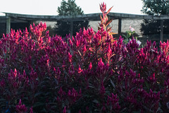 DSC_2015 by Harrison Wideman, on Flickr DSC_2015 by Harrison Wideman, on Flickr DSC_1824 by Harrison Wideman, on Flickr DSC_1824 by Harrison Wideman, on Flickrthetzar posted:
I really enjoy this image. The colors are great but something about the cleanliness of the environment makes it stand out to me as well. I think if the framing of the chairs were more symmetrical, it might play up the features I mentioned already, but that may just be me. I don't care much for the fire alarm box. thetzar posted:I've been traveling. There are going to be travel shots. Oh, yes. I don't really find the car lighting to be obtrusive in this shot. Rather, I think it provides a nice color contrast to the rest of the image. Evokes imagery of a lot of mountain travel. Maybe would have chosen a spot where there weren't boulder/rock nets, as it intrudes on the natural features, and you already have signs of civilization in the form of roadway and automobile. I assume they might be placed beside many suitable places for pulling over, though. sorry guy on next page  playground tough fucked around with this message at 17:26 on Oct 31, 2015 |
|
#
?
Oct 31, 2015 04:32
|
|