|
I remember getting annoyed at the batteries in my old non-wacom tablets, just because rather than stop working suddenly, they stopped gradually, so there was always this period of unnoticed annoyance until it got bad enough where it was obvious. Those were really poo poo no-name tablets though, one was by Trust and the other was called XP-Pen or something crazy, I guess cashing in on the name-recognition of Windows XP? Anyway, does this look 3D to anyone else?  I made this fuckin' ages ago, but only just found it again. I think it has some weird poo poo with a depth map but I was also experimenting with another thing to do with nearest neighbour scaling that was definitely done to this image:  They're both supposed to be running much faster, but all browsers cap the framerate of gifs, so the effect might be more pronounced if you download the gifs and play them in your image browser. Not much mind you, probably not worth the effort.
|
 #
?
Feb 28, 2016 02:17
#
?
Feb 28, 2016 02:17
|
|

|

|
| # ? May 15, 2024 03:36 |
|
|
I've realized I should make the jump to digital art, with my..art. I'm currently pretty alright with traditional media, but the jump to digital is confusing as hell and frustrating since I have to learn a new medium. Currently my plan is to do line work traditionally and color stuff digitally, and possibly do light line edits as need as well. I do not have any Adobe software unfortunately, but have Manga Studio 5 and a several year-old Bamboo Create. I'm sure the tablet is sufficient, but not really sure about the software. Some stranger at a bar recommended that I learn After Effects, so I'm starting the process of "getting my feet wet" with digital media. I'm basically going to be self-teaching myself here. Any pointers, advice, or places to look at as starting points would be greatly appreciated.
|
|
#
?
Mar 1, 2016 19:38
|
|
|
The software is fine. I don't know why you'd want to learn After Effects. Fangz fucked around with this message at 19:44 on Mar 1, 2016 |
|
#
?
Mar 1, 2016 19:40
|
|


|
Fangz posted:The software is fine. To follow up on this, do you want to make films? Strictly speaking it's for movies, and if you want to make movies After Effects would be a good program to know. But it's really more on the compositing side than creating any artwork from scratch. That being said out of all the compositing programs (Final Cut Pro, Adobe Premiere) After Effects for me wins hands down. Adobe has a 30 day trial so you can test all their stuff out before you decide to be apart of their "cloud". Nude fucked around with this message at 21:00 on Mar 1, 2016 |
|
#
?
Mar 1, 2016 20:58
|
|
|
Yeah sorry, I was kinda tired and out of it earlier. The ultimate goal is doing animation in after effects, but first I need to learn how to make my art digitally. A large portion of my work is already dynamic and alludes to motion anyway, so after effects would be perfect for what I want to do.
|
|
#
?
Mar 1, 2016 21:49
|
|
|
I'm not sure if it was this thread or another one, but whoever mentioned the sale on Clip Studio Paint, THANK YOU. I'd been using Corel Painter my whole life and I feel completely spoiled by the features CSP has. Also, here's a quick doodle of my cat:
|
|
#
?
Mar 2, 2016 01:55
|
|

|
After Effects being called a composting program is kind of selling it short, I think. I'm no expert, but a LOT of motion graphics and simple effects are done in it as well.
|
|
#
?
Mar 2, 2016 04:35
|
|


|
Does anyone have some good recommendations for digital painting/coloring tutorials? I've gone through the majority of CTRL+Paint's stuff, and while it's good from a technical "this is what everything does" standpoint, I'm still shaky when it comes to the actual application part: what kind of brushes to use, what sort of opacity is best, what blending mode I want, how to best use layers, etc. I'm using Krita, but anything Photoshop-related should do fine too.
|
|
#
?
Mar 3, 2016 02:00
|
|


|
I had a dream with this guy in it. I decided to try painting it entirely with a triangle brush:
|
|
#
?
Mar 3, 2016 02:13
|
|

|
Vermain posted:Does anyone have some good recommendations for digital painting/coloring tutorials? I've gone through the majority of CTRL+Paint's stuff, and while it's good from a technical "this is what everything does" standpoint, I'm still shaky when it comes to the actual application part: what kind of brushes to use, what sort of opacity is best, what blending mode I want, how to best use layers, etc. I'm using Krita, but anything Photoshop-related should do fine too. really the best way to figure all that out is by experimentation, but layer basics layer mask tutorial layer style tutorial brush tool tutorial why your painting doesn't look like the cover of ImagineFX Good old hard round and soft round are all the brushes you really need to start out with, but a directional chalk textured brush of some kind is great for sketching too - download lots of brushpacks and play around with them to find brushes you like.
|
|
#
?
Mar 3, 2016 02:24
|
|

|
Humboldt Squid posted:There's tons of basic digital painting tutorials on Deviantart, pintrest, tumblr etc. that will go over that. Thanks a bunch for the links! Another area of difficulty is getting consistently good-looking lineart when using raster-based programs. While I appreciate the freedom and textured look that raster lineart gives, it's also a real challenge for me to make it look good (especially on the very outer edges). Is doing the initial lineart in Illustrator and then coloring/adding texture in Krita the better option?
|
|
#
?
Mar 3, 2016 03:40
|
|
|
dog nougat posted:Yeah sorry, I was kinda tired and out of it earlier. The ultimate goal is doing animation in after effects, but first I need to learn how to make my art digitally. A large portion of my work is already dynamic and alludes to motion anyway, so after effects would be perfect for what I want to do. You can make beaucoup bucks my applying a little bit of typography know-how with particle effects in After Effects. Just saying. Vermain posted:Another area of difficulty is getting consistently good-looking lineart when using raster-based programs. While I appreciate the freedom and textured look that raster lineart gives, it's also a real challenge for me to make it look good (especially on the very outer edges). Is doing the initial lineart in Illustrator and then coloring/adding texture in Krita the better option? The trick is to zoom in at the correct size (which depends on how long the line is and how big your drawing surface is) and get each line drawn in one swift, fell swoop, preferably using your entire arm and not just your wrist. Also Photoshop is reportedly fussier than Manga Studio when it comes to tiny line jitters. Doing lineart in Illustrator is a true test of patience with pen tool unless I'm doing path > expand for completely perfectly uniform outlines. Blob Brush and Blob Erase tend to overcorrect for smoothness as well, and the points are nubby little circles no matter how high or low I set the pressure tolerance, and there are always icky stray points that need to be flicked off at the end. This is great for something that needs to be completely perfect once like a lasercut design that can be repeated over and over, not so good for mass-producing imagery like a comic requires in my opinion. Edit to add: The nice thing about vector points in Illustrator is that if your machine is a 2gb RAM beast from 2007 that's missing its internal battery, it's not as much of a memory hog as photoshop...Most of my Illustrator experience is due to being unable to use a tablet/stylus and unable to afford a computer that could actually run Photoshop without lag. However if your tech is up to date, use something with more traditional drawing controls, it's much better. GreatJob fucked around with this message at 04:33 on Mar 3, 2016 |
|
#
?
Mar 3, 2016 04:26
|
|

|
The trick is to use a big canvas and use quick, sweeping movements - and have ctrl-z set to a tablet hotkey  Lazy Nezumi is also an awesome smoothing program for PS that helps me a lot with lineart, plus it has perspective tools that are really helpful. iirc manga studio has smoothing built in as well.
|
|
#
?
Mar 3, 2016 06:36
|
|
|
I made this today, because I am a dumb nerd:
|
|
#
?
Mar 3, 2016 11:45
|
|

|
Flyer design mockup that the band is now considering for an album cover instead. EDIT: A few slight tweaks. Put the moons up in the corner. 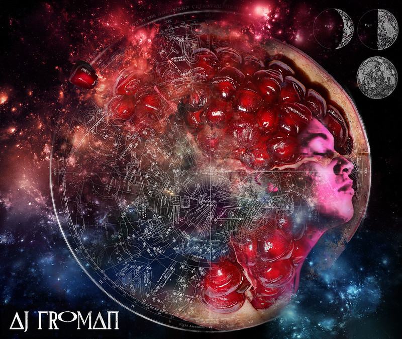 Since it might actually end up as an album cover, C&C is very much needed. Animated GIF progress here: 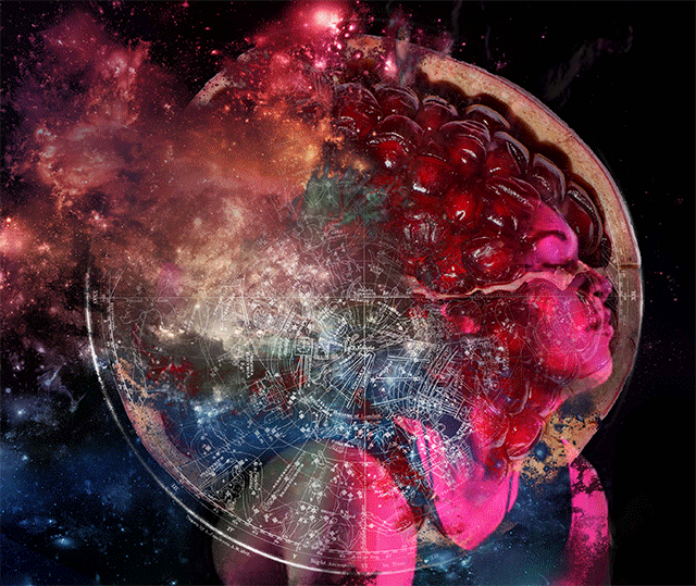
sigma 6 fucked around with this message at 00:53 on Mar 8, 2016 |
|
#
?
Mar 7, 2016 14:44
|
|

|
Found an old sketch from like 2009 on a dusty HD Decided to scribble all over it, had fun! Megaspel posted:Anyway, does this look 3D to anyone else? Kinda sorta? to me it looks like the 2d character pops more with the weird jittering. Not sure, it does look more alive and interesting though.
|
|
#
?
Mar 8, 2016 00:46
|
|

|
I'm shooting to be able to produce pieces like these in 30 minutes.  I do know it's possible.  Edit: Made this quick as well but wasn't gonna make a new post for it.  Edit 2: Ditto! Scribblehatch fucked around with this message at 00:50 on Mar 9, 2016 |
|
#
?
Mar 8, 2016 14:46
|
|

|
Humboldt Squid posted:There's tons of basic digital painting tutorials on Deviantart, pintrest, tumblr etc. that will go over that. Thanks for this!
|
|
#
?
Mar 9, 2016 03:13
|
|
|
 It's a shame the squire class is weak. The female knight design doesn't look this cool.  Edit: I'm 'avin a grand ol time with these.  Edit: Thread seems a bit more inactive than usual. Scribblehatch fucked around with this message at 03:56 on Mar 11, 2016 |
|
#
?
Mar 9, 2016 19:32
|
|
|
Is that Orko from He Man? Here is another flyer prototype but I liked the first one much better. 
|
|
#
?
Mar 11, 2016 05:14
|
|
|
Scribblehatch posted:Edit: Thread seems a bit more inactive than usual. Relevant to thread: I've finally found a wireframe method and figure drawing methodology that actually saves me time but I haven't had time to do more than sketch because it's photography season so I'm making GBS threads up the photography forum. Once rainy season picks up in Japan it'll be drawing time again.
|
|
#
?
Mar 11, 2016 06:09
|
|


|
sigma 6 posted:Is that Orko from He Man? https://www.youtube.com/watch?v=XjPF3AwVPM4
|
|
#
?
Mar 11, 2016 11:23
|
|
|
https://www.youtube.com/watch?v=aeVOg9D5q0Q There's nothing better than 30 minutes of this glorious loving theme song. Vivi was my favorite character, I think it spoke to my teenage angsty existential crisis at the time.
|
|
#
?
Mar 11, 2016 17:37
|
|

|
  I think I posted this here forever ago, right? Slow progress.
|
|
#
?
Mar 11, 2016 19:43
|
|
|
Oh right. Completely forgot about Final Fantasy. Used to play that on my NES... or SNES... can't remember. Anybody else tried out polybrush? It is a lot of fun! https://www.youtube.com/watch?v=g4_h1FTiQ_g ...also free for the time being!
|
|
#
?
Mar 11, 2016 23:12
|
|
|
sigma 6 posted:Is that Orko from He Man? Nice work looks great
|
|
#
?
Mar 12, 2016 13:00
|
|
|
Stuff that uses electronics counts as digital art right? I made this interactive installation: https://vimeo.com/158418094 
|
|
#
?
Mar 12, 2016 18:20
|
|

|
 I may have gone a little overboard in places..
|
|
#
?
Mar 13, 2016 03:06
|
|
|
ekuNNN posted:Stuff that uses electronics counts as digital art right? This is cool as hell man. Can you elaborate a little more on the technical side of how it works?
|
|
#
?
Mar 14, 2016 04:59
|
|
|
Scribblehatch posted:I'm shooting to be able to produce pieces like these in 30 minutes. Would you mind sharing your typical method for doing one? I've been working on trying to reduce the overall time I spend on each piece that I'm done, but I don't have a good method yet worked out and thus end up dithering a whole lot on irrelevant details.
|
|
#
?
Mar 14, 2016 06:32
|
|
|
Alrighty this may not be the best jumping on point since how I produced this is so atypical to the rest. Recently I've been actually timing myself at 30 minute intervals. Every time the timer goes off, I screencap my progress, tuck it into the image and write the time.   You see how I colored it in early on. Those aren't final. I just put them in to make it easier to divine which lines were actually which. It helped a lot for this particular piece. Aside from that I think it's sorta visually explanatory, but if you have any questions, shoot.
|
|
#
?
Mar 14, 2016 20:06
|
|
|
Scribblehatch posted:Alrighty this may not be the best jumping on point since how I produced this is so atypical to the rest. It took a moment to figure out there was only one pair of legs. If the sash was shorter and he cast more of a shadow that you could see in its entirety, the floating effect would be stronger. This is a bit more detached, but if the staff was also off the ground, I wouldn't suspect this was one of those fake floating yogi deals.
|
|
#
?
Mar 14, 2016 22:19
|
|

|
frozenpussy posted:This is a bit more detached, but if the staff was also off the ground, I wouldn't suspect this was one of those fake floating yogi deals.
|
|
#
?
Mar 14, 2016 22:37
|
|
|
I'd say that you are probably putting too much detail into sketching and the colour sketch. You can work a lot faster if you keep sketching very simple and move straight into inking and colouring, fixing as you go. I had a go at trying to do that picture as quickly as I can and this is what I ended up with:  Total time = 90 minutes. Obviously my linework and design is much simpler, there's no background, and I had your thing to look at (though I tried to avoid looking too much....) But I do think the benefit of working digitally is that you can put in a more messy preliminary work and fix it afterwards, and this can be much faster. Ideally with this I'd leave it overnight and come back to it with fresh eyes in the morning.
|
|
#
?
Mar 15, 2016 01:47
|
|
|
 I stopped working on this because I couldn't figure out a method that would look right, and not take the rest of my life to complete. I'm going to scrap the third step and instead render a metallic sphere of the same material as the armor. Then I'll cut slices of the sphere and overlay them onto each piece of the armor to get the lighting to look uniform and correct. It will probably look pixellated or blurry as I shrink or expand slices of the sphere, and I'll fix that in Painter by going over it with a brush that picks up underlying colors.
|
|
#
?
Mar 15, 2016 10:46
|
|
|
moonraker posted:Nice work looks great Thanks but it is my least favorite of the 3 mockups I have made. Turned my drawing into a 3rd flyer mockup. Not really sure if it is working. Especially not sure about the smoke element. Help please!! I feel like I suck at graphic design. Font will be fixed soon. 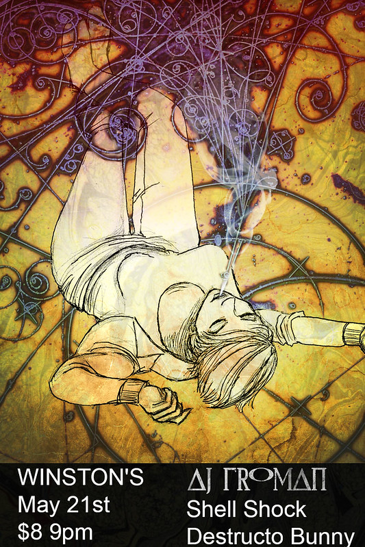 All three in order here. Definitely like the 1rst and 3rd best. 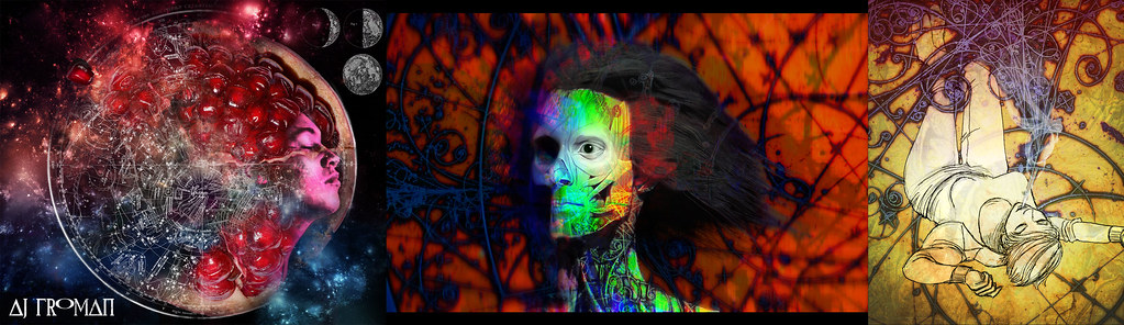
sigma 6 fucked around with this message at 20:56 on Mar 15, 2016 |
|
#
?
Mar 15, 2016 20:51
|
|
|
Fangz posted:I'd say that you are probably putting too much detail into sketching and the colour sketch. You can work a lot faster if you keep sketching very simple and move straight into inking and colouring, fixing as you go. I had a go at trying to do that picture as quickly as I can and this is what I ended up with: Very flattering to have a drawing of mine redrawn unconditionally like that. I would like to keep my early sketches simple but it's so ingrained in me now to do the exact opposite. I'm very curious what the process looks like for someone with a very lineart-heavy style. Like yours, for example! Unless it really does take an eternity. Also.  MUSH, BIRD
|
|
#
?
Mar 16, 2016 02:17
|
|
|
Scribblehatch posted:Very flattering to have a drawing of mine redrawn unconditionally like that. The structural linework doesn't take so long, because it's more of a shorthand for myself. The hard part is letting go of the lines and deciding on a rendering plan. I haven't found one that is successful or practical. I could probably continue refining the line work into a grisaille underpainting and then use overlay layers like a paint glaze. But before that I want to try the rendered sphere method so that I might be able to avoid rendering the same form and light over and over. I could also take a photo reference and color pick from it. I found an artist who uses an underpainting method, and they've been generous enough to post them alongside the final images. I've kept this tumbler open in a tab to study during my hiatus from my drawing. http://kilart.tumblr.com/ I have a feeling I just need to stage an intervention for my overuse of line.
|
|
#
?
Mar 16, 2016 04:17
|
|
|
This is shaping up to be my favorite one of these. And it's a guy who's gotten his rear end kicked.   Not because he's bad or anything. He's probably just outnumbered. And there's at least one ninja.  Edit: Weeeeeeeeee Scribblehatch fucked around with this message at 17:36 on Mar 18, 2016 |
|
#
?
Mar 17, 2016 08:01
|
|
|
|
| # ? May 15, 2024 03:36 |
|
|
Scribblehatch posted:This is shaping up to be my favorite one of these. I'm getting major Vagrant story vibes from this 
|
|
#
?
Mar 22, 2016 16:18
|
|