


|
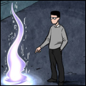
Stupid question: I have seen some games with a certain style, like "Hyper Light Drifter" having a certain scraggy/ frayed look. Are they done like this purely because the artist wants them to look this way or is there some other reason, like some developer tools that would lead to it? I just can't place them into the more "traditional pixel art" school of, well pixeling, is all. http://store.steampowered.com/app/257850/?snr=1_4_4__122
|
 #
?
Apr 1, 2016 10:49
#
?
Apr 1, 2016 10:49
|
|

|

|
| # ? May 11, 2024 08:06 |
|
|
Hyper Light Drifter is taking the approach to texture from a different angle than most traditional pixel art. If you look at a screenshot, you can see that large swathes of space are just flat colour, with perhaps just the occasional cluster of pixels to hint at a material. A lot of texture is being indicated along the boundaries of tiles, just by shaping the silhouette of the edge of that flat patch of pixels. Stylistically, I think this looks excellent and I'm sure that's part of the appeal, however I think modern gaming has some influence. Hyper Light Drifter uses lots of lighting and gradient shaders. It also uses lots of objects that feature transparency or emit light as layers above the terrain and sprites. All this other stuff happening on screen would tend to muddle finely detailed pixel art. They would fight each other. In old games where nearly everything had to be drawn almost verbatim, artists had to cram most or all of that visual effect into the opaque sprites and tiles of the main art. Additionally, animating 'untextured' pixel art is soooo much easier, as is the speed of drawing sprites. This allows the designer to create many more unified art assets than if they spent the same amount of time on 'textured' pixel art.
|
|
#
?
Apr 1, 2016 13:32
|
|

|
That makes a lot of sense. Thank you, Scut!
|
|
#
?
Apr 2, 2016 18:36
|
|
|
experiments with a limited color range -- going for 'understated', but it ended up just looking kinda bland and bonus studyboat, ft. metal slug: wherein I discover the satisfaction of drawing lots of chunky wooden planks. 
|
|
#
?
Apr 4, 2016 00:48
|
|
|
_jink posted:experiments with a limited color range -- going for 'understated', but it ended up just looking kinda bland I actually really love this piece. While it might be too desaturated for a full game, it works really well as a standalone, and would be perfectly fine for a flashback segment.
|
|
#
?
Apr 4, 2016 01:27
|
|

|
Sophism posted:I actually really love this piece. While it might be too desaturated for a full game, it works really well as a standalone, and would be perfectly fine for a flashback segment. Flashback is exactly what I thought of too. I like it! Also that wooden ship is dope.
|
|
#
?
Apr 4, 2016 01:45
|
|

|
_jink posted:experiments with a limited color range -- going for 'understated', but it ended up just looking kinda bland Hot to death. I'm envisioning the ground either only appearing as it's illuminated, or sort of clunking into place like it does in Bastion, with enemies as silhouettes until they get to the light. I'd play the hell out of that.
|
|
#
?
Apr 4, 2016 08:07
|
|

|
_jink posted:experiments with a limited color range -- going for 'understated', but it ended up just looking kinda bland jink these Own a lot and im glad to see your stuff around again
|
|
#
?
Apr 4, 2016 09:42
|
|

|
_jink posted:experiments with a limited color range -- going for 'understated', but it ended up just looking kinda bland Glad I'm not the only one to think this would be a good idea for a side scroller.
|
|
#
?
Apr 4, 2016 13:07
|
|
|
|
|
#
?
Apr 5, 2016 08:08
|
|

|
Is there any sense to working small and scaling up? My friends are telling me that I'd be wasting my time working at 4096x4096 then scaling down to half that, for example, instead of just going at a smaller resolution and scaling up.
|
|
#
?
Apr 5, 2016 13:51
|
|
|
ijyt posted:Is there any sense to working small and scaling up? My friends are telling me that I'd be wasting my time working at 4096x4096 then scaling down to half that, for example, instead of just going at a smaller resolution and scaling up. If you're using a larger brush size then I guess it's no different, unless you're doing in-game scaling, in which case you end up with smaller file sizes.
|
|
#
?
Apr 5, 2016 14:04
|
|
|
Do you mean doing like a line drawing at high res, then scaling that down to pixel art size? That is a technique often used in adventure games and also fighting games I think. If you mean trying draw pixel art at high res and then reducing resolution, that is a bad idea because dropping resolution means losing information and therefore throwing out work you have invested into a piece.
|
|
#
?
Apr 5, 2016 14:04
|
|
|
Scut posted:
Yeah, it's pixel art because pixel-level detail is important.
|
|
#
?
Apr 5, 2016 15:17
|
|
|
 Testing high-dynamic blurring action 
|
|
#
?
Apr 6, 2016 04:34
|
|

|
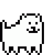
Tunicate posted:Yeah, it's pixel art because pixel-level detail is important. Yeah I was being dumb that day and confusing myself. Too used to scaling down digital art to smooth things out. Speaking of resolutions I'm really not sure what to work in for using as 2D game assets. The following is in a 128x128 canvas and would be used for a character select portrait (won't actually be a corgi, just the first reference image I had to hand), and it seems a bit too spacious. But when I tried 64x64 it seemed too limiting. Also it's my first attempt, but I feel like it turned out quite flat and not what I think of with pixel art. Are my colours too muted, not enough exaggeration in the shading in highlights? Doing something with fur probably wasn't helpful either. 
|
|
#
?
Apr 6, 2016 13:16
|
|
|
ijyt posted:Yeah I was being dumb that day and confusing myself. Too used to scaling down digital art to smooth things out. It can be hard to figure out the size of assets without knowing how your ui for your game will later be laid out. Are these portraits for an rpg status menu, dialogue boxes where you're going to not want to hamper horizontal space and have more vertical space to fill, portraits for some other purpose? If you dont know what your ui is going to look like, try looking at games in other genres and see how big their portraits are. Generally its good to stick to power 2 and then clip some of, but not all the borders with details.
|
|
#
?
Apr 6, 2016 13:20
|
|

|
At the moment a character select menu, and we're toying with the idea of including them at the bottom of the screen in a dedicated UI box/section where the health / score /etc would go. It's for a shmup so we might end up not using it that way just to keep as much screenspace as possible for the gameplay.
|
|
#
?
Apr 6, 2016 13:25
|
|
|
To be honest I would love to play as a corgi in a shmup.
|
|
#
?
Apr 6, 2016 13:36
|
|
|
I would suggest going way down in resolution, try 32x32. If you are getting accustomed to pixel art, you want to limit variables and scale is a big one.
|
|
#
?
Apr 6, 2016 18:10
|
|
|
Scut posted:I would suggest going way down in resolution, try 32x32. If you are getting accustomed to pixel art, you want to limit variables and scale is a big one. Okay.  
|
|
#
?
Apr 6, 2016 21:12
|
|
|
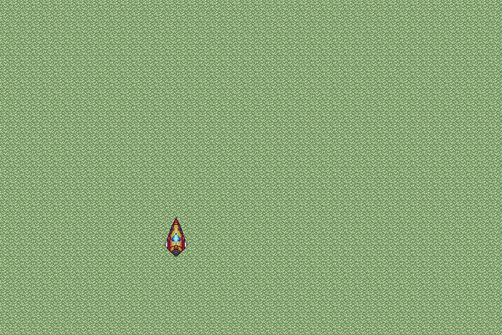 I haven't really grappled with tilesets much, so I thought I'd try doing a simple grass tile; eliminating the "grid effect" completely is pretty difficult!
|
|
#
?
Apr 7, 2016 18:33
|
|

|
At that resolution your best bet might be to use a solid color with a few sparse details that imply the presence of grass rather than showing it directly.
|
|
#
?
Apr 7, 2016 19:39
|
|

|
Disproportionation posted:I haven't really grappled with tilesets much, so I thought I'd try doing a simple grass tile; eliminating the "grid effect" completely is pretty difficult! Time to share some hot tips. 1. Open up an image done with the tile in photoshop, blur it with a radius of around half the tile initially. If you get an obvious repeating pattern, then it'll still happen. Try with a smaller radius next, etc, until you notice distinct blobs instead of the sort of 'straight line' effect you get on the picture itself. That'll let you identify exactly where the problem is. (This isn't really useful for that small of a pattern, but is especially useful when dealing with multicoloured tiles.) 2. If your tile is multicoloured, turn to grayscale (preferably with two-three ways of colour transform; the uniform transform isn't that useful here really). This'll make it more obvious where the problem is, as well as pointing out contrast issues. 3. The grid effect can be part of your style. The image you posted, for example, is subtle enough that I don't think it's a major issue to leave in a game for example. 4. If you want to leave it in but you can't seem to not make it glaringly powerful, introduce more lines yourself, off-center. Again, this is mostly useful in larger tile patterns. An interesting thing I've seen is a tile pattern that had 6 more 'grid patterns' at a few angles. They were all about as subtle as in your image though, so it actually looked really nice. I wish I still had a link to it. e: Also in case it wasn't obvious, it is very much still present in the image you posted. The tile itself also seems a bit too 'sharp' like the poster above said. It's less like grass and more like an etched surface, or like a carpet.
|
|
#
?
Apr 7, 2016 19:40
|
|

|
Cheers for the tips, guys! I was actually considering toning down the detail; I'm aiming for more of a top down shooter look, so a scaled back look might be more appropriate considering the foreground is supposed to be pretty high up altitude-wise.
|
|
#
?
Apr 7, 2016 20:11
|
|
|
 7/12 DnD classes made so far. It's a little tricky trying to keep everything in an appropriate scale, but I think nothing is particularly egregious. The Orc Bard is just slightly small by orc standards. Eventually I'm planning on making both genders for each class, and if I'm insane, maybe even racial options. All I know is they're fun as hell to make and keep me busy.
|
|
#
?
Apr 8, 2016 08:23
|
|
|
McKilligan posted:
These look so good! Are they for an actual game or a mock-up? Here's a quick update on the creature i was working on before and another one:  Tried to go for a monitor/Komodo dragon look, flattened the body and made the tail broader.  Probably a bit too active, but wanted to go with something a tad different. Based/heavily influenced by the desert worms from the final fantasy series.
|
|
#
?
Apr 8, 2016 21:30
|
|

|
Disproportionation posted:Cheers for the tips, guys! I was actually considering toning down the detail; I'm aiming for more of a top down shooter look, so a scaled back look might be more appropriate considering the foreground is supposed to be pretty high up altitude-wise. Reducing the contrast between the colors in the grass should also help to add a bit more depth and make the ship stand out from the background: 
|
|
#
?
Apr 8, 2016 22:59
|
|
|
Ash Crimson posted:These look so good! Are they for an actual game or a mock-up? Not for a game (animating is a nightmare for me), but I think eventually I'd like to compile them all into a simple program that would let you print them out as minis for DnD. I'll eventually get around to making mobs as well, skeletons, zombies, goblins, etc.
|
|
#
?
Apr 9, 2016 03:39
|
|
|
This has probably been already answered but I haven't been able to find it. Has anyone used Aseprite for game assets? Specifically tiles and spritesheets. Would you recommend another program over it? From the trial it seems pretty good, but I want to know if anyone has any gripes with it before I pull the trigger and commit to learning it
|
|
#
?
Apr 9, 2016 16:14
|
|


|
Jay Tholen used it for Dropsy. I would recommend Aseprite. I'm planning to switch over to it on my next major project. If you are doing a lot of tiling operations I would recommend Pyxel Edit.
|
|
#
?
Apr 9, 2016 17:52
|
|
|
I know it's possible to preview animations at 2x, 3x speed etc, but is it possible to save it at those speeds?
|
|
#
?
Apr 10, 2016 19:47
|
|
|
 temp art -> real art comes with a heavy tonal shift - - - too much to quote, but this threads real good still, good job goon  ( & hi jewel long time no see :] )
|
|
#
?
Apr 11, 2016 04:21
|
|
|
ijyt posted:I know it's possible to preview animations at 2x, 3x speed etc, but is it possible to save it at those speeds? Frame > constant frame rate and set your frame duration Edit: also have some art! 
Shoehead fucked around with this message at 13:53 on Apr 11, 2016 |
|
#
?
Apr 11, 2016 10:19
|
|

|
Shoehead posted:Frame > constant frame rate and set your frame duration Thanks! Not sure how I missed that. Really liking aseprite so far, much easier to work with for animations than Photoshop's timeline.
|
|
#
?
Apr 11, 2016 17:52
|
|
|
_jink posted:
 Where've you been at?? hmu with new contact details in a message or somethin if you have em, there's a lot to talk about!
|
|
#
?
Apr 11, 2016 20:29
|
|
|
 This is still getting polished off but I thought someone might like to see how I'm roughing out my animations now. I'm gonna have a lot more appreciation for Dark Souls when I finally get around to playing those games.
|
|
#
?
Apr 12, 2016 03:05
|
|
|
Every time I look into this thread I'm like "man, why am I even trying". 
|
|
#
?
Apr 12, 2016 13:43
|
|
|
Police Automaton posted:Every time I look into this thread I'm like "man, why am I even trying". Wicked same, but 
|
|
#
?
Apr 12, 2016 13:45
|
|
|

|
| # ? May 11, 2024 08:06 |
|
|
Police Automaton posted:Every time I look into this thread I'm like "man, why am I even trying". Look at my post history itt. If I can do it you can too!! 
|
|
#
?
Apr 12, 2016 15:15
|
|