


|
I dont know why anybody likes Frank Miller, I've even lost the ability to give him credit for his 80s stuff at this point
|
 #
?
Apr 28, 2016 18:31
#
?
Apr 28, 2016 18:31
|
|


|

|
| # ? May 11, 2024 14:13 |
|
|
10 Beers posted:I remember when I was around 11, Amazing Spider-Man 324 came out, as part of the Assassin Nation Plot. This was in McFarlane's heyday, and he was doing all the art for ASM then. The cover was of Spidey's hands in the web slinging position, facing Sabertooth. I opened it up, super excited....and it was drawn by Erik Larsen. Now, don't get me wrong, I like Larsen, but 11 year old me was confused and disappointed in the switcheroo. Todd did 298 - 323 and 325, then did 328, and that was it for him. I totally forgot he didn't do 324.
|
|
#
?
Apr 28, 2016 18:49
|
|


|
Travis343 posted:I dont know why anybody likes Frank Miller, I've even lost the ability to give him credit for his 80s stuff at this point The Wolverine mini is dope.
|
|
#
?
Apr 28, 2016 18:55
|
|

|
zoux posted:MMMyeah see, ya better let me, Baby Edward G Robinson, outta this freakin' papoose unless you wanna dum dum in the groceries, Wonder Broad. The half-naked gorilla stance The disconnected head floating eerily into frame like a permed penanggalan
|
|
#
?
Apr 28, 2016 20:41
|
|


|
I think it's a perfectly acceptable picture of a 11-year-old boy in a wig cosplaying as Wonder Woman.
|
|
#
?
Apr 28, 2016 21:32
|
|


|
I wish DK3 had WAY MORE Frank Miller art. Andy Kubert's art for the main story in DK3 #4   From it's Batgirl mini with art by Miller.    I'd much rather read the sloppy, wild exaggeration. Of course there could be a better middle ground if Frank can't do the main pages. They probably felt they had to retreat completely from the bonkers look of DK2, but Kubert is just so basic and plainly-functional-Batman-comic-art for the series. Teenage Fansub fucked around with this message at 21:42 on Apr 28, 2016 |
|
#
?
Apr 28, 2016 21:39
|
|

|
Jesus christ all of them are salted garbage
|
|
#
?
Apr 28, 2016 21:55
|
|
|
Teenage Fansub posted:From it's Batgirl mini with art by Miller.
|
|
#
?
Apr 28, 2016 21:59
|
|

|
The angry metastasized hatelook goes well with DKR3. It's just the use of Adobe Photoshop Essentials filters that made DKR2 a chore. Also like Aquaman's S-shaped seahog there. 
|
|
#
?
Apr 28, 2016 22:28
|
|

|
Travis343 posted:I dont know why anybody likes Frank Miller, I've even lost the ability to give him credit for his 80s stuff at this point Art or writing? I mean he basically created everything that is interesting about Daredevil so I'll give him that but I've always thought that he is a poo poo artist. Every character looks like they've been drinking for decades and had just gone ten rounds with Ali and the last seven were just Ali punching their unconscious face. DarkCrawler fucked around with this message at 23:31 on Apr 28, 2016 |
|
#
?
Apr 28, 2016 23:29
|
|

|
zoux posted:MMMyeah see, ya better let me, Baby Edward G Robinson, outta this freakin' papoose unless you wanna dum dum in the groceries, Wonder Broad. There's some pretty good stuff in this gallery: http://comicbook.com/2015/11/25/frank-miller-on-dark-knight-iii-the-master-race-im-not-a-pyroman/8 but that cover looks like poo poo.
|
|
#
?
Apr 29, 2016 00:25
|
|

|
DarkCrawler posted:Art or writing? I mean he basically created everything that is interesting about Daredevil so I'll give him that but I've always thought that he is a poo poo artist. Every character looks like they've been drinking for decades and had just gone ten rounds with Ali and the last seven were just Ali punching their unconscious face. I won't say I liked Sin City (I found the plots either outright misogynistic or pants on head retarded retreads of noir staples) but I did really appreciate the aesthetic. How he used negative and positive space was really something.
|
|
#
?
Apr 29, 2016 07:28
|
|


|
Scaramouche posted:I won't say I liked Sin City (I found the plots either outright misogynistic or pants on head retarded retreads of noir staples) but I did really appreciate the aesthetic. How he used negative and positive space was really something. Sin City was good. The problem is that Frank Miller never stopped making Sin City.
|
|
#
?
Apr 29, 2016 15:54
|
|

|
This is pretty relevant to the current discussion, on how the issue with Frank Miller's current work is that a lot of the colourists he gets are approaching his inks in the wrong way. It looks a lot better in flats, because it's much to abstract to work well if you try and shade it softly and realistically.    
|
|
#
?
May 4, 2016 14:21
|
|

|
I'm still pretty sure I saw that baby get covered with cement back in the early 90s
|
|
#
?
May 4, 2016 14:29
|
|
|
Red Bones posted:This is pretty relevant to the current discussion, on how the issue with Frank Miller's current work is that a lot of the colourists he gets are approaching his inks in the wrong way. It looks a lot better in flats, because it's much to abstract to work well if you try and shade it softly and realistically. I still think Miller's recent stuff is awful either way, but he's right - the flat coloring suits it way, way better. To me, the best example of Miller loving stuff up on his own without any colorist is his infamous Judge Dredd piece: http://1.bp.blogspot.com/_l_ds-CD9ytM/TI9vQ9HQXbI/AAAAAAAABHg/8Lxm0lK0Azw/s1600/Miller%2BDredd.jpg It's bizarre, though. It's like he spent all the time on that little guy Dredd is holding, and he looks GREAT - and then Dredd himself is a hot mess of anatomy. PS: James Harvey is fuckin' rad. Rotten Red Rod fucked around with this message at 16:01 on May 4, 2016 |
|
#
?
May 4, 2016 15:58
|
|
|
I saw this at the local comic store the other day. I can't understand the anatomy of that elbow even if it's exaggerated. There's no way his right arm is as big and meaty as the left one if it's completely hidden from that angle. 
|
|
#
?
May 4, 2016 17:41
|
|

|
Red Bones posted:This is pretty relevant to the current discussion, on how the issue with Frank Miller's current work is that a lot of the colourists he gets are approaching his inks in the wrong way. It looks a lot better in flats, because it's much to abstract to work well if you try and shade it softly and realistically. The only ink that can save those is one bucket of black ink over the entire page.
|
|
#
?
May 4, 2016 20:01
|
|


|
I absolutely agree with him about the flats vs gradients, but his style of adding texture and coloring in black lines doesn't work either. That Superman's much improved until you get to the hands and the pop-art flourish shoved in the corner. Also, don't agree that DK2 should look any less garish. That's a feature. Anyway, the guy doing this, James Harvey, is amazing on his own, as I've previously posted http://forums.somethingawful.com/showthread.php?threadid=3400783&userid=91602&perpage=40&pagenumber=4#post458360898 Check out his issue of We Are Robin (#4) it's real beautiful. e: I wanna see Jordie Bellaire color Frank ")
Teenage Fansub fucked around with this message at 21:29 on May 4, 2016 |
|
#
?
May 4, 2016 20:44
|
|
|
That post about Miller was pretty revelatory to me too, I'd previously thought his DK3 stuff was just laughable garbage but it actually does look really nice when coloured in a way that suits the lines, for the most part. It's hard to see how anyone in an industry that employs so many professional artists could reasonably be like, "yes, this looks exactly as it ought to when I use the house style colouring method on it". Like, the difference between the Superman image as printed and as recoloured by that person is night and day. It goes from looking like a 14 year old's DeviantArt cover photo to a solid, striking piece. Even if you still don't like the resultant image that much, which I could understand, I think it's difficult to argue that it isn't leaps and bounds better.
|
|
#
?
May 4, 2016 21:22
|
|

|
It does look better, it still looks incredibly awful though
|
|
#
?
May 4, 2016 21:34
|
|
|
The take-away from that article is that Miller has a style that works best on old fashioned newsprint, but this is a medium that's long since left that behind, and he's awful for it.
|
|
#
?
May 4, 2016 21:47
|
|

|
I don't imagine after Punisher much of his stuff was ever on newsprint.
Teenage Fansub fucked around with this message at 22:09 on May 4, 2016 |
|
#
?
May 4, 2016 22:01
|
|
|
Said it before and I'll say it again, "realism" in art is pretty much the worst thing that can happen to a medium. Those recollors look amazing.
|
|
#
?
May 4, 2016 23:55
|
|
|
Red posted:Yes and yes. Larsen LOVES to draw mega hot babes. I just don't think he's ever succeeded at it.
|
|
#
?
May 5, 2016 00:39
|
|


|
Rotten Red Rod posted:It's bizarre, though. It's like he spent all the time on that little guy Dredd is holding, and he looks GREAT - and then Dredd himself is a hot mess of anatomy. A Good Miller Art.
|
|
#
?
May 5, 2016 01:14
|
|
|
Scaramouche posted:I won't say I liked Sin City (I found the plots either outright misogynistic or pants on head retarded retreads of noir staples) but I did really appreciate the aesthetic. How he used negative and positive space was really something. This. Millers use of describing scenes without outlining everything on the panels is really well done and very hard to do. I'm an illustrator and graphic designer and have always thought that the most striking form of visual communication, and one of the most difficult to pull off, is using light and shadow to describe and portray depth and form without using a lot of lines. Too many comics, you can tell, start with the pencils, then the inks (the lines) and then someone colors it in PhotoShop with a lot of juicy colors and hot gradients. Klaus Janson is good at this too and the perfect inker for Miller's style. Kirby had it down too. Look at Bernie Wrightson's later illustration work. There are lines but not AROUND the individual objects in the scene. Wrightson uses lines like an etcher; to describe form, shape and contour, like presidents on money. Miller is also an expert storyteller in the way he composes a page. When I was a kid/teenager, I didn't like Miller because he got the anatomy wrong and poo poo like that. I wanted guys like Neal Adams, Brian Bolland, Mike Grell and George Perez who drew muscles around everything and seemed incredibly detailed. But Miller's best worst is theatrical and cinematic on ways that escape my perception back then. If you read his early Daredevil stuff, Ronin, TDKR...they're like storyboards for a movie and you can really feel the images moving and jumping off a page. You barely have to read the text to know what's going on and that's an art in itself.
|
|
#
?
May 5, 2016 01:35
|
|
|
Toadstrieb posted:Said it before and I'll say it again, "realism" in art is pretty much the worst thing that can happen to a medium. Those recollors look amazing. Yeah. Like, imagine how much something like Watchmen would lose in being recoloured to have naturalistic, smooth shading everywhere. At present, DC in particular seems a little addicted to trying to make everything fit under one extremely bland umbrella colour-wise.
|
|
#
?
May 5, 2016 08:21
|
|
|
A couple DC comics I picked up this week are pretty damned vibrant. New Suicide Squad  Midnighter 
|
|
#
?
May 5, 2016 08:39
|
|
|
You got me there, those look real neat.
|
|
#
?
May 5, 2016 08:42
|
|
|
RE: Thunderbolts #1 Is "Jon Malin" a pseudonym for Rob Liefeld?  It gets worse inside. That open-mouthed yell Techno is doing? It appears at least three other times in the issue itself. EDIT-Note how every character has some kind of shoulder pad/cover to prevent viewers from seeing how the arm and shoulder connect, a classic Liefeld weakness Scaramouche fucked around with this message at 10:09 on May 5, 2016 |
|
#
?
May 5, 2016 10:06
|
|
|
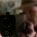
Those loving guns can't be anyone else but Liefeld.
|
|
|
#
?
May 5, 2016 10:19
|
|


|
also a distinct lack of feet
|
|
#
?
May 5, 2016 10:24
|
|

|
I am Not-Corsair's tiny raptor hands e: or ... is that Corsair?
|
|
#
?
May 5, 2016 10:41
|
|

|
Scaramouche posted:RE: Thunderbolts #1 What's with Atlas's eyes?
|
|
#
?
May 5, 2016 14:26
|
|
|
When did Fixer stop being black?
|
|
#
?
May 5, 2016 15:34
|
|


|
Teenage Fansub posted:A couple DC comics I picked up this week are pretty damned vibrant.
|
|
#
?
May 5, 2016 15:40
|
|

|
10 Beers posted:I'm sure it must be my eyes, but all the red makes the art look blurry to me, and kinda hurts my head.
|
|
#
?
May 5, 2016 15:42
|
|

|
Lurdiak posted:Those loving guns can't be anyone else but Liefeld. No, they're not Liefeld. You can tell because they were not obviously drawn after the hand holding them.
|
|
#
?
May 5, 2016 15:59
|
|

|

|
| # ? May 11, 2024 14:13 |
|
|
Travis343 posted:It does look better, it still looks incredibly awful though In a different context Miller's recent art might be great - like as a piece of pop art doing an alternate take on a character. As an entire comic, like DK2, it makes me want to claw my eyes out. Lurdiak posted:Those loving guns can't be anyone else but Liefeld. Rotten Red Rod fucked around with this message at 16:18 on May 5, 2016 |
|
#
?
May 5, 2016 16:15
|
|