|
I like it but to add to the criticism: It also looks wrong as it somehow turns the wrong way from the knees-to-face-down frames. Chest is pointing towards the camera but somehow lands chest down, pointed away from the viewer, I think? It's difficult to even tell what the intended orientation in the final down frame is supposed to be. That last frame could use some work in general.
|
 #
?
Jun 10, 2016 18:45
#
?
Jun 10, 2016 18:45
|
|


|

|
| # ? May 25, 2024 03:35 |
|
|
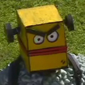
 making heads for a game jam game
|
|
#
?
Jun 10, 2016 19:51
|
|

|
For those of you who use your art for games (I imagine it's most of you), how do you handle shadows in your game? Do you include them as part of your sprite, a separate sprite, or actually rendered from a light source? Edit: Content. My first pixel art attempt: 
|
|
#
?
Jun 10, 2016 20:14
|
|
|
InevitableCheese posted:For those of you who use your art for games (I imagine it's most of you), how do you handle shadows in your game? Do you include them as part of your sprite, a separate sprite, or actually rendered from a light source? it varies from project to project. I usually put them in on a second sprite as a general rule and only render them if im doing something super fancy
|
|
#
?
Jun 10, 2016 20:41
|
|
|
Thank you for all the feedbackChristo posted:Just as a general tip: if you're not already, you should get your keys figured out first, then duplicate those frames to adjust your timing before you replace the duplicates with inbetweens (so four frames of pose A followed by 3 frames of B becomes A, three inbetweens, B, two inbetweens, C). If you're drawing every frame in sequence or doing inbetweens before you get the keys and timing down, you're probably going to end up making more work for yourself. Guilty as charged, I have been working from frame to frame and more concerned with smoothness than nailing the timing first thing. I'll try this on the next new project.  I translated the sprite a little bit to give some stability to his footing as he falls. Originally I was working within the 40x40 canvas from the simpler first iteration but I was too stubborn to expand the canvas and give him more room to fall, which was a silly mistake. I also cut a frame from his fall at the bottom of the kneeling pose. I had wanted to create a kind of "jello bounce" when his weight fell down on his knees and the inertia of his upper body was catching up, but it was not successful and it just ended up causing him to melt a bit. I redrew the final frame a bit but I agree that it's rough looking. I'm having a hard time communicating that kind of heavily foreshortened laying figure with only ten pixels vertical space. On some level I'm kind of okay with it just being a slop of pixel gore.
|
|
#
?
Jun 10, 2016 22:22
|
|
|
That is significantly better. You could probably cut more frames at the end even to give it a more weighty thud.
|
|
#
?
Jun 11, 2016 00:30
|
|
|
Pixeling and running
|
|
#
?
Jun 11, 2016 23:24
|
|

|
Shoehead posted:Pixeling and running I think that if you make her mouth slightly dimmer, to show only a light shadow (since rounder lips aren't very dark when closed, especially in that kind of soft light) it'd look better. It'd also lessen the appearance she has now where if you look at it for a while it looks like she has an underbite.
|
|
#
?
Jun 11, 2016 23:29
|
|

|
wayfinder posted:That is an untrue statement. Some fonts are absolutely, specifically made for impactful titles. Yeah you're right, that was way too broad a statement. I don't see that happening with the fonts theyve been trying though. The japanese characters are more visually dynamic than the latin letterforms and it's gonna be hard to find something that doesn't look sort of bad by comparison. I think the first try was the best, because like the original title it plays off the similar lines and shapes in the background, and because it minimizes the filler words. "THE " plus " OF " is sooo much more screen real estate than the "no" character or whatever it's called
|
|
#
?
Jun 12, 2016 03:04
|
|
|
Jewel posted:I think that if you make her mouth slightly dimmer, to show only a light shadow (since rounder lips aren't very dark when closed, especially in that kind of soft light) it'd look better. It'd also lessen the appearance she has now where if you look at it for a while it looks like she has an underbite. Like so? 
|
|
#
?
Jun 12, 2016 15:15
|
|
|
Shoehead posted:Like so? Definitely a lot of improvement; but the appearance of the straight horizontal line still leads the eye into weird shapes. A lot of art doesn't draw the top lip at all (other than sometimes the intent at the bridge) since there's no harsh boundaries of lighting or overlaps unless it's harsh lighting or a particularly sharp-lipped style. Since Mei is particularly "soft"/rounded you'd probably want to avoid sharp edges in general (which you have everywhere else!). Anyway, even as it is I think it's really good!
|
|
#
?
Jun 12, 2016 15:49
|
|
|
On defining mouths with slight anti-aliasing, I found this example from Breath of Fire, that Pixel-Logic explored, to be pretty helpful
|
|
#
?
Jun 12, 2016 19:20
|
|

|
Been working on a course this week. It seems to help my though process to think of this more like sculpting than free drawing. 
|
|
#
?
Jun 13, 2016 16:18
|
|
|
I don't know what i can do to improve anymore, not because im good (Im not) but because i feel like i've stagnated and im stuck doing the same crap, but i've put so much effort and time into it, it's become a sunk-cost fallacy, i feel if i walk away from what i usually do i'll have wasted my time, but i know i need to do something different, i can't keep making units/people with very little difference in between updates. I'm still drawing, still doing life drawing and reading up and practicing anatomy and whilst it has helped me, i feel like im stuck behind whilst everyone is racing ahead of me. I don't feel i've noticeably improved in the last year or so, to be honest. This is probably more of a post directed at art in general, but given pixel-art has pretty much been my first foray into that field i guess it's sort of appropiate to post it here. I'd like to do some sort of a scene, but i honestly have no idea where to start with it.
|
|
#
?
Jun 14, 2016 01:14
|
|

|
Relax knowing that it IS a sunk cost fallacy. Practice done is never wasted, even if it was in a limited style or has limited application. If you're afraid of branching out into other things, try doing a dude in a different scale. Make him bigger, and force yourself to add the details and complexity required to make it look good.
|
|
#
?
Jun 14, 2016 02:32
|
|
|
Ash Crimson posted:I don't know what i can do to improve anymore, not because im good (Im not) but because i feel like i've stagnated and im stuck doing the same crap, but i've put so much effort and time into it, it's become a sunk-cost fallacy, i feel if i walk away from what i usually do i'll have wasted my time, but i know i need to do something different, i can't keep making units/people with very little difference in between updates. Pair up with someone on a game jam and do the art for it! Spread your wings and tackle a genre you'd never think to practice. Game jammers could always use an artist, plus it forces you to do the work.
|
|
#
?
Jun 14, 2016 03:11
|
|
|
Ash Crimson posted:I don't know what i can do to improve anymore, not because im good (Im not) but because i feel like i've stagnated and im stuck doing the same crap, but i've put so much effort and time into it, it's become a sunk-cost fallacy, i feel if i walk away from what i usually do i'll have wasted my time, but i know i need to do something different, i can't keep making units/people with very little difference in between updates. Visual art is highly interdisciplinary and the skills involved transfer significantly across different media. Even if your goal is only to become better at pixel art, it's hard to imagine that any serious study of drawing or painting would end up truly a waste of time. There are a whole host of artistic muscles involved with imagination, design, abstraction, composition, etc. that you end up flexing no matter what kind of thing you're making, and growing those skills pays dividends wherever you take them. It's not a waste of time to acknowledge that you have comfort zones and deliberately move away from them into scary and uncharted territory. It is in fact absolutely necessary to do this in order to learn and grow as an artist. This constant need to press forward in the face of probable failure is one of the reasons why it is basically a true stereotype that so many artists are self-effacing and feel like their skills are inadequate (this, and the tendency to always compare oneself to the works of others rather than focusing on their own trajectory). Your frustrations here are not unusual or unique at all. Trying something new and difficult and failing miserably is not the end of the world, it's part of the learning process. Any artist would do well to court failure and recognize it as an opportunity, a clear sign where your attention should be directed in order to temper weaknesses. If you want to try a scene, then try a scene! Accept that if you are truly rudderless, it will probably turn out poorly and that it's okay to make bad art. You show that art to your peers, ask them to help show you where you went into the weeds, and then you try again armed with more guidance. If you want to truly talk about wasting time, all the consternation and angst and frustration in the world is worthless compared to failing a few times in pursuit of growth. Scoss fucked around with this message at 04:59 on Jun 14, 2016 |
|
#
?
Jun 14, 2016 04:51
|
|
|
Do Pixel Dailies maybe?
|
|
#
?
Jun 14, 2016 11:05
|
|

|
the chaos engine posted:Do Pixel Dailies maybe? This is awesome, thank you. Content, made this this morning (sorry about the size): 
|
|
#
?
Jun 14, 2016 15:52
|
|
|
Do pixel dailies, make assets for games, do fanart, re-pixel old sprites, do demake mockups, use weird pallets, use real console pallets, start collecting sprites and illustrations (tumblr is good for this) and just look at them for a bit, play a heap of late-era NES and any era SNES games. :justpixel: When you feel like you are stagnating with one thing move on to something else, if your sprites are frustrating you go draw a poo poo tonne of tiles or do some portraits and have fun with it. Be patient with it and you'll get better. :justpixel:!!!!
|
|
#
?
Jun 14, 2016 16:07
|
|
|
Pixel Daily (cape):
|
|
#
?
Jun 14, 2016 20:21
|
|
|
I made art with some pixels! Costumes for our game Tiny Tower made while our artist is on vacation.
|
|
#
?
Jun 14, 2016 20:50
|
|
|
eeenmachine posted:I made art with some pixels! Costumes for our game Tiny Tower made while our artist is on vacation. I play Tiny Tower like nobodies business.
|
|
#
?
Jun 14, 2016 21:15
|
|
|
Tried the pixel daily thing. The animation and palette is a bit off I think, but this is a huge jump in complexity from what was trying on the previous page, so that counts for something.
|
|
#
?
Jun 15, 2016 08:37
|
|
|
Thanks for the comments and advice guys, i really appreciate it! I'm going to try different things, hopefully it'll allow me to improve in different areas. Tried my hand at the beach daily pixel thing  Wanted to go back to basics and make a really simplistic, small scene, although it's probably a bit too simple. I really like Miami Hotline's simplistic style, although i disagree with the colour choice and some of the fuzziness, so im thinking of taking a look at how they deal with objects and putting my own twist on it. Struggled with the chair and the perspective, hopefully it reads as one.
|
|
#
?
Jun 15, 2016 16:46
|
|
|
Scoss posted:Tried the pixel daily thing. Something isn't quite right with his chest motion, but overall I really like the style. The cape is great.
|
|
#
?
Jun 15, 2016 17:18
|
|


|
taqueso posted:Something isn't quite right with his chest motion, but overall I really like the style. The cape is great. I think its the fact that the arms and cape don't move along with the torso. I agree that other than that it's very well done, especially for a daily exercise! A bit of an offset on the timing of head's up-down motion (and arms should you revisit this piece, scoss) would be a nice subtle touch. Hardcordion fucked around with this message at 17:41 on Jun 15, 2016 |
|
#
?
Jun 15, 2016 17:34
|
|
|
 skarks
|
|
#
?
Jun 16, 2016 03:54
|
|
|
Today's pixel daily:
|
|
#
?
Jun 16, 2016 14:12
|
|
|
 Getting close to finishing this 
|
|
#
?
Jun 17, 2016 18:00
|
|
|
This is looking great. Can you make a tech demo of one of those Final Fight-type minigames where you trash a car?
|
|
#
?
Jun 17, 2016 20:29
|
|

|
Scut posted:This is looking great. Can you make a tech demo of one of those Final Fight-type minigames where you trash a car? I was thinking "nuh uh, that was street fighter," but turns out it is both. I wonder how many games had car smash stages?
|
|
#
?
Jun 17, 2016 21:10
|
|
|
Scut posted:This is looking great. Can you make a tech demo of one of those Final Fight-type minigames where you trash a car? Waaay ahead of you http://forums.somethingawful.com/showthread.php?threadid=3506853&userid=84791&perpage=40&pagenumber=8
|
|
#
?
Jun 18, 2016 00:01
|
|
|
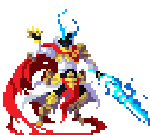
Pixel daily: EDIT: Also updated my swordsman sprite. 
InevitableCheese fucked around with this message at 17:16 on Jun 20, 2016 |
|
#
?
Jun 20, 2016 15:31
|
|
|
Shoehead posted:
Ok... So I completley redid his proportions  Yes I am the worst for doing this, but on the plus side his torso is actually somewhat human now and I think his head is cute! Look at it!  I still need to start on the second half of his animations, I got ahead of myself with the placeholders and now his sheet is something stupid like 50+ frames 
|
|
#
?
Jun 20, 2016 16:34
|
|
|
Finished a gas station for pixel dailies this morning: Edit: Not for use in the jam: 
InevitableCheese fucked around with this message at 19:06 on Jun 22, 2016 |
|
#
?
Jun 21, 2016 16:00
|
|
|
Shoehead posted:Ok... So I completley redid his proportions Just wanted to say that you've come along way since your first post, hopefully we'll one day see your beat 'em up game actualised. I'd definitely buy it! So i've been pouring over FF Tactics Advance sprites, trying to understand the pixel placement and why it works, I've been re-coloured the sprites, copied the outline and tried to place the pixels myself, but i must be missing something because i can't make head or tails over it. I'm not sure how gauche it is to recolour or to use pre-existing sprites as a base, but i've tried to at least put my own spin on it (ignoring the head for the time people, first one is the original, ffta sprite):  So i'm wondering; is it mainly Anti-aliasing? Specifically the placement of the pixels and clusters, that makes ffta sprites so good? Sorry if this is a dumb question, I've become obsessed with avoiding banding, to the point of avoiding doing sprites like this.
|
|
#
?
Jun 22, 2016 11:46
|
|
|
Those Final Fantasy sprites you posted are good examples of clustering and avoiding banding. That's why they look good. The proportions and level of detail are skewed to favour good pixel clusters because that makes for an overall more readable sprite.
|
|
#
?
Jun 22, 2016 14:34
|
|
|
Scut posted:Those Final Fantasy sprites you posted are good examples of clustering and avoiding banding. That's why they look good. The proportions and level of detail are skewed to favour good pixel clusters because that makes for an overall more readable sprite. Thanks for the answer Scut! So it's a mixture of clustering and avoiding banding? Are there any tutorials on clusters, I know cure's tutorial briefly mentions it but is there any more in-depth stuff? I tend to take a literal approach to see stuff, hence why most of my is WYSIWYG, so this sort of "style" (FF tactic's advance and similar stuff) is sort of baffling to me, so here's a quick attempt at a full bodied verison, two bases, and the original sprite it's based off:  I took the basic shape of the sprite and tried to put my own touches on it, it's probably way too similar to be classified as a seperate sprite on it's own, but i feel if i get a better understanding of this style i might be able to make my own from scratch at some point, or maybe radically modify it and make it distinct. Sorry for fretting over such a basic thing, i just want to make sure i get it right because it's a style i've always liked (Final Fantasy Tactics Advance was actually what got me into pixel art in the first place) but always found a bit intimidating to try/practice. Edit: Just noticed the messed up left arm and hand 
Ash Crimson fucked around with this message at 19:47 on Jun 22, 2016 |
|
#
?
Jun 22, 2016 19:41
|
|
|

|
| # ? May 25, 2024 03:35 |
|
|
Shoehead posted:
Bottom right, is that not based off of the original black power ranger? That sort of jive followed by the uppercut is way too awesome.
|
|
#
?
Jun 24, 2016 14:28
|
|