

|
If anyone makes a good tag for this forum, I will give you a free avatar or something similar. Please make a good tag for the new DIY forum!
|
 #
?
Sep 21, 2016 13:17
#
?
Sep 21, 2016 13:17
|
|


|

|
| # ? Jun 10, 2024 10:52 |
|
|
Nail in wood:
|
|
#
?
Sep 21, 2016 15:49
|
|

|
If it's not a picture of insulated stairs, then something has gone wrong.
|
|
#
?
Sep 21, 2016 15:59
|
|

|
Adiabatic posted:Nail in wood: that's pretty drat good, it's got my vote.
|
|
#
?
Sep 21, 2016 16:00
|
|
|
Adiabatic posted:Nail in wood: A square nail? Into the end grain? Won't that just split the wood?! Madness!
|
|
#
?
Sep 21, 2016 17:36
|
|


|
DrBouvenstein posted:A square nail? Into the end grain? Won't that just split the wood?! Madness! 
|
|
#
?
Sep 21, 2016 17:56
|
|
|
make it a square phillips head screw too
|
|
#
?
Sep 21, 2016 18:01
|
|

|
Jose posted:make it a square phillips head screw too 
|
|
#
?
Sep 21, 2016 18:05
|
|
|
This is perfect!
|
|
#
?
Sep 21, 2016 19:09
|
|

|
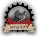
So we have this one. There's also this one someone posted in QCS.  More of a metal look Letters are a little more readable. Preferences?
|
|
#
?
Sep 21, 2016 19:29
|
|
|
Cracked wood one. If there's a version of that with the letters outlined in black, that would be swell.
|
|
#
?
Sep 21, 2016 19:31
|
|


|
Rotten Cookies posted:Cracked wood one. If there's a version of that with the letters outlined in black, that would be swell.  e: if you want the black background all the way around, instead of the offset edge:  It's also worth noting that other one's the same color scheme as AI, which is right above DIY now. Adiabatic fucked around with this message at 19:46 on Sep 21, 2016 |
|
#
?
Sep 21, 2016 19:39
|
|
|
Adiabatic posted:
Needs some blood splatter and a bandaid.
|
|
#
?
Sep 21, 2016 19:46
|
|
|
*kisses fingertips*
|
|
#
?
Sep 21, 2016 20:58
|
|
|
 I don't know how well the melted siding reads at this size
|
|
#
?
Sep 21, 2016 21:00
|
|


|
RandomFerret posted:
|
|
#
?
Sep 21, 2016 21:46
|
|
|
FactsAreUseless posted:
Should be a torx head screw
|
|
#
?
Sep 21, 2016 23:06
|
|

|
Winner
|
|
#
?
Sep 22, 2016 00:16
|
|

|
Teflon Don posted:Should be a torx head screw This made me want to try this. It's not even that I think I can do better, just felt like it. I stole Adiabatic's letters to do this, and the image for Goon Meets to give it that sort of congruence that some of the icons have.  or or  It's a bit similar to some of the others tags, though. But I do like the idea of the 'dot' being a screw.
|
|
#
?
Sep 22, 2016 00:45
|
|

|
Magnetic North posted:This made me want to try this. It's not even that I think I can do better, just felt like it. I stole Adiabatic's letters to do this, and the image for Goon Meets to give it that sort of congruence that some of the icons have.
|
|
#
?
Sep 22, 2016 01:34
|
|
|
FactsAreUseless posted:
frame this as a 400 lbs forum tag and I think you're on to something
|
|
#
?
Sep 22, 2016 03:04
|
|

|
Laminator posted:frame this as a 400 lbs forum tag and I think you're on to something Oh god no, please don't do that. Let that stupid joke die plz tia
|
|
#
?
Sep 22, 2016 03:11
|
|
|
I like the cracked wood grain. Is it possible to change the font to a stencil? Probably too complex for low res.
|
|
#
?
Sep 22, 2016 03:56
|
|

|
my humble submission I feel it incorporates the not-quite-perfect appearance that most of my DIY projects end up with.
|
|
#
?
Sep 22, 2016 04:51
|
|

|
This one, but with the screw head of this: There's a lot of dark/brown icons around this forum on the main listing, so a less dark and less brown one is probably a good idea.
|
|
#
?
Sep 22, 2016 10:01
|
|


|
nielsm posted:This one, but with the screw head of this:  Magnetic North posted:I stole Adiabatic's letters to do this All good I stole RGD and IYGs e: wormil posted:Is it possible to change the font to a stencil? 
Adiabatic fucked around with this message at 13:12 on Sep 22, 2016 |
|
#
?
Sep 22, 2016 12:58
|
|
|
Rotten Cookies posted:*kisses fingertips*
|
|
#
?
Sep 22, 2016 15:08
|
|
|
Perfection
|
|
#
?
Sep 22, 2016 15:12
|
|
|
This one gets my inconsequential vote.
|
|
#
?
Sep 22, 2016 16:38
|
|


|
This
|
|
#
?
Sep 22, 2016 18:20
|
|
|
FactsAreUseless posted:Would a hexagonal nut or something be more readable at that size? Maybe but at 11 x 11 pixels, I can't draw a hexagon that looks good, especially with GIMP. Also, I don't think we can make it bigger either because we probably want that one pixel buffer. I think the stencil really makes it.
|
|
#
?
Sep 22, 2016 20:38
|
|
|
Perfect.
|
|
#
?
Sep 22, 2016 20:38
|
|
|
 This was just for fun, obviously no one wants a strobing animation on the page. Also I learned the order of layers to create a gif because my first attempt was this: 
|
|
#
?
Sep 22, 2016 22:45
|
|
|
You know, that thing falling off then getting put back on slowly would actually look pretty good. edit: but don't bother if no one is ever going to use it mom and dad fight a lot fucked around with this message at 00:20 on Sep 23, 2016 |
|
#
?
Sep 23, 2016 00:18
|
|

|
I was thinking the Y should be hanging at a slight angle to the DI, maybe even swinging in a slight breeze
|
|
#
?
Sep 23, 2016 00:36
|
|


|
Holy cow
|
|
#
?
Sep 23, 2016 01:55
|
|

|
Ciaphas posted:I was thinking the Y should be hanging at a slight angle to the DI, maybe even swinging in a slight breeze
|
|
#
?
Sep 23, 2016 15:52
|
|


|
GWBBQ posted:Different versions with letters askew in different ways, load a different version every time the page loads like the BYOB logo    
|
|
#
?
Sep 23, 2016 16:10
|
|
|
Is the forum name going to stay boring? edit: Oh wow, I didn't catch the Groverhaus reference in the one tag. I vote for that one
|
|
#
?
Sep 23, 2016 20:58
|
|


|

|
| # ? Jun 10, 2024 10:52 |
|
|
Change it to say DIRESTA
|
|
#
?
Sep 24, 2016 03:08
|
|