


|
rinski posted:
If the light source is casting shadows on the lower part of the sphere, it seems like the stalk and some of the other parts should be casting longer shadows too, on the sphere and themselves.
|
 #
?
Nov 30, 2016 23:47
#
?
Nov 30, 2016 23:47
|
|


|

|
| # ? May 21, 2024 22:03 |
|
|
Some portraits from the last few weeks.     
|
|
#
?
Dec 3, 2016 12:59
|
|

|
I've been taking Ben Anderson's pixel art course (do recommend, by the way), here's my colored in project from that course. It's my Lucas amiibo. Something feels a little off about it, but I'm not sure what. It's harder than I would have thought to work in such low resolution!
|
|
#
?
Dec 5, 2016 00:27
|
|

|
Ben Anderson isn't awful, but he's not really a master of the art either (based on what I've seen on his pixeljoint anyway). That's not to say the course won't be worthwhile, but I'd recommend also taking some time to read through the Pixelation forums and poking around Pixeljoint as well. That said, you are off to a good start so it can't be too bad! Just some broad comments on your sprite. Your palette is generally low in contrast, so a lot of colors are bleeding together. This means that details don't really show up and it also tends to give things a bit of a blurry look that it's best to avoid. Shading-wise, it's important to have a directional light source in mind so that you know where shadows should be cast. Broadly speaking, you want your shading to communicate three-dimensional forms, and it's hard to do that if lighting isn't consistent between different parts of the sprite. As-is, you sort of have an above-left light source, which is a good choice, but it isn't really reflected on every part of the sprite, particularly the shirt. I made an edited version to suggest a direction you could take it--I'll remove it if you'd prefer but I hope it can be helpful.  A couple of other points: it's tempting to want to keep the original proportions on things like hands, but this gets difficult at low resolutions, so it's usually worthwhile to simplify or change proportions to make things read better. edit Rinski: a quick edit of one of the frames that I think best showcases the issue you were mentioning:  Your current shading is basically hugging the outlines on the head, which doesn't really do much to convey forms (and also adds in a fair amount of banding, see OP). Even with a low color count you could definitely have a more three-dimensional look to the sprite without having to put in too much more work. But of course, "good enough" is going to be entirely contextual, and it's not like what you have looks bad. Another thing is that, while you've put a whole lot of work into making a lot of frames, you're selling your work a bit short by having them all essentially have the same timing. It can have more impact with a bit of speeding up in places: 
Scarodactyl fucked around with this message at 19:13 on Oct 18, 2018 |
|
#
?
Dec 5, 2016 03:15
|
|

|
Scarodactyl posted:Another thing is that, while you've put a whole lot of work into making a lot of frames, you're selling your work a bit short by having them all essentially have the same timing. It can have more impact with a bit of speeding up in places: Hmm. I'll try to play around with speed more in the future. I hadn't really considered it, but it does make sense. Also, regarding shading, I think I'm starting to understand what you, Diabetes Forecast, and General Specific were saying a bit better. It wasn't clicking for a while, but your edit made me start thinking in terms of "layers of shadow," which for some reason helped a lot. I tried giving it a shot and saw some minor improvement, I think. I'll keep practicing. 
|
|
#
?
Dec 10, 2016 03:36
|
|
 blatt blatt, noyemi's bringing gats
|
|
|
#
?
Dec 10, 2016 18:28
|
|

|
 Here's a fun "How to Play" button for my admittedly slow Kid Icarus SNES homebrew (as well as a controller sprite inspired by Kirby Super Star's) Coincidentally, the 30th anniversary of the original game is also next Monday.
|
|
#
?
Dec 13, 2016 17:34
|
|

|
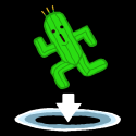
A little doodle I made the other day: Its a soul sucker 
|
|
#
?
Dec 13, 2016 17:48
|
|
|
https://www.youtube.com/watch?v=f_5nNQmszDw Lot's of neato stuff in the thread folks. I've just been lurking recently but I've dusted off my wacom and will draw something.
|
|
#
?
Dec 13, 2016 19:43
|
|

|
Today's adventure in iterative design: light bugs. These guys were some of the first enemy sprites I made, and initially they were just intended to be generic flying enemies. In a later pass, I decided they lived in hives built in the hollowed-out bodies of larger, seemingly more menacing enemies (I like some creepy with my cute). Today I finally got around to designing what their queen looked like. During that doodle session, the light bugs evolved into something... more. Apparently, sometime in the distant past, a peculiar adaptation emerged: drones began using their corrosive saliva to fuse their queens' heads together. The queens' brains gradually networked together, forming giant biological computers. Travelers tell tall tales of gigantic, floating masses hovering lazily over sprawling, alien cities. These morbid flights of fancy are best ignored. 
|
|
#
?
Dec 14, 2016 10:51
|
|
|
rinski posted:Today's adventure in iterative design: light bugs. These guys were some of the first enemy sprites I made, and initially they were just intended to be generic flying enemies. In a later pass, I decided they lived in hives built in the hollowed-out bodies of larger, seemingly more menacing enemies (I like some creepy with my cute). Today I finally got around to designing what their queen looked like. During that doodle session, the light bugs evolved into something... more. Apparently, sometime in the distant past, a peculiar adaptation emerged: drones began using their corrosive saliva to fuse their queens' heads together. The queens' brains gradually networked together, forming giant biological computers. I am loving what I am seeing here! https://twitter.com/modernmodron/status/809072842348367872/photo/1 "the heartwood" the core of a game that im currently working on
|
|
#
?
Dec 14, 2016 17:44
|
|

|
Some terrain types meant to be put onto cards (hence the dimensions)    
|
|
#
?
Dec 20, 2016 01:51
|
|
|
Old Man Mozz posted:"the heartwood" the core of a game that im currently working on I mentioned it on twitter, but I really, really like anatomical structures outside their intended context. This is great. Holy poo poo, these are incredible, especially these last two. I really like the aesthetic of this location, especially the juxtaposition of structures with a clear purpose (the wires and pipes) and those without (the random boxes, oil river, cracked sphere). To contribute: instead of doing anything productive on my game, I instead doodled this holiday spirit. Start your rituals today to ensure an adequate seasonal haunting. 
|
|
#
?
Dec 21, 2016 02:49
|
|
|
Alright here's my first attempt at Pixel Art. I first sketched something in SAI, brought it over to Paint.net, scaled it down, and then traced over it. I'm going to try to make some animations too.
|
|
#
?
Dec 21, 2016 10:34
|
|

|
Did a mock-up for the code guy for how the menu might work, but it was pointed out to me that hamburger menus are terrible. I guess I'll just have a buttons in the bottom corners and maybe put the "slide to unlock pause" option in the settings menu?  Also, here's a race of oceanic polyp cyborgs, which augmented themselves to live on land (and sometimes in orbs). They adorn themselves and their mini-orbs with sea plants, to remind them of their briny home. Though comforting, the plants tend to attract flies. 
|
|
#
?
Dec 30, 2016 03:34
|
|
|
So I was looking at different ways games did their run animations, and I went looking for sprites for SmashTV. I found something crazy. I have no idea if it's okay to post some other sprite ripper's work, so I'll link it: http://i560.photobucket.com/albums/ss42/The_Deathbringer/smashtv.png Basically, the head and the body are two separate parts, probably so that the programmers could control what direction the guy is running and which gun he has without ten billion sprites. But I would think that would look really stiff in a modern game. Would it? What do you all think?
|
|
#
?
Dec 30, 2016 19:34
|
|
|
It's a totally legit technique. For modern pixel art games I would point you to Tower 57. I think it's the same technique Brigador uses as well though that's not pixel art. I think Ikari Warriors in the arcade used a similar method of layering separate sprites for the torso and legs?
|
|
#
?
Dec 30, 2016 22:09
|
|
|
Bean posted:So I was looking at different ways games did their run animations, and I went looking for sprites for SmashTV. I found something crazy. I have no idea if it's okay to post some other sprite ripper's work, so I'll link it: http://i560.photobucket.com/albums/ss42/The_Deathbringer/smashtv.png I see this technique used a lot in indie dual joystick shooters, and no, it doesn't look great most of the time. Serviceable, maybe, but not great. It might just be my "I grew up with 8/16-bit games" bias, but I think something like Smash TV looks much better than a lot of more modern takes on the technique, primarily because I'm used to low-res sprites snapping between 4 or 8 different directions. In modern games, I think whether or not this technique scans well depends on the overall art style of the game and what exactly the two halves of the sprite are. A lot of indie dual joystick shooters like to have some light animation for the legs half, but for the top half they mostly just use a static sprite that they rotate to face wherever your controller is pointing, which, you're right, looks really stiff. This is compounded by the fact that many of these games offer full 360� range of motion for both the legs and the torso, so you wind up with the very unnatural-looking result of your character's top and bottom halves pinwheeling around each other in opposite directions. Honestly, the only time I've seen this technique used well were when the game was really stylized, either low-res or otherwise. Something like Binding of Isaac splits the sprite into a head and a body, which both makes more sense visually (you can rotate your head quickly and more or less independently of the rest of your body) and its simple, stylized graphics help mask the remaining weirdness.
|
|
#
?
Dec 30, 2016 22:42
|
|
|
You can also get more milage out of it by bobbing the two separate parts rather than just have them stiffly connected.
|
|
#
?
Dec 31, 2016 00:00
|
|

|
Being balls deep in NES era stuff still I can tell you that a lot of the taller sprites youd see back then worked like that. The Shatterhand guy for example is 2 seperate sprites that animate independently, its also how they get around the colour restrictions and also also why that dudes waist is so tiny. I think the contra guys were similar?
|
|
#
?
Dec 31, 2016 01:23
|
|
|
 Bullying destroys lives, you guys. Edit: for closure 
rinski fucked around with this message at 07:57 on Jan 8, 2017 |
|
#
?
Jan 8, 2017 07:06
|
|
|
So I've been trying to practice with pixel art and so far my work flow involves doodling in SAI and then downsizing it in Paint.net than tracing over it pixel by pixel, but I lose so much detail (and things get so blurry) with my reference image that it's hard to keep track of what I'm working on. Has anyone figured out how to have a high resolution image layer underneath a very low resolution layer? Additionally and I presume this is more of an issue with working with pixel art at small resolutions but is it basically impossible to rotate a selection your working on? I assume it's trying to interpolate pixels.
|
|
#
?
Jan 13, 2017 15:39
|
|
|
Raenir Salazar posted:So I've been trying to practice with pixel art and so far my work flow involves doodling in SAI and then downsizing it in Paint.net than tracing over it pixel by pixel, but I lose so much detail (and things get so blurry) with my reference image that it's hard to keep track of what I'm working on. I think Aesprite just added that feature actually! https://www.aseprite.org/ edit : perhaps it's coming in a future update? there's also paint of persia http://www.cartoonbrew.com/tools/paint-persia-new-free-tool-rotoscoping-pixel-art-141093.html Old Man Mozz fucked around with this message at 18:16 on Jan 13, 2017 |
|
#
?
Jan 13, 2017 18:12
|
|
|
Old Man Mozz posted:I think Aesprite just added that feature actually! Nice, and it's only 15$ too, I'll have to get it once I'm back home. ")
|
|
#
?
Jan 13, 2017 18:21
|
|
|
I've spent the first two weeks of this year running around with sick pets and all sorts of mad stuff. Barely had any time even for proper paid work  But here's some crap I pooped out when I had a spare like 20 minutes. But here's some crap I pooped out when I had a spare like 20 minutes.
|
|
#
?
Jan 14, 2017 00:48
|
|
|
Shoehead posted:I've spent the first two weeks of this year running around with sick pets and all sorts of mad stuff. Barely had any time even for proper paid work Dang. Most of the stuff you post is really stylistically different and all of it looks good.
|
|
#
?
Jan 14, 2017 02:57
|
|
|
Heh heh I'm glad someone enjoys my terrible ADD  Here's a gif from that NES project that I forgot to post 
|
|
#
?
Jan 15, 2017 21:21
|
|
|
 Working on a tileset & font for a game. The pangram is where the title would be if the game had a title.
|
|
#
?
Jan 20, 2017 02:58
|
|

|
Music Theory posted:
The kerning seems a bit spread open, can you close it up at all or is it restricted by your tile dimension?
|
|
#
?
Jan 20, 2017 14:51
|
|
|
I stitched together some of my terrain chunks into a new facebook cover.
|
|
#
?
Jan 20, 2017 20:44
|
|
|
Hello friends. Here is a sample screen mockup I made to test some animations and general forest geoblock assets. While I'm sure my animation process is grossly inefficient, this took me so long that I'm nearly positive it'll be more efficient to just code stuff into the game, then use the game engine for mockups instead. So I guess I'll try that next time. I also made a version where the portal flickers subtly (a 5% opacity black that oscillates between frames), but that turned a 222KB gif into a 16MB file, which is so darn big imgur saved it as a gifv video file instead of a normal gif. So here's a link in case you want to see the exact same animation with a minor effect added.  Scut posted:I stitched together some of my terrain chunks into a new facebook cover. Still really digging the aesthetic. Perhaps even more so now that there's an emoting computer in the middle of this weird desolate techno-wasteland.
|
|
#
?
Jan 24, 2017 21:26
|
|
|
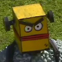
Fixin' poses and robots. Still think there's something wrong with my bot's legs
|
|
#
?
Jan 24, 2017 21:43
|
|
|
Shoehead posted:Fixin' poses and robots. Still think there's something wrong with my bot's legs Hips(or torso) are turned too far if you're trying to restrict it to human anatomy limitations.
|
|
#
?
Jan 24, 2017 22:37
|
|

|
Shoehead posted:Fixin' poses and robots. Still think there's something wrong with my bot's legs I can't unsee the two leftmost ones as crossing their arms and turning to the left in a really sassy way. Are they not meant to have arms?
|
|
#
?
Jan 24, 2017 23:31
|
|
|
Wait...you guys can't see their arms??
|
|
#
?
Jan 25, 2017 14:25
|
|
|
Shoehead posted:Wait...you guys can't see their arms?? Looks like the robot on the left is at the end of a Obsurveyor fucked around with this message at 15:01 on Jan 25, 2017 |
|
#
?
Jan 25, 2017 14:50
|
|
|
Shoehead posted:Wait...you guys can't see their arms?? try as I can, I simply can not
|
|
#
?
Jan 25, 2017 15:42
|
|
|
Obsurveyor posted:Looks like the robot on the left is at the end of a My brain can't decide if it's that or a bulky chest part facing straight ahead and no arms.
|
|
#
?
Jan 25, 2017 15:48
|
|
|
I'm messin, his full sprite has arms but I chopped em off to try and re-pose him!
|
|
#
?
Jan 25, 2017 16:39
|
|
|

|
| # ? May 21, 2024 22:03 |
|
|
 Workin on a new tileset (where's everyone gone?)
|
|
#
?
Feb 16, 2017 16:47
|
|