|
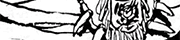
What kind of man can turn even his ears into a weapon?
|
 #
?
Jan 2, 2017 22:58
#
?
Jan 2, 2017 22:58
|
|

|

|
| # ? May 13, 2024 17:19 |
|
|
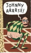
qntm posted:What kind of man can turn even his ears into a weapon? The goddamn Batman.
|
|
#
?
Jan 2, 2017 23:06
|
|

|
ruddiger posted:JRJR's art is so insane and awesome. His first dozen or so issues of Punisher War Zone were a blast. Always been my favorite depiction of the Punisher. Looks like somebody the Romita's could have known in some rough New York neighborhood. And A+ for that post at the top of the page.
|
|
#
?
Jan 2, 2017 23:07
|
|


|
X-O posted:Wow, that is terrible. Get a load of this guy, batman knife ears are awesome and I can't believe I've never seen it before.
|
|
#
?
Jan 2, 2017 23:22
|
|
|
Brazilianpeanutwar posted:Get a load of this guy, batman knife ears are awesome and I can't believe I've never seen it before. "And today Batman died when a villain accidentally triggered the release on his knife-ears, sending a 5-inch spike of steel directly into his brain."
|
|
#
?
Jan 2, 2017 23:25
|
|

|
ImpAtom posted:"And today Batman died when a villain accidentally triggered the release on his knife-ears, sending a 5-inch spike of steel directly into his brain." "NUH UH! Batman would totally have them made to slide down past his ears cause he's batman and he's always prepared and furthermore"......
|
|
#
?
Jan 2, 2017 23:27
|
|
|
Brazilianpeanutwar posted:Get a load of this guy, batman knife ears are awesome and I can't believe I've never seen it before. Yeah, the ballistic knife ears are kind of dumb, but the literal knife ears are great, both on their own and with Two-Face's little speech there. JRJR is someone who I feel like is either absolutely fantastic or completely underwhelming. I love the gently caress out of his Punisher, and his All-Star Batman art right now is stellar, but some of his recent stuff has really felt phoned in. I'm realizing now that it might have something to do with him trying to do children, though, because Kick-rear end and Captain America are my first thoughts and both of those the first thing I think of is how his kids just look like shrunken adults and all have the same drat face.
|
|
#
?
Jan 2, 2017 23:28
|
|
|
qntm posted:What kind of man can turn even his ears into a weapon? Plastic Man, Mister Fantastic, Clayface, Sandman...
|
|
#
?
Jan 2, 2017 23:31
|
|


|
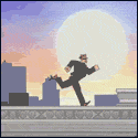
Always makes me laugh, from Dr. Mcninja.
|
|
#
?
Jan 2, 2017 23:33
|
|
|
I liked his work on Hulk. Especially stupid sexy Abomination.
|
|
#
?
Jan 2, 2017 23:38
|
|
|
People focus on Batman's knife-ears from ASB, but lose sight of the truly amazing revelation that Batman actually hears through his bat-ears and cannot hear when he pulls the knives out
|
|
#
?
Jan 3, 2017 00:02
|
|
|
Also, he made some sonic blast out of playing Batman inspired death metal out of a chest-speaker. Also, he used a shark repellent. Scott Snyder's All-Star Batman, people.
|
|
#
?
Jan 3, 2017 00:26
|
|

|
ruddiger posted:Liefeld has absolutely zero relevance in a discussion involving Kelley Jones and Sam Kieth and is the lowest bearing fruit to go after, so much so that your mod had to put it in the thread title. Liefeld was such an incompetent shitheel that he was forced to quit Image so he wouldn't be fired for embezzlement. He almost destroyed the company single-handedly and ruined multiple careers along the way. He also ripped off Jack Kirby's impoverished widow.
|
|
#
?
Jan 3, 2017 00:53
|
|

|
Catfishenfuego posted:Liefeld was such an incompetent shitheel that he was forced to quit Image so he wouldn't be fired for embezzlement. He almost destroyed the company single-handedly and ruined multiple careers along the way. He also ripped off Jack Kirby's impoverished widow. I thought the embezzlement thing was bullshit? Because they invited him back to Image a few years ago.
|
|
#
?
Jan 3, 2017 02:15
|
|

|
I did have lunch with Liefeld and can confirm that he's a nice guy, SO STOP TALKING poo poo
|
|
#
?
Jan 3, 2017 02:25
|
|

|
Teenage Fansub posted:Also, he made some sonic blast out of playing Batman inspired death metal out of a chest-speaker. Also, he used a shark repellent. I assume the sonic blast was this: https://www.youtube.com/watch?v=pqv_LUStxDw
|
|
#
?
Jan 3, 2017 04:15
|
|
|
Jones's Batman is all about mood and atmosphere over practicality. His stuff is closer to Nosferatu than let's say Dracula, and there is a reason a lot of Batman's posers were vampire-like.
|
|
#
?
Jan 3, 2017 05:55
|
|

|
Teenage Fansub posted:Also, he made some sonic blast out of playing Batman inspired death metal out of a chest-speaker. Also, he used a shark repellent. Batman was making a joke. It wasn't shark repellent, it was acid.
|
|
#
?
Jan 3, 2017 07:46
|
|
|
r/comicbooks has their best-of-the-year winners and they have entries for best colorist and best inker and I realized that I can't really tell the difference between most colorists and I dunno if even know what "good inking" is. What are some good resources to help me better understand and appreciate these skills?
|
|
#
?
Jan 4, 2017 16:04
|
|

|
Inking is so loving weird to figure out, to me, if I never see the pencils. It's one of those skills that can change the total meaning of a panel but if you didn't know the original intent, I'm not sure you could tell anyway.
|
|
#
?
Jan 4, 2017 16:07
|
|

|
I don't know of any resources, but as you look at a given penciler's work more and more with different inkers, you can, at the very least, notice a difference in the inker. There's definitely penciller/inker combos that work better than others. Pretty much no one but Klaus Jansen should be inking Frank Miller and JRJr at this point.
|
|
#
?
Jan 4, 2017 16:14
|
|


|
One thing to watch out for or consider is that the width of lines tends to come from the ink. Pencil width/thickness doesn't vary too widely so if you see lines that are thick, that's the inker. The above-mentioned Klaus Janson is one of those inkers people tend to notice very early on because he has a very distinctive use of thick lines and it pairs well with someone like JRjr, as Endless Mike says, because Romita's figures are blockier and chunkier and Janson's inks amplifies that and adds much more "weight" to everything. Like, look at the top of Thor's cape or the left edge of his arm as compared to his hair. Or check out the shading on his arm. You don't even need to see Thor's face to spot a JRjr/Janson collaboration.  Edit: If you compare it to Coipel's Thor (unsure of inker) you'll see the linework is much thinner. 
Lobok fucked around with this message at 16:37 on Jan 4, 2017 |
|
#
?
Jan 4, 2017 16:33
|
|
|
RevKrule posted:Inking is so loving weird to figure out, to me, if I never see the pencils. It's one of those skills that can change the total meaning of a panel but if you didn't know the original intent, I'm not sure you could tell anyway. Yeah, one of my big eureka moments with coloring was that famous Injustice Batman-punching-and-crying panel that looks so bad, and then someone posted the pencils and it turned out to be a total colorist error. I was like, whoa I better pay attention to colors more. But beyond like Ive Svorcina on Ribic's pencils I dunno that I could say, whoa the color here is especially amazing and is definitely adding to the art. Not to say that colorists don't make a difference, just that I can't tell unless it's at either extreme.
|
|
#
?
Jan 4, 2017 16:46
|
|
|
You can definitely spot bad colour if you look through early-to-mid-90s comics when comics were first getting into digital colouring.
|
|
#
?
Jan 4, 2017 16:53
|
|
|
Lobok posted:You can definitely spot bad colour if you look through early-to-mid-90s comics when comics were first getting into digital colouring. Or any comic by Salvador Larocca, there's this one guy he's usually paired with, I can't remember his name, but he's godawful.
|
|
#
?
Jan 4, 2017 17:17
|
|


|
I Before E posted:Or any comic by Salvador Larocca, there's this one guy he's usually paired with, I can't remember his name, but he's godawful. Larocca's never had an inker that can do much good with his pencils.
|
|
#
?
Jan 4, 2017 17:20
|
|
|
Colour theory is sort of something you have to learn, otherwise you end up appreciating that the end result is pleasing, but the "why" is on a subconscious level that you might not be able to identify. One thing to look for if you want to up your...I guess colouring interest value recognition-skills? is which colours are good contrasts and perfect complements. Pairings like purple and green, yellow and blue, or red and teal may not sound intuitively "right" on paper, but they make up a whole lot of iconic costumes, and if you look at many more subtle things, like lighting or backgrounds, you may see artists drawing out similar contrasts in a more restrained way to heighten elements of tone or mood. Often what makes for the best colours is hard contrasts, colours that are distinctly different and have clear lines dividing them. I think a lot of people with no grounding in colour theory intuitively assume the opposite, that you'd want soft gradients of very similar colours seamlessly blended with each other. In reality, this often ends up looking plasticky or muddy, and most good colour jobs that "read" like this are in fact using lots of contrasts that are just so subtly implemented that the end result looks lively and natural.
|
|
#
?
Jan 4, 2017 17:23
|
|

|
And of course, if the work in question is being coloured in flats with limited shading, like most comic books before a certain period, it's all about those hard contrasts and striking colour clashes to bring out mood and tone.
|
|
#
?
Jan 4, 2017 17:27
|
|
|
On the topic, I was just reading this the other day. It's less about colour theory and more about spotting how colour choices reinforce story and character, and also hint at it. Though to be able spot stuff like this I think you might need to be as keen-eyed as Hawkeye herself but it's an interesting read if you ever think that colourists are just supposed to make the sky blue and the grass green. Even moreso than movies, everything you see in a comic is 100% an intentional choice of someone's. http://comicsalliance.com/strip-panel-naked-bellaire-hawkeye-coloring/ Lobok fucked around with this message at 17:32 on Jan 4, 2017 |
|
#
?
Jan 4, 2017 17:30
|
|
|
Rhyno posted:Larocca's never had an inker that can do much good with his pencils. I was talking about the colorist. E: Frank D'armata seems to be who I was thinking of. I Before E fucked around with this message at 17:58 on Jan 4, 2017 |
|
#
?
Jan 4, 2017 17:56
|
|
|
My favorite example of the use of color is Dave Cockrum's redesigns for the '70s Legion of Super-Heroes costumes. Even working with a very limited color palette, he gives every Legionnaire his or her own set of colors that stood out from the others, making them immediately identifiable on the page even in crowd scenes. 
|
|
#
?
Jan 4, 2017 19:12
|
|
|
Is it a construct that blue highlights on black = black hair, while brown highlights on black are clearly brunette? Or is it some kind of wacky color theory thing?
|
|
#
?
Jan 5, 2017 00:27
|
|

|
Jago posted:Is it a construct that blue highlights on black = black hair, while brown highlights on black are clearly brunette? Or is it some kind of wacky color theory thing? Jet black hair vs. very dark brown hair, probably. Irl it can be difficult to tell the difference depending on the lighting.
|
|
#
?
Jan 5, 2017 00:32
|
|

|
Jago posted:Is it a construct that blue highlights on black = black hair, while brown highlights on black are clearly brunette? Or is it some kind of wacky color theory thing? Pretty much. Back in the newsprint days, that was the best they could do.
|
|
#
?
Jan 5, 2017 02:04
|
|
|

|
|
#
?
Jan 5, 2017 02:12
|
|

|
Tony No
|
|
#
?
Jan 5, 2017 02:27
|
|


|
I don't think hairdo has 2 o's in it guys
|
|
#
?
Jan 5, 2017 02:31
|
|
|
For a bad colorist, look at who ever is ruining Foreman's art on Ultimates.
|
|
#
?
Jan 5, 2017 02:36
|
|


|
purple death ray posted:I don't think hairdo has 2 o's in it guys I like to think he was lowkey calling it poo poo.
|
|
#
?
Jan 5, 2017 02:40
|
|
|

|
| # ? May 13, 2024 17:19 |
|
|
Somebody put Murata on a Spider-man book please
|
|
#
?
Jan 5, 2017 05:54
|
|