


|
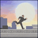
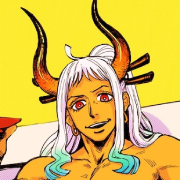
That's Ryan Kinnaird and yes he sucks real bad. It's shameful he got paid money for that comic. http://ryankinnaird.deviantart.com/
|
 #
?
Jan 7, 2017 12:24
#
?
Jan 7, 2017 12:24
|
|


|

|
| # ? May 13, 2024 10:35 |
|
|
I'm not sure which bit is worse, the entirely deliberate flap at the top of the thong or the entirely accidental club hand.
|
|
#
?
Jan 7, 2017 13:11
|
|


|
Did horrendous faux anime style still work for people in the mid 2000s? I mercifully skipped that era.
|
|
#
?
Jan 7, 2017 13:20
|
|

Teenage Fansub posted:Did horrendous faux anime style still work for people in the mid 2000s? I mean it started in the early 2000s and ended in the late mid 2000s and was never popular before or after that, so yeah. This coincided with the north american manga boom that everyone assumed would never end for some reason.
|
|
|
#
?
Jan 7, 2017 14:37
|
|


|
Legit manga artists have insanely tight schedules and are probably on exclusive contracts while they produce their ongoing titles, so any major project in the States is out of question. A Strange Tales-style anthology would be more plausible. (Hell, just another Strange Tales/Bizarro Comics book right now would be awesome) There is also a question of payment - a recognizable manga artist with their studio of assistants for even a GN or mini-series would cost quite a lot. So even hooking Kubo Tite while he is on a post-Bleach sabbatical would be too difficult and expensive (he would love lax western deadlines tho). And you may wish for Yuusuke Murata on Spider-Man now, but you probably wouldn't like Spider-Man fighting Puri-Puri Prisoner or Miles using his "jump power of the black people".
|
|
#
?
Jan 7, 2017 14:48
|
|

fatherboxx posted:And you may wish for Yuusuke Murata on Spider-Man now, but you probably wouldn't like Spider-Man fighting Puri-Puri Prisoner or Miles using his "jump power of the black people". Hey, nobody said anything about letting non-scottish people write.
|
|
|
#
?
Jan 7, 2017 14:56
|
|
|
Doctor_Fruitbat posted:I'm not sure which bit is worse, the entirely deliberate flap at the top of the thong or the entirely accidental club hand. Most of Ryan Kinnaird's style is creepy crotch-centric gross stuff. There is an actual tentacle rape scene in that comic iirc. Like I said he sucks real bad  fatherboxx posted:And you may wish for Yuusuke Murata on Spider-Man now, but you probably wouldn't like Spider-Man fighting Puri-Puri Prisoner or Miles using his "jump power of the black people". Murata does not write One Punch Man, he just draws the overwhelming gently caress out of it.
|
|
#
?
Jan 7, 2017 14:57
|
|
|
Also Eyeshield 21 is literally better than any Miles Morales comic so, yeah I actually wouldn't give a gently caress if Murata was also writing.
|
|
#
?
Jan 7, 2017 15:08
|
|

|
Onmi posted:Also Eyeshield 21 is literally better than any Miles Morales comic so, yeah I actually wouldn't give a gently caress if Murata was also writing. Murata didn't write Eyeshield 21, actually. 
|
|
#
?
Jan 7, 2017 19:02
|
|


|
Eyesheild 21 is also insanely racist so apt comparison there.
|
|
#
?
Jan 7, 2017 19:03
|
|

|
Flesh Forge posted:Most of Ryan Kinnaird's style is creepy crotch-centric gross stuff. There is an actual tentacle rape scene in that comic iirc. Like I said he sucks real bad Didn't that series have to get the MAX branding after the first issue because of that?
|
|
#
?
Jan 8, 2017 01:15
|
|
|
All I can tell you is it looked like crap, everything he does looks like crap, crappy crap crap  HAND DRAWN ARTIST SKETCH e: I mean usually I complain about artists who blatantly trace or worse do straight photo manipulations for characters but this guy, maybe he should trace Flesh Forge fucked around with this message at 02:03 on Jan 8, 2017 |
|
#
?
Jan 8, 2017 01:59
|
|
|
I am totally fine with stylized art as long as that style is not "really loving ugly"
|
|
#
?
Jan 8, 2017 02:08
|
|
|
JordanKai posted:Murata didn't write Eyeshield 21, actually. Huh, i had not realized that.
|
|
#
?
Jan 8, 2017 04:31
|
|
|
Murata normally just draws, while somebody else writes.
|
|
#
?
Jan 8, 2017 04:53
|
|

|
Roth posted:Murata normally just draws, while somebody else writes. I wonder if that makes him more atypical or if more popular works simply skew perception? Like I think of Tezuka, Oda, Toriyama and they all write and draw. Not that they don't have assistants but primary art and writing fall to them. Like, Murata has written one-shots before, but I guess he works a more traditionally american style of finding a writer to pair with. EDIT: Also, here's a 3 hour video of Hirohiko Araki Drawing https://www.youtube.com/watch?v=2RMfURKTHf4 Onmi fucked around with this message at 10:06 on Jan 8, 2017 |
|
#
?
Jan 8, 2017 05:02
|
|
|
I enjoyed that discussion on color. It's an underrated part of comic art and hardly ever gets talked about. Colorists never seem to get the name recognition that pencilers do but they should. Miller's "Ronin" comes to mind. Photoshop did a lot of good for comic coloring but also created a lot of really bad poo poo too. I get really tired of that "juicy", "hot" sort of look where there's hardly any neutral coloring going on, everything is oversaturated and blended and airbrushed way too much and it all looks like a pack of Fruit Stripe gum. Who's a good really colorist? It'd be interesting to see comparisons between a good one and bad one, working on the same image, that demonstrates how easy it is to gently caress up good line art with bad color. Also, isn't it true that Superman's primary color pallette was chosen because back then Cyan, Yellow and Red were the easiest to reproduce at the time? And Hulk was supposed to be grey but the printer hosed up and made him green?
|
|
#
?
Jan 8, 2017 16:07
|
|

|
I really like Jordie Bellaire's work in Pretty Deadly. I don't have a copy handy, so here are a few examples pulled up from a Google image search.  
|
|
#
?
Jan 8, 2017 17:49
|
|
|
BiggerBoat posted:Who's a good really colorist? It'd be interesting to see comparisons between a good one and bad one, working on the same image, that demonstrates how easy it is to gently caress up good line art with bad color. There are a lot of really great colorists out there these days. To get a variety of styles, I would look at Jordie Bellaire, Nathan Fairbairn, Dave Stewart, Rico Renzi, Elizabeth Breitweiser, Dave McCaig, Dean White, Lee Loughridge, Jose Villarubia, Matt Wilson, Nick Filardi, and Tamra Bonvillain. quote:Also, isn't it true that Superman's primary color pallette was chosen because back then Cyan, Yellow and Red were the easiest to reproduce at the time? And Hulk was supposed to be grey but the printer hosed up and made him green? Yeah, a lot of creative decisions in early comics come down to available technology. Generally speaking, heroes were colored in primary colors because those were the least likely to be messed up by printing processes, and you want your heroes to be iconic and instantly recognizable. Gray was very difficult to consistently color with the old separation process, so, yeah, that's why Hulk turned in short order from gray to green and also why Iron Man coated his armor in gold after about one story. Pretty sure it's also why furry Beast became blue after being gray for his first few appearances.
|
|
#
?
Jan 8, 2017 19:45
|
|
|
Benito Cereno posted:Yeah, a lot of creative decisions in early comics come down to available technology. Generally speaking, heroes were colored in primary colors because those were the least likely to be messed up by printing processes, and you want your heroes to be iconic and instantly recognizable. Mike Allred explains: 
|
|
#
?
Jan 8, 2017 19:54
|
|

|
Benito Cereno posted:There are a lot of really great colorists out there these days. To get a variety of styles, I would look at Jordie Bellaire, Nathan Fairbairn, Dave Stewart, Rico Renzi, Elizabeth Breitweiser, Dave McCaig, Dean White, Lee Loughridge, Jose Villarubia, Matt Wilson, Nick Filardi, and Tamra Bonvillain. A great list of colorists (I'm familiar with several of them), but I'd also add in Laura Martin and Laura Allred.
|
|
#
?
Jan 8, 2017 20:14
|
|
|
fatherboxx posted:
You know, I'd think I'd like to see Kubo be an artist in an american comic. He could have someone else write and he could just draw cool poo poo and as you said, he'd be happier with the american work schedule.
|
|
#
?
Jan 9, 2017 05:21
|
|

|
Monaghan posted:You know, I'd think I'd like to see Kubo be an artist in an american comic. He could have someone else write and he could just draw cool poo poo and as you said, he'd be happier with the american work schedule. Yes but he reputedly hated working with assistants, which is why his series basically stopped having backgrounds.
|
|
#
?
Jan 9, 2017 06:16
|
|
|
Great art from this week's Moon Knight by Greg Smallwood.   
|
|
#
?
Jan 9, 2017 07:33
|
|

|
BiggerBoat posted:Who's a good really colorist? It'd be interesting to see comparisons between a good one and bad one, working on the same image, that demonstrates how easy it is to gently caress up good line art with bad color. Comparisons of Absolute Sandman vol 1 with the original issues.
|
|
#
?
Jan 9, 2017 08:56
|
|

|
That gradient sky makes me very sad.
|
|
|
#
?
Jan 9, 2017 09:22
|
|
|
Have to say I prefer the original colouring in those three examples. Like someone said, I would probably have to read up on some colour theory to articulate why, but surely Hell can't intentionally be that dull.
|
|
#
?
Jan 9, 2017 12:25
|
|
|
qntm posted:Have to say I prefer the original colouring in those three examples. Like someone said, I would probably have to read up on some colour theory to articulate why, but surely Hell can't intentionally be that dull. That's the proper way to feel. Gradient recolors are garbage. Look for the one they did of The Incal compared to the original for another example.
|
|
#
?
Jan 9, 2017 12:41
|
|
|
Top Cow Colorist Jasen Smith posted this to his facebook Flat's probably my favorite. I find i tend to dislike glossier colors.
|
|
#
?
Jan 9, 2017 16:07
|
|

|
zoux posted:Top Cow Colorist Jasen Smith posted this to his facebook In a couple of those it looks like Wolverine's head can open up and launch a missile.
|
|
#
?
Jan 9, 2017 16:39
|
|


|
Lobok posted:In a couple of those it looks like Wolverine's head can open up and launch a missile. That's his secondary mutation.
|
|
#
?
Jan 9, 2017 16:45
|
|


|
zoux posted:Top Cow Colorist Jasen Smith posted this to his facebook I like the flat one a lot more than the others. But that's probably because things looked that way when I was first exposed to them. They do shading on the more recent Bugs Bunny cartoons, too, and it's never felt right to me. 
|
|
#
?
Jan 9, 2017 16:47
|
|


|
Flat looks good, but it also makes him look like he's in Colossus' shadow.
|
|
#
?
Jan 9, 2017 17:00
|
|
|
RandallODim posted:That's the proper way to feel. Gradient recolors are garbage. Look for the one they did of The Incal compared to the original for another example. I actually don't mind the Sandman recolours that much (possibly because I haven't read it yet), but good lord:  
|
|
#
?
Jan 9, 2017 18:07
|
|
|
JordanKai posted:I actually don't mind the Sandman recolours that much (possibly because I haven't read it yet), but good lord: This and the Sandman recolors just make me so sad. In Sandman's case I'm sure part of it is just that it's so different from the version I've read and reread numerous times. It does ensure that I'll try to keep my volumes in great shape so I don't ever have to replace them. a kitten fucked around with this message at 18:35 on Jan 9, 2017 |
|
#
?
Jan 9, 2017 18:29
|
|


|
The original colors look so much better. Like the new ones are done to be more "accurate" or "realistic" but that's not really what you want from something like Sandman. The occasionally weird or gaudy colors are a big part of the charm.
|
|
#
?
Jan 9, 2017 18:41
|
|

|
Thinking of dope colorists I always immediately jump to Zero Year. Art by Capullo, colors by Fco Plascencia  
|
|
#
?
Jan 9, 2017 19:41
|
|

|
Vulpes Vulpes posted:Simon Gane and Jordie Bellaire's work on They're Not Like Us is so great: Reposting Jordie Bellaire's work on They're Not Like Us, which she described as her "101 Dalmations" style. Best in the biz.
|
|
#
?
Jan 9, 2017 21:53
|
|


|
Flesh Forge posted:That's Ryan Kinnaird and yes he sucks real bad. It's shameful he got paid money for that comic. Would you prefer he be paid in lutefisk?
|
|
#
?
Jan 10, 2017 01:48
|
|
|

|
| # ? May 13, 2024 10:35 |
|
|
If he had to eat it straight out of the lye that'd be preferable, yeah
|
|
#
?
Jan 10, 2017 08:30
|
|