


|
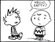
Cut and Paste seduces you with promises of glory, power and easy to create art but will ultimately betray and destroy you in the end. Beware, for some tools were not meant to be wielded by human hands.
|
 #
?
Apr 29, 2017 23:12
#
?
Apr 29, 2017 23:12
|
|


|

|
| # ? May 18, 2024 21:20 |
|
|
What about face outlines and separate eyes, eyebrows, and mouths that can be swapped out. Stop motion uses it.
|
|
#
?
Apr 30, 2017 03:58
|
|

|
Elsa posted:What about face outlines and separate eyes, eyebrows, and mouths that can be swapped out. Stop motion uses it. Don't ever cut so many corners you end up with a circle like this. The big tell for this is facial muscles stretch and squish the form of the face itself, like if you have wide toothy grin and then a tall open mouth on the same jawline outline it's going to be really obvious what work you're trying not to do.
|
|
#
?
Apr 30, 2017 04:01
|
|


|
true, true.
|
|
#
?
Apr 30, 2017 04:11
|
|
|
Also, claymation is what tends to use those techniques, not stop motion. Typically. There is an implicit difference, notably in what is being animated. Doing that on a claymation sculpt is generally fine. Gumby stuff. Doing that on a stop motion figure is really silly and goes against the point of having such articulated and advanced skeletal structures.
|
|
#
?
Apr 30, 2017 04:26
|
|

|
http://www.hollywoodreporter.com/behind-screen/coraline-makers-reveal-how-they-863155
|
|
#
?
Apr 30, 2017 04:50
|
|
|
What is even the point of having multiple panels if they're all gonna look the same. Like no bs or anything, especially if you're gonna redraw them for the principle or whatever why wouldn't you make it a more dynamic layout instead. I understand if you have a subtle moment to moment thing goin on but every time I see some comic where two people talk on a couch and everything but they're facial features stays exactly the same I question why they chose the format of comic strip in the first place. I dunno I see where sweeper bravos point kinda works but I think this specific thought a lot
|
|
#
?
Apr 30, 2017 10:11
|
|

|
Plus you are missing having two jokes going on at the same time, the spoken one and then the visual one.
|
|
#
?
Apr 30, 2017 13:40
|
|


|
Wowporn posted:What is even the point of having multiple panels if they're all gonna look the same. Like no bs or anything, especially if you're gonna redraw them for the principle or whatever why wouldn't you make it a more dynamic layout instead. I understand if you have a subtle moment to moment thing goin on but every time I see some comic where two people talk on a couch and everything but they're facial features stays exactly the same I question why they chose the format of comic strip in the first place. I dunno I see where sweeper bravos point kinda works but I think this specific thought a lot for me that's a matter of timing for the strip. Panel breaks indicate the passage of time, and when you're drawing something you can use that to manipulate the reader's sense of time. Not that it's always used to great effect, obviously, but (in the case of a well written, well set up punchline) sometimes you want each chunk of the set-up to be separate and then the punchline to also be visually, and thus temporally separated. The copy the sektch layer and ink it multiple times thing Reiley talked about is a really great method for getting most of the benefits of copy/pasting while having a product that doesn't look lazy. Also- one other thing that copy/paste does is I think your brain picks up on the fact that every picture is the exact same, and it sends the subconscoius message to tune out the art and focus just on the words. Which is ok if that's what you want the reader to focus on, but you have to make sure that your writing is really tight then. Though I think this also depends on the level of detail- I've seen it go both ways, where I just tune out the art entirely, or when something is just slightly different or off center in one of the panels and my brain goes into "find the difference" mode. This is all about improving yourself as an artist though and assuming most of your readers are also artists who will notice things. If you don't care and just want to get stuff out, and most of your readership is people who aren't looking at your work critically*, they probably won't notice that every panel is literally the same. And my opinion on this has changed a bit over the years, but right now I don't think there's anything wrong with making stuff because it's fun for you to do, and not focusing on improving with everything you do if it becomes a stressor that's taking away the joy of drawing for you. (I used to be of the opinion that "why wouldn't you want, and actively seek, to improve?" and learned that the answer is because for some of us that kills the love of drawing if you push yourself too hard but that's another story and another topic.) *I'd say "people who don't draw," but a lot of people who DO draw don't think critically about the choices they're making and would probalby think you're a genius for copy pasting and saving yourself the time.
|
|
#
?
Apr 30, 2017 15:16
|
|

|
Wowporn posted:I see some comic where two people talk on a couch and everything but they're facial features stays exactly the same I question why they chose the format of comic strip in the first place I don't think anyone was arguing for this? There is a difference in repeating a panel for a certain effect and just copy pasting the same two dudes and couch over and over.
|
|
#
?
Apr 30, 2017 16:40
|
|
|
Frankly, I think webcomics is ready for a silver age of Two Guys Sitting on the Couch Comics. When was the last time you read a good (bad) Two Guys Sitting on a Couch Comic?
|
|
#
?
May 1, 2017 20:06
|
|

|
I kinda want to read a Jason Shiga two guys on a couch comic. The premise could be something like "two guys are on a couch, they are told that the last person off the couch gets a hundred million dollars". Then the murderous game of maths and bodily functions begins. Also they review videogames.
|
|
#
?
May 1, 2017 20:11
|
|


|
I am going to start a thing maybe, what you guys think? Just flatting colours atm.
|
|
#
?
May 1, 2017 20:46
|
|
|
I am glad to see Fight City again, I love this concept.
|
|
#
?
May 1, 2017 21:22
|
|
|
I've started adhd meds a week ago,so I might actually get some where this time!
|
|
#
?
May 1, 2017 21:49
|
|
|
Alright, I've been doodling a comic in my spare time and trying to get feedback from my animator friends along the way. Unfortunately, my friends are very nice and I'm starting to get paranoid. I've finally decided to balls up and come in here for some honest feedback. I guess my first question is how best to present what I've got to a private audience? I'm trained in illustration and animation so I don't have any trouble dropping that poo poo publicly outright, but I am not trained in comics. This is my first attempt and I don't wanna embarrass myself any more than I have to. 
|
|
#
?
May 2, 2017 11:02
|
|

|
Show us what you got?
|
|
#
?
May 2, 2017 11:38
|
|
|
Das Boo posted:Alright, I've been doodling a comic in my spare time and trying to get feedback from my animator friends along the way. Unfortunately, my friends are very nice and I'm starting to get paranoid. I've finally decided to balls up and come in here for some honest feedback. Being embarrassed is just part of learning  . .
|
|
#
?
May 2, 2017 15:52
|
|

|
Das Boo posted:Alright, I've been doodling a comic in my spare time and trying to get feedback from my animator friends along the way. Unfortunately, my friends are very nice and I'm starting to get paranoid. I've finally decided to balls up and come in here for some honest feedback. Post it in the webcomics thread for some honest feedback.
|
|
#
?
May 2, 2017 17:49
|
|
|
Nude posted:Being embarrassed is just part of learning I got 24 pages of this poo poo and it seems like a lot to just image dump. Hogge Wild posted:Post it in the webcomics thread for some honest feedback. I know better than to trust you, Hoggers. You and your jazz hands.
|
|
#
?
May 2, 2017 20:41
|
|
|
Das Boo posted:I got 24 pages of this poo poo and it seems like a lot to just image dump. Upload them to imagur and just leave the links. You could also save them all into a PDF and put that out on Google Drive or whatever. Or them all. That's fine too.
|
|
#
?
May 2, 2017 20:57
|
|
|
This thread is dead for long stretches of time. I don't think anyone will mind even if you post the whole thing in here. If you are really worried, then just post the first few with a link to where the rest are at and that should be fine.
|
|
#
?
May 3, 2017 04:24
|
|
|
The Imgur thing should work fine. I was curious about the most digestible format, so here's what I got so far.
|
|
#
?
May 4, 2017 00:14
|
|
|
Das Boo posted:The Imgur thing should work fine. I was curious about the most digestible format, so here's what I got so far. objectively cool
|
|
#
?
May 4, 2017 01:00
|
|
|
Das Boo posted:The Imgur thing should work fine. I was curious about the most digestible format, so here's what I got so far. Well the general quality of the art is really good. I think if I have to criticise I don't agree with your speech balloon placement in a number of places. Specifically while readers know how they should read the balloons, you aren't making it easy for them with stuff like panel 3 -> 4 in http://i.imgur.com/rknCUr3.jpg To get from one panel to the next following the conversation, the reader's eye has too go *through* a balloon in a panel that is further on! So yeah, basically avoid putting balloons in the bottom of tall panels, and don't overdo balloons clipped to the corners of panels. Think about the path the eye has to follow. There's also some "two upanddown to the left of one tall" type layouts, and that's a no no. E.g. First three panels on http://i.imgur.com/qeARK1r.jpg Also I wonder if you would benefit from white or wider gutters. With your use of blacks things get confusing sometimes, see the panel border at the bottom of http://i.imgur.com/yKockGC.jpg If you want me to keep nitpicking I think you might be over-doing the face + shoulder shot somewhat.
|
|
#
?
May 4, 2017 01:26
|
|
|
I really do think you would benefit from wider gutters. The art is great but busy, and with background details in nearly every panel things get real claustrophobic. Also watch your tangents. Some of the balloon tails are touching or crossing through so many details. Like panels 4, 5, and 6 are real obvious in how the tails meet up at a vertical line which looks sloppy. It's okay to erase a little around where balloon tails point.
|
|
#
?
May 4, 2017 01:48
|
|

|
Das Boo posted:The Imgur thing should work fine. I was curious about the most digestible format, so here's what I got so far. Love it and want more. Your art is generally pretty darn good and your characters are nicely expressive so it was easy for me to like everyone from early on. You've also set up an interesting scenario that I'm genuinely interested in seeing play out. Which is hard to do in so few pages so good work. As for nitpicks I'll echo Fangz comments on the gutter size. They're not a huge issue but I think making them a tad bigger in places would improve the readability of the work. The "two upanddown to the left of one tall" layouts are also technically a mistake, though I didn't notice them until Fangz pointed them out for what it's worth. The only other criticism I have is that the reveal that the pair are collaborators was a touch too subtle (or I could just be dumb). It took me a few pages more than it should have to figure out what was going on and I wonder if that could throw off other people as well. But that's kind of it. You should absolutely get a website and start posting this online.
|
|
#
?
May 4, 2017 01:55
|
|
|
Excellent, thank you! I'm really glad there's a consensus on problems and I'll be happy to fix them.
|
|
#
?
May 4, 2017 02:28
|
|
|
readingatwork posted:Love it and want more. I agree with everything except the subtlety. I think it works quite well and feels like a more natural way to handle it. I don't mind a little bit of confusion for a page or two personally and it pretty quickly becomes clear they are conspiring together anyways. But yeah, you should definitely put the comic out there somewhere and start building an audience. It's a great comic so far and I think it could do pretty well.
|
|
#
?
May 4, 2017 05:26
|
|
|
 Hey, we're starting up a new anthology and we're looking for pitches! It's called WAYWARD SISTERS: An Anthology of Monstrous Women. This 160-page book will celebrate monsters who are indelicate, impolite, irrepressible, all the things women are told they can�t be. Wayward Sisters will be a collection of stories where the monsters are women, told by creators with intersectional backgrounds who self-identify as women or gender-nonconforming. We will be looking for stories by creators exploring aspects of their identities that society tells us are wrong or monstrous, stories of righteous monster-vengeance, and stories where monster friends go out together to have their fangs cleaned and claws manicured. Creative teams will be paid $51 USD per page for a maximum of $510 USD (10 pages): $11 USD per script page $25 USD per page for pencils & inks $15 USD per page for colours The anthology will be led by Allison O'Toole, an editor of the two most recent volumes of the Toronto Comics Anthology as well as titles for Chapterhouse Publishing. As a kid, she dreamed of growing up and becoming a werewolf. Now she�s mostly given up on that dream but hopes that the next best thing is giving creators this opportunity to invent the lady monsters she always wanted to read about. Allison will be supported by M. Blankier, a contributor to Toronto Comics: Volume 3, Strange Romance, and Iron Man: Golden Avenger. All the submission info about sending in a pitch, or applying as an artist is up at http://waywardsistersanthology.com/.
|
|
#
?
May 9, 2017 00:36
|
|

|
TCAF is this weekend! Do we have any other thread folks hitting up the show? We're going to be at table 213, on the second floor near the stairs. Come say hi!
|
|
#
?
May 9, 2017 23:05
|
|
|
I'll be exhibiting at TCAF's Comics x Games wing with the latest build of my game as well as the usual array of comic stuff.
|
|
#
?
May 9, 2017 23:25
|
|
|
Yeah! Table 122, first floor.
|
|
#
?
May 10, 2017 01:00
|
|

|
Have any of you bought banner ads? How effective are they? (I know the answer is 'it varies' but I'm curious about the range of experiences)
|
|
#
?
May 11, 2017 14:20
|
|
|
Back in 2011 I found PW pretty effective for driving new readers to my last comic from other comics in the network. Unfortunately since then, ad blocker adoption has become almost total among the webcomic-reading audience (young, computer savvy). The PW ads I bought for my new comic were totally useless. I also tried Facebook ads and they didn't work, either. I found I got more readers from cross-posting to Tumblr than anything else.
|
|
#
?
May 11, 2017 16:56
|
|
|
That's a bit depressing, but thanks.
|
|
#
?
May 11, 2017 19:27
|
|
|
Squidster posted:TCAF is this weekend! Do we have any other thread folks hitting up the show? We're going to be at table 213, on the second floor near the stairs. Come say hi! I will definitely be there! Got one of my comics printed up to hand out to people and everything (Cover is by a friend of mine)! 
|
|
#
?
May 13, 2017 01:46
|
|

|
okay so my computer's no longer recognizing tablet pressure sensitivity. I've got an intuos tablet and use Medibang Paint Pro for art. I tried uninstalling and reinstalling the drivers but that didn't work. any help?
|
|
#
?
May 16, 2017 17:12
|
|

|
Unplug and plug back in you wacom? Worked for me once.
|
|
#
?
May 16, 2017 22:35
|
|
|

|
| # ? May 18, 2024 21:20 |
|
|
The Ayshkerbundy posted:okay so my computer's no longer recognizing tablet pressure sensitivity. I've got an intuos tablet and use Medibang Paint Pro for art. I tried uninstalling and reinstalling the drivers but that didn't work. any help?
|
|
#
?
May 16, 2017 22:39
|
|
