


|
Thanks for all the tips, I started with this model as a prep to work out the process before painting the rest of my Shadespire box. It's been a while since I painted yellow but now that I think about it, I would base brown (like I did here) and then paint like an eggshell / off white, then yellow. Forgot the eggshell this time 
|
 #
?
May 9, 2018 15:22
#
?
May 9, 2018 15:22
|
|


|

|
| # ? Jun 3, 2024 00:33 |
|
|
Cross post from the 40k thread:Fake James posted:Started shading my poxwalkers last night. Here are the first few, the rest were still drying by the time I went to bed. Cant wait to get the rest of them done. Going to save highlights for after Nova, most likely. Still have a lot to do. The 2nd pic is potato quality because I didn't feel like busting out my camera again but I think it's the best one of the bunch so far. I need to figure out how to blend the bruising around the guts better. Would adding a crimson wash to the edge help it fade better into the skin, or would a highlight help break up the line better?
|
|
#
?
May 9, 2018 15:30
|
|


|
 Also pictured: Prescription eye drops. DO NOT MIX THESE THINGS UP. Well, that was easier than expected. Though I think I wasted a little bit. Oh well, not bad for a paint that was dead. Deviant fucked around with this message at 15:53 on May 9, 2018 |
|
#
?
May 9, 2018 15:50
|
|


|
PaintVagrant posted:Find the most opaque seeming light grey paint you can find. I don�t know the modern gw colors very well, but something like the old foundation paints or equivalent. The kind of paint that reminds you of housepaint it is so opaque. I usually use an old vgc color, wolf grey or some poo poo. I really can't stress this enough. The most consistent yellows I've personally ever gotten were just over an extremely light grey or white base coat with thin layers of yellow paint and yellow glaze. It ended up saving me a lot of extra layers, too. That brown is too dark to paint the yellow straight on to.
|
|
#
?
May 9, 2018 16:55
|
|


|
PaintVagrant posted:Find the most opaque seeming light grey paint you can find. I don’t know the modern gw colors very well, but something like the old foundation paints or equivalent. The kind of paint that reminds you of housepaint it is so opaque. I usually use an old vgc color, wolf grey or some poo poo. I use a p3 frostbite (like a super bright space wolves grey) and it's awesome for this.
|
|
#
?
May 9, 2018 17:17
|
|

|
A base coat of Averland Sunset or an equivalent is also a good foundation to build a nice bright yellow on top of.
|
|
#
?
May 9, 2018 19:02
|
|

|
The secret to yellow was Iyanden Darksun.
|
|
#
?
May 9, 2018 20:19
|
|

|
Eifert Posting posted:I use a p3 frostbite (like a super bright space wolves grey) and it's awesome for this. Im pretty sure thats very close to the vallejo color I use.
|
|
#
?
May 9, 2018 21:07
|
|
|
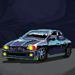
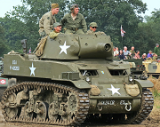
Could I get some opinions from folks? I'm painting up a ww2 British Churchill tank with a winter camo whitewash. Ive finished up the effect but I'm really torn on if it looks great or utter crap.  
|
|
#
?
May 9, 2018 22:28
|
|
|
Fake James posted:I need to figure out how to blend the bruising around the guts better. Would adding a crimson wash to the edge help it fade better into the skin, or would a highlight help break up the line better? Glazing works way better for bruising. I usually do this by mixing roughly 50:50 purple wash to matte medium, and it works wonders. Do the same with red after the purple dries and you get a more convincing blend of colors.
|
|
#
?
May 9, 2018 22:28
|
|

|
Lupercalcalcal posted:Could I get some opinions from folks? I'm painting up a ww2 British Churchill tank with a winter camo whitewash. Ive finished up the effect but I'm really torn on if it looks great or utter crap.
|
|
#
?
May 9, 2018 22:37
|
|
|
Slimnoid posted:Glazing works way better for bruising. I usually do this by mixing roughly 50:50 purple wash to matte medium, and it works wonders. Do the same with red after the purple dries and you get a more convincing blend of colors. Oh good call! I was working fast and didn't think to mix with medium. I'll cover the edge with some of the base color and blend in the edge using this method.
|
|
#
?
May 9, 2018 22:42
|
|
|
Ilor posted:The two things that strike me most about this are that a) you could probably go a little heavier with the white (i.e. have less green showing), and b) the brush-strokes in the white are really obvious. White is a difficult color, though, so I'd recommend maybe applying it with a sponge rather than a brush (or stippling rather than straight painting). Sponging in the white is a great idea, and you're definitely right about the amount of green showing, I think I was just so nervous about applying the white that I struggled to get adequate amounts on. For the next one I'll try going heavier on the white and using a sponge to apply it. Thanks!
|
|
#
?
May 9, 2018 22:43
|
|
|
Ilor posted:The two things that strike me most about this are that a) you could probably go a little heavier with the white (i.e. have less green showing), and b) the brush-strokes in the white are really obvious. White is a difficult color, though, so I'd recommend maybe applying it with a sponge rather than a brush (or stippling rather than straight painting). Arguably correct for a whitewashed vehicle, though.
|
|
#
?
May 10, 2018 00:04
|
|
|
Anyone have tips on painting tiny wood? Trying to find a good way of painting the tiny wooden stocks on my Skitarii, and I'm not really happy with what I've got so far. I tried out two last night on some scrap guns:  The left's base XV-88, Nuln Oil wash, edge highlight/drybrush Balor Brown, wash with Seraphim Sepia. The right's base Rhinox Hide, Nuln Oil wash, edge highlight/drybrush Skrag Brown. The right is also the method described in Warhammer TV's "How to Paint Skitarii Rangers" video. Issue with the left is that is seems more a leather color than a wood color, and I really don't like Balor Brown on wood (looks too yellow). And the right one is dark to the point where it just looks black under normal lighting. I figure at least part of the reason I dislike it is a lack of grain running through the wood, so I was going to try lighter streaks tonight. But other than that, does anyone have recommendations on colors and/or techniques to try out?
|
|
#
?
May 10, 2018 00:13
|
|

|
For what it's worth, I like the one on the right as-is. It reminds me of old, worn wood. Though I'd do something different with the stock; maybe the left one's stock with the right one's forearm (is that the right word?).
Avenging Dentist fucked around with this message at 01:45 on May 10, 2018 |
|
#
?
May 10, 2018 01:42
|
|

|
spectralent posted:Arguably correct for a whitewashed vehicle, though.
|
|
#
?
May 10, 2018 01:42
|
|
|
Lupercalcalcal posted:Could I get some opinions from folks? I'm painting up a ww2 British Churchill tank with a winter camo whitewash. Ive finished up the effect but I'm really torn on if it looks great or utter crap. It looks crap in a good way? Like, I 100% believe that this paint-job is the result of a crew being handed a paint brush and bucket of whitewash after a 16 hour day of watching their friends get brewed up and burned alive. It's got verisimilitude is what I'm saying: they want to cover the tank (so they don't get killed) and they want it to be good enough (so they don't have to re-do it) but they're goddamn tired. Schadenboner fucked around with this message at 04:52 on May 10, 2018 |
|
#
?
May 10, 2018 04:29
|
|
|
Avenging Dentist posted:For what it's worth, I like the one on the right as-is. It reminds me of old, worn wood. Though I'd do something different with the stock; maybe the left one's stock with the right one's forearm (is that the right word?). I want them to be the same color across the entire gun, but drat do I agree that the left one's stock is looking good. I think I'll keep that in my back-pocket for the next time I want to do a "dusty new leather" look. I think I'm settled on the right one for paint colors. Maybe instead of Nuln Oil wash I'll try Agrax Earthshade as a wash to not darken it so much and bring out a bit more brown.
|
|
#
?
May 10, 2018 04:42
|
|
|
Duct Tape posted:I want them to be the same color across the entire gun, but drat do I agree that the left one's stock is looking good. I think I'll keep that in my back-pocket for the next time I want to do a "dusty new leather" look. You can change the paints around, but the main things I like about each are that the right one looks like old, somewhat-grimy wood that's broken off around the edges, revealing fresh (untreated/unstained) wood. Because of the metal trim on the stock, it wouldn't make sense for the "edges" to be lighter, since they're protected somewhat by the trim; instead, you'd see some fading in the middle (but probably less than the forearm), which is more like what you have on the left gun.
|
|
#
?
May 10, 2018 04:46
|
|
|
Schadenboner posted:It looks crap in a good way? Like, I 100% believe that this paint-job is the result of a crew being handed a paint brush and bucket of whitewash after a 16 hour day of watching their friends get brewed up and burned alive. So this is exactly what I was going for so that's encouraging. I think ilor is still right about brush strokes vs size so I'm going to try the sponge, but this really is an encouraging response, and makes me feel like it wasn't a total waste of time and effort. Thanks.
|
|
#
?
May 10, 2018 06:25
|
|
|
Lupercalcalcal posted:So this is exactly what I was going for so that's encouraging. I like narrative paint jobs (like, where there's a story of the painting in the painting) so I really liked your tank.
|
|
#
?
May 10, 2018 07:10
|
|
|
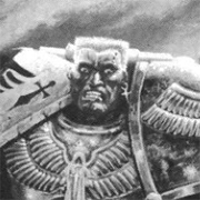
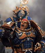
'Spear of Ultramar', a Knight Lancer from House Konor, now sworn to the Ultramarines 4th Company:      
|
|
#
?
May 10, 2018 16:20
|
|

|
I hate how the FW knight's knees are constructed such that it actually can't straighten its spindly-rear end legs. They always have this loving doofy power-squat look to them that just looks awful. That said, your paint-job is dope as gently caress!
|
|
#
?
May 10, 2018 16:24
|
|
|
GuardianOfAsgaard posted:'Spear of Ultramar', a Knight Lancer from House Konor, now sworn to the Ultramarines 4th Company: Goddamn dude, that's loving gorgeous. Where's the giant shield (and shield within a shield) from? Great use of Guilliman bits too, and I love that base.
|
|
#
?
May 10, 2018 16:24
|
|
|
SRM posted:Goddamn dude, that's loving gorgeous. Where's the giant shield (and shield within a shield) from? Great use of Guilliman bits too, and I love that base. Thanks man! The shield is made by James Taro, he does amazing conversion parts for knights: https://www.etsy.com/uk/shop/TaroModelmaker?ref=l2-shopheader-name Ilor posted:I hate how the FW knight's knees are constructed such that it actually can't straighten its spindly-rear end legs. They always have this loving doofy power-squat look to them that just looks awful. Cheers ")
|
|
#
?
May 10, 2018 16:31
|
|
|
If that text is hand painted I will break down and weep. Great job on this whole thing.
|
|
#
?
May 10, 2018 17:20
|
|

|
Ilor posted:I hate how the FW knight's knees are constructed such that it actually can't straighten its spindly-rear end legs. They always have this loving doofy power-squat look to them that just looks awful. I always assumed* it's like that to allow some sort of power thrust to add some pelvic oomph behind a spear? *: Just-so-storied a reason because Forgeworld cannot into mechanical design Schadenboner fucked around with this message at 12:31 on May 11, 2018 |
|
#
?
May 11, 2018 12:28
|
|
|
Schadenboner posted:some sort of power thrust to add some pelvic oomph behind a spear? Txt me. Schadenboner fucked around with this message at 12:31 on May 11, 2018 |
|
#
?
May 11, 2018 12:28
|
|
|
Cross postin' from 40k threadGeneral Olloth posted:
|
|
#
?
May 11, 2018 17:22
|
|


|
General Olloth posted:Cross postin' from 40k thread Those look delicious.
|
|
#
?
May 11, 2018 17:55
|
|
|
Schadenboner posted:Txt me. 
|
|
#
?
May 11, 2018 18:24
|
|
|
Ilor posted:Jesus, did you just "txt me" yourself, you moron? Txt me.
|
|
#
?
May 11, 2018 18:41
|
|
|
Schadenboner posted:Txt me. 
|
|
#
?
May 11, 2018 19:06
|
|
|
Please stop
|
|
#
?
May 11, 2018 19:30
|
|

|
Please dont poo poo up the P&M thread. It is neutral ground.
|
|
#
?
May 11, 2018 20:37
|
|

|
schlobinboner cant help his braindamaged self
|
|
#
?
May 12, 2018 00:21
|
|

|
Okay, I worry that I'm headed for the other thread about posting horribly painted minis. I can't quite get flesh right. I would love some constructive criticism. https://imgur.com/a/4EylAkv The base flesh tone is Vallejo Model Color Medium Flesh with a little red, brown, and yellow to tint. I keep trying to use a sort of glaze/shade of the base with some extra brown on the underside and other shadow areas, and highlights of the base with some white. Whatever I end up doing it seems to just look like the base flesh color. I'm not sure if it's just the fact that the mini has a less-cheekbony or angular face but it just seems to elude me. I have a few other Model Color flesh/skin colors so if I have to strip it, re-prime, and restart (or I could just tone over it) but if I have to get other colors, please keep it at Vallejo simply because my inventory apps display by brand.
|
|
#
?
May 13, 2018 15:52
|
|


|
MJP posted:Okay, I worry that I'm headed for the other thread about posting horribly painted minis. I can't quite get flesh right. I would love some constructive criticism. https://imgur.com/a/4EylAkv I'd also suggest that you make your highlight colors with a Also, outline the eyes with an extra dark color to seperate them from the rest of the face and add more depth. Electric Hobo fucked around with this message at 20:16 on May 13, 2018 |
|
#
?
May 13, 2018 17:44
|
|


|

|
| # ? Jun 3, 2024 00:33 |
|
|
Did I not thin my paints enough? Some other comments elsewhere said it looked too thick.
|
|
#
?
May 13, 2018 19:55
|
|