


|
dupersaurus posted:I had your stuff in mind but I couldn�t remember if it was you or another gamedev threader It�s me. But I haven�t done gamedev in years and don�t plan on picking it back up. Painting is way more chill.
|
 #
?
May 11, 2018 00:33
#
?
May 11, 2018 00:33
|
|


|

|
| # ? Jun 3, 2024 23:49 |
|
|
Franchescanado posted:See if you can find this book somewhere: Learn To Paint Acrylics with 50 Small Paintings boiught this to get back into it and get pumped up for some big pieces... this book is really great. easily the best acrlyic book I have seen  using 6x6 (x3/4) stretched canvas instead of hte 5x5. quick and fun which is cool  
|
|
#
?
May 12, 2018 02:47
|
|
|
Monochromatic birds (minus the beaks). Also, I got my heavy body acrylics and matte medium in yesterday and started reworking an old painting. My life has just become 100x easier now that I can paint instead of reapplying the same color over and over. Thanks again for all the help. New question: Anyone have experience getting their paintings into prints? All my friends and family are dying for a print of the birds. I'm reading about scanners and taking nice pictures outdoors with grayscale cards and touching up in photoshop and all that. It's pretty overwhelming and I'm not even sure where to go after that. I'd rather people have the option to get prints on demand instead of me ending up with 200 prints in a closet or something crazy.
|
|
#
?
May 14, 2018 20:20
|
|
|
Call around for local print shops and ask if they do prints of paintings. E-mail them what your paintings look like and they'll tell you their price or tell you where to go. Glad to hear the matte medium helped out!
|
|
#
?
May 14, 2018 20:29
|
|

|
poemdexter posted:Monochromatic birds (minus the beaks). There are sites like Society6 that do print-on-demand like that. Unless it can fit on a scanner, find yourself a friend with a ~24MP camera and some good glass and you can do prints up to 13x20 or so. Take pics outside on a cloudy day or in the shade on a sunny day, tweak in photoshop as needed.
|
|
#
?
May 14, 2018 20:37
|
|

|
poemdexter posted:Monochromatic birds (minus the beaks). jus tmake them paintings on stretched canvas... or maybe even a nice candidate for wood panel imo. they will love the actual real painting much more than dumbass print. then again you dont want to keep painting them and they surely don't want ot pay the actual cost to create them gl 
|
|
#
?
May 15, 2018 03:23
|
|
|
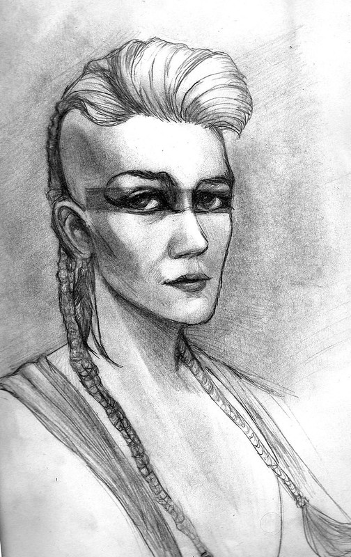
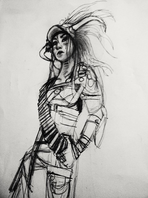 WIP portrait from Wastelands Festival.
|
|
#
?
May 15, 2018 07:22
|
|


|
Jack Daniels posted:jus tmake them paintings on stretched canvas... or maybe even a nice candidate for wood panel imo. they will love the actual real painting much more than dumbass print. I think I would quit painting forever if I had to do the same painting over and over again for every person that wanted one. Even if they were paying.
|
|
#
?
May 15, 2018 15:32
|
|
|
dupersaurus posted:*takes notes* What kind of art fair did you enter? Was it juried? I have been doing (mostly outdoor) fairs for about 5 years, so let me know if you have questions.
|
|
#
?
May 17, 2018 05:19
|
|


|
HungryMedusa posted:What kind of art fair did you enter? Was it juried? I have been doing (mostly outdoor) fairs for about 5 years, so let me know if you have questions. A local juried outdoor fair. Waiting to hear if they'll have me, but if they do I'll probably have some logistics questions, thanks
|
|
#
?
May 17, 2018 13:28
|
|
|
I went plein air painting a couple times recently. acrylic on canvas 12" x 9"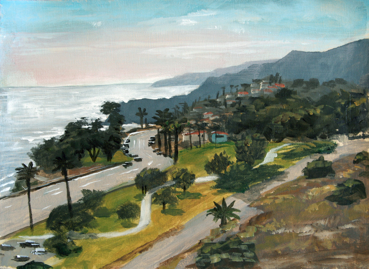 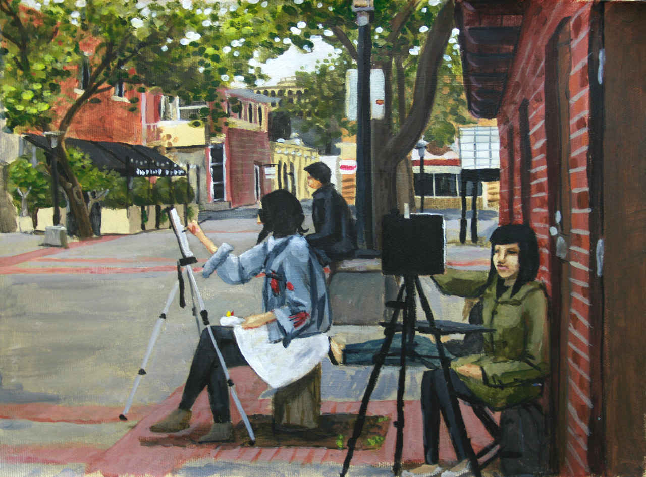
|
|
#
?
May 18, 2018 04:59
|
|

|
Has anyone tried this? Painting with inverted colors, so that when you put the invert filter over a photo of the painting it looks the way it's supposed to. I tried it and made this YouTube video. It really puts your knowledge of color theory to the test. https://www.youtube.com/watch?v=y2J7aJNT63Y
|
|
#
?
May 19, 2018 05:31
|
|
|
Very interesting challenge, something to look into soon! The thank you screen at the end of a video feels like it would work well as a calendar, just a series of images next to their inverted colour counterpart.
|
|
#
?
May 19, 2018 08:14
|
|


|
Duck Party posted:I went plein air painting a couple times recently. acrylic on canvas 12" x 9" These are great. Plein air is hard but so satisfying when it comes out.
|
|
#
?
May 20, 2018 00:50
|
|
|
poemdexter posted:Anyone have a recommendation for stores to get acrylic paints? I'm looking at some of the heavy body acrylics (Liquitex and Golden) since I'm tired of applying 4 coats of everything and they are obviously more expensive. I can always wait for Michaels to have a coupon here or there, but I'd rather not buy one tube at a time due to coupon or run out of something due to a larger canvas and have to pay an arm and a leg to finish a piece. If you've got the Queen on your money check out Jacksonsart.com. Not only are they the cheapest prices I've seen online, but shipping from London UK to buttfuck nowhere Alberta Canada is free and fast, like 6-7 days, and never any import duty. If you're in the commonwealth, they're the poo poo. If you're in the States, probably Dick Blick. dupersaurus posted:How metallic is the pewter? I've tried using the speedball gold but I couldn't get it to sparkle on the paper. The pewter is really nice actually. It's less of a sparkle and more of a sheen. The Schmincke metallics are a little more on the sparkle side. Their "Pearl" utility ink is pretty nifty too, although curiously it's not advertised alongside their colour line (which includes their three metallics) so I wouldn't have expected it to be so useful and interesting. XYZAB fucked around with this message at 15:15 on May 20, 2018 |
|
#
?
May 20, 2018 08:51
|
|


|
Franchescanado posted:See if you can find this book somewhere: Learn To Paint Acrylics with 50 Small Paintings and practice on some acrylic painting pads instead of canvas. Most of the paintings in the book are pretty neat, and they break down the techniques in a step-by-step picture style, so you can follow along or use the same techniques to do something else. Picked up this book this weekend and flipped through it a little. I didn't know "glazing" existed and now I feel like I'm just looking at the tip of the iceberg in terms of painting techniques and theory. Gonna start going through the paintings this afternoon. Thanks for the recommendation! Also those Forger's Masterclass videos are super awesome.
|
|
#
?
May 21, 2018 15:57
|
|
|
TheMostFrench posted:Very interesting challenge, something to look into soon! The thank you screen at the end of a video feels like it would work well as a calendar, just a series of images next to their inverted colour counterpart. Yeah It would be cool if a bunch of people did it and made some kind of book. You can't really tell what it will look like inverted so both the inverted and the original has something cool and unexpected about it.
|
|
#
?
May 22, 2018 05:51
|
|
|
poemdexter posted:Picked up this book this weekend and flipped through it a little. I didn't know "glazing" existed and now I feel like I'm just looking at the tip of the iceberg in terms of painting techniques and theory. Gonna start going through the paintings this afternoon. Thanks for the recommendation! I'm glad that people are picking up that book. And Forger's Masterclass is the best. I wish there were more episodes. You'd think British Baking Competition Show But With Painting would have caught on. Two other books that I think are handy references to keep nearby: Acrylic Revolution: New Tricks and Techniques for Working with the World's Most Versatile Medium. Plenty of techniques and experiments to try out. Everything from different textures, glosses, to Jackson Pollack splatter stuff. Color Mixing Recipes for Oil & Acrylic. Pretty much essential. Has a mixing chart that makes it very easy to get the ratios right, and an intuitive layout that makes it easy to find what color you want. You can get either of these at most art supplies stores, even Joanne's and Michael's, for those that want to look before you buy. No need to buy them brand new at full price, though. You're just going to get paint on them.
|
|
#
?
May 22, 2018 12:46
|
|
|
 First time using liquid mask, though you can't really tell because after I started using the watercolour pencils like they were gouache pastels halfway through it turned out to be completely unnecessary. Caran D'Ache museum watercolour pencils are loving awesome by the way. This is about 6x8 on 300lb Arches, work in progress. I got stuck trying to build the snakes up volumetrically so I ended my last session the other day by outlining in black the places I'm going to have to go back into when I can find the time.
|
|
#
?
May 24, 2018 08:17
|
|
|
Self-improvement month is over; time to remain stagnant for the rest of my life like any sane person Babby's first Bargue plates     Master studies in graphite and charcoal   Drawing from plaster cast  My first live models   Babby's first oil paintings (all master studies)    Self-portrait 
|
|
#
?
May 25, 2018 10:47
|
|
|
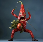
I continued my series of Universal Monsters paintings. "The drugs I took seemed to light up my brain." acrylics on canvas (16" x 20") Franchescanado fucked around with this message at 19:34 on May 28, 2018 |
|
#
?
May 28, 2018 19:22
|
|
|
That is really cool. Is there a rule of thumb for what viewing distance I should be going for when adding detail? I am very slowly learning to draw, in pencil for now, and I always get sucked in until im basically with my face to the paper and adding tiny poo poo on the edge of what the pencil thickness will let me draw and if I hold the finished product at arm's length everything obviously blurs into a grey smudge. I think part of the problem is that I start out too small, like dollar coin size faces, but starting out bigger seems so daunting. I'll just keep drawing and see where it goes but I wanted to check if I'm acquiring bad habits here.
|
|
#
?
Jun 2, 2018 17:52
|
|


|
Argue posted:Self-improvement month is over; time to remain stagnant for the rest of my life like any sane person This is all great work! Here is a peacock sketch. 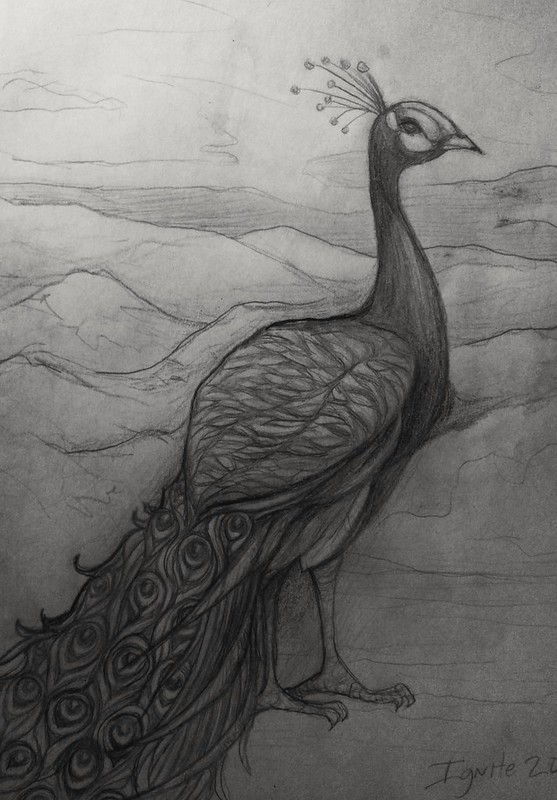
|
|
#
?
Jun 2, 2018 18:57
|
|
|
Franchescanado posted:I continued my series of Universal Monsters paintings. Good Goon Art.
|
|
#
?
Jun 18, 2018 04:19
|
|
|
 Some one watched fury road tonight.
|
|
#
?
Jun 18, 2018 08:49
|
|
|
Did an ink and gouache illustration for a class, we had to create a picture for an article. I chose one about divorce celebrations. I'll probably create a digital version for T-shirts without the background at some point.
|
|
#
?
Jun 19, 2018 22:40
|
|

|
cool
|
|
#
?
Jun 20, 2018 03:34
|
|
|
Looks like I'm gonna keep doing these until I die Handen posted:
Love it!
|
|
#
?
Jun 21, 2018 03:44
|
|
|
hey i made a facebook group a few days ago for folks called Leftist Creators,Artists, Makers, Designers, etc. you should hop on in ans join if you want a cool place to post/discuss art with other like-minded folks
|
|
#
?
Jun 22, 2018 02:24
|
|

|
 I've painted a few versions of this scene, happiest with this one so far but I reckon the church needs something to make it seem less plain, create abit more texture somehow whilst still keeping it in the background.
|
|
#
?
Jun 24, 2018 15:45
|
|
|
I'm teaching myself how to paint like old dead guys for fun. Oil painting is cool and good, here are a couple underpaintings that my next task is to not ruin.  
|
|
#
?
Jun 28, 2018 22:52
|
|
|
mudskipp posted:
When I look at it, it feels like the church blends in too much with the grass and the tombstones. In the thumbnail I see the shapes and colours of the rear tombstones blend together, as though they are part of the church wall. I think it's because most of the brush strokes are very smooth and go mostly in the same direction. IMO, give the tree some more texture and tonal variation to differentiate it from the rest of the scene - it is a strong foreground figure which really towers over everything else. The front most tombstone could also benefit from some more texture as well, I think. In case you haven't tried, looking at it in black and white can let you see where the tones are similar, and where things are looking flat as a result of tone.  When I look at the B&W image, I get the sense that the tree blends in too much with the roof. Maybe try some highlights which are distinct from the greeny-blues which you have used. IMO I would try with something like a yellow or red - just very thin highlights near the edges of the branches and trunk.
|
|
#
?
Jun 29, 2018 11:10
|
|
|
 Finally started drawing again, especially trying to do a full scene rather than just a character in a void. Space hotdogs battling a 1920s cartoon spider monster on some grassy space plains. First inking pass complete. Gotta flesh it out a bit more and throw in some color.
|
|
#
?
Jul 3, 2018 04:01
|
|
|
 Did some color on this fella today. Need to push my values in the body a bit more, but it's coming along nicely.
|
|
#
?
Jul 4, 2018 21:23
|
|
|
Hi folks. Long time reader first time poster (in this thread I think) I did my first plein air painting. I chose watercolor for easy cleanup and space for packing in my bag. It was very different working directly from a real landscape instead of from a reference photo. This was probably about an hour of work. Silver Springs campground near Mt. Rainier. I'm struggling to decide if I should go back and fill in behind the trees. I took reference photos but is that ok? Does it no longer become plein air if I mess around with it later? 
|
|
#
?
Jul 5, 2018 15:10
|
|
|
Working on a design for a new mural. Still very WIP. Trying to figure out how much graff / graphic design aesthetic should be incorporated.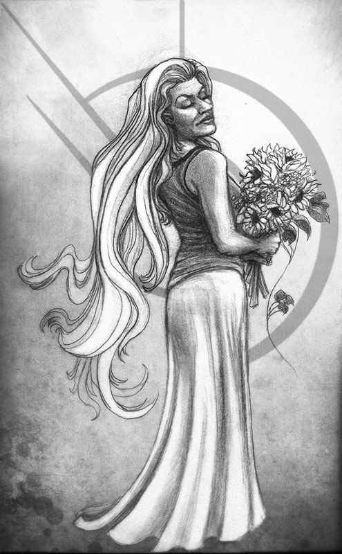 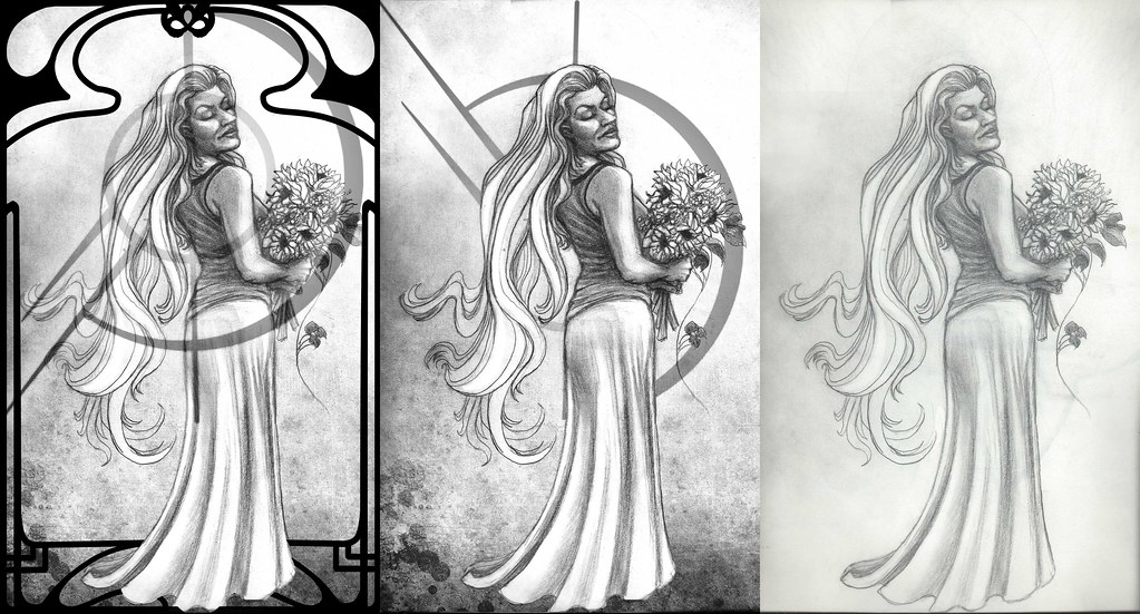
sigma 6 fucked around with this message at 21:00 on Jul 7, 2018 |
|
#
?
Jul 7, 2018 10:13
|
|
|
silicone thrills posted:Hi folks. Long time reader first time poster (in this thread I think) I like the textures in the bark, and the contrast between the darker and brighter trees works well I reckon. If you are primarily interested in working outdoors, I would say leave this one as finished and if you go back, start another. I don't think there's much value in being able to call something 100% plein air for the sake of that alone, but returning to the same spot and building up a series of studies at different times of day or alternate weather conditions seems like a great way to experience the key differences between static reference material and working from life/outdoors. I'm finding the way tree bark changes colour in the rain very interesting at the moment, although I've just been snapping photos of interesting trees after a shower and working from those.
|
|
#
?
Jul 7, 2018 19:16
|
|
|
Worked from a photo reference for this one - Sol Duc Falls in WA. Watercolor with some india ink to push the contrast. about 4 hr of work.  I realized the last photo I posted was horribly blown out and I am definitely not going to use the same scanner app as before. Just a straight up photo for this one. Also - Water is SO drat HARD to portray. I want to go back to portraits when I hit water.
|
|
#
?
Jul 8, 2018 05:22
|
|
|
Knocked out two more from the same photo set today. Yay for actually being art productive for once in the last few years!  White River near Mt. Rainier  Silver Springs Campground also near Mt. Rainier.
|
|
#
?
Jul 9, 2018 04:38
|
|
|

|
| # ? Jun 3, 2024 23:49 |
|
|
Nice work! Watercolors are tough. ^^^ Here is a pinup sketch based on Kato. 
sigma 6 fucked around with this message at 09:26 on Jul 9, 2018 |
|
#
?
Jul 9, 2018 08:05
|
|