|
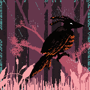
Thanks! I played around with a two thirds and a couple straight-on comps but I think profile worked the best for the long beak and exaggerated body proportions. Here's a bit more progress:  Scaled up the head a bit, deepened the shadows (basically just darkened the whole drawing by around 15% to give me more space to work with for highlights later), and started roughing in the feathers and building up a bit more detail before I make the move to color.
|
 #
?
Aug 11, 2018 00:39
#
?
Aug 11, 2018 00:39
|
|


|

|
| # ? May 28, 2024 15:51 |
|
|

|
|
#
?
Aug 11, 2018 03:38
|
|

|
https://twitter.com/neoMuffinlord/status/1028311388173860864?s=19 My kid wouldn't stop pestering me to show him pictures of robots so I figured I'd draw my favorite robot.
|
|
#
?
Aug 11, 2018 17:12
|
|

|
Gave it the old college try I did: https://imgur.com/a/bXiTuzF https://imgur.com/a/eo3lrXX https://imgur.com/a/PnoVXSe Fun fact, in the past week since I decided to knuckle down, I have filled twice as many pages as I have the entire rest of the year. Doctor_Fruitbat fucked around with this message at 18:35 on Aug 11, 2018 |
|
#
?
Aug 11, 2018 18:33
|
|


|
trying some less alien looking stuff
|
|
#
?
Aug 11, 2018 18:52
|
|
|
One of the things I'm working on right now.
|
|
#
?
Aug 11, 2018 23:21
|
|
|
Al! posted:trying some less alien looking stuff If this is your normal, I wanna know where you live. This is me when I draw animals. 
|
|
#
?
Aug 11, 2018 23:31
|
|

|
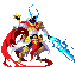
Propitious Jerk posted:Thanks! I played around with a two thirds and a couple straight-on comps but I think profile worked the best for the long beak and exaggerated body proportions. This is a cool Samurai Heron! The head and upper body are well designed and looking pretty cool, but I would advise a little caution on the body interior. Things are becoming a little bit busy and confused near the unsheathed portion of the blade, some of the 'energy fwoosh' splurting out of the sword is even sort of making a tangent with the vertical design on the costume. I would consider simplifying some of the shape design on the cloth and quieting down the value contrast while pushing the value separation between the hands/sword and the body itself, in service of helping to make this spatial difference unmistakable.
|
|
#
?
Aug 12, 2018 00:31
|
|
|
https://twitter.com/rainbowfission/status/1028426954360274944
|
|
#
?
Aug 12, 2018 00:45
|
|

|
Scoss posted:This is a cool Samurai Heron! The head and upper body are well designed and looking pretty cool, but I would advise a little caution on the body interior. Things are becoming a little bit busy and confused near the unsheathed portion of the blade, some of the 'energy fwoosh' splurting out of the sword is even sort of making a tangent with the vertical design on the costume. I would consider simplifying some of the shape design on the cloth and quieting down the value contrast while pushing the value separation between the hands/sword and the body itself, in service of helping to make this spatial difference unmistakable. Advice like this is so helpful cause I feel like every time I draw something the first pass has like 50 tangents and things with similar values overlapping that I need to slowly smoodge around until it looks okay e that was not my drawing but I always appreciate advice like this so I wanted to point it out
|
|
#
?
Aug 12, 2018 00:58
|
|

|

|
|
#
?
Aug 12, 2018 01:22
|
|

|
Sharpest Crayon posted:If this is your normal, I wanna know where you live rn im living in yakuza 0 and getting a lot of inspiration 
|
|
#
?
Aug 12, 2018 04:15
|
|
|
https://twitter.com/rainbowfission/status/1028491679093940224
|
|
#
?
Aug 12, 2018 05:06
|
|
|
Scoss posted:This is a cool Samurai Heron! The head and upper body are well designed and looking pretty cool, but I would advise a little caution on the body interior. Things are becoming a little bit busy and confused near the unsheathed portion of the blade, some of the 'energy fwoosh' splurting out of the sword is even sort of making a tangent with the vertical design on the costume. I would consider simplifying some of the shape design on the cloth and quieting down the value contrast while pushing the value separation between the hands/sword and the body itself, in service of helping to make this spatial difference unmistakable. Yessir, good call. started adding color: 
|
|
#
?
Aug 12, 2018 07:21
|
|
|
What process do you use to add color? Anytime I try painting something in greyscale and adding color afterwards I'm never very happy with how the colors look, but I always get the values so much better so I wished it worked out more.
|
|
#
?
Aug 12, 2018 07:46
|
|
|
 Sketching in the rain, fun times. I've not been doing much daily drawing lately, been crazy-busy. 
|
|
#
?
Aug 12, 2018 16:05
|
|

|

|
|
#
?
Aug 12, 2018 16:52
|
|
|
Wowporn posted:What process do you use to add color? Anytime I try painting something in greyscale and adding color afterwards I'm never very happy with how the colors look, but I always get the values so much better so I wished it worked out more. Curious about this myself. I can never seem to make my palette harmonize with my values and I'd love to know more about this technique.
|
|
#
?
Aug 12, 2018 17:23
|
|


|
The last time I tried it it definitely helped to change it from greyscale to monochromatic brown or something first to make it a little less washed out but it still felt like I wasn�t getting the range of colors that I wanted. Gradient maps maybe if you�re in photoshop?
|
|
#
?
Aug 12, 2018 20:08
|
|
|
I just use a color layer and then maybe an overlay or multiply layer on top to tweak, this is just to get a base, it looks pretty drab, but it's a good place for me to start because my color theory skills are no bueno.
|
|
#
?
Aug 12, 2018 20:24
|
|
|
    
|
|
#
?
Aug 12, 2018 21:15
|
|
|
https://twitter.com/rainbowfission/status/1028857044005253120
|
|
#
?
Aug 13, 2018 05:15
|
|
|
 "In the land of the blind, the one eyed man is king."
|
|
#
?
Aug 13, 2018 08:29
|
|

|
https://twitter.com/rainbowfission/status/1029047174112440320
|
|
#
?
Aug 13, 2018 17:51
|
|
|
Propitious Jerk posted:I just use a color layer and then maybe an overlay or multiply layer on top to tweak, this is just to get a base, it looks pretty drab, but it's a good place for me to start because my color theory skills are no bueno. Is there a video or timelapse of this somewhere? Very curious.
|
|
#
?
Aug 13, 2018 20:31
|
|
|
I'll put together some screenshots. e:  The first adjustment layer I apply is a fill layer of a solid color based on the color swatch I'm most likely to use the most, this will save me a ton of time in the future as it means fewer areas to paint and I can start focusing on small details more quickly. This also gives me a good baseline for picking other colors. In this example I know I'm going for a winter overcast or evening scene, so my yellows and reds will be more muted and shifted towards blue.  I start blocking in colors with the next layer. Color layers tend towards the vibrantly cartoony, since a color layer will be unaffected by the brightness of the swatch you're using.  Color layers are best for filling in primary color changes; in this case the crane's red face and the golden yellow of his sword.  The next layer is a multiply layer, multiply layers darken whatever is underneath them while adding color, they will never lighten the drawing underneath,  For the crane I really only used multiply to adjust the value of his kimono and tone down the teal color to a darker blue that was a little easier on the eyes and provided a higher contrast between the figure and the background.  I didn't do much adjustment via overlay for this illustration, just a little bit of cadmium red around his face to pump up their vibrancy around his eye.  Overlay layers will lighten and apply color to anything underneath but will not effect black lines or shapes.  I applied one last color layer fill of the same blue I used in the first layer to reduce contrast. This tends to make everything feel like part of the same scene. Since the environment the crane figure is standing in is quite dark I used a pretty high opacity (41%) since the yellow gold of the sword would be fairly muted. If I was going for something brighter, in natural daylight I'd probably only apply this layer at around 5-10% just to make everything appear a bit more cohesive.  Here's an image showing how color, overlay and multiply layers behave in comparison to one another on an image with a bit of color added. Both multiply and color layers will apply a tint of whatever swatch your using, in this case the orange mixes with the blue of the layer underneath and creates a greenish hue whereas the color layer overrides the blue underneath completely. and the finished painting.  Propitious Jerk fucked around with this message at 23:51 on Aug 13, 2018 |
|
#
?
Aug 13, 2018 21:03
|
|
|
Propitious Jerk posted:
Hey thanks for this v. good informative stuff about colouring a greyscale image! I gotta see if I can do something like this on artweaver. I'm doing some new keychain designs and UGH there's a wolf.  Last couple of times I did 5 designs that we chose 3 from to actually make but this time I just did a wolf, badger and a snek. The snek wasn't working out so I already ditched the design before even starting any outlines. I gotta try that one again. For the first time in forever I'm actually having trouble making something look cute.
|
|
#
?
Aug 14, 2018 00:17
|
|
|
If the snake has its head down looking up at the viewer like the wolf does it'll probably give off intimidating tough-guy snake vibes because of its posture.
|
|
#
?
Aug 14, 2018 00:38
|
|
|
Re: colorizing grayscale painting Another good thing to keep in mind is that in any real lighting situation, it's not only the values that are changing as you move from relative lightness to darkness, but probably also the hues. I made a rough demonstration:  Imagine these are perfect spheres of flesh. Skin is a great object example of this principle because it is a complex multilayered material, it's very easy to get it wrong, and it tends to take on an undesirable rubbery pallor when you do. In the top example, we have a simple flat flesh tone, and when we make it a colorize layer and mix it with the original grayscale values the end result is quite synthetic and lifeless. In the second example, by introducing reds to the shadowed areas and halftones, and even some subtle greens, the result is somewhat more convincing. You could easily push it further with even more hues in there and it would still look good. In most situations, when you move from areas of light across to areas of dark, the environmental elements influencing the apparent color of those spots are also changing. Some objects (like skin) have a degree of translucency and you get subsurface light scattering that can saturate hues in the halftones and shadows, and as you move away from primary lightsources, things become more affected by secondary lightsources or bounce lighting-- for example, in outdoor situations classically the blue sky itself becomes the dominant lightsource when a form is shadowed from direct sunlight, and the apparent color of any object will be very different when it's under blue light versus white or orange light. I won't expand too much because I don't really consider myself a color theory expert, but hopefully this is useful. One additional note on colorizing paintings is that you shouldn't be afraid to go in and do additional direct opaque color painting on a normal layer atop of everything once you've already put in your color layers. If I ever do this kind of colorizing from grayscale approach I personally consider this a mandatory procedure to tie it all together. Scoss fucked around with this message at 02:58 on Aug 14, 2018 |
|
#
?
Aug 14, 2018 02:52
|
|
|
Yeah that part is why it ends up feeling like I'm just painting it all over again to get the hues right, it always looks so dead of I don't do that part.
|
|
#
?
Aug 14, 2018 04:26
|
|
|
That's a lot of great info! "He who fights with monsters should be careful lest he thereby become a monster. And if thou gaze long into an abyss, the abyss will also gaze into thee." 
sigma 6 fucked around with this message at 07:46 on Aug 14, 2018 |
|
#
?
Aug 14, 2018 07:30
|
|
|
Drawn from reference
|
|
#
?
Aug 14, 2018 11:25
|
|
|
Argue posted:Drawn from reference This looks really nice.
|
|
#
?
Aug 14, 2018 12:28
|
|
|
https://twitter.com/rainbowfission/status/1029460214712557569
|
|
#
?
Aug 14, 2018 21:13
|
|
|
Finally recovered from exam prep, so here's some stuff. https://twitter.com/Shinmera/status/1029462495692505089 https://twitter.com/Shinmera/status/1029506749718585350 And this took me way too long into the night. God I'm tired.
|
|
#
?
Aug 15, 2018 00:16
|
|

|

|
|
#
?
Aug 15, 2018 02:40
|
|
|
Argue posted:Drawn from reference My brain can�t see this and not see sephiroth�s long rear end sword just out of frame to the upper left
|
|
#
?
Aug 15, 2018 03:13
|
|
|
 Why do i keep drawing butts  
|
|
#
?
Aug 15, 2018 03:39
|
|
|
A little inking.
|
|
#
?
Aug 15, 2018 06:59
|
|
|

|
| # ? May 28, 2024 15:51 |
|
|
Radio du Cambodge posted:
Why wouldn't you not keep drawing butts?
|
|
#
?
Aug 15, 2018 13:48
|
|