|
If you don't mind me asking, how many books do you get out a month, Clayton? (thanks again for your work on Man Without Fear)
|
|
|
|

|
| # ? May 25, 2024 22:55 |
|
I love that we can have obscure questions, and someone pops up who�s actually a well known professional in that field. I remember asking if anyone read the DCU Adventure game books, and turns out Inkslinger helped write them.
|
|
|
|
Maybe someone in the audience was dyslexic?
|
|
|
|
X-O posted:I'm on my phone so I can't really search it out right now but there was an article on some site a while back where they interviewed Clayton about his fonts used on Mister Miracle that I found really interesting. You should all seek it out as it was really good. Here it is! Thank you, I'm VERY glad you liked it! Vulpes Vulpes posted:If you don't mind me asking, how many books do you get out a month, Clayton? Thank YOU for being easy to work with. It went pretty well for me, especially for a weekly book. Let's do it again sometime NUDGE NUDGE. And my monthly output varies from month to month, but this month it's 25 (yargh).
|
|
|
|
Minister of Sound posted:Here it is! Thank you, I'm VERY glad you liked it!  holy poo poo holy poo poo
|
|
|
|
Here's a question for a letterer (I'm guessing.) On a lot of books, people seem to have a really tough time incorporating in-scene text naturally with the art, like on phones, computer screens, signage, book covers, etc. I don't have any screenshot examples on hand, but it's still all over the place on big-two comics. I remember a Superman issue from a couple of years ago with text on a newspaper that was all awkwardly in different angles of straight lines instead of curving along with the drawing. Would that be an issue with the kind of software letterers use? A limitation to how they can deliver? Cause I'd think it would be simple enough to plot the perspective of a rectangular object like a monitor or phone and have the text sit naturally, but I dunno.
|
|
|
|
Teenage Fansub posted:Here's a question for a letterer (I'm guessing.) I can't speak for everyone, but for me it's a software issue, yes. For whatever reason, Adobe Illustrator doesn't have a decent perspective or distortion tool, and that's what most of us are stuck with. I've heard there's some other vector-based software that's supposedly better with this, but I haven't checked it out yet. To do it right, you either have to use whatever tools you have and eyeball it (like the Skew or Free Distort tools), or just do it in Photoshop with its awesome "Transform -> Distort" tool and create a separate art file. But that doesn't always fly with some publishers because of their workflows. But if a newspaper is crumpled in any way, all bets are off. There's no getting that one right.
|
|
|
|
Good lettering doesn't get enough credit so I'll chime in with a thank you, MoS.
|
|
|
|
Just finished that paste article that's pretty interesting, worth a read. And links to the fonts!Dawgstar posted:Good lettering doesn't get enough credit so I'll chime in with a thank you, MoS. Yeah good lettering is weird cuz it's not like the other aspects of comics in that (for me at least) it's imperceptible and just clicks when it's good but it's the bad and illegible lettering that you notice. So ty for the hard work mos
|
|
|
|

|
|
|
|
Thanks to the reply MoS. A shame perspective tools aren't more ready at hand. Are there any hand-letterers left beside John Workman? site posted:it's imperceptible and just clicks when it's good but it's the bad and illegible lettering that you notice. So ty for the hard work mos There's one letterer who has a style that distracts me every time. I don't have their name at hand, but I think it was the person doing Steve Orlando's Supergirl run. Everything's pretty normal until you get to S's where the lower curve stops a bit short, and it always stands out. e: here  ee: Ah. Guess I should say font rather than letterer. Teenage Fansub fucked around with this message at 01:58 on Feb 6, 2019 |
|
|
|
Teenage Fansub posted:Thanks to the reply MoS. A shame perspective tools aren't more ready at hand. Aditya Bidikar hand-lettered Grafity's Wall, and I think he hand-letters most (if not all) of his sound effects. That guy is way too good. I think it's still common in the comic strip world, too. EDIT: Teenage Fansub posted:There's one letterer who has a style that distracts me every time. I don't have their name at hand, but I think it was the person doing Steve Orlando's Supergirl run. Ah, they used Sequentialist by Blambot! That font was one of my picks for the main Mister Miracle text, but Mitch Gerads shot it down for the same reason you mentioned. Minister of Sound fucked around with this message at 01:44 on Feb 6, 2019 |
|
|
|
Teenage Fansub posted:Thanks to the reply MoS. A shame perspective tools aren't more ready at hand. Stan Sakai has 2 or 3 Eisners specifically for lettering and you can drat well guarantee that�s done by hand.
|
|
|
|
X-O posted:Stan Sakai has 2 or 3 Eisners specifically for lettering and you can drat well guarantee that�s done by hand. Oh yeah. I should have remembered him. He beat me last year and that's probably why!
|
|
|
|
Minister of Sound posted:Oh yeah. I should have remembered him. He beat me last year and that's probably why! Honestly Stan is so good at everything that it�s surprising anyone else ever wins any of the awards.
|
|
|
|
Minister of Sound posted:I can't speak for everyone, but for me it's a software issue, yes. For whatever reason, Adobe Illustrator doesn't have a decent perspective or distortion tool, and that's what most of us are stuck with. I've heard there's some other vector-based software that's supposedly better with this, but I haven't checked it out yet. To do it right, you either have to use whatever tools you have and eyeball it (like the Skew or Free Distort tools), or just do it in Photoshop with its awesome "Transform -> Distort" tool and create a separate art file. But that doesn't always fly with some publishers because of their workflows. If it's a known issue, why isn't it drawn by the penciller or inker?
|
|
|
|
Teenage Fansub posted:Thanks to the reply MoS. A shame perspective tools aren't more ready at hand. The last time i ran into was actually in daughters of the dragon #1 (sorry vulpes), like it's better if you really blow it up until it's basically large print but reading the drug effect dialogue on my screen gave me a headache trying to parse it. But it may just be me cuz i don't think anyone brought it up at the time of release  
|
|
|
|
X-O posted:Honestly Stan is so good at everything that it�s surprising anyone else ever wins any of the awards. Pretty much. If it isn't him, it's Todd Klein. And vice versa. Lobok posted:If it's a known issue, why isn't it drawn by the penciller or inker? Good question. Because it's not really that known an issue. Typography is loving hard, and most artists assume it's letterer/bullpen work anyway (and they're not wrong). In the end, only letterers and the really eagle-eyed readers like you all seem to notice, anyway. I think everyone else, when they do notice, is resigned to it just being "the way things are". But some artists will do it, and they'll do a great job too. I love those people.
|
|
|
|
site posted:The last time i ran into was actually in daughters of the dragon #1 (sorry vulpes), like it's better if you really blow it up until it's basically large print but reading the drug effect dialogue on my screen gave me a headache trying to parse it. But it may just be me cuz i don't think anyone brought it up at the time of release When it's that stylised you can really notice the repeating letters, which makes it look like a cheap kooky halloween card font. Lucky there wasn't another capital O. Teenage Fansub fucked around with this message at 02:05 on Feb 6, 2019 |
|
|
|
site posted:Yeah good lettering is weird cuz it's not like the other aspects of comics in that (for me at least) it's imperceptible and just clicks when it's good but it's the bad and illegible lettering that you notice. So ty for the hard work mos Seconding this; when lettering is good you just kind of absorb it. It's only when it's bad that you notice it. Or when it's outstanding, but there's only one Tom Orzechowski Anyways that article was great, thanks for sharing it MoS!
|
|
|
|
I just want to be clear that I'd still much rather have creators swing for the fences on stylizing lettering and having a hard time parsing a bubble here or there than doing the more basic fonts all the time to make it legible for 100% of readers, because I think stylized lettering can look very cool. It's just that was a time when it was a little too stylized for me personally
|
|
|
|
The only time lettering distracts me is when they use some weird old timey ursine handwritten looking poo poo for certain characters I usually end up just skipping all of it instead of expanding the energy to figure out what the gently caress it says.
|
|
|
|
|
Nonvalueadded User posted:I know I'm super late on this but I finally got unlimited. I checked out Immortal Hulk based on reccos here and drat is that an awesome comic. Best horror I've read since Moore's Swamp Thing, and I never knew I even wanted a horror comic to read. Yeah I'm not sure if I said it here or in another thread but I got Unlimited after seeing Spiderverse and Immortal Hulk is the biggest reason the sub is ongoing. Admittedly I devoured horror manga growing up so this is like, no surprise, taste wise.
|
|
|
|
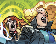
cool 2pg spread in todays x23
|
|
|
|
That is cool and you should post it in the good art thread.
|
|
|
|
site posted:cool 2pg spread in todays x23 Olortegui is killing it so I hope he doesn't disappear after an arc! Some of his Gabby expressions are priceless, and he also makes Laura look imposing in her own way, without resorting to any "Logan-style" imagery. Really enjoying this arc too, even more so than the excellent first X-23 arc.
|
|
|
|
lol i havent actually read the og story but i suspect the pitch in champions is fairly similar to one a different spidey once got?
|
|
|
|
so uhh cw: suicide for uncanny xmen if you need it
|
|
|
|
The writer was all the content warning I needed.
|
|
|
|
Hey come on now, Rosenberg's punisher has been pretty good once it ditched the war machine armor arc
|
|
|
|
site posted:so uhh cw: suicide for uncanny xmen if you need it Yeah, this issue was starting to feel like the aftermath of a particularly kill-happy What If.
|
|
|
|
site posted:so uhh cw: suicide for uncanny xmen if you need it Uncanny #11: I'm fuming at Loa being killed, and the only way to tell is because Ruth spells it out since the art is so vague. I hate that liking the New X-Men just means waiting for them die (naked in a bathtub posed just so because why not - props to the colourist for doing a lot of work to cover with the lighting)/be drawn off-model (Anole) and/or written ooc (X-23, recently Armor), or to get nicknames that make no sense (Rockslide). I hope for a fakeout or Nate Grey/Legion/Elixir magic fix, but it's just so depressing, especially after THE CLOUDS. Some parts were ok, but I just can't get invested since we know where the X-Men are, so it's just all falling flat as THE STAKES are rammed into me more times than if I was a vampire and Blade had blunted his last ones on all my undead comrades previously.
|
|
|
|
Metalshark posted:Some parts were ok, but I just can't get invested since we know where the X-Men are, so it's just all falling flat as THE STAKES are rammed into me more times than if I was a vampire and Blade had blunted his last ones on all my undead comrades previously. But didn't you see how it opened THIS IS THE LAST X-MEN STORY It's the end of X-Men forever and ever, it must be big!
|
|
|
|
I kind of hope that X-23 will just become Laura and Gabby adopting a whole bunch more clone sisters of various stripes until it's turned into a team book and rebranded Wolverines.
|
|
|
|
Like i knew whatever reason they came up for why Sera up and disappears on Angela would never be satisfactory, but "some rando aliens needed help so i just ghosted on you" is just not putting any effort into it
|
|
|
|
site posted:Like i knew whatever reason they came up for why Sera up and disappears on Angela would never be satisfactory, but "some rando aliens needed help so i just ghosted on you" is just not putting any effort into it I mean, the bar for this is awfully low, but at least it was due to going on a heroic adventure.
|
|
|
|
Another writer made her disappear, having her come back is good enough. I don't need one writer to jump through hoops for something that can just be easily handwaved so we can get the relationship back to where it should be.
|
|
|
|
Wanderer posted:I mean, the bar for this is awfully low, but at least it was due to going on a heroic adventure. I guess, its just after like 20 issues of angela about how they're inseparable cullen couldve at least had her have been like kidnapped or something instead of having sera just up and leave of her own volition But, i knew it was gonna be poo poo well ahead of time so he didnt disappoint i suppose
|
|
|
|
Yeah I'm not into Sera being kidnapped as a reason. I honestly did think that was what they were going to go with and I'm glad they didn't. I mean being rescued by Angela yet again would not be ideal. I'm glad Sera actually had some say in what happened to her this time.
|
|
|
|

|
| # ? May 25, 2024 22:55 |
|
Minister of Sound posted:Yes I am. Thank YOU for your patronage! I was gonna post something about Champions 2 and turns the letterer for the issue is a goon! This is amazing; your work is greatly appreciated. We are pretty lucky in this thread! Regarding Champions, I thought it was a pretty good issue, specially that last page. It took me a second to realize what was going on and then it hit me.
|
|
|


