


|
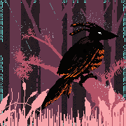
coal grove, west virginia
|
 #
?
Jun 8, 2019 22:43
#
?
Jun 8, 2019 22:43
|
|


|

|
| # ? May 25, 2024 23:06 |
|
|
Thought I'd take my own advice and get some weird-shaped painting going (also wanted to try This One Weird Trick with the masking fluid, which was putting it in a squeezy bottle with a very tiny 1mm nozzle) Sorry about the terrible colour balance in the pics, I just ..   
|
|
#
?
Jun 8, 2019 23:49
|
|

|
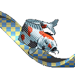
a kraken
|
|
#
?
Jun 9, 2019 00:59
|
|
|

|
|
#
?
Jun 9, 2019 03:59
|
|

|
Sharpest Crayon posted:Thought I'd take my own advice and get some weird-shaped painting going (also wanted to try This One Weird Trick with the masking fluid, which was putting it in a squeezy bottle with a very tiny 1mm nozzle) I love these so much. Also this came in the mail!  Thank you!
|
|
#
?
Jun 9, 2019 08:18
|
|

|
Painting a dog I saw on the internet. Got tired of the bushes though.
|
|
#
?
Jun 9, 2019 15:46
|
|

|
Sharpest Crayon posted:Thought I'd take my own advice and get some weird-shaped painting going (also wanted to try This One Weird Trick with the masking fluid, which was putting it in a squeezy bottle with a very tiny 1mm nozzle) These are so great! Love the kittah, especially. Keetron posted:Also this came in the mail! Yay, I'm glad it came quickly! And funnily enough, I just got yours in the mail yesterday. Thank you so much for the Pokemon and the wonderful letter! I choose you, Bulbasaur  And one of my own... 160. 
digital penitence fucked around with this message at 16:43 on Jun 9, 2019 |
|
#
?
Jun 9, 2019 16:39
|
|
|
Not quite a daily drawing. Rather an engraving of a daily drawing. Getting crafty with a local laser cutter. Engraved glass on the left and engraved paper on the right. Pokemon / wave image is not mine. My friend wanted me to try engraving glass and that was the image he wanted.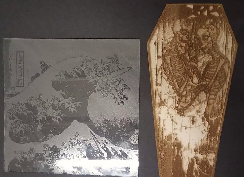
|
|
#
?
Jun 9, 2019 17:03
|
|

|
My daughter's D&D character. Whipped it up for her this morning.
|
|
#
?
Jun 9, 2019 18:41
|
|
|

|
|
#
?
Jun 10, 2019 00:28
|
|
|
Wasn't feeling super creative this morning, so I spent 30 or 45 minutes slowly refining and cleaning up yesterday's drawing. But I'm going to count it! 161. 
|
|
#
?
Jun 10, 2019 12:15
|
|
|
Thank you for this, it is now my desktop background at work.
|
|
#
?
Jun 10, 2019 16:11
|
|

|
Trying to make a bookmark but I am getting very frustrated with my results so far. Some C n C is very welcome. This is just not turning out as I well as I had hoped. Old drawing: 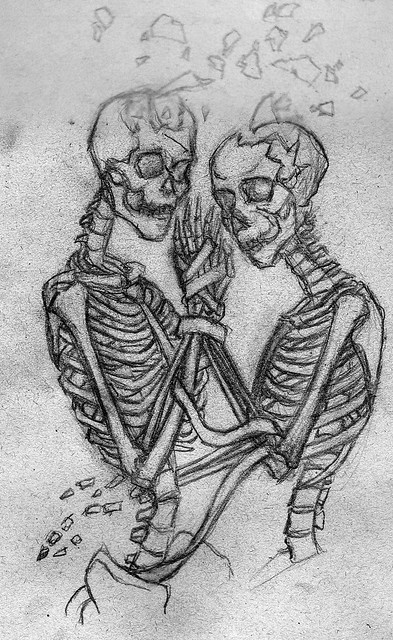 Old iteration: 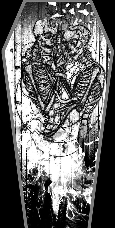 New drawing: 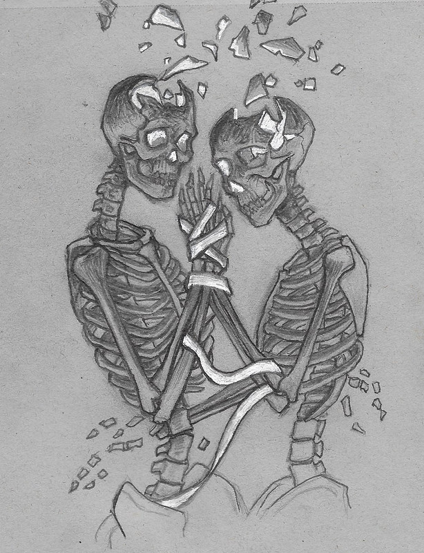 New iteration: 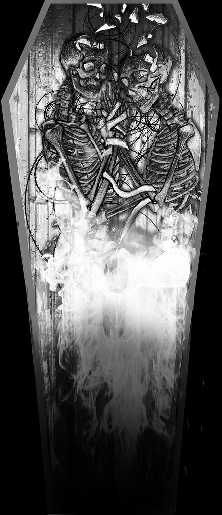 I was wanting the fire to light up the skeleton from below (and within) and the figures get darker / more scorched towards the top of the figures. However I am happier with the old iteration for some reason. The scale of the bookmark doesn't seem long enough. The fire is funky (should I just draw this instead of composting a photo?) and the figures are kind of lost now and don't pop as well against the background wood / coffin. Ugh. Please help. sigma 6 fucked around with this message at 09:18 on Jun 11, 2019 |
|
#
?
Jun 11, 2019 09:15
|
|
|
sigma 6 posted:
I don't have my tablet with me so I can't draw over your image right now, unfortunately. But my feeling is that there is too much mid-tones on the skeletons, and if you want them to pop more, you'll have to lighten them up overall. That, combined with even darker areas in the shadowed areas will make them pop. More contrast, basically. I think you should also consider making their eyesockets, nose cavities and sides of their jaws black, instead of lit up. Even if it seems like some light from the fire would reflect from inside the skull. It might help them register better. The last suggestion is that if you have a model skeleton, it could be helpful to place a light beneath it to see where the light falls and shadows lay, instead of trying to guess. If you don't have one, well, it's probably not worth going out to buy one. My two cents. But I think it's looking nice! Oh, and about the fire, the composite doesn't bother me. But you could play around with a drawn one as well. It might even be cool to try out a more stylized and graphic fire instead of a realistic one. Worked on this some more from last week. 162. 
|
|
#
?
Jun 11, 2019 12:36
|
|
|
sigma 6 posted:
Well, first of all, you haven't given your female skeleton bone tiddies so we'd know she's female and the guy is obviously missing a penis bone, furthermore...  No, but seriously. Your second drawing is loads better than the first iteration, but you can see the problem if you cross your eyes a bit to give yourself a soft focus and compare the first iteration with the second. In the first, the basic shape of the skeletons is still visible even when blurred because of their uniform colour and strong outlines, in the second, the skeletons merge with the background because of the amount of same-tone shapes competing with them for attention. That only-half-eyesocket-light might look cool against the plain grey background, but it does make the skull more difficult to read when you combine it with everything else. To fix this, give your skeletons stronger definition by either making the skeletons even blacker and the background and occult linework lighter, or the other way around. Also an option is to give a darker outline to the main shapes of your skeletons, or using a highlight line to do the same. Heck, go nuts and do both - highlight lines from one direction, darklines from the other. I would go for a drawn fire, too, but that's because I personally don't like the flame-effect aesthetic. I think the length is fine on the second one, but if you want a longer bookmark, you can always add a tassel.
|
|
#
?
Jun 11, 2019 23:40
|
|
|
163.
|
|
#
?
Jun 12, 2019 11:58
|
|
|
sigma 6 posted:
Beyond what others have said, the background's too complex, imo - all the swirls are making it hard to pick out the important bits. You could cut them out, or do them in a lighter tone to help the figures pop. I'm really not a fan of the composited fire, I'd go for drawn - I don't like the look of photoreal mixed with drawing. Also, for balance, I'd shift the figures a touch to the left. Oh, and push the black, darken your shade areas. It's really cool, though, I love the concept!
|
|
#
?
Jun 12, 2019 13:33
|
|
|
Sunsets is where it is right now.  Here are some more, these I made to fast and I need to practice trees.  
Keetron fucked around with this message at 20:00 on Jun 12, 2019 |
|
#
?
Jun 12, 2019 16:54
|
|
|
lofi posted:Beyond what others have said, the background's too complex, imo - all the swirls are making it hard to pick out the important bits. You could cut them out, or do them in a lighter tone to help the figures pop. I'm really not a fan of the composited fire, I'd go for drawn - I don't like the look of photoreal mixed with drawing. Also, for balance, I'd shift the figures a touch to the left. Thanks. I am going to try and do another iteration tonight where I hand draw the wood for the coffin and try and draw the fire. I feel like the mix of drawing and photos may not be working. If I had time to paint the entire thing using photoshop or maybe acrylic maybe that would be different but I am kind of on a big time crunch here and I just want the elements to look good. Right now it just seems like it is too muddy because the elements aren't reading very well. I will center the figures as well. The designs behind the figures are meant to be arcane circles / sacred geometry. It might just be too much and serving to add too much noise. The wood grain and circles are competing against the figures. Something about the contrast / values just isn't working at all. A little off topic but Krita can animate like TV paint?!? Wow. https://www.youtube.com/watch?v=NOTY_421Qcg Krita is a free painting program and works MUCH better than photoshop on my surface book. I could never get pressure sensitivity to work on my surface book with photoshop unfortunately. sigma 6 fucked around with this message at 22:35 on Jun 12, 2019 |
|
#
?
Jun 12, 2019 22:33
|
|
|
Hey, look what showed up today. Thanks, Shinmera! Edit: Here's a super quick and dirty paint-over of the coffin, just to give you an idea of what I would do. I darkened the wood background and lightened the skeletons to increase the contrast and make them pop. I didn't play around with the fire, but I would try to draw it and see if that works any better. Just my two cents. You may hate the direction that I took this in, and that's cool too. 
digital penitence fucked around with this message at 01:54 on Jun 13, 2019 |
|
#
?
Jun 13, 2019 00:54
|
|
|
hi yall, the art dome just entered round 2 https://forums.somethingawful.com/showthread.php?threadid=3890426&pagenumber=1&perpage=40 if you were scared away or not interested in doing a gangtag, round 2 is a much broader and more open topic: vanitas. so get your skulls ready to draw some skulls and sign up!!!
|
|
#
?
Jun 13, 2019 01:55
|
|
|
Added some more Jetsons 164.  
|
|
#
?
Jun 13, 2019 12:44
|
|
|
Today's stream drawings: Shinmera fucked around with this message at 17:49 on Jun 13, 2019 |
|
#
?
Jun 13, 2019 14:43
|
|

|
Tried to login to chat but kept getting some kind of socket error. Cool you are using Krita and playing Pink Floyd though. I approve!
|
|
#
?
Jun 13, 2019 17:13
|
|
|
Neon Noodle posted:Thank you for this, it is now my desktop background at work. Wow, thank you!! Also hi, I've been drawing a lot.  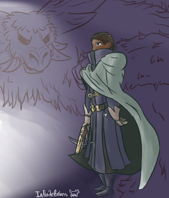 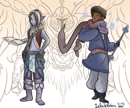 
|
|
#
?
Jun 13, 2019 22:19
|
|
|
since im not allowed to participate in a contest im judging (i think???????) i painted a vanitas
|
|
#
?
Jun 14, 2019 06:00
|
|
|
Al! posted:since im not allowed to participate in a contest im judging (i think???????) i painted a vanitas Very nice, I like how the composition of the objects guide your eye to the focal point. And, I like the shadows and the detail of the fruit bowl, it's impressionistic and colorful, but doesn't distract from the main subject.
|
|
#
?
Jun 14, 2019 10:03
|
|

|
165. 
|
|
#
?
Jun 14, 2019 11:49
|
|
|
I like her outfit, especially the haircut and neck ornaments! Today I realised I had never drawn Fujiko Mine before, so I rectified that with a quick late-night sketch.
|
|
#
?
Jun 14, 2019 23:02
|
|
|
Good Ol Filbert posted:Very nice, I like how the composition of the objects guide your eye to the focal point. And, I like the shadows and the detail of the fruit bowl, it's impressionistic and colorful, but doesn't distract from the main subject. thank you!
|
|
#
?
Jun 14, 2019 23:10
|
|
|
a space......marine???
|
|
#
?
Jun 15, 2019 04:18
|
|
|
It finally happened! I managed to complete Keetron's art trade prompt. Many, many apologies for being so drat late with this. I hope the letter copy finds you soon and in good condition!
|
|
#
?
Jun 15, 2019 14:06
|
|
|
And some random gunk that a friend of mine prompted me to do: John Shootlady, space marine
|
|
#
?
Jun 15, 2019 17:47
|
|
|
Shinmera posted:It finally happened! I managed to complete Keetron's art trade prompt. I think this is amazing and the care you put into it is visible. Looking forward to your letter!
|
|
#
?
Jun 15, 2019 19:15
|
|
|
 Playing around with my tablet and one of my go-to sketch ideas. Also been drawing for 52 days straight, though most of those days are 20 minutes in my car at work.
|
|
#
?
Jun 16, 2019 04:07
|
|
|
Keetron posted:I think this is amazing and the care you put into it is visible. Looking forward to your letter! I'm really glad you like it! I finally managed to get back to working on the new calendar for next year, so here's February: Probably gonna stream some of the work on the future pages for that, too.
|
|
#
?
Jun 16, 2019 13:34
|
|
|
Shinmera posted:I like her outfit, especially the haircut and neck ornaments! Thanks! That one came together quickly, and I'm pretty happy with the result. I also like the colors in your February calendar picture quite a bit. It goes quite will with your landscape and style you have. It's been a busy weekend, so I only have the rough beginnings of a portrait. I'm hoping to spend some more time on it later this evening and maybe even finish it. 166.  chipping away  Edit 3 - pretty much done. For today at least. I might add more to it tomorrow. I'm going to count this drawing as two to catch me up. 167. 
digital penitence fucked around with this message at 02:15 on Jun 17, 2019 |
|
#
?
Jun 16, 2019 13:55
|
|
|
The 2020 calendar that I'm working on includes a bunch of underwater and beach scenes, so I need to design an outfit for that. Can't quite decide what to settle on, or how to remix different parts. Opinions?
|
|
#
?
Jun 16, 2019 20:57
|
|
|
Haven't posted anything in here for ages, so I guess it's about time. Wanted to draw something cyberpunkesque, so I drew... a woman with a funny looking box on her head   e: nitpick-changed something e(2): ugghh I need to go to sleep and stop fiddling with this. last nitpick a hole-y ghost fucked around with this message at 07:28 on Jun 17, 2019 |
|
#
?
Jun 17, 2019 06:32
|
|

|

|
| # ? May 25, 2024 23:06 |
|
|

|
|
#
?
Jun 17, 2019 06:59
|
|