


|
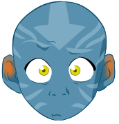
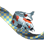
Sharpest Crayon posted:Dark/fighting? You got the pokemon style down so well. But you can't tease us with just the one, c'mon, I wanna see the previous evolutions. I mean, I�m thinking it�s just the evolution of Murkrow/Honchkrow, no?
|
 #
?
Jun 26, 2019 00:25
#
?
Jun 26, 2019 00:25
|
|


|

|
| # ? May 24, 2024 12:55 |
|
|
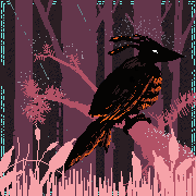
Hey people. I've not been coming on SA much, but I've been continuing to practice and try and develop. Here's my latest piece, messing around with a more stylised aesthetic. 
|
|
#
?
Jun 26, 2019 00:42
|
|
|
Phylodox posted:My wife invented a Pok�mon and I drew it! I love this
|
|
#
?
Jun 26, 2019 07:59
|
|


|
d3c0y2 posted:Hey people. I've not been coming on SA much, but I've been continuing to practice and try and develop. You should come on more, that's really nice. Love the choices you've made with colours and layout.
|
|
#
?
Jun 26, 2019 08:55
|
|

|
177.
|
|
#
?
Jun 26, 2019 12:32
|
|
|
d3c0y2 posted:Hey people. I've not been coming on SA much, but I've been continuing to practice and try and develop. Great job!
|
|
#
?
Jun 26, 2019 14:08
|
|

|
Sharpest Crayon posted:Dark/fighting? You got the pokemon style down so well. But you can't tease us with just the one, c'mon, I wanna see the previous evolutions. I like to think it's the same bird but it's arms just get bigger with each evolution.
|
|
#
?
Jun 26, 2019 14:54
|
|


|
Hi! I went on vacation and kept drawing a bunch on my phone with dotpict but just didnt bother to post all of it so sorry if this is a bit spammy.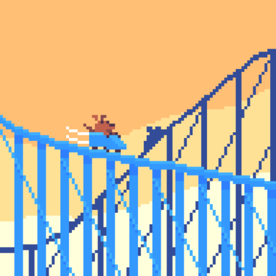    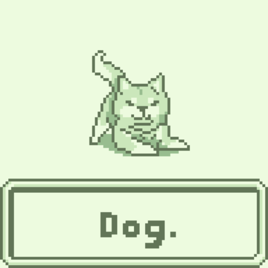 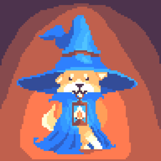   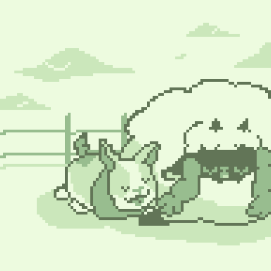
|
|
#
?
Jun 26, 2019 21:52
|
|

|
woah, tell me more about dotpict that's something i've been wanting forever
|
|
#
?
Jun 26, 2019 22:22
|
|

|
Al! posted:woah, tell me more about dotpict that's something i've been wanting forever Cheap, easy to use phone app that offers a bunch of really good simple palettes. No copy and paste or layers though. https://play.google.com/store/apps/details?id=net.dotpicko.dotpict&hl=en_US
|
|
#
?
Jun 26, 2019 22:45
|
|
|
https://twitter.com/muffinlordArt/status/1143999669145616386?s=19 I'm working on my inking. I've always really admired Western comic book style line and shading work so I'm trying to figure all that out.
|
|
#
?
Jun 26, 2019 23:10
|
|

|

|
|
#
?
Jun 26, 2019 23:28
|
|

|
this made me think of this right away https://www.youtube.com/watch?v=6bAPlojfgO0
|
|
#
?
Jun 26, 2019 23:48
|
|
|
my buddy Superfly posted:Hi! I went on vacation and kept drawing a bunch on my phone with dotpict but just didnt bother to post all of it so sorry if this is a bit spammy. This is adorable. Post as much of it as you want.
|
|
#
?
Jun 27, 2019 04:02
|
|
|
Picked up pen again    
Imaginary Friend fucked around with this message at 11:10 on Jun 27, 2019 |
|
#
?
Jun 27, 2019 10:47
|
|
|
178.
|
|
#
?
Jun 27, 2019 12:20
|
|
|
sammyv posted:You should come on more, that's really nice. Love the choices you've made with colours and layout. Thanks! I should make more effort to come on. Im always really glad when I do because so much nice art gets posted on here. smallmouth posted:Great job! Thank you!
|
|
#
?
Jun 27, 2019 15:51
|
|
|
Oh poo poo it's summer y'all time to draw people! and a bike, I guess. 
|
|
#
?
Jun 27, 2019 21:02
|
|
|
Still working on my game and doing art for it occasionally. Been holding off on posting because I want to get something more extensive to look at together first. Here's a quick progress screenshot from tonight though, with newly added lighting: 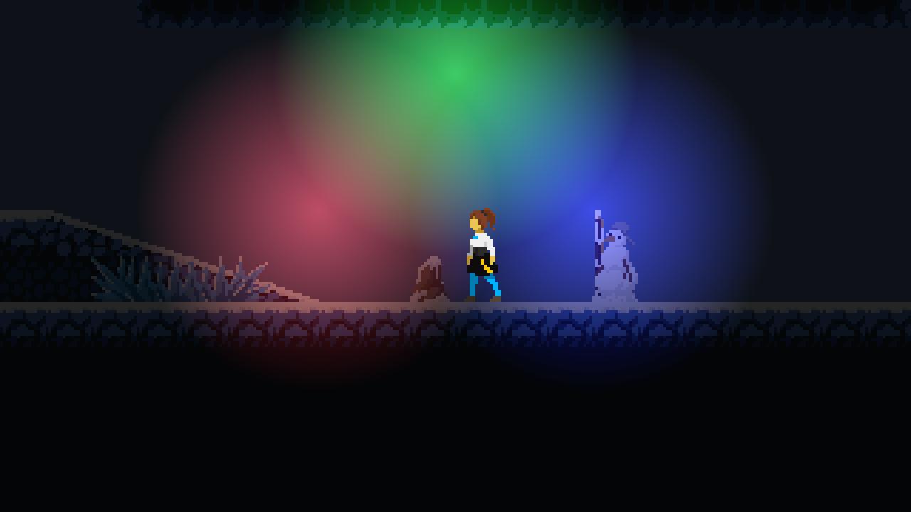
|
|
#
?
Jun 27, 2019 21:11
|
|

|
Trying some Oculus Medium sculpting. Pokefusions seemed like they would be good practice. Started with something easy.
|
|
#
?
Jun 27, 2019 22:46
|
|

|
 It started out a squirrel.
|
|
#
?
Jun 27, 2019 23:27
|
|
|
Oculus Medium sculpting practice #2. A little harder this time. Some more complex shapes involved.
|
|
#
?
Jun 28, 2019 22:43
|
|
|
 Trying my hand at ink washes. Would have worked better if I'd pencilled to start.
|
|
#
?
Jun 29, 2019 20:26
|
|
|
heavy liquid posted:178. Love this. lofi posted:
...and this. REALLY nice portraits / value studies. I have been itching to get back into painting but I am waiting on mural negotiations to be settled on. Making a mural feels like marathon painting sometimes and definitely tricky to get approval from all parties involved.
|
|
#
?
Jun 29, 2019 22:02
|
|

|
WIP!* *lol that's just another word for "never gonna bother again" Sedgr posted:Oculus Medium sculpting practice #2. A little harder this time. Some more complex shapes involved. I know these are pokemon fusions and I appreciate the cute fartball too, but there's a real strong SPORE vibe here. It's a good thing.
|
|
#
?
Jun 29, 2019 23:48
|
|
|
The creature creator for Spore was so much fun, I remember being v stoned and playing for hours with it with a bunch of friends.
|
|
#
?
Jun 30, 2019 00:07
|
|
|
This should probably be for the digital art thread but it's an art dome so I am hoping for critique before final submission. vs.  Kinda thinking handwriting in marker or something instead of the formal font. Really unsure about the cornea going all the way around the eye and giving it a beachball effect. Also the moon "fade" kind of competes with the eye texture although the original concept was a moon kind of turning into an eye....dunno if any of it works anymore. "That's no moon..." sigma 6 fucked around with this message at 18:26 on Jun 30, 2019 |
|
#
?
Jun 30, 2019 06:39
|
|
|
lofi posted:
So amazing. What is the size? Over the last two weeks I have been cross stitching and that is a ton more work than anticipated so my drawing is on a back burner. This weekend I participated in an even called Hood2Coast where we run 240km with a team of 8 runners, each about 10k at a time over 24h. I was planning to draw at every stop I could but yeah, it was dark all of a sudden and after a night of no sleep, running, tending to people's injuries, trying to sleep in a carseat, more running, and then scorching heat combined with extreme fatigue and hunger while trying to figure out how to get home... I drew only two things:  
|
|
#
?
Jun 30, 2019 20:48
|
|
|
sigma 6 posted:This should probably be for the digital art thread but it's an art dome so I am hoping for critique before final submission. Do you have any thoughts in your mind about what sort of music the band Adequate Revelation plays? Because knowing that would probably influence my feedback. At the moment, the things that catch my attention are:
|
|
#
?
Jun 30, 2019 22:39
|
|
|
I drew a bunch of stuff for SGDQ, rather than post a bunch of stuff, here's all of them together!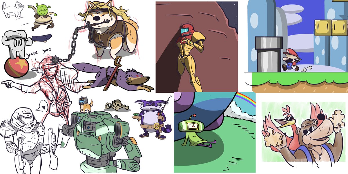 
|
|
#
?
Jun 30, 2019 23:25
|
|
|
gmc9987 posted:Do you have any thoughts in your mind about what sort of music the band Adequate Revelation plays? Because knowing that would probably influence my feedback. At the moment, the things that catch my attention are: Hmmmm - that last part is kind of interesting. I sort of thought of "Adequate Revelation" in terms of the image and name of the album. Hadn't really considered a different band name or that the name even referred to the band vs. the album. Here is another (last?) iteration. Not sure if the writing really feels like handwriting in sharpie or if the faded / damaged polaroid effect is working.  I do think the lack of cornea reflection works better and hopefully it is obvious the eye is pointing down towards the city in the valley.
|
|
#
?
Jul 1, 2019 04:05
|
|
|
Keetron posted:So amazing. What is the size? Thanks, it was about A3, a quarter sheet of watercolour paper. I'm really happy with the layered effect, less so with the proportions - the lips especially took too long to pin down, so they're pretty muddy. I'm avoiding the artdome crit cos I'm judging this one, seems unfair to give advice to a contestant. 
|
|
#
?
Jul 1, 2019 08:07
|
|
|
Hello everyone! I hope some of you can help me out with a colour problem. I've been working on a new tileset for my game, something that should be a sort of icey tundra environment. However, I just can't seem to get things to look good. It always either ends up looking either too glaring, or too boring to me when I play around with colour replacements. I would appreciate it a ton if some of you could offer some advice or ideas on how to make it look less garbage. Here's what I have so far: Ideally I'd like to avoid the boring brown kind of look that easily crops up with landscape tiles, but I don't know how to make it more interesting without it turning out distracting or glaring. Thanks in advance to anyone who takes a look at it! Colours are one of my weak points, so any feedback is appreciated.
|
|
#
?
Jul 1, 2019 21:07
|
|
|
"Garbage" is not how I'd describe it at all, the tiles looks pretty nice so far! As for colors, with this current version I think you may be thinking too literally in terms of colors - dirt = brown, snow = white, etc. The first game that sprang to my min as an example was Celeste. That game takes place almost entirely in a snowy alpine region, but most of the screenshots you can find on Google show a very "unnatural" palette of yellows, purples, and pinks. There are some blue areas to make a particular icy hazard stand out, but overall the palette is very limited and restricted. Have you tried picking out a palette of 5 or 6 colors that you like together, and limiting yourself to only those colors plus a couple shadow/highlight colors?
|
|
#
?
Jul 1, 2019 21:46
|
|
|
Did something different for once, drew a dog.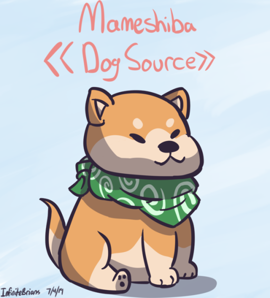
|
|
#
?
Jul 1, 2019 21:52
|
|
|
Shinmera posted:Hello everyone! I hope some of you can help me out with a colour problem. Use photo reference!! I imagine an icy tundra would not be near neon yellow. One is idea is to find a photo of an icy tundra that you like. Blur the crap out of it and then color pick 4 or 5 average colors from that as a color palette. Cool colors and less saturated color scheme would be my advice. The bright yellow and black scheme is like yellowjacket bees for the brain. Not pleasant and definitely not an icy tundra. lofi: Completely understandable.
|
|
#
?
Jul 1, 2019 21:57
|
|
|
Shinmera posted:icey tundra environment
|
|
#
?
Jul 1, 2019 23:20
|
|
|
Where theres ice, theres snow. Go for a more desaturated blue grey color scheme and then make it pop with white snow for highlights. I mocked this up quick. 
|
|
#
?
Jul 2, 2019 00:21
|
|
|
Shinmera posted:Hello everyone! I hope some of you can help me out with a colour problem. As a general tip, putting more intense, saturated colors in the background than are in the foreground makes the background try to jump in front of the foreground. It's not always bad (e.g. silhouettes) but should be done only sparingly for effect. As Sedgr said, snowy environments have desaturated blues and greys for color, if any at all. In nature, snowy environments have almost no color. Of course, you have a blue sky, but in nature, skies are only saturated towards the top. Here's a picture I took that shows this:  You can see it starts out grey and goes blue only towards the top. Of course, a gradient doesn't necessarily fit this art style. This is why, when going with a flatter style, you'd probably use a desaturated sky, like in Sedgr's example. "Warmer" colors (your reds, yellows, oranges) tend to jump out more than "cooler" colors (blues, purples, bluer greens). Check out this Sonic screenshot:  As you can see, the background is pretty darn saturated. Still, the foreground is more saturated, warmer, with strong contrast and patterns. This makes it easily stand out. Of course, again, it depends on the environment you're trying to create, and we mentioned earlier snow environments should be less saturated. Here's a more relevant example, from Super Mario Bros. 3:  You can see that the same principles are at work here, but the colors are much less intense. I hope that helps. Keep up the good work�I've been enjoying watching your art skills progress! Oh, and remember: the best way to learn art is to steal techniques from a better artist  so look at similar scenes from your favorite games so look at similar scenes from your favorite games
|
|
#
?
Jul 2, 2019 13:29
|
|

|

|
| # ? May 24, 2024 12:55 |
|
|
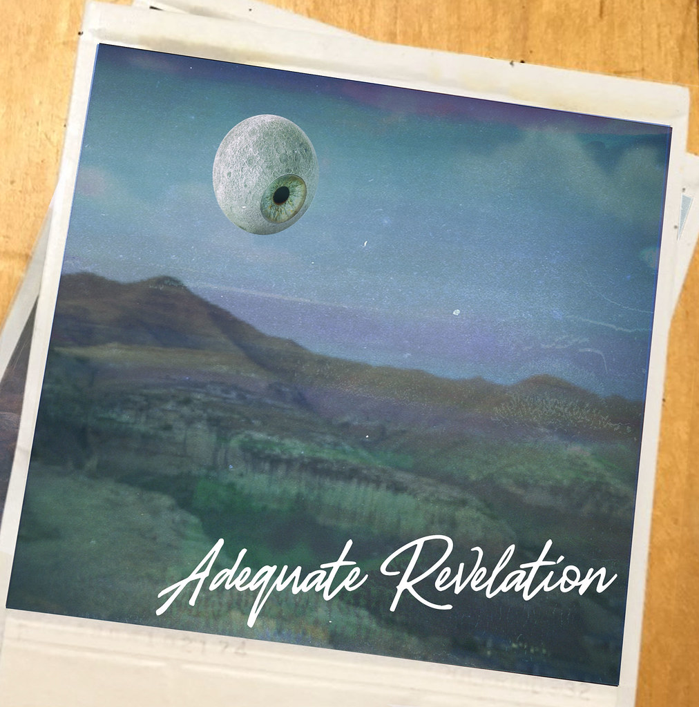 I think I like the last version's font a bit more. I also *think* the moon aspect looks better but now I am wondering if I should add any stars? A few at the very top? The city / town in the bottom right is impossible to see now. Also the damaged polaroid effect might be too heavy handed, I dunno. Really trying to make the moon / eye element look like it belongs in the background but it still pops a bit more than I would like ...even after adding some extra clouds.
|
|
#
?
Jul 2, 2019 15:34
|
|