|
Sleepytime posted:I don't have much to add but I think it's good to experiment and try new things - if you enjoyed it absolutely go back and do more. I think the processing is overdone, especially on the first one. The grass color in the last one looks more natural compared to the first, and I think you can still get the contrast with the green and the red without having the green so intense. If it's overexposed from panning to capture the motion, I'm sure there are ways to compensate for that. Thanks! I agree. Going back to look at the images from the day, the ones I processed more similarly to the way I process my nature photography are the ones I like the best. I spent some time looking at professional F1 photography from the race in France (Circuit Paul Ricard) which was the race right around the time I did the processing on these, and they almost all appeared to be processed for hyper saturated colors and crushed blacks. So I tried my hand at emulating that style. I didn't do it as well as those folks, let's put it that way. I definitely want to go back and try again. It was a really fun challenge, and as a fan of motorsport there are far worse ways to spend the day. Thanks again!
|
 #
?
Sep 3, 2019 18:47
#
?
Sep 3, 2019 18:47
|
|


|

|
| # ? Jun 6, 2024 12:18 |
|
|
 Pollen 3 by Aves Lux, on Flickr My macro. How am I doing? I'm aiming to stand out a bit from the usual insect macro I see around, I get closer, I shoot live active subjects, it makes it harder but I want the look of a studio shot but of a live insect in field, I want print quality resolution and detail. I also like contrast and darker shots than most seemingly. have I over done anything, sharpening etc? Thanks.
|
|
#
?
Sep 4, 2019 13:43
|
|

|
I haven't done much macro myself but I think that's a phenomenal image. Well done! Definitely not over sharpened in my opinion.
|
|
#
?
Sep 4, 2019 23:12
|
|

|
Pretty Cool Name posted:I haven't done much macro myself but I think that's a phenomenal image. Well done! Appreciate the feedback! Thanks.
|
|
#
?
Sep 5, 2019 12:29
|
|
|
jarlywarly posted:
I also do not think it's over-sharpened and the focus on the fur looks great. Nice job. Here's one from me -  IMG_7422 by s b, on Flickr IMG_7422 by s b, on Flickr
|
|
#
?
Oct 3, 2019 11:17
|
|

|
real nap poo poo posted:I also do not think it's over-sharpened and the focus on the fur looks great. Nice job. That is a pretty small Quonset hut. Have you been inside of it?
|
|
#
?
Oct 3, 2019 16:47
|
|

|
I have not.
|
|
#
?
Oct 4, 2019 00:53
|
|
|
real nap poo poo posted:I also do not think it's over-sharpened and the focus on the fur looks great. Nice job. This just registers as a snapshot to me, basically (I think I'm using that term right?). I mean, the building looks like it could be interesting; maybe if there were no cars in front of it and from a different angle? So, hi, this is my first post here. I randomly got a lomography (does that actually mean anything other than film?) camera while I was in Japan and had some fun taking shots with lomochrome purple film. A ton of them ended up having poor lighting due to a combination of: being bad, forgetting to use flash, cloudiness, and bad luck, but a few ended up looking pretty cool. Here are three of my favorites that I had developed at a local lab when I got back to the states.    That last one is mainly for shits and giggles, I don't know how I produced that effect and I think it's a neat pic in a "hey dude I got a new profile pic for you" kinda way.
|
|
#
?
Oct 17, 2019 04:15
|
|
|
quote:This is easily the strongest of the three. You capture the architecture well and the color palate is pleasing. My only negatives aren�t anything you can control, like contrast, because of the medium you�re using. Great job; for what it�s worth I really like this!
|
|
#
?
Oct 17, 2019 04:36
|
|
|
an skeleton posted:
That's caused when the film is being put in the camera. The first shot usually gets exposed to the light when you're threading it.
|
|
#
?
Oct 17, 2019 04:40
|
|
|
Thirteen Orphans posted:This is easily the strongest of the three. You capture the architecture well and the color palate is pleasing. My only negatives aren�t anything you can control, like contrast, because of the medium you�re using. Great job; for what it�s worth I really like this! Thank you so much for the kind words! Feels good XBenedict posted:That's caused when the film is being put in the camera. The first shot usually gets exposed to the light when you're threading it. Does it matter that this was definitely not the first shot? Was closer to the end of the reel I think
|
|
#
?
Oct 17, 2019 05:34
|
|
|
an skeleton posted:This just registers as a snapshot to me, basically (I think I'm using that term right?). I mean, the building looks like it could be interesting; maybe if there were no cars in front of it and from a different angle? hmm, I see how it could read like that, you're probably right. For me "Lomography" is tacky and just makes me wish I was looking at higher resolution and normal colors instead. Your composition looks decent enough on the first two. Here are some more recent photos of mine~   
real nap shit fucked around with this message at 07:27 on Oct 17, 2019 |
|
#
?
Oct 17, 2019 07:20
|
|
|
I'm not really sure what the subject or focal point of any of those images are, to be honest. Nothing is drawing my eye. Could just be me though.
|
|
#
?
Oct 17, 2019 20:35
|
|
|
They look really underexposed for daylight photos, the first two at least. I appreciate those kinds of banal urban/suburban environment photos though, but even then it feels like it's missing.. something.
hope and vaseline fucked around with this message at 21:06 on Oct 17, 2019 |
|
#
?
Oct 17, 2019 21:02
|
|
|
The third one is the most interesting composition because of the geometric shapes it's got going on. They all suffer from bad light. I'm not one of those "shoot at golden hour ONLY" types, grey skies are the best time to be out, but I still feel like there's gotta be some kind of contrast going on. The middle has the best light, but the brightest thing in the scene is the yellow curb so the eye gets glued to it. It's also probably a stronger crop without that white lane marker at the bottom of frame. I would go back to the third location in different conditions until nature gives you something rad.
|
|
#
?
Oct 17, 2019 21:18
|
|

|
I�m kinda torn on Lomography purple. It definitely comes off as gimmicky, since many times it�s used as a crutch to make an otherwise boring / mundane photo stand out. On the other hand, i do like the colors and ~*aesthetic*~ it provides, and I think with a specific shot or composition it could work well to give an uneasy / otherworldly feeling.
|
|
#
?
Oct 17, 2019 23:20
|
|


|
an skeleton posted:Does it matter that this was definitely not the first shot? Was closer to the end of the reel I think I mean it�s usually at the front, but someone could have just as easily opened the back at any point and exposed it.
|
|
#
?
Oct 18, 2019 01:27
|
|
|
So I got coerced into shooting some baby photos for the in-laws, I guess the photographer that was supposed to do it for them flaked out but listening to their stories wearies me so honestly I tuned the whole thing out because I was busy being annoyed that they figured I could bail them out. I've never done portraits, don't really want to do portraits, and if I did do portraits it certainly wouldn't be of infants because they always look like corpses. But I did do the best I could with limited equipment/preparation and if I could learn from the experience maybe it'll help me with other picture taking down the road. So I'm curious if people who do know portraits could give these a once-over and give some pointers on what I could have done better. I shot these with sunlight coming through a window, using a 40" reflector to get highlights on the baby, slapped my nifty-fifty on and cranked the aperture wide open to try and blur out the crappy low res backdrop we were using (which you can see wrinkles in the swaddle image because it was impossible to get the thing to lie flat).    The family is ecstatic with them so I guess that's a win. I really feel like I was doing something wrong with framing and posing though because nothing really looks "great" to me.
|
|
#
?
Nov 11, 2019 21:43
|
|
|
xzzy posted:I really feel like I was doing something wrong with framing and posing though because nothing really looks "great" to me. I'm not really an expert at any sort of photography, let alone portraits, but to me they feel like looking at animal photos taken where you're standing, shooting at an angle down at a squirrel on the ground or something. Basically the difference between what this dude is going to get (smartphone photo aside)  CO/SD Snapshots by charliebravo77, on Flickr CO/SD Snapshots by charliebravo77, on Flickrvs. laying down on the ground and getting eye level with a prairie dog  CO/SD/WY 2019 by charliebravo77, on Flickr CO/SD/WY 2019 by charliebravo77, on FlickrMaybe getting more eye level with the kid would get more of the look you were hoping for?
|
|
#
?
Nov 11, 2019 22:17
|
|


|
People who buy baby photos want super cute staging with props, closeups with eye contact, and/or B&W stuff in my experience.
VelociBacon fucked around with this message at 12:45 on Nov 12, 2019 |
|
#
?
Nov 12, 2019 01:08
|
|

|
They look, compositionally, pretty similar to all the Baby pictures I've ever seen so that's fine for the client but the lighting is a bit boring which is usually what stands out to me most in this kind of photography (along with the 1mm wide DOF). I think you did great for not even being into doing normal portraits.
|
|
#
?
Nov 12, 2019 12:41
|
|
|
I'm with you on not really doing any portrait work, and I know nothing of infant photography, but those seem good! At least the baby isn't in a flower or bumble bee costume. I finally got another chance to do some motorsport photography. This time at the US Grand Prix in Austin. Here are some shots from Friday. I didn't post-process the gently caress out of these ones. ")     
|
|
#
?
Nov 12, 2019 19:49
|
|
|
Thom12255 posted:but the lighting is a bit boring which is usually what stands out to me most in this kind of photography Keeping in mind that I'm aware that studio lighting is a giant topic that I could easily google on my own, do you see any specifics of what's boring/wrong about what I did? I was unhappy with my shadows and rejected a bunch of photos because of it, but with just two pieces of lighting equipment I felt like all I could do was avoid casting ugly hard edges. Additionally I was unable to consistently get highlights on the subject.. like two of the photos I posted have the brightest light on the basket or the blanket. Is that kind of what you're talking about?
|
|
#
?
Nov 12, 2019 20:09
|
|
|
A bounce flash with a soft box can be super helpful in cases like this for extra fill lighting or for softening shadows. I use one for taking photos of my cats all the time.
|
|
#
?
Nov 12, 2019 20:26
|
|
|
I've been away from taking photos for a couple of years now, but I want to get back to it and this is my first decent photo since starting again. It's not a super interesting subject, but I decided to try making a long exposure and using an iPad on full brightness to light paint (with some xmas light off to the right for the warmer light that mostly hit the couch and a Kindle making the light behind the guitar). Part of the reason I stopped was that I just spent too much time in Lightroom/Aperture and Photoshop, so I've simplified this as to only use Lightroom and Photoshop on the iPad. I'm pleased with the result, but could improve the light painting aspect a whole lot.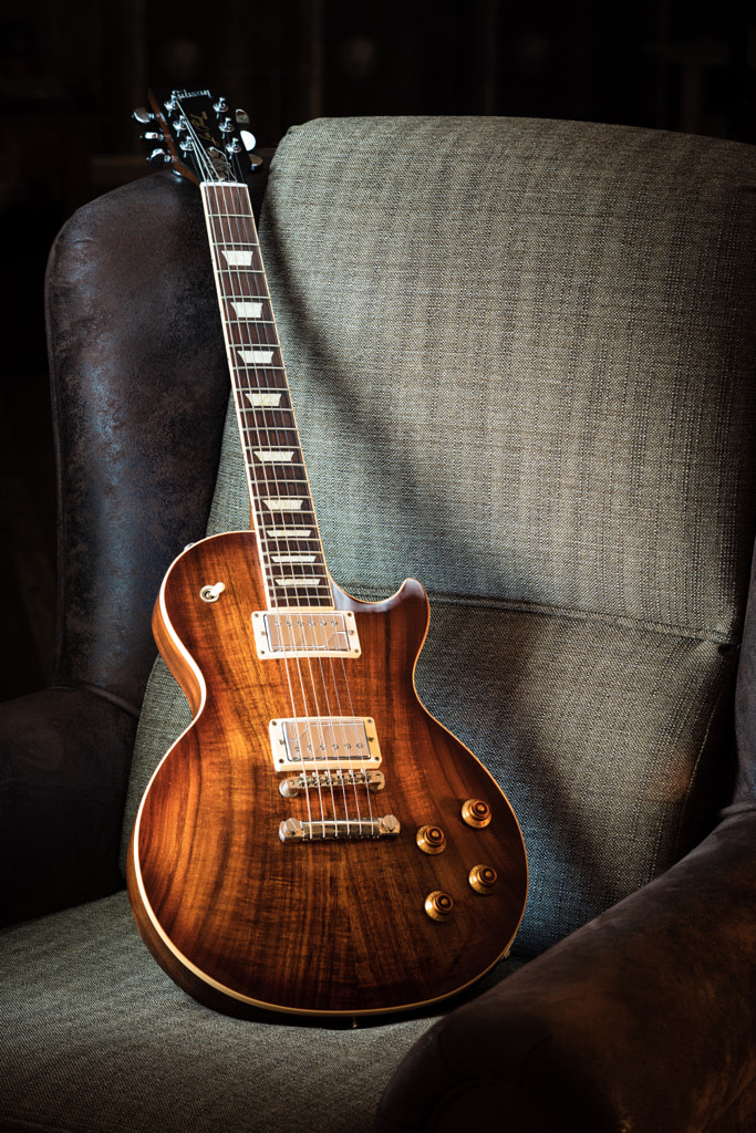
|
|
#
?
Dec 5, 2019 22:20
|
|

|
sensy v2.0 posted:I've been away from taking photos for a couple of years now, but I want to get back to it and this is my first decent photo since starting again. It's not a super interesting subject, but I decided to try making a long exposure and using an iPad on full brightness to light paint (with some xmas light off to the right for the warmer light that mostly hit the couch and a Kindle making the light behind the guitar). Part of the reason I stopped was that I just spent too much time in Lightroom/Aperture and Photoshop, so I've simplified this as to only use Lightroom and Photoshop on the iPad. I'm pleased with the result, but could improve the light painting aspect a whole lot. Here's a work-in-progress. I'm trying something new so welcome all feedback. 
|
|
#
?
Dec 5, 2019 23:18
|
|

|
Hot drat you made that wood grain look gorgeous. I'm not sure I like the blue light you get from the kindle. I don't like guitar pictures as a category because everything's been done but they way you captured what makes a Gibson beautiful makes this one a-ok. Beautiful. It looks like someone could use this for a horror movie, call it "Ursine," and put the title between it's legs. Very atmospheric.
|
|
#
?
Dec 6, 2019 00:01
|
|
|
InternetJunky posted:Here's a work-in-progress. I'm trying something new so welcome all feedback. That�s really cool. Think you could add in some highlights to the bear�s facial area? The illuminated fur further back seems a bit distracting in comparison.
|
|
#
?
Dec 6, 2019 00:06
|
|


|
 I think the concept here is cool, and I�ve never tried a shot like this before so I�m glad I kind of pulled it off, but it could stand some improvement. One thing I struggled with is that I had to crank up the ISO�longer exposure with a six-year-old just wasn�t gonna happen. I could�ve used a faster lens, but I needed more DOF (and he�s still a bit out of focus). Wonder if exposure stacking and some other editing in photoshop is the way to go...
|
|
#
?
Dec 26, 2019 19:57
|
|
|
I like the mood of the piece, it�s initially appealing. However, I find it dissonant that you�re so close to being symmetrical but are slightly off. It doesn�t have to be symmetrical, but if you�re gonna make it so close you ought to make it so.
|
|
#
?
Dec 26, 2019 20:03
|
|
|
I think I get what you�re saying. Because his head�s a bit off to the side? e: Oh, the hands too.
|
|
#
?
Dec 26, 2019 20:05
|
|
|
President Beep posted:I think I get what you�re saying. Because his head�s a bit off to the side? Yeah I noticed the hands right off. I should be clear, this piece is successful in many ways, my comment was nit-picking to make it more successful.
|
|
#
?
Dec 26, 2019 20:09
|
|
|
Thirteen Orphans posted:my comment was nit-picking to make it more successful. I wouldn�t have posted it if I didn�t want folks picking it apart and offering suggestions for improvement. Thank you!
|
|
#
?
Dec 26, 2019 20:12
|
|
|
The moon looks too low rez too, it doesn't seem to match the fidelity of the child's photograph. It might just be a personal preference thing but the moon seems really low contrast too.
|
|
#
?
Dec 26, 2019 20:18
|
|
|
xzzy posted:The moon looks too low rez too, it doesn't seem to match the fidelity of the child's photograph. Yeah, I�m still trying to figure that part out too. I put a radial gradient over the moon lamp to brighten it a bit more and also add in some contrast, I�m not quite sure why it�s looking more lo-fi than the rest of the image. It�s 3D printed, so I�m wondering if the actual object lacks definition in certain areas. The edges of my son�s fingers are pretty sharp against the moon, but it does look a bit fuzzy towards the middle. e: Just took another look at the lamp. Sure enough the surface isn�t consistently detailed. The topography�s pretty soft in some areas. President Beep fucked around with this message at 02:12 on Dec 27, 2019 |
|
#
?
Dec 26, 2019 20:28
|
|
|
lol oops, I thought you had composited a moon in. Then yeah it's just a low resolution toy, nothing you can do about that (except maybe actually composite a moon photo in its place).
|
|
#
?
Dec 26, 2019 21:20
|
|
|
xzzy posted:lol oops, I thought you had composited a moon in. I did, too. Maybe it's because of the sharp contrast between the dark fingers and the bright moon? I don't know that it's possible but maybe if your son held his fingers a little away from the moon? Or maybe even a very small second light source to give a tiny bit of light to the back of your son's fingers? Don't know that it'd actually work out but just some ideas.
|
|
#
?
Dec 27, 2019 07:49
|
|
|
Very nice, I like how it kinda looks like it could've had the details painted in. It reminds me of the album art for that "Bear and the Maiden Fair" song from GoT. Here are some scans I just got back from the Darkroom of that Eastman High-Con film used for contact printing and title making for films. Most of it is really unusable and I had no idea what to expect, despite it being in the name. The contrast really is high, it seems like it would a great film to use with constant, even lighting though. The detail is there but it doesn't handle the difference in lighting well at all, I haven't gotten my negatives back to do any scans of my own but I'm going to assume the lab got it close to what it's supposed to look like.   
GreaseGunner fucked around with this message at 05:55 on Jan 10, 2020 |
|
#
?
Jan 9, 2020 03:18
|
|

|
This is definitely my favorite of the three. The shape of the signs is nice, and the aesthetic of the signs themselves is pleasing. Good work, this is the kind of photo I�d put on my wall.
|
|
#
?
Jan 9, 2020 16:57
|
|
|

|
| # ? Jun 6, 2024 12:18 |
|
|
I agree that this one is my favourite, I also like the smooth tonal gradient on the wall to the left which isn't really present anywhere else in the other two shots. Interesting film though, seems like it's mostly going to be 'useful' either for a particular aesthetic or in very specific lighting conditions. I'm really struggling right now with motivation for photography, I like taking photos of landscapes/outdoor settings but I'm also really disappointed with pretty much all of my photos right now as I don't think I'm really finding anything unique in my compositions they're all just 'picture of a thing'. Anyway here's one that I like from a recent day out, would love to hear some tips/feedback. 
|
|
#
?
Feb 2, 2020 20:03
|
|