|
CannonFodder posted:Well I just learned a new word today. I offer my most enthusiastic contrafibularities.
|
 #
?
Nov 3, 2019 01:51
#
?
Nov 3, 2019 01:51
|
|


|

|
| # ? May 20, 2024 02:19 |
|
|
Sausage!?!?
|
|
#
?
Nov 3, 2019 02:50
|
|

|
is there a greatest hits of line graphs in particular? I want to use some for a class. I'm definitely including the original Florida stand your ground one.
|
|
#
?
Nov 5, 2019 08:15
|
|

|
morallyobjected posted:is there a greatest hits of line graphs in particular? I want to use some for a class. I'm definitely including the original Florida stand your ground one. specifically bad ones, or line graphs in general? if the former, big fan of the National Review's since deleted "the only climate change graph you'll ever need"  the stand your ground chart was based off of the o.g. "iraq's bloody toll" which i think is an interesting counterpoint because the figure/ground stuff works much better for it than in the florida chart 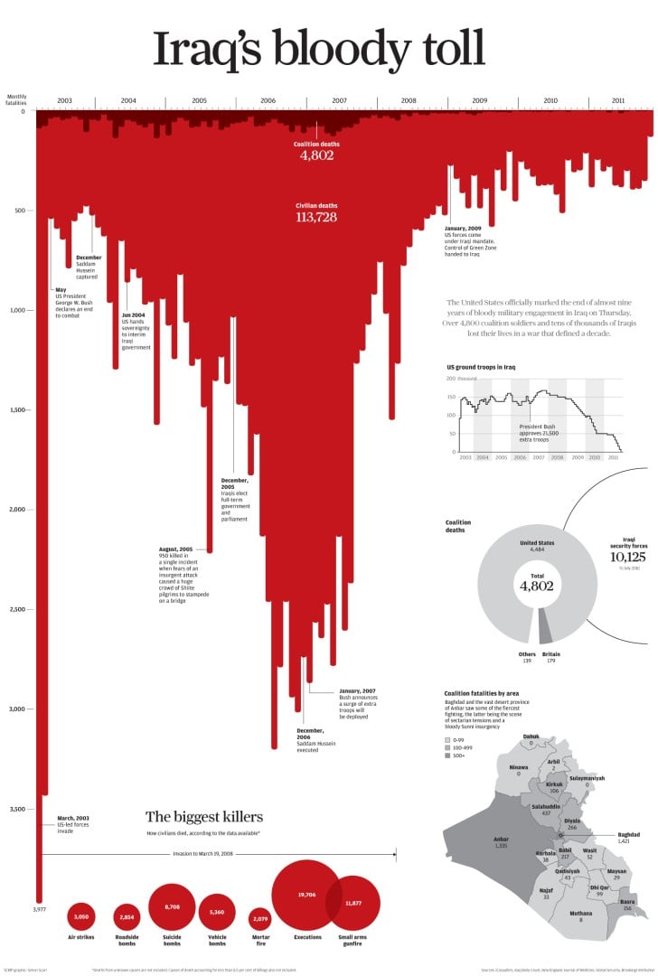
Tree Goat has a new favorite as of 15:45 on Nov 5, 2019 |
|
#
?
Nov 5, 2019 15:43
|
|

|
morallyobjected posted:is there a greatest hits of line graphs in particular? I want to use some for a class. I'm definitely including the original Florida stand your ground one. 
|
|
#
?
Nov 5, 2019 17:47
|
|

|
Such a classic. I like the leap from "only need two points to draw a straight line" to "only need two points to draw a curve". Edit: in addition to the heavy cherry picking going on, of course. jjack229 has a new favorite as of 18:59 on Nov 5, 2019 |
|
#
?
Nov 5, 2019 18:54
|
|
|
jjack229 posted:Such a classic. I like the leap from "only need two points to draw a straight line" to "only need two points to draw a curve". Please do not mock the  curve curve
|
|
#
?
Nov 5, 2019 19:17
|
|


|
morallyobjected posted:is there a greatest hits of line graphs in particular? I want to use some for a class. I'm definitely including the original Florida stand your ground one. it might have been a bar chart but gunchart.jpg is a classic
|
|
#
?
Nov 5, 2019 23:26
|
|


|
I still have to stop and stare at that graph every time. It just is so ridiculous.
|
|
#
?
Nov 5, 2019 23:36
|
|


|
morallyobjected posted:is there a greatest hits of line graphs in particular? I want to use some for a class. I'm definitely including the original Florida stand your ground one. Pretend I went to the effort of cropping this properly: 
|
|
#
?
Nov 6, 2019 00:50
|
|

|
Has anyone actually seen the article that is from? For all I know, it could be saying the reality doesn't mach the tax revenue predicted by the model and showing this graph.
|
|
#
?
Nov 6, 2019 01:48
|
|

|
mobby_6kl posted:Has anyone actually seen the article that is from? For all I know, it could be saying the reality doesn't mach the tax revenue predicted by the model and showing this graph. I don't know what article that specific graph is from so yeah it might be aiming to debunk it, but the concept depicted is one that a lot of "experts" take seriously. Experts in quotes there because it's peak Reaganomics where they're starting from a conclusion ("high taxes are bad") and working backwards to create the data to support it. Nobody who actually understands economics takes it seriously.
|
|
#
?
Nov 6, 2019 01:51
|
|

|
Even the concept of the Laffer curve is a big "citation needed". It's just the idea that at a 0% tax rate, you'll get 0 tax revenue, and at a 100% tax rate, nobody will bother to work, so there will still be 0 tax revenue. People draw whatever shapes they want in between. The idea that people would just sit around if they didn't have a direct profit incentive (or, in the case of the graph shown earlier, if corporations didn't have a direct profit incentive) seems very dubious to me. Give me a living stipend and something interesting and meaningful to do, I'll work extra hard if I like what I'm doing regardless of whether it directly benefits me.
Karia has a new favorite as of 04:07 on Nov 6, 2019 |
|
#
?
Nov 6, 2019 03:58
|
|


|
I'm pretty sure that chart was from The Economist, so no, they thought they were dropping truth bombs.
|
|
#
?
Nov 6, 2019 04:03
|
|

")
|
Well, it mentioned the American Enterprise Institute as a source. 'Nuff said.
|
|
#
?
Nov 6, 2019 04:47
|
|
|
Any model that doesn�t fit the data as well as a simple linear regression is garbage. Also, Karia, your avatar is hypnotic.
|
|
#
?
Nov 6, 2019 06:38
|
|

|
|
|
#
?
Nov 6, 2019 07:28
|
|

|
https://twitter.com/bsblcardvandals/status/1191418883334238212
|
|
#
?
Nov 6, 2019 07:29
|
|


|
This is one of my favourite Twitter accounts: https://twitter.com/amazing_graphs/status/1191423274699411456
|
|
#
?
Nov 6, 2019 07:39
|
|

|
foobardog posted:I'm pretty sure that chart was from The Economist, so no, they thought they were dropping truth bombs. It doesn't fit their style, the Economist will always have a little red rectangle in there.
|
|
#
?
Nov 6, 2019 12:29
|
|

|
Count Roland posted:It doesn't fit their style, the Economist will always have a little red rectangle in there. it's from the wsj https://scienceblogs.com/goodmath/2007/07/a_laughable_laffer_curve_from.php
|
|
#
?
Nov 6, 2019 12:54
|
|
|
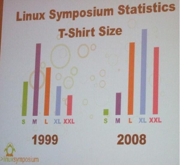
This is funny and it's not exactly a scientific study, but at the same time I find it to be deeply disturbing. These are people with serious potential health issues. I kind of want to see the stats for 2019.
|
|
#
?
Nov 6, 2019 12:58
|
|


|
Phlegmish posted:This is funny and it's not exactly a scientific study, but at the same time I find it to be deeply disturbing. These are people with serious potential health issues. I kind of want to see the stats for 2019. It�s unlikely to be the same people.
|
|
#
?
Nov 6, 2019 13:11
|
|


|
Subjunctive posted:It’s unlikely to be the same people. It also doesn't show magnitude. I'm sure the conference has grown, so it's possible they sold the exact same number of Medium shirts both years but are selling like 10x the shirts overall.
|
|
#
?
Nov 6, 2019 15:18
|
|

|
TinTower posted:This is one of my favourite Twitter accounts: Weirdly, 101 is narrower than 111 in Helvetica according to that. And I guess kerning multiple of the same number makes it such that 497 is wider than 999 and such. Neat.
|
|
#
?
Nov 6, 2019 17:55
|
|


|
Phlegmish posted:This is funny and it's not exactly a scientific study, but at the same time I find it to be deeply disturbing. These are people with serious potential health issues. I kind of want to see the stats for 2019. you are aware that obesity keeps going up in developed countries, right? it's not that notable of a chart
|
|
#
?
Nov 6, 2019 20:36
|
|
|
https://twitter.com/zebulgar/status/1192198379859636225
|
|
#
?
Nov 7, 2019 02:07
|
|
|
|
|
#
?
Nov 8, 2019 03:21
|
|

|
If that's what 20% of a house looks like, I can't imagine what a whole house looks like.
|
|
#
?
Nov 8, 2019 03:28
|
|


|
Ariong posted:If that's what 20% of a house looks like, I can't imagine what a whole house looks like. 
|
|
#
?
Nov 8, 2019 03:41
|
|
|
That's not a house, that's an entire swarm of hice!
|
|
#
?
Nov 8, 2019 04:19
|
|
|

|
|
#
?
Nov 8, 2019 04:49
|
|


|
Eessh, get some chemo on that thing, that can't be healthy.
|
|
#
?
Nov 8, 2019 05:08
|
|


|
Ariong posted:That's not a house, that's an entire swarm of hice! actually its a house king
|
|
#
?
Nov 8, 2019 05:19
|
|


|
I think that's called a mansion
|
|
#
?
Nov 8, 2019 05:43
|
|

|
Ariong posted:That's not a house, that's an entire swarm of hice! I've been calling them heeces this whole time...
|
|
#
?
Nov 8, 2019 06:40
|
|
|
Jesus In A Can posted:I've been calling them heeces this whole time... Weirdly enough it's actually "hodes"
|
|
#
?
Nov 8, 2019 07:12
|
|


|
�Hausen�, please.
|
|
#
?
Nov 8, 2019 07:18
|
|

|
Ariong posted:If that's what 20% of a house looks like, I can't imagine what a whole house looks like.
|
|
#
?
Nov 8, 2019 08:52
|
|
|

|
| # ? May 20, 2024 02:19 |
|
|
I thought it was "hooses".
|
|
#
?
Nov 8, 2019 09:38
|
|