


|
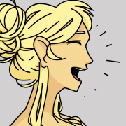
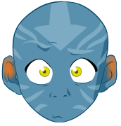
lofi posted:Getting the jaw/neck right from that angle is SO hard! Every time I try that angle it freaks me out. Hellbeard posted:I like it. Glad to hear! I don't think I mentioned it earlier, but that dude gives me strong Geralt vibes. The highlights look really nice, but I think you could make it stand out even more by cranking the shadow casting up to 11. I'm still working on perspective stuff. Today, after some other sketches, I decided to engage MASTER FOV mode: It's pretty challenging, but also kind of fun. Here's to hoping I keep the practise up!
|
 #
?
Dec 2, 2019 23:39
#
?
Dec 2, 2019 23:39
|
|


|

|
| # ? May 23, 2024 07:49 |
|
|
Hellbeard posted:and a group composition:  Yes, hello, Art Police? I gotta report Hellbeard. Yeah, the guy cranking out new arts like a freaking machine? Well now they've gone and done a group pic in which a JoJo is the LEAST sexy character. Mhm, I know, it should be impossible, but there it is! Yes, hello, Art Police? I gotta report Hellbeard. Yeah, the guy cranking out new arts like a freaking machine? Well now they've gone and done a group pic in which a JoJo is the LEAST sexy character. Mhm, I know, it should be impossible, but there it is! Ma'am this line is only for serious Art Emergencies, unless there's a Sonic OC situation or lens flares involved, we can't do a thing. Ma'am this line is only for serious Art Emergencies, unless there's a Sonic OC situation or lens flares involved, we can't do a thing.
|
|
#
?
Dec 2, 2019 23:58
|
|


|
Sharpest Crayon posted:
 I have a podcast because now a days who doesn't, and I was trying to cartoonify the star trek cast so we could put videos on YouTube with something for people to look at. I started flipping through my avatar book and forgot about the cool rear end old yoga dude! I had to draw him. I had this dumb grin on my face while I copied his design before I jumped into the shower. I now know what artists mean when they say " I had a lot of fun drawing X". I never really understood that before. Anyways any cartoonify-ing real people ideas that a beginner could implement would be appreciated as well as any feedback. Tried to keep it loose so I didn't feel like it was so important. It was fun and I don't hate some of the results.  
syntaxrigger fucked around with this message at 15:53 on Dec 3, 2019 |
|
#
?
Dec 3, 2019 13:43
|
|

|
Shinmera posted:... lol yeah, I felt so too. I guess people sometimes draw inspiration from popular culture for their roleplaying characters. Especially the white/silver hair part which is in itself unusual for the witcher here. Sharpest Crayon posted:
The trick is to have a minimum wage graveyard shift job where you can draw while you work!
|
|
#
?
Dec 3, 2019 20:43
|
|
|
Animals, mainly various pencils.  Why do dogs have such daft long noses?  
|
|
#
?
Dec 3, 2019 22:09
|
|

|
a senator
|
|
#
?
Dec 4, 2019 22:35
|
|

|
|
|
#
?
Dec 4, 2019 23:19
|
|

|
syntaxrigger posted:
Ok lemme lay down the best Art Hack right here: stupid loving chibis. They're easy to make and everyone will think they're cute, and they will love them and they will love you. This is essentially the pop!-figure technique. I did Worf real quick since that's what you've worked on too. The process is as follows: I do a sketch as quick as possible, doesn't need to look like anything like the model. I do this because I find this the easiest way to identify the main characteristics, and to simplify them. Then you draw a massive round goddamn head, pop down huge eyes on it and then add in all the main features, in this case a ginormous wrinkly forehead and fetching facial hair. You might think you'd need to, like, change the eye shape or jawline or whatever, and you can, but get this: people are hella good at recognizing patterns, which is essentially how the pop! figures work. You don't need much for the character to "click".  Below, a random example to reitirate. Start with your basic bobblehead, try to see what parts make a character recognizable, simplify and exaggerate to taste and add those in. Try to keep detail to a minimum with the body.
|
|
#
?
Dec 5, 2019 00:21
|
|
|

|
|
#
?
Dec 5, 2019 05:00
|
|
|
I like this, but I don't understand where the light is coming from - best guess is the white speck behind her? If so I'd do something to make it look like an object or spell effect rather than just a bit you forgot to paint over
|
|
#
?
Dec 5, 2019 08:14
|
|
|
Sharpest Crayon posted:Ok lemme lay down the best Art Hack right here: stupid loving chibis. They're easy to make and everyone will think they're cute, and they will love them and they will love you. This is essentially the pop!-figure technique. Thank you for this it is super helpful!
|
|
#
?
Dec 5, 2019 15:18
|
|
|
Phylodox posted:And even more Not Another D&D Podcast fan art. Goddamn, I'm still at it! Just really enjoying this particular style.   
|
|
#
?
Dec 5, 2019 16:04
|
|


|
Angrymog posted:I like this, but I don't understand where the light is coming from - best guess is the white speck behind her? what if i told u...... i was very stoned when i painted that and that was indeed just a bit i forgot to paint over 
|
|
#
?
Dec 5, 2019 16:37
|
|
|
Al! posted:what if i told u...... i was very stoned when i painted that and that was indeed just a bit i forgot to paint over Welp, it's the only logical place for the light to come from so... Another light thing - I get what you're trying for with the blue on the pillars, but I reckon that there should be some blue around the flowers too?
|
|
#
?
Dec 5, 2019 17:37
|
|
|
Angrymog posted:Welp, it's the only logical place for the light to come from so... yeah, i was planning on putting a magic lantern there but oops! it's just a doodle anyway i think you're probably right, i was going for more of a rim lighting effect but really there should have been a bit more blue overall
|
|
#
?
Dec 5, 2019 20:05
|
|
|
Perspective again. Skipped some days because depression is a wild beast. Also made her buff because hey, why not. Buff ladies are cool!
|
|
#
?
Dec 5, 2019 23:03
|
|
|
a december prompt: "bag"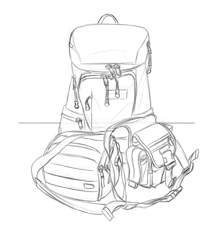
|
|
#
?
Dec 6, 2019 05:38
|
|
|
aaaaAAAAaaaAAAAAAA  Gods it's so rushed but I just needed to quickly draw something, anything, for myself before I go nuts. Batbutt it is.
|
|
#
?
Dec 6, 2019 22:53
|
|
|
Dumping some oil painterings and ink drawins. 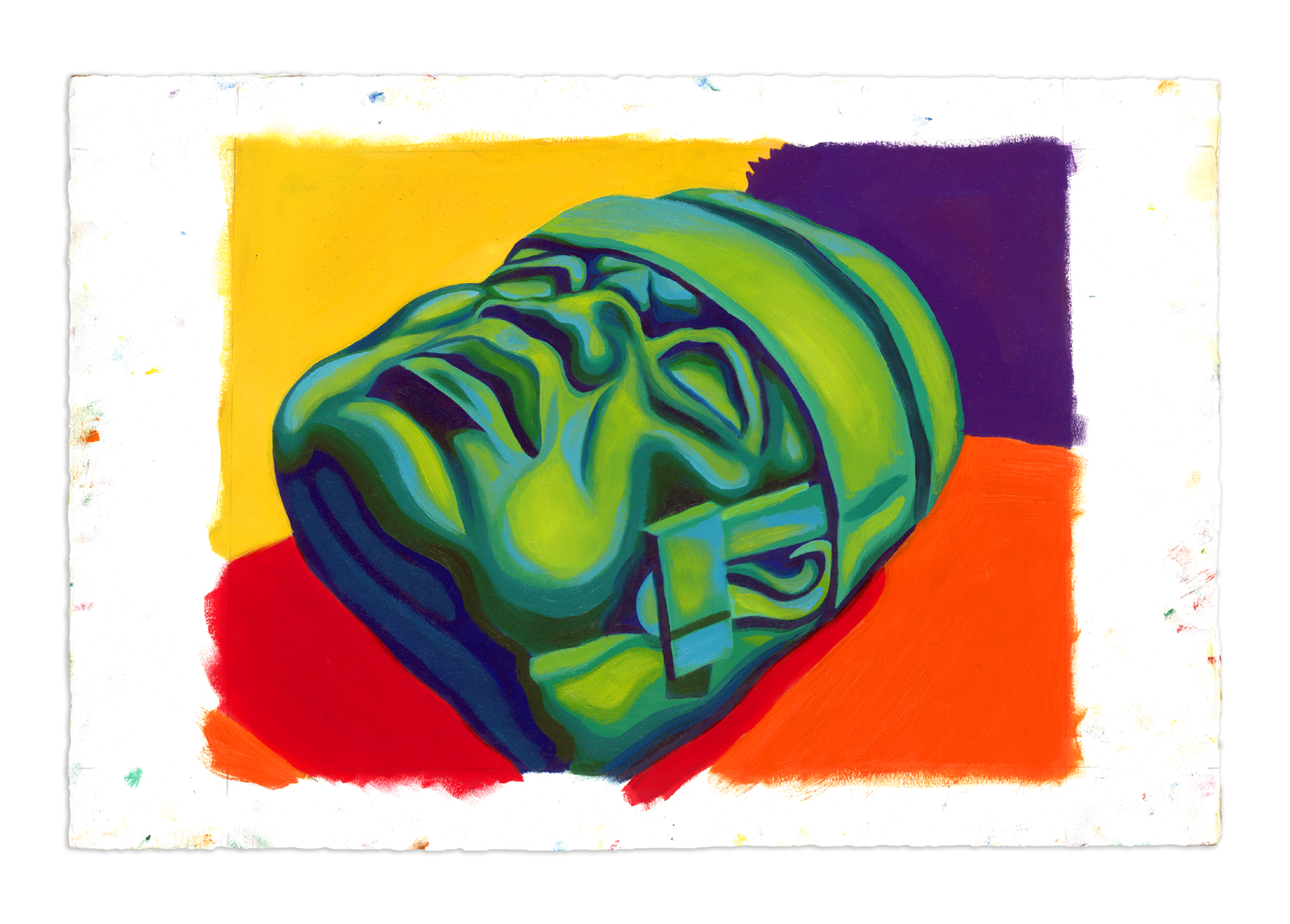 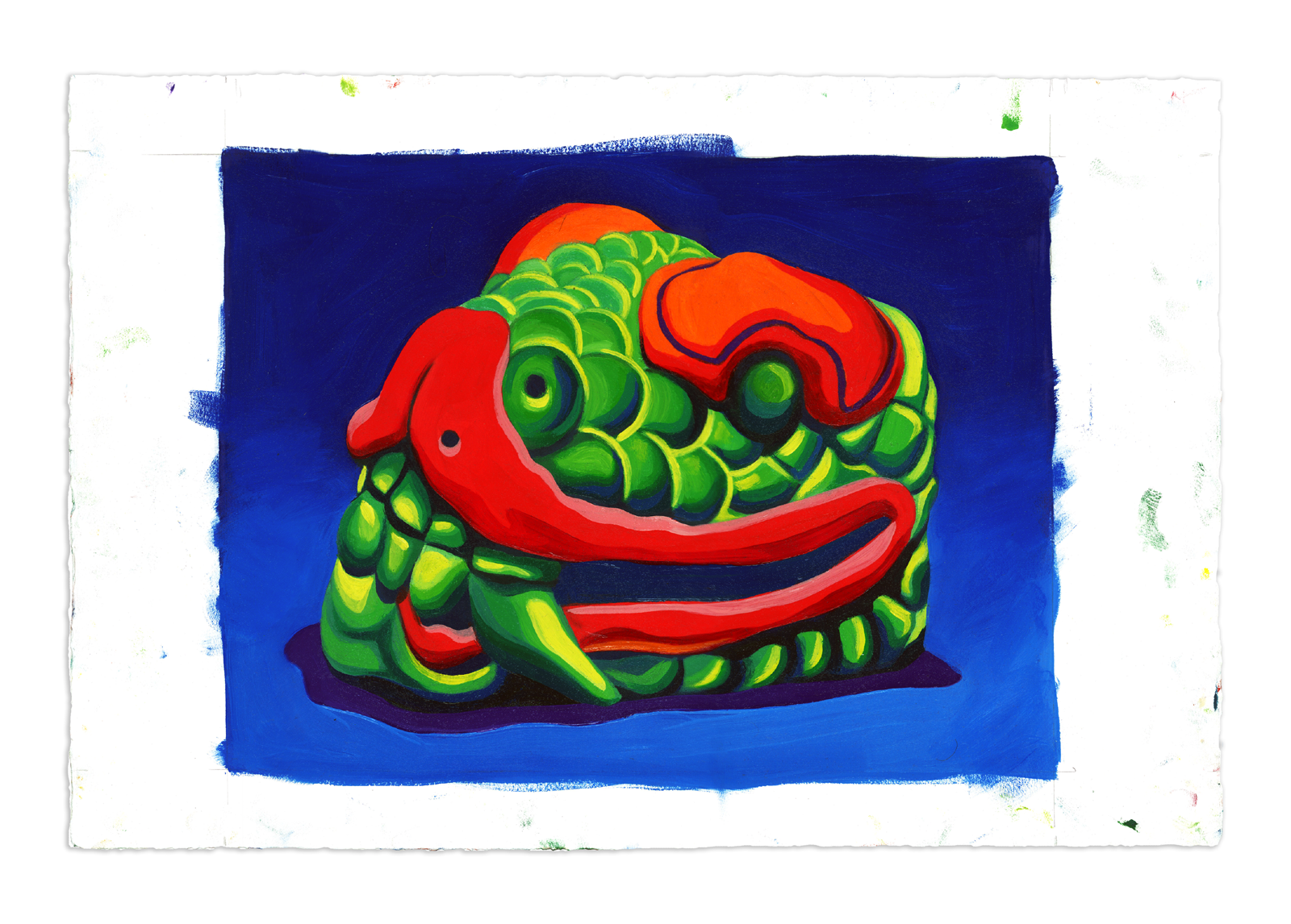    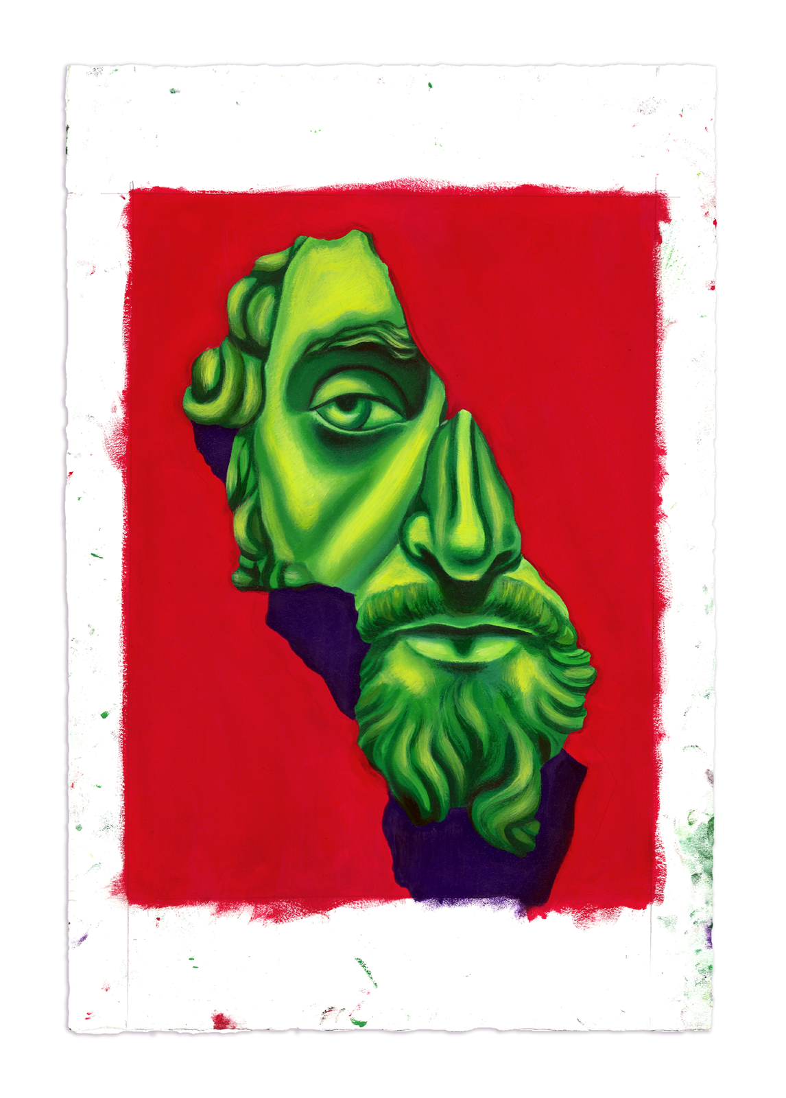   don't got time for no resizing.
|
|
#
?
Dec 7, 2019 00:44
|
|

|
Cartyisme posted:Dumping some oil painterings and ink drawins. Sweet. I like the shading / color. I want to call it cel-shading but I guess I mean limited gamut? What do you call it? catch my drift? Here's a bunch of recent stuff and a work in progress. The wip I thought I'd color later but I'm not so sure now. I think I'll try to take it as far as I can in monochrome and then think about it. idk Is there any recommended method of coloring a value drawing? Maybe it's a bad idea to begin with and I should have worked in color from the get-go?    
|
|
#
?
Dec 7, 2019 03:14
|
|
|
I really like this one
|
|
#
?
Dec 7, 2019 04:55
|
|


|
Baby's First Figure Drawing Trip Report So I just rolled up with a drawing pad and some pencils. A lot of what I would think are the 'good spots' were already taken and I ended up with sort of a weird angle. The model was pretty and clothed but I still felt weird taking her picture even though I had to sign some sort of sheet? I dunno it felt like I would just do what I could with the pose in the time alotted. I expected to have a sort of group of different standing poses for a short period of time for a warm up then progressively longer poses. Basically like this site does when you pick the class option https://line-of-action.com/practice-tools/figure-drawing. That wasn't the case. It was one pose for something like 20 or 40 mins then the model took a break. It was a laying down pose and I think she fell asleep at one point heh. I tried an overhand grip but after about 1 hour in my shoulder started to bother me. At around the 1.5 mark I got frustrated and just left. I feel like I need to have a better handle on proportion, perspective, and how squishy forms deform when being pressed on something like a pillow before I try again. I felt like I got the rough shape of the model's pose but I had problems with her foot. It was kinda curled and curved. I feel like I got the hand over her stomach pretty decent  I decided to say screw it and just focus on her face/shoulders. Her cheek that was pressed against the pillow was really hard to get right and my proportion and perspective kept messing up. I was basically positioned at her feet looking 'up' at her chin and that kept messing with my head. She had a pointy nose and it was hard to judge how to draw that in relation to the eyes and lips.  This is me trying the body again, getting frustrated by the details then quitting  . My shoulder kinda hurts. I guess I need to build up my endurance for this sort of thing . My shoulder kinda hurts. I guess I need to build up my endurance for this sort of thing Any feedback or suggestions is appreciated. syntaxrigger fucked around with this message at 05:15 on Dec 7, 2019 |
|
#
?
Dec 7, 2019 05:13
|
|
|
Hellbeard posted:Sweet. I like the shading / color. I want to call it cel-shading but I guess I mean limited gamut? What do you call it? catch my drift? I like these the most. I love the duck. The ink lines with varying line weight is pretty rad! The shading on the middle one is pretty neat. I feel like I have seen that before, that creature, but I can't place it.
|
|
#
?
Dec 7, 2019 05:15
|
|
|
Hellbeard posted:Sweet. I like the shading / color. I want to call it cel-shading but I guess I mean limited gamut? What do you call it? catch my drift? I remember you! I dig the artwork, the duck is great, your style as a contemporary/internet Noir feel. The grappling between the loose lines and clear definition really works for you. As to your comments/questions about color, to be clear I'm no expert, I'm usually thinking exclusively in color from the start if I'm working with color. If it's not a black line it's just another color. Then again a lot of comics aren't thought out in color necessarily but they still manage to pop. I guess I'd say there's a sort of logic to it? Throwing down some color under a line drawing will always seem secondary. But when you think it out and put colors in competition with each other it starts to pop a bit more. Like that snake head for example. The lips are red playing off the cool green. The green is tinted more and more yellow with the light which compliments the purple shadow and the hard yellow highlights work with the orange to pop off the cool blues in the bg. The colors sort of play off each other.... "Who's on first?" Hope this sort of makes sense. Someone once suggested a long time ago that I make paintings and mix color without ever using a black. Probably one of the more helpful suggestions I've been given. Purposefully leaving black off your palette seemed counter-intuitive until I did it long enough to realize you almost never need it. Cartyisme fucked around with this message at 06:35 on Dec 7, 2019 |
|
#
?
Dec 7, 2019 06:25
|
|
|
syntaxrigger posted:Any feedback or suggestions is appreciated. Maybe you missed the warm-up bit? Were you standing or sitting? Re. Stamina that is just practice - muscles used in new ways do tend to complain. If they don't do warm-up, you could take a smaller back up pad and move yourself around to get different views, and when they change pose speak up and ask for her to face the direction you want, or even the length of pose that you want. Angrymog fucked around with this message at 11:07 on Dec 7, 2019 |
|
#
?
Dec 7, 2019 09:59
|
|
|
Cartyisme posted:
I got serious linework envy! What brush are you using? syntaxrigger posted:Baby's First Figure Drawing Trip Report You're working really small there, I'd try to go a lot bigger - a page per drawing. The session sounds unusual (compared to my experience), but long pose is good, gives you lots of time to play with different ideas. Well done on going!
|
|
#
?
Dec 7, 2019 11:05
|
|
|
syntaxrigger posted:Baby's First Figure Drawing Trip Report You did great for your first attempt. It's hard to dive in and just go for it, but this is how you learn the proportion and perspectives and squishiness - by observing. You might not notice it, but your second attempt at the body was already better in terms of drawing what you see rather than what your brain wants to see - look at the lower line of the torso on your first attempt where you've curved it inward (because that's what a waist does, says your brain, and it ends up looking flat) and compare it with the second, where you've gone with the shape of the torso. The overall construction of the shapes is much more solid in the second. You did get the dreaded position of looking up at a chin, which - as Shinmera and lofi JUST mentioned here - terrifies seasoned artists as well, me included. As for your shoulder hurt, there's a few things you can do about this although when starting out, there's gonna be some strain on all the muscles that aren't used to drawing. When you feel strain, try to straighten up your posture and pull back your shoulders so you're not extending your shoulderbone from your side and letting your arm hang in front of you with its full weight. If the seats (or your body) allow it at all, sit cross-legged, propping up one leg so you can use it as an arm rest. If possible, try not to let your neck extend too far in front of you, because hanging the weight of your entire head forward also affects your shoulders. Try to keep the neck upright, and tilt your head instead. If you need to get closer to the paper, bring the paper up to you (by propping it against your legs, using an easel - whatever works). Then look around at the hunchbacked artist who are always in pain because no-one remembers ergonomics.
|
|
#
?
Dec 7, 2019 13:43
|
|
|
Angrymog posted:Maybe you missed the warm-up bit? I was sitting for the first bit then I tried standing, that felt a bit better. I wanted a better angle. I got there before the model did so I don't know what the structure of the event normally is. I did just make some marks on the page with an overhand grip because I am not used to using it. I do like how it seems easier to make long arched lines. lofi posted:I got serious linework envy! What brush are you using? Good to know. I felt like I was going big but I can see how I can go bigger. Thanks Sharpest Crayon posted:You did great for your first attempt. It's hard to dive in and just go for it, but this is how you learn the proportion and perspectives and squishiness - by observing. You might not notice it, but your second attempt at the body was already better in terms of drawing what you see rather than what your brain wants to see - look at the lower line of the torso on your first attempt where you've curved it inward (because that's what a waist does, says your brain, and it ends up looking flat) and compare it with the second, where you've gone with the shape of the torso. The overall construction of the shapes is much more solid in the second. Thanks. I guess that makes sense. I felt like my mind was wrestling with perspective, deformed shapes, and proportion all at the same time. I thought that if I at least had proportion and perspective more natural then I'd only be wrestling with one thing. I dunno. It makes sense drawing from life would be the better way to go. Yeah I do felt like some of my marks were a lot better on the second attempt. When I got frustrated I sort of felt like a runner that has no more gas in the tank. Like I could sort of force myself to go forward but I was running on fumes and maybe that was partly why I was getting frustrated. I think next time I will get some of that news paper stuff and charcoal sticks and some bottled water and a rag. All things I wouldn't have minded having. Also the guy running this was legit a hunchbacked artist. I felt bad. I definitely want to keep my posture as good as possible. I have already had a herniated disk that needed removing so miss me with that hunchbacked nonsense! Thanks for the feedback!
|
|
#
?
Dec 7, 2019 15:25
|
|
|
syntaxrigger posted:I was sitting for the first bit then I tried standing, that felt a bit better. I wanted a better angle. I got there before the model did so I don't know what the structure of the event normally is. I did just make some marks on the page with an overhand grip because I am not used to using it. I do like how it seems easier to make long arched lines.
|
|
#
?
Dec 7, 2019 16:12
|
|
|
Can we post sculptures?
|
|
#
?
Dec 7, 2019 16:56
|
|
|
Angrymog posted:That's weird then. Maybe speak to the organisers? Maybe. I'll get a few more under my belt before I go all Karen on them.
|
|
#
?
Dec 7, 2019 18:14
|
|
|
syntaxrigger posted:I like these the most. I love the duck. The ink lines with varying line weight is pretty rad! The shading on the middle one is pretty neat. I feel like I have seen that before, that creature, but I can't place it.  thank you. The creature is from the Nordic Gamer Meme format I think it's a variant of wojak. thank you. The creature is from the Nordic Gamer Meme format I think it's a variant of wojak.Cartyisme posted:I remember you! I dig the artwork, the duck is great, your style as a contemporary/internet Noir feel. The grappling between the loose lines and clear definition really works for you. Cool, thank you I love the term "Internet Noir". I'm adopting it. I like the technique, it's fun for me to do. I'm not sure what to do with it but I enjoy exploring it. I've had an idea for the coloring and how to do it. I'll put the black and white layer on multiply and lay down color under it and then merge it down and then paint over it. Maybe adjust the output levels according to the colors.
|
|
#
?
Dec 7, 2019 18:29
|
|
|
more weird landscapes
|
|
#
?
Dec 7, 2019 22:08
|
|
|
The Dregs posted:Can we post sculptures? There is a traditional arts thread which might welcome the content too, but honestly, I'm cool with any form of art getting posted here. Next year I think I'll just name this the catch-all thread, it's not like we're in danger of getting the thread sidetracked with too many people posting off-topic when the topic is literally "arts posted here plz" I wanna know how big that sucker is, though. And what is he made of? I've got a real hard time honing in on the material. Some sorta sculpty material? But that would be SO MUCH of it, that's like one million bux in sculpey.
|
|
#
?
Dec 7, 2019 23:27
|
|
|
Sharpest Crayon posted:There is a traditional arts thread which might welcome the content too, but honestly, I'm cool with any form of art getting posted here. He is about 18" tall, you can get a sense of scale by looking at the spray paint can in the background. He is fired clay covered in acrylic paint. He is my Ceramics 1 final. Not outstanding, but I learned a whole hell of a lot working on him. He actually broke into 6 pieces when we bisque fired him. I put him right back in for the final firing because he was just too fragile as bisque. Then I used a whole stick of epoxy putty putting the poor bastard back together.
|
|
#
?
Dec 8, 2019 00:30
|
|
|
So he IS freaking huge. I mean, I could see the lil bottles of paint but perspectives in pictures can be misleading. I don't know a goddamn thing about ceramics, did you do like a skeleton out of wire for him or something and he still fell apart? I remember doing some claywork as a kid and poo poo falling apart was on par for the course. Anyway, me n my starter on our way to steal ur gym badges 
|
|
#
?
Dec 8, 2019 01:34
|
|
|
Sharpest Crayon posted:So he IS freaking huge. I mean, I could see the lil bottles of paint but perspectives in pictures can be misleading. I don't know a goddamn thing about ceramics, did you do like a skeleton out of wire for him or something and he still fell apart? I remember doing some claywork as a kid and poo poo falling apart was on par for the course. no. I sculpted the bottom, torso and head separately and then joined them. But the bottom had mostly dried out and the top hadn't, so the differential shrinkage caused issues. Also he was just too heavy for his ankles, you can see that they are heavily built up with epoxy now. What a learning experience. I considered making a wireframe, but they can also cause issues since the clay shrinks and they have to be removed before firing anyway.
|
|
#
?
Dec 8, 2019 01:44
|
|
|
Hellbeard, there was a good post about digital coloring on Muddy Colors recently. For one thing, working from a colored under painting instead of straight gray is very helpful. Consider the color of the ambient light and make your tone drawing that hue. Here�s the post: http://www.muddycolors.com/2019/12/applying-transparent-color-in-photoshop/
|
|
#
?
Dec 8, 2019 14:36
|
|
|
More perspective practise.
|
|
#
?
Dec 9, 2019 00:02
|
|
|

|
| # ? May 23, 2024 07:49 |
|
|
Lot of good stuff this week! I think I'll be able to have this Christmas card colored and printed by next week to sell at our holiday art market, but I doubt any of my friends will be receiving my card before Christmas.  Cartyisme posted:Dumping some oil painterings and ink drawins. Oh hey you're still around! You sent me an ink drawing of a hipster a few years back, just thought you'd like to know that it made it over to Europe and is still hanging in my living room. Glad to see you're still making rad art.  Please forgive the late-night working alone on digital art crappy lighting photo.
|
|
#
?
Dec 9, 2019 00:26
|
|