


|
so did the artist use an etch-a-sketch or what
|
 #
?
Nov 15, 2020 15:19
#
?
Nov 15, 2020 15:19
|
|


|

|
| # ? May 22, 2024 08:32 |
|
|
Faces aside, a lot of those lines they decided to ink are inexplicable. I'm pretty sure like a third of them were guidelines for shading and definition and not actually supposed to be inked.
|
|
#
?
Nov 15, 2020 15:53
|
|

|
For the record that's from The Authority v2/2003 #5. Tan Eng Huat is credited with "art", and Dave Baron with colors. It's essentially a fill-in issue, as Dwayne Turner, Sal Regla, and Dave Baron were the art team for issues 1-4 and 6-13 of the series, with Regla/Baron working over Whilce Portacio pencils for the 14th and final issue. He mostly does concept art these days, but he drew most of John Arcudi's 2001 Doom Patrol revival and a big chunk of Simon Spurrier's Legion run of X-Men Legacy. He uses a lot of lines (and draws some divisive faces) but to echo what was said above, the page posted seems like a mix between "rush job", "someone colored it straight from pencils", and "maybe he was trying out a slightly new style that didn't really work". Here's a random "page with a fair number of faces" from Doom Patrol circa 2001  And another from 2011's X-Men Legacy  In general he's pretty cool, here's his Instagram. https://www.instagram.com/tan_enghuat/?hl=en
|
|
#
?
Nov 15, 2020 18:00
|
|
|
Oh wow, yeah, those are much better. The Doom Patrol page is still a little wonky, but the other is great.
|
|
#
?
Nov 15, 2020 19:56
|
|

|
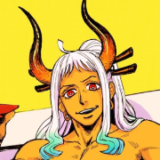
What's with surfer hair Goku there?
|
|
#
?
Nov 15, 2020 20:14
|
|


|
Doctor_Fruitbat posted:What's with surfer hair Goku there? I�m pretty sure that�s Legion, Professor X�s very powerful very unstable son
|
|
#
?
Nov 15, 2020 20:24
|
|
|
Bro Dad posted:The Authority #5 I have many questions. But my main one is "is everyone made out of balsa wood in this comic?" Because whoa. I don't know if I can chalk it up to the inker or not either. Those thin lines on the faces are ostensibly there for a reason, I would like to think, but I can't ascertain what reason that might be. For a second, I thought they might be there for the colorist to suggest highlights and shadows (like a paint by number) but, upon closer inspection, that doesn't make sense either. Structurally, compositionally and proportion wise, I think I could work with this if you gave it to me to ink. The layouts are fine. The artist almost seems like he's trying to invoke Walt Simonson but Walt, even though he can be blocky and a little line happy, usually doesn't add lines that don't actually describe something.
|
|
#
?
Nov 16, 2020 02:59
|
|


|
Libra posted:Faces aside, a lot of those lines they decided to ink are inexplicable. I'm pretty sure like a third of them were guidelines for shading and definition and not actually supposed to be inked. That was my exact thought. You see lines like that all the time from penciled work before it gets shaded in by the inker or colorist. But this looks like they just came in and inked every single line they could find on the page. 
|
|
#
?
Nov 16, 2020 04:00
|
|
|
 Second Lieutentant "We Gave Him A Map To An Iceberg, How Were We To Know?", v5 #14 1999 Whole issue is pretty good, art-wise. B&W except for Skull, until near the end of the book - you get weird dreams when you're destroyed by/commingled with a Cosmic Cube.
|
|
#
?
Nov 16, 2020 04:37
|
|

|
Tin Can Hit Man posted:That was my exact thought. You see lines like that all the time from penciled work before it gets shaded in by the inker or colorist. Yeah, the lines on the arms in particular are just wonky as hell, but would make sense as guides to a colourist or for shading.
|
|
#
?
Nov 16, 2020 05:51
|
|


|
Bro Dad posted:The Authority #5 This looks like someone is aping 1999ish Travis Charest pretty hard.
|
|
#
?
Nov 17, 2020 17:53
|
|
|
 Spider-Man Team-Up #4 (1996) Pencils: Darick Robertson Inks: Andrew Pepoy  Spider-Man Team-Up #4 (1996) Pencils: Brandon McKinney Inks: Chris Ivy  The Amazing Scarlet Spider #1 (1995) Pencils: Mark Bagley Inks: Larry Mahlstedt
|
|
#
?
Nov 23, 2020 18:23
|
|


|
Darthemed posted:
WHAT IS WRONG WITH YOUR FACE?!?
|
|
#
?
Nov 24, 2020 01:50
|
|

|
Darthemed posted:
This is just a drawing of Andrew Garfield.
|
|
#
?
Nov 24, 2020 02:21
|
|
|
I miss when games had big head mode too.
|
|
#
?
Nov 24, 2020 02:52
|
|
|
Darthemed posted:
That's quite the neck there. Was he bitten by a radioactive giraffe?
|
|
#
?
Nov 24, 2020 12:58
|
|


|
   Silver Surfer #10 (1988) Pencils: Marshall Rogers Inks: Joe Rubinstein
|
|
#
?
Nov 24, 2020 17:19
|
|
|
Just giving dismissive half-arm waves to your boss.
|
|
#
?
Nov 24, 2020 21:16
|
|

Darthemed posted:
IIRC this is the era where editorial was making them stretch out the passing of the baton between Peter and Ben so that they could keep Ben in the Scarlet Spider suit longer because readers liked that suit, and everyone in the creative team was really annoyed about it and half assed all the Scarlet Spider comics.
|
|
|
#
?
Nov 24, 2020 21:19
|
|


|
Proteus Jones posted:That's quite the neck there. Was he bitten by a radioactive giraffe? That's weird because Bagley was real good on Ultimate Spiderman but that's some lazy rear end line work That whole post looked like they were inked with Bic pens
|
|
#
?
Nov 24, 2020 21:35
|
|
|
He definitely rushed his two issues, layouts only. I think every Scarlet Spider comic from that stretch were thrown together in a week.
|
|
#
?
Nov 24, 2020 23:01
|
|

|
Darthemed posted:
<insert balloon-rubbing noises here>
|
|
#
?
Nov 25, 2020 06:26
|
|
|
Ygolonac posted:<insert balloon-rubbing noises here> https://archive.org/details/TNGTheWoundedPetersCut (skip to 23:10)
|
|
#
?
Nov 25, 2020 11:35
|
|


|
 
|
|
#
?
Dec 6, 2020 23:15
|
|

|
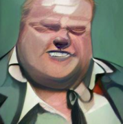
Gene Simmons?
|
|
#
?
Dec 6, 2020 23:23
|
|


|
Looking past the whole hyper-gaunt cheeks thing: the eyes look like they're from a different piece. Or maybe they've been hastily resized.
|
|
#
?
Dec 6, 2020 23:28
|
|


|
Lobok posted:Gene Simmons? Nah. Chief from One Flew Over the Cuckoos Nest found his niche.
|
|
#
?
Dec 7, 2020 14:43
|
|
|
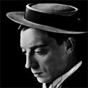
Adam Driver, surely?
|
|
#
?
Dec 7, 2020 14:48
|
|

|
I didn't even notice the woman in the bottom left at first. I love her expression holding those two guns. It's like the murderous version of
|
|
#
?
Dec 7, 2020 15:33
|
|
|
All prettiness aside, the cover is by Jim Terry, who like pretty much everyone involved in the book is a member of a Native nation. The art is exaggerated (and honestly looks a little 'off' from his normal style, possibly because it's inked and/or colored by Brian Reber, ) but I can fully believe some of the exaggeration is very deliberate in the sense that so many non-white characters in superhero comics (including everyone on that cover) are generally drawn so that they look like pallete-swapped white people. If you're doing a book based on the idea of representation, I can see how you would want to course correct that, and maybe err on the side of over correcting.
|
|
#
?
Dec 7, 2020 15:55
|
|
|
I honestly like that guy's face a lot. He's distinctive in a charming way, rather than being just another Generic Interchangeable Handsome Man like most superheroes. He feels a lot more real. However, I will poke fun at Scowly McKnifedude on the left there. The nineties are over, man!
|
|
#
?
Dec 7, 2020 16:02
|
|
|
Being scowly and having two knives is all he has.
|
|
#
?
Dec 7, 2020 16:22
|
|
|
Maybe it's the eyes, but I get strong Tommy Wiseau vibes off this. "O hai, fists!"
|
|
#
?
Dec 7, 2020 16:40
|
|


|
WaffleZombie posted:Maybe it's the eyes, but I get strong Tommy Wiseau vibes off this.
|
|
#
?
Dec 7, 2020 16:55
|
|

|
Yeah I don't hate that cover. It's pretty 90s, sure, but the anatomy is competent, the characters are distinct, the poses are believable... The cheekbones guy clearly isn't an error, he's meant to look that way.
|
|
#
?
Dec 7, 2020 17:04
|
|

|
ITT: people who are treating a stylized person w/ indigenous ancestry as if they were a badly drawn white dude
|
|
#
?
Dec 7, 2020 17:29
|
|

|
goatface posted:Being scowly and having two knives is all he has. In the Days of Future Past movie, Warpath had the most darkly funny deaths. His friends just got brutally owned by the Sentinels who now converge on him, and he pulls a loving knife, scowls and dies.
|
|
#
?
Dec 7, 2020 17:30
|
|
|
 Venom: The Madness #2 (1993) Pencils & Inks: Kelley Jones  Venom: The Madness #2 (1993) Pencils: Kelley Jones Inks: John Beatty  Venom: The Madness #3 (1994) Pencils: Kelley Jones Inks: John Beatty; Al Milgrom; Kent Williams  Astonishing Spider-Man & Wolverine #1 (2010) Pencils & Inks: Mico Suayan
|
|
#
?
Dec 7, 2020 17:37
|
|
|
I like inhuman chonky Marko.
|
|
#
?
Dec 7, 2020 17:52
|
|
|

|
| # ? May 22, 2024 08:32 |
|
|
flatluigi posted:ITT: people who are treating a stylized person w/ indigenous ancestry as if they were a badly drawn white dude I didn't post it because I thought it was particularly badly drawn (in retrospect the thread with bad art in the title was a poor choice), it was because I found his expression out of place. He's in a traditional action pose, yet the face (to me) just looks sad/melancholy.
|
|
#
?
Dec 7, 2020 18:19
|
|