


|
Eej posted:The most important part of airbrushing is that you just gotta start spraying paint to learn. You're gonna spiderweb or shoot powder or have awful pooling and that's just part of the learning process of airbrushing and also your specific setup of airbrush + paints etc. As long as you're not destroying the needle by smashing it into things and taking the time to do at minimum a quick cleaning after every session there's no horrible mistakes you can do. This. As in so many other things in life, there's really no substitution for practice and/or experience. If you can't bear the thought of loving up even one of your precious bois and then strip the model, paper and cardboard are cheap and plentiful, and can at least let you experience the basics. EDIT: Jesus WEP has a solid idea as well. Feeple fucked around with this message at 01:30 on Feb 7, 2021 |
 #
?
Feb 7, 2021 01:17
#
?
Feb 7, 2021 01:17
|
|


|

|
| # ? May 9, 2024 02:48 |
|
|
if i was starting airbrushing from scratch i�d buy a thing of plastic spoons and practice on them
|
|
#
?
Feb 7, 2021 01:20
|
|


|
The best practice surface for airbrushing is a van from the 70s or 80s, which history and countless issues of Vantasm magazine have shown to be the ideal canvas for painting wizards and dragons
|
|
#
?
Feb 7, 2021 01:28
|
|

|
Did some Skyfires up with contrast on the non-metal segments. Got a little lazy on the discs, but gently caress it.  
|
|
#
?
Feb 7, 2021 02:05
|
|

|
They look awesome but the discs deserve some love!!
|
|
#
?
Feb 7, 2021 02:19
|
|


|
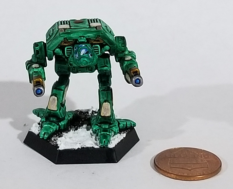
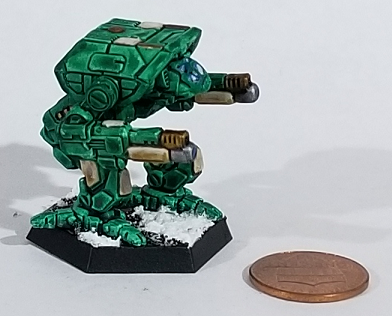
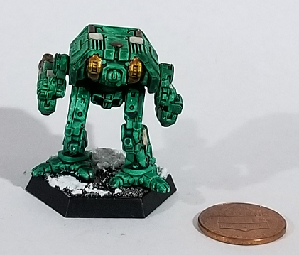
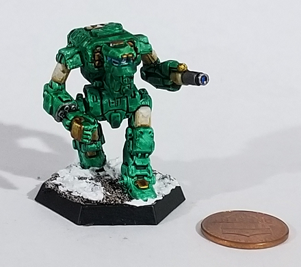
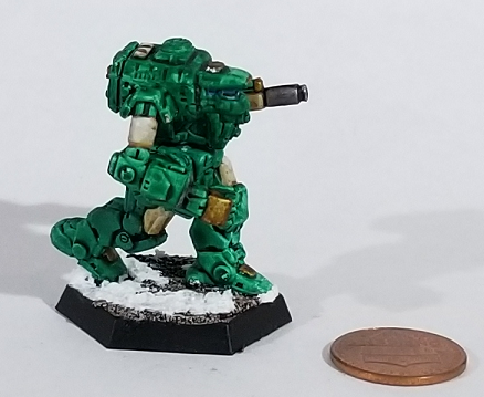
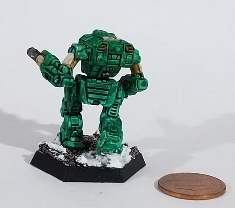
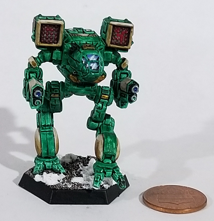
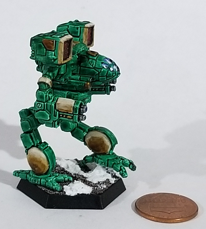
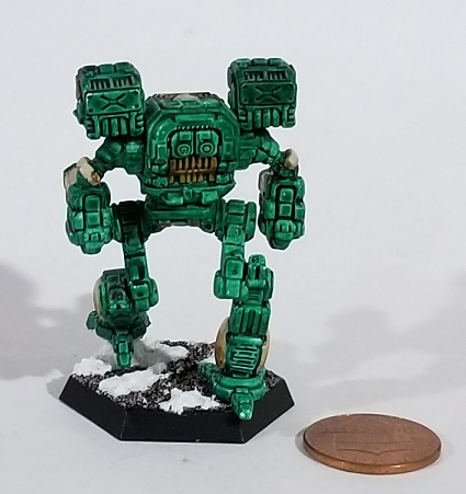
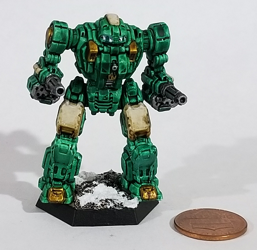
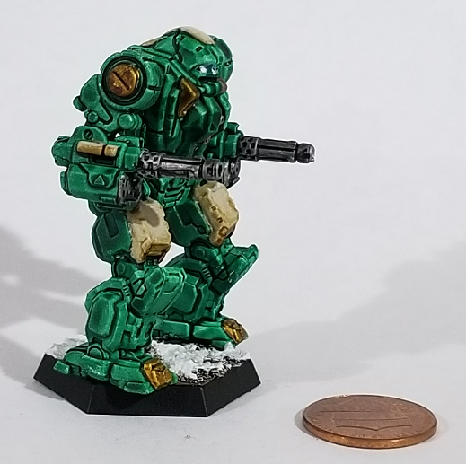
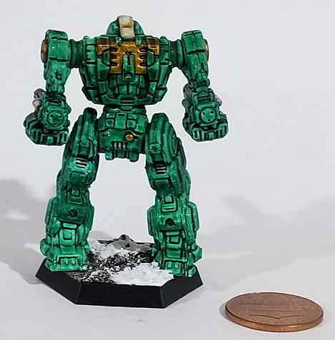
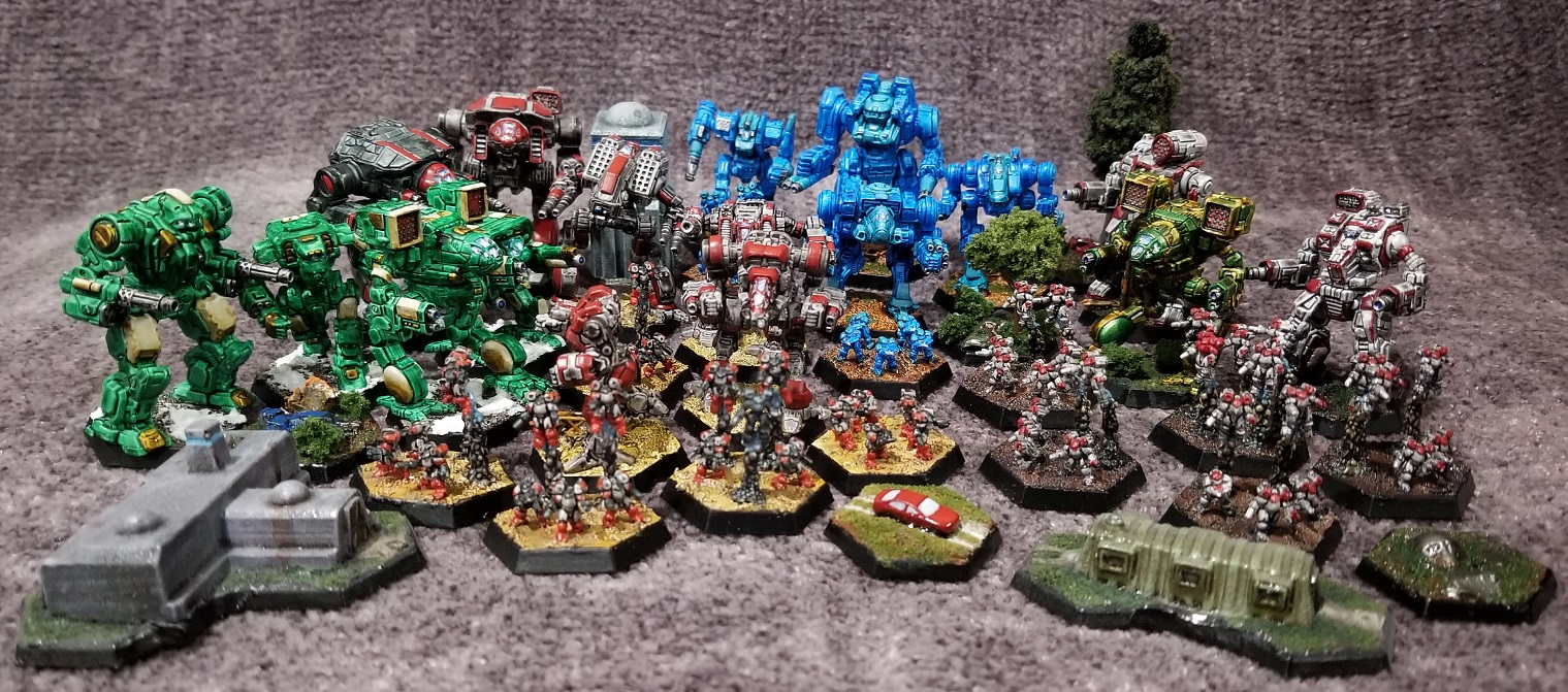
One last BattleMech cross post, because I finished the last of the Wave 1 Clan 'Mechs.PoptartsNinja posted:Adder:
|
|
#
?
Feb 7, 2021 04:44
|
|


|
Do you guys have any suggestions on black paints with a glossy finish? I know you can apply varnish afterward to change this but I've been trying to mess with finishes and textures to imply materials. So like something that's metal should be glossy, something that's cloth should be matte, so on an so forth along with textures from techniques like cross hatching and stippling. So far all I currently have is vallejo black (matte) and P3 thrallmar (middle) so I'm curious what else I can add to my toolbox.
|
|
#
?
Feb 7, 2021 04:58
|
|

|
Spanish Manlove posted:Do you guys have any suggestions on black paints with a glossy finish? I know you can apply varnish afterward to change this but I've been trying to mess with finishes and textures to imply materials. So like something that's metal should be glossy, something that's cloth should be matte, so on an so forth along with textures from techniques like cross hatching and stippling. Have you tried acrylic inks? I use liquitex carbon black ink through an airbrush to lay down zenithal shadows and it definitely has a a satin-y finish. Definitely shinier than regular paint but not as extreme as a coat of gloss varnish. Incidentally inks are really good for replicating satin / silk / skin textures. edit: you could also probably get a similar effect with a more controlled level of shine by mixing satin / gloss medium directly into your paints. Would probably take some experimenting to get it exactly where you want it though. Grizzled Patriarch fucked around with this message at 05:18 on Feb 7, 2021 |
|
#
?
Feb 7, 2021 05:15
|
|


|
Gloss medium + black ink will get you gloss for days, sometimes too glossy. Not a terrible idea to hit up an art store and grab some Liquitex Matte and Gloss mediums.
|
|
#
?
Feb 7, 2021 05:57
|
|
|
Eej posted:Gloss medium + black ink will get you gloss for days, sometimes too glossy. Not a terrible idea to hit up an art store and grab some Liquitex Matte and Gloss mediums. Doing this was a great idea. Now I have an unlimited supply of glazes and washes that I can make from any of my paints
|
|
#
?
Feb 7, 2021 06:02
|
|


|
drat, I just went to michaels today and got some inks (they were on sale) and flow aid to make washes, along with some cheap brushes for doing lazy basecoats. If I had known about it I totally would have got some gloss medium while I was there. Thanks guys, I'll give that a shot in the future.
|
|
#
?
Feb 7, 2021 07:59
|
|
|
Thanks for the airbrush advice everyone!Communist Walrus posted:The best practice surface for airbrushing is a van from the 70s or 80s, which history and countless issues of Vantasm magazine have shown to be the ideal canvas for painting wizards and dragons 
|
|
#
?
Feb 7, 2021 09:03
|
|

|
So I got my Primaris Eliminators and they turned out to be quite a learning experience. The paint layer on the power armour turned out pretty thick in some places since I actually changed my plans for the colour scheme mid-paintjob. That'll teach me to think those through before starting. I was also using a wet palette for first time, which was good, since the colour of the cloak was a mix of different paints and I needed it to last a while. I know it doesn't make sense since they're wearing armour, but I wanted the cloaks to be more like a rain poncho than some cool sniper cloak. I kind of like the result, at least compared to the chunky paint on the power armour.      Stuff to pay attention to for next time: - Paint consistency, had a lot of streaking and poor coverage on some paint this time, which then probably led to over compensating and too thick subsequent layers. - Plan ahead, ran into a lot of weird issues that I could have avoided. Ultimately I'm painting these for the fun of painting so I don't really gain anything from getting models that turn out to be a bit finicky for a beginner like me (whatever ability to paint I retained from the early 2000's basically makes no difference at this point). Next up I think I'm getting some of these boyz:  Should help with practice on coverage of larger surfaces, and they are more straightforward than most models.
|
|
#
?
Feb 7, 2021 14:07
|
|

|
Finished up the skull altar - this was a ton of fun   
|
|
#
?
Feb 7, 2021 16:52
|
|

|
Painted a horrid worm! Ugh.
|
|
#
?
Feb 7, 2021 18:57
|
|


|
HopperUK posted:Painted a horrid worm! Ugh. You should get that checked by a doctor.
|
|
#
?
Feb 7, 2021 19:26
|
|

|
Harvey Mantaco posted:You should get that checked by a doctor. I would but the only hospital that takes my plan is Miskatonic Medical School
|
|
#
?
Feb 7, 2021 19:31
|
|
|
So I'm starting to prime some of the resin mini's I've printed but having a hell of a time getting started painting them. The OP Reaper tutorial is 404'ing so any good articles or videos to watch for idiots first painting?
|
|
#
?
Feb 8, 2021 02:02
|
|
|
Moochewmoo posted:So I'm starting to prime some of the resin mini's I've printed but having a hell of a time getting started painting them. The OP Reaper tutorial is 404'ing so any good articles or videos to watch for idiots first painting? https://www.youtube.com/watch?v=v-BlVYFxfRA
|
|
#
?
Feb 8, 2021 02:57
|
|
|
NUMBER 1 FULCI FAN posted:Finished up the skull altar - this was a ton of fun What did you use for the metal trim? From the photos, it looks like copper. I ask because I keep thinking about painting Khorne Berserkers, and I don't know if you use brass or copper for the trim.
|
|
#
?
Feb 8, 2021 05:18
|
|
|
Max Wilco posted:What did you use for the metal trim? From the photos, it looks like copper. I use Balthazar Gold for all my Khorne metal stuff. It's a very reddish gold color that comes off more coppery than bronzey. Especially after an Agrax wash and a Runefang Steel edge highlight.
|
|
#
?
Feb 8, 2021 06:29
|
|
|
Max Wilco posted:What did you use for the metal trim? From the photos, it looks like copper. I put Fulgurite Copper over Balthazar Gold with a silver highlight for these guys, makes for a decent brass (Fulgurite Copper is a really misleading name) 
|
|
#
?
Feb 8, 2021 07:38
|
|
|
The "official" World Eater scheme is red with brass trim, but personally I always thought the GW version looked kinda bright and cartoony (the awful old berserker sculpts don't help). Copper + a darker red looks really nice together, especially if you get a little bit of verdigris around the rivets for some sweet color theory magic.
|
|
#
?
Feb 8, 2021 08:05
|
|
|
Finally got around to the Wolf Priest on bike. I have to say, doing weathering/wear without drybrushing or sponging is tricky and I don't like it. I like the organic randomness you can get from those a lot more, also that they're pretty fast. I am proud of how the extra little bits make this guy look more like a wolf priest than a chaplain with a wolf on his shoulder.  
|
|
#
?
Feb 8, 2021 14:38
|
|
|
I posted a few pages back seeking advice on yellow. I chose to go with GW contrast over a white primer, and this is how it turned out: I really liked using the contrast paint, it spread so easily. Can definitely see using more of them in the future.
|
|
#
?
Feb 8, 2021 14:51
|
|

|
Pb and Jellyfish posted:I posted a few pages back seeking advice on yellow. I chose to go with GW contrast over a white primer, and this is how it turned out: The faces on these look really good!
|
|
#
?
Feb 8, 2021 15:53
|
|
|
Pb and Jellyfish posted:I posted a few pages back seeking advice on yellow. I chose to go with GW contrast over a white primer, and this is how it turned out: Iyanden yellow is great especially when you put two coats! I def recommend trying it out, I think it comes out much richer after a second coat. Here is a picture comparing the two. On the left I've applied one coat of Iyanden Yellow, on the right I've applied two coats. Both are over Wraithbone. 
Verisimilidude fucked around with this message at 16:21 on Feb 8, 2021 |
|
#
?
Feb 8, 2021 16:16
|
|
|
I painted up this gnome last night and it's by far and away the very best face I've ever painted. 
|
|
#
?
Feb 8, 2021 18:44
|
|

|
Zuul the Cat posted:I painted up this gnome last night and it's by far and away the very best face I've ever painted. That is gorgeous. I love the deep shading on the face, gives him lots of character. And the gradient in the lit parts of the lantern!
|
|
#
?
Feb 8, 2021 19:00
|
|
|
Kabuki Shipoopi posted:I got you homie. Unless you're looking for one that they don't have. Ordering some Vallejo Metal Colors from here! Wish my local store carried this stuff.
|
|
#
?
Feb 8, 2021 21:29
|
|
|
Finished a pair of Reaper Vulture Demons, and a 3D printed Vrock.  The Vrock was pretty Tzeentchian, so I decided completely unnatural colors were the way to go, with Talassar Blue over Stormhost for the wings, and a drybrush of FolkArt's color shift paints over everything to make him catch the light in strange and unnatural ways.
|
|
#
?
Feb 8, 2021 21:55
|
|
|
Verisimilidude posted:Ordering some Vallejo Metal Colors from here! Wish my local store carried this stuff. I got to visit this store yesterday. They are very cool and good and deserve your money. I bought a bunch of Scale75 stuff and am extremely happy with their metallics in particular.
|
|
#
?
Feb 8, 2021 22:23
|
|
|
Fyrbrand posted:I got to visit this store yesterday. They are very cool and good and deserve your money. I bought a bunch of Scale75 stuff and am extremely happy with their metallics in particular. I just placed an order with them over the weekend. The order might take forever because of stocking issues, but they at least let me order the paints I want and I can be patient.
|
|
#
?
Feb 9, 2021 01:33
|
|


|
Winklebottom posted:I put Fulgurite Copper over Balthazar Gold with a silver highlight for these guys, makes for a decent brass (Fulgurite Copper is a really misleading name) Balthazar Gold is also meant to be a bronze color, I think. GW's color naming scheme gets really confusing after a while. Grizzled Patriarch posted:The "official" World Eater scheme is red with brass trim, but personally I always thought the GW version looked kinda bright and cartoony (the awful old berserker sculpts don't help). Copper + a darker red looks really nice together, especially if you get a little bit of verdigris around the rivets for some sweet color theory magic. Well, I ordered the Vallejo Metal Color Copper, so I could use that. I dunno, though; it seems like brass would give more a of contrast between the armor panels and the trim (since copper is a reddish color on its own). Could just be that I prefer the more bright, cartoony look. Using a darker red also hits on an issue I've asked about before, where I don't know what red you use for World Eaters. I'd have thought Khorne Red/Flesh Tearers Red (which is a dark red), but they seem to be more of a bright red. Word Bearers (which I've also wanted to paint) seem to be a darker red (with a silver trim). Are the Khorne Berserker sculpts really that bad? I remember from some other site where they complained about it, but I don't really get what the issue is.  I guess maybe the un-helmeted face is kind of off, and some of the details are a little simple compare to stuff nowadays. Maybe there's some other issue I'm not aware of?
|
|
#
?
Feb 9, 2021 05:32
|
|
|
Max Wilco posted:Balthazar Gold is also meant to be a bronze color, I think. GW's color naming scheme gets really confusing after a while. Bad sculpts is often a matter of taste (barring technical issues like soft details, models which cant actually balance, that kind of thing). If you like the sculpt, then the sculpt is fine. Having said that, I'm looking at that picture, and I can see why someone wouldnt like the sculpt. They're probably fine in a unit as part of a massed army, but individually.... I'm assuming they are multi pose kits, and the reason I'm assuming that is that half of them have their arms sticking straight out from their torso at 90 degrees like a toddler playing truck driver. The beaky space marine kits we had in the early 90s had better variety in natural looking arm positions. The running poses are... Well the one with the left leg down is fine (although because of the stiff arm poses not terribly dynamic). The one with the right leg down and the left leg back looks like they are ballet dancing. Particularly the guy in the second row where they've turned his head slightly to the left. Also, some of the poses are obviously constrained by the nature of the model; Between the bulky shoulder pads, sweeping... vent things whatever they are supposed to be on the chaosmarine back pack and the giant fins on either side of the berzerker helmets, there are some combinations of head position and arm position that you probably just cant do. And some of these lads are in danger of chainswording their own head fins, which from an aerodynamic point of view might not be a terrible idea. To me the actual technical quality of the sculpts looks fine (the details are nice enough for a multipose plastic kit, there is a variety of different fiddly bits to give some visual interest) but the posing is crap. I'm sure a lot of it can be fixed by being careful which arms go on which legs, maybe a few minor changes like cutting an arm so you can change the angle (the cut could easily be hidden under the shoulder pad if those are separate bits) or carefully cutting the extended back leg at the hip and rotating it into a more natural and less unbalanced position. Plus swapping some bits out for stuff from your bits box, changing the odd arm into a tentacle, putting a rock or a skull under a foot, that sort of thing. tldr: If you like a figure the sculpt is fine, god knows I've liked my share of models that others didnt. In this case the kit appears to have all the weaknesses that a multi pose kit can have, in an attempt to make all limbs, torsos and heads completely interchangable none of the constructed models have any sense of dynamism. But I assume this is a GW picture, and they cant, in their picture showing customers exactly whats in the kit, bring in a bunch of other bits or manually change the angles of limbs with a razor saw and some greenstuff, whereas you can.
|
|
#
?
Feb 9, 2021 10:22
|
|


|
Also they're all wearing leather gloves for some reason
|
|
#
?
Feb 9, 2021 12:11
|
|


|
Gravitas Shortfall posted:Also they're all wearing leather gloves for some reason A good point I didnt even notice! Do you think they are wearing them instead of their power armour gauntlets, or over the top of them?
|
|
#
?
Feb 9, 2021 12:17
|
|
|
SiKboy posted:A good point I didnt even notice! Do you think they are wearing them instead of their power armour gauntlets, or over the top of them? So initially I thought that the Berserkers were re-using the sculpts from the original hybrid metal/plastic Chaos Marine kit:  That might still be true, but they would have had to make new casts of the old models (since the sprue layouts are entirely different) which I can't see them doing. More likely is that the sculptor was inspired by the old set, without referencing the original Berserker concept art. 
|
|
#
?
Feb 9, 2021 12:40
|
|
|
I don't mind the berserker kit all that much, but I also have a soft spot for a ton of older sculpts. They're a fair bit dated now, but aren't nearly the worst example of it. I feel like for most people, the issue is probably that modern CSM and Marine sculpts are so much better, that they stand out especially badly.
|
|
#
?
Feb 9, 2021 12:58
|
|

|

|
| # ? May 9, 2024 02:48 |
|
|
Has anyone cracked the recipe for a not-$10-for-0.6-ounces of Citadel's Contrast Medium? I have tried both Liquitex Glazing Medium and Matte Medium, and both come out far too think. I've been using Liquitex Airbrush Medium to try to thin it down, but it just doesn't seem the same.
|
|
#
?
Feb 9, 2021 15:15
|
|