


|
From Deadpool Black, White, & Blood #1: James Stokoe drawing a man/bear hybrid driving a giant tank? Yes please.
|
 #
?
Aug 11, 2021 17:56
#
?
Aug 11, 2021 17:56
|
|

|

|
| # ? May 13, 2024 07:04 |
|
|
Stokoe�s doing interiors on a marvel book?
|
|
#
?
Aug 11, 2021 18:08
|
|
|
it was only like 12 pages for a mini story
|
|
#
?
Aug 11, 2021 18:19
|
|

|
I don't have time just now to dig out images, but you might want to search for The Heroes Union, which is dropping from Binge Comics this month. Layouts by Ron Frenz, inking and finishing by Sal loving Buscema.
|
|
#
?
Aug 11, 2021 19:09
|
|


|
Chinston Wurchill posted:From Deadpool Black, White, & Blood #1: Not just ANY man-bear hybrid. Noted butthead separatist Ursa Major... 
|
|
#
?
Aug 11, 2021 21:53
|
|
|
Is that a Pouch Tank?
|
|
#
?
Aug 11, 2021 23:28
|
|

|
Jedit posted:I don't have time just now to dig out images, but you might want to search for The Heroes Union, which is dropping from Binge Comics this month. Layouts by Ron Frenz, inking and finishing by Sal loving Buscema. I own a couple of pages inked by Sal, they're lovely.  
|
|
#
?
Aug 12, 2021 00:20
|
|
|
ruddiger posted:Stokoe�s doing interiors on a marvel book? He also did the main story in one of the Heroes Reborn issues recently where Rocket Raccoon fights Doctor Spectrum in space. Then there was that Secret Wars tie in where he did a short story where alt universe Juggernaut and Silver Surfer fight, and there�s a rather terrifying looking Galactus. I think there was Moon Knight story over the last couple years as well. That Deadpool special had some great art. Noto and Stokoe.
|
|
#
?
Aug 12, 2021 00:34
|
|


|
I found an interior page from The Heroes Union, which dropped last week as it turns out:
|
|
#
?
Aug 12, 2021 00:51
|
|
|
BiggerBoat posted:^^^alcohol^^^ I don't have quite as much to say but I'll agree with all of your points in general. I've said a bunch in this thread how Sienkiewicz is such a goddamn master that it almost pisses me off how he can illustrate a graphic novel or comic or series of portraits with seemingly 20 different styles, but he still makes everything beautiful and cohesive. His psychedelic experimental stuff looks as awesome as one of the luminescent portraits he does on social media. And it can't be stated enough how you need to know the fundamentals before pulling off that kind of stylization. Walk before you run, and all those other cliches. I used to be a game art/modeling/illustration instructor at a local 2-year college and as such, a lot of my students were into manga/anime, which I hated. I'm not going to go into any anti-manga rant, it has plenty of merit and is an enormous art form in its own right, it's just not for me. I mainly disliked how they'd try to turn drawing or digital sculpting exercises into some cutesy anime caricature (as in, don't put a kawaii face on a figure drawing of an in-class model). I just tried to impart to them that all of the manga artists that they were inspired by learned fundamentals and could do representational art before they got into stylization, otherwise it looks like the dreadful DeviantArt poo poo being done by 10-year-olds or something.
|
|
#
?
Aug 14, 2021 20:16
|
|

|
 
|
|
#
?
Aug 15, 2021 15:39
|
|
|
 and that�s kid�s back again! Wtf? and that�s kid�s back again! Wtf?
|
|
#
?
Aug 15, 2021 15:40
|
|
|
This rules.
|
|
#
?
Aug 15, 2021 15:44
|
|

|
Yeah don�t know what OP�s feelings on that art is but imo it�s all great-to-serviceable
|
|
#
?
Aug 15, 2021 16:04
|
|
|
That kid (Elsie Dee) is a recurring supporting character in Larry Hama's Wolverine for at least a year or three.
|
|
#
?
Aug 15, 2021 16:04
|
|
|
Is he attached to the Stealth Express of Doom by his nipple?
|
|
#
?
Aug 15, 2021 16:05
|
|

|
 Nice flares you goon. Nice flares you goon.
|
|
#
?
Aug 15, 2021 16:10
|
|
|
There oughta be a law preventing 90s Wolfsbane and Feral from appearing in the same panel.
|
|
#
?
Aug 15, 2021 16:38
|
|

|
Strong Guy always looks like an oversized baby to me. I have to assume that's completely intentional.
|
|
#
?
Aug 15, 2021 16:47
|
|

|
Rotten Red Rod posted:Strong Guy always looks like an oversized baby to me. I have to assume that's completely intentional. I know a dude IRL who is proportioned like a baby but he's also 6'4" so it's like, extremely weird.
|
|
#
?
Aug 15, 2021 16:52
|
|

|
Brazilianpeanutwar posted:
Is this bad art because of period-appropriate pant legs?
|
|
#
?
Aug 15, 2021 17:14
|
|


|
Conrad_Birdie posted:Yeah don�t know what OP�s feelings on that art is but imo it�s all great-to-serviceable You can keep it.
|
|
#
?
Aug 15, 2021 17:24
|
|
|
Lobok posted:Is this bad art because of period-appropriate pant legs? Yes.
|
|
#
?
Aug 15, 2021 18:19
|
|
|
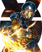
My favorite thing in that X-Force picture is how there's a dimension issue on Wolverine's claws that makes it look like they don't extend out at all, and in fact he doesn't have claws, just white knuckle fins.
|
|
#
?
Aug 15, 2021 19:15
|
|
|
The Canuck'll knuckle ya.
|
|
#
?
Aug 15, 2021 19:17
|
|
|
theironjef posted:My favorite thing in that X-Force picture is how there's a dimension issue on Wolverine's claws that makes it look like they don't extend out at all, and in fact he doesn't have claws, just white knuckle fins. The whole drawing is poo poo and gets shittier the more one looks at it. It's better than Liefeld but is "Liefeldian" in the way that it's emblematic of the Marvel House Style the company mandated everyone adapt in the wake of his sales and popularity. Within that framework of criticism, it's...OK...but so much of that 90's EXTREME style is just noise on a page to me. There's no pacing to that style either; nothing that gives it any contrast to work off of. Everything is either a posed cover or a splash page. I mean, sure, there's definitely a sense of action to a lot of it that's hard to deny but that's about all I can say for it. Except EVERY PAAAGGGGEEEE doesn't need to be action oriented. Especially since you can't really follow probably 75% of said action. Two seated characters discussing plot points and maguffins over coffee in a secret headquarters with security screens on the walls don't need to be gritting their teeth, posing with long flowing pony tails, hot red eye lasers and cradling weird looking guns or swords. It's the whole "there's no light without dark" or "no noise without silence" thing that illustrators and film makers learn early on in art school. 90's comic book art is like the film Battlefield Earth where every scene uses dutch angles and lens wipes for transitions. If your whole movie is like that, then none of that poo poo achieves anything. In fact, it makes things worse.
|
|
#
?
Aug 15, 2021 20:07
|
|
|
That specific issue of X-Force has a page where Greg Capullo draws Cable loading up on weapons that is quite amazing. It definitely takes Liefeldian to the extreme.
|
|
#
?
Aug 15, 2021 21:38
|
|

|
Why are you comparing Capullo to Liefeld when he's basically McFarlane 2.0?
|
|
#
?
Aug 15, 2021 23:08
|
|


|
What's up with melty face Wolvy on top? I distinctly remember having a toy of him but I don't think I've ever seen a comic featuring him until this very picture.
|
|
#
?
Aug 15, 2021 23:55
|
|

|
He is Albert, a Wolverine robot built to kill the original.
|
|
#
?
Aug 15, 2021 23:57
|
|


|
goatface posted:He is Albert, a Wolverine robot built to kill the original. Of all the responses I could have gotten, I never thought 'He is Albert' would be one of them.
|
|
#
?
Aug 16, 2021 00:14
|
|
|
I'm not 100% sure it's true. f.e. - No, it is: https://marvel.fandom.com/wiki/Wolverine_Vol_2_40
|
|
#
?
Aug 16, 2021 00:21
|
|
|
Brazilianpeanutwar posted:
Larry Stroman is a pro follow on Facebook. He posts some awesome stuff. 
|
|
#
?
Aug 16, 2021 01:16
|
|

|
Bill Sienkiewicz is a good one too. He draws lots of celebrities or fellow creators after they pass which is neat, but also will post con sketches and stuff.
|
|
#
?
Aug 16, 2021 13:24
|
|


|
Codependent Poster posted:Why are you comparing Capullo to Liefeld when he's basically McFarlane 2.0? Which makes it even more hilarious that right after Marvel hired him to be McFarlane 2.0, McFarlane poached him to draw Spawn.
|
|
#
?
Aug 17, 2021 13:34
|
|
|
Obviously most artists' styles change a hell of a lot over, like 20-30 years, but modern Silvestri looks so different from back then. I don't know the story behind these covers, they look like they're pencils before inks, but his shading style now reminds me more of Bernie Wrightson's Frankenstein penwork.
|
|
#
?
Aug 17, 2021 21:19
|
|
|
Zoben posted:Obviously most artists' styles change a hell of a lot over, like 20-30 years, but modern Silvestri looks so different from back then. I don't know the story behind these covers, they look like they're pencils before inks, but his shading style now reminds me more of Bernie Wrightson's Frankenstein penwork. That cover kicks rear end I chalk it up to The Marvel House Style where they mandated that everyone try to ape Liefeld and McFarlane. Herb Trimpe, for example, was never that great to begin with IMO but good lord was his poo poo just god awful in the 90's . I think he said in an interview somewhere that he was basically forced to draw that way and didn't care for it but found it really easy.
|
|
#
?
Aug 17, 2021 23:43
|
|
|
One of his kids recently said that was a rumor and Trimpe simply updated his style on his own because marvel literally just stopped calling him for work. E: if you haven�t read Trimpe�s diary entries written at the time of his marvel firing, it�s loving heartbreaking. https://archive.nytimes.com/www.nytimes.com/library/national/010900edlife-56-edu.html?hc_location=ufi ruddiger fucked around with this message at 00:35 on Aug 18, 2021 |
|
#
?
Aug 18, 2021 00:32
|
|
|
it's a still from an anime but nevertheless https://twitter.com/Speed_Stat/status/1427431063891189764
|
|
#
?
Aug 18, 2021 00:43
|
|

|
|
| # ? May 13, 2024 07:04 |
|
|
ruddiger posted:One of his kids recently said that was a rumor and Trimpe simply updated his style on his own because marvel literally just stopped calling him for work. Jesus Christ.
|
|
#
?
Aug 18, 2021 00:45
|
|