|
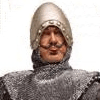
Wolverine really overcompensating for that time he didn't have a nose. (A vs. X #2)  UGHK
|
 #
?
Jan 30, 2023 04:39
#
?
Jan 30, 2023 04:39
|
|

|

|
| # ? May 22, 2024 13:43 |
|
|
That�s not a nose, that�s a beak
|
|
#
?
Jan 30, 2023 04:48
|
|
|
Wolverines have snouts. His finally came in.
|
|
#
?
Jan 30, 2023 05:43
|
|


|
I'm the best at what I do, and what I do is SQUARRK
|
|
#
?
Jan 31, 2023 00:09
|
|
|
 The Fury of Firestorm, The Nuclear Man #9 (1983) Pencils: Jerome Moore Inks: Rodin Rodriguez Colors: Tom Ziuko  Silent Hill: Sinner's Reward #1 (2008) Artist: Steph Stamb  Bodycount #4 (1996) Pencils & Inks: Simon Bisley Colors: Steve Lavigne Computer Colors: Altered Earth Arts  Ultimate Marvel Team-Up #7 (2001) Pencils & Inks: Bill Sienkiewicz Colors: June Chung   Strange Tales #156 (1967) Pencils, Inks, & Colors: Jim Steranko  The Horror Show #1 (2005) Pencils: Mark Kidwell Inks: Mojo Colors: Mike Kelleher  Captain Atom #79 (1966) Pencils: Steve Ditko Inks: Rocco "Rocke" Mastroserio Colors: ?  Fantastic Four #129 (1972) Pencils: John Buscema Inks: Joe Sinnott Colors: ?  Spider-Man: Web of Doom #3 (1994) Pencils: Anthony Williams Inks: Sam de la Rosa Colors: Bob Sharen and Joe Andreani  Monster Menace #1 (1993; reprints) Pencils: Jack Kirby Inks: Dick Ayers Colors: ?
|
|
#
?
Jan 31, 2023 00:59
|
|


|
Liam Sharpe's Hulk is ridiculous and I love it.  
|
|
#
?
Feb 1, 2023 18:27
|
|
|
When I think of Superman, this is what pops in my head. https://twitter.com/travischarest/status/1620997752393170944?s=46&t=3RyERtfvkb93Y9aK-T3o2Q
|
|
#
?
Feb 3, 2023 16:22
|
|
|
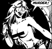
The eyes of of a killer.
|
|
#
?
Feb 3, 2023 16:34
|
|

|
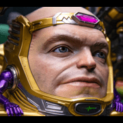
Is it how the picture displays on my phone, or does the blue of that costume have barely any detail or definition. It seems really out of pace with the extremely detailed face. Like he is from a movie where they green screened out his suit and replaced it was a Roger Rabbit cartoon body but kept the human head and hands.
|
|
#
?
Feb 3, 2023 16:39
|
|


|
Yes, it's weird. Detail worthy of a Ren & Stimpy close-up for his head and hands, 2-dimensional MSPaint Fill tool for the suit.
|
|
#
?
Feb 3, 2023 16:42
|
|
|
I assume they took an existing picture and slapped a simplified costume over the top.
|
|
#
?
Feb 3, 2023 16:43
|
|


|
It even looks like it's not quite opaque. The top of the thighs and the left arm both seem to have the ghost of detail underneath.
|
|
#
?
Feb 3, 2023 16:50
|
|
|
Y�all are hard to please
|
|
#
?
Feb 3, 2023 17:00
|
|
|
Joe Fisto posted:Y’all are hard to please No but I am easy to disappoint.
|
|
#
?
Feb 3, 2023 17:03
|
|
|
Lobok posted:No but I am easy to disappoint. That�s what my dad used to say to me all the time
|
|
#
?
Feb 3, 2023 17:18
|
|
|
I like it, it looks like a decent fitting costume but not the "tight to the point it drat near looks like body paint" look like some artists draw superhero costumes
|
|
#
?
Feb 3, 2023 17:23
|
|

|
It needs shading to really bring out the volume of those trunks.
|
|
#
?
Feb 3, 2023 17:25
|
|
|
goatface posted:It needs shading to really bring out the volume of those trunks. Yeah. It either needs more detail on the costume or less detail on the face, as-is I can't help but think it looks a little unfinished. Conceptually though I think it's not bad, just needs a bit of extra polish.
|
|
#
?
Feb 3, 2023 20:38
|
|
|
catlord posted:Yeah. It either needs more detail on the costume or less detail on the face, as-is I can't help but think it looks a little unfinished. Conceptually though I think it's not bad, just needs a bit of extra polish. Yeah, I like the basic concept, a pushback against the insanely-jacked Superman. (Why wouldn't he have the body closer to a 50s strongman, just with a little less fatty tissue thanks to better dietary understanding, or maybe Christopher Reeves? It's not like he's got a lot of opportunities to work his neck muscles unless he's got some really weird gym equipment in the Fortress of Solitude; I see him working mostly larger muscle groups through exercising his powers in the line of duty.)
|
|
#
?
Feb 3, 2023 20:51
|
|


|
Honestly I love it, I think it's a great way to emphasize the iconic nature of the suit itself instead of the physique of whoever's wearing it while still having him feel like a real person. It'd be a hard sell for a comic or something but as a single piece, fantastic.
|
|
#
?
Feb 4, 2023 04:26
|
|


|
Admiralty Flag posted:Yeah, I like the basic concept, a pushback against the insanely-jacked Superman. (Why wouldn't he have the body closer to a 50s strongman, just with a little less fatty tissue thanks to better dietary understanding, or maybe Christopher Reeves? It's not like he's got a lot of opportunities to work his neck muscles unless he's got some really weird gym equipment in the Fortress of Solitude; I see him working mostly larger muscle groups through exercising his powers in the line of duty.) I mean, logically he should either be skinny as poo poo, or kinda chubby depending on how Kryptonian metabolisms work in regards to burning calories while resting. You build muscle by pushing muscles to their physical limit and they rebuild themselves larger, something he never did for the first 2 decades of his life and still barely ever does now. But trying to apply logic to the physiology of Superman is a fools errand.
|
|
#
?
Feb 4, 2023 08:38
|
|
|
Skwirl posted:I mean, logically he should either be skinny as poo poo, or kinda chubby depending on how Kryptonian metabolisms work in regards to burning calories while resting. You build muscle by pushing muscles to their physical limit and they rebuild themselves larger, something he never did for the first 2 decades of his life and still barely ever does now. But trying to apply logic to the physiology of Superman is a fools errand. Turns out powered up kryptonians dont do atrophy
|
|
#
?
Feb 4, 2023 09:02
|
|


|
Skwirl posted:I mean, logically he should either be skinny as poo poo, or kinda chubby depending on how Kryptonian metabolisms work in regards to burning calories while resting. You build muscle by pushing muscles to their physical limit and they rebuild themselves larger, something he never did for the first 2 decades of his life and still barely ever does now. But trying to apply logic to the physiology of Superman is a fools errand. I really like the way Alex Ross depicts him
|
|
#
?
Feb 4, 2023 13:33
|
|

|
https://twitter.com/HeGotGronch/status/1622054469730181120
|
|
#
?
Feb 5, 2023 07:35
|
|

|
How long does it take Stokoe to draw this poo poo?
|
|
#
?
Feb 5, 2023 09:01
|
|
|
his twitter is great, check him out https://twitter.com/HeGotGronch/status/1613745354146734086 the embedded image is a lot larger than what it's scaled and cropped to be at first glance
|
|
#
?
Feb 5, 2023 09:18
|
|
|
Jared Muralt by way of Terry Moore (who also has a good twitter game): https://twitter.com/TerryMooreArt/status/1622077857546608640 https://twitter.com/JaredMuralt/status/1583123698437193728 https://twitter.com/JaredMuralt/status/1582335743883890688 https://twitter.com/JaredMuralt/status/1573580652338974720 https://twitter.com/JaredMuralt/status/1544953524257177601
|
|
#
?
Feb 5, 2023 09:32
|
|
|
Flesh Forge posted:Jared Muralt by way of Terry Moore (who also has a good twitter game): I really like the coloring on these
|
|
#
?
Feb 5, 2023 13:15
|
|
|
Is it just me, or is this a really awkward panel layout? (Black Cat mini #4, Javier Pulido)
|
|
#
?
Feb 9, 2023 07:55
|
|
|
that looks so weird must be deliberate for some reason?
|
|
#
?
Feb 9, 2023 08:14
|
|


|
It's breaking the 180 degree rule, which can be broken deliberately to create confusion or unease. I don't feel like that's what's happening here. https://en.wikipedia.org/wiki/180-degree_rule edit: Looking at it again, what breaks me is how her arms in the second panel follow from her shoulders in the first panel, but her hands in the first panel also follow from her shoulders if her arms were visible. CannonFodder fucked around with this message at 19:11 on Feb 9, 2023 |
|
#
?
Feb 9, 2023 19:02
|
|


|
Also, her face is just one flat surface with nose and mouth and whatnot painted on. Very Picasso.
|
|
#
?
Feb 9, 2023 20:07
|
|
|
It's bad art gents. Take no pleasure in saying that. 
|
|
#
?
Feb 9, 2023 21:35
|
|


|
First panel's decent av material, tho.
|
|
#
?
Feb 10, 2023 02:51
|
|
|
No, I wouldn't call it bad art. The face itself is Javier Pulido, and his style can work for you or not. The top and bottom panel are clearly separate but line up, to help clarify that the head in the top panel belongs to the body in the bottom panel, even though the angle is different. I think he's trying to keep the association clear because there are 2 black cats in that issue? It's not a great set if you focus on it, but I can see it helping to keep things clear if you're reading through.
|
|
#
?
Feb 10, 2023 02:53
|
|
|
StumblyWumbly posted:. I think he's trying to keep the association clear because there are 2 black cats in that issue?
|
|
#
?
Feb 10, 2023 02:55
|
|
|
 Doorway to Nightmare #4 (1978) Pencils & Inks: Johnny Craig Colors: Adrienne Roy  Ghost Manor #58 (1981; reprints) Pencils & Inks: Enrique Nieto Colors: ?   Ghost Rider #77 (1983) Pencils: Bob Budiansky Inks: Kevin Dzuban Colors: Andy Yanchus  Daredevil / Black Widow: Abattoir (1993) Pencils, Inks, and Colors: Joe Chiodo  Annex #2 (1994) Pencils: Paris Karounos Inks: Matt Banning, Yancey Labat, Rodney Ramos, and Vin Evans (across the whole issue; no idea about this specific panel) Colors: Chia-Chi Wang  Monster Menace #3 (1994) Pencils, Inks, and Colors: Steve Ditko  Green Lantern & Sentinel: Heart of Darkness #1 (1998) Pencils: Paul Pelletier Inks: Dan Davis Colors: Jason Wright   Spider-Man & Wolverine #2 (2003) Pencils & Inks: Vatche Mavlian Colors: Paul Mounts  Spider-Man & Wolverine #3 (2003) Pencils & Inks: Vatche Mavlian Colors: Paul Mounts  Spider-Man & Wolverine #4 (2003) Pencils & Inks: Vatche Mavlian Colors: Paul Mounts  Punisher War Journal #19 (2008) Pencils & Inks: Howard Chaykin Colors: Edgar Delgado; Jesus Aburtov And a bonus panel from a Daisy air rifle ad. 
|
|
#
?
Feb 12, 2023 01:03
|
|
|
Darthemed posted:
I didn't know Ghost Rider was a member of Harlem Heat.
|
|
#
?
Feb 12, 2023 01:30
|
|

|
Darthemed posted:
Imagine how strong you�d have to be that you could lift and drag a manhole cover with shoes on.
|
|
#
?
Feb 12, 2023 14:52
|
|
|

|
| # ? May 22, 2024 13:43 |
|
|
never skip toe day
|
|
#
?
Feb 12, 2023 16:24
|
|