


|
Wide or long landscapes aren't better or worse, but wide is vastly overdone because that's the lenses almost everyone has. Even with high end glass, wide angle is a lot cheaper. I do agree wide is a lot harder to fill the frame correctly with. Wide generally gives a better sense of scale when done well, and can feel more visceral since it is closer to our natural FOV. Shooting long on landscapes does give you an entirely new perspective, since it is so different than what our eyes see. It lets you easily isolate your subjects and draw focus a lot more directly too. The results generally stand out more in the crowded field of wide shots. theHUNGERian posted:28 mm: I tend to like landscape shots like this the most though, where you could tell me it was taken at 24mm or 200mm and both seem plausible. Too often the ultra-wide shots are more about the extreme angle than the content, and super long (400+) looks too compressed.
|
 #
?
Dec 3, 2023 22:15
#
?
Dec 3, 2023 22:15
|
|


|

|
| # ? May 16, 2024 11:14 |
|
|
 313A1449 by Austin DeGroot, on Flickr 313A1449 by Austin DeGroot, on Flickr
|
|
#
?
Dec 3, 2023 22:40
|
|

|
Long vs wide, it comes down to whether the image is a copy of something people have seen a million times or not. A stereotypical couples picture with the Eiffel tower in the background taken with a long lens (fancy camera)? Yawn. Earth rise viewed by a human for the first time from the moon taken with a Holga? gently caress yeah!
|
|
#
?
Dec 3, 2023 23:06
|
|

|
theHUNGERian posted:Gonna have to disagree. The shorter focal lengths just require you to zoom with your feet and be an active participant. goddamn, I also prefer around 50mm but there's no arguing with those results El Laucha posted:I've been trying to get back to taking photos big fan of these also! field balm fucked around with this message at 03:19 on Dec 4, 2023 |
|
#
?
Dec 4, 2023 03:15
|
|


|
El Laucha posted:I've been trying to get back to taking photos Looks like you found it.
|
|
#
?
Dec 4, 2023 03:22
|
|
|
Mega Comrade posted:Better? I think so. Pleasant image.
|
|
#
?
Dec 4, 2023 13:38
|
|


|
Beautiful colors. I'm a sucker for sunsets. If you want concise feedback I would tell you what I would have told myself when I started out: a beautiful scene does not necessarily translate to an interesting or captivating photograph. I think this could be even better if you for example put more emphasis on the silhouetted foreground objects. *mwah*  Love the gradual fading of each ridgeline.
|
|
#
?
Dec 5, 2023 10:32
|
|


|
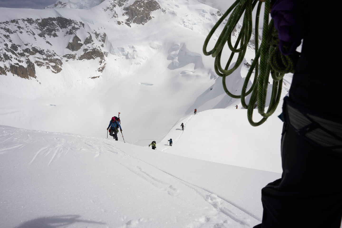
El Laucha posted:I've been trying to get back to taking photos aces all around, really nice composition, lighting and atmospheric layering of the mountains and the valley as they recede in the back, and that cool sense of scale you get from the people hiking
|
|
#
?
Dec 5, 2023 14:03
|
|

|
QuasiQuack posted:Beautiful colors. I'm a sucker for sunsets. Good feedback for the OP. What do you think about the fact that you can see some detail in the bottom versus it being a completely black foreground? At first I had been going to suggest that the OP mask that out and make it all black, but then I actually liked that if the viewer looks closely, they can pick out some details. It makes the photo more interesting to me
|
|
#
?
Dec 5, 2023 15:16
|
|
|
When I looked at it on my phone it was subtle and didn't mind it. On desktop I found it a bit distracting personally.
|
|
#
?
Dec 5, 2023 15:25
|
|

|
i like the hint of detail personally on that shot
|
|
#
?
Dec 5, 2023 16:48
|
|
|
The problem with cropping foreground on that one is you'd have to get rid of all the houses, and by the time you did that it'd just be a sliver of tree silhouettes at the bottom. It feels unbalanced then. I guess another option is to completely crush all detail out of the bottom then crop to taste but I'm not convinced it would be an improvement.
|
|
#
?
Dec 5, 2023 18:07
|
|

|
QuasiQuack posted:Beautiful colors. I'm a sucker for sunsets. ty! QuasiQuack posted:If you want concise feedback I would tell you what I would have told myself when I started out: a beautiful scene does not necessarily translate to an interesting or captivating photograph. I think this could be even better if you for example put more emphasis on the silhouetted foreground objects. interesting takeaway. i suppose i assume whatever is nice to look at with your eye automatically makes a good photo. while that doesn't have to not be true, what i'm not considering is that a photo can have different properties to make it more interesting, too. thank you for the perspective. i'll tinker with the foreground a bit
|
|
#
?
Dec 5, 2023 18:32
|
|


|
ShoogaSlim posted:ty! Watch this youtube series https://www.youtube.com/playlist?list=PLTQtLjIqecdydlanOGh6iwoWOb9VxpDts
|
|
#
?
Dec 5, 2023 18:38
|
|
|
 I think this is the most interesting part of the scene. I don�t think there�s much use trying to tinker and analyze that shot too much beyond cropping out a lot of the clutter in the frame. I assume it was a �hey the sunset looks really good now� shot without much thought for the composition and foreground beyond that? My advice would be to go shoot a sunset again but compose the entire shot beforehand to compliment the sky and not just be busy filler in most of the frame.
|
|
#
?
Dec 5, 2023 18:44
|
|
|
blue squares posted:Good feedback for the OP. What do you think about the fact that you can see some detail in the bottom versus it being a completely black foreground? At first I had been going to suggest that the OP mask that out and make it all black, but then I actually liked that if the viewer looks closely, they can pick out some details. It makes the photo more interesting to me To be completely frank I didn't see any detail there on my phone screen. Maybe I shouldn't judge or contribute criticism before viewing something on a proper screen.  As for the question, I have no answer. I waffle between all black, some detail or lots of detail. Unable to decide what I like best. Usually I just keep them for myself, but here's a few.     As mentioned I love sunsets.
|
|
#
?
Dec 5, 2023 22:45
|
|
|
QuasiQuack posted:To be completely frank I didn't see any detail there on my phone screen. Maybe I shouldn't judge or contribute criticism before viewing something on a proper screen. Ooooh, these two are the keepers and are great examples of leaving the little hints of details that make the photo come alive, especially the bottom one
|
|
#
?
Dec 5, 2023 23:49
|
|
|
^ love both of these.
|
|
#
?
Dec 5, 2023 23:53
|
|

|
yea this one is very nice
|
|
#
?
Dec 6, 2023 00:03
|
|
|
Thanks y'all 
|
|
#
?
Dec 6, 2023 17:51
|
|
|

|
|
#
?
Dec 6, 2023 19:26
|
|
|
blue squares posted:Good feedback for the OP. What do you think about the fact that you can see some detail in the bottom versus it being a completely black foreground? At first I had been going to suggest that the OP mask that out and make it all black, but then I actually liked that if the viewer looks closely, they can pick out some details. It makes the photo more interesting to me Mega Comrade posted:When I looked at it on my phone it was subtle and didn't mind it. On desktop I found it a bit distracting personally. hope and vaseline posted:i like the hint of detail personally on that shot xzzy posted:The problem with cropping foreground on that one is you'd have to get rid of all the houses, and by the time you did that it'd just be a sliver of tree silhouettes at the bottom. It feels unbalanced then. Bottom Liner posted:
appreciate all the discussion here. all interesting perspectives and it gives me more to think about as i continue ramping up into this hobby. and i saved that youtube playlist about photo composing. i thought it might be helpful (or distracting?) to include the completely unedited original version of the photo i took:  the foreground is still in that "barely visible" territory, so i'm not sure if it warrants any further discussion than what's already been brought up. part of me actually like the unedited version better bc it's more "natural" but the edits were me just trying to see what was possible in Lr. i like that it's stylized. maybe a question worth asking is how far does anyone here feel is "too far" when it comes to editing? maybe it's covered in that youtube playlist. if so, i'll get to it!
|
|
#
?
Dec 6, 2023 20:39
|
|
|
"Too far" is not covered in that series and it's super subjective. No one in here complained about it so that's generally a positive sign, goons are savage with calling out over processing. I have seen skies that red before so it didn't really trigger any alarms. But in the end all that actually matters is whether you had fun and enjoy the product.
|
|
#
?
Dec 6, 2023 20:47
|
|
|
appreciate that! i know we all must have seen dozens of photos on various social platforms where the saturation is overblown and you get that halo'ing effect around clouds of a landscape and everything looks super fake. obviously trying to avoid that. got to catch a sunset near my job last night and grabbed a few photos at various points as it was going down. edit  original  edit  original 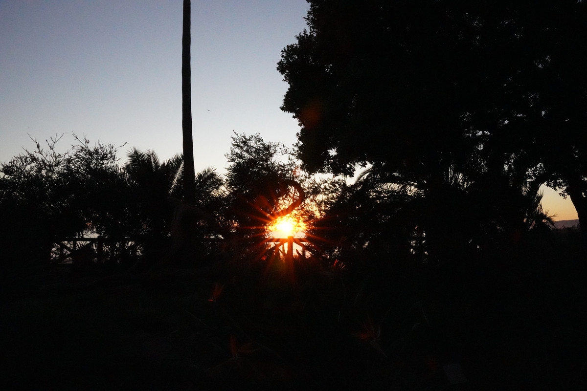
|
|
#
?
Dec 6, 2023 21:29
|
|
|

|
|
#
?
Dec 8, 2023 02:42
|
|

|
that's the good stuff
|
|
#
?
Dec 8, 2023 02:47
|
|
|
wow
|
|
#
?
Dec 8, 2023 03:01
|
|
|
poo poo that�s fire
|
|
#
?
Dec 8, 2023 03:41
|
|
|
beautiful stuff. Love the colours
|
|
#
?
Dec 8, 2023 03:42
|
|
|
Nothing better than a perfect tree with some kickass weather. And being there with a camera.
|
|
#
?
Dec 8, 2023 03:46
|
|
|
thanks everyone ")
|
|
#
?
Dec 8, 2023 04:59
|
|
|
gently caress off that's so good
|
|
#
?
Dec 8, 2023 06:06
|
|


|
 Now we're talking. Holy poo poo.
|
|
#
?
Dec 8, 2023 06:09
|
|
|
Oh my gosh
|
|
#
?
Dec 8, 2023 06:22
|
|
|
 313A2035 by Austin DeGroot, on Flickr 313A2035 by Austin DeGroot, on Flickr 313A2037 by Austin DeGroot, on Flickr 313A2037 by Austin DeGroot, on Flickr
|
|
#
?
Dec 8, 2023 19:40
|
|
|
blue squares posted:
|
|
#
?
Dec 10, 2023 18:33
|
|
|
Yeah, that�s great. Sort of a warm contrast? Has the feel of a painting
|
|
#
?
Dec 10, 2023 18:37
|
|

|
took me four months, but finally had some time/headspace     
|
|
#
?
Dec 10, 2023 18:38
|
|
|
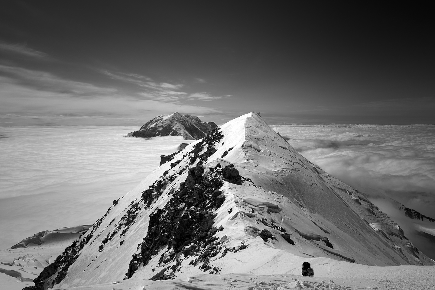
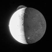
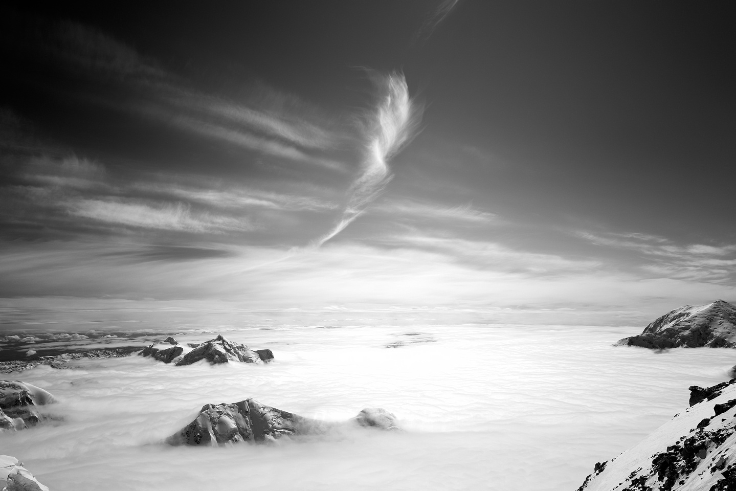
gently caress yeah zooming in on mountains The mottled light one is my jam. Also the moon one, the cloud is rad.
|
|
#
?
Dec 10, 2023 18:53
|
|
|

|
| # ? May 16, 2024 11:14 |
|
|
JAY ZERO SUM GAME posted:took me four months, but finally had some time/headspace. Love all of those, but these two especially.
|
|
#
?
Dec 10, 2023 19:16
|
|