

|
NM
Mannequin fucked around with this message at 13:11 on Jan 16, 2009 |
 #
?
Jan 14, 2009 19:41
#
?
Jan 14, 2009 19:41
|
|

|

|
| # ? Apr 20, 2024 11:51 |
|
|
friendship waffle posted:I never have the printer handle color management, so the file is converted in photoshop or aperture using the profile for the printer (which is never sRGB) from what I am working in (which is not sRGB either in most cases). You do not know poo poo about color management, please stop posting. Your devices have their own profiles that are separate from the image. If you profile your monitor you assign that custom profile to that device (you don't convert your image to the monitor profile, right?). If you profile your printer/ink/paper you assign that profile to that device. This has absolutely nothing to do with the actual image file. Why the gently caress would you convert your image to a device profile? Image files are device neutral which is why you use a generic profile like sRGB. You send the image file tagged with the device-neutral colorspace it expects and then the device interprets that information through the filter of it's own custom profile. Replace "printer" with "monitor" or "scanner", same exact thing. If I print something and accidentally leave it in AdobeRGB I can immediately tell because the colors are way off, if I go back and convert to sRGB everything is fine. Now you might not be doing as color critical work as I am, but I am really, really anal about how my prints look and this stuff is not that complicated. edit: quote:In other words, the color profile for your printer can't "expect" sRGB for the colorspace as input, because the master colorspace is always the input for the conversion when going from one colorspace to another. The color profile tells you how to get to/from the master space to the colorspace specified by the profile. If you had ever actually made a custom profile it would be immediately obvious why this is 100% wrong. Just think about it for a second before your brain vomits all over your keyboard again. I'm not going to derail this any further, everyone please ignore anything friendship waffles says about color management because he doesn't understand how it works. I can't believe you wrote a paragraph about subtractive printing, what a needlessly pedantic gently caress you are. brad industry fucked around with this message at 19:54 on Jan 14, 2009 |
|
#
?
Jan 14, 2009 19:44
|
|

|
jackpot posted:I've been trying to fix this for a while now, with no success; my images are desaturated in browsers but look good in photoshop/bridge (don't make fun). It's not computer specific; I have the same problem between my windows home pc and my work macbook pro. And the thing is, I don't want to have to change any settings in firefox to see them right, because I can't expect people looking at them to change anything. Can someone give me the lowdown on what to set/how to save so that what I see in a browser matches what I see in PS, and what most other people will see? Here's what I do, on every machine, which has always worked for me. I have CS3 and CS4 on my windows machine right now so screenshots from both. Convert to sRGB first. here's the results so you can believe me  here's the CS3 settings (include "ICC profile" anyways, it never hurts)  here's the CS4 settings 
|
|
#
?
Jan 14, 2009 19:49
|
|


|
Zoowick posted:I shoot JPEG to keep file sizes down and to speed up my workflow. I average about 10 or so sessions a week plus weddings. The composition sucks I'll give you that one, I just really liked the look of her body and the way the light way laying on her in that shot. I enjoy what I do as do my clients and at the end of the day that's all that really matters. I'm curious who some of your favorite photographers are? Mine are Jill Greenberg, David Hill, Joey L so obviously I like that overdone look. My target market does not give a poo poo about technically flawless images they just want to look awesome. The point some people are missing is that when you are shooting for clients, the rules of photography go out the window and it boils down to whether or not they like the shots and if it goes with their preconcieved notion of how the pictures would turn out. If Zoowick bumped saturation all the way up and the photo looked like a rainbow slurry, yet the couple loved it, printed it, framed it and hung it on their wall, it doesn't matter what anyone in here thinks- he would have done his job right. I'd also like to hop on the "Friendship Waffle show your poo poo" wagon. Don't mistake this for flattery though.
|
|
#
?
Jan 14, 2009 19:51
|
|

|
brad industry posted:You do not know poo poo about color management, please stop posting. Your devices have their own profiles that are separate from the image. If you profile your monitor you assign that custom profile to that device (you don't convert your image to the monitor profile, right?). If you profile your printer/ink/paper you assign that profile to that device. This has absolutely nothing to do with the actual image file. Why the gently caress would you convert your image to a device profile? Image files are device neutral which is why you use a generic profile like sRGB. You send the image file tagged with the device-neutral colorspace it expects and then the device interprets that information through the filter of it's own custom profile. Replace "printer" with "monitor" or "scanner", same exact thing. You have photoshop handle the color management. That means the printer driver does nothing. What do you think photoshop does with the image data before the printer driver sees it? I don't use the "convert to profile" command in photoshop if that's what you're implying. I think you're a bit confused about this. My images are usually in AdobeRGB. However, that imaging data never arrives at the printer. Phoitoshop converts it first in the printing dialog quote:If I print something and accidentally leave it in AdobeRGB I can immediately tell because the colors are way off, if I go back and convert to sRGB everything is fine. Now you might not be doing as color critical work as I am, but I am really, really anal about how my prints look and this stuff is not that complicated. I have never seen this behavior and I care particularly about how my prints look. quote:If you had ever actually made a custom profile it would be immediately obvious why this is 100% wrong. Just think about it for a second before your brain vomits all over your keyboard again. I've made several custom profiles, mostly for using epson paper with my canon printer. Brad Industry: if you don't think that photoshop is converting your document to the printer profile in the print dialog, then why does it give you black point conversion and rendering intent options? what is this fucked around with this message at 19:57 on Jan 14, 2009 |
|
#
?
Jan 14, 2009 19:54
|
|
|
Edit: NM
Mannequin fucked around with this message at 13:14 on Jan 16, 2009 |
|
#
?
Jan 14, 2009 20:02
|
|
|
Tziko posted:Also, if any of you have good post-processing resources (online or books), please share them so that I can add them to the OP. This is really nice site for a bunch of different tutorials. Very professional. I like their Photomatix / HDR tutorial. Mannequin fucked around with this message at 07:18 on Jan 15, 2009 |
|
#
?
Jan 14, 2009 20:11
|
|
|
Everything and everybody tells me this is wrong, but I have been getting excellent results with it: - Shoot in RAW (Nikon D70s, until I get a D90) - Edit in Photoshop CS3 or CS4 using AdobeRGB - Monitor : Dell 2005FPW (non-calibrated set to sRGB) - add a 68 --> 72 curve layer before printing (well, the printer was printing dark..) - Print (Epson 9800 Pro, Enhanced Matte paper) -- Photoshop manages colors -- AdobeRGB, Gamma 2.2 Go ahead and laugh, and I'm sure that if I change one single thing in this setup (different paper, monitor, printer, or even camera), everything will go to hell. I better enjoy it while it lasts. 
quazi fucked around with this message at 20:33 on Jan 14, 2009 |
|
#
?
Jan 14, 2009 20:21
|
|
|
quote:Brad Industry: if you don't think that photoshop is converting your document to the printer profile in the print dialog, then why does it give you black point conversion and rendering intent options? Do you even know what a color profile does? All PS is doing is skipping the device driver and sending along the image (tagged with your device-neutral profile) WITH the device profile to the device. Nothing happens in PS or on your computer. The conversion (it's not really a conversion, more like a filter) happens at the device level, the device profile just tells your printer how to correctly interpret the information in the image file. You can't send an image with no profile over, it has to have something, and for all inkjet printers they assume it's sRGB. When you make the custom profile you printed out a target file to calibrate to right? That target file was sRGB. Device and image profiles are completely separate - the image has one and the device has one, it's not either/or. All PS is letting you do is send these raw commands and information over and skip the poo poo your device driver normally does, it's not doing any sort of conversion. I don't know how else to explain it. Your monitor does the same thing. If you open an image on your screen the same process happens (this is oversimplified): Image with device neutral profile like sRGB / AdobeRGB -> gets sent by PS to OS -> OS sends image + profile over to video card WITH your device profile (custom monitor profile) -> Video card takes image information and filters it through the device profile -> Video card tells monitor how to correctly display image Please go read a book or something on this and stop posting about it. If your workflow works for you it's because you can't tell your prints are lovely or you somehow managed to accidentally pick the right sequence of steps despite not understanding how the process works. Just for reference here is how a correctly color managed workflow should work if you are printing from PS. This assumes you have custom profiles for your monitor/printer already: -Open your image -Convert to sRGB -Go to Print dialog -Select "Photoshop manages color" and whatever other rendering intents/options you chose when you made your custom profile -Select the custom profile - this is device, inkset, and paper specific -Go to printer driver dialog and turn off ALL color management (since you are doing it manually in PS you don't want the driver loving with it) -Select the correct media type (should choose the same thing as what you made the custom profile with) -Send to printer When you do this what happens is that PS sends the commands and information over instead of the driver applying it's (lovely) settings. Once it gets to the printer, the printer processes the image information using those commands and then filters everything through the device profile. The device profile is the last step, all it does is tell the printer nozzles how to adjust what ink it lays down (ie. "shift red this direction, shift blue here, etc." it's not doing anything to the image, it's telling the device how to adjust - that's why it's a DEVICE profile). brad industry fucked around with this message at 20:59 on Jan 14, 2009 |
|
#
?
Jan 14, 2009 20:38
|
|
|
You guys need to just have sex and be done with it.
|
|
#
?
Jan 14, 2009 22:12
|
|

|
brad industry posted:Do you even know what a color profile does? All PS is doing is skipping the device driver and sending along the image (tagged with your device-neutral profile) WITH the device profile to the device. Nothing happens in PS or on your computer. The conversion (it's not really a conversion, more like a filter) happens at the device level, the device profile just tells your printer how to correctly interpret the information in the image file. You can't send an image with no profile over, it has to have something, and for all inkjet printers they assume it's sRGB. When you make the custom profile you printed out a target file to calibrate to right? That target file was sRGB. Device and image profiles are completely separate - the image has one and the device has one, it's not either/or. All PS is letting you do is send these raw commands and information over and skip the poo poo your device driver normally does, it's not doing any sort of conversion. what you're calling a "shift" or "processing" is in fact a color space conversion. Colorspace conversions happen through the universal profile connection colorspace. This profile connection space is independent of the source and target. It doesn't matter if you convert to sRGB before printing (aside from how this conversion will affect your image in the first place, which will be visible onscreen) because it moves through the profile connection space. If you move to the profile connection space and move back to your original profile it is lossless. That's the whole idea. This is also why it doesn't make sense to convert to sRGB. You can only hurt your image quality depending on how lossy the adobeRGB->sRGB process is. Things are converted to the monitor profile in the process of rendering onscreen. Likewise they are converted to printer profile in the process of sending to the printer. Your workflow is entirely correct with the exception of converting to sRGB. This step is unnecessary, but all the changes it makes to the output of your final image will be viewable onscreen. In actual fact photoshop sends the printer driver an image file with the color conversion applied. The printer driver then can perform additional color correction (you turn this off because it ruins everything, obviously). Lightroom and Aperture don't even have options internally (as far as I know) to work in sRGB or convert to sRGB before printing. Everything you print uses the internal colorspace they work in (ProPhoto for lightroom, something "wider" than that according to Apple for Aperture). If converting to sRGB before printing were so critical, these programs would make you do it. They don't. I know exactly what a color profile does. Photoshop does not "tag" the image with the color profile to send it to you screen, and it doesn't "tag" the image with a color profile to send it to a printer. That's how color profiles are attached to image files, but it doesn't work that way with raw image data. Photoshop passes the image data to the OS for the onscreen display, and the OS handles the color correction. Likewise photoshop passes the image data to the printer driver for printing, and the printer driver handles the color correction - only in this case we modify the image data first because we don't want to use the printer driver's color correction. I have never found a guide saying convert to sRGB first because "that's what the printer expects." I even went online looking for one, I did find many people printing from AdobeRGB, ProPhoto, etc into their printer space. Luminous landscape is one, and Datacolor, who make the Spyder3, specifically recommend your workspace as AdobeRGB (there's no caveat here, "except right before printing"). What you're doing is AdobeRGB -> PCS -> sRGB -> PCS -> Printer colorspace It's PCS no matter what right before it gets converted into the printer colorspace (and yes, each pixel of the image gets converted. The math is pixel based, conversion is the name of the math). All you're doing is clipping your image to sRGB (or crunching it, depending on conversion method). what is this fucked around with this message at 22:52 on Jan 14, 2009 |
|
#
?
Jan 14, 2009 22:50
|
|
|
This thread is making me happy that I'm not doing this for a living, because it is apparently a bunch of photographers waving dicks and getting really self-important about printers when you reach the "professional" level.
|
|
#
?
Jan 15, 2009 00:04
|
|

|
I'm really excited for this thread because my post-fu is non-existent. But can we restart it later and turn this into a Friendship Waffle call out thread? Just a couple pictures, alittle about what you like to shoot... I like posts asking to post work are ignored whilst writing 500 word response to color management.
|
|
#
?
Jan 15, 2009 00:05
|
|
|
Jahoodie posted:I'm really excited for this thread because my post-fu is non-existent. It's never going to happen- I asked months ago for some shots but I think his eyes glazed over and only reads that which applies to technical detail. Remember folks- there are photographers that are "technically" perfect but that doesn't mean their pictures are good. All this talk about color management is way over my head though- I'll leave that to brad and waffle to duke it out.
|
|
#
?
Jan 15, 2009 01:25
|
|

|
I didn't realize the photo-a-day thread was for dickwaving, somehow I thought it was for critique. I get feedback on my work from other avenues. It's pointless for me to post a portfolio for you guys to hate on just because you don't like the tone of my posts. I don't need validation from the internet.
|
|
#
?
Jan 15, 2009 02:13
|
|
|
Some people asked how I got the dark look from the foggy day pictures, I will give a brief and sloppy run-down. 1. The original incredibly grey picture. It's foggy. 2. Slight exposure boost, increased clarity and contrast. 3. Maxed blacks. 4. Exposure boost, reduced highlights. 5. Desatured blue and aqua. 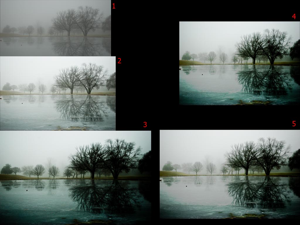 It's pretty easy, I did it all in Lightroom.
|
|
#
?
Jan 15, 2009 02:34
|
|
|
Fidel Castronaut posted:This thread is making me happy that I'm not doing this for a living, because it is apparently a bunch of photographers waving dicks and getting really self-important about printers when you reach the "professional" level. Nah, I'm gonna count myself as a professional but where I work we create our own custom rgb and cymk spaces for viewing and printing, though I work with some super anal people (not to be confused with angry)
|
|
#
?
Jan 15, 2009 05:07
|
|
|
friendship waffle posted:I didn't realize the photo-a-day thread was for dickwaving, somehow I thought it was for critique. I get feedback on my work from other avenues. Im not typically one to jump in the middle of any sort of e-penis contest but after reading your posts for months on end, not having seen much (or any) of your work for having had so much to say, seeing the reasons you have been banned/probated, and then this most recent overly pretentious post....I have a few things to say. Im going to go ahead and address them point by point and let it die so that I dont poo poo on the thread and derail it because I think this thread is a benefit to the SA Creative Convention Community. 1) Having read your posts with much respect for so long... I really do appreciate your opinion because it is very critical and informational. It is obvious you have had a great education and have a passion for what you do. Thanks to you a lot of people have learned how to become better photographers. However you come off as a very arrogant and pretentious person by how it is that you phrase your responses. Of course a lot of these photos suck, but thats why this isnt called "The worlds greatest photos per day" thread. We all want critique but theres a difference between criticism and being an rear end in a top hat. Ive seen your posts for quite some time now and generally they are pretty negative and bring people down when you could easily have eased back on the sass and helped someone. This brings me to my next point. 2) In design school we had a rule, if you have nothing to show you also have nothing to say. It seems odd to have to say this but it is frustrating when people post their work, some of which didnt take much effort and some who work their asses off, but still show their work regardless to get broken down and essentially mocked by you when they see nothing of your work to establish your credibility. It is also important to note that criticism should be constructive meaning that it shouldnt always just be the negative, offer suggestions on how to improve aside from "this looks like crap dont do it" instead of "this looks bad, maybe try this...". I know that good criticism is priceless but the way you give "criticism" almost turns people away from photography and makes them feel like crap because they think that everyone who knows anything about photography is as disrespectful as others claim you to be. 3) Having been banned twice and probated several times, people make mistakes... ...but generally people also learn from their mistakes. I think I recall my first year being littered with stupid mistakes Ive done on the forums, once in particular stating "history of stupidity". I would have imagined that after having been banned/on probation that many times you might have gotten the clue. Being the rear end in a top hat in a thread isnt a good thing, I dont even recall people being this brash in the Sports Argument Stadium, maybe we should retitle a photography thread "Photography Argument Convention" or "Photographers Dick Waving Vanguard". 4) And This Quote..... friendship waffle posted:I didn't realize the photo-a-day thread was for dickwaving, somehow I thought it was for critique. I get feedback on my work from other avenues. Its funny because by the nature of your sarcasm and arrogance, one could make the claim that you are the one waving the most dick. friendship waffle posted:It's pointless for me to post a portfolio for you guys to hate on just because you don't like the tone of my posts. I don't need validation from the internet. Its not pointless to post your stuff, I am being completely honest and would like to see your work. I am curious to see your style as I am sure many people are. Hopefully others in the thread would be big enough people not to crap on your images out of sheer disrespect for you. Your work would speak for itself. As for you claiming you dont need validation from the internet, I find this interesting because it seems that of most people, you thrive on being "that guy" in the forums who people cant stand. As frequently as you post, you either like hearing the hypothetical sound of your internet voice or use the internet to build your confidence and feel better about yourself having gone to school for photography and it being worth while because clearly some of the people in this thread, myself included, are not up to that standard. Thats all I have to say, I dont intend to start any sort of flame war by any means as I really do respect you Friendship Waffle, but you make it really hard to keep that respect with the way you dont give it to anyone else here. If you dislike what you see and hear in this forum as much as you make it sound, why do you stick around? Im not trying to shoo you at all but your actions seem contradictory to your statements. Verman fucked around with this message at 06:37 on Jan 15, 2009 |
|
#
?
Jan 15, 2009 06:32
|
|
|
In the photo world your work is everything, I have worked for plenty of assholes that I respected anyways because their poo poo was good. Usually I just ignore friendship waffle's stupid bullshit, but I love printmaking and it is so obvious he is just pulling stuff out of his rear end in this thread for the sake of arguing I couldn't help but respond. The only reason friendship waffle won't post his stuff is either because he's a troll, his work sucks and he knows it, or the "professional" experience he loves to allude to is something unimpressive like shooting pimply teenagers in bumfuck nowhere. I don't post here for "validation" either, that is a bullshit excuse, I post here because I like to talk about photography and look at images. It is just common courtesy to post your own work so people know where you're coming from, so either post your images or shut the gently caress up. Anyways, let me pull together some images and I will make an actual post about post-processing...
|
|
#
?
Jan 15, 2009 07:05
|
|
|
RangerScum posted:Some people asked how I got the dark look from the foggy day pictures, I will give a brief and sloppy run-down. Im not sure how I missed this but I was very curious how you processed this image and I have been meaning to ask but have been so busy lately. Thanks for posting this.
|
|
#
?
Jan 15, 2009 07:09
|
|
|
RangerScum posted:Some people asked how I got the dark look from the foggy day pictures, I will give a brief and sloppy run-down. I think it's time for me to dig into my archive and look for foggy pictures.
|
|
#
?
Jan 15, 2009 07:40
|
|
|
Ok, so the way I work I pretty much always know what the shot is going to look like before I even think about shooting it, so post for me isn't a way to "fix" things, it's a way to reach the final goal. When I shot film I was big into the zone system/previsualizing so my goal then was to make the best negative possible for printing (which is not the same thing as making the best image straight-out-of-camera, if that makes sense). I think of RAW files as negatives so I don't really care what they look like as files, as long as the information is there that will let me make the print I want. For me the print is the final form of the image, so everything from location scouting to RAW processing is just a step toward that. Anyways here is how my most recent shoot progessed since this is still fresh in my mind... I had this image sketched out weeks ago and had scouted the location/model/props/etc. so everything from that point on was just trying to resolve what I had in my head and on paper into an image. RAW file straight out of camera:  In LR my goal is to get the tonal range and color to where I want it so I can finesse everything else in PS:  I corrected the color, boosted exposure by 1/3rd stop, hosed with the curve a little bit (brought highlights down a tiny bit and shadows up), and starting getting my color palette to where I wanted (boosted the yellow paper, brought back the original blue of the wall).  In PS I break it down into steps: 1. actual pixel manipulation - correct perspective, Liquify, crop, some compositing, etc. - I don't want to have to redo masks later 2. overall adjustments - for this image I just boosted contrast and upped the blue saturation to get it to how it was in real life 3. local adjustments - removed the yellow-ish tint from the table, brightened her eye a little bit, couple of other minor things (mostly removing tiny casts or upping the contrasts on certain spots - this image didn't need much but sometimes I get into 50+ adjustment layer territory if I am feeling particularly anal) Then I do final compositing and "polishing":  Added in the bubbles from other frames, Liquified her jacket a little so it didn't look so loving bulky. "Polish" is hard to see in these tiny files and I think I actually did it first on this one.. but basically I zoom in at 200-300% and go through every surface and remove imperfections with the patch (or clone) tool. For this one I spent about two hours going through and removing dings and scratches from the wall and smudges from the table surface. I also go through and remove annoying things (I ask myself "is this adding to the image?" and if not take it out) - on this one the sticker on the table, that blue thing on the right, the logo on the handle, and the writing on the tubing. I think that's it. This one was pretty straight forward.
|
|
#
?
Jan 15, 2009 08:19
|
|
|
I knew this would be trouble because I was shooting into the sun. I don't have artificial lighting big enough to flood fill the entire house (just an SB600 flash, heh), and I didn't have the time to set it all up even if I did have it. So, two exposures. One for the ground, the other for the sky. The Ground ISO 200, 12mm, F/8, 0.8 sec  (the purple window is from my polarizing filter. I kinda like it, so I'm leaving it there. Adjustments ( basic , HSL )
 --- Then, a totally separate image (and for the love of god, adjust the exposure without bumping the tripod. Use a cable release if you have one, or hope it ain't windy.) The Sky ISO 200, 12mm, F/8, 1/6 sec  Adjustments ( Basic, Tone Curve, HSL, Split Toning )
 I know the ground is ugly, I don't care. All I care about is that lovely sky. --- Into Photoshop Put the dark layer on the bottom, and then use the other layer to brighten it.  Making a mask is fun: Start with a black mask, and don't view it like this. These images only show what I came up with afterwords.   Notice the registration problem along the left? Yeah, the images weren't exact. We're almost there..  We just need some little tweaks:  ..which do this:  Now the house is warmer and brighter, which is how I remember it:  One more thing.. When you use a 12mm lens, and tilt it above or below the horizon line, no matter how slight, you will get perspective distortion. Since I don't have a tilt-shift lens, or a large-format view camera like Ansel Adams, where you can correct for this in the camera, I'll have to settle for this: You have to flatten the image because this only works on one layer. Also, expand the canvas so you have room to work without the image going off the edge.  ..which does something like this: I don't remember the exact settings, these are pretty close though  And finally, the moment we've all been waiting for: click for big  Any questions? quazi fucked around with this message at 23:53 on Jan 15, 2009 |
|
#
?
Jan 15, 2009 11:35
|
|

|
Different people do different things for different reasons. Stop loving up such an informative thread.
|
|
#
?
Jan 15, 2009 16:56
|
|

|
pipes! posted:Different people do different things for different reasons. Stop loving up such an informative thread. To add to this, if you do not like a specific technique, don't use it. Nobody's forcing you to.
|
|
#
?
Jan 15, 2009 17:46
|
|
|
If anybody has any input or good tutorials on using textures in post, that would be greatly appreciated.
|
|
#
?
Jan 15, 2009 18:25
|
|
|
quazi, beautiful image and thanks for the writeup.
|
|
#
?
Jan 15, 2009 19:02
|
|
|
Note that quazi's method works if the picture lends itself to. If the sun was visible at all, it will create lens flare and possibly ruin the frame where the building was correctly exposed. Just wanted to point that caveat.
|
|
#
?
Jan 15, 2009 19:22
|
|
|
Fidel Castronaut posted:If anybody has any input or good tutorials on using textures in post, that would be greatly appreciated. Grayscale the texture you are working with and mess with all of the different blending modes, the ones I frequent are "overlay" and "softlight" Here is a quick sample: Starter image:  Grayscale texture:  Texture with "overlay" blending mode. I masked about 50% of the texture off of the subjects face to preserve details. I also did a little "highpass" overlay to pop the details. 
|
|
#
?
Jan 15, 2009 19:44
|
|

|
Does someone make a Lightroom plugin that repairs known lens distortions, so you could for example correct a whole bunch of pictures shot at different apertures and lengths?
|
|
#
?
Jan 16, 2009 00:26
|
|

|
Can't you load a preset in PS's Lens Correction tool?
|
|
#
?
Jan 16, 2009 00:33
|
|
|
evil_bunnY posted:Does someone make a Lightroom plugin that repairs known lens distortions, so you could for example correct a whole bunch of pictures shot at different apertures and lengths? I'd really like to know of a good way of doing this as well. For a bunch of shots at the same focal length it's easy to do a group CA fix, but that's far from ideal when using zooms or switching lenses a lot. I guess DxO is supposed to do this stuff, but it's not at all convenient for a RAW->LR workflow.
|
|
#
?
Jan 16, 2009 02:07
|
|
|
Man, all this threa has shown me is how i'm a newbie of the higest proportions when it comes to photography. I've got a rough idea about compositions and stuff and i'm getting my head around technically using a proper camera (i got an EOS 450D as a gift), but while i know of very basic post processing, i've never dealt with RAW image formats before. I just got my camera and i was playing about with it in the DJ booth at my work, but i'm rather embarassed about uploading the images as they're horrendously newbieish (as in it's an awful pucture to start with). I'm looking for advice though so here's the original RAW:  And here's what it looks like after some playing about with the RAW settings  I basically just dropped the exposure (the blue LED was overexposed and giving a clipping warning?? when loaded into photoshop) and saturation while upping the fill light. Then it was kind of just a mishmash of me playing with the sliders until things came out looking a little bit better. What advice would you give for someone who's right at the beginning of doing all this stuff? Other than to take better pictures that is.
|
|
#
?
Jan 16, 2009 02:28
|
|

|
evil_bunnY posted:Does someone make a Lightroom plugin that repairs known lens distortions, so you could for example correct a whole bunch of pictures shot at different apertures and lengths? * - I haven't used it yet
|
|
#
?
Jan 16, 2009 02:38
|
|
|
I have tried to find some info on split toning color pictures and never could. but I would love to see how every one is doing the split toning, especially since it looks kind of cool and all the cool kids seem to be doing it.
|
|
#
?
Jan 16, 2009 02:57
|
|
|
@kin: I like the first one, honestly.
|
|
#
?
Jan 16, 2009 02:57
|
|

|
I am not sure if this is really a 'post processing' question, but - I took this picture : http://i39.tinypic.com/iegx3n.jpg I like it, for the most part, except the obvious eye is red as poo poo part. I have had several photographs like this in the past where just one area is an odd color - but I think the actual image data is still all there - IE, it's not completely blown out. How would I go about correcting this in photoshop?
|
|
#
?
Jan 16, 2009 03:15
|
|

|
rigeek posted:@kin: I like the first one, honestly. Heh, thanks. The problem i have with it is that when i was physically looking at the mixer, there was a clearly defined "spot" of blue light on the black surface that looked quite cool, especially when you could make out all the details. I think i'm more disappointed that i've not captured exactly what it was that i saw, or my final image doesnt have the clearly visible "spot" and heavy blue colour while retaining the detail that you can make out in the second photo. I also think i left the UV filter on, but i dont know if that would have any effect on things. edit: I went back and tried to make it a bit closer to what i remember it looking like and ended up with this:  Then i got all cliche and did this:  This is without using any filters, curves or fancy layering shenanigans, so chances are that if i properly knew what i was doing, i could get these looking a lot better. Kin fucked around with this message at 03:43 on Jan 16, 2009 |
|
#
?
Jan 16, 2009 03:23
|
|
|
quazi posted:PTLens. It's not a Lightroom plugin, but it has a database of cameras and lenses, and claims to* correct barrel distortion, pincushion, and even moustache distortion. I've used it, it works as advertised. It's not perfect out of the box but it's very close.
|
|
#
?
Jan 16, 2009 03:59
|
|
|
|
| # ? Apr 20, 2024 11:51 |
|
|
First, hey rigeek, good to see you. ") Here's a quick and dirty guide to a way of sharpening images that can give you punch where you need it. In a sense, it's actually very similar to HDR images, except... well, not. Basically, Photoshop's layer masks are very powerful tools, and let you do things that, with a little work, give you a lot of rewards. Often times when you sharpen an image, you'll wind up with hard/jagged edges or strange moire artifacts. It means you've sharpened too much. Yet, what if other areas of the image need that amount of sharpening? Well, you're in the right place.For me (and probably many others), sharpening is a two-step process. There's capture sharpening, which is meant to remove the natural softness that the antialiasing filters on our camera sensors introduce. There is also output sharpening, where you apply sharpening to best reveal your details on your output device. Sharpening for the screen/web is similar, but different than going to print. Here's a quick walkthrough on an image I recently posted on PaD.  The first thing I need to do is perform capture sharpening, and this occurs in one of two places - in your camera (for JPEGs) or in your favorite RAW converter. For this particular one, here's the settings panel in LR. 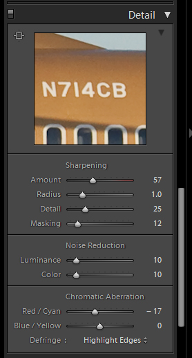 More often than not, the settings of 50/1.0/25/0 make a good starting point (and happen to be the default of Lightroom and Adobe Camera Raw for my a700). This step of sharpening is intended to bring back the often subtle microcontrasts that can be hidden via antialiasing filters. It's not really meant to bring out what most of us consider "sharpness," which is better referred to as acutance, or edge contrast. That step is generally performed right before output. Once I've adjusted the capture sharpening to my liking (often times it only takes some minor tweaking or using the masking slider to preserve skies), I then export the image full size to Photoshop. I don't downsample on export from LR, because although LR2 provides the ability to turn its output sharpening off, it still uses a downsampling algorithm similar to Photoshop's "Bicubic Sharper," which I dislike. It tends to create jagged edges on high contrast areas. Once the image opens up in PS from Lightroom, I downsample it to the desired size (if I'm going on Airliners.net for instance, I usually go to 1024 or 1280 wide depending on the image). Generally, larger images in pixel terms will be easier to sharpen simply because you have more area to work with between the edges. Unfortunately, you can't keep 12+mpx images on the web. So we need to downrez them and sharpen properly in Photoshop. Once I downsample it, I duplicate the current background layer. It doesn't have a key command, so you right click on the bg layer and choose duplicate layer. Name it whatever you like. In most cases, there are probably large sections of the image you don't want to sharpen at all. For example, in this image, we don't want to sharpen the sky at all; it'll just reveal noise. This is where layer masks come in. First, I'll select the sky and other relevant areas with the magic wand. Then I'll go to the Select Menu and choose Inverse (or press shift-ctrl-I on Windows).  The next step is to generate a layer mask from this selection. So long as you have an area selected it will get knocked out of the mask (Photoshop by default makes the mask filled) and it'll be the area that will get sharpened. Look in the layers palette and you'll see this little button (which I've conveniently circled for you).  Click on it and it will generate the mask. It'll show up in the row of the layer. Black areas are the masked areas, meaning that the layer underneath will show up through it. White areas are the unmasked areas, which will allow the content of the masked layer to show up.  Once you've created the mask, click on the thumbnail of the layer (not the mask) to select it for editing. The next step is to sharpen. I've largely migrated away from old Unsharp Mask to Smart Sharpen. Smart Sharpen automates what used to be a lot of old layer tricks into one convenient plugin to make sure that shadow areas don't get sharpened, for example. It also has tools to eliminate motion blur and other types of blur, though I've never really found them particularly useful. However, the lens blur removal is quite useful, more often so than the standard Gaussian (which is akin to normal USM and very similar to LR's sharpening method).  These are the settings I generally use for screen-sized images. I've used the Advanced tab for print sharpening, but only if it's a very tough image and the standard highlight/shadow separation fails to sharpen the right areas. You can tweak the separation between shadow areas and highlight areas to determine where to sharpen, but more often than not the default works pretty well. The large preview in the plugin window gives you a great overview of what will happen. The old click-and-hold on the image to disable the preview makes a great one-two check for seeing the original state and the post-sharpened state while you adjust your sliders. Once you're happy with the overall sharpening (even if some areas appear to have halos or jagged edges), click OK to apply the filter. At this point, you have to start thinking about the details of the sharpening. All too often some areas of the image need more sharpening than others. This is what we're looking to fix. By sharpening this top layer and masking off areas that are too "hot," we'll have a composite where the areas that need the sharpening most will get it. Now you need to click on the layer mask in your layers palette to activate it. Next, choose the pencil tool (or the brush tool, whatever floats your boat), and if you use a mouse set the color of the brush to pure black (0R 0G 0B) and set your opacity slider to ~30%. If you have a tablet, go to the brushes tab, choose Other Dynamics, set opacity jitter to 0%, and set control to pen pressure. This will allow you to control the flow of opacity via your brush tip pressure and avoid doing several brushstrokes with the mouse to get the opacity where you want. Next, you just paint on the image where you see jagged edges or halos. By varying the opacity of your brush, you'll allow the unsharpened under layer to show through, disguising these artifacts and allowing only the level of sharpening that you need. Since this method is completely non-destructive, you can go and use the eraser tool on the areas that you masked off to reveal them if you went too far - which is why you're doing it via the mask method instead of simply erasing the oversharpened ares on the layer. By default, PS will not show the mask in the image. You have to go to the channels tab to enable it. Turn it on like any other channel and you'll see your affected mask areas light up like a Christmas tree.  You can see that the sky is completely solid (masked out) since we want the unsharpened background layer to show through. The cheatlines, flap edges, registration, titles are all masked out to varying degrees of opacity so that they have just the right amount of sharpness. At this point, when I'm satisfied, I then go to Save for Web and save the image. All in all, it takes about ten minutes to sharpen the average image and do other misc things in PS. I also take this opportunity to eliminate dust spots by using the Equalize command to make them stick out and then undo and clone them out as I see them. It would be nice if Equalize was an adjustment layer type, but that's a topic for another post. I don't use this method just for airplanes, of course - it's great for portraits when you want to sharpen eyes and hair but leave delicate skintones alone. It's also excellent for architecture to keep askew edges from going totally jagged on you. I also use this method for sharpening prints, although the general settings I use in the actual sharpening differ depending on the device and size of the print. The general workflow is about the same. I know this tutorial probably isn't as easy to read as the other ones in this thread, but if you have questions you're more than welcome to ask. kefkafloyd fucked around with this message at 04:29 on Jan 16, 2009 |
|
#
?
Jan 16, 2009 04:27
|
|
