

|
With all the great photos that appear in the Photo A Day threads, I would love to hear how many of you process the photos that come out of your camera into what appear in the thread. The point of this thread is to give step by step instructions on your post-processing, enabling other photographers to build upon their skill set when it comes to Lightroom/Photoshop/etc. I'll start off with a recent photo of mine and hopefully other people will contribute as well. I'd love to see instructions on the processing work for johnasavoia's B&W conversions, blake_sw's desaturated look, the professional work of brad industry and friendship waffle, Dread Head's landscapes and the countless other great contributions that have been made in this forum. --- Online Resources http://www.chromasia.com/ - A photo blog with heavily processes photos done well. Also includes some (non-free) tutorials. http://www.stuckincustoms.com/ - If HDR is your processing technique of choice, this photo blog is for you. http://abduzeedo.com/tutorials - Tons of tutorials http://i305.photobucket.com/albums/nn203/DocGawnz/kitten_1.gif - IMPORTANT Books The Creative Digital Darkroom - An absolutely fantastic book that gives detailed instructions on how to do just about any photography post-processing with Photoshop/Lightroom. --- So, onto the guide. I started off with the following RAW image out of the camera and imported it into Lightroom.  I had also taken a couple more exposures of the same scene at around -1EV and -2EV compared to the above image. I rotated the images a bit (rotate one, select them all, right-click, develop settings / sync settings, select crop) and opened them up in Photoshop CS3. By using the darkest of the three as a base image, I copied the other two images and pasted them as layers on top of it. I also created layer maskes (Layer / Layer Mask / Reveal All) for the two topmost layers. This allows me to paint through to the underxposed layers, replacing the burnt out sections of the longest exposure with less over-exposed regions. This is accomplished by selecting the layer mask in the Layers dialog and simply painting with a black brush over the sections where you want to show the layer below. By alt-clicking on the layer mask, you can see the layer mask in black and white (see image below, ignoring the three topmost layers) and by ctrl-clicking on a mask it selects everything that is not hidden (i.e. the white sections).  Once the masking was completed to my satisfaction, I started working with adjustment layers. My first step was to darken the sky with a curve. To select the sky, I used the lasso tool to roughly select the sky and then refined it by using Select / Color Range. I then created a new curves adjustment layer, as seen below.  This resulted in a way too satured look. I selected the sky again (ctrl-clicked on the curves adjustment layer mask) and created a Hue/Saturation adjustment layer.  Finally, I wanted to modify the colors and contrast of the rest of the image. I selected the sky again (ctrl-click on mask), inversed the selection (Select / Inverse) and created another curves adjustment layer.  I was now done with Photoshop. I saved the image and returned back to Lightroom. The image was nearly complete at this point, but I wanted to emphasize the building features a bit more. I bumped up the blacks a bit to +3 and changed to Clarity slider to +48. Being satisfied with the result, the final step was exporting the image to a more suitable web-sized sRGB JPG with sharpening set to Medium and Display. Here is the final image: 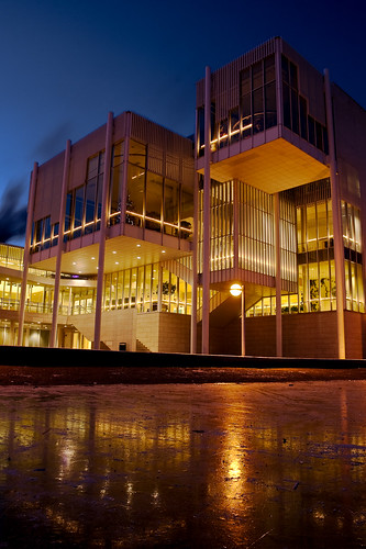 Feel free to offer improvement suggestions or ask questions. I'm still pretty much a Photoshop newbie and would love to hear of any shortcuts or better ways of doing the above. Tziko fucked around with this message at 21:02 on Jan 14, 2009 |
 #
¿
Jan 12, 2009 16:48
#
¿
Jan 12, 2009 16:48
|
|


|

|
| # ¿ May 1, 2024 15:49 |
|
|
Luk3 posted:Haha, I was talking about this on the IRC channel yesterday and just finished writing up an OP. God drat! By the way, what IRC channel do you guys hang out on?
|
|
#
¿
Jan 12, 2009 17:17
|
|
|
jackpot posted:I've been trying to fix this for a while now, with no success; my images are desaturated in browsers but look good in photoshop/bridge (don't make fun). It's not computer specific; I have the same problem between my windows home pc and my work macbook pro. And the thing is, I don't want to have to change any settings in firefox to see them right, because I can't expect people looking at them to change anything. Can someone give me the lowdown on what to set/how to save so that what I see in a browser matches what I see in PS, and what most other people will see? My problem turned out to be related to my monitor color profile. Depending on your video card, XP can't handle two seperate color profiles if you have two monitors connected to the same video card. I unloaded the profile of my secondary display and reloaded only the profile of my main display, which fixed my problems. I still don't exactly know why this caused images to look weird in non color managed applications only, though. Anyone have any ideas? Also, if any of you have good post-processing resources (online or books), please share them so that I can add them to the OP.
|
|
#
¿
Jan 14, 2009 19:15
|
|

|
kefkafloyd posted:By default, PS will not show the mask in the image. You have to go to the channels tab to enable it. Turn it on like any other channel and you'll see your affected mask areas light up like a Christmas tree. Finally, the thread-making GBS threads is over and we can focus on post-processing again. Great guides on the previous page!
|
|
#
¿
Jan 16, 2009 10:40
|
|
|
teh_Shane posted:I didn't take this shot, another guy who posts on here did (I'm not sure of his alias on SA though). It was taken at Splendour in the Grass '09.
|
|
#
¿
Jul 30, 2009 16:27
|
|


")
|
A5H posted:I'd like to thank all you guys for writing this stuff up. I've been reading it for the past few days and the amount of stuff I've learned is absolutely mind boggling. I know I will not remember hardly any of it, so I will definitely keep coming back to a lot of the tuts, and I still don't understand colour profiles haha!
|
|
#
¿
Aug 20, 2009 17:42
|
|
|
Was aware of the content-aware fill coming in CS5, but some of the other features are pretty incredible as well (except the last one  ): http://www.youtube.com/watch?v=vfkjHnsAsvg&feature=related ): http://www.youtube.com/watch?v=vfkjHnsAsvg&feature=relatedAlso, some neat new stuff in Illustrator CS5: http://www.youtube.com/watch?v=XFXJY0a8NiU&feature=related Edit: I think it's really cool how Adobe can take a new SIGGRAPH technology and turn it into a usable feature (Content Aware Resize) in about a year and then take it further (Content Aware Fill) with the next release. Not all new technology is available that fast to consumers. Tziko fucked around with this message at 21:05 on Apr 25, 2010 |
|
#
¿
Apr 25, 2010 20:30
|
|
|
GWBBQ posted:Look at the road in the content aware delete while he's talking about the line on the left and it's obvious that while amazing, it's still far from perfect. It's not meant to be a one-stop tool that allows you to remove whatever you want. It simply makes the whole process a lot faster by giving you a good starting point, after which you fix it up by doing some manual cloning/other fixes.
|
|
#
¿
Apr 26, 2010 13:57
|
|
|
|
| # ¿ May 1, 2024 15:49 |
|
|
diarrhea for girls posted:But look at that extraordinary detail in the wall! Wonderful texture! I've been using Beta 2 for a while now and it's been working great. Go try it out - the noise reduction is better than in LR 2.
|
|
#
¿
Apr 30, 2010 08:58
|
|